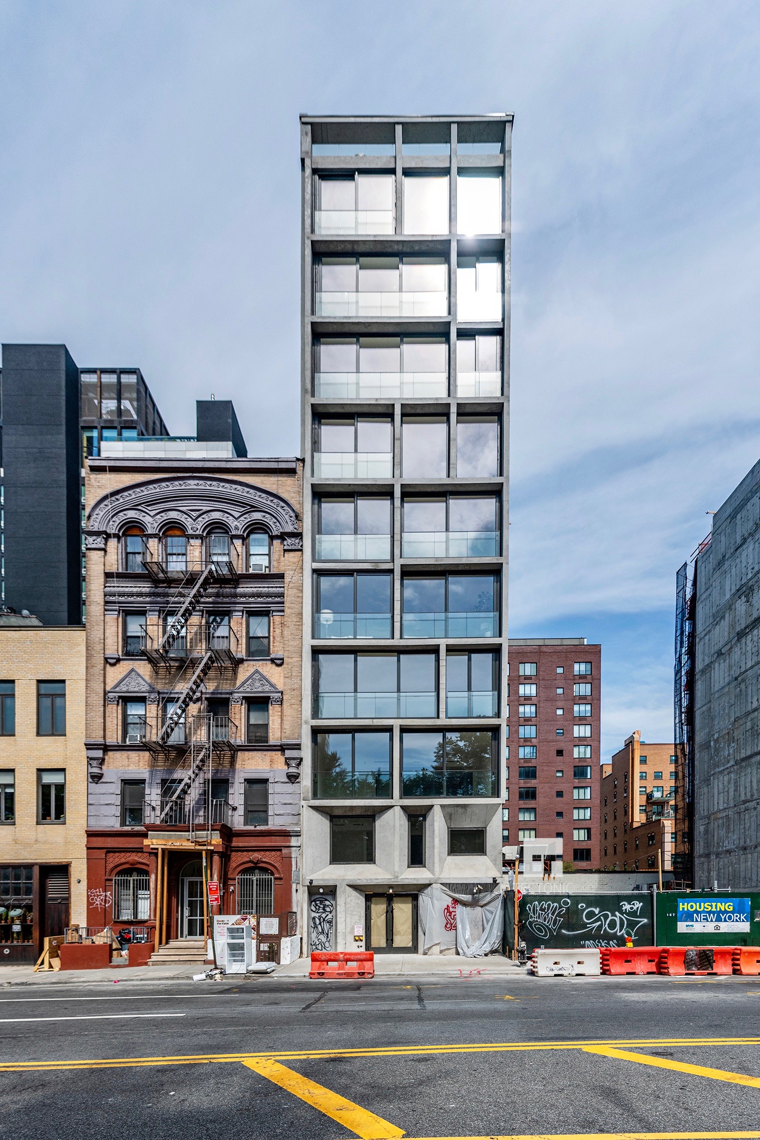
Construction is wrapping up on 165 Chrystie Street, a ten-story residential building on Manhattan’s Lower East Side. Designed by Architecture Only and developed by Nortco and Nexus Development, the reinforced concrete structure stands on the west side of Sara D. Roosevelt Park between Delancey Street and Rivington Street. Sales is handled by Nest Seekers led by Ryan Serhan, with marketing handled by CORE. Layouts include six through-floor simplex units, a duplex townhouse with a private rear yard, and a triplex penthouse with a private rooftop.
The below photograph from Tectonic lines up perfectly with the main rendering above, and illustrates a number of subtle changes to the design. As rendered, the Mondrianesque grid of horizontal and vertical openings featured inward-chamfered walls leading to their floor-to-ceiling windows. This was scrapped in favor of a more straightforward approach. The chamfered design for the first two stories remains, albeit in a slightly modified arrangement. The ground floor appears to be the final portion of the structure awaiting completion.
The closest subways to the address are the J and Z trains, located to the south at the Bowery station, and the F train at the 2nd Avenue station, located three blocks to the north at Houston Street. Amenities include package and bicycle storage areas, a recreation room, a fitness center, and a shared roof deck hidden from street view on the flat roof parapet. Prices start at $2.995 million. Homes will come with ceiling spans exceeding nine feet, hardwood flooring, and in-unit washers and dryers.
165 Chrystie Street is complete with a temporary certification of occupancy to come next month.
Subscribe to YIMBY’s daily e-mail
Follow YIMBYgram for real-time photo updates
Like YIMBY on Facebook
Follow YIMBY’s Twitter for the latest in YIMBYnews





Twice as beautiful from previously reported, modernization on look right; and modernism on look left: Thanks to Michael Young.
I love it!
Um, lots of changes right down to the front door. Hopefully the finished design will still look as good as the rendering, but I’m skeptical now.
Yes, lots of small ‘budget item’ changes, but still l’ve rarely seen the rendering and actual photo of a building maintain the same ‘feel’
As it appears so far, it looks a darn sight better than the rendering, thank goodness!
What a shame the lovely, vintage building next door is ruined by fire escapes (as are countless, similar examples in NYC), albeit absolutely justified by emergency egress regulations. What would be the possibility of, say, creating a scissor stair in the existing, interior stairwell so that the exterior, abominable stairs on that graceful facade could be legally removed?
The rendering has style and grace, the design modifications as built has neither. Too bad.