Exterior work is nearing completion on 799 Broadway, a 12-story office building in Greenwich Village. Designed by Perkins + Wills and developed by Columbia Property Trust, the 182-foot-tall structure will yield 180,000 square feet of commercial space marketed by JLL. The corner lot is located at the intersection of Broadway and East 11th Street, and was purchased by Normandy Real Estate Partners and Ares Management in 2016 for $101 million.
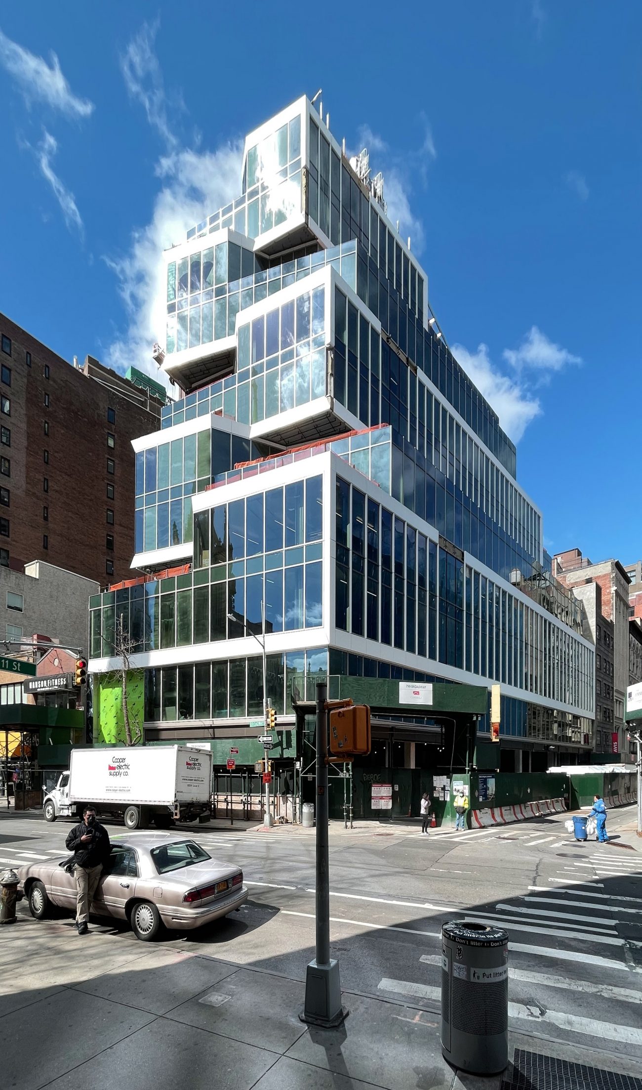
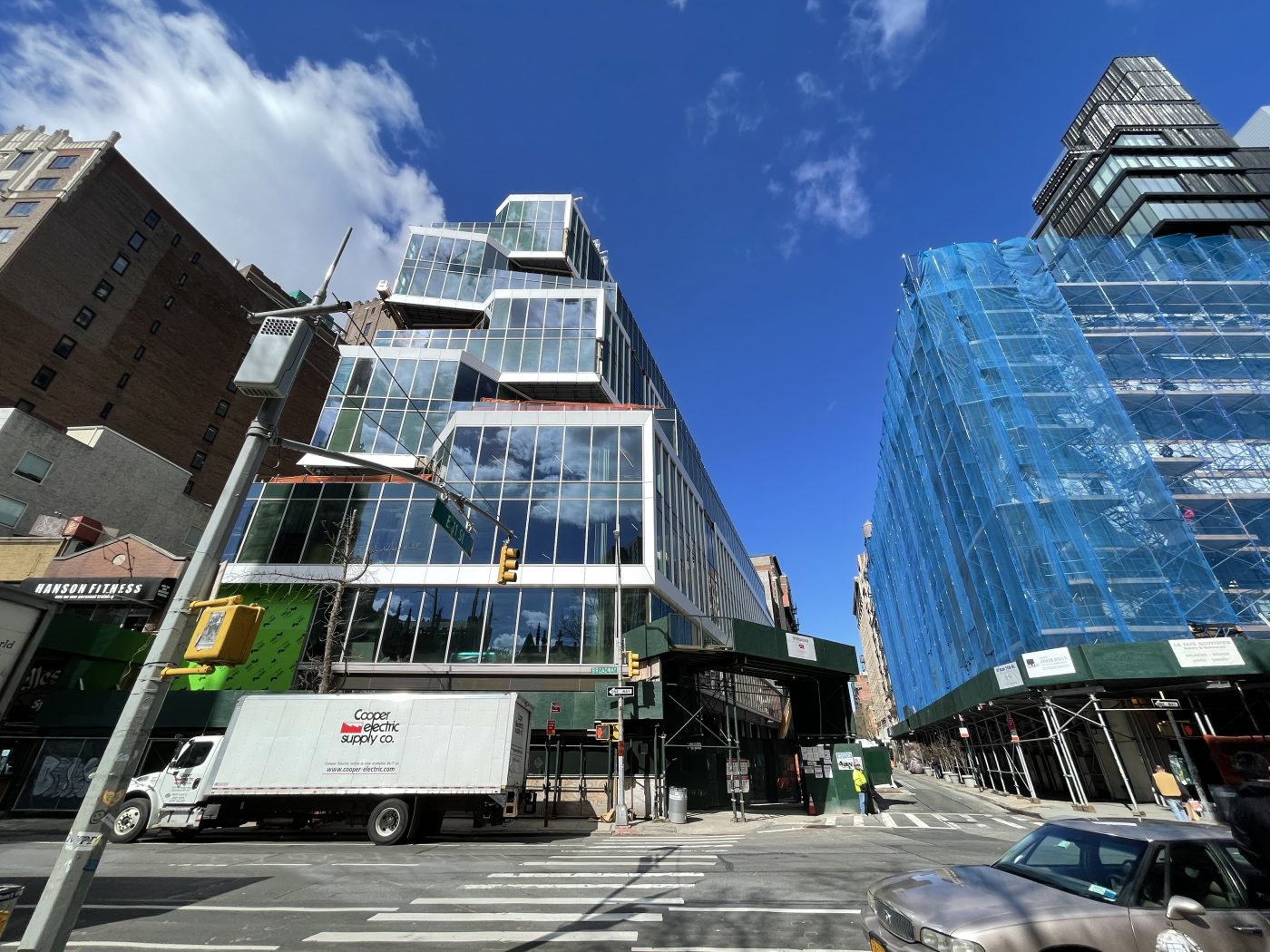
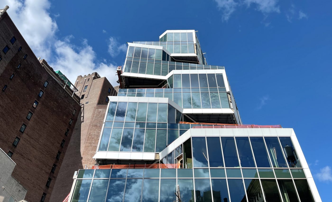
Recent photos show the curtain wall progress since our last update in October, when the floor-to-ceiling glass and white paneling was just beginning to be installed on the reinforced concrete superstructure. Now the façade covers nearly the entire building.
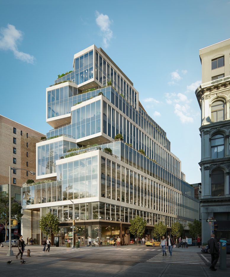
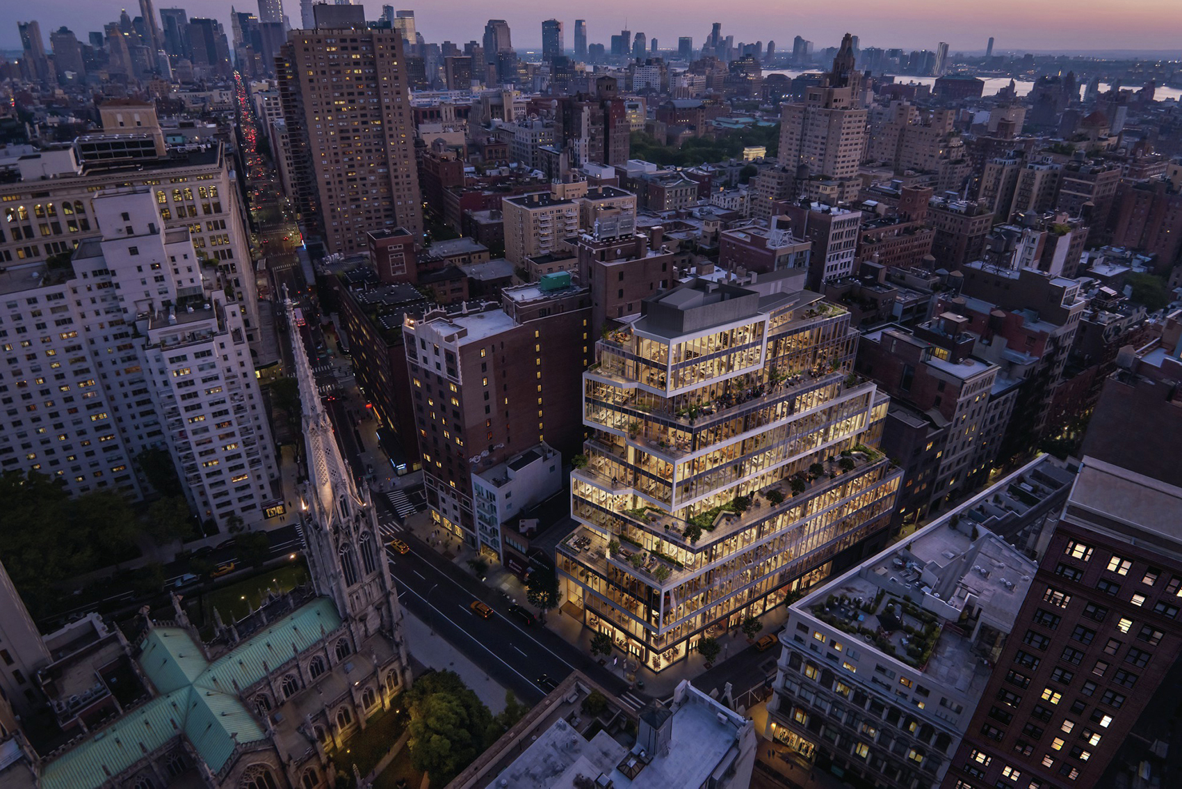
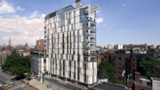
The building’s dynamic design is best expressed on the eastern elevation facing Broadway, with the staggered levels making way for multiple outdoor landscaped terraces. The longer northern side that runs along East 11th Street has a more conventional tiered approach with the curtain wall uniformly stretching the length of the block.
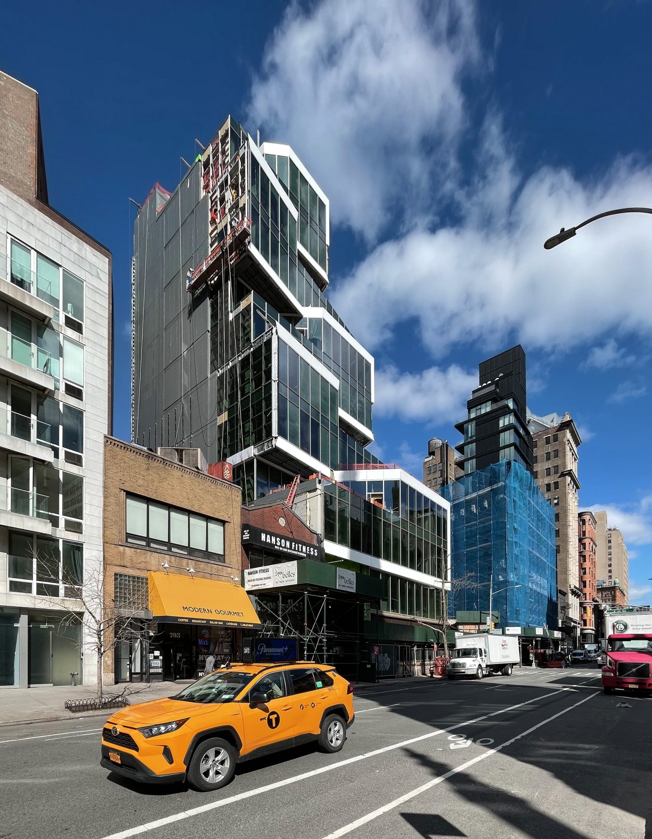
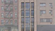
Workers were seen suspended on scaffolding rigs putting together glass panels against the largely opaque gray southern profile.
799 Broadway is one of the newest office buildings along this section of Broadway in Greenwich Village. The envelope greatly contrasts with the more traditional brick and stone masonry clad low-rise neighbors. The address is conveniently serviced by the nearby 14th Street-Union Square station, with access to the 4, 5, 6, L, N, Q, R, and W trains.
Additional renderings below show the building above at dusk, and offer a preview of the lobby and communal areas.
YIMBY estimates 799 Broadway to be finished sometime before the end of the year.
Subscribe to YIMBY’s daily e-mail
Follow YIMBYgram for real-time photo updates
Like YIMBY on Facebook
Follow YIMBY’s Twitter for the latest in YIMBYnews





I like it. I don’t love the blank side wall, but my guess is that the low-rise building next to it will eventually give way to a taller building that will cover it up. The aerial rendering shows that it does fit contextually with its surroundings. Love those terraces. This is overall a winner.
I completely agree.
I really like this building. I like the uniqueness of the design, compared to other office buildings at this scale. It also fits the neighborhood perfectly. Overall, it’s just a very cozy and gentle looking building, which I really like.
Thanks to Michael Young.
The rendering looking down on the terraces is one of the best “explanatory” renderings I can remember. Good work.
It appears that the glass panels on the south side of the building are not in conformity with the rest of the glass panels, forgetting about the blank area. Curious as to how that will finally turn out. Otherwise, as a neighbor, I have watched this building rise super fast, the builders deserve applause.
Interesting
A rare example where the actual building looks better than the rendering.
“fit(s) contextually with its surroundings.” That is some good grass you’re smoking.