The Landmarks Preservation Commission (LPC) will again review renderings and proposals from Roman & Williams Buildings and Interiors to install new signage and illuminated canopies at the historic Tin Building in Manhattan’s South Street Seaport Historic District.
![Existing conditions at 95 Marginal Street (The Tin Building) - Roman & Williams Buildings and Interiors - [From left to right] View of previously submitted renderings of 95 Marginal Street (The Tin Building) and current renderings - Roman & Williams Buildings and Interiors](https://newyorkyimby.com/wp-content/uploads/2021/08/Existing-conditions-at-95-Marginal-Street-The-Tin-Building-Roman-Williams-Buildings-and-Interiors.jpg)
Existing conditions at 95 Marginal Street (The Tin Building) – Roman & Williams Buildings and Interiors
The design team has also eliminated the proposed 16-inch-tall extruded metal letters that would have been mounted at the front of the canopy. As illustrated in the new renderings, this signage has been replaced with painted signage mounted to a plate directly on the fascia, in keeping with the historical models at the Fulton Street Market. Proposed lettering is now only 12 inches tall.
The volume of halo-lit signage on the western and eastern façades has also been reduced by one on the west and two on the east.
In response to comments regarding the homogeneity of previously proposed blade signage outside forthcoming venue spaces, the design team has now included confirmed tenant logos in an effort to illustrate how these areas will actually appear once completed. This includes a new dining concept from Jean Georges.
![[From left to right] View of previously submitted renderings of 95 Marginal Street (The Tin Building) and current renderings - Roman & Williams Buildings and Interiors](https://newyorkyimby.com/wp-content/uploads/2021/08/2View-of-previously-submitted-renderings-of-95-Marginal-Street-The-Tin-Building-and-current-renderings-Roman-Williams.jpg)
[From left to right] View of previously submitted renderings of 95 Marginal Street (The Tin Building) and current renderings – Roman & Williams Buildings and Interiors
![[From left to right] View of previously submitted renderings of 95 Marginal Street (The Tin Building) and current renderings - Roman & Williams Buildings and Interiors](https://newyorkyimby.com/wp-content/uploads/2021/08/View-of-previously-submitted-renderings-of-95-Marginal-Street-The-Tin-Building-and-current-renderings-Roman-Williams.jpg)
[From left to right] View of previously submitted renderings of 95 Marginal Street (The Tin Building) and current renderings – Roman & Williams Buildings and Interiors
![[From left to right] View of previously submitted renderings of illuminated signage at 95 Marginal Street (The Tin Building) and current renderings - Roman & Williams Buildings and Interiors](https://newyorkyimby.com/wp-content/uploads/2021/08/View-of-previously-submitted-renderings-of-illuminated-signage-at-95-Marginal-Street-The-Tin-Building-and-current-renderings.jpg)
[From left to right] View of previously submitted renderings of illuminated signage at 95 Marginal Street (The Tin Building) and current renderings – Roman & Williams Buildings and Interiors
![[From left to right] View of previously submitted renderings of canopy signage at 95 Marginal Street (The Tin Building) and current renderings - Roman & Williams Buildings and Interiors](https://newyorkyimby.com/wp-content/uploads/2021/08/View-of-previously-submitted-renderings-of-canopy-signage-at-95-Marginal-Street-The-Tin-Building-and-current-renderings.jpg)
[From left to right] View of previously submitted renderings of canopy signage at 95 Marginal Street (The Tin Building) and current renderings – Roman & Williams Buildings and Interiors
When complete, the new building will serve as a modern marketplace offering a mix of retail and dining establishments. Both the ground floor and the second level will contain ample seating, open restaurant and bar concepts, and views of the waterfront neighborhood.
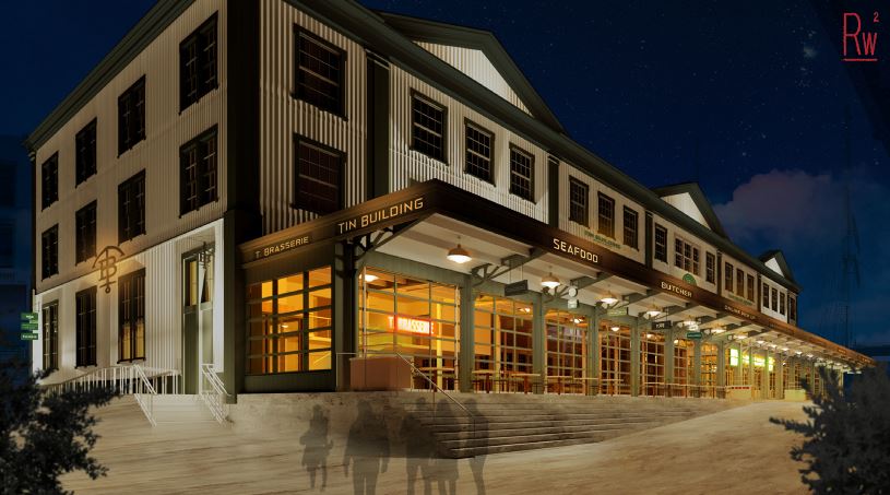
Updated rendering of 95 Marginal Street (The Tin Building) – Roman & Williams Buildings and Interiors
Subscribe to YIMBY’s daily e-mail
Follow YIMBYgram for real-time photo updates
Like YIMBY on Facebook
Follow YIMBY’s Twitter for the latest in YIMBYnews

![Updated rendering of 95 Marginal Street (The Tin Building) - Roman & Williams Buildings and Interiors - [From left to right] View of previously submitted renderings of illuminated signage at 95 Marginal Street (The Tin Building) and current renderings - Roman & Williams Buildings and Interiors](https://newyorkyimby.com/wp-content/uploads/2021/08/Updated-rendering-of-95-Marginal-Street-The-Tin-Building-Roman-Williams-Buildings-and-Interiors-777x428.jpg)
I guess the new signage looks more fitting to the classical vibe of the building.
An improvement