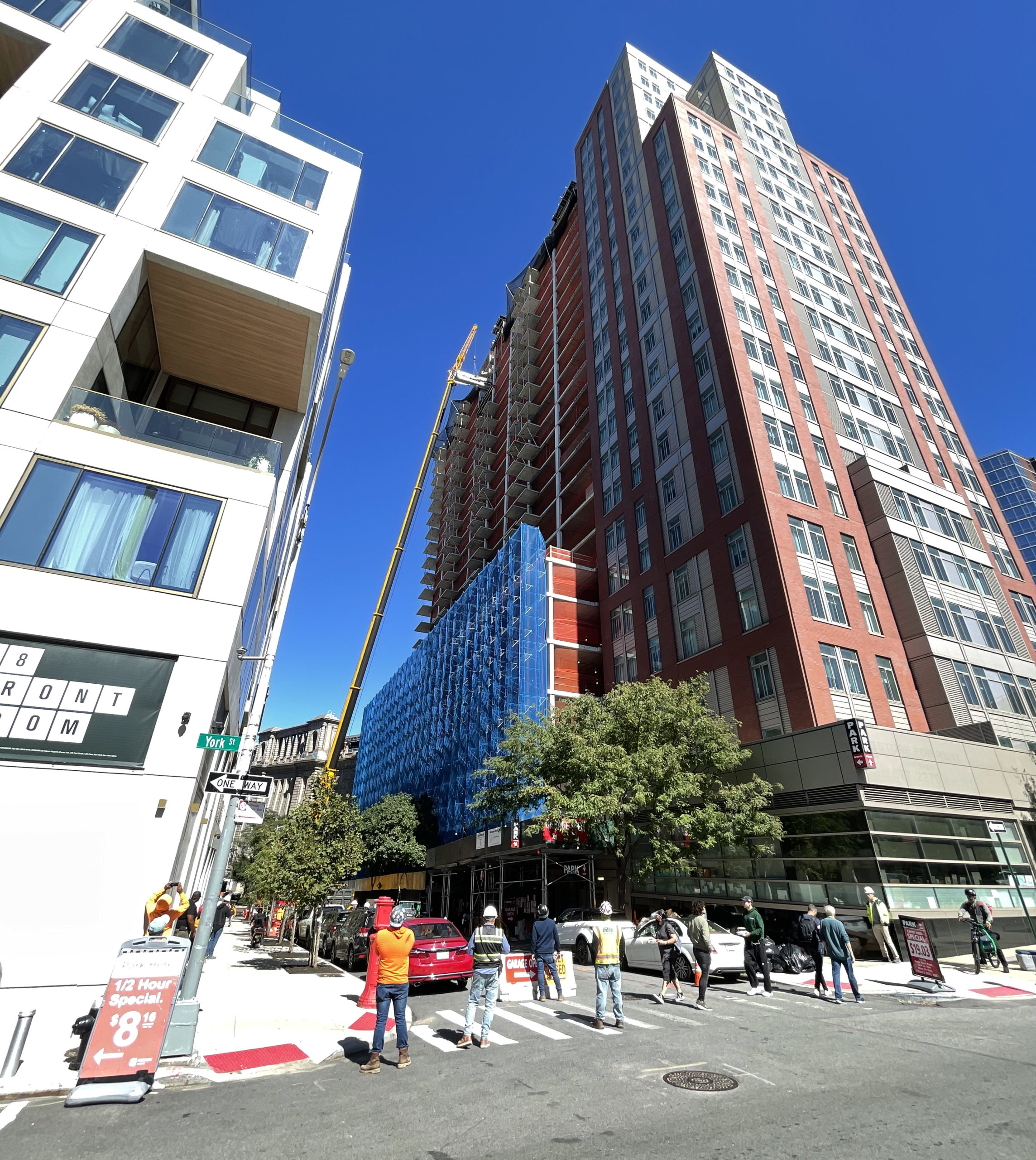
Construction has topped out on 69 Adams Street, a 26-story residential building in DUMBO, Brooklyn. Designed by Fariba Makooi of Fischer + Makooi Architects and developed by The Rabsky Group, the 280-foot-tall structure will yield 225 units in studio to two-bedroom layouts spread across 258,200 square feet as well as 60 feet of retail frontage, a 25-foot-long rear yard, and 61 parking spaces. Galaxy Developers is the general contractor for the property, which is bound by Front Street to the north, York Street to the south, the elevated Manhattan Bridge roadway to the east, and Adams Street to the west.
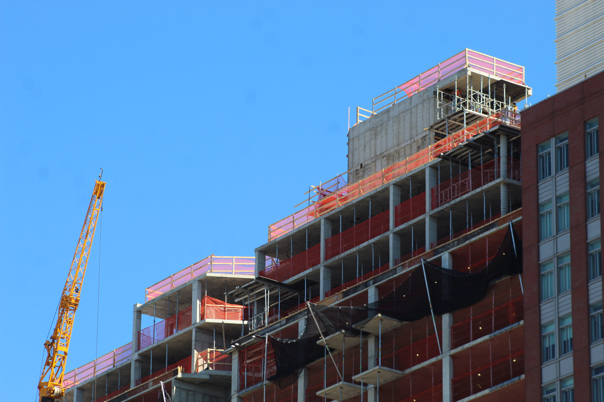
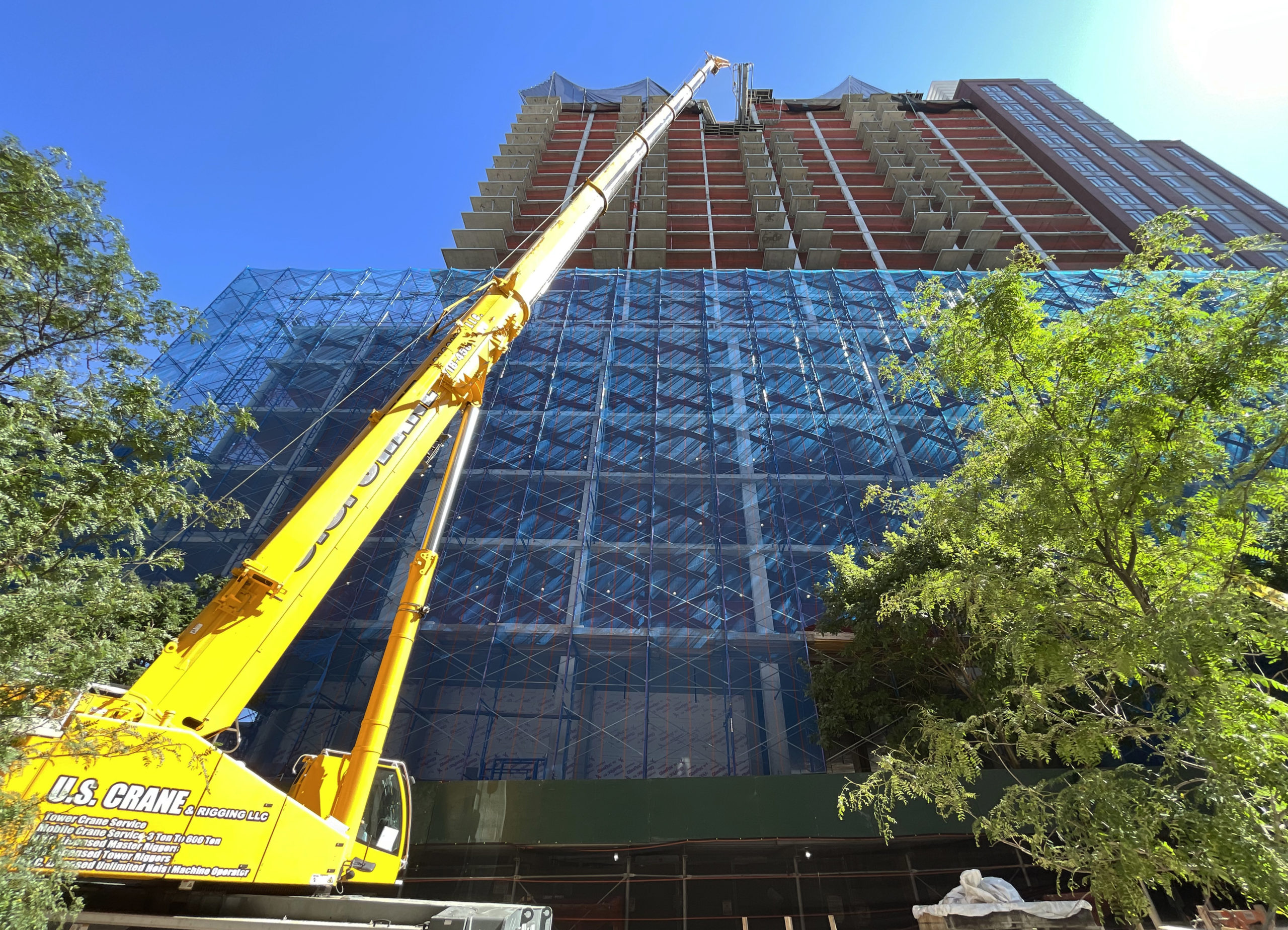
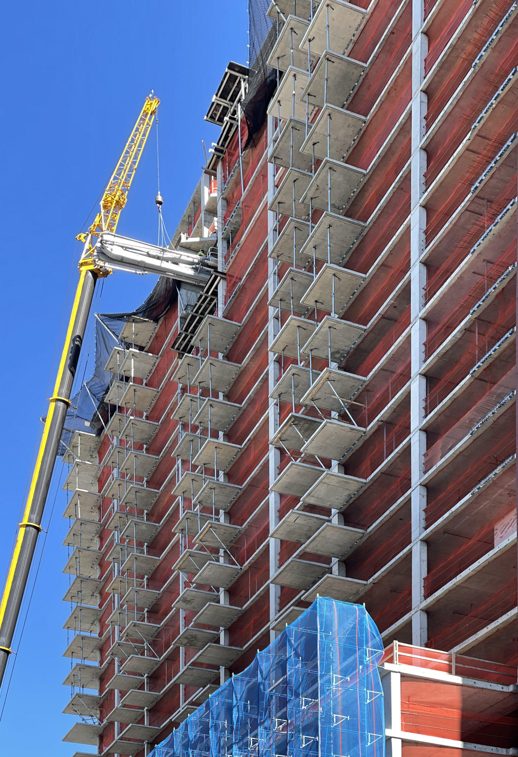
The reinforced concrete superstructure rose rapidly since our last update in late June, when construction had just passed the podium levels, and now stands at its pinnacle as scaffolding and blue netting envelop the lower floors in preparation for façade installation.
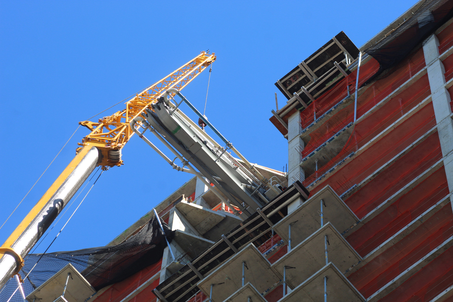
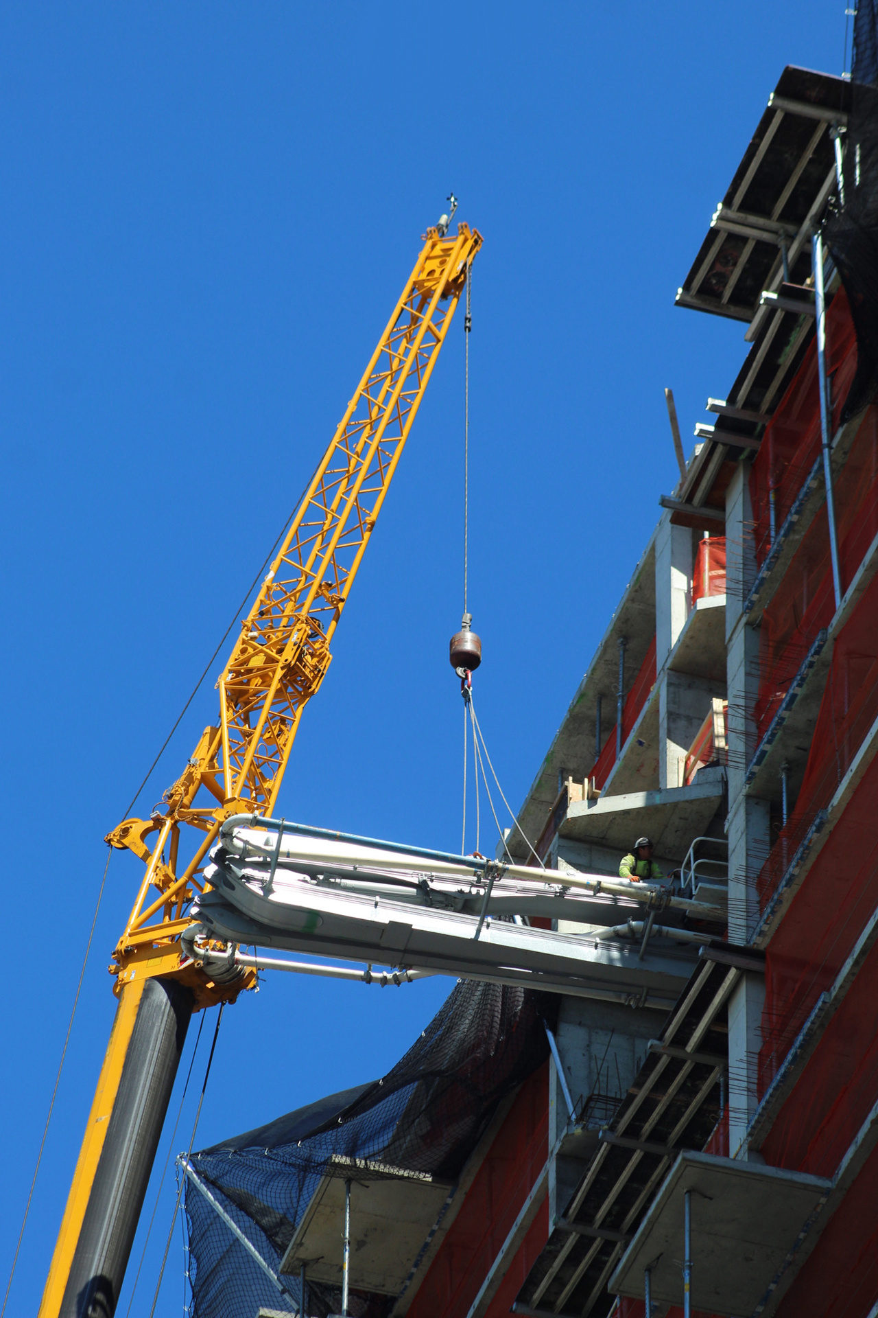
A crane on the western face along Adams Street was in the process of removing a concrete pumping rig from the top of the tower.
Below is a photograph of 69 Adams Street from the World Trade Center showing the bare concrete structure awaiting its façade.
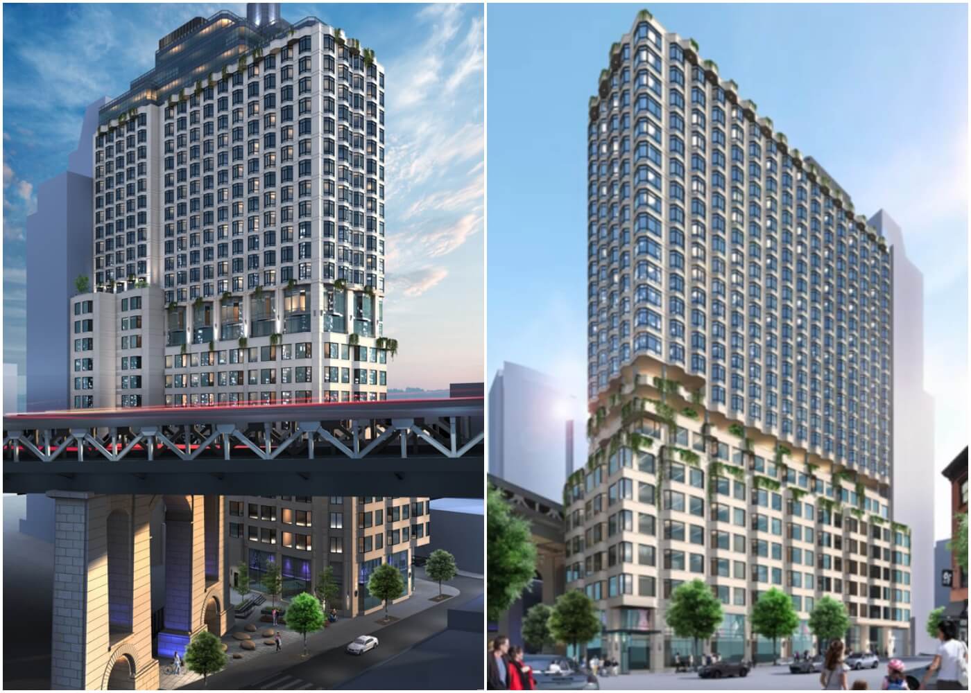
The following renderings show the two wide elevations with an exterior composed of light-colored paneling surrounding a tight grid of floor-to-ceiling bay windows. The upper levels feature a tiered glass massing with rounded corners and terraces topped with landscaping. A section of taller windows breaks up the volume at the midpoint of the building. The ground floor will feature a landscaped public plaza with seating and tree-lined sidewalks.
69 Adams Street is expected to be finished in the summer of 2024, as noted on the construction board.
Subscribe to YIMBY’s daily e-mail
Follow YIMBYgram for real-time photo updates
Like YIMBY on Facebook
Follow YIMBY’s Twitter for the latest in YIMBYnews

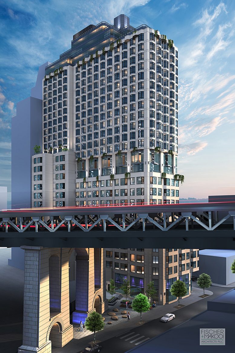




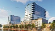
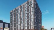
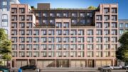
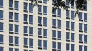
The upper levels feature a tiered glass massing with rounded corners and terraces topped with landscaping, a section of taller windows breaks up the volume at the midpoint of the building. Beautiful and prominent features on exterior design, so glorious by light and colors to my admiration: Thanks to Michael Young.
Hahah well judging by the slab edges its not going to look ANYTHING like the rendering. Bay windows? Gone. Ugly balconies? Why not. Shame original design looked promising.
Is this even the same building?
Looks nothing like the renderings. They went for flat, cheaper windows and materials Gone are the bay windows.
Hoping the obvious redesign is an improvement.
What happened with the original design?? The new version is quite ugly. That orange/red colored brick is such a bad choice.
That’s not the same building pal.
“Pardon me dear, can you pass the gravy, these mashed potatoes taste like ‘bus exhaust’?!! 😝🤣
Since buses are going electric…that’s one less gripe.
yeah they totally changed the design. Though to Rabsky’s credit they have done some interesting buidlings lately so I do have a modicum of hope.