Foundations are approaching street level at 30 India Street, the site of a six-story residential building in Greenpoint, Brooklyn. Designed by JWC Architect Engineer and developed by Miriam and Ken Chan of 32 Tower LLC, which purchased the property for $7.15 million in 2006, the 67-foot-tall structure will yield 52 rental apartments spread across 42,500 square feet, as well as 3,500 square feet of commercial space and 850 square feet of community facility space. Titan Realty & Construction is the general contractor for the project, which is located at the corner of India and West Streets.
Excavation work was still ongoing at the time of our last update in early September, with most of the site unearthed and awaiting the start of foundations. Significant progress has occurred since then, and the reinforced concrete foundations are now built up just below street level. Recent photos show a dense horizontal network of steel rebar awaiting the formation of the ground-floor slab, and sections of vertically protruding rebar marking the positions of the building’s core and interior columns. YIMBY expects the superstructure to rise above the sidewalk fencing by early spring and top out before the end of the year.
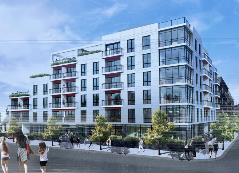
The main rendering depicts 30 India Street clad in white paneling with a regular grid of floor-to-ceiling windows and stacks of balconies on the northern and western elevations. Multiple setbacks on the eastern end of the structure are shown topped with landscaped terraces, and a roof deck appears to cap the structure.
The ground floor will feature three sections of retail frontage, a healthcare facility, and an entrance to street-level and below-grade parking with a capacity of 26 vehicles and 30 bicycle parking spots. The nearest subway is the G train at the Greenpoint Avenue station at the corner of Greenpoint and Manhattan Avenues. The East River waterfront is a short walk to the west.
A completion date of summer 2025 is posted on the construction board.
Subscribe to YIMBY’s daily e-mail
Follow YIMBYgram for real-time photo updates
Like YIMBY on Facebook
Follow YIMBY’s Twitter for the latest in YIMBYnews




Giving the feeling of being in a modern building, which does not include nearby buildings. According to the various components that are described to illustrate the design. Clad in white paneling make it looks much brighter: Thanks to Michael Young.
what a piece of crap
where’s the brick to fit into the neighborhood?
Garbage
I’m guessing by your incessant rampage on Yimby that Crap is your favorite word isn’t it…
Hurray!
More Buildings!
More People!
More Density!
More Traffic on our streets, subways and busses, etc.,
While our fragile infrastructure
continues to crumble.
This is the Evil of Rezoning:
One less Family Home.
The is No Planning for our true needs.
Who profits?
Ruthless Real Estate Opportunists.
Who loses?
We The Community.
Shame on all the Talentless Architects for knocking out another hideous building.
Is this your best work?
Do you have any concept of style?