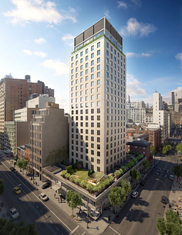
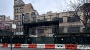
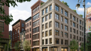
William Macklowe’s 23-story mixed-use project in Greenwich Village is nearing completion. 110 University Place, aka 21 East 12th Street, is nearly finished, with construction with work on the lower two-story podium still underway. The project is a 52-unit tower designed by SLCE Architects. CNY Group is in charge of the construction, and 110 University Place contains just under 108,000 square feet of space.
Of that, 13,000 square feet will be dedicated to commercial space, and 1,050 square feet will go towards a community facility, with the rest for the condo up top.
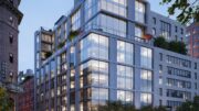
The main tower has a uniform square-shaped footprint rising from a rectangular two-story podium that nearly spans from East 12th Street to East 13th Street. Each window, six across on each side of the tower, is set into the facade within a perimeter of light-colored panels surrounding the symmetrical grid. The top of the structure is capped with a two-story setback covered in dark window frames and panels for the mechanical floor. Inside, each unit will average around 2,076 square feet. Views of the Empire State Building can be seen looking north while views of Lower Manhattan are visible looking south from the upper floors.
The site is two blocks south of Union Square Park, with access to the 14th St-Union Square subway station on the 4, 5, 6, L, N, Q, R and W trains, as well as numerous restaurants serving the local NYU community and residents on the easternmost edge of Greenwich Village.
Completion of 110 University Place should not take too long, and the building looks like it could open sometime next spring.
Subscribe to YIMBY’s daily e-mail
Follow YIMBYgram for real-time photo updates
Like YIMBY on Facebook
Follow YIMBY’s Twitter for the latest in YIMBYnews



Please pardon me for using your space: This is show that I am thinking about the tower. I like its body. (Thanks to Michael Young)
This was designed by Selldorf Architects, SLCE was the AOR.
This is just an ugly building…..shame,shame,shame,you call this design? I don’t!! This is what someone went to school to learn,and this is it….someone got major money under the table to approve this box with Windows.The W.village deserves better.
Wonderful local businesses were sadly lost here but the old building won’t be. This new building is solidly timeless and the setback does make a nice difference. It’s a unique location for a taller building that shouldn’t make a big deal but look good and this manages both.
looks cheap and dated…
Shame on Selldorf Architects for this cheap, constipated throwback to the worst of 1960’s design. The only reason to live in this building is that when you look out the window you won’t see it. Featureless, beyond bland. And it will only look worse when all that flat precast is streaked with soot. What a squandered opportunity.