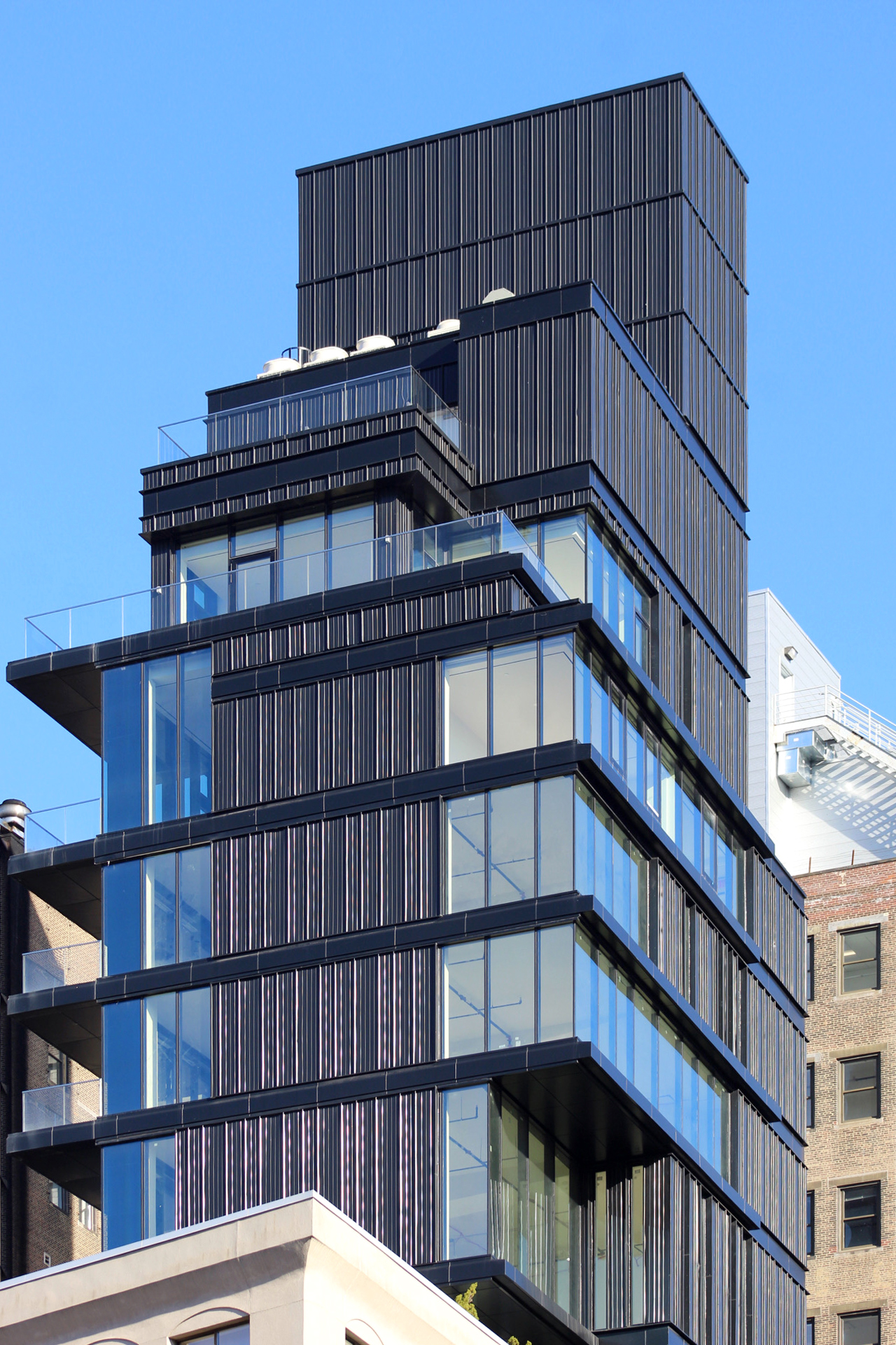
Construction has wrapped up at 809 Broadway in Greenwich Village, and tenants are steadily moving into the 15-story mixed-use building. The 41,000-square-foot, 200-foot-tall structure is designed by ODA Architecture and developed by 809 Broadway Holding, and is located on the west side of Broadway between 11th Street and 12th Street. Cushman & Wakefield is in charge of office leasing for the project and Ripco is handling retail leasing.
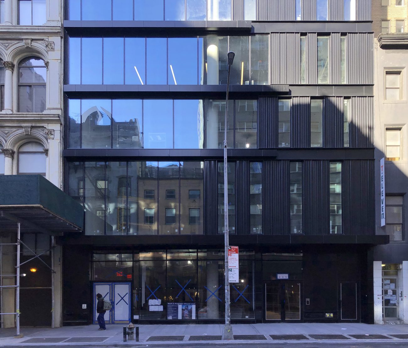
The sidewalk scaffolding has been taken down, and work on the sidewalk is finished as well.
809 Broadway yields 30,000 square feet of commercial retail and office space, 3,100 square feet of residential space, and 500 square feet for an unspecified community facility in the cellar. Retail will occupy parts of the cellar and ground floor. Offices span the second through 12th floors, and apartments are housed on the final three stories at the top of the building and average 1,033 square feet apiece. The development also includes a private garden.
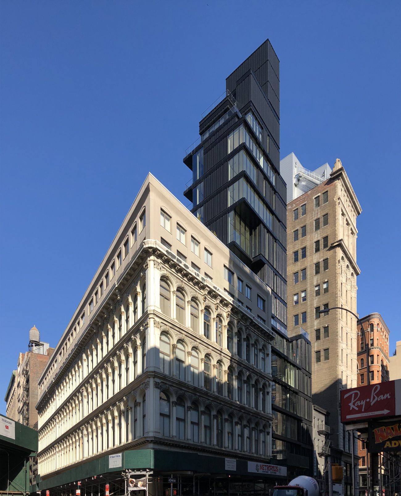
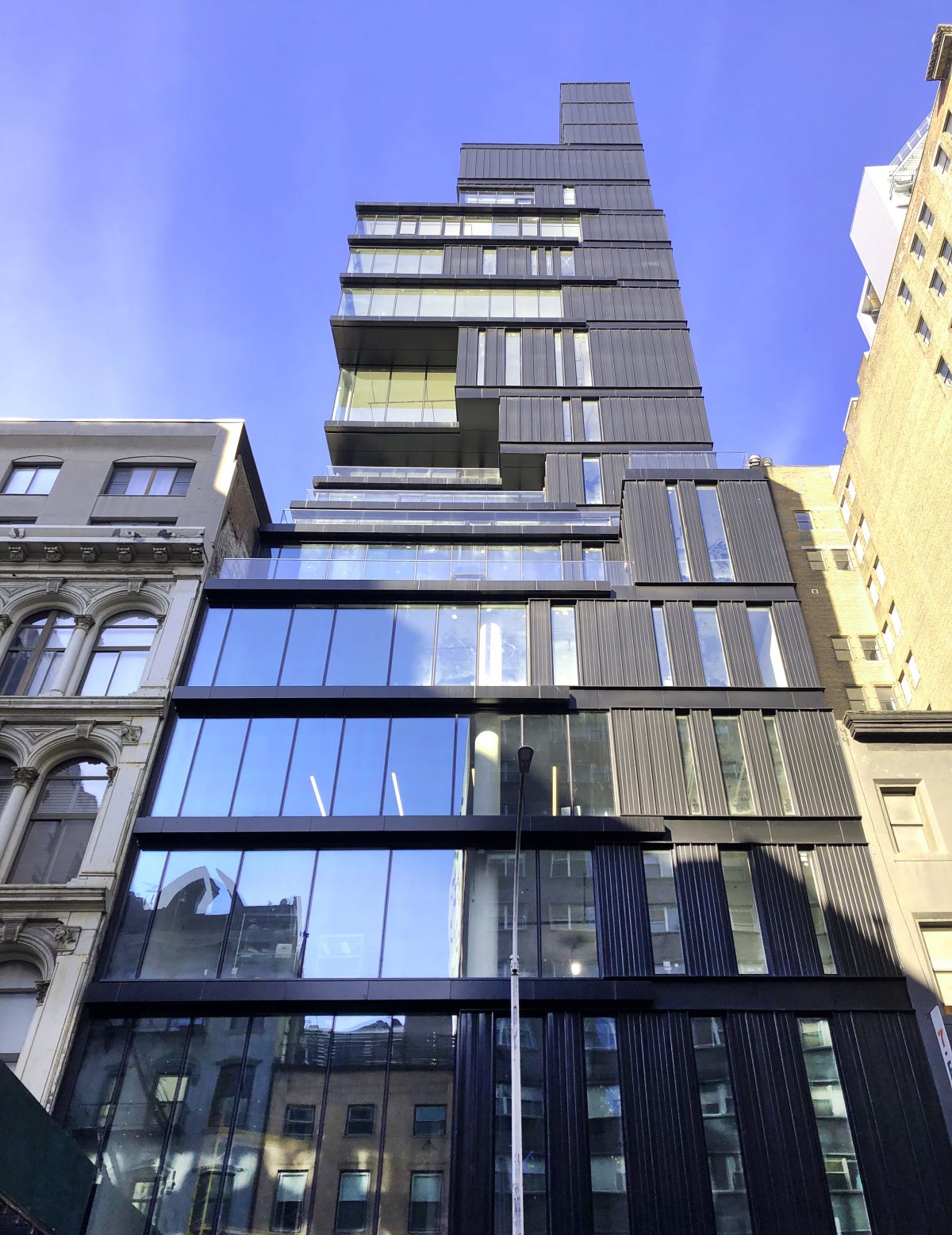
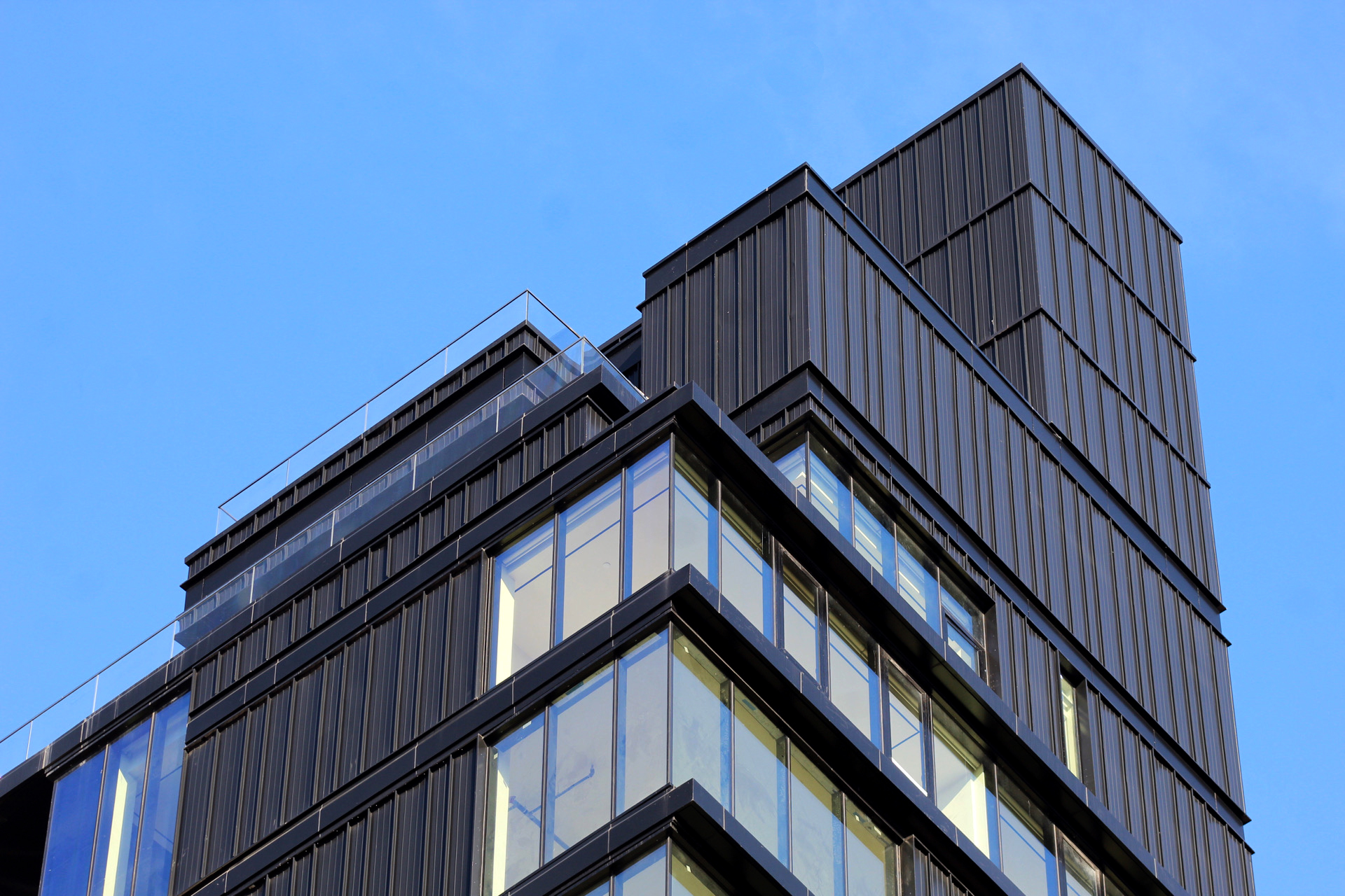
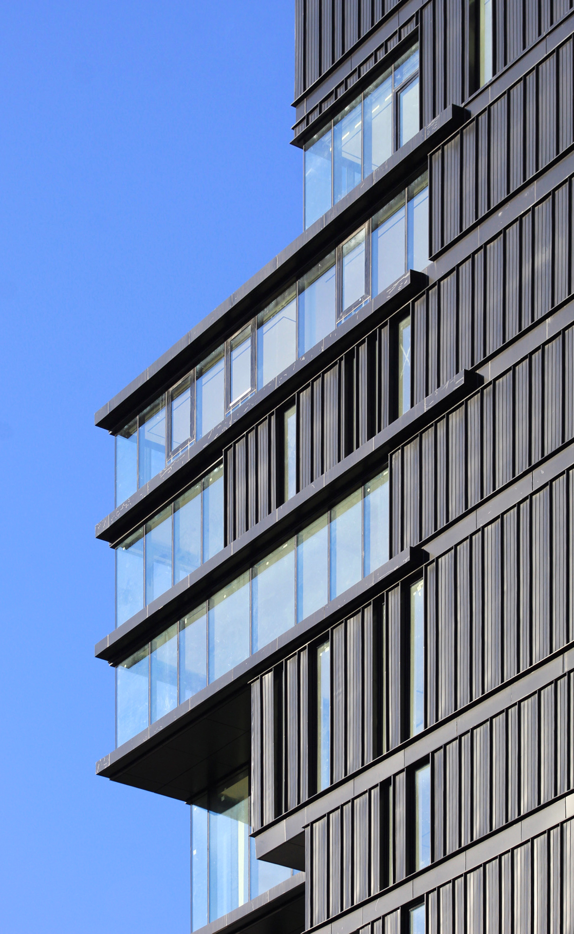
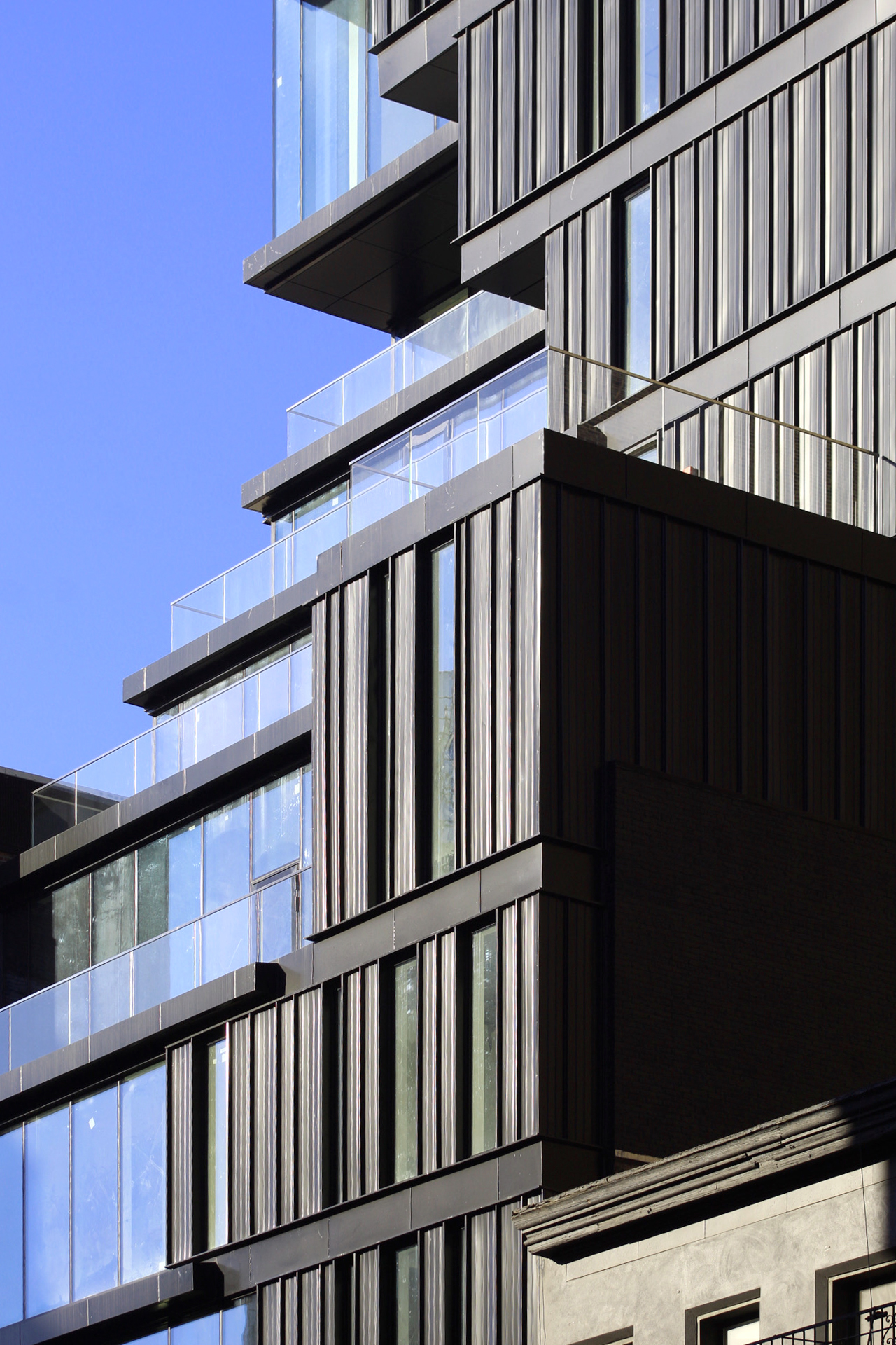
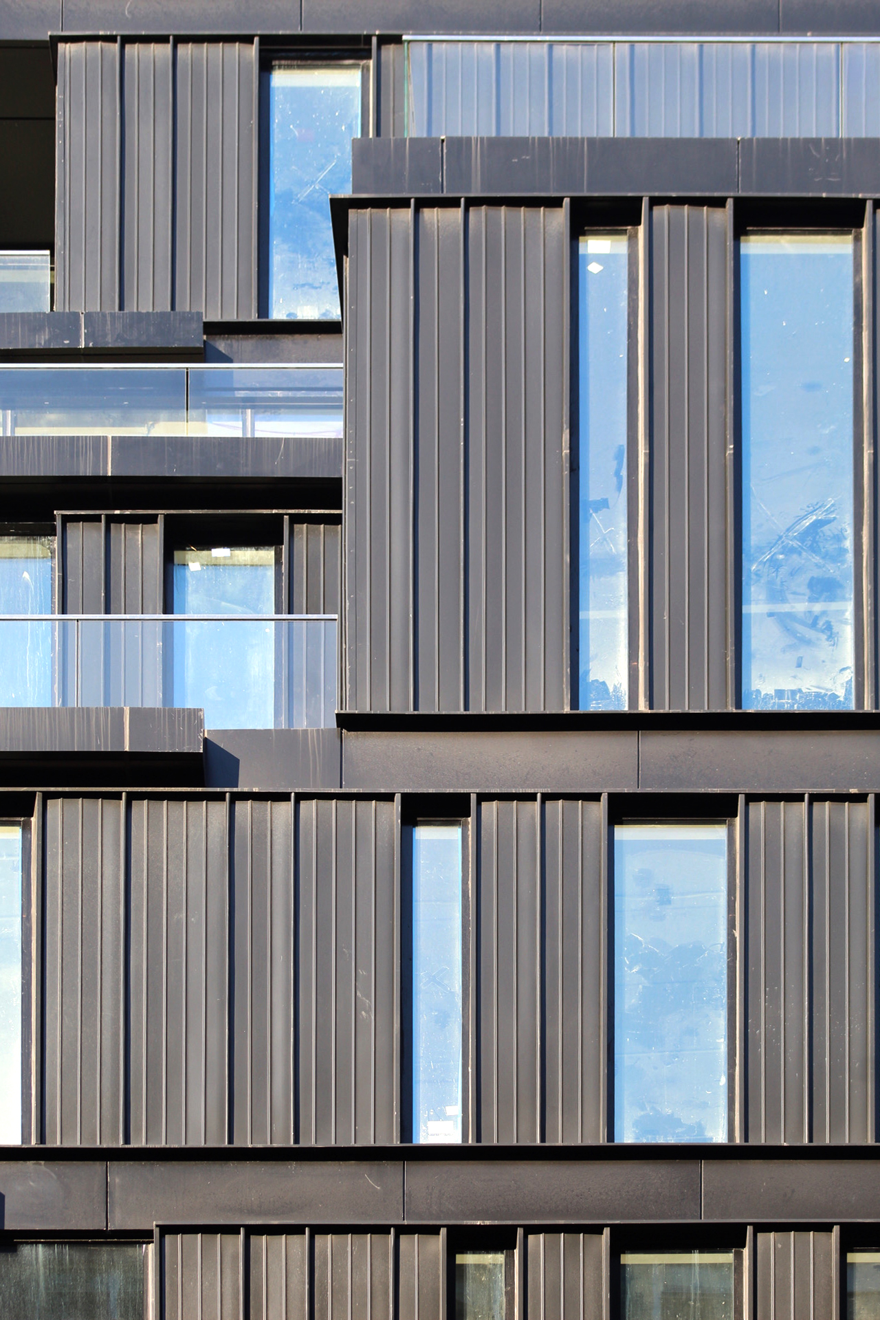
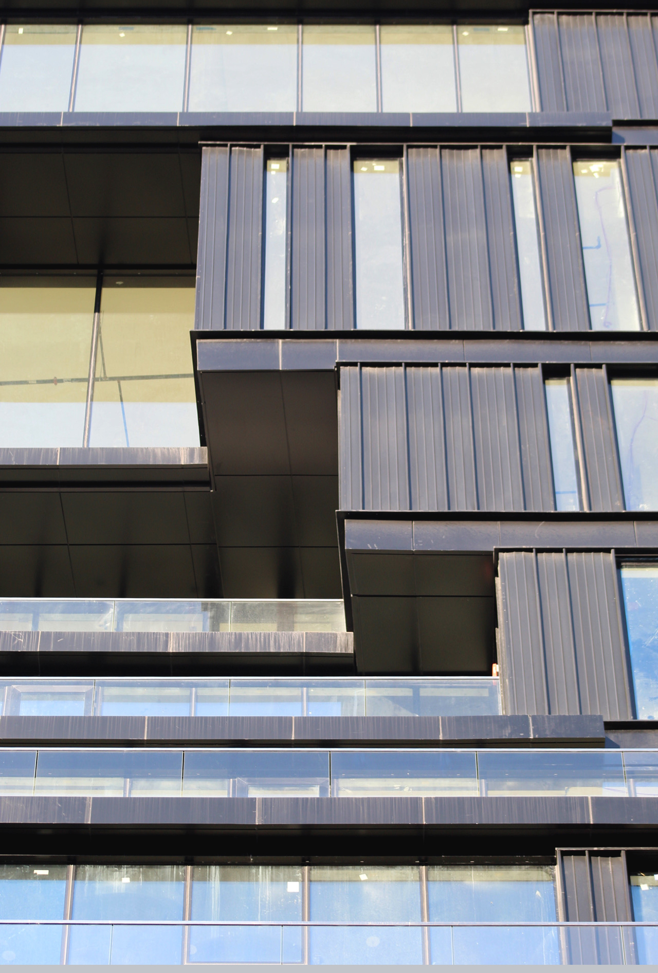
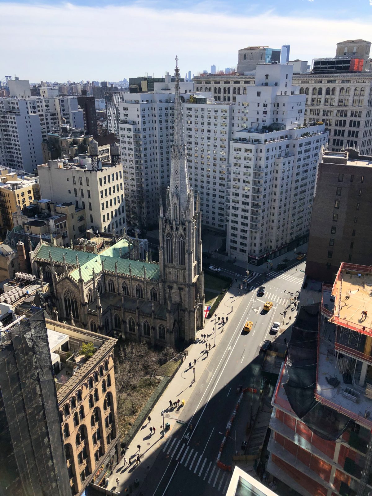
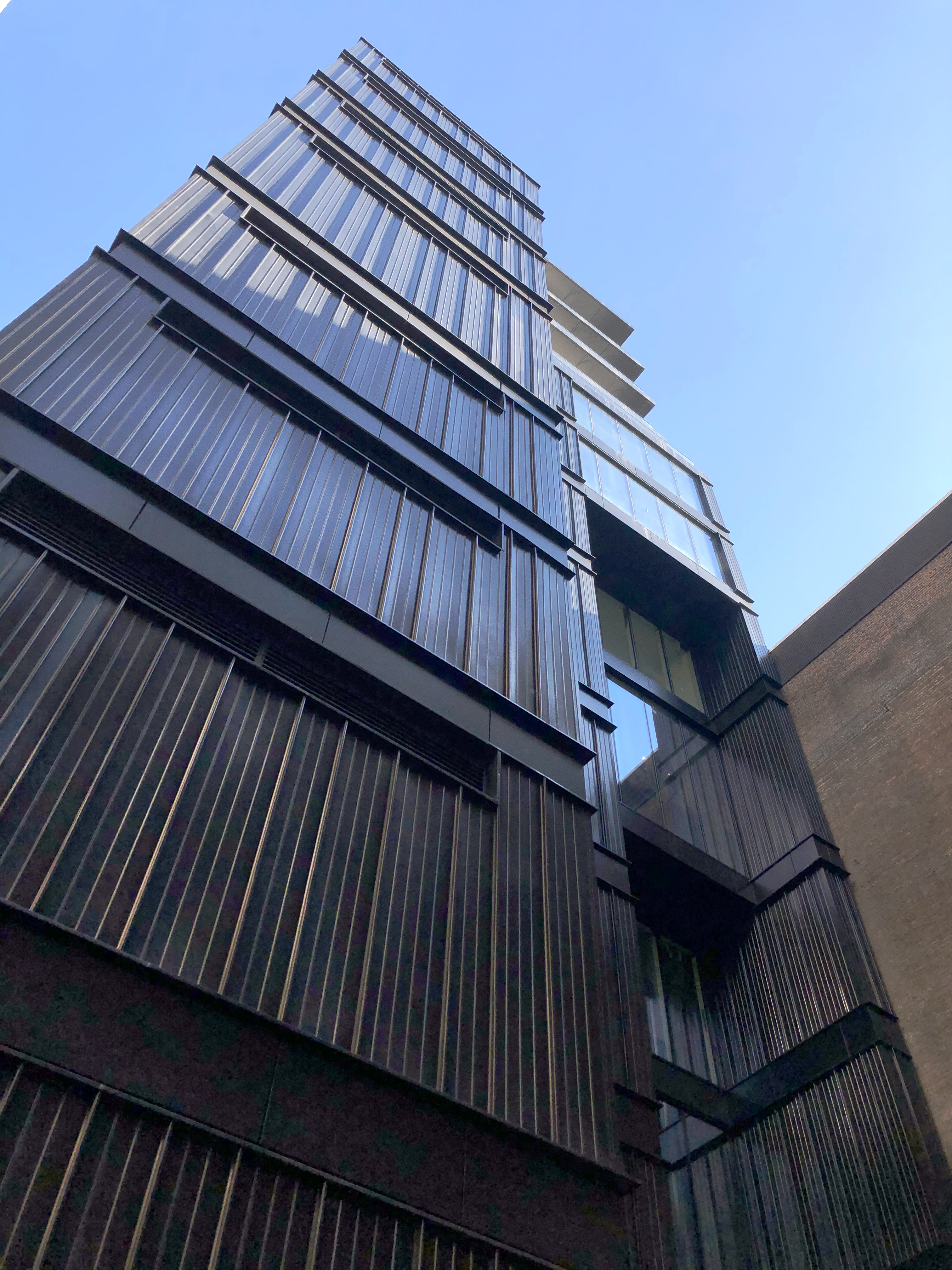
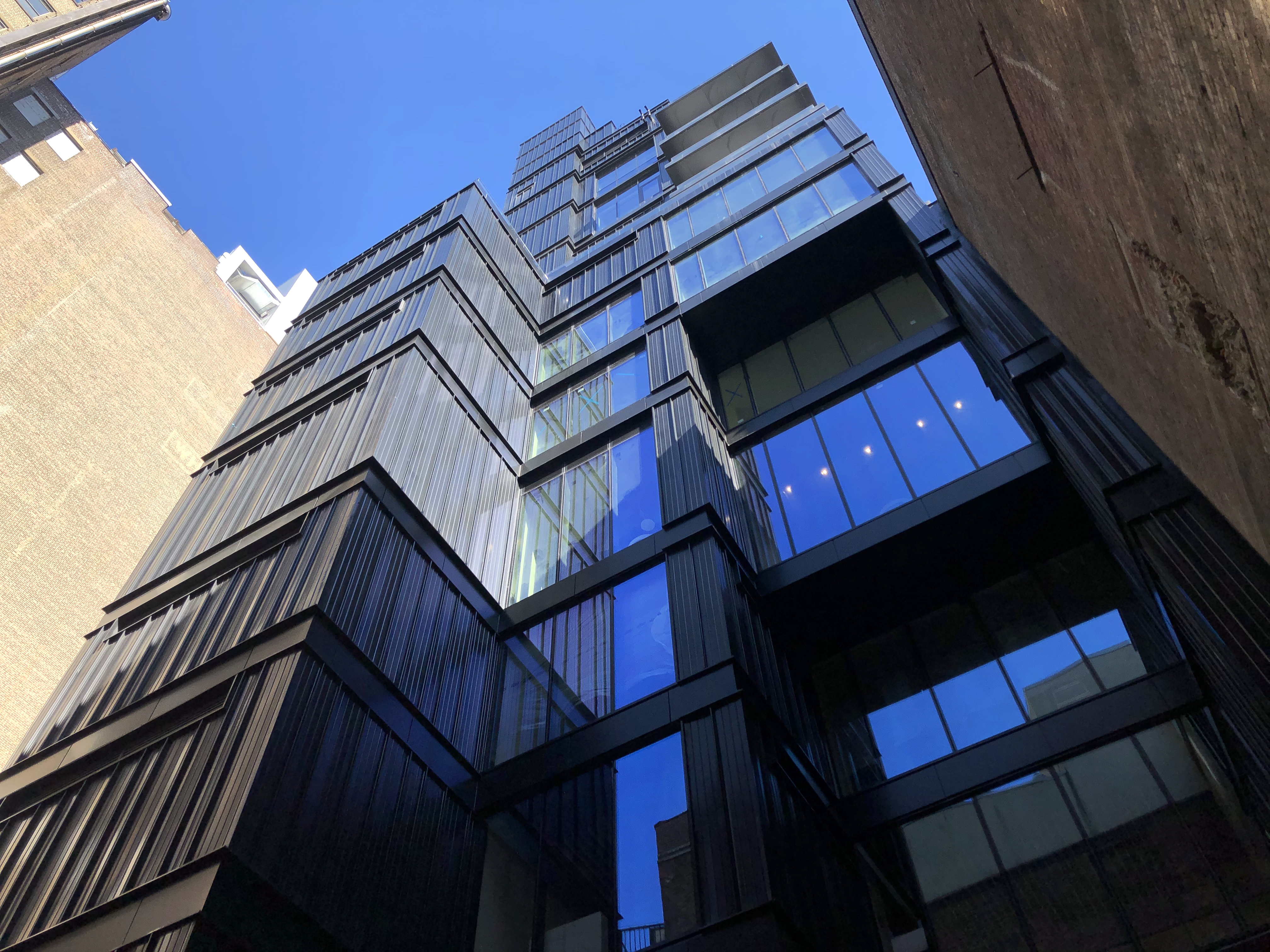
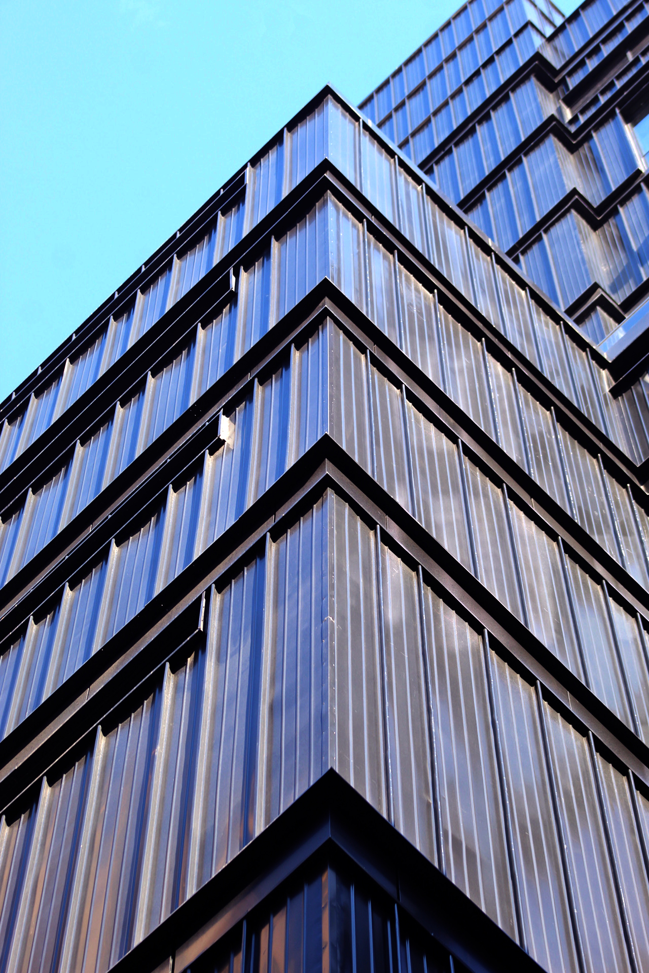
The building makes a striking impression with its black façade and floor-to-ceiling glass panels, as well as with its idiosyncratic massing, which features stepped and cantilevering floor plates. Setbacks in the design make way for landscaped outdoor terraces overlooking Broadway and the neighborhood. Overall, 809 Broadway makes an interesting mark on the streetscape, which is lined with orthodox-shaped brick buildings, cast iron structures, and the nearby Grace Church. The northern elevation of the building has been left windowless, likely out of consideration that the adjacent low-rise structure could eventually be replaced by something of similar height to 809 Broadway.
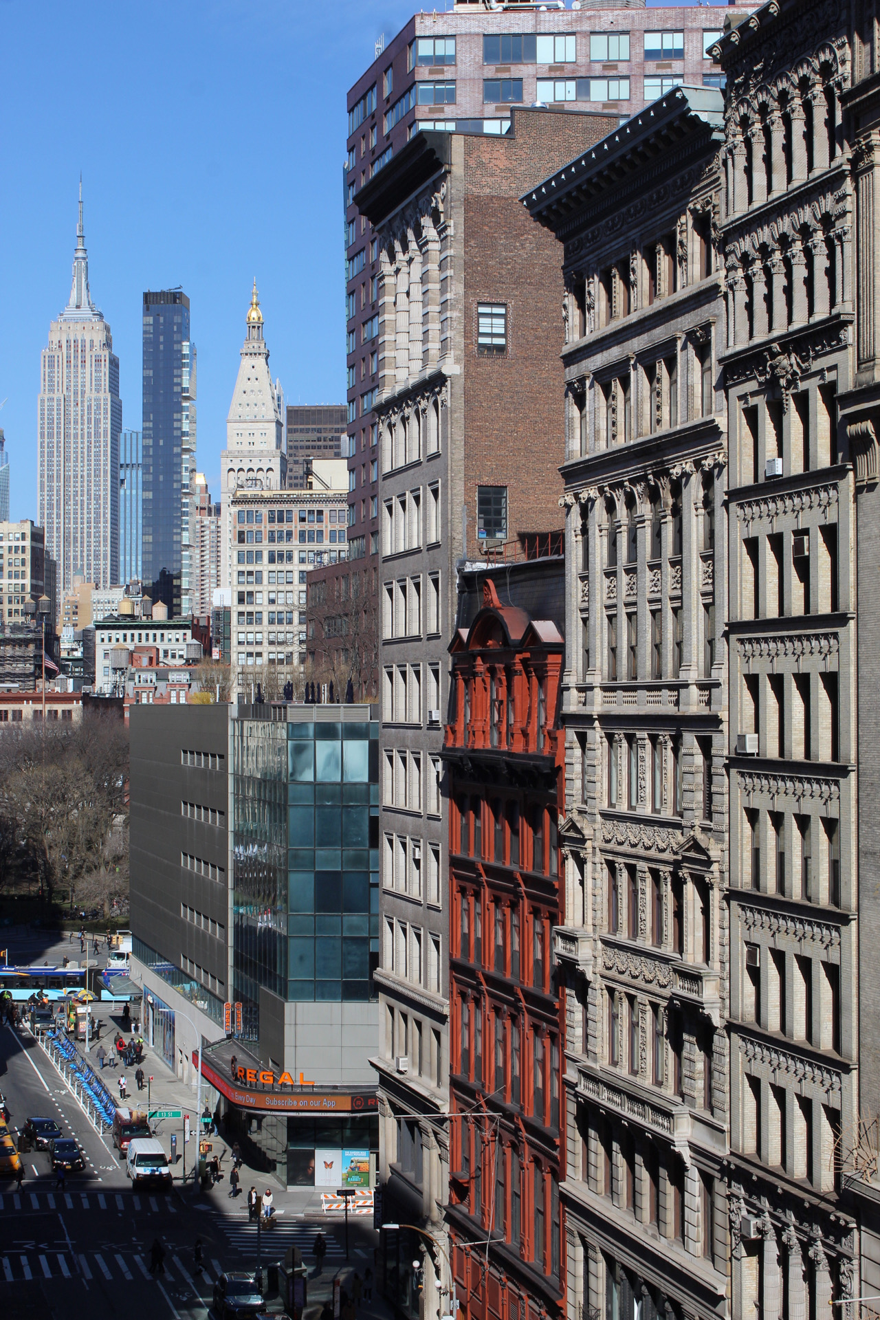
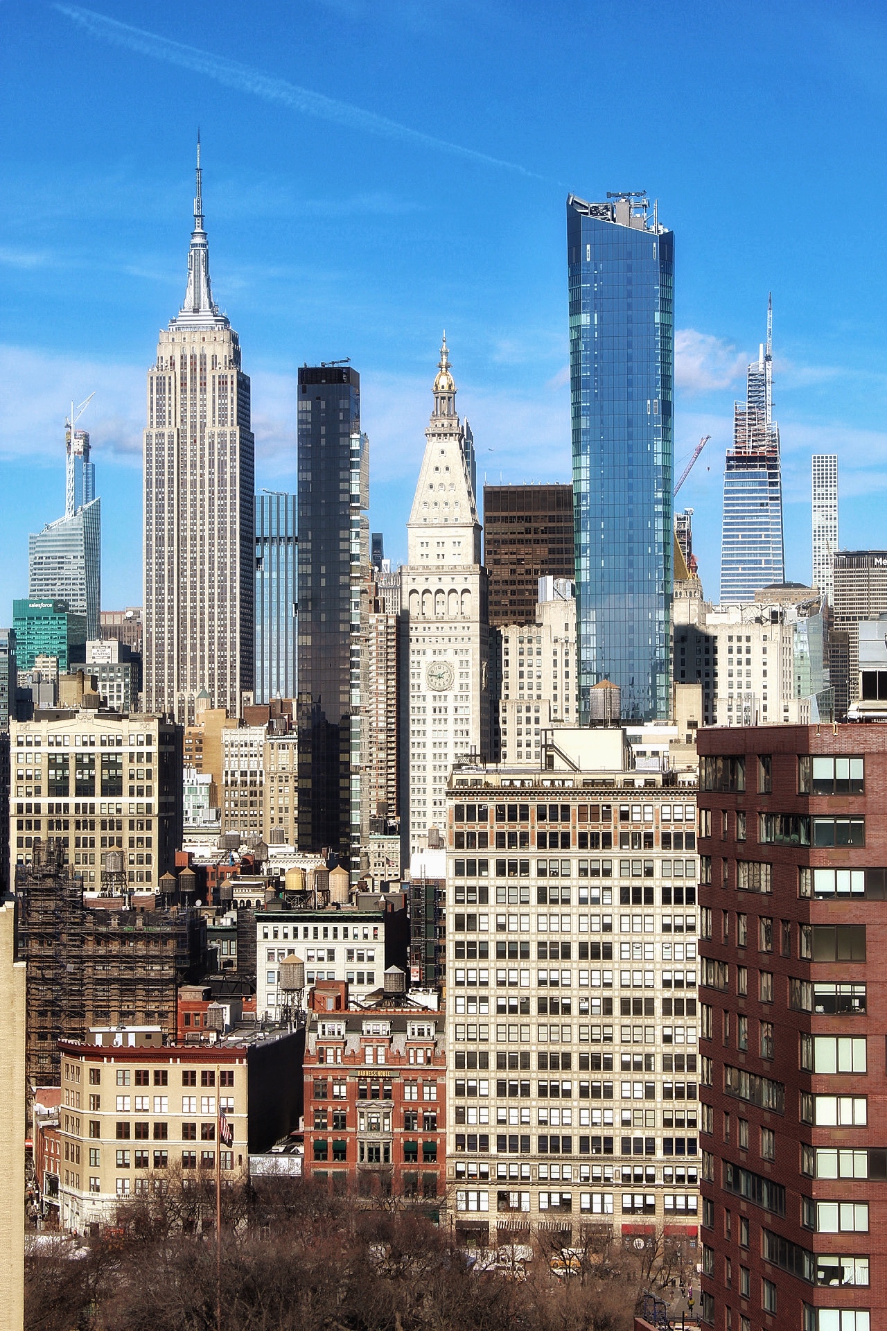
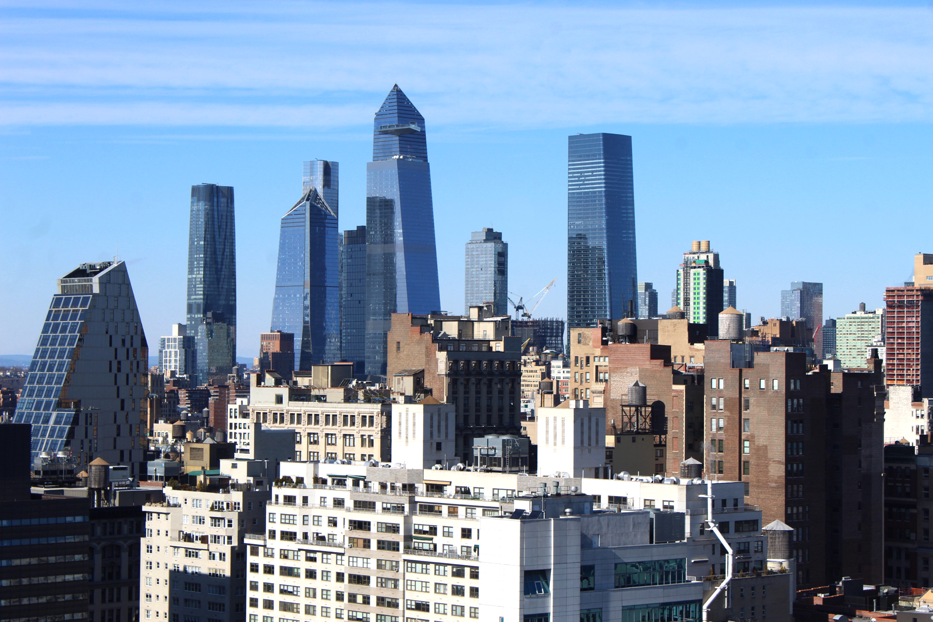
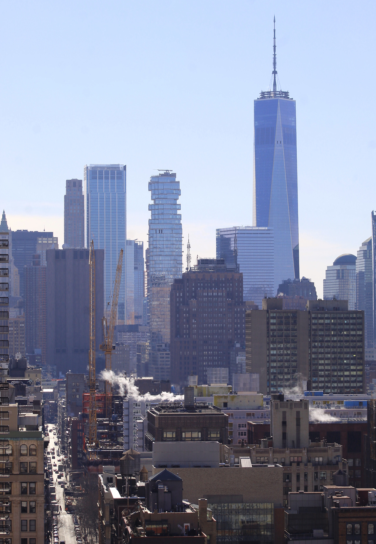
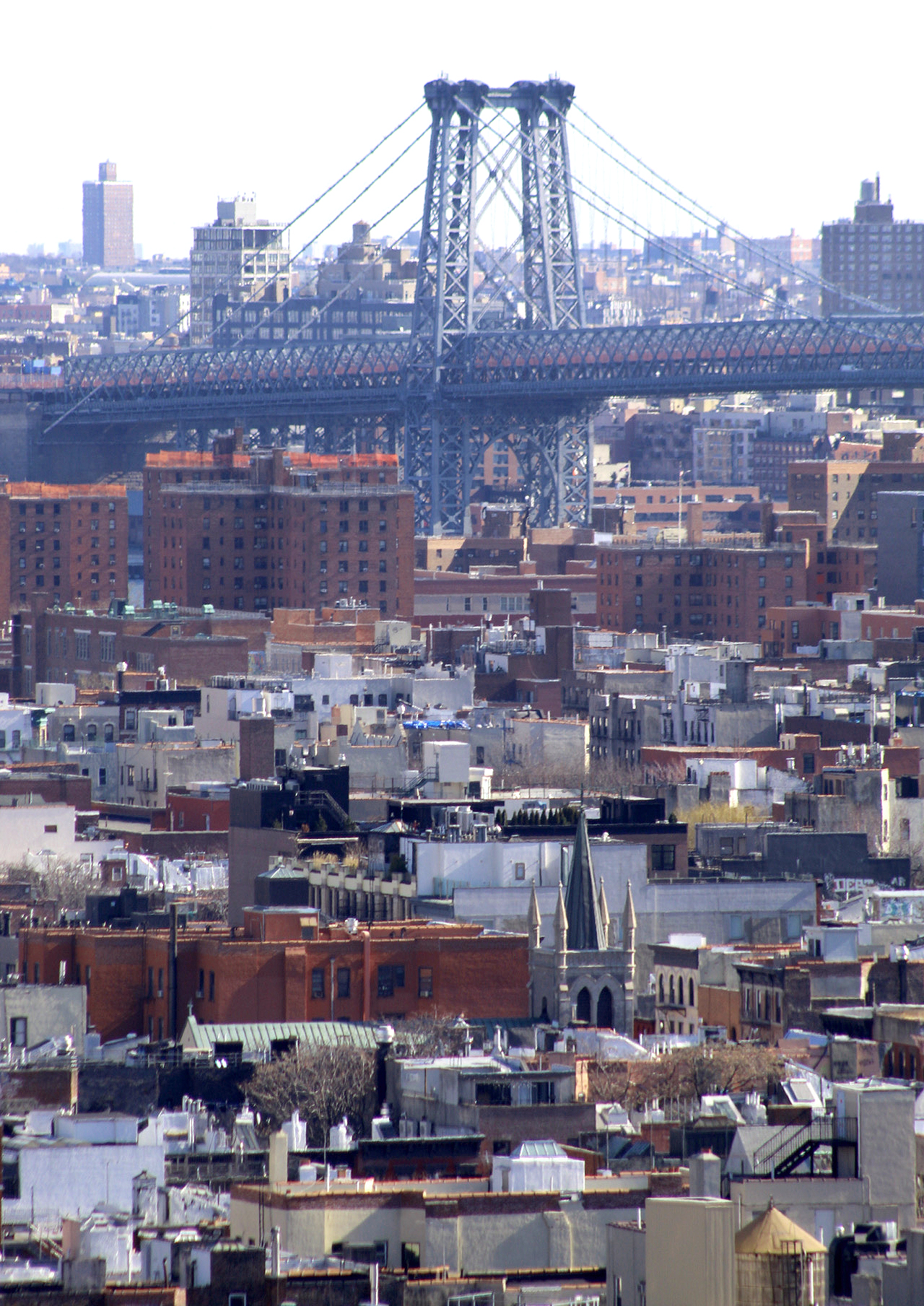
YIMBY recently toured the building to check out the views from the upper floors and balconies. There are vistas looking north along Broadway toward the cluster of skyscrapers that make up part of the central Midtown skyline. Hudson Yards and Lower Manhattan are easily spotted as well.
Photos below show the back side of 809 Broadway.
The closest subways are the L, N, Q, R, W, 4, 5, and 6 trains at Union Square.
Subscribe to YIMBY’s daily e-mail
Follow YIMBYgram for real-time photo updates
Like YIMBY on Facebook
Follow YIMBY’s Twitter for the latest in YIMBYnews

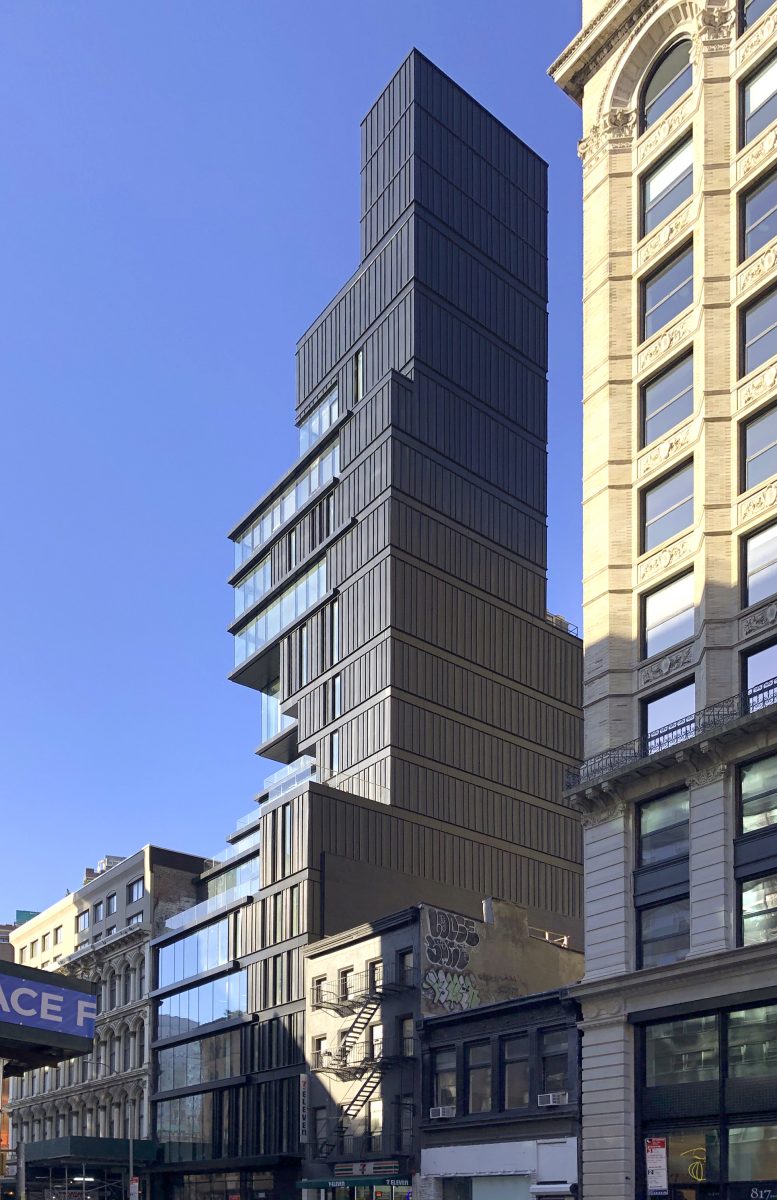



The blank northern wall is atrocious. ODA usually delivers, but I have to say, this is one ugly, out-of-place POS. Really bad.
What they did to that corner building is a crime against humanity.
Maybe the “architects” were inspired by 56 Leonard?, as seen in the photo with One World Trade Center?!
This one adds to the “Jingazation” period of Manhattan!
This looks exactly like 15 Union Sq. West (which ODA did under Perkins Eastman.
Why copy and paste?!
Yeah, when the service core of a ‘narrow’ building is one entire side, instead of the interior, you get these horrible blank walls.. Happening more and more as buildings get shoehorned in.
I agree with Adam Smith above regarding the brutal blank wall. This was designed, perhaps, in anticipation of another tall building being constructed to its south facing the blank wall – its south facade would be perminantly blocked. This situation reminds me of 500 Fifth Avenue with its blind wall to the north anticipating another skyscraper being built there. Elevators shaftways occupy the north facade rather in the tower’s core, a clever resolution.
RE: Joseph Korom’s 500 Fifth Avenue comment:
At least the 500 Fifth’s side-core wall has some architectural detail that enhances its verticality.
The craftsmanship (or lack of) of the metal facade is horrendous. Those close-ups show well how this was hacked together.
ODA’s over-use of Jeng-architecture is getting very old and it’s apparent they don’t have the technical staff to execute their designs-which are becoming heavy-handed.
Reminds me of the German/Soviet Brutalism architecture, just this time wrapped up in the shipping containers. Finally something interesting and different.
This design tries too hard without trying hard enough. The result is a needlessly fussy, poorly detailed and clumsily executed design overwhelmed by an arrogant, brutally ugly Darth Vaderish massing. Ugh.
Am I the only person who thinks this is a great building? I’ve been watching it go up with increasing excitement. I love the intricate massing, the striated panels of the facade, and the way it contrasts with the surrounding traditional architecture, bringing out the beauty of the older buildings. This stretch of Broadway was already lovely, and has gotten even more interesting!
WOW The exterior cladding really suffered during construction. speechless that this is acceptable… but hey its ready for a nice re-clad:)
wtf
this is ………… uggghhhhhhhhhhh…………..awesome