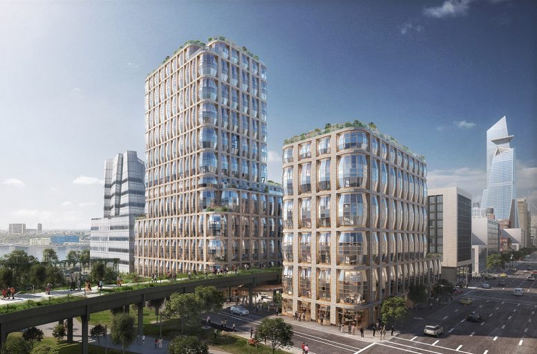
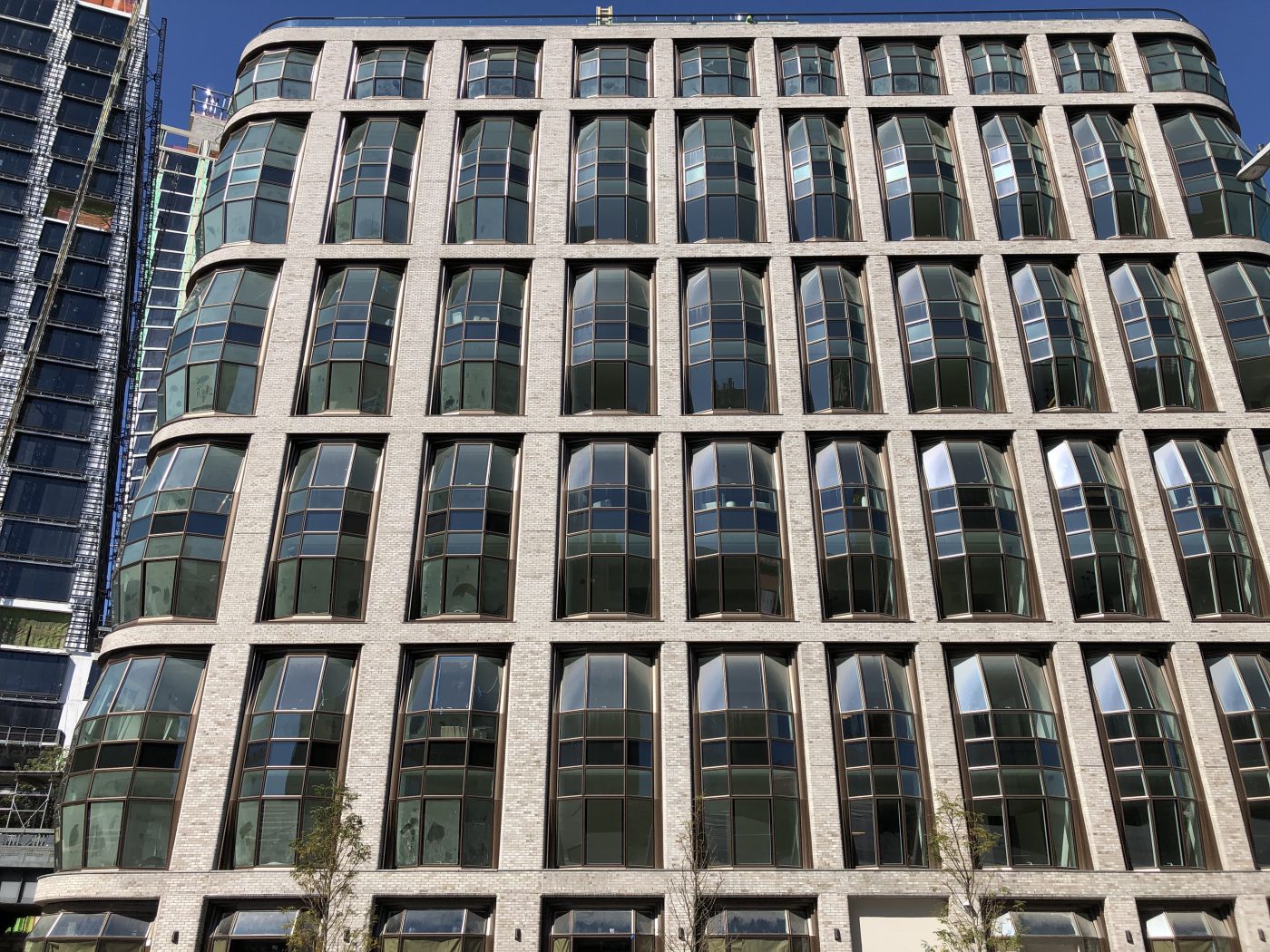
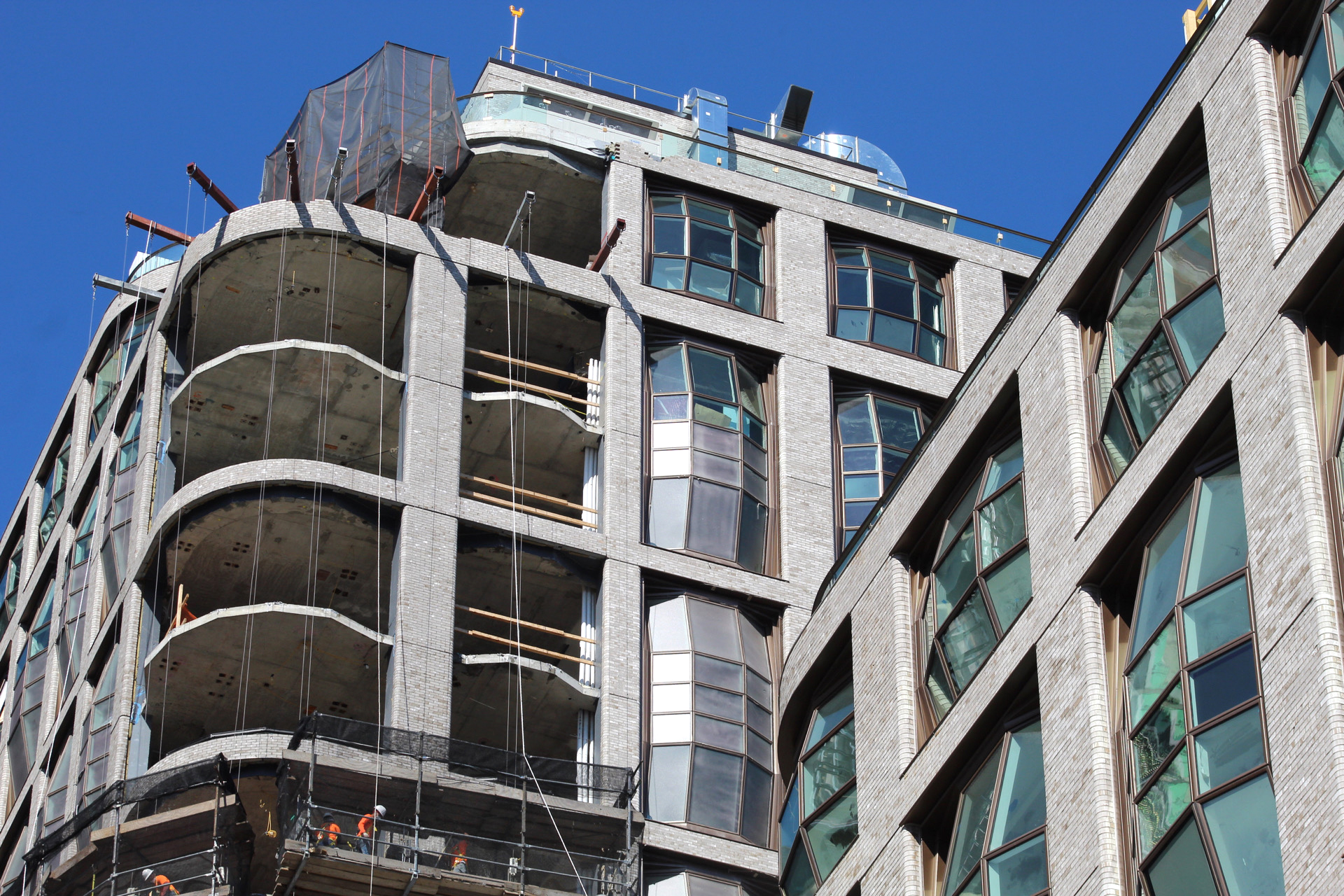
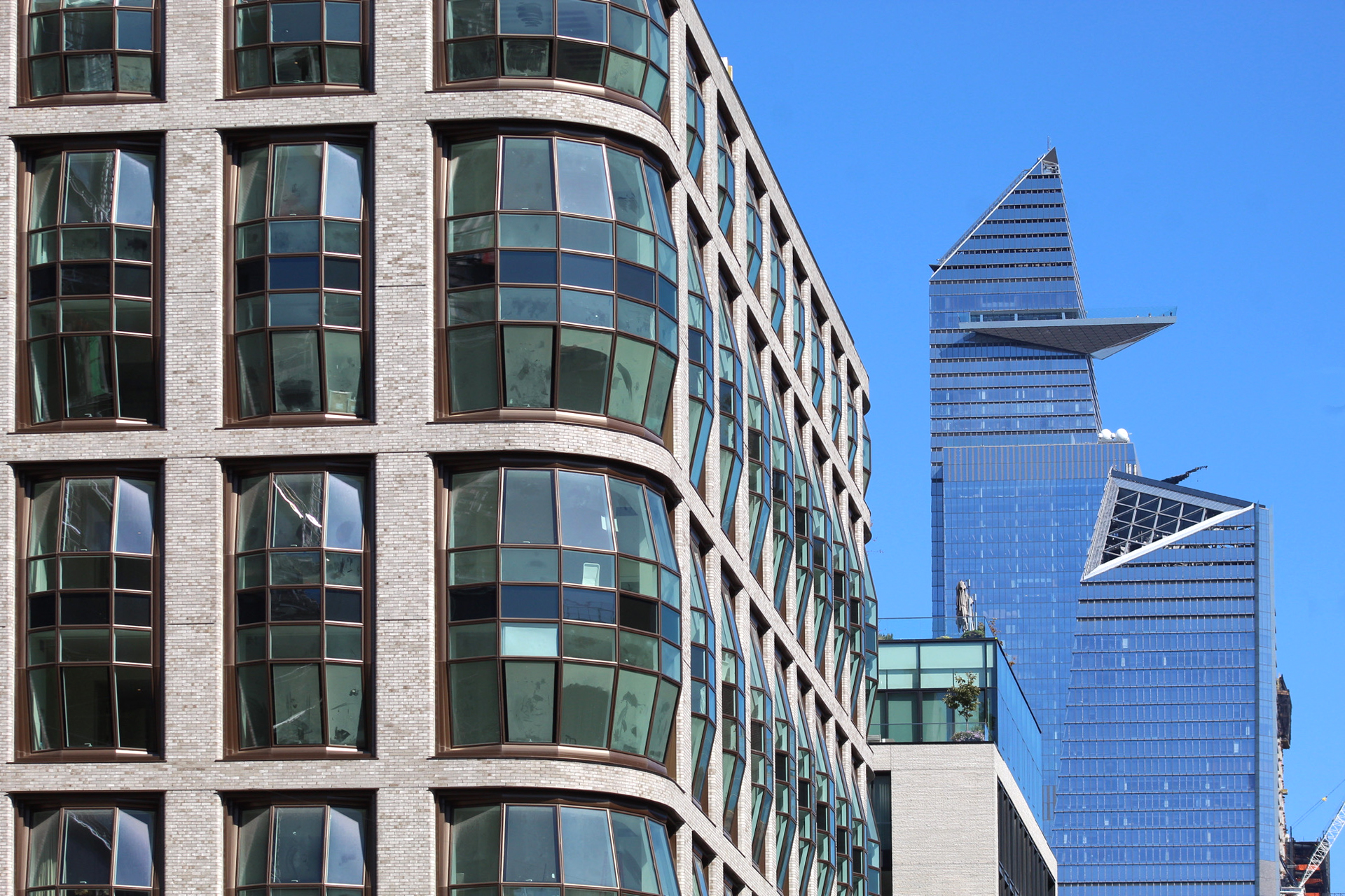
Installation of the signature bay windows is nearing completion on Thomas Heatherwick‘s Lantern House at 515 West 18th Street in Chelsea. Developed by Related Companies with SLCE Architects as the architect of record, the ten- and 21-story reinforced concrete edifices straddle the High Line and yield 181 residential units. Sales and marketing are led by Related Sales LLC and Corcoran Sunshine Marketing Group.
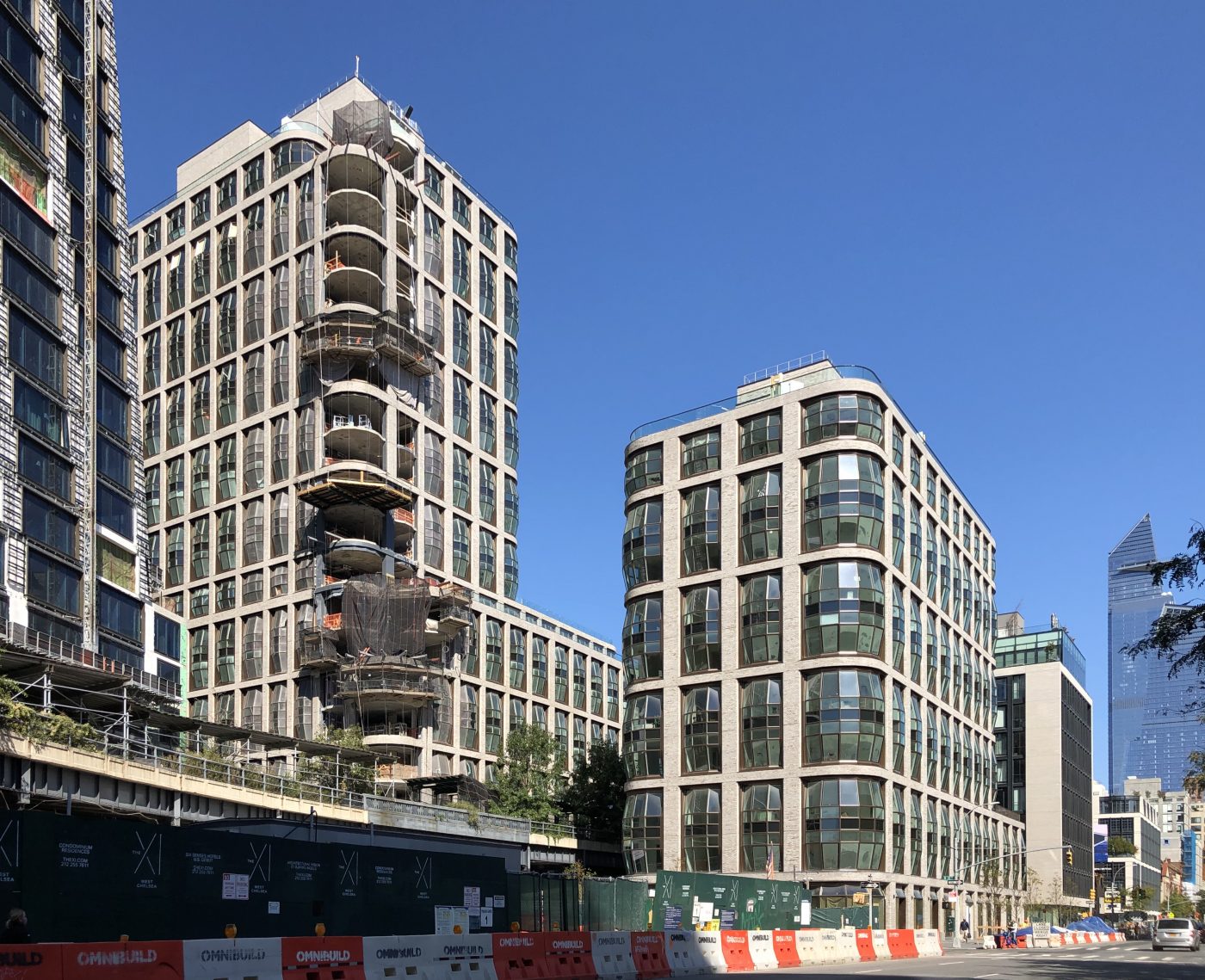
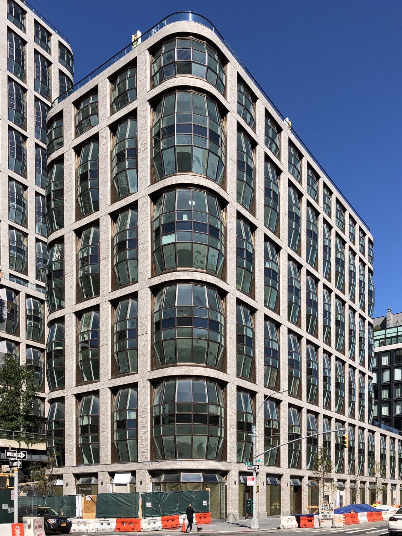
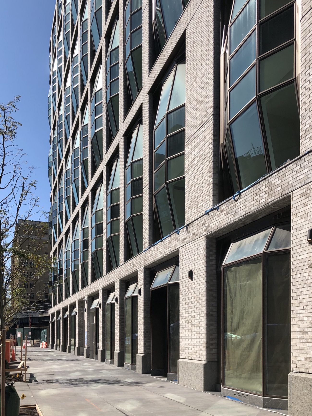
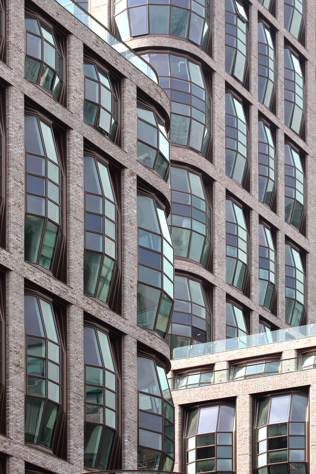
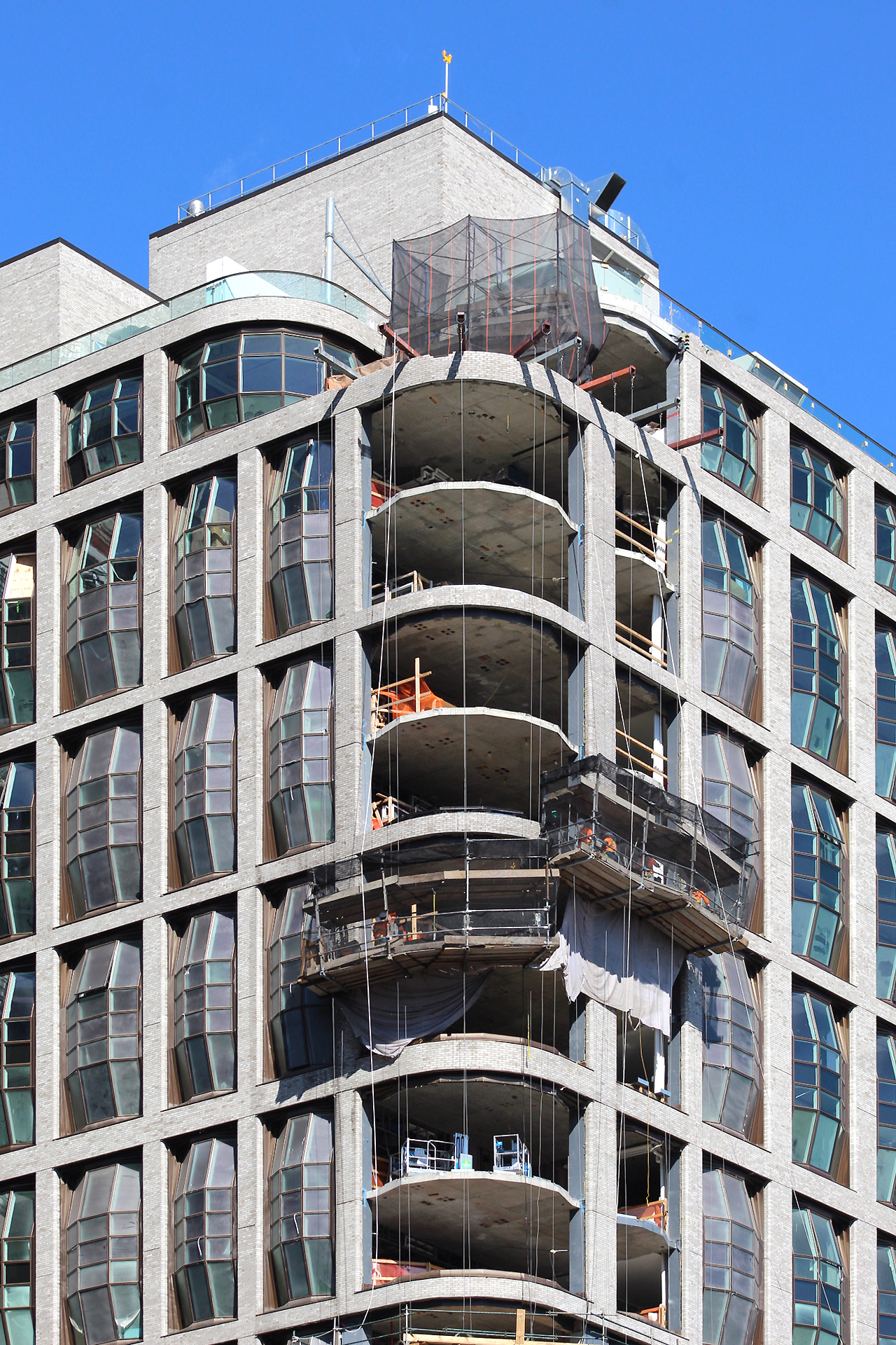
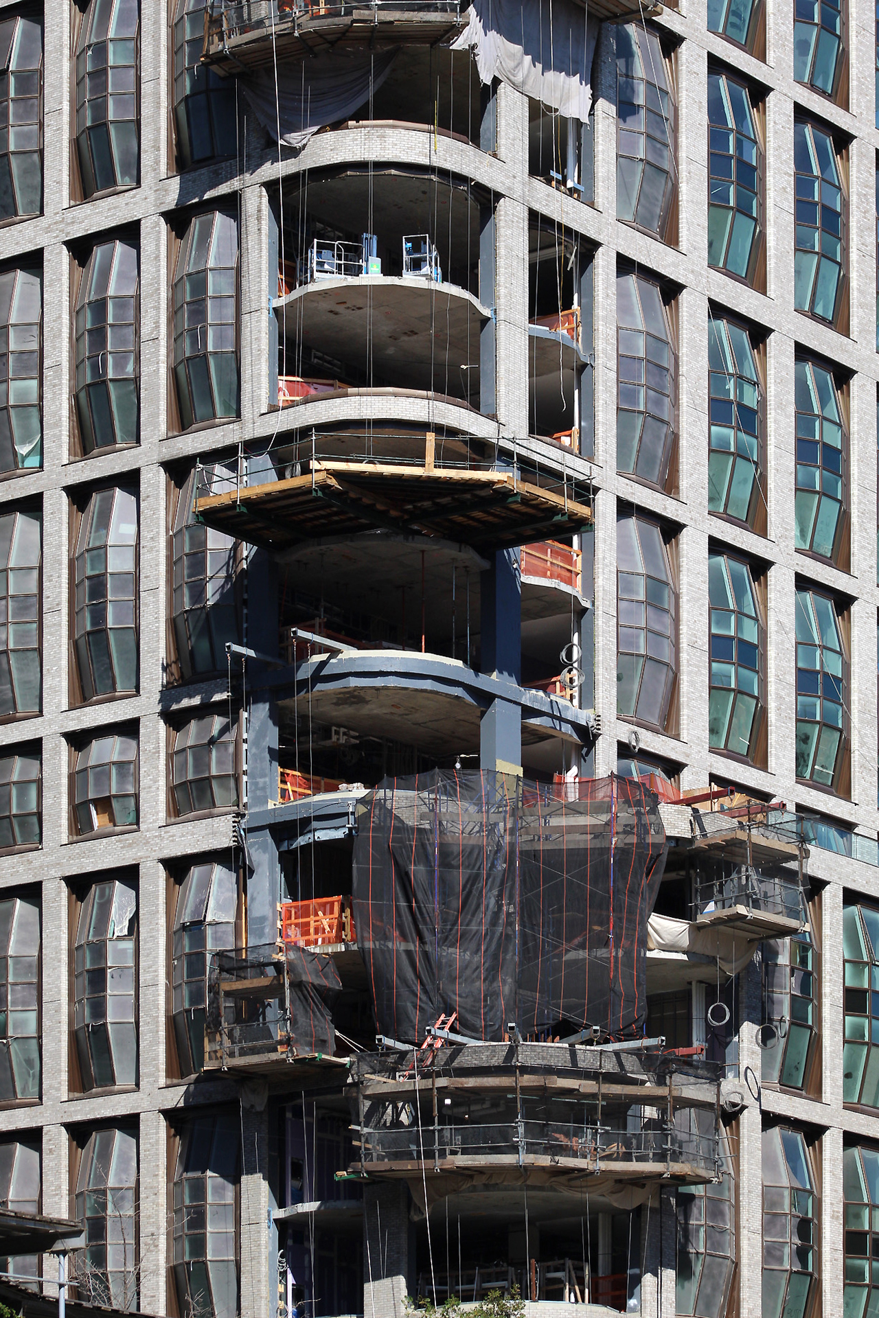
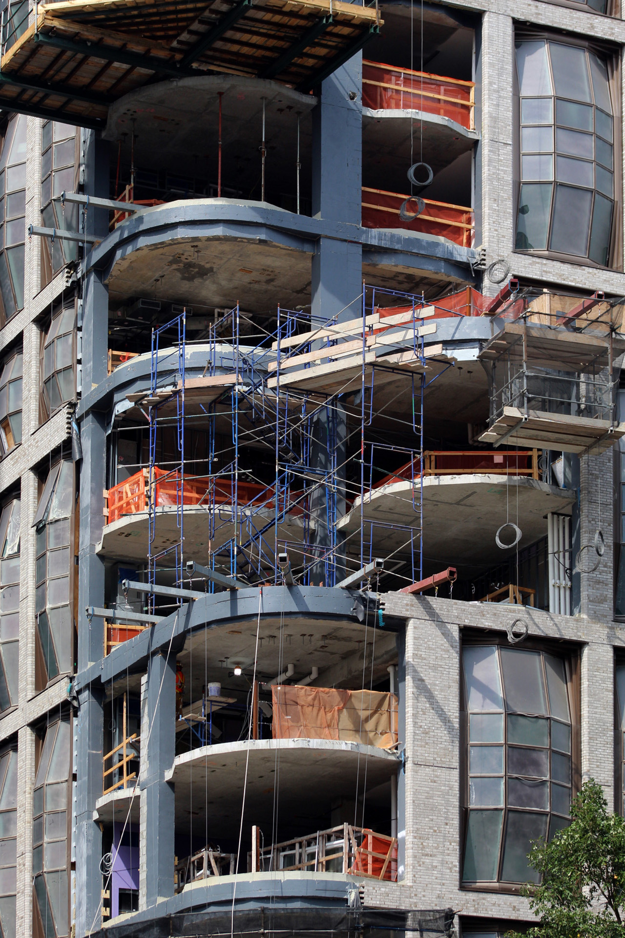
Recent photos show the state of progress at the site and the remaining external segments left to be filled in. The shorter ten-story edifice appears completely enclosed, while the taller 21-story sibling has work in progress on the southern corner. Most of the tall bay windows span two floors and disguise the actual number of levels behind the large-scale assembly of glass and brick masonry.
The sidewalks along Tenth Avenue are mostly complete with some extra work of tree planting and landscaping to be done.
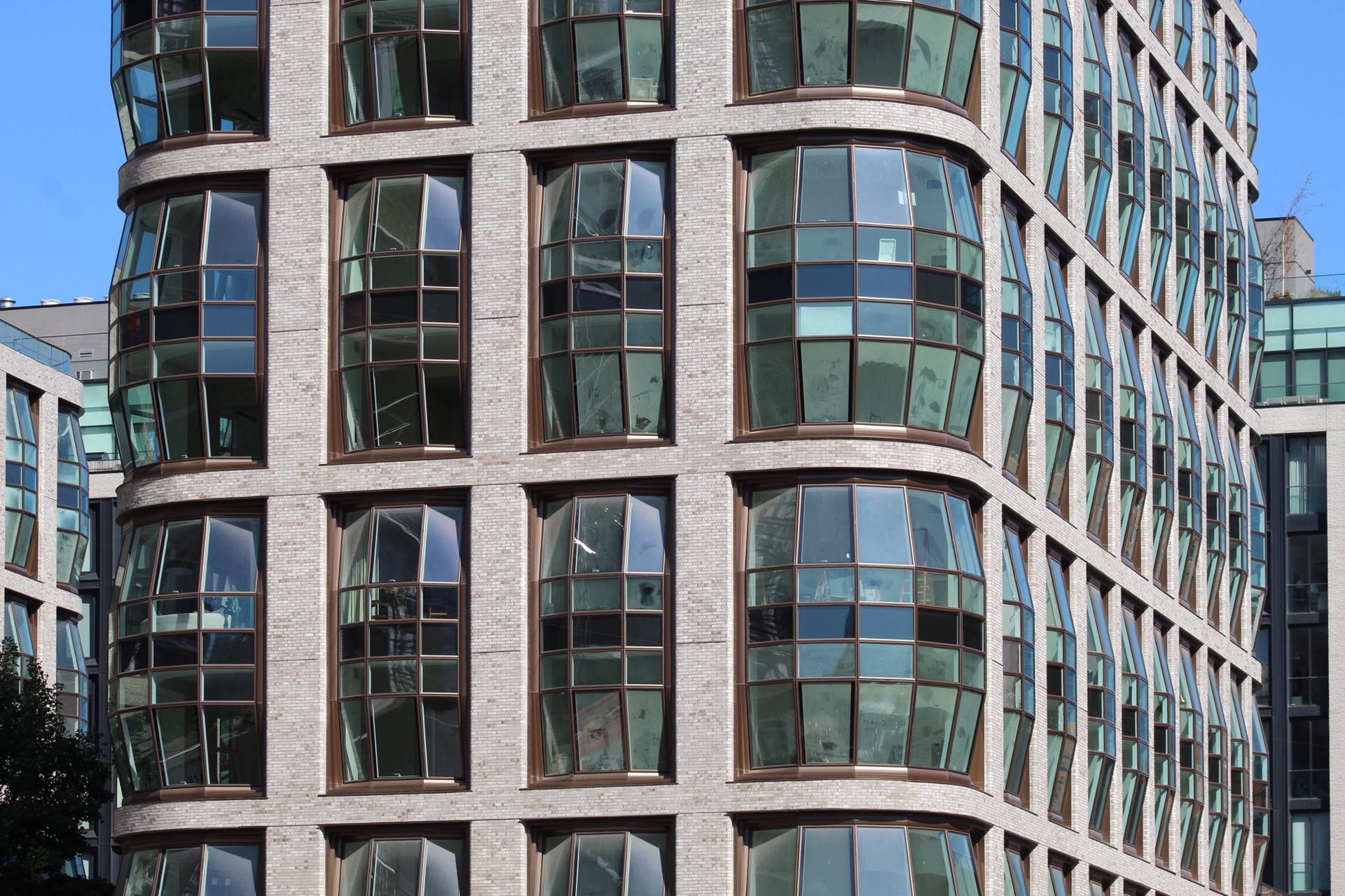
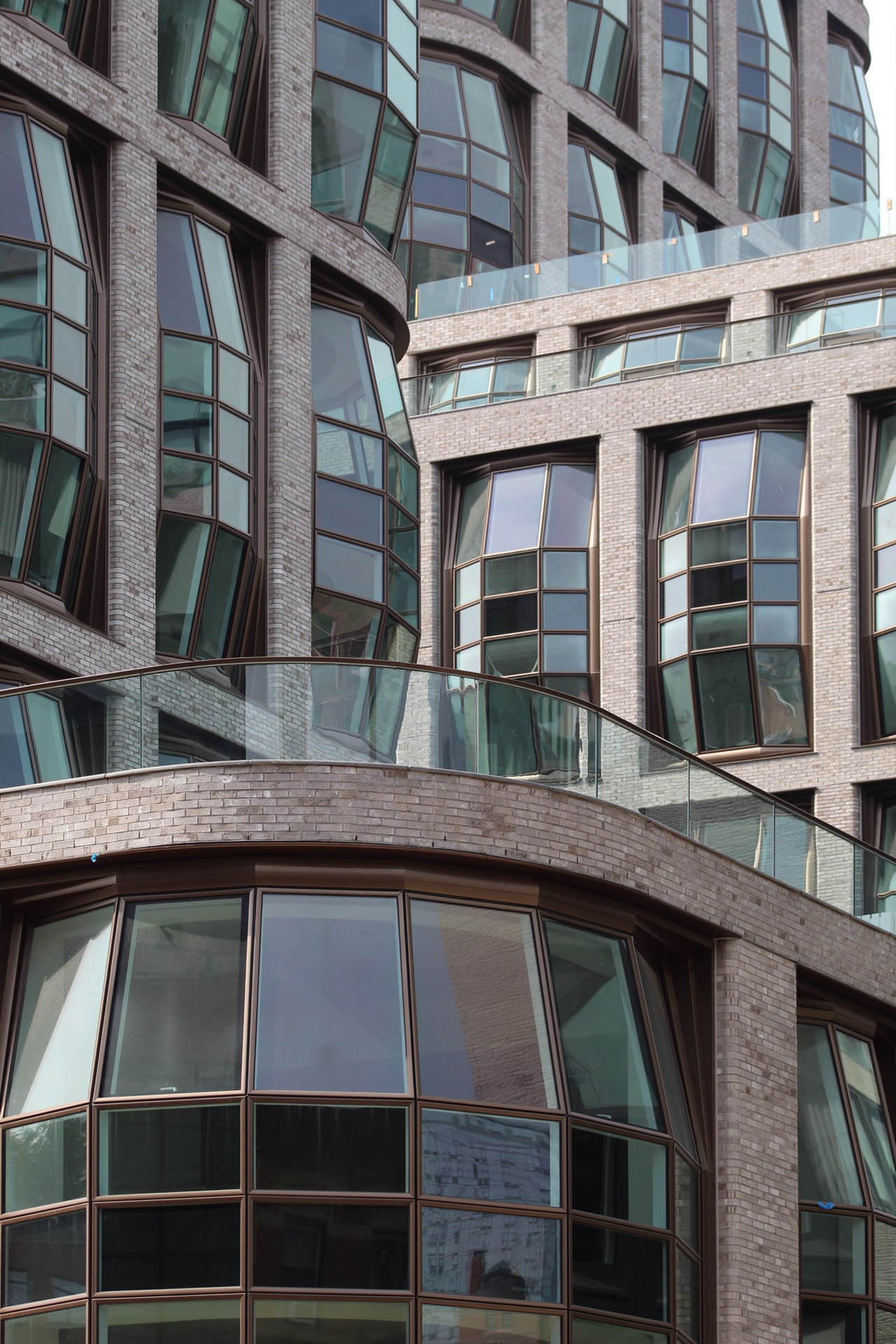
The glass railings have been installed on the setbacks, which yield private outdoor terraces and will soon feature additional landscaping. The rounded brick corners are a nice touch to the design of Lantern House and complement the voluminous two-story bay windows.
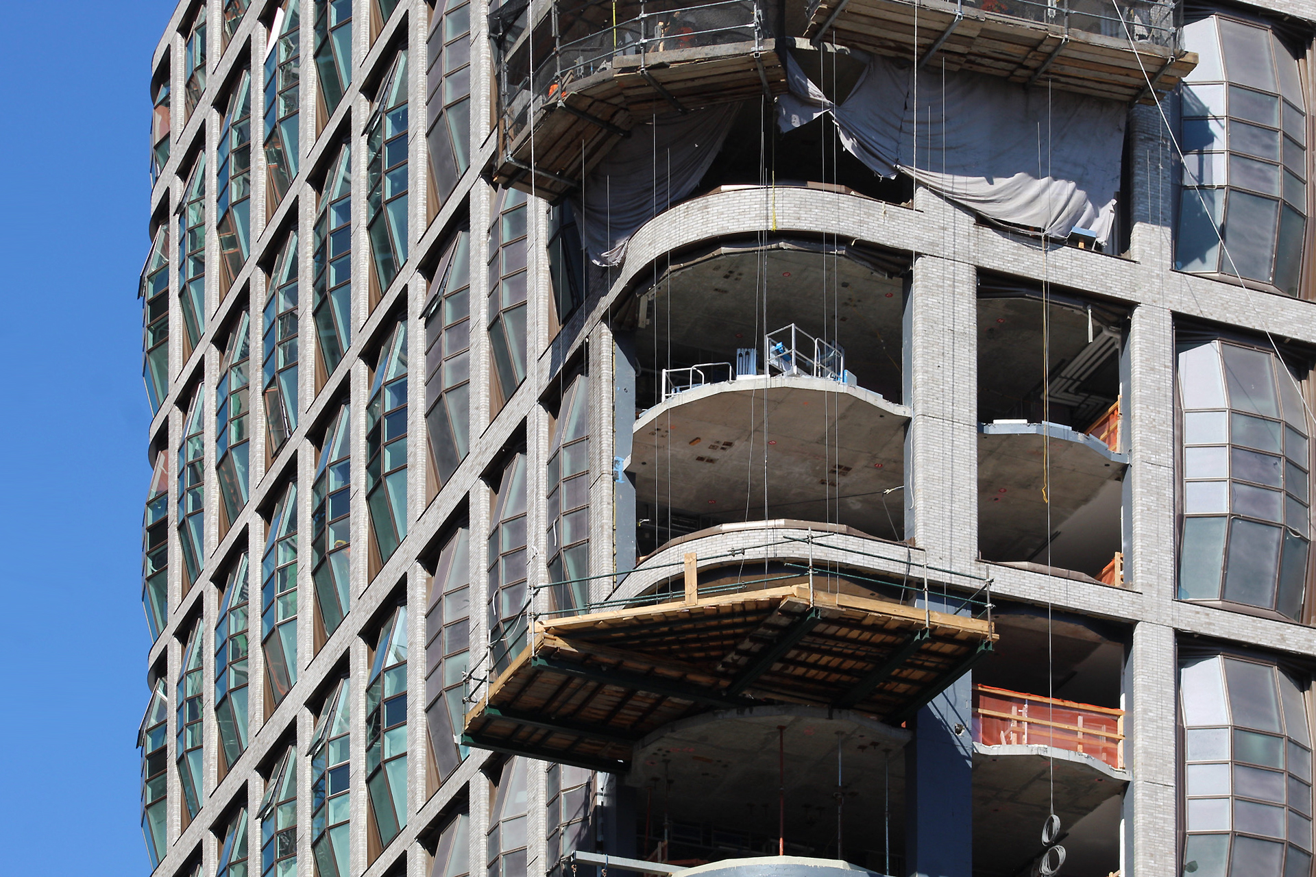
Below are close-up photographs that show workers preparing for the installation of the corner enclosures for the taller structure to the west of the High Line.
The morning is the best time of the day to see the majority of Lantern House illuminated in the light.
Both buildings will feature homes with one- to four-bedroom layouts and 10-foot-high ceilings. A number of units are planned to provide landscaped terraces that offer views of the High Line, Chelsea, and the Midtown skyline. Prices start at $1.7 million, with residential amenities including a doorman, concierge service, a common courtyard and outdoor garden, a meeting room, a fitness center with spa and swimming pool, an entertainment room, residential lounges, a children’s playroom, and private parking for 175 vehicles.
It looks like work on Lantern House should fully wrap up by the end of the year.
Subscribe to YIMBY’s daily e-mail
Follow YIMBYgram for real-time photo updates
Like YIMBY on Facebook
Follow YIMBY’s Twitter for the latest in YIMBYnews








One if by land, two if by sea.
If only the Lantern Houses didn’t have those big ugly bay windows…
Muffin tops
Grotesque, awkward.
An amateur’s infatuation with the arbitrary and oppressive ‘expression of frame’.
Functionally uninformed in the design of the swelled out glass infill ‘bays’. Think about the functional derivation of the traditional Bay Window— allowing an enhanced projecting outlook from the interior. This number, in combining two floor levels to achieve each swell, creates a truly tortured ‘truncated’ outlook from each unit.
This is what results in the pursuit of vapid formalism.
..plus, a little ‘Windex’ could help
You really nailed it. This is probably the most intelligent way to describe everything wrong with this tower’s exterior design.
A “signature” that’s been rubber-stamped hundreds of times means nothing. The mixed color brick just makes it worse.
Something like this goes from offensive to eventually amusing. That’s almost positive.
The developing Highline architectural corridor will now have a conversation piece that makes the other buildings look so much better.
I’m 72 years old and just watched the movie “Them” from 1954 that popped up on TV; I remembered it. Giant mutated ants from the Trinity site at Alamagordo, NM. These windows are just about as ugly as the monster ants. If one must design an ugly building to be different, DON’T.
I can’t, for the life of me, find this building nearly as repulsive as most of the people commenting. I am honestly surprised by all of the vitriol directed to a rather interesting piece of architecture. Sure, its not another boring waste basket from Vinoly or some run of the mill mediocre glass box, but the windows are rather attractive along with the building’s bricks and curves. Is it a show stopper? Maybe not. But far more attractive and visually interesting than most of copy-and-paste residential buildings being built in the city. It’s actually, genuinely unique. Many buildings want to say that but can’t. And thank god its not another one of those ugly jenga buildings! That fad can die any day now!
Totally agree, CJ. I think it’s very interesting and a nice change.
Michael Young – have you asked the developer if you can get inside to take pictures of the windows looking outside? I bet they are stunning.
The concept of these bulging windows, while a bit of a “one-liner,” isn’t the biggest problem with this project, but rather it’s the execution of that expression. The windows are heavy-handed and not very elegant. The rendering tried, but reality fought back.
I’am a Wisconsinite I find the windows interesting . Look like beer barrels. What made Milwaukee famous.
Note to all impassioned commentors… Please redirect you critical energy towards the scourge of mindless setback budget towers destroying the urban fabric of the West 20s-40s. Thanks
Yes this project is weird and probably wont age well but its worlds away from the McSam funded garbage designed by Kaufmann, Poon, et al.
+1
99 barrels of beer on the wall……
Not my cup of tea; however, I Respect that it’s a unique/quality and discussion provoking building.. Agree with the previous poster that the Kaufman/Poon projects are the real problem with our city’s architecture at the moment.
I guess I’m in the minority, but I think these offbeat windows are a welcome change from the same old same old we usually get. Furthermore, I predict these buildings will look magical when they are fully occupied and lit up at night.