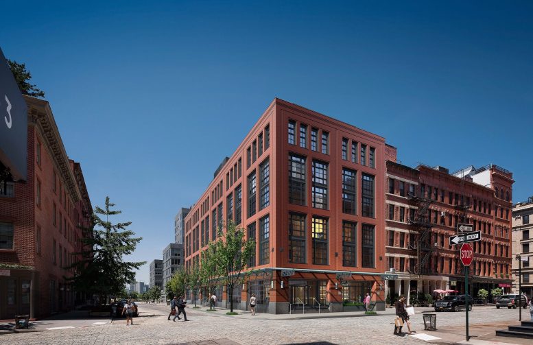
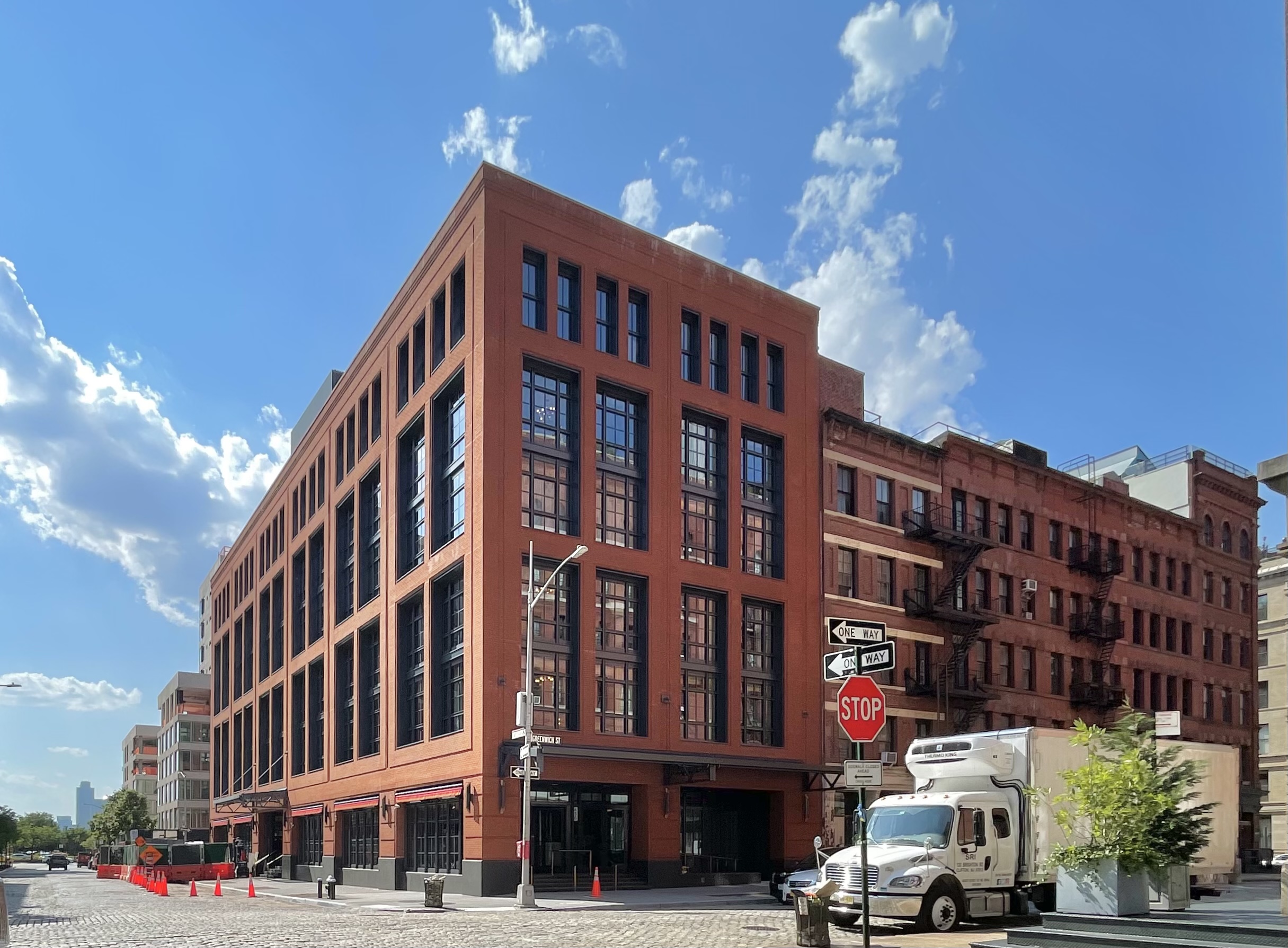
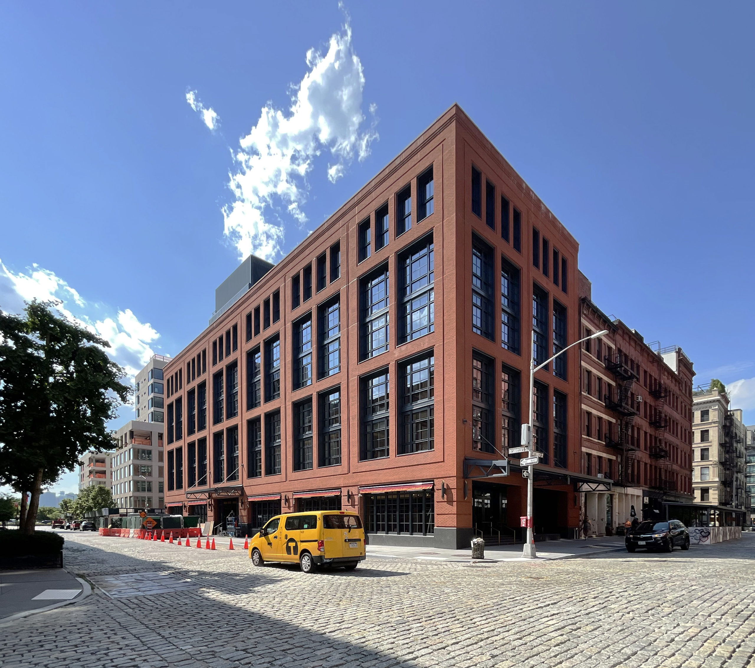
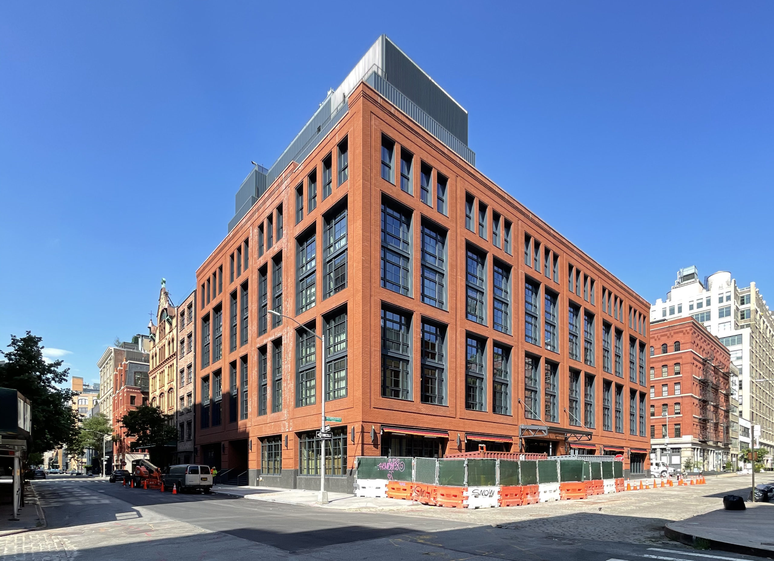
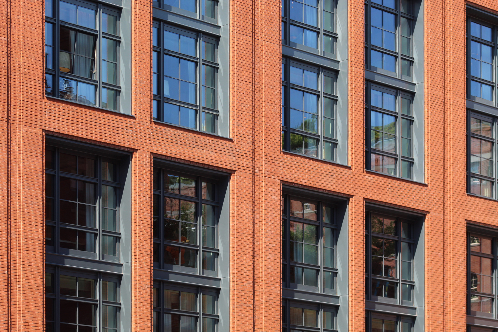
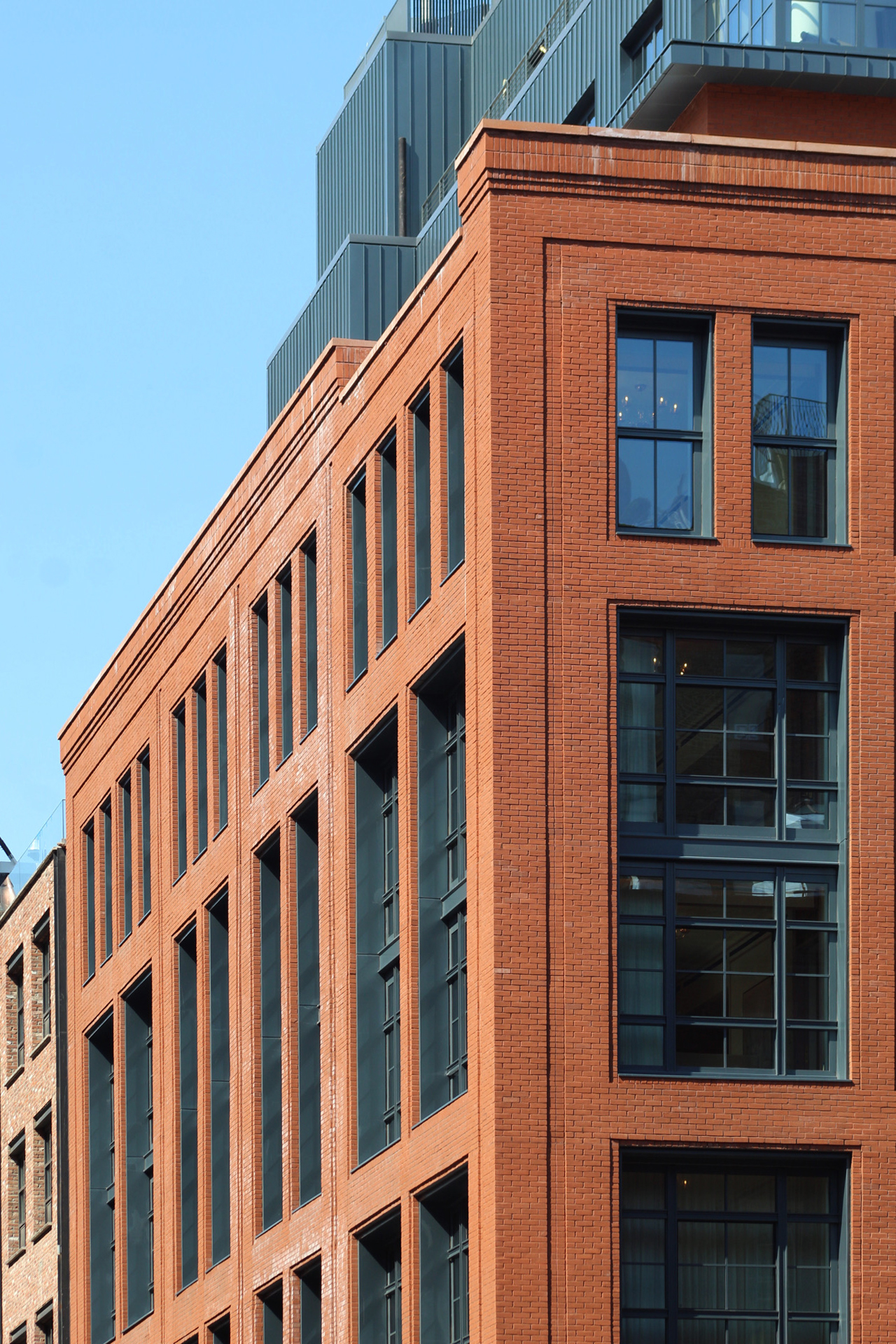
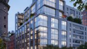
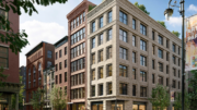
Construction is complete on 456 Greenwich Street, an eight-story hotel building in Tribeca. Designed by Stephen B. Jacobs Group and developed by Caspi Development, the 94,000-square-foot structure yields 96 Art Deco-inspired guest rooms with interiors by Martin Brudnizki Design Studio. Groupe Lucien Barrière of the Hôtel Barrière Le Fouquet’s Paris is the operator of the property, which is bound by Greenwich Street to the east, Desbrosses Street to the south, and Washington Street to the west.
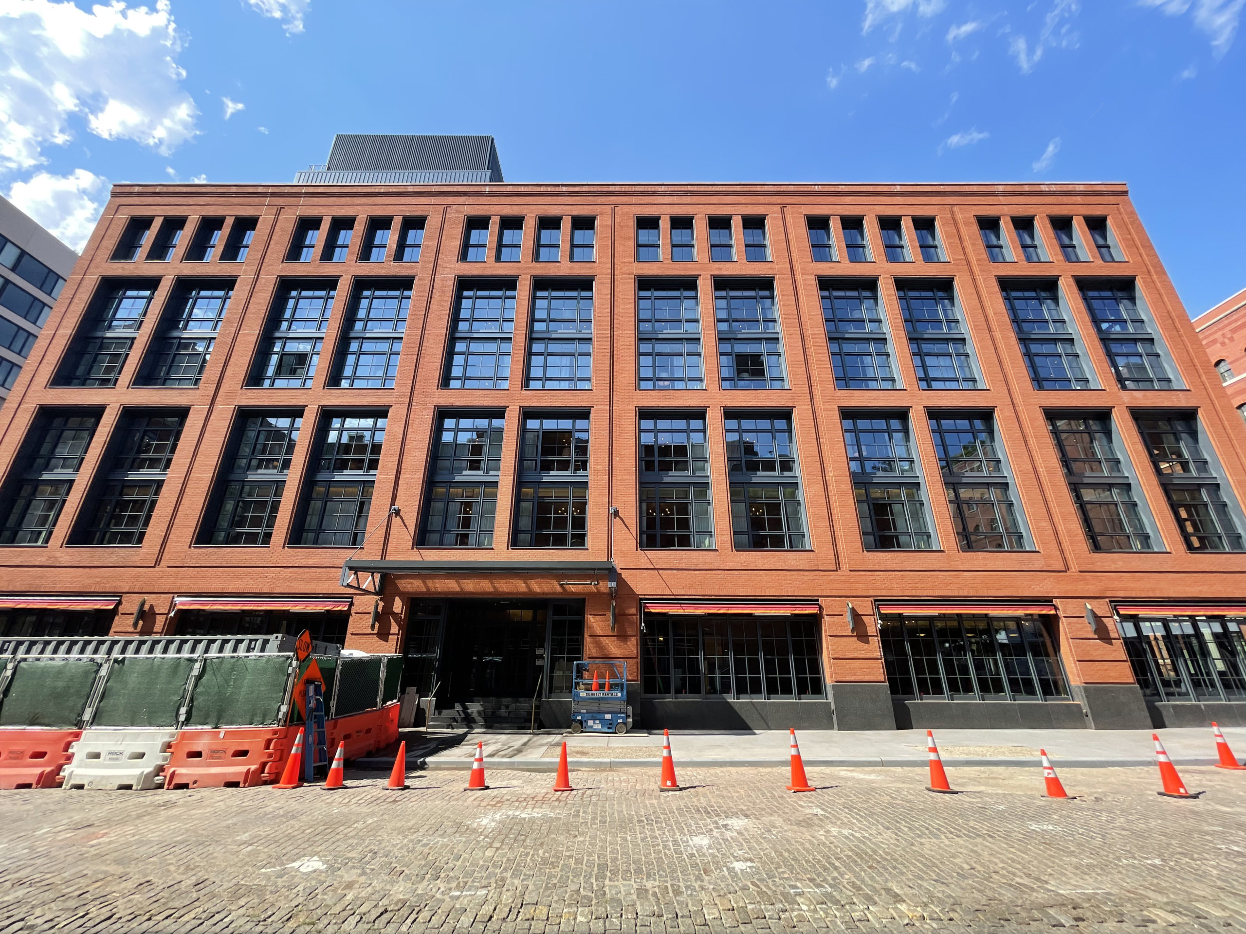
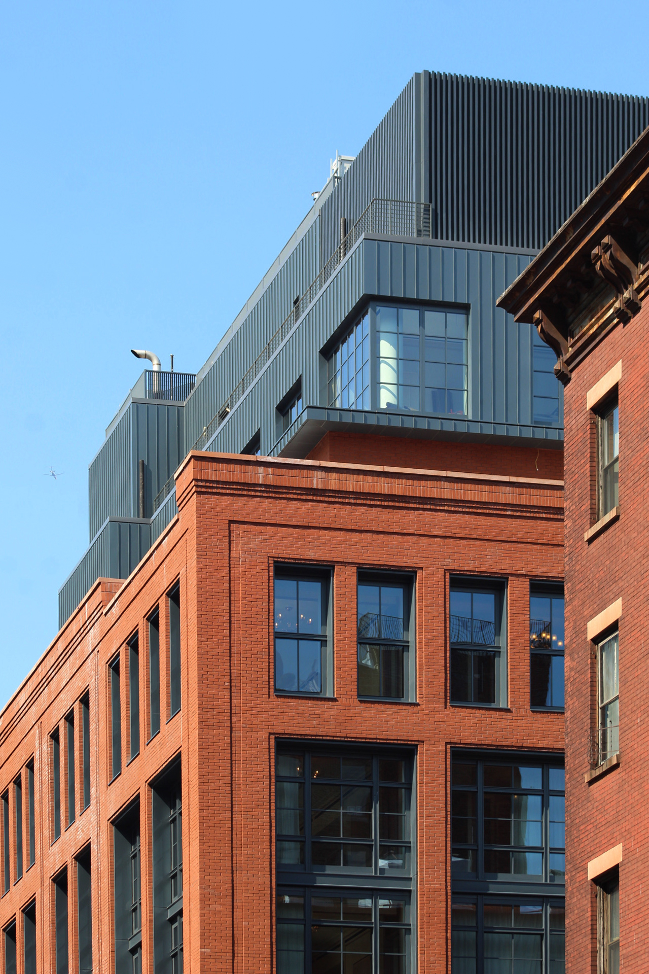
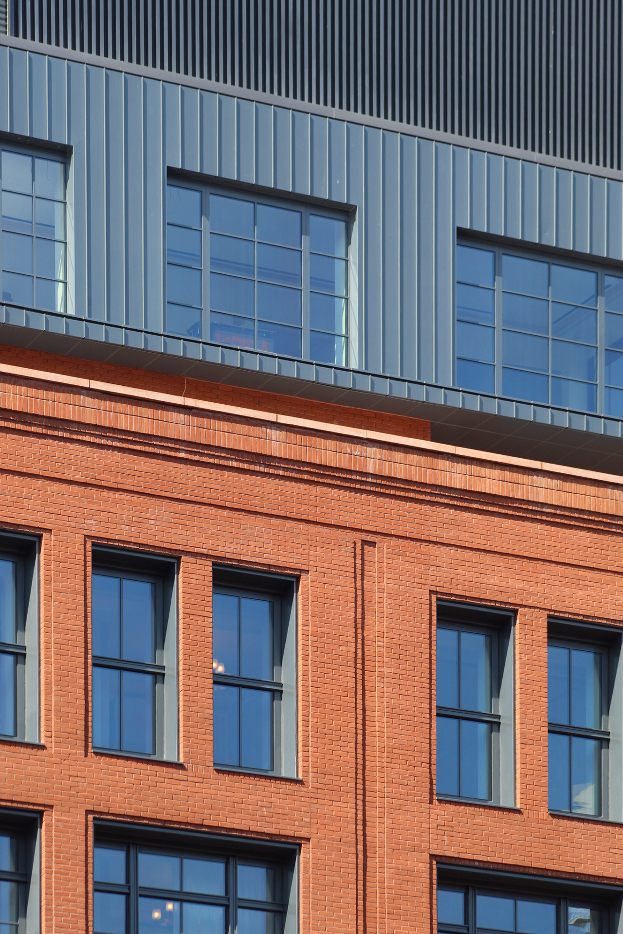
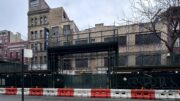
At the time of our last update in February, much of the upper extensions above the parapet remained covered in scaffolding and black netting, and sidewalk scaffolding still surrounded the property. All of this has since been dismantled, revealing the finished look of the ground-level frontage and the metal-paneled volumes at the top of the structure. Only a small section of construction barricades remains around the southwestern corner of the property.
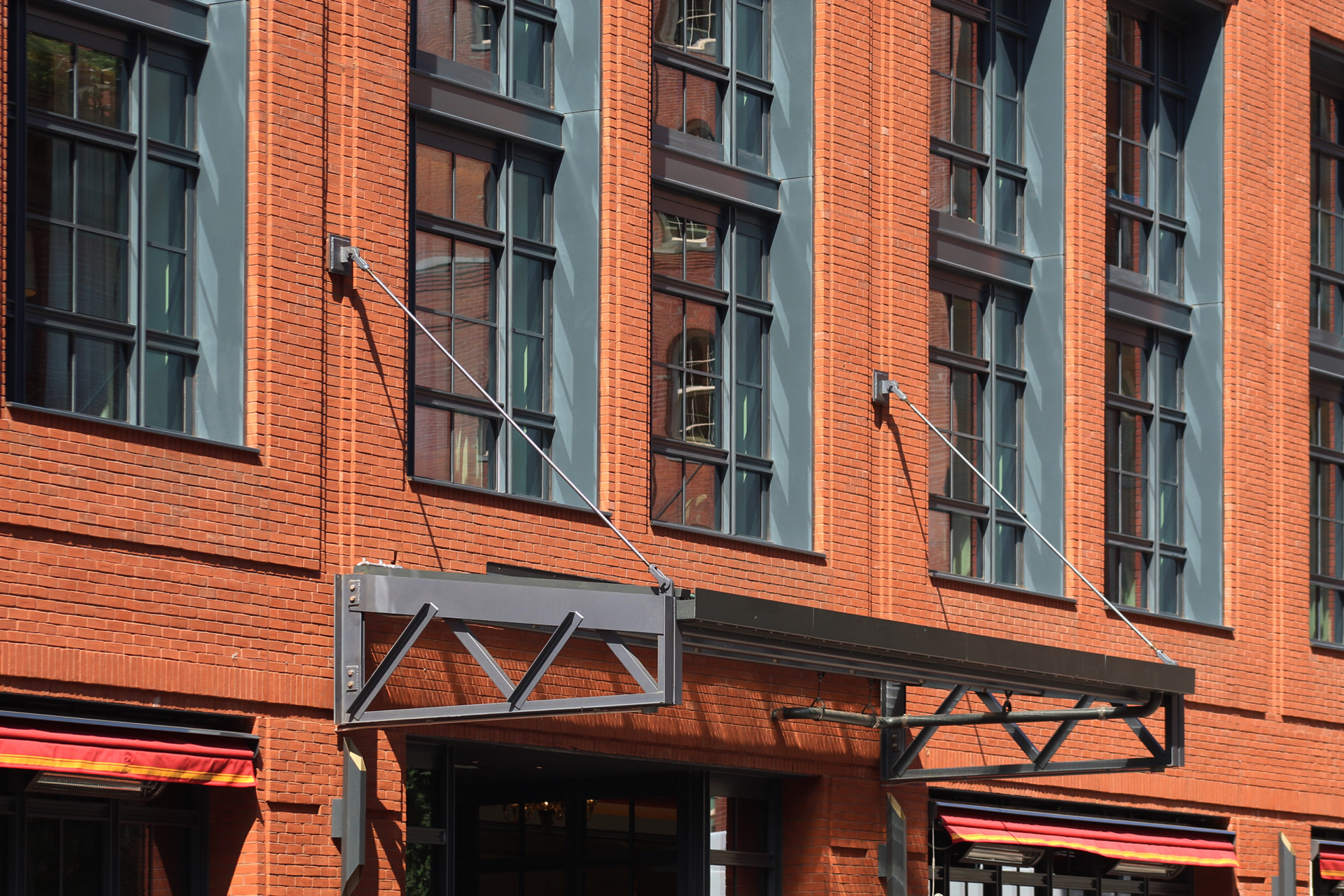
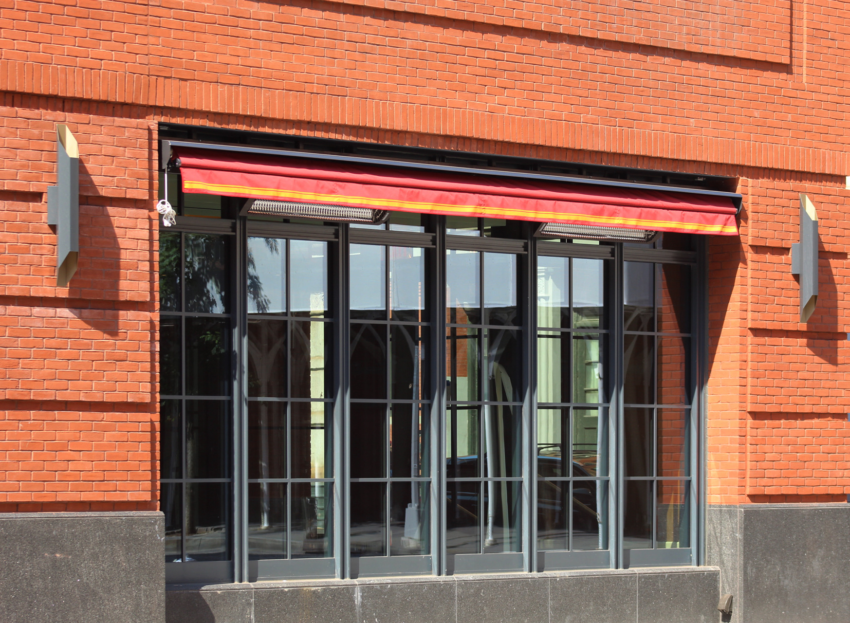
Also added since our last update are new metal canopies and light fixtures over the ground floor of the main southern elevation and shorter eastern and western profiles. New sidewalks have also been poured around the site.
Guest rooms range in size from 900 to 1,200 square feet, with a total hotel capacity of 1,000 guests. Thirty percent of the rooms are suites. Amenities for 456 Greenwich Street include six food and drink vendors, a 1,500-square-foot interior landscaped courtyard, a private members club, a fitness center, an outdoor rooftop swimming pool, and a two-story cellar with meeting spaces, event rooms, a spa, and the largest hotel-based theater in Lower Manhattan with a capacity of over 100.
The closest subways from 456 Greenwich Street are the 1, A, C, and E trains at the two Canal Street stations to the east along Varick Street and Sixth Avenue. Hudson River Park is a short walk to the west. There are also a number of art galleries in the vicinity and numerous dining options to the south.
Subscribe to YIMBY’s daily e-mail
Follow YIMBYgram for real-time photo updates
Like YIMBY on Facebook
Follow YIMBY’s Twitter for the latest in YIMBYnews



I love these modern warehouse designs. This one does that trend very well, and it’s beautiful. It also fits the surrounding buildings quite perfectly, too.
New metal canopies with windows so beautiful, and the finished look of the ground-level frontage. The most impressive I would like to focus on color, it looks like beautiful painting: Thanks to Michael Young.
A building that is inviting to see and timeless in design. Hopefully glass box designers will take note and make their next project better and more human scaled.
Would be nice to see the interiors.
A simply beautiful design and perhaps the most realistic rendering ever proven.
I’d be very happy to live here! They did a great job with a modern design featuring retro touches. Bravo.
Gorgeous building and fits the neighborhood perfectly. Those windows are smashing (radon the pun!).
Looks like an old factory building you may have seen on Northern Boulevard in Queens.
Bland architecture at its best.
Better than bland if you look at the detailing….and right for the neighborhood: context matters. Old Factory Building – you betcha. That’s the point. Not every building has to scream!!
Beautiful
Although I am glad Disney chose to put the headquarters here, I am less happy with the green color of the building. The photos above do not show the true color which is less appealing.
and you’re on the wrong page!