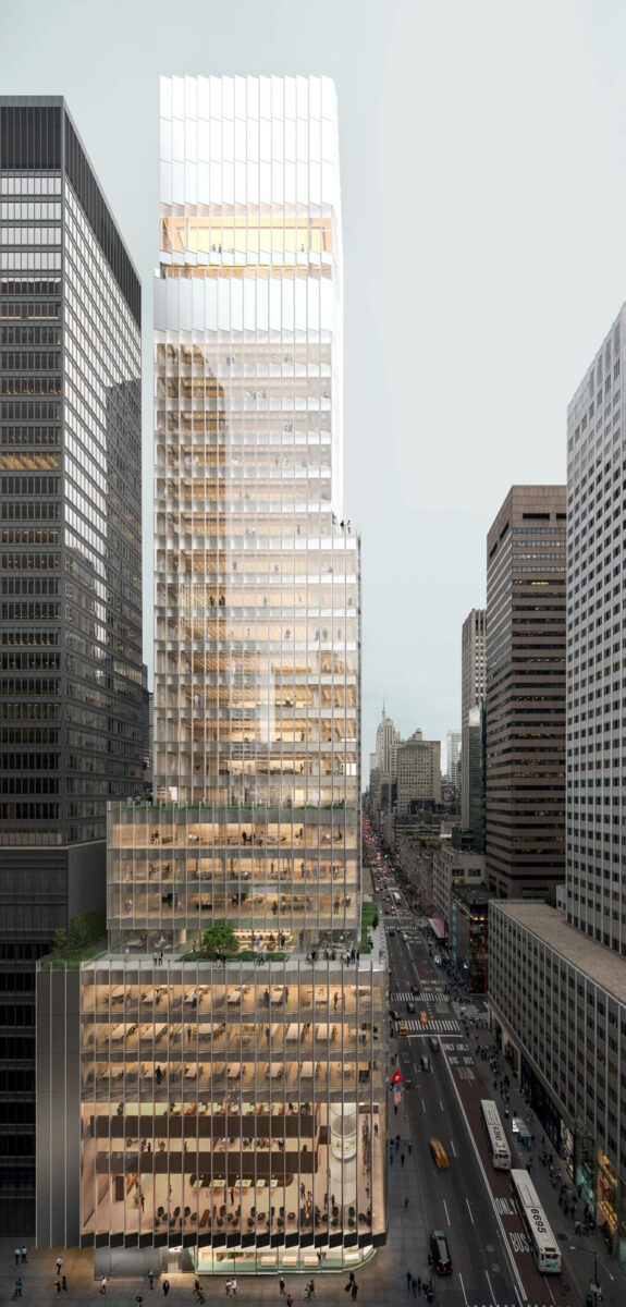
At number 21 on our annual year-end construction countdown is the Rolex USA headquarters, a 469-foot-tall commercial building at 665 Fifth Avenue in Midtown, Manhattan. Designed by David Chipperfield Architects with Adamson Associates as the architect of record and developed by the Rolex Realty Company, the 28-story structure will yield 199,000 square feet of office and retail space for the world-famous watchmaker. Pavarini McGovern is the general contractor for the property, which is located at the corner of Fifth Avenue and East 53rd Street.
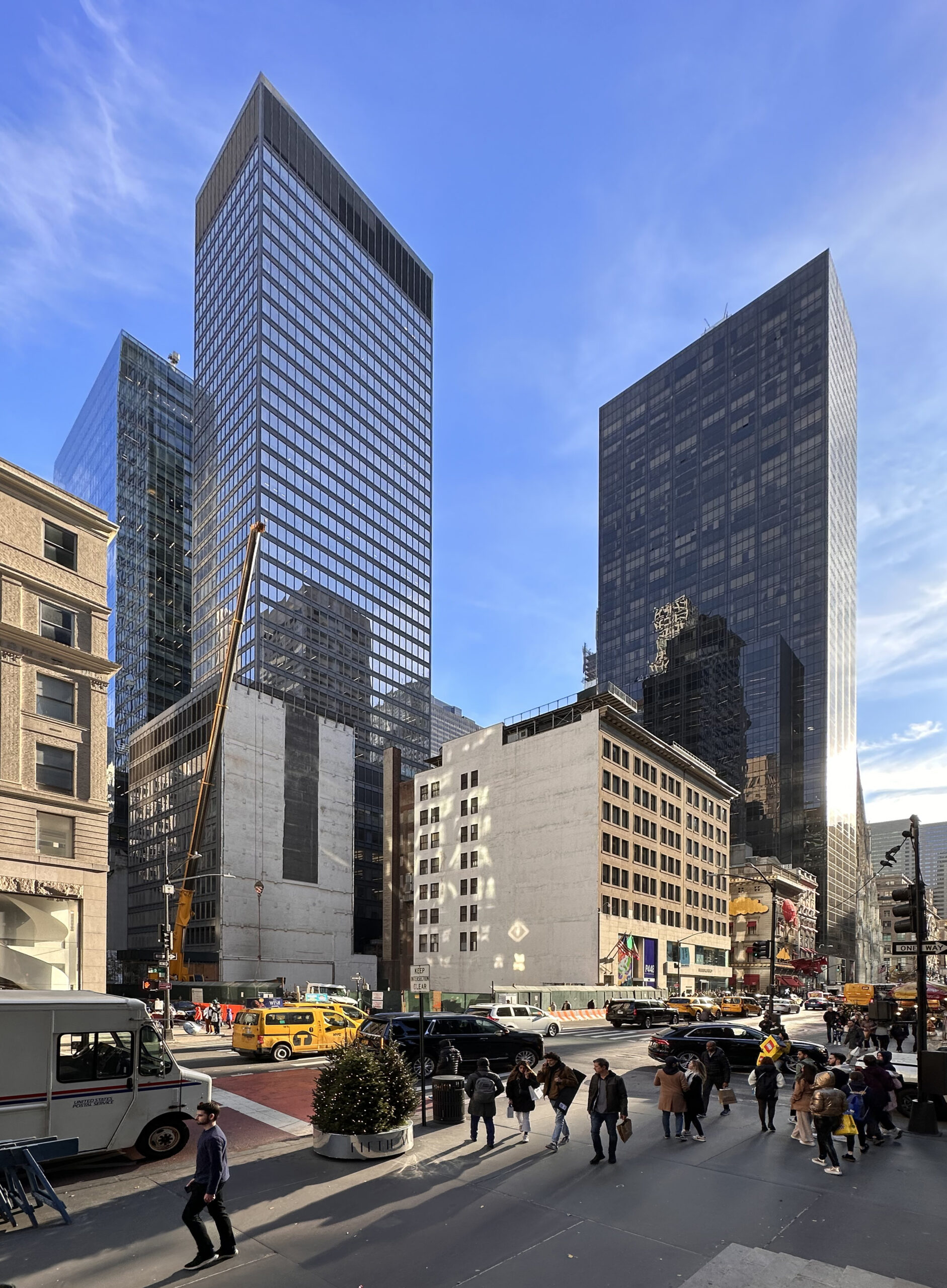
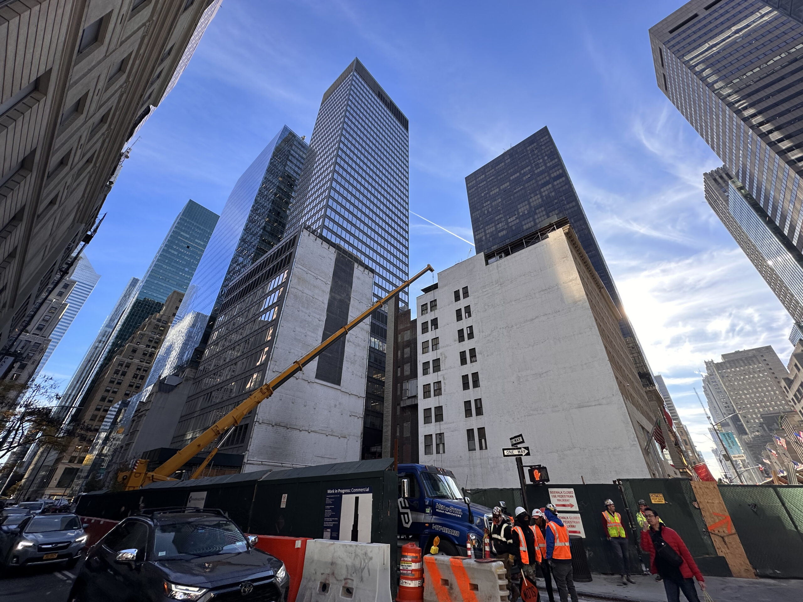
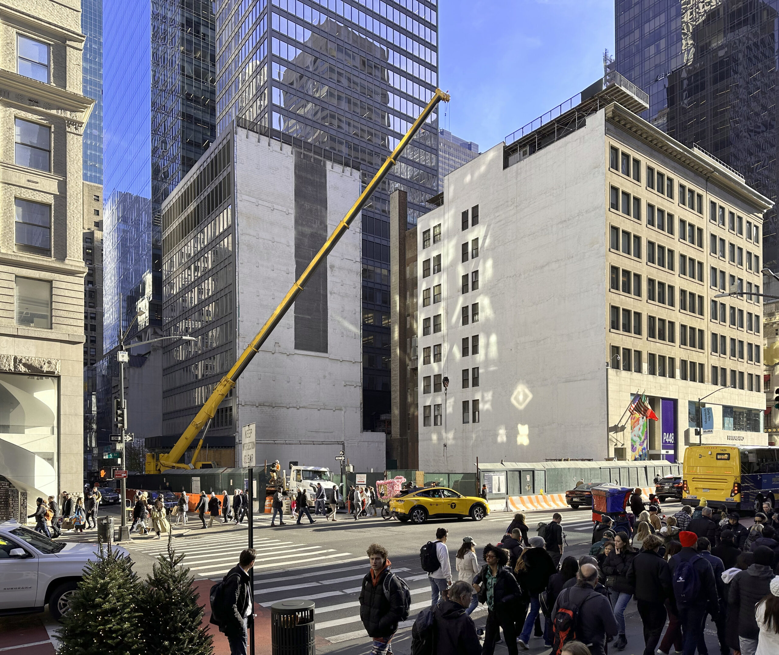
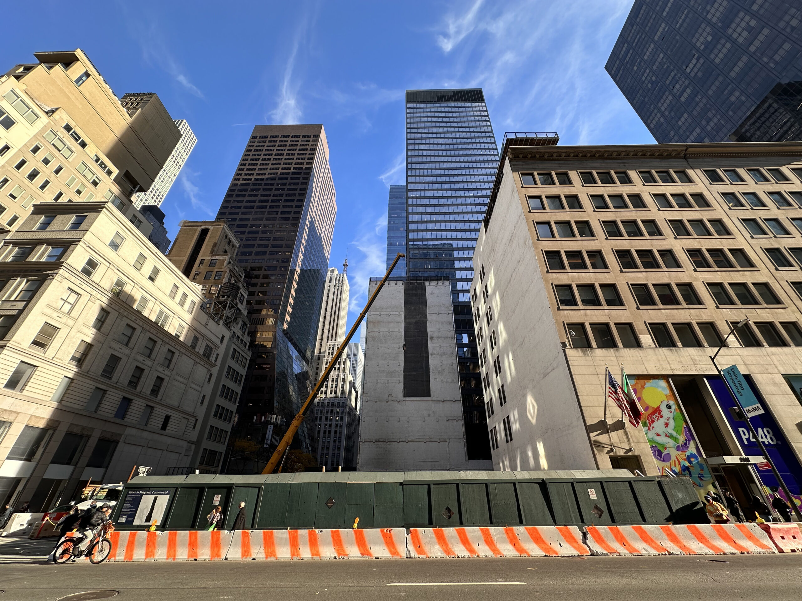
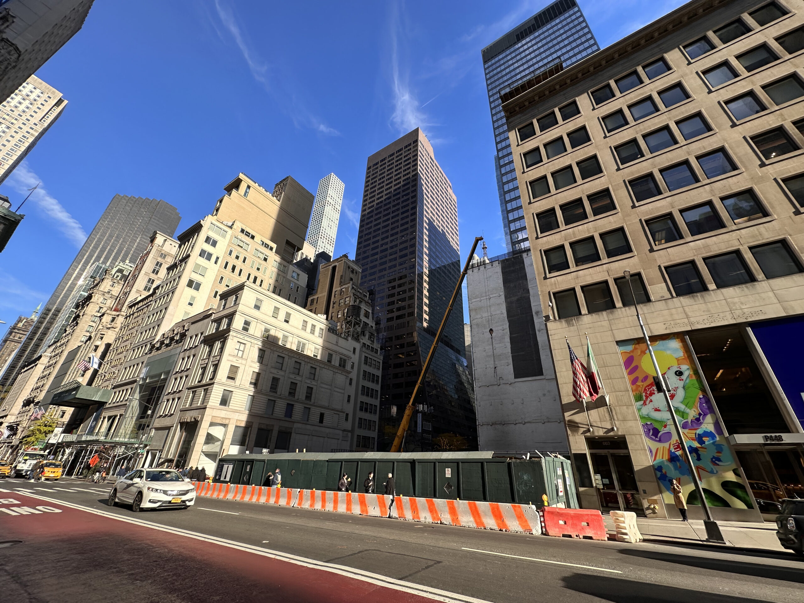
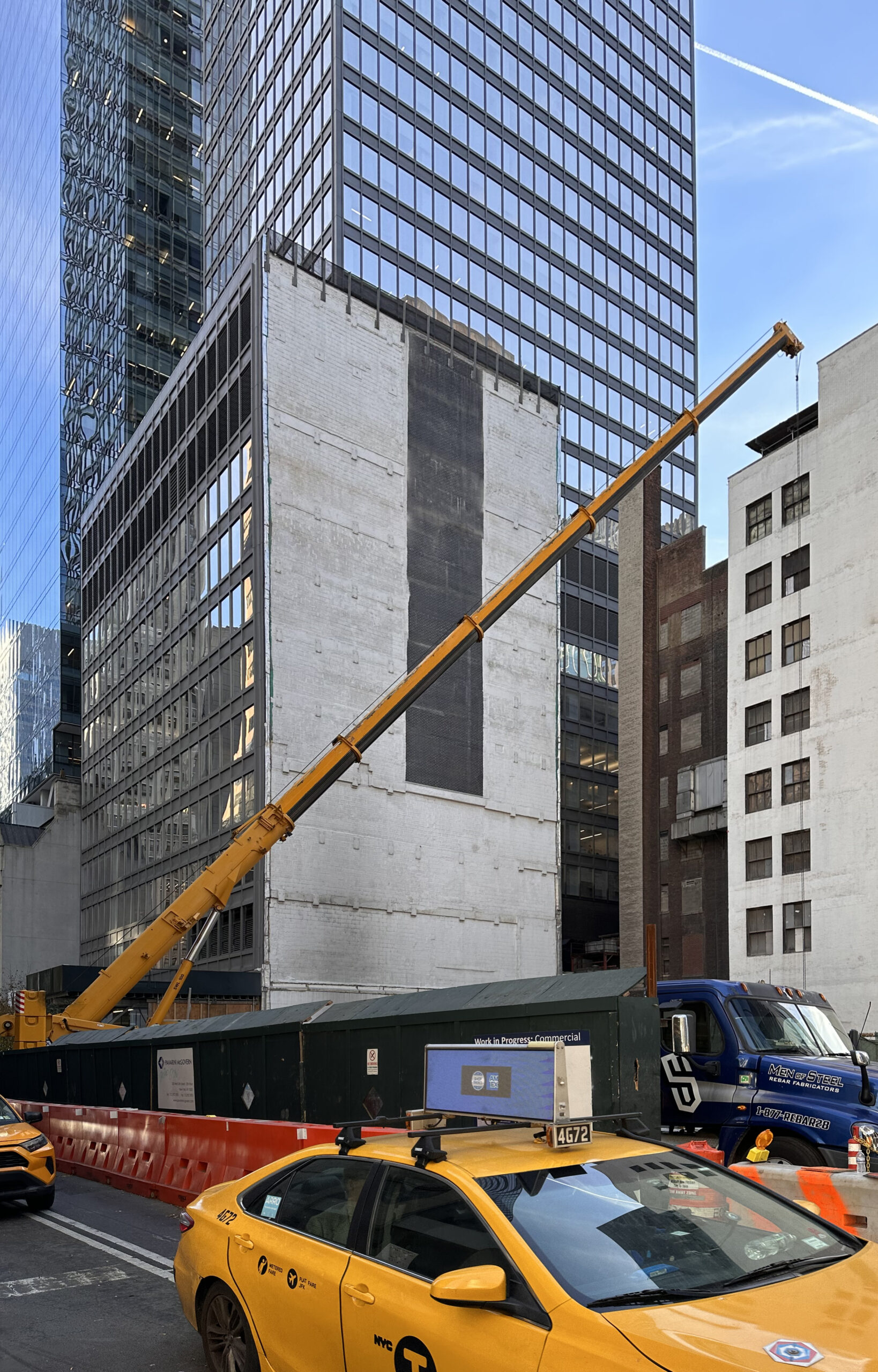
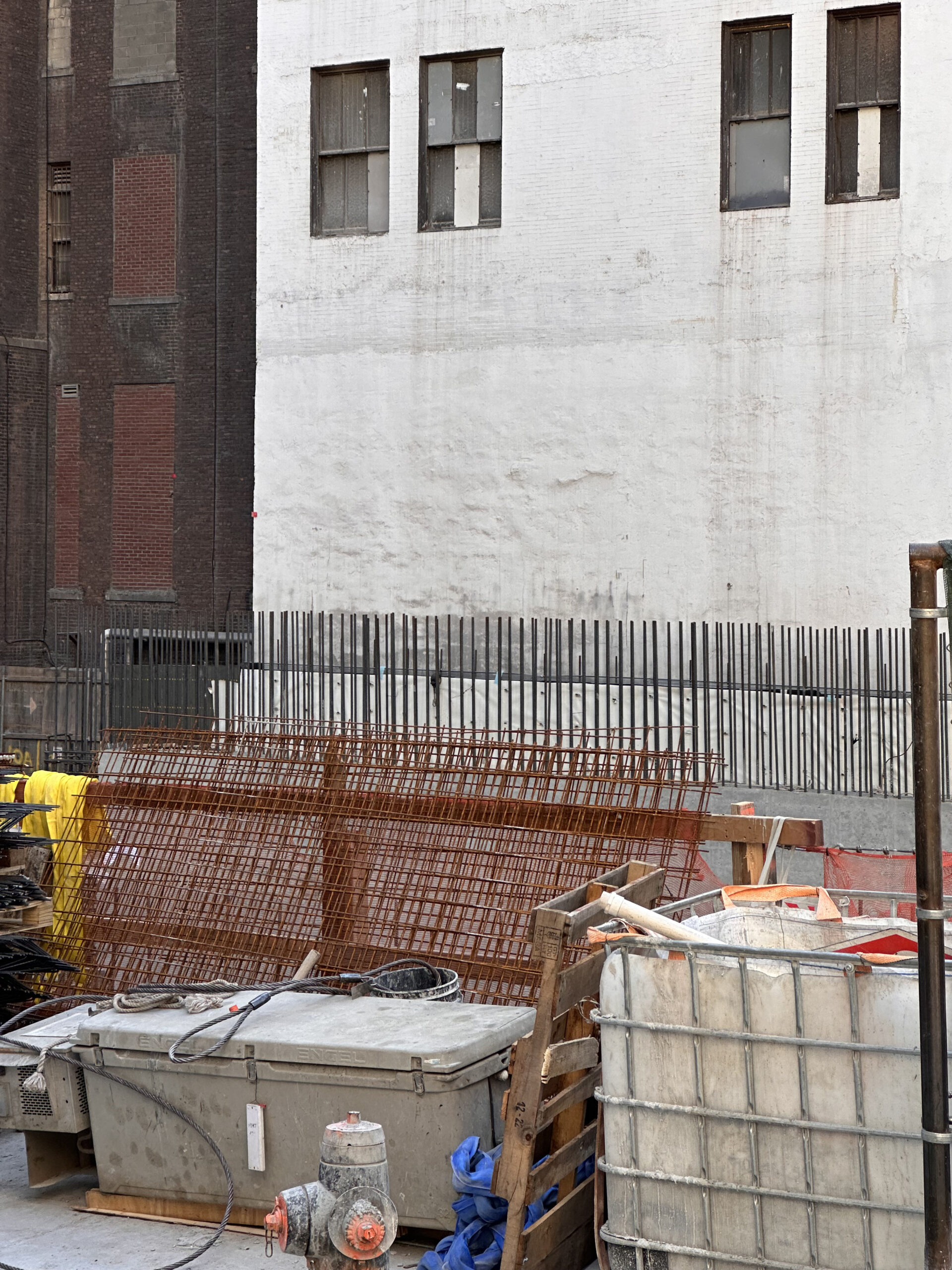
Foundations have begun to take shape since our last update in early July, when crews had recently begun to unearth the plot below street level. Excavation is still progressing on other portions of the site, while large sections of rebar and concrete formwork are being assembled for subsequent pours for the below-grade base. Based on the pace of construction, it’s possible the superstructure could emerge above street level by the spring.
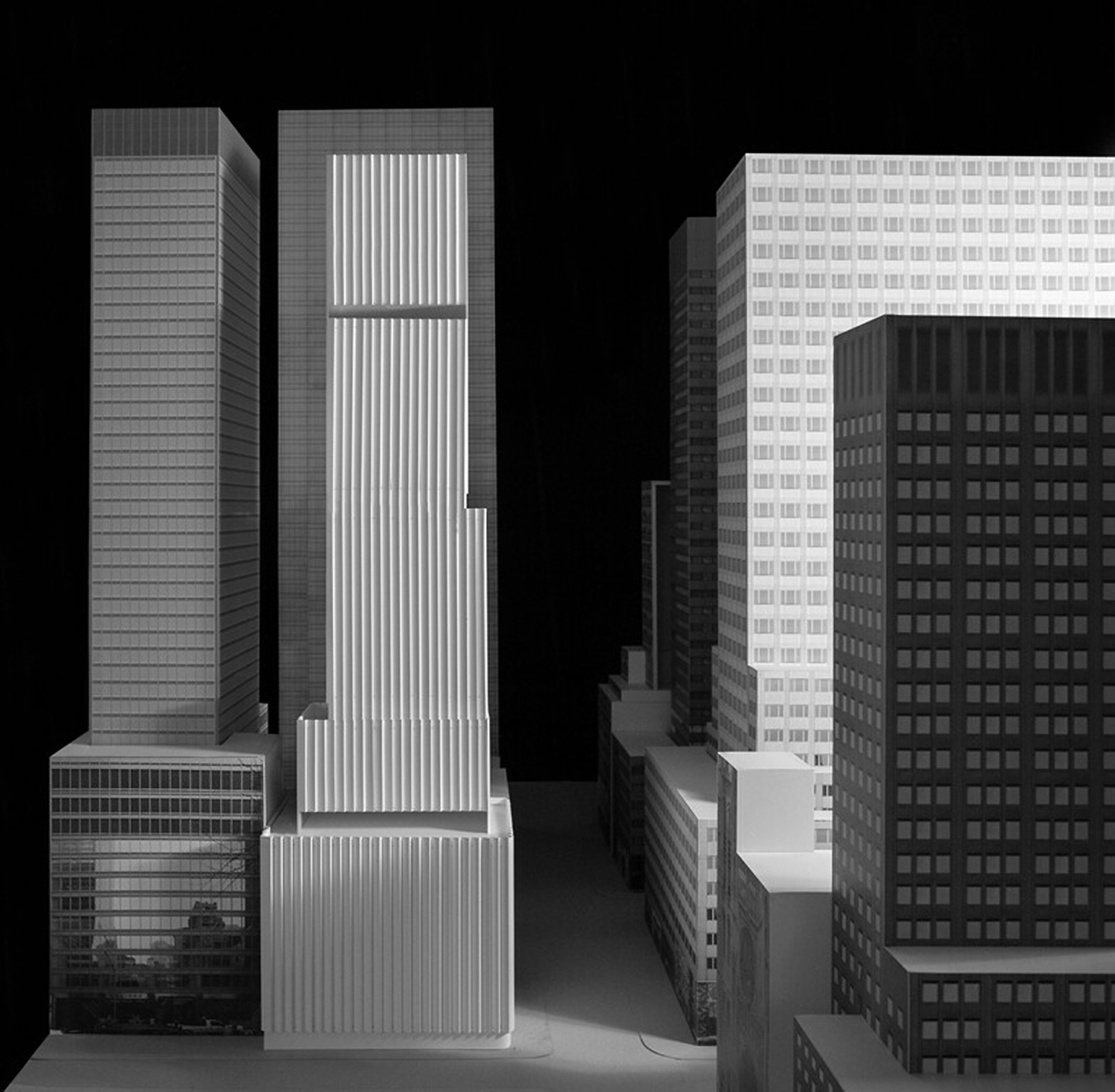
The updated rendering in the main photo depicts the latest iteration of the design, which was increased by 50 feet from the original height of 419 feet. The building will utilize the same exterior look highlighted by a distinctive pleated glass curtain wall and crown.
Below is the former version of the structure.
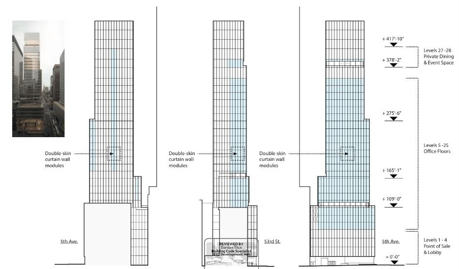
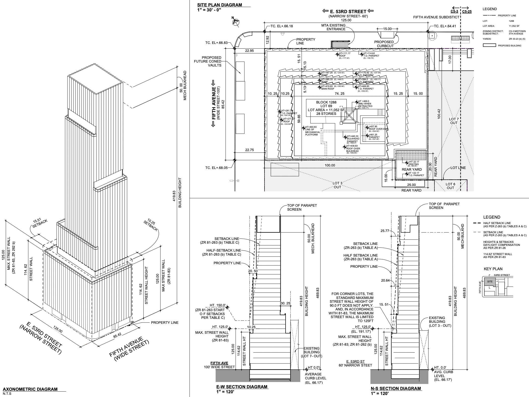
The following diagrams show the interior programming layout. Offices will span floors five through 25, followed by a double-height dining and event space with an adjoining terrace on the top two stories of the tower. A 50-foot-tall mechanical bulkhead and flat roof parapet cap the building. There also appears to be a small rear yard tucked in the southern corner of the property, as noted in the site plan diagram.
The nearest subways from the site are the B, D, F, and M trains at the 47-50th Streets-Rockefeller Center station along Sixth Avenue, as well as the E and F trains at the 5th Avenue-53rd Street station to the east.
665 Fifth Avenue is engineered to achieve LEED Platinum certification and has an anticipated completion date of December 2025, as noted on site.
Subscribe to YIMBY’s daily e-mail
Follow YIMBYgram for real-time photo updates
Like YIMBY on Facebook
Follow YIMBY’s Twitter for the latest in YIMBYnews







Glad the height was increased; that’ll emphasize the pleated design of the glass more
Much better proportions
I agree Jeffrey, and love how it’s like a modern take of a mid-century office building like the one directly to the west
It’s smart that the building design could eventually house any commercial office space, but the renderings may be too flattering. Waiting to see the finished product is a must.
The renderings show 660 Fifth Avenue (across the street from Rolex) as it appeared years ago before it was reclad. It looks much better now.
Only 28 floors in a building 47 story height.
I wish the city had required them to recess their building a little, away from 53rd street, to give us–the voiceless pubic–a little more room on the sidewalk, as it is done voluntarily by the building immediately next to it on 53rd…..
Looks like part of the neighboring Ferragamo building and the glass tower behind will have “rear yard” views?
LOL rear yard smaller than a studio apartment. At 20’ by 25’ I presume it will just be a concrete platform.
The angular sawtooth glass stripes are sexy. I also agree the proportions are waaaay better now.
The former version of the structure should be removed, pleated glass curtain wall and crown should not change: Thanks to Michael Young.
This will definitely be “Grade A” office space. My general understanding is that while the overall commercial market in mid-town has been tough, there is market for new Class A office space with all modern amenities. This includes significantly higher floor heights like this. I agree with an earlier post. The proportions are right and this building would not have been as attractive if it had been shorter. The height will also make the exterior cladding more striking. Waiting to see how the final turns out.
It fits well and I am sure more efficient than its neighbors.
Chipperfield’s elegant modernist refresh on classical architecture. At least being built here, following the MET’s pretty obnoxious cancelation of his marvelous new contemporary art wing design (facing the park) – in favor of some other architect checking the right boxes better (woman architect from Mexico, as opposed to a white male Brit).
Oh yay another boring glass box. Is that all architects can muster up for the last 20 years?