
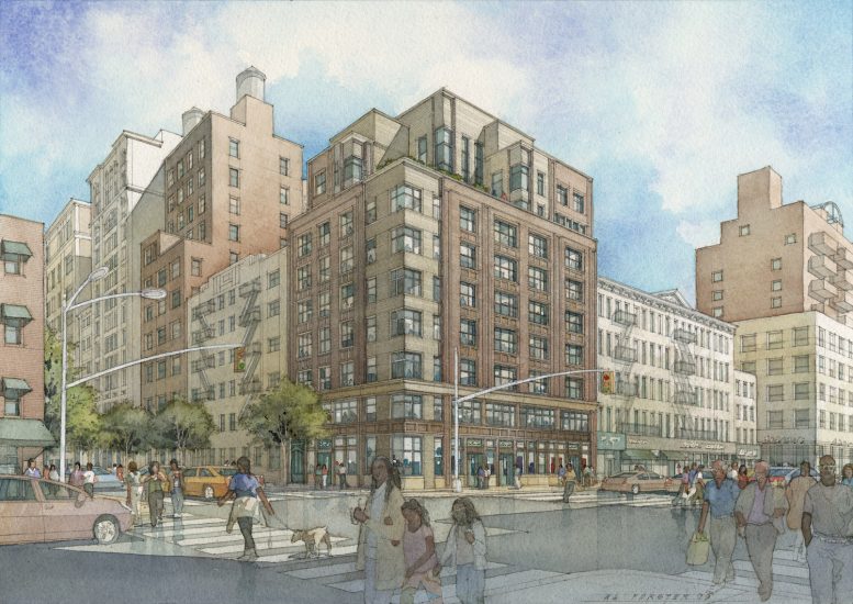
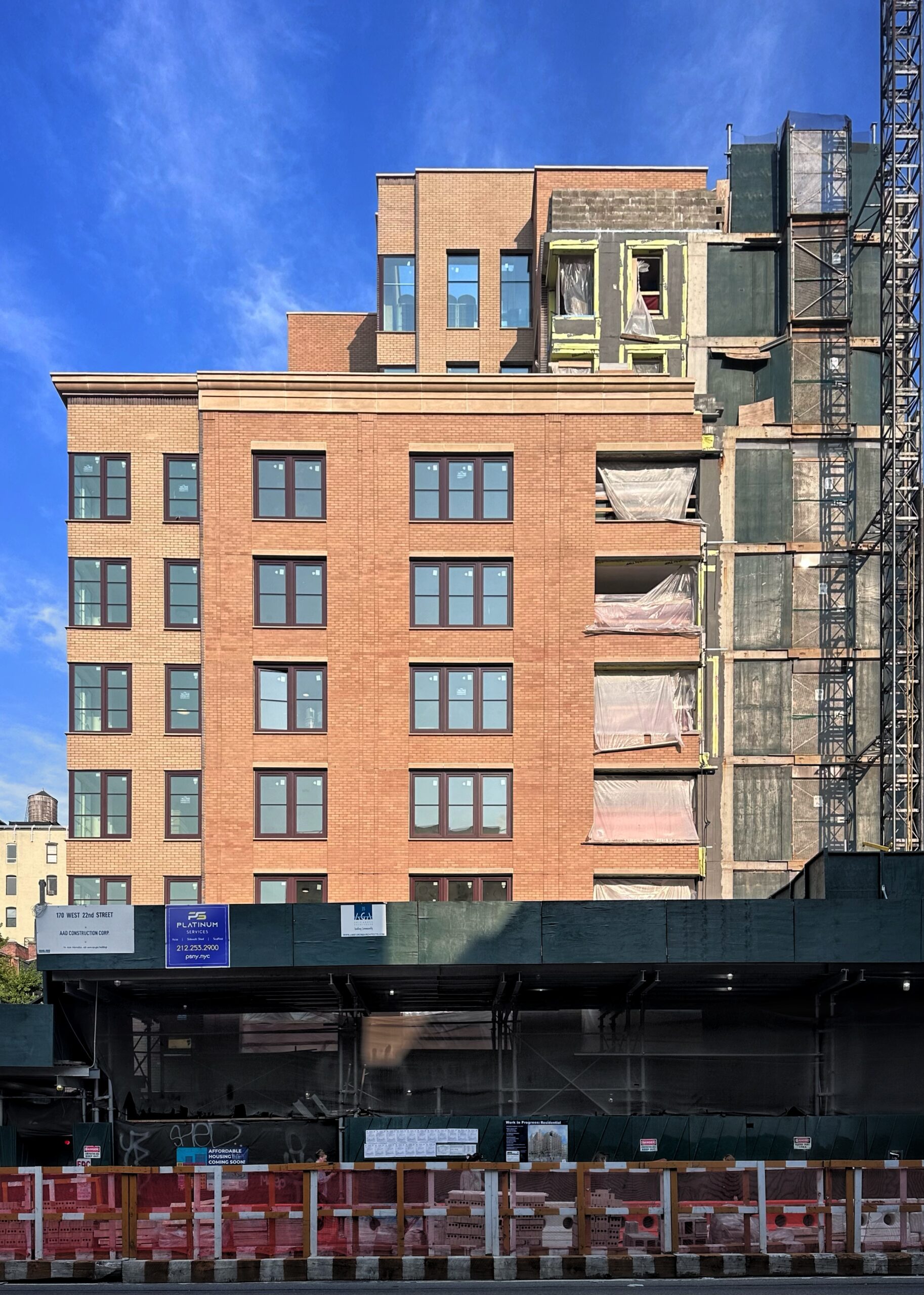
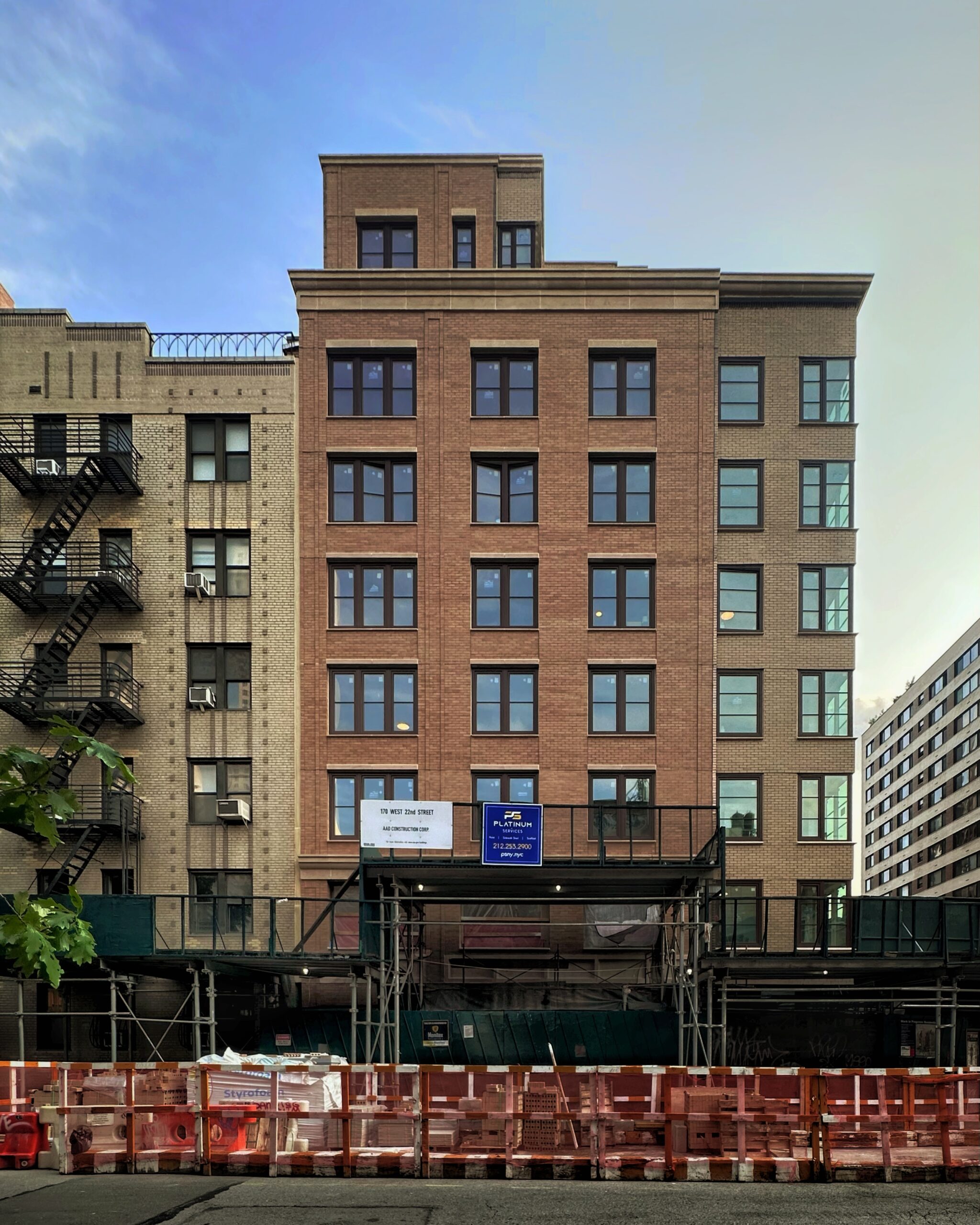
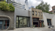
Construction is close to completion on 201-207 Seventh Avenue, a nine-story residential building in Chelsea, Manhattan. Designed by Amie Gross Architects and developed by New York City’s Department of Housing Preservation and Development under the Chelsea HDFC, the 85-foot-tall structure will span 30,859 square feet and yield 26 affordable co-op units in studio to three-bedroom layouts. The project will also include 1,828 square feet of retail space divided among three tenants. The property is alternately addressed as 170 West 22nd Street and located at the southeast corner of Seventh Avenue and West 22nd Street.
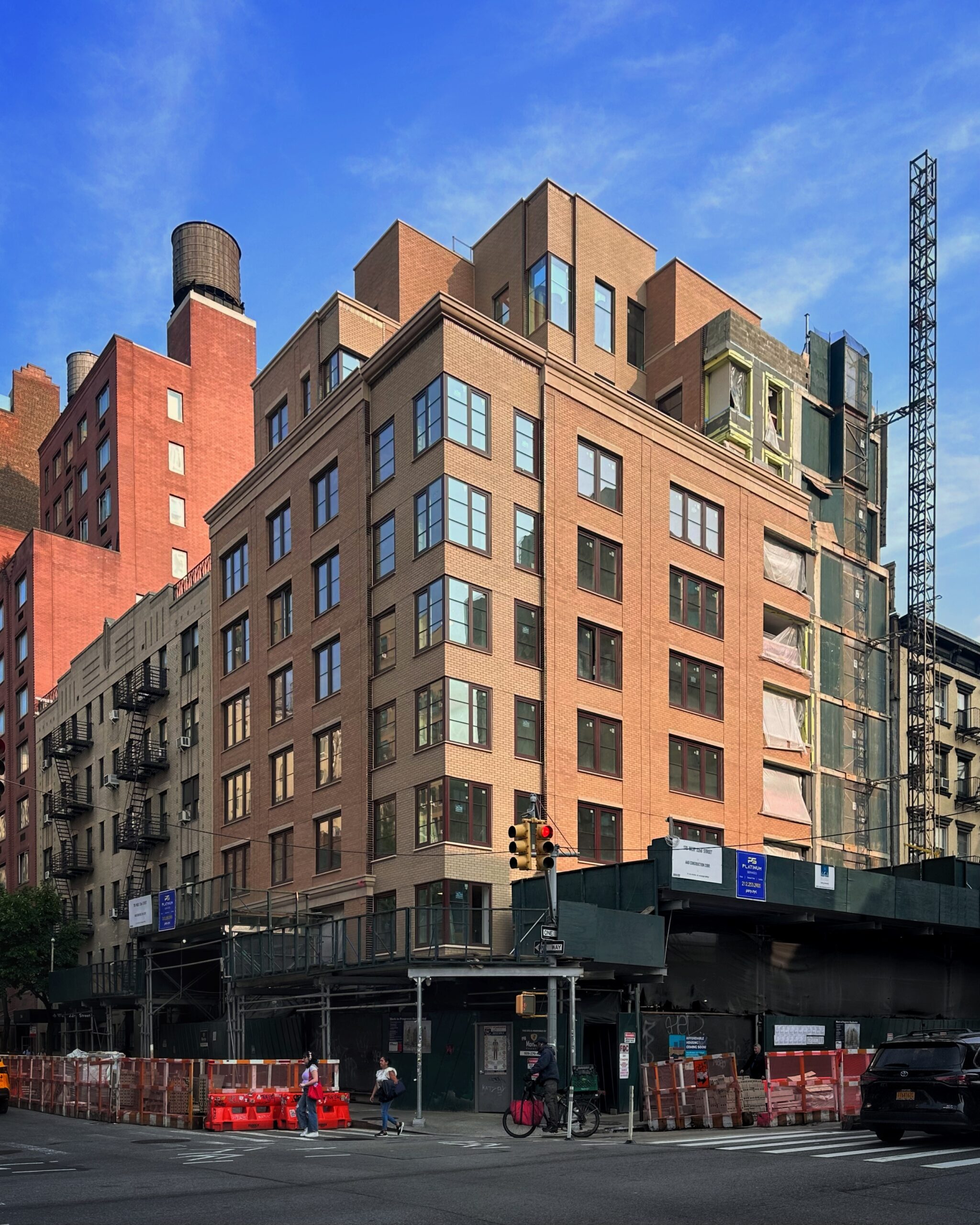
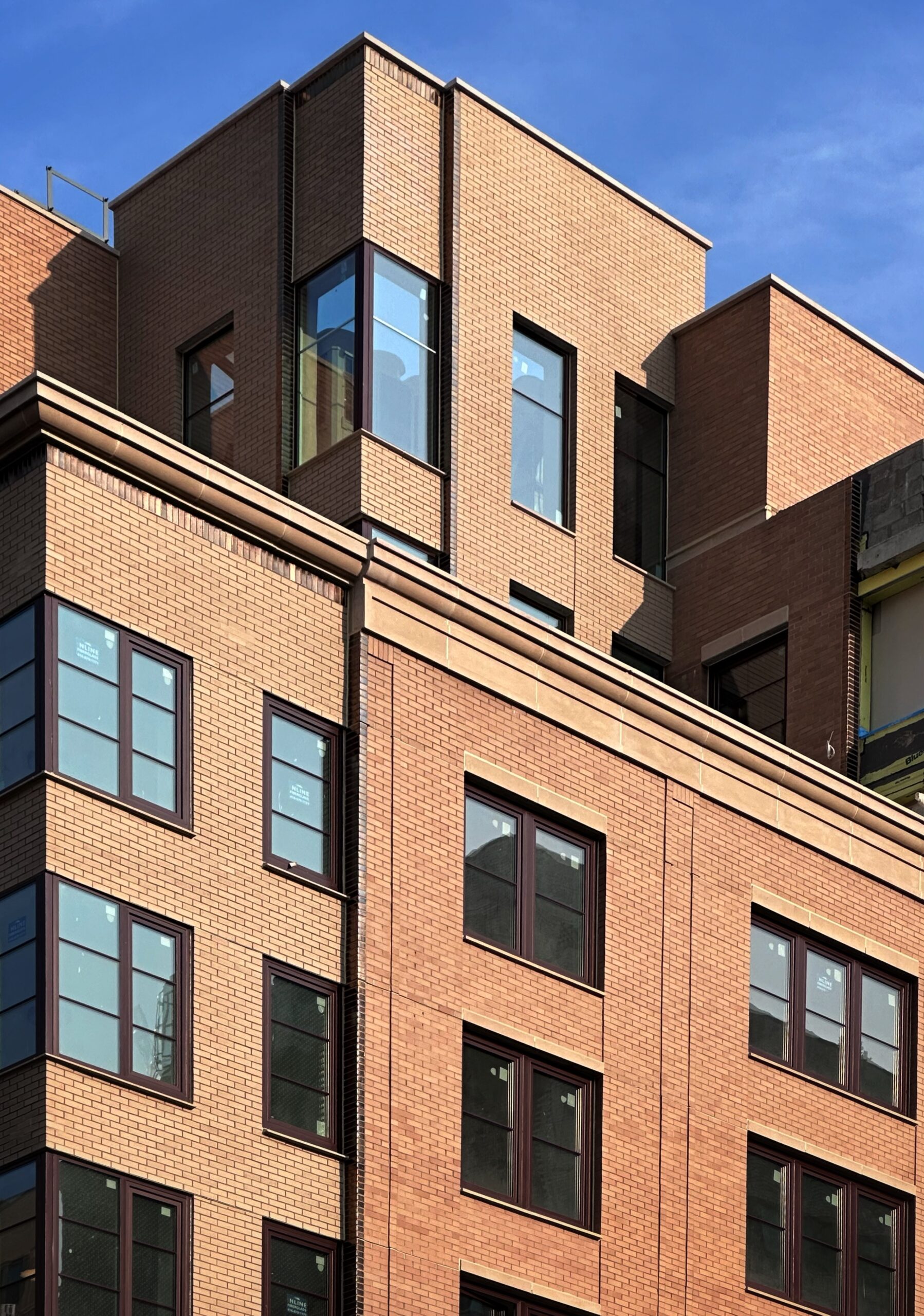
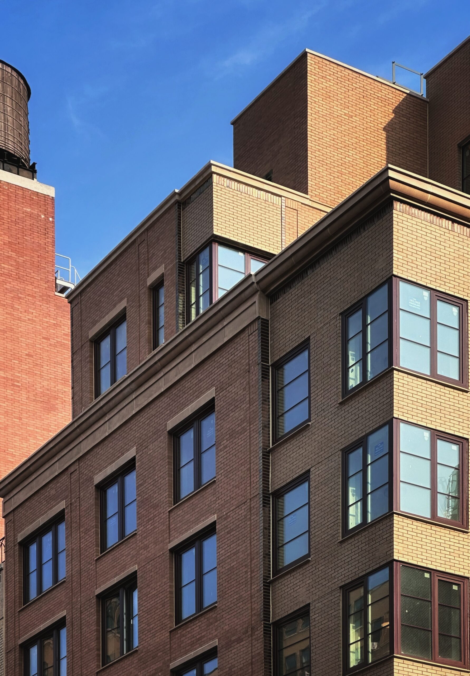
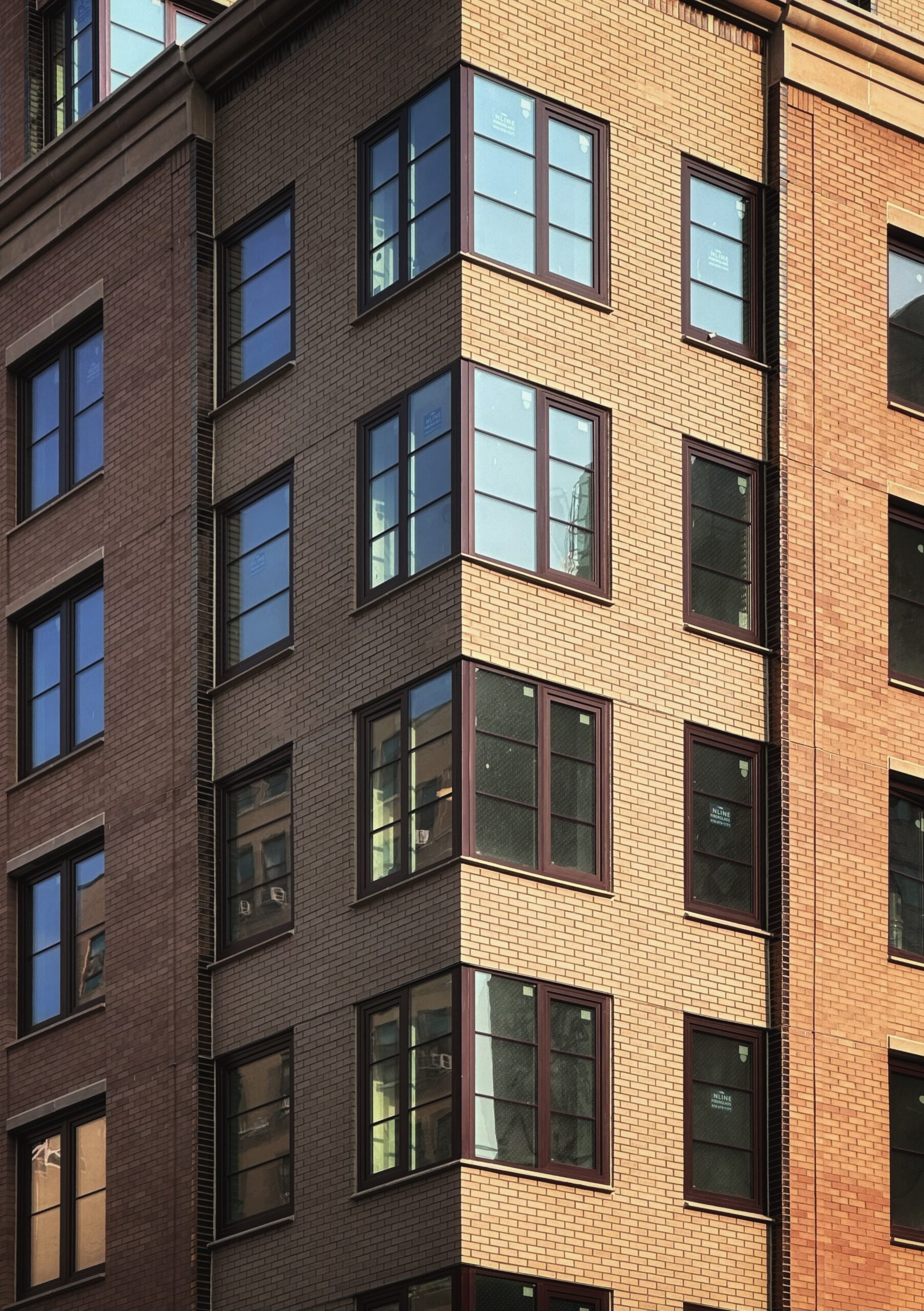
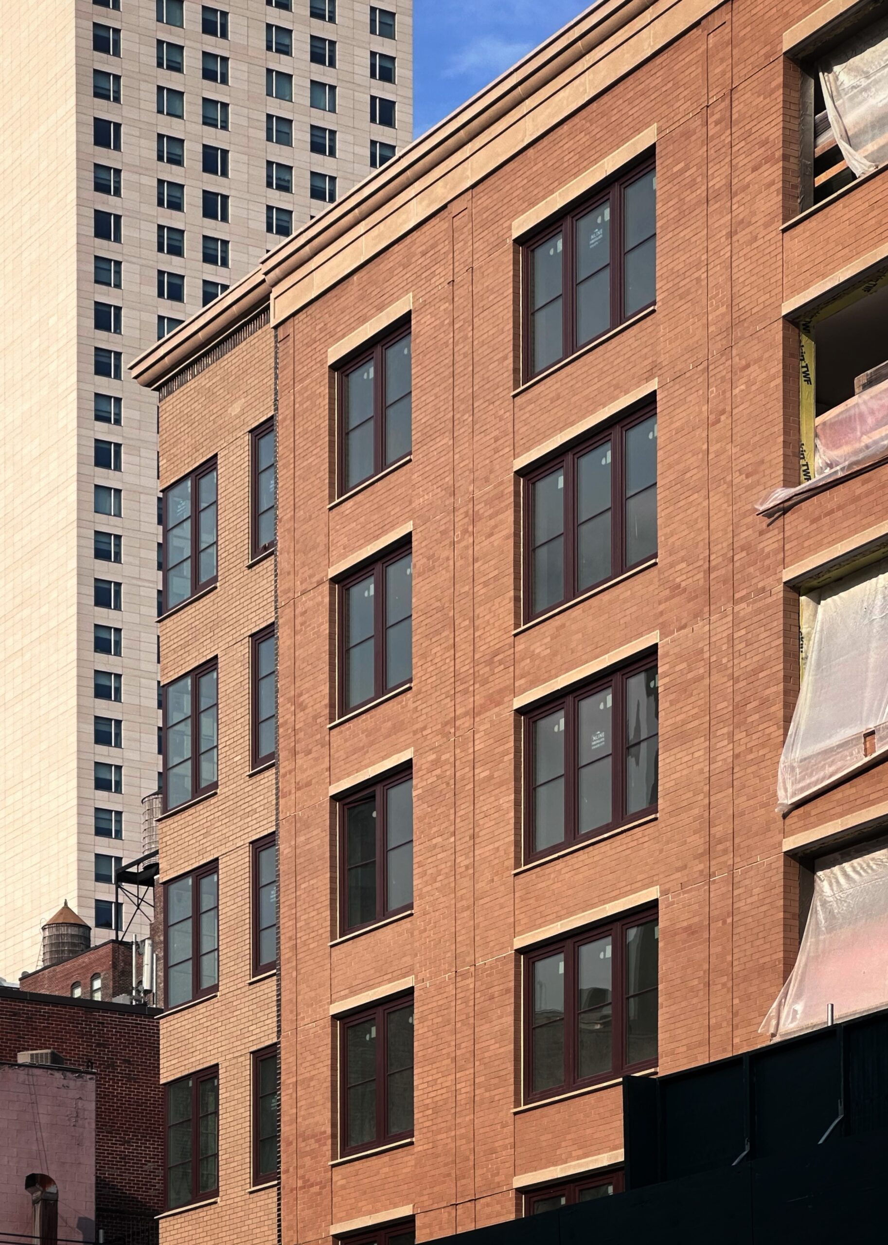
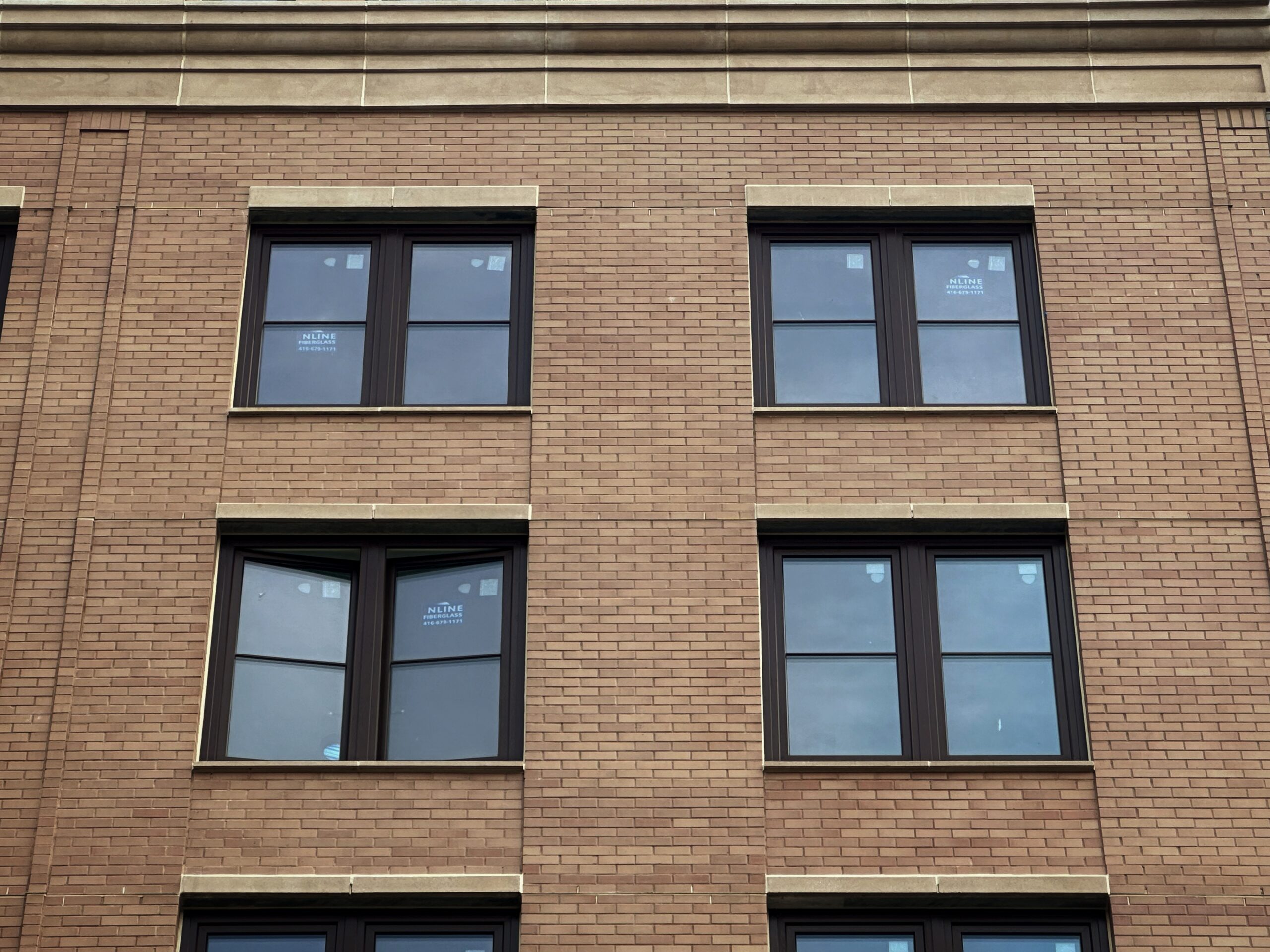
Nearly the entire brick façade was installed since our last update in April 2024, when the reinforced concrete superstructure had recently topped out and stood shrouded in black netting as crews worked to frame the walls with metal studs. The warm-hued masonry envelope and window grid now enclose almost the entire building with the exception of the southern edge of the western elevation, where the hoist remains attached, and the ground floor, which remains obscured by the sidewalk shed and fencing.
201-207 7th Avenue. Photo by Michael Young.
201-207 7th Avenue. Photo by Michael Young.
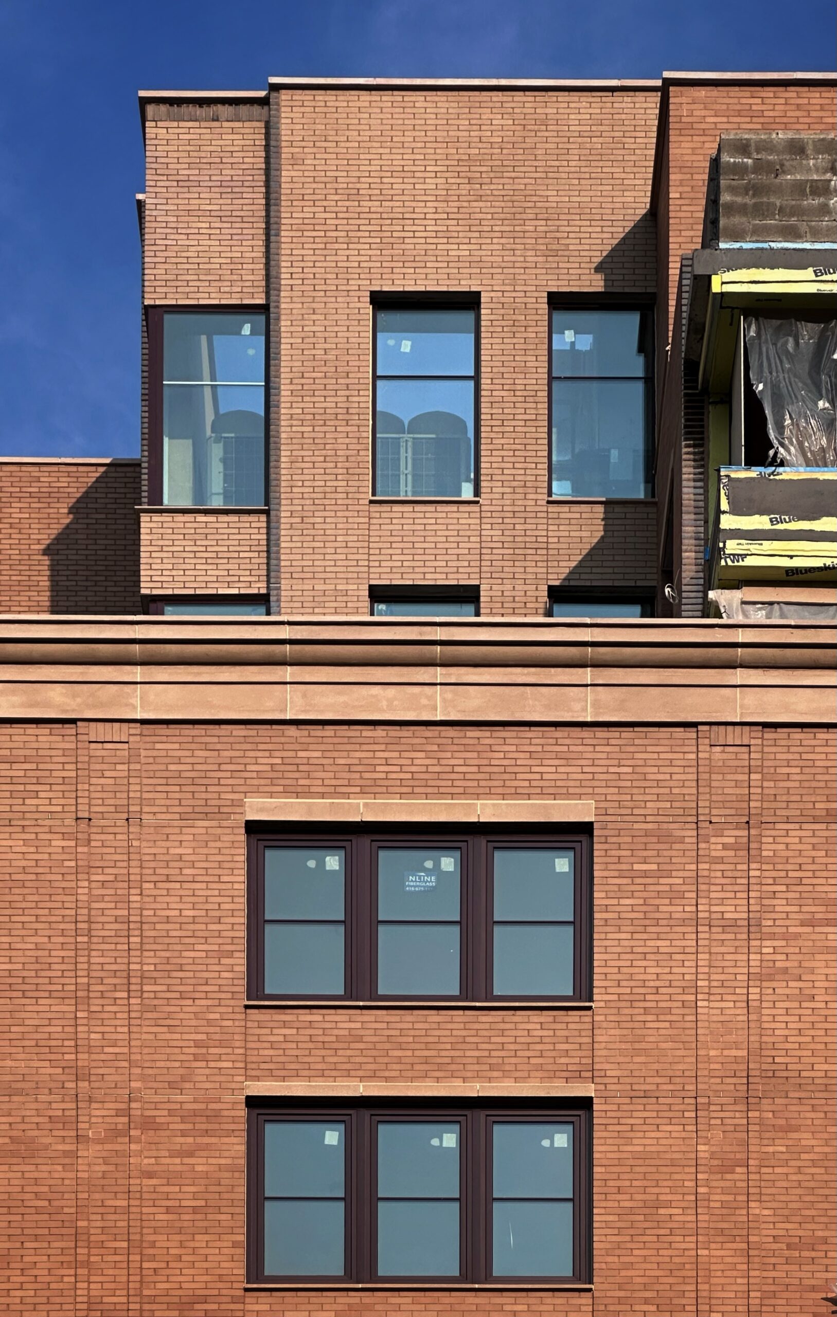
201-207 7th Avenue. Photo by Michael Young.
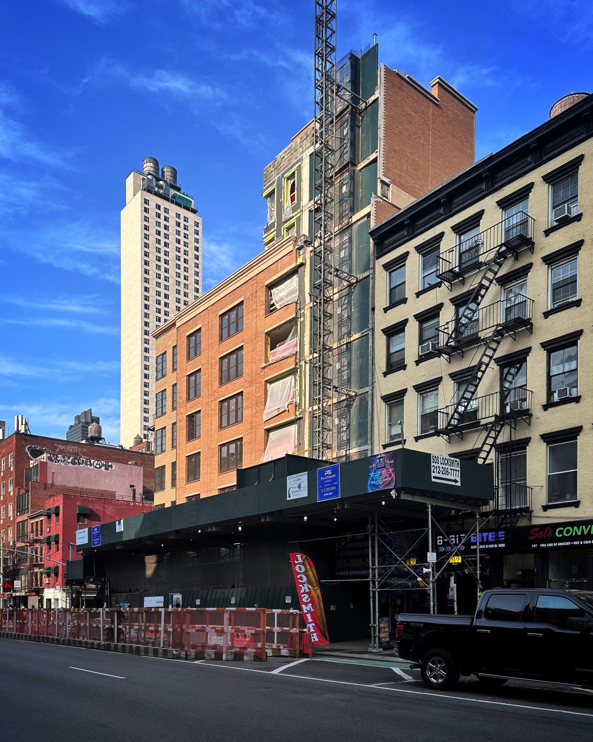
201-207 7th Avenue. Photo by Michael Young.
201-207 7th Avenue. Photo by Michael Young.
201-207 7th Avenue. Photo by Michael Young.
201-207 7th Avenue. Photo by Michael Young.
201-207 7th Avenue. Photo by Michael Young.
201-207 7th Avenue. Photo by Michael Young.
201-207 7th Avenue. Photo by Michael Young.
The watercolor rendering in the main photo at the top of the article previews the finished look of the façade and its decorative spandrels, stone banding, and cornices. A setback above the seventh floor will be topped with a landscaped terrace, while the eighth and ninth stories feature a multifaceted massing leading to a flat roof parapet, which will likely support an additional terrace.
Residential amenities will include a rear courtyard, a rooftop garden, a cellar level, and a recreation room. Five units are slated to be reserved for residents of the buildings that formerly occupied the site, with the rest of the inventory dedicated to residents earning 160 percent of the area median income.
The closest subway from the development is the 1 train at the 23rd Street station.
201-207 Seventh Avenue’s anticipated completion date is slated for June of 2025, as noted on site.
Subscribe to YIMBY’s daily e-mail
![]()
Follow YIMBYgram for real-time photo updates
Like YIMBY on Facebook
Follow YIMBY’s Twitter for the latest in YIMBYnews

It does not look like the rendering.
It’s a damn decent building.
Maybe because it’s not done yet?
Why is the window lintel thicker on the top floor like that?
There appears to be a subtle manipulation of the architectural elements to express different areas of the design.
Two reasons; typically, placing larger elements at higher levels draws one’s eye up the structure. It also has the effect of visually reducing the height. done the other way one can place smaller elements at the higher levels and it will exaggerate the height.
It looks like it’s been stripped of all depth.
it’s a damn decent building. The same shadows in the rendering are there in reality. Depends on the location of the sun. This is great infill.
Great contextual design!
I wish it were there when I was in business on 22nd Street. The summer weekends brought out the worst elements of those former tenants. I remember them cooking on overturned metal garbage cans, as if they were at the beach. People were forced to walk on the other side of the street.
This is great info. The brickwork does seem closer in tone than in the rendering, but just a bit- and it certainly can be due to sunlight. Nevertheless, it’s nice.
I wonder what the prices are?! What constitutes an affordable co-op in Manhattan nowadays?
Sure, I meant: This is great infill.
Nine stories but only 85 feet tall? I guess that’s possible?
This is how to do a two-toned brick facade. All the new “affordable” buildings in the Bronx and Brooklyn have two or three color facades, and they all give the same impression as the housing projects of the 50s: housing for “the poor” (yes, I know “affordable” now means for people with six figure incomes)should LOOK like housing for “the poor.”
Prior building had stone work that was as much prettier. This fake brick looks cheap. Looks like Disney replica of a building.
Over a million dollars per affordable unit.
subsidized by other tax payers.
the HPD taken over prewar walkups there before sat empty for decades. housing nobody
not an answer to affordability at all.
Are we really pretending this couldn’t be a lot better? There’s no character in the masonry. There’s no texture. No depth. Gone are the dramatic shadow lines of the rendering. I’d give this a B for concept and a C- for execution.
Just came here from the Linden Lane article. I can appreciate this building now