
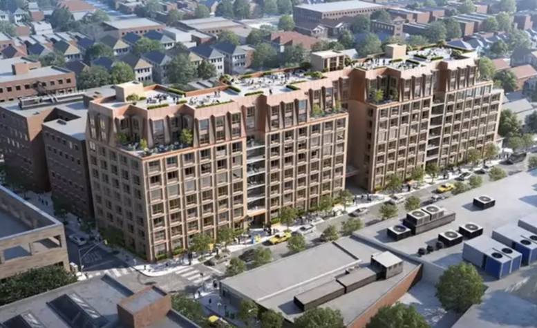
New renderings have been revealed for 1214-1238 East 14th Street, a proposed nine-story residential building in Midwood, Brooklyn. Designed by IMC Architecture and developed under the East14 Realty Holdings LLC, the nearly 171,000-square-foot structure would yield 225 units, including 57 income-restricted homes. The project is also planned to include 13,880 square feet of community facility space, recreation space, and 42-vehicle parking garage with 115 bicycle spaces. The property is located between Locust Avenue and Avenue L.
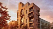
The renderings preview the structure with a rectangular massing running north to south with a contemporary Mansard roof on the final two stories. The façade will be composed of tan brick surrounding a grid of square windows with protruding frames. The design incorporates multiple stacks of balconies and terraces on its upper setbacks.
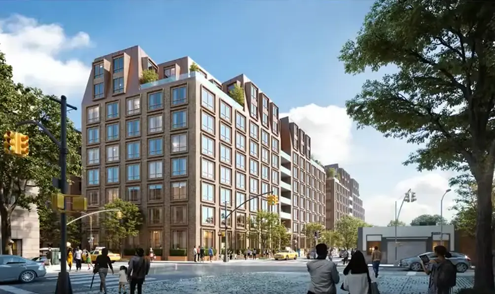
1214-1238 East 14th Street.
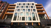
The below renderings show the previous 156,300-square-foot iteration from IMC Architecture that would have yielded 215 units and nearly 15,000 square feet of community facility space on the ground floor.
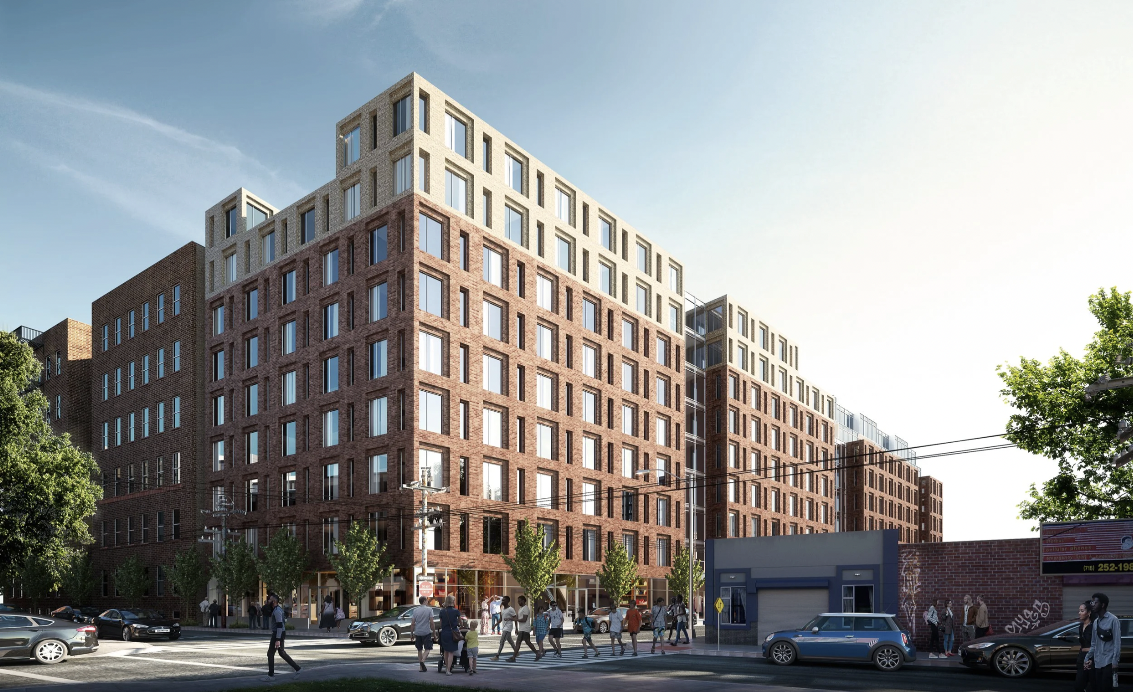
The old design for 1214-1238 East 14th Street. Rendering courtesy of IMC Architecture.
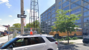
The property is currently occupied by a surface-level parking lot.
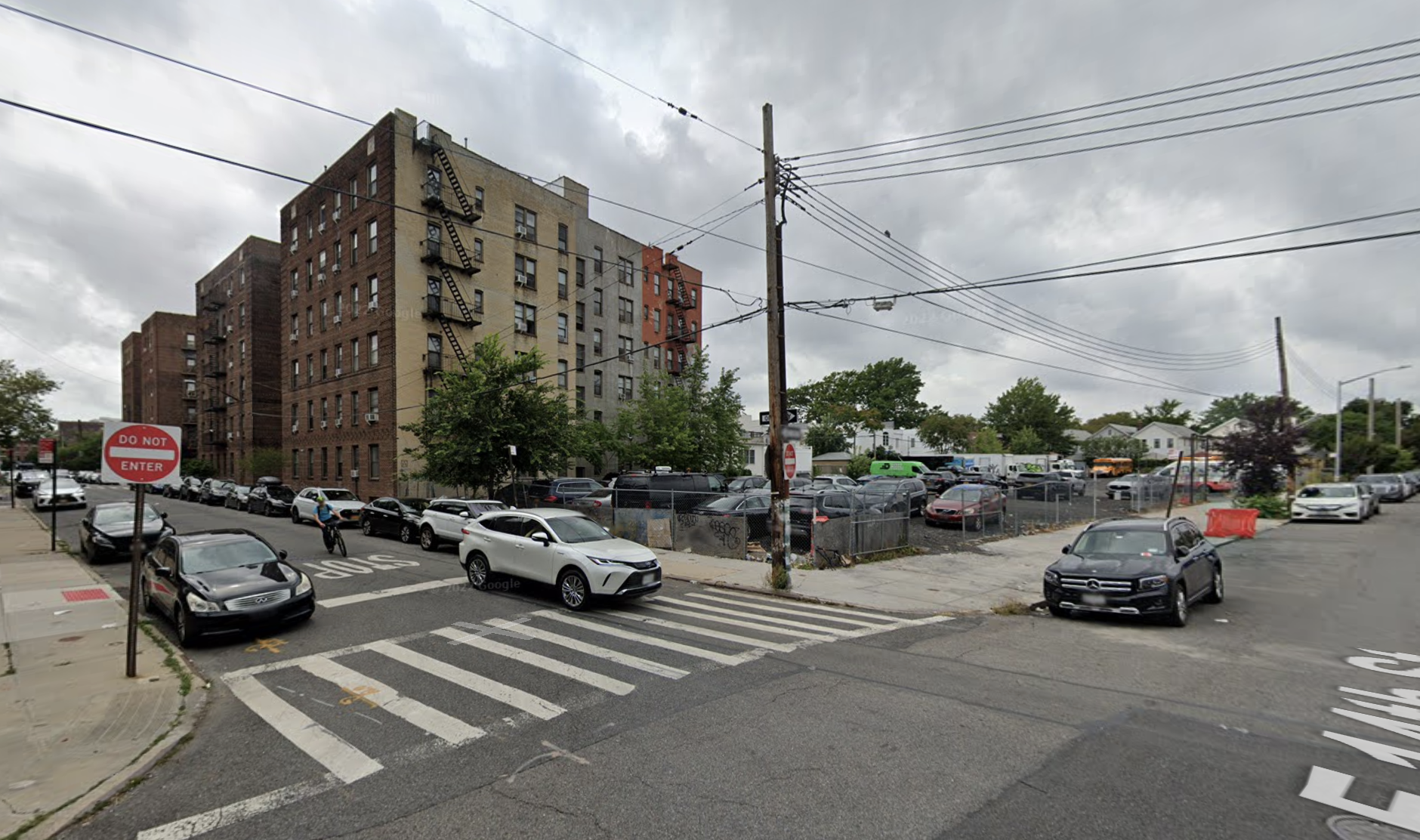
1214-1238 East 14th Street, circa August 2021. Image via Google Map.
A potential list of amenities and income requirements for the affordable housing have yet to be disclosed.
The nearest subway from the ground-up development site is the Q train at the elevated Avenue M station to the southeast.
A rezoning from M1-1 and R5 to R7A would need to be certified for 1214-1238 East 14th Street before construction can commence. A proposed construction timeline has not been announced.
Subscribe to YIMBY’s daily e-mail

Follow YIMBYgram for real-time photo updates
Like YIMBY on Facebook
Follow YIMBY’s Twitter for the latest in YIMBYnews
so good
Fitter, happier, more productive
Still cries at a good film
The 60s Neo French look is back. The previous design was better.
Consult an optomitrist immediately.
While I prefer the recent/2nd design submission, I feel the ‘Penthouse’ floor ‘Mansard’ design needs revision, since it contradicts w/the facade and blatantly standouts as awkward. Not a timeless design.
Yeah it looks a little too gimmicky/Las Vegas gauche
The 2nd is much better, adds a bit of character.
New one is FAR superior 💯 this will look good
Lovely, with a dash of character.