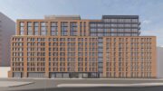
Construction is getting closer to completion on 101 West 14th Street, a 13-story residential building in Chelsea, Manhattan. Alternately addressed as 531 Sixth Avenue, the reinforced concrete structure is designed by ODA Architecture and developed by Gemini Rosemont and will yield 44 condominium units as well as 5,830 square feet of ground-floor retail space for two tenants. Residential sales launched last year and are being led by Ryan Serhant of Nestseekers International’s Serhant Team, with prices starting at $1.35 million for one-bedroom units. Whitehall Interiors is in charge in interior designs and New Line Structures is the general contractor for the property, which is located at the northwest corner of West 14th Street and Sixth Avenue, just above the border with Greenwich Village.
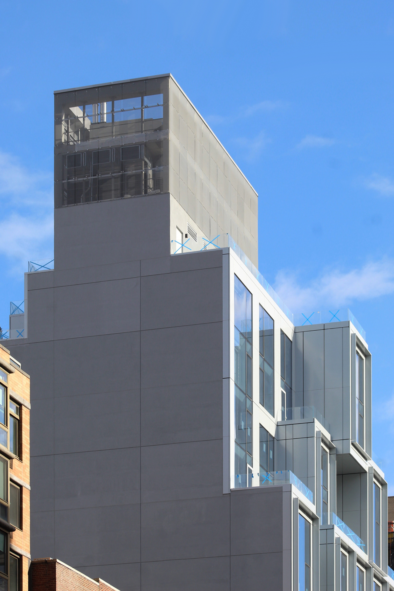
Since our last update in June, the windowless western elevation has been fully enclosed with DensGlass gypsum sheathing and work has concluded on the mesh metal screen surrounding the rooftop mechanical extension. Sidewalk scaffolding remains around the first floor, obscuring signs of progress at this level.
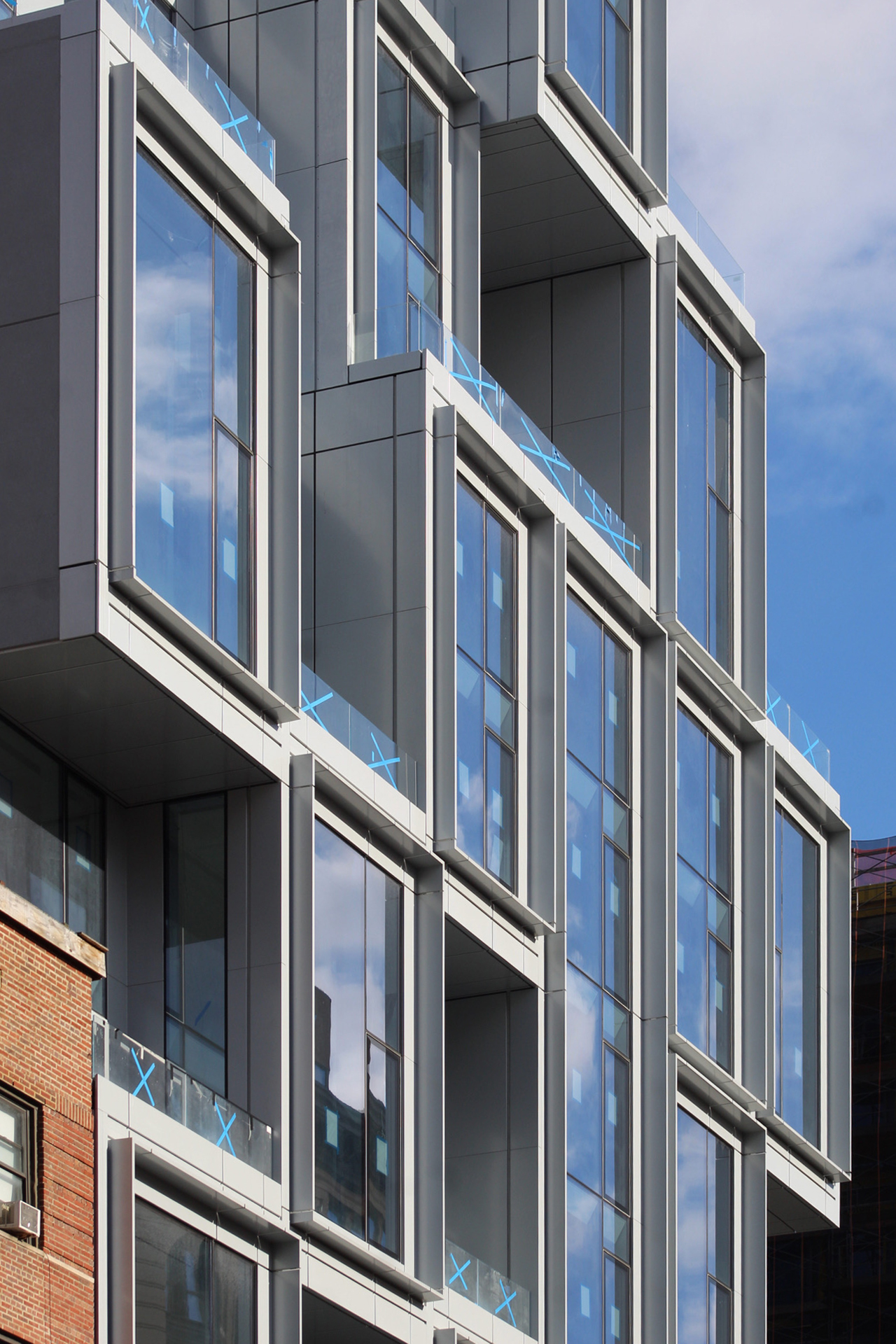
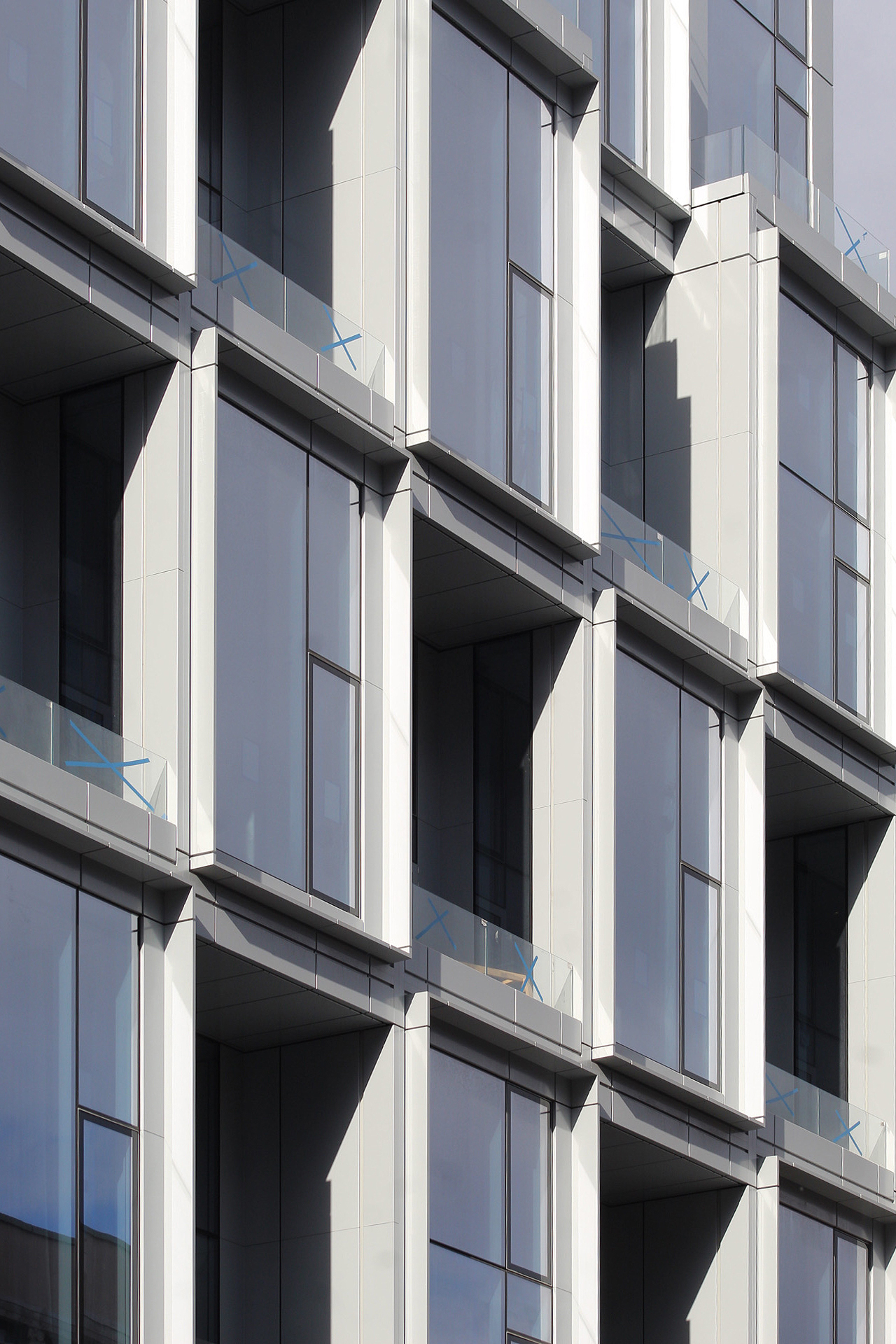
All of the glass railings for the numerous pocketed terraces are in place, and the sidewalk scaffolding should be taken down in the coming weeks.
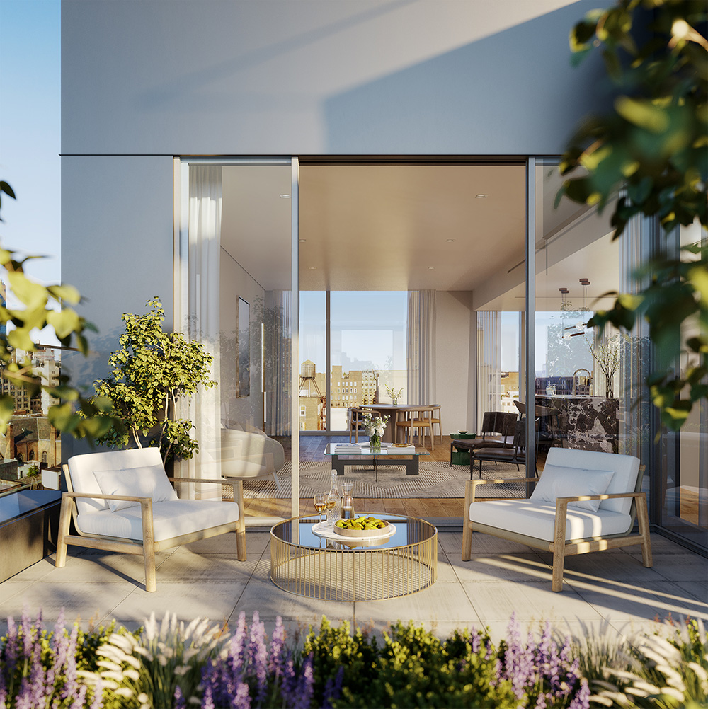
Interior renderings depict a typical living room layout and the outdoor penthouse terrace. Occupants will have views over the neighborhood and abundant natural light year round.
The F, M, and L trains are conveniently accessible at the 14th Street station, located directly in front of the building. This station also features a subterranean walkway to the 1, 2, and 3 train lines to the west, and the PATH trains.
101 West 14th Street is anticipated to finish construction sometime later this year.
Subscribe to YIMBY’s daily e-mail
Follow YIMBYgram for real-time photo updates
Like YIMBY on Facebook
Follow YIMBY’s Twitter for the latest in YIMBYnews





I don’t mind this building at all. I think the cubic design looks very sleek and it makes a bold statement on the corner. It’s certainly a lot better than other floating box designs around the city.
Put prominent material to progress in place, development activities not oppose the city views. The property has become much more building these days, and the area is governed by its beautiful exterior: Thanks to Michael Young.
The building looks great but they should have been required to relocate the subway street stair into the base and off the sidewalk.
it also would have been nice if the city could have offered the development additional square footage in return for funding part of the costs for making the station complex ADA-compliant. That should be the policy city-wide: additional bulk in return for funding transit improvements (or other city improvements like classroom space, senior centers, water and sewer improvements, etc., though ADA elevators are the need here) that mitigate the costs to the community and city services of the additional bulk and neighborhood residents.
These cube building look very messy and distracting.
Ryan Serhant left Nest Seekers last year to start his own firm, SERHANT.
More jenga boxes. Snore.
Completely out of the context. It doesn’t fit with the neighborhood at all. For an example of a new structure that corresponds seamlessly with the surrounding buildings, just look across the street.
Yeah, it is a little Jenga like. But I actually think overall that it helps the corner. What I really like is the casement style to the windows. Great touch.
Very nice looking corner piece.
Real architectural thinking my kind of .