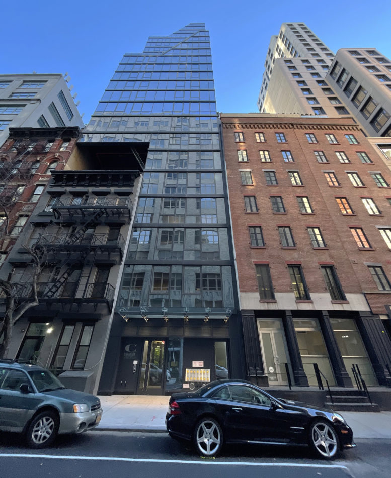
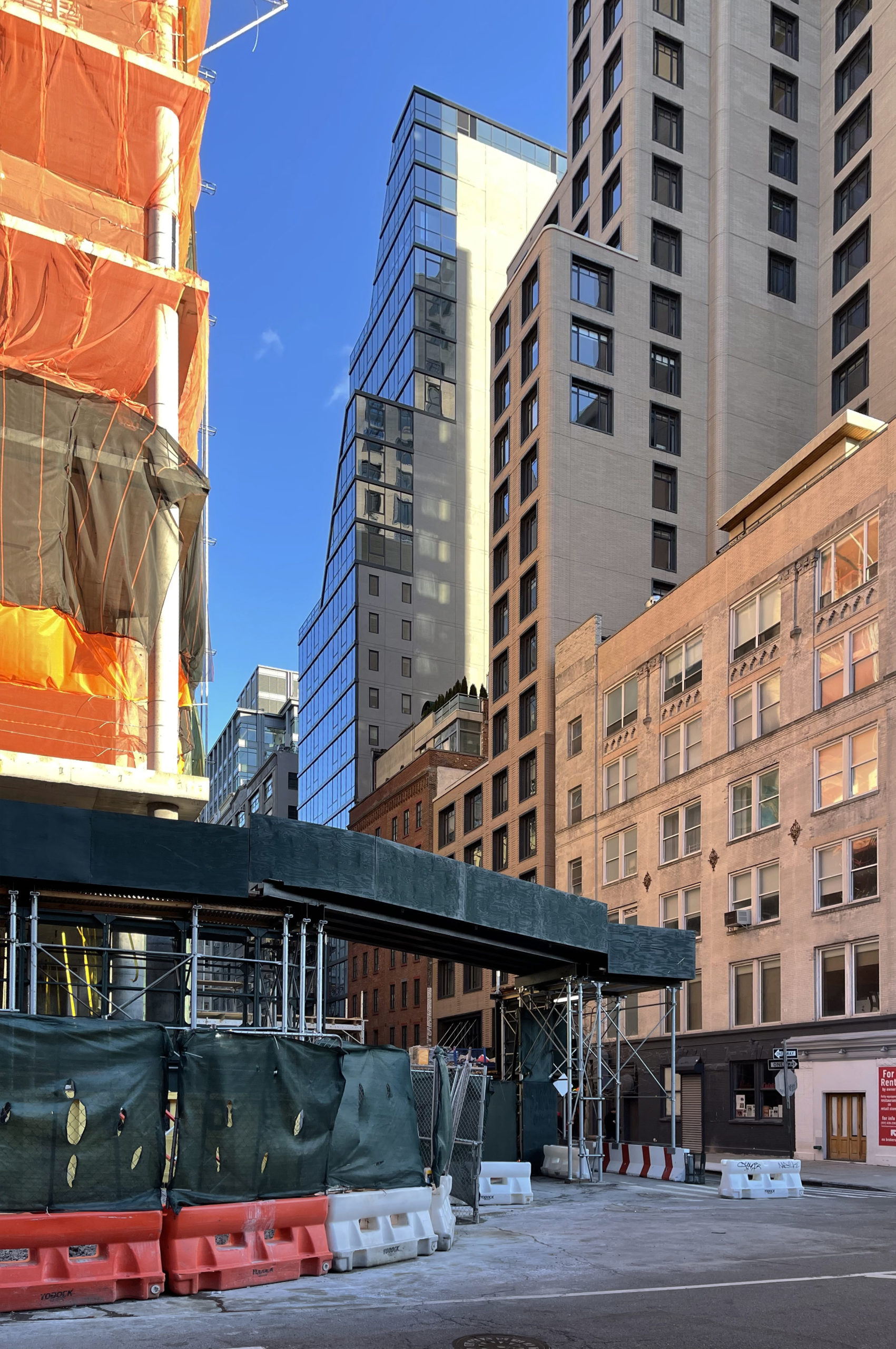
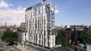
Construction is complete on 102 Charlton Street, a 21-story residential building in Hudson Square. Designed by Ismael Leyva Architects and developed by Lalezarian Properties, the 210-foot-tall structure yields 59,323 square feet with 61 residential units in a mix of studios, one- and two-bedroom layouts, and full-floor spreads. The property is located between Greenwich and Hudson Streets and is surrounded by a wave of new construction including headquarters for Disney and Google.
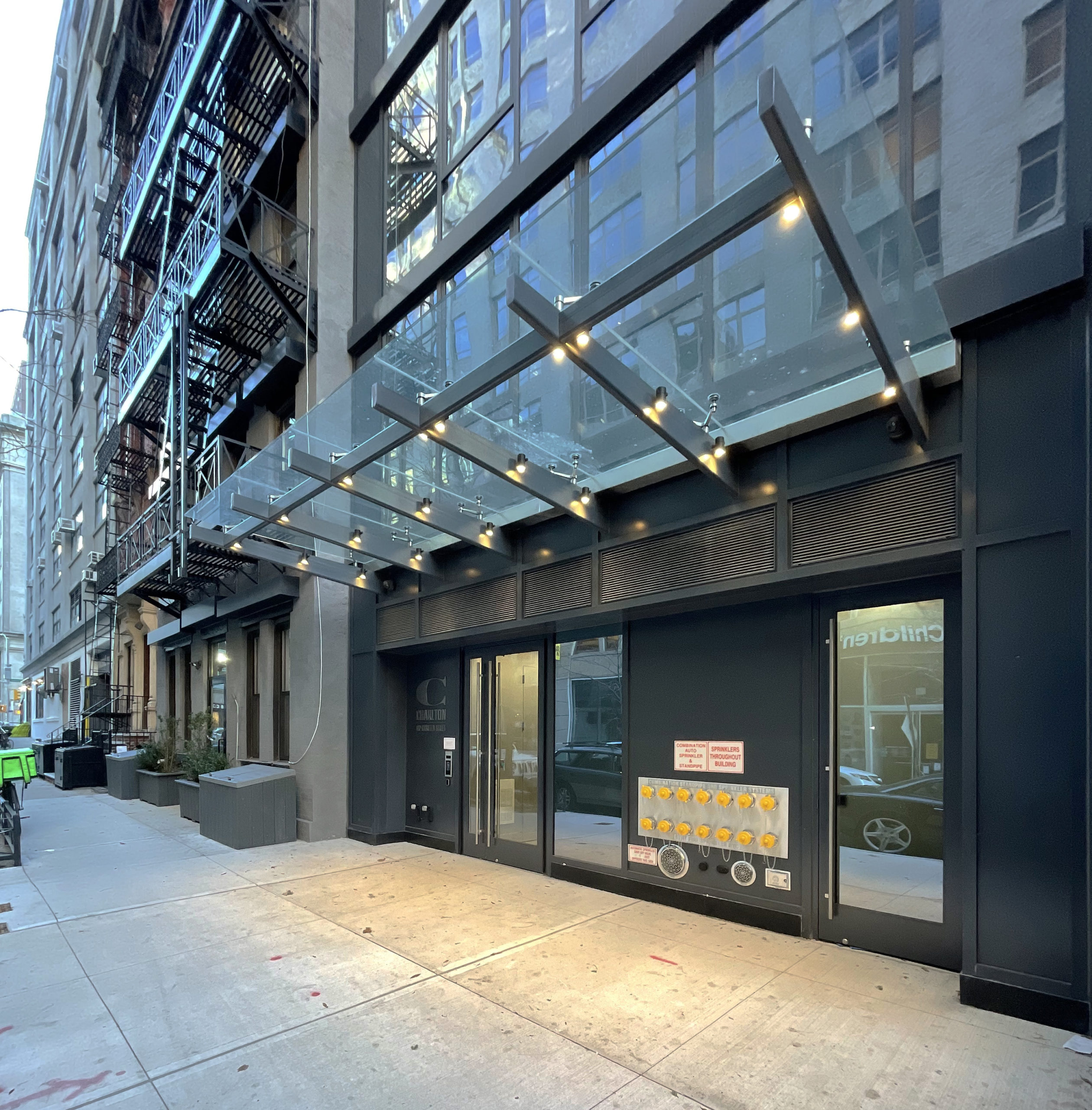
Since our last update in early September, a number of finishing touches have concluded, such as the installation of lights under the entrance canopy and the addition of the property’s logo by the main doors.
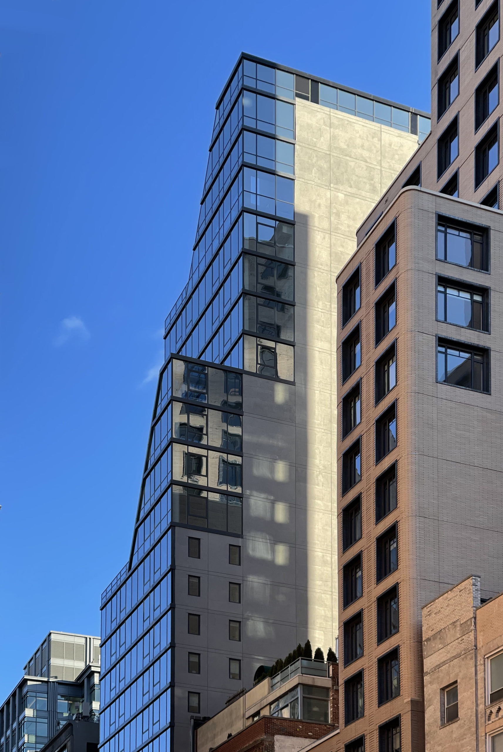
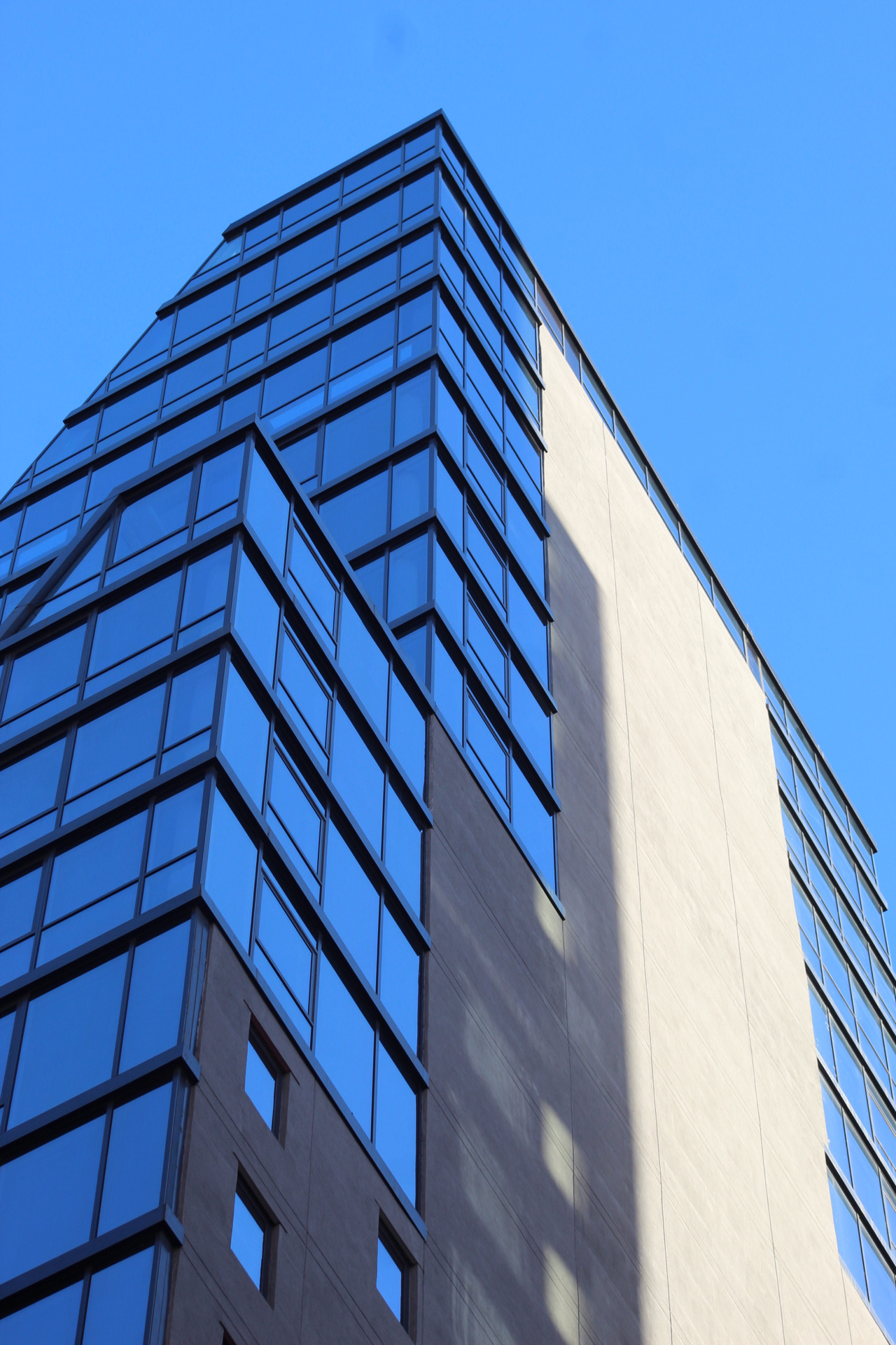
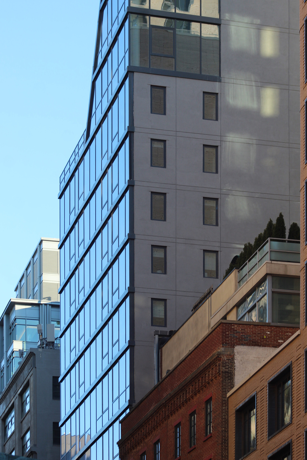
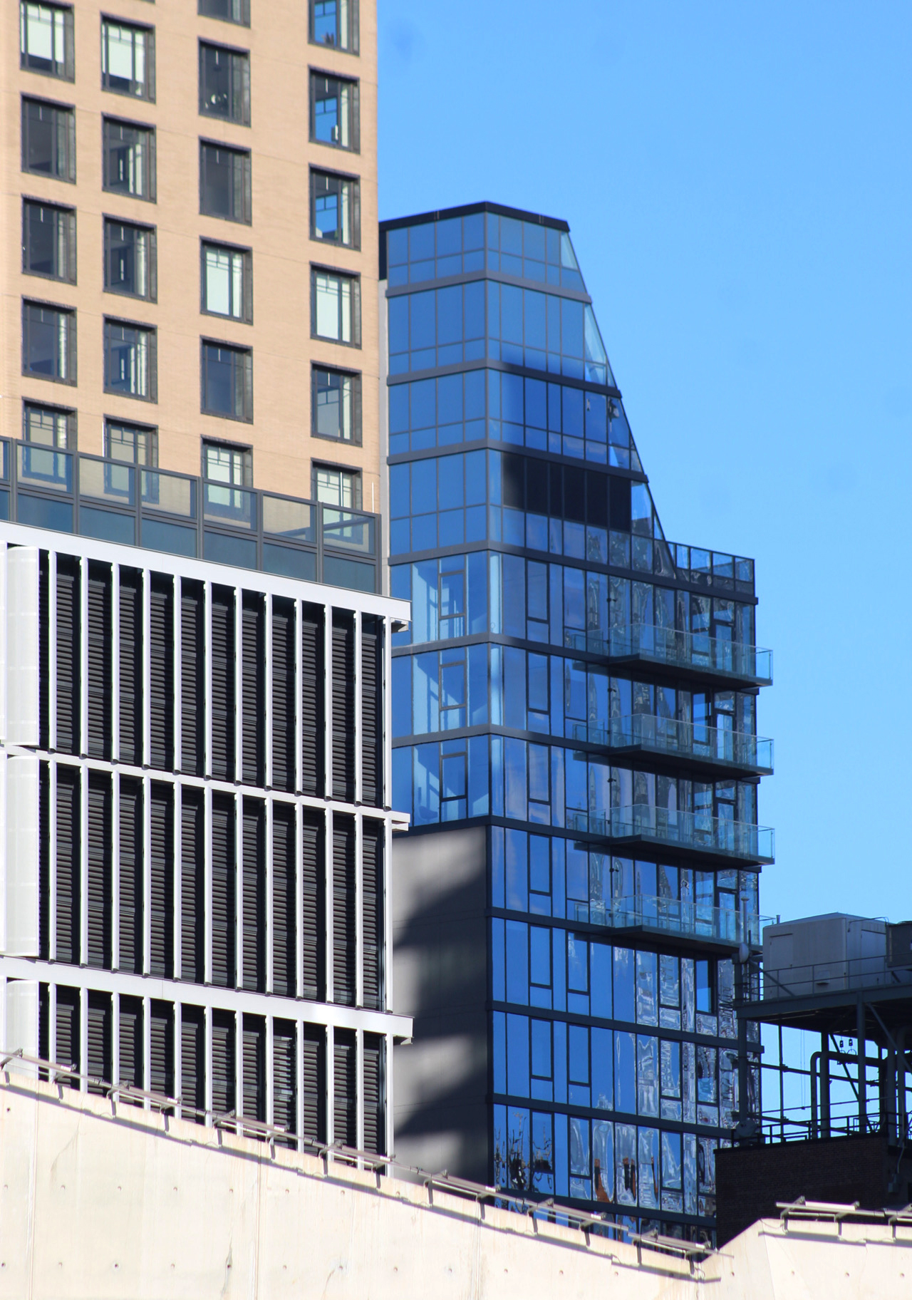
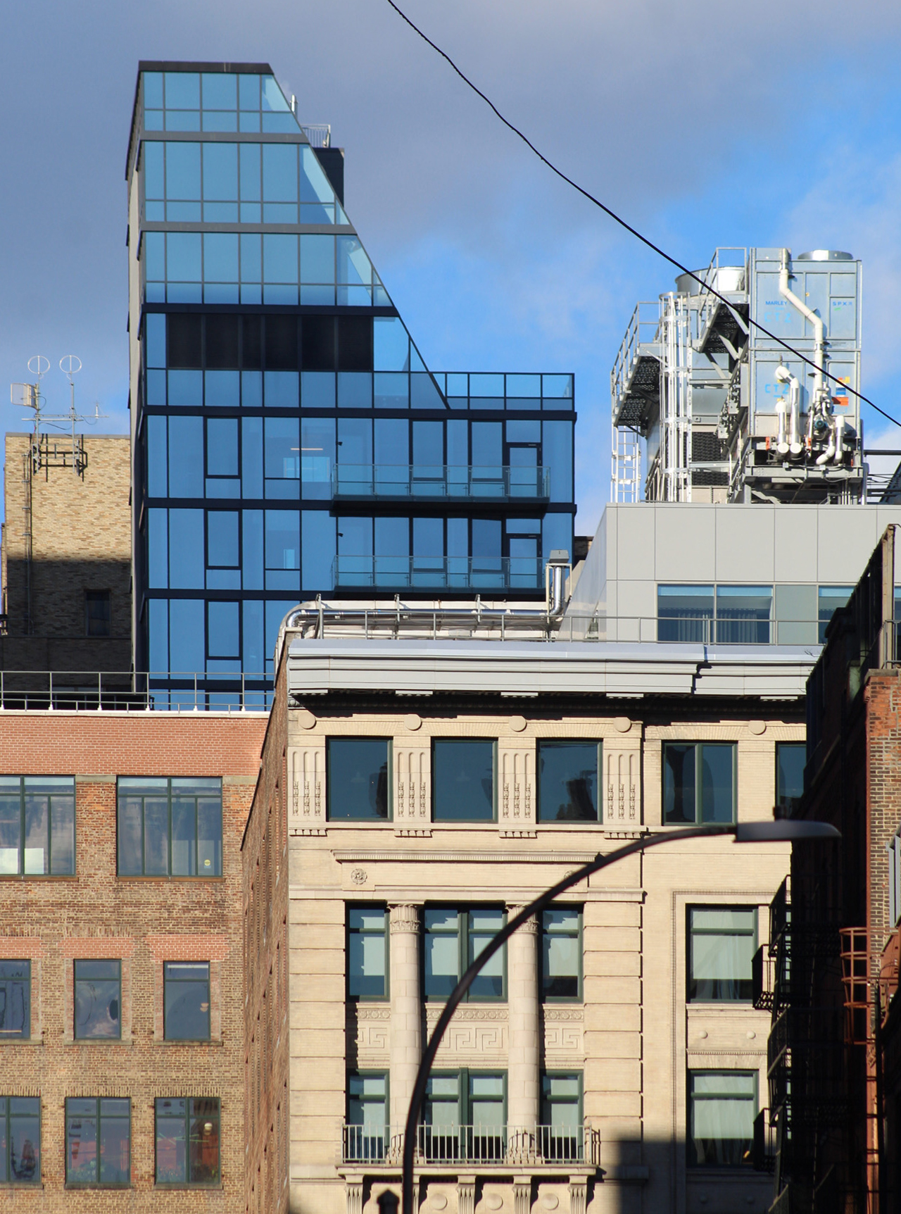
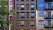
Close-up shots show the finished look of the gray paneling and floor-to-ceiling glass. The back side of the building has four balconies protruding from the final levels of the superstructure. These sit beneath the sloped roof that forms the crown.
102 Charlton Street has two units per floor from the second through sixth stories. The seventh floor accommodates three units, followed by four to five units on the eighth through 16th levels. The remaining five levels are occupied by full-floor residences with views of the Lower Manhattan skyline to the south.
Residential amenities include recreation space, a shared outdoor rooftop deck, and bicycle storage in the cellar. The nearest subways are the C and E trains at the Spring Street station and the 1 train at Houston Street. 102 Charlton street is also a very short walk from the numerous piers and pathways running along Hudson River Park to the west.
Subscribe to YIMBY’s daily e-mail
Follow YIMBYgram for real-time photo updates
Like YIMBY on Facebook
Follow YIMBY’s Twitter for the latest in YIMBYnews



Simply dreadful.
It looks like it was
“shoe horned” into the space!
Ans notice how it “intimidates” the older buildings on the left by cantilevering over them! 😠
Move on people… nothing to
see here…
Like to apply send application thank you
I feel so bad for the little brownstone next door with a building over them
Why oh why the floor of negative space below the cantilever? Is this some sort of fire code? It would have looked a thousand times better just appearing to be a facadextomy of the old sttucture incorporated into the new tower. They could have even had a false glass facade bridging the open space and still satisfied the code if in fact thats the reasoning.
Yes, fire code.
That cantilever is just plain bad. It looks so unnecessarily painful. However, I think everything above the cantilever is quite nice. The angled setbacks are unique, but not flashy.
The key moment is the exposed brace, and the pipe under the cantilevered floor…classy detailing. Do we accept this overall, and the precedent it sets by
saying the rest is quite nice. (you look great except for the black eye)…..
Surely engineering that cantilever cost a pretty penny…. Could they not have acquired that little building? Maybe not demoed it, but incorporated into the base (NFA’s facadectomy)? As it stands, it looks like Tetris….