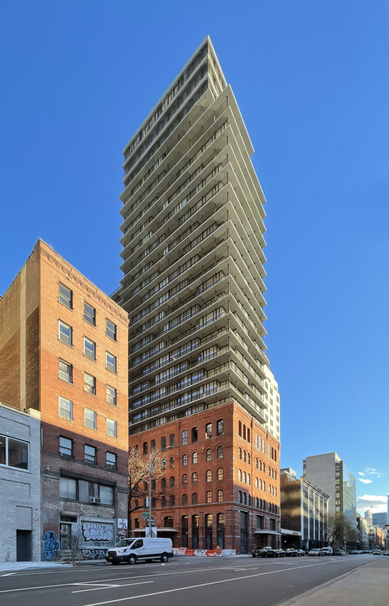
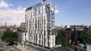
Work is finishing up on 100 Vandam Street, a 25-story residential building in Hudson Square, Manhattan. Designed by COOKFOX and developed by Jeff Greene, the project involved the repurposing of a 134-year-old former power plant into the podium for a 300-foot-tall structure, and will yield 72 residential units and ground-floor retail space. Jili Properties is the property manager and Douglas Elliman Development Marketing is handling sales and marketing of the one- to four-bedroom homes within the tower, which is located at the corner of Greenwich and Vandam Streets.
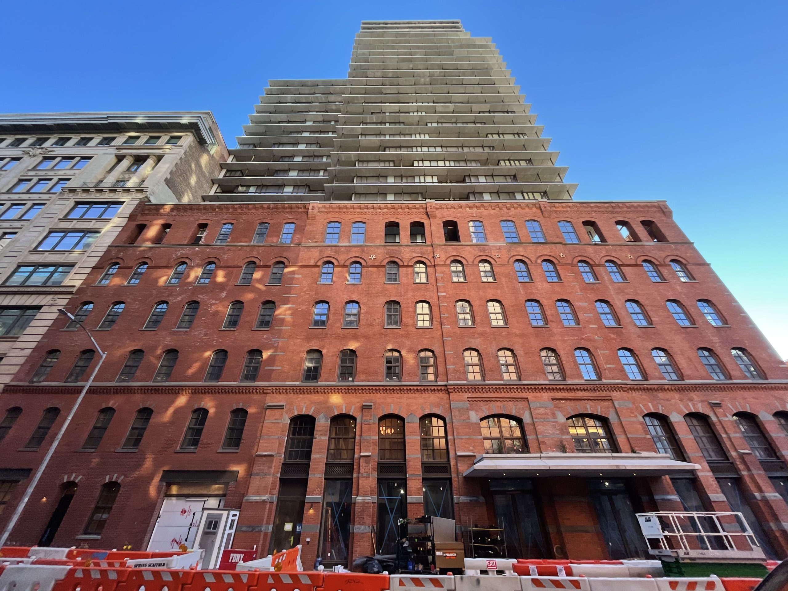
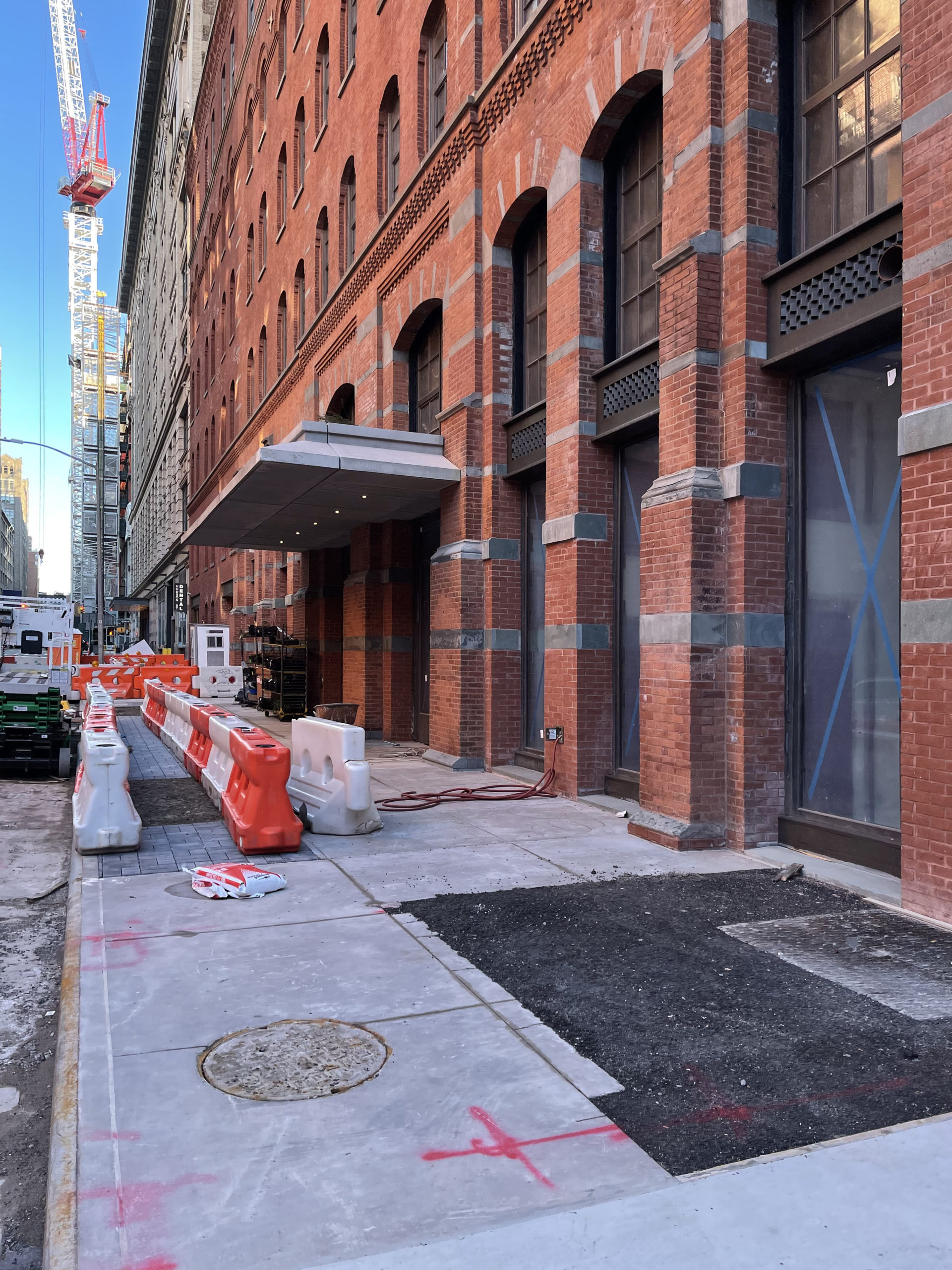
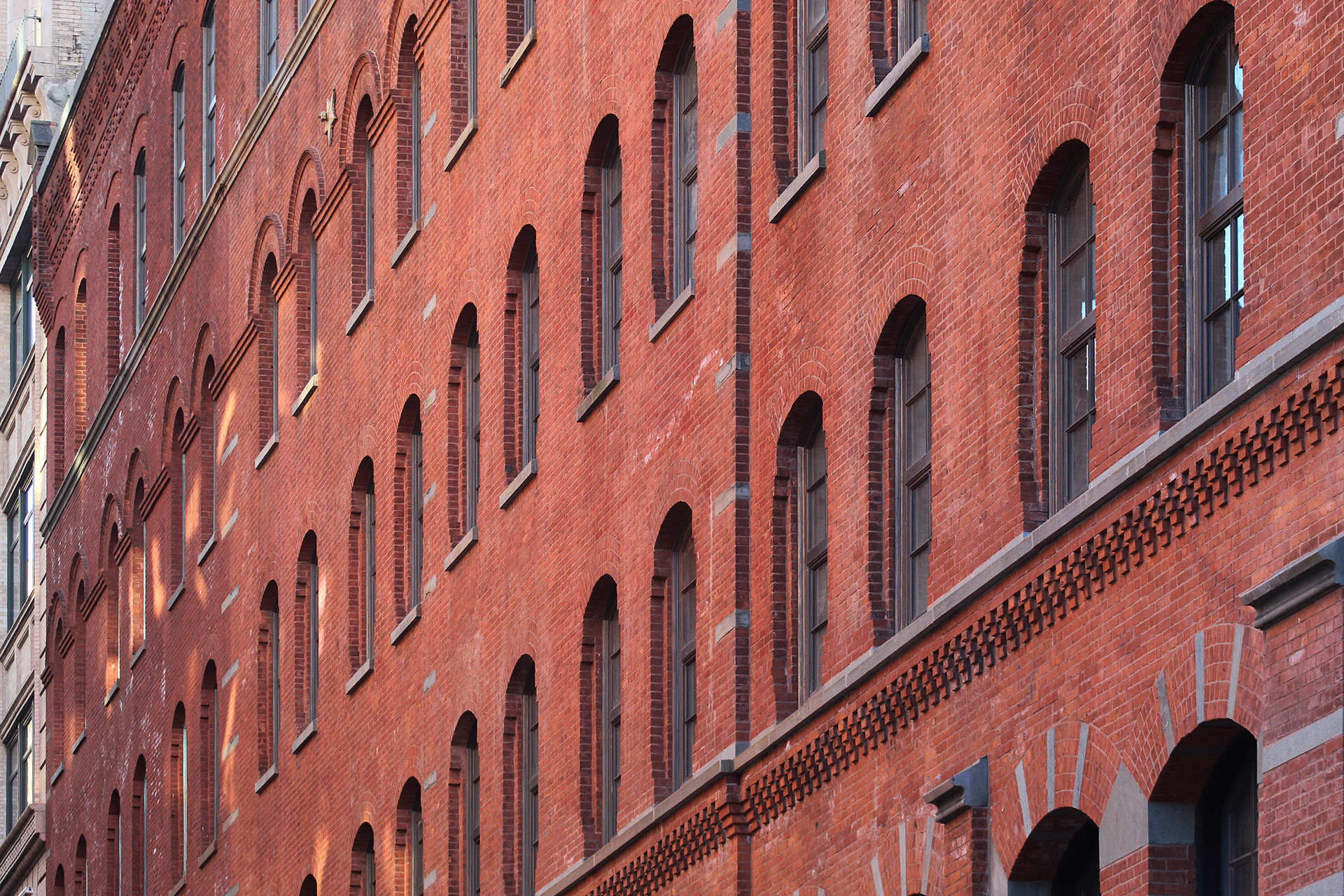
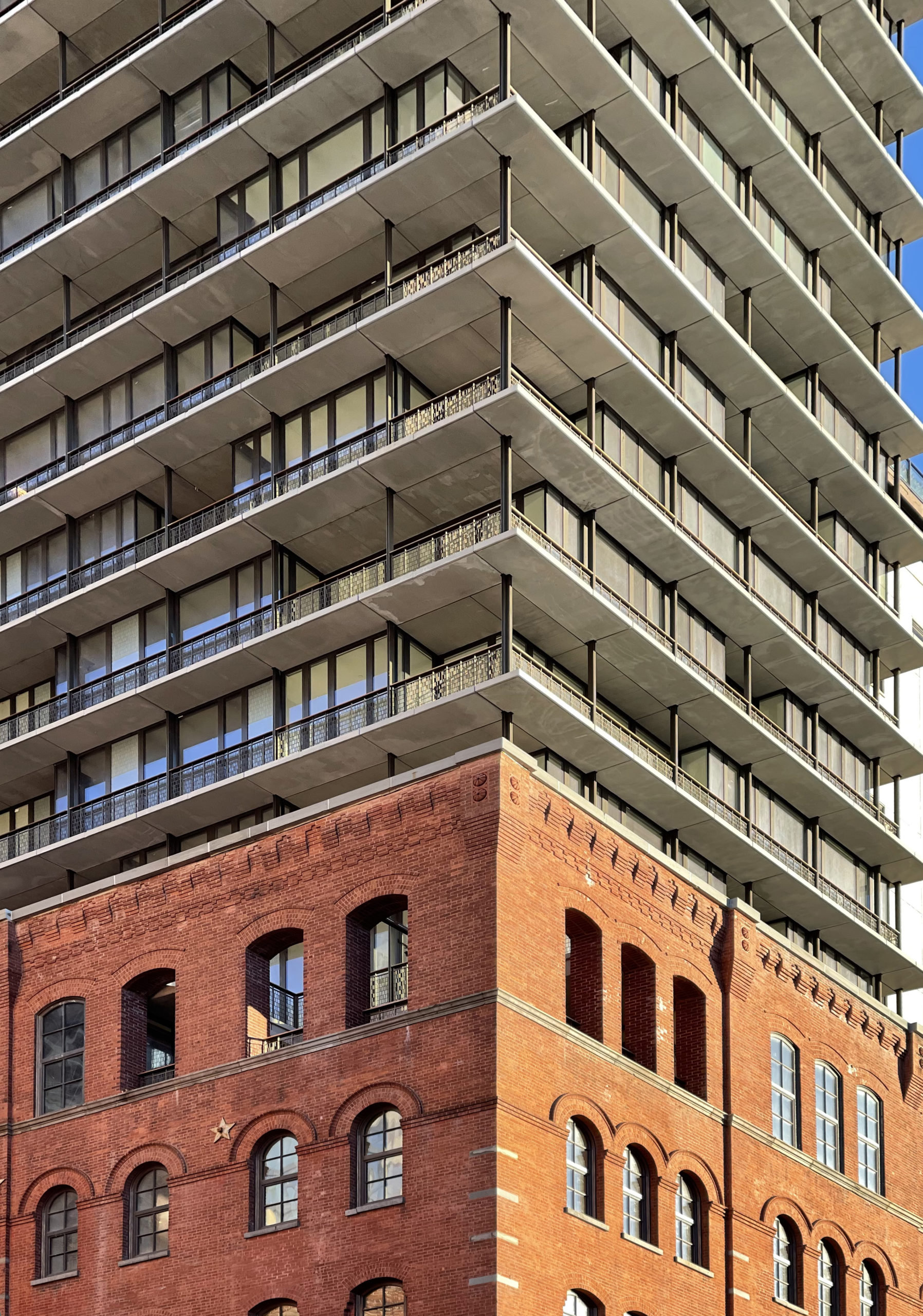
Since our last update in March 2021, window installation has concluded on the five-story brick podium and the tall scaffolding that surrounded the ground floor has been dismantled.
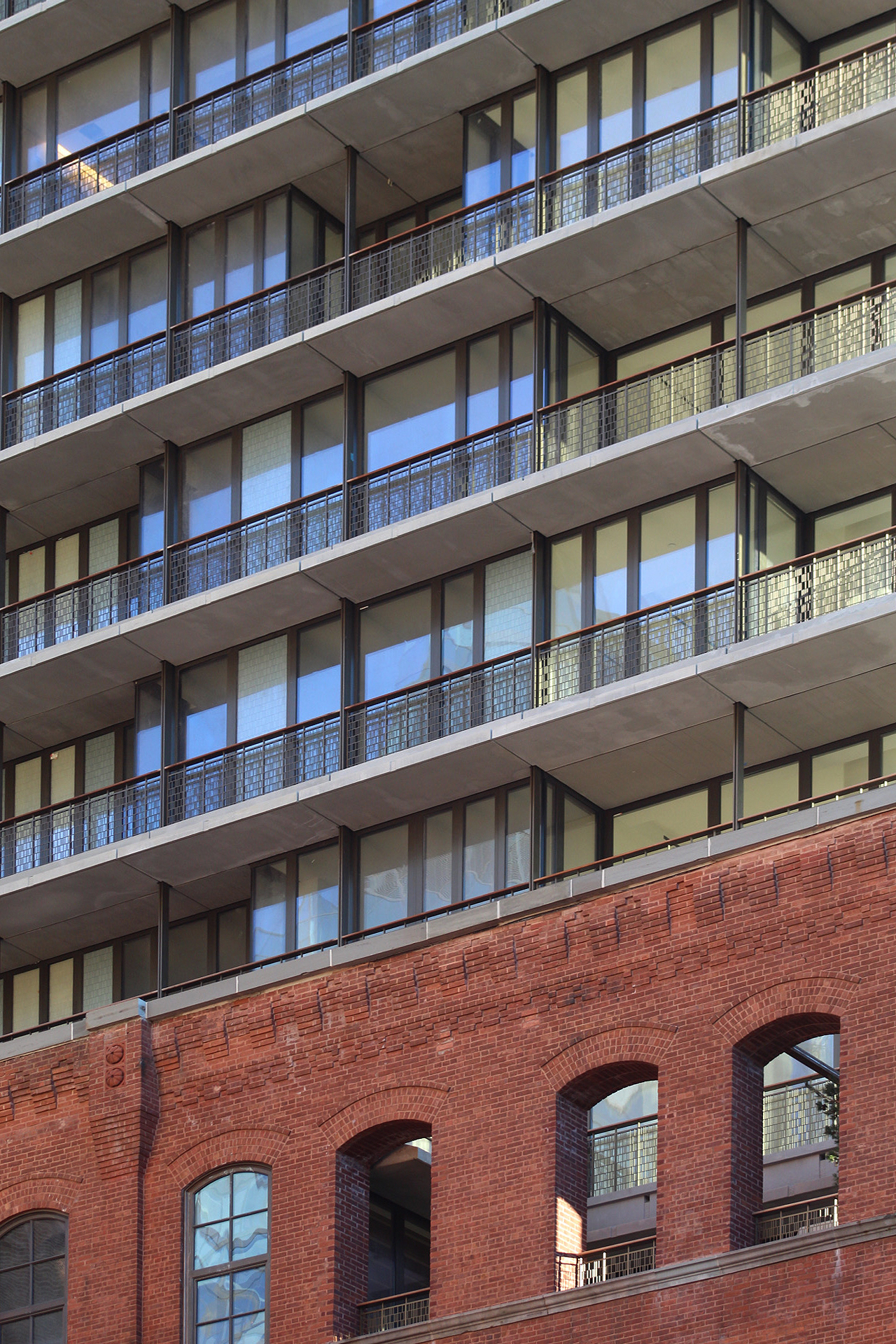
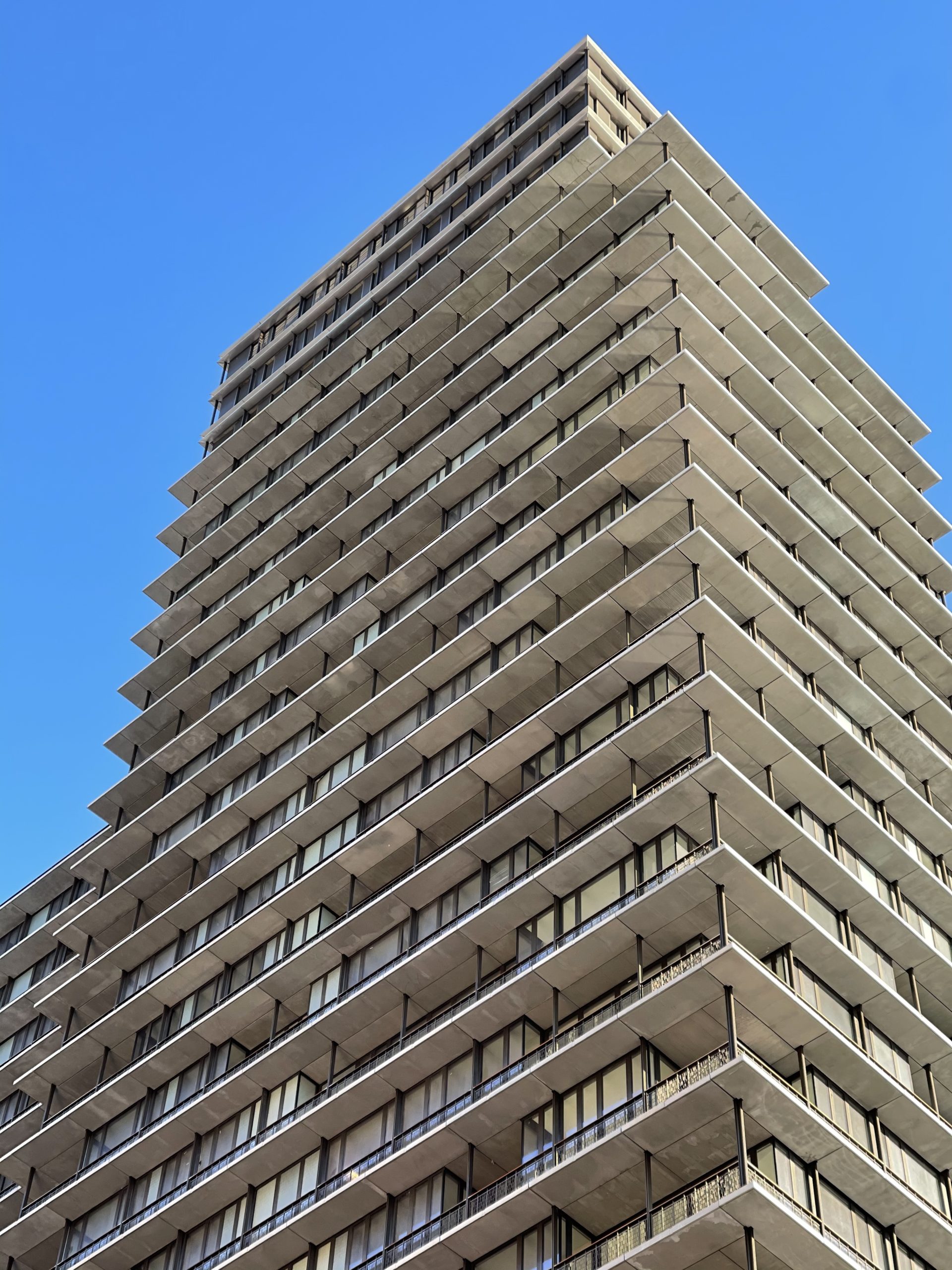
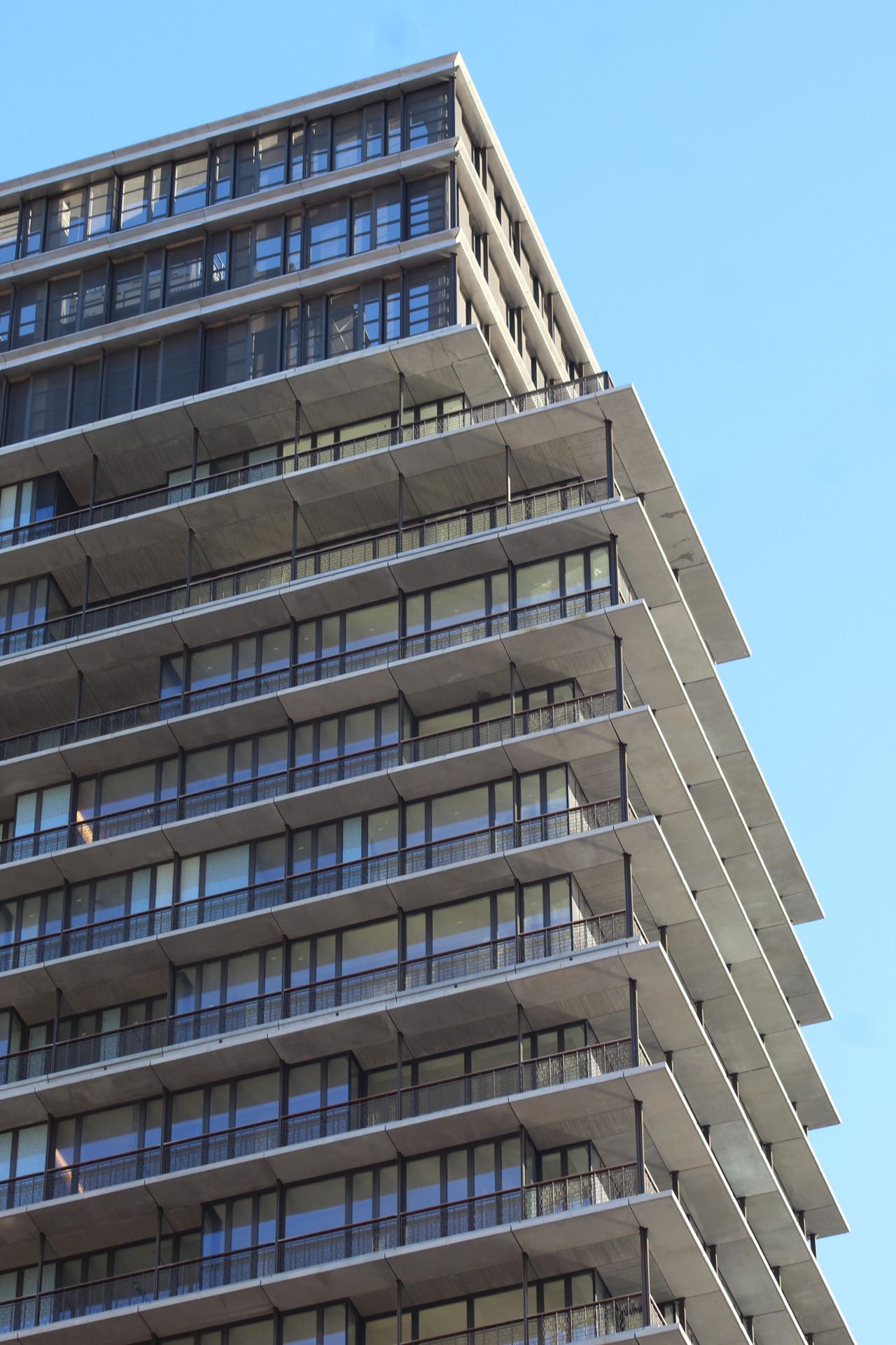
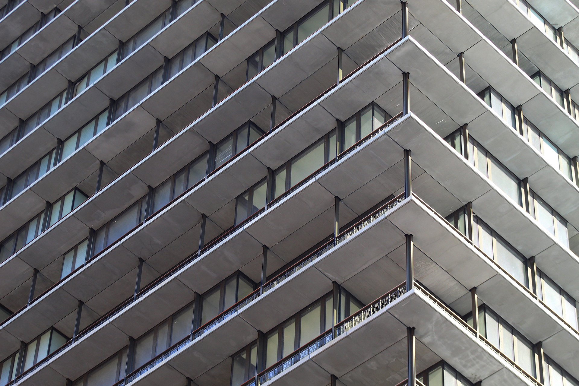
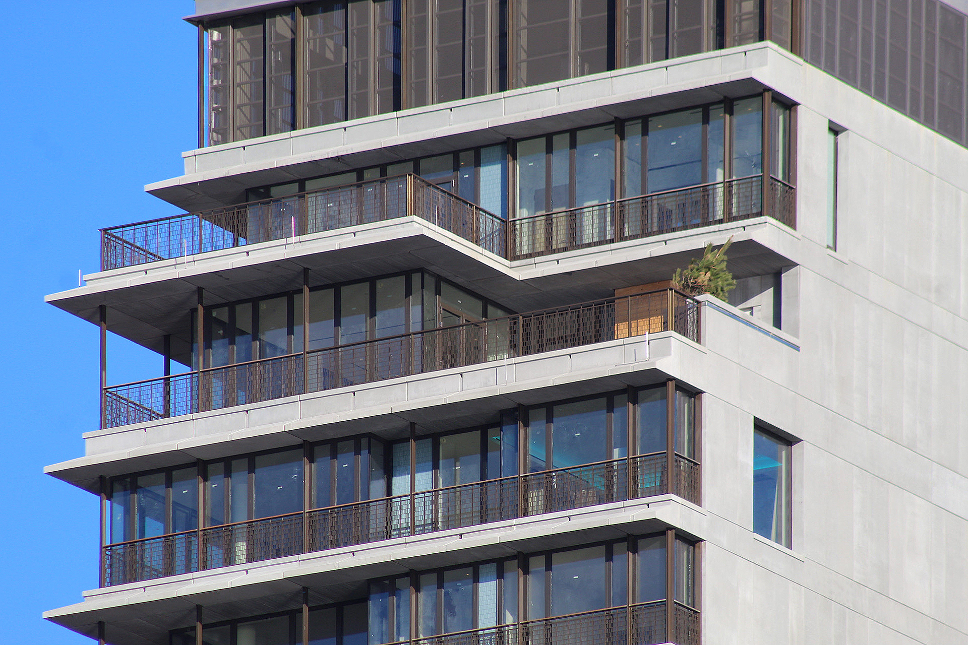
Canopies have been installed over the pair of entrances as finishing touches proceed on the retail frontage. The main tower is externally finished and will soon see newly planted shrubs and landscaping for its numerous loggia gardens, which are designed by Terrain-NYC, around the edges of each floor behind detailed railings. 100 Vandam Street can easily be seen from Hudson River Park, and is capped with a mechanical bulkhead that is enclosed with dark mesh screens.
100 Vandam Street will feature 177,000 square feet of residential space, for a scope of more than 2,500 square feet per residence. The commercial space measures 2,500 square feet. Amenities include a 1,220-square-foot fitness center with yoga and training studios, a 1,600-square-foot screening room, a media room, residential lounge, children’s playroom, bicycle room, cold storage, in-house washers and dryers, a live-in super, package room, parking and storage available for purchase, and a double-height lobby with concierge service.
Subscribe to YIMBY’s daily e-mail
Follow YIMBYgram for real-time photo updates
Like YIMBY on Facebook
Follow YIMBY’s Twitter for the latest in YIMBYnews








Open space in a private building for residential, and a substance used for building. That is made by mixing brick and glass, clearly based on beautiful structure; I don’t need to guess: Thanks to Michael Young.
After almost a year, I still really don’t like this expansion. I especially dislike those terraces that make the building look so depressing. The railings look almost third world to me. It’s such a pity since the old brick building is very nice, to be honest. I don’t know what to think of COOKFOX anymore. They can make very fine designs, such as the Bank of America Tower, but then they can make mediocre things like this that are almost on par with Gene Kaufman.
Whatever you think of the new tower above, this project is proof that historic buildings do not need to be destroyed while still allowing new development growth in the City. We need to stop destroying what makes NYC special and just have smarter building regulations.
Well said!
you are so right !!!!
Stop destroying old buildings and readapt them into the new building.
No more out of context Glass cubes forever
Yes
They did a nice job.
My first impression is that the new so vertical structure looks like a prison block. How jarring is this – such a hard building to embrace!
It’ll be interesting to see with the plants installed.
A fine old red brick building seems to have grown a grey cancerous tumor above it. It will not age well.
The machine-like quality to this new expansion fits well into the neighborhood, with its industrial past. Even though it’s not “pretty”, I like it.
Great job restoring the base too.
Some strickinly new structures now dot the Lower Manhattan landscape, sadly the terrace design of 100 Vandam is not one of them.
I love this so much.
Love this project. Excellent historical preservstion and a quality high-rise addition that actually has texture.
Miami Beach, welcome to Hudson Square.
Very 1950’s with the concrete and terraces, smaller multipaned windows, and metal railings. Looks Miami.
A singularly unlovely expansion. Those vertical “posts” between floors on the balconies resemble construction props that the contractor forgot to remove. I guess it was intended to evoke the industrial past but at the design phase, arguably it should have been a case of, you’re on the right track but let’s work on it some more.
The floor plans for this residential tower are some of the nicest of the crop of buildings coming to the market, albeit for a price (guys, you have to look at the insides of the buildings to make fully-formed comments)….but the exterior looks like the worst of 1960’s pancake buildings decorated with nicely detailed railings all seems like an idea gone wrong. More like the curving building on CPS at 7th Ave and not like the solidity of Tribeca warehouses.
I would say this is like a Miami condo sprouting out of an nice old industrial loft building… except those railings and all that brown framing makes me think more of Tel Aviv – and that’s not good. I like COOKFOX so I’m hoping this isn’t what they envisioned. I think if it had more minimal window framing (maybe in black steel) and some other kind of railing… I don’t like all-glass but that brown texture isn’t translating well.