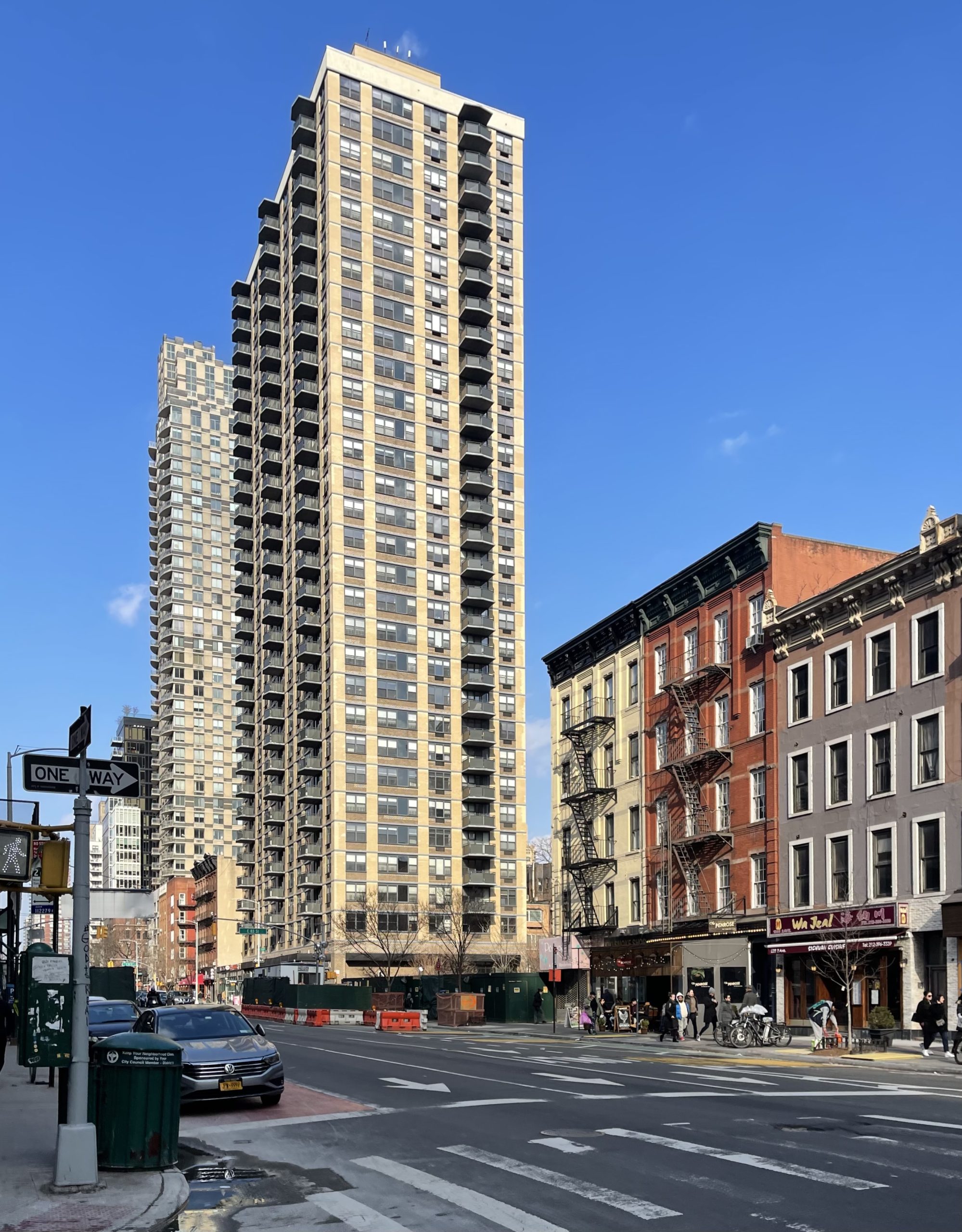
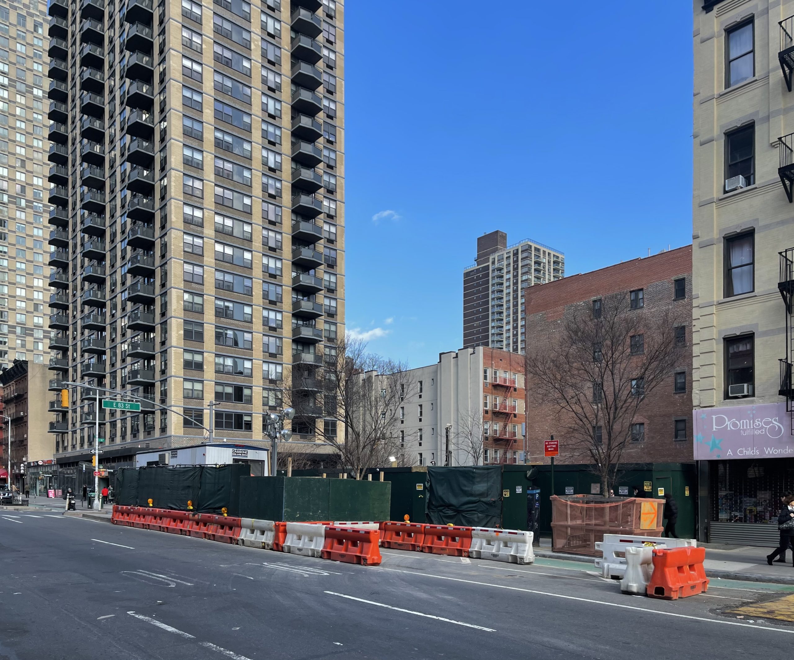
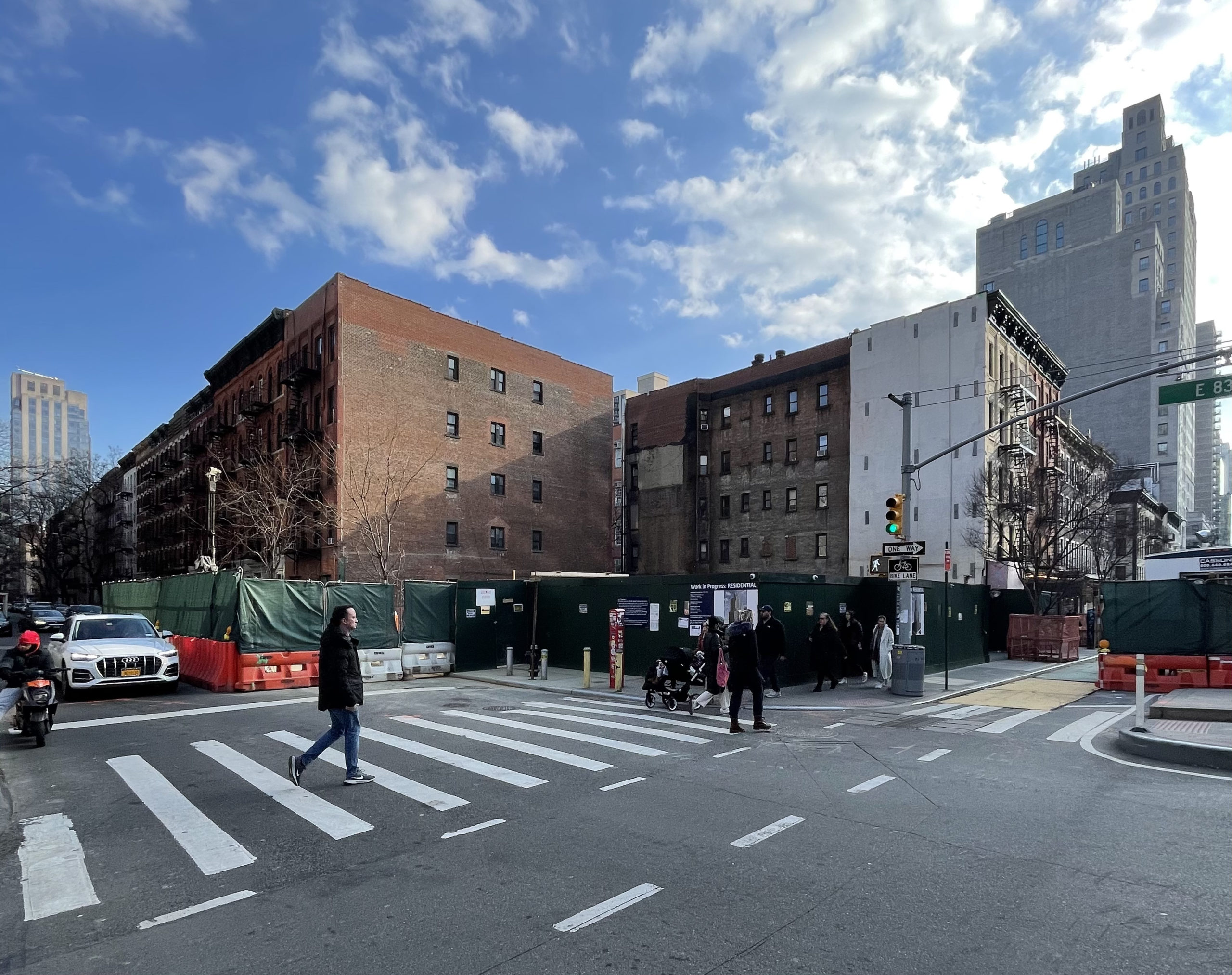
Foundation work is progressing at 300 East 83rd Street, the site of a 22-story residential building in the Yorkville section of the Upper East Side. Designed by SLCE Architects and developed by Lalezarian Group, the 235-foot-tall structure will span 84,266 square feet and yield 70 units, as well as cellar and ground-floor retail space. The homes will average 1,203 square feet, likely indicating condominiums. Hudson 37 LLC is the general contractor for the property, which is located at the corner of East 83rd Street and Second Avenue.
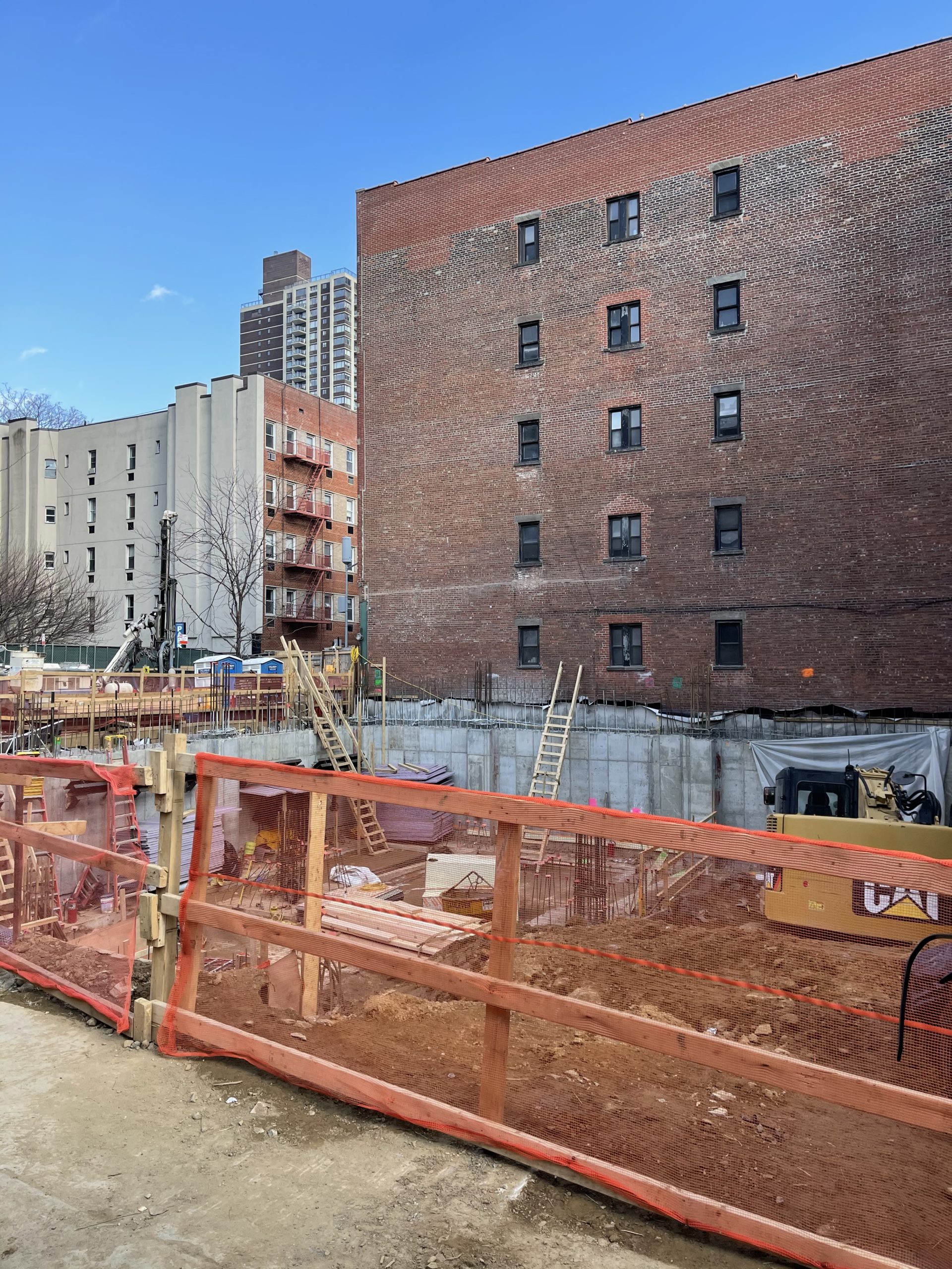
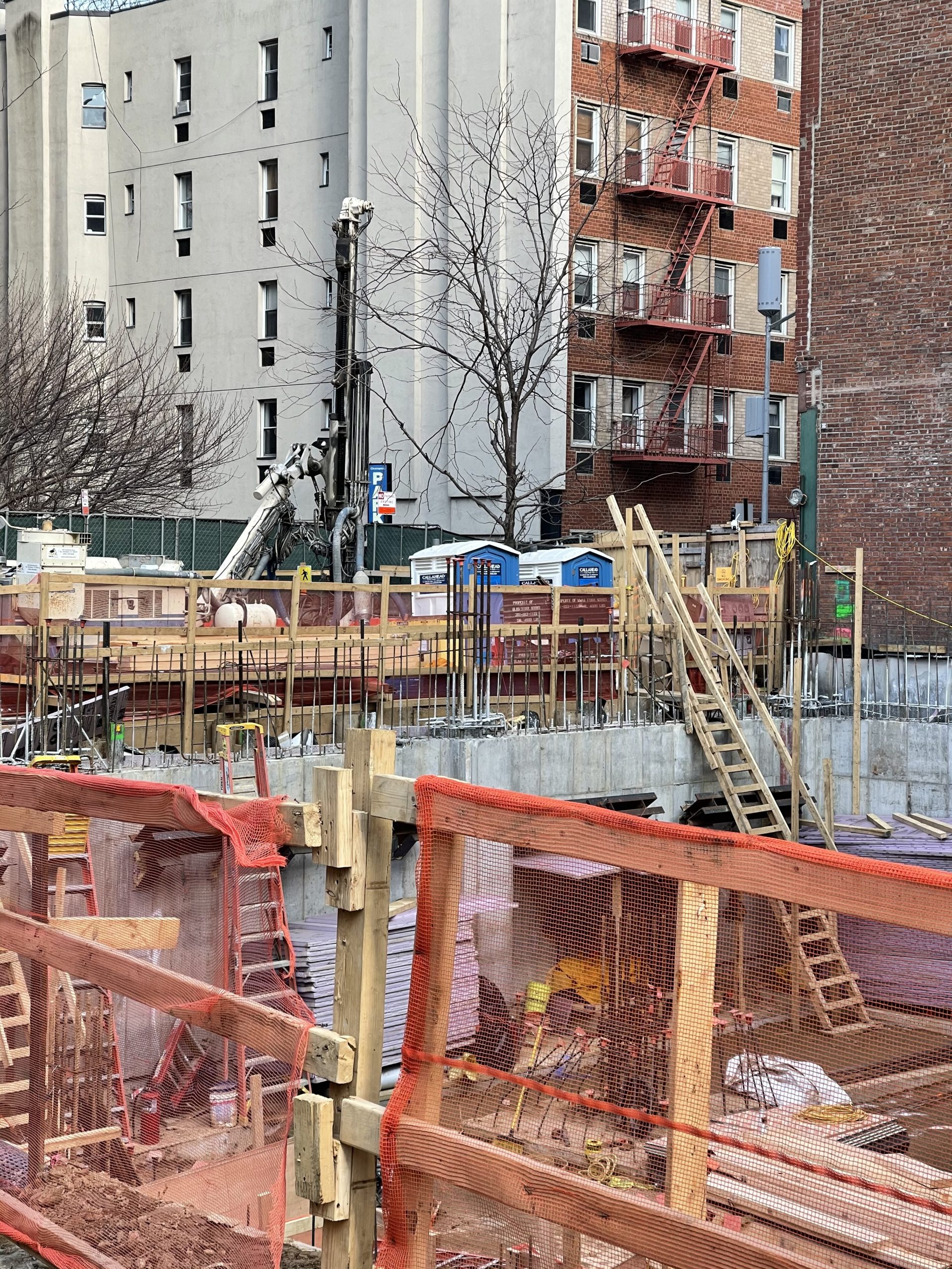
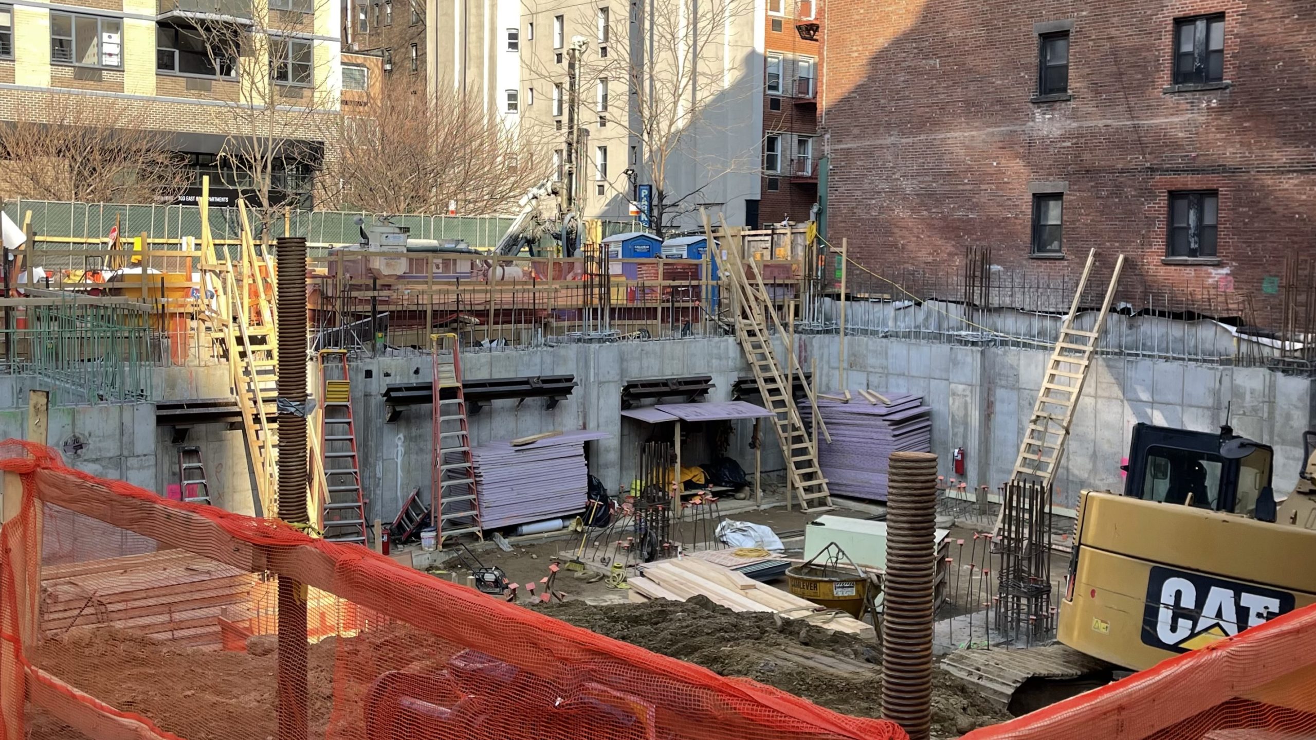
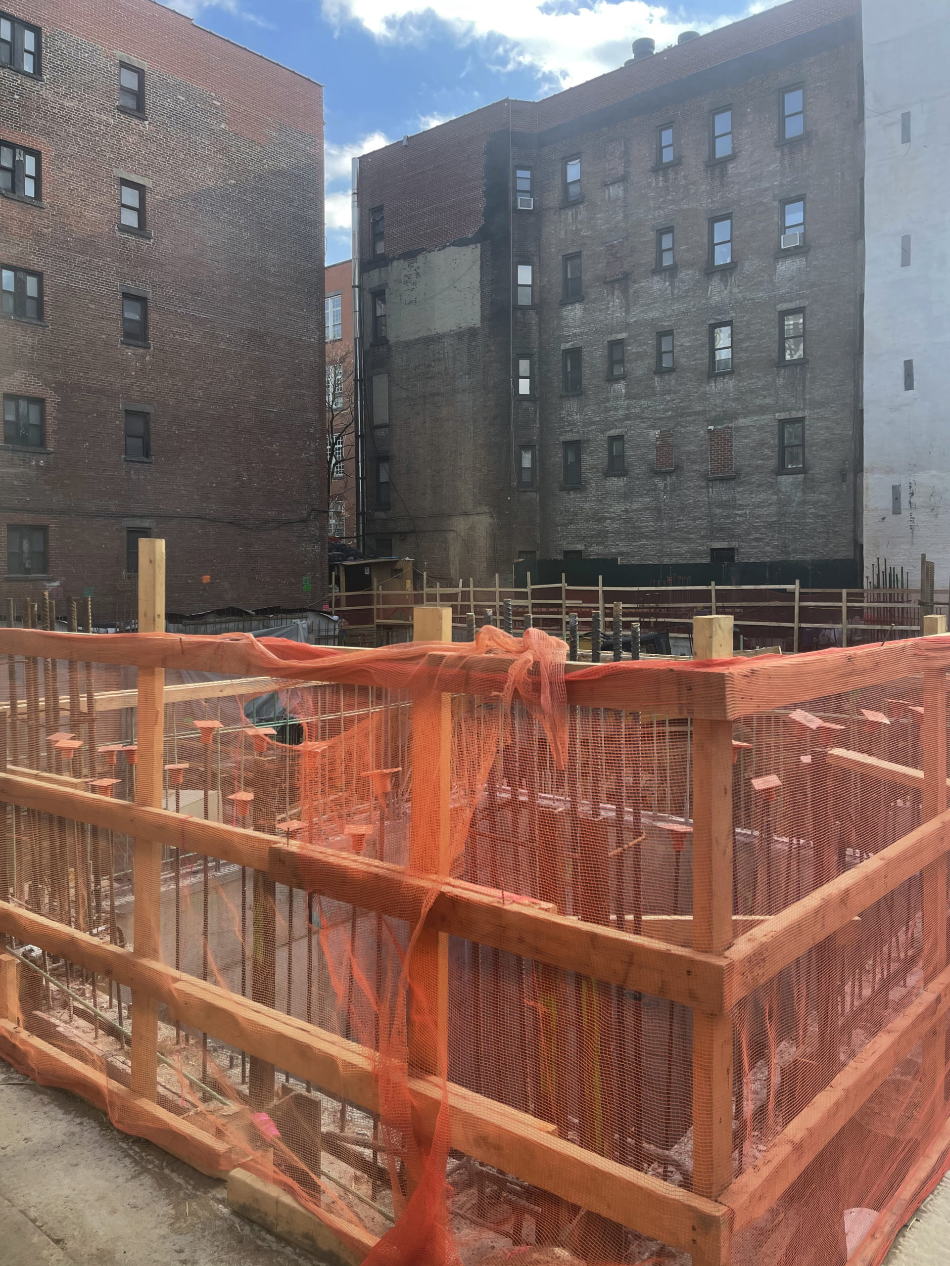
Excavation was just getting started at the time of our last update in November. Since then, crews have continued to unearth the site and have begun formation of the below-grade perimeter walls. Bundles of rebar protrude across the bottom of the plot at the locations of the forthcoming interior columns and walls, which will be formed over the coming weeks. Some excavation remains to be completed, with a dirt ramp around the southwestern corner currently aiding in the access to the lower levels of the property. Based on the pace of progress, below-grade work could wrap up by the middle of spring, followed by the ascent of the reinforced concrete superstructure.
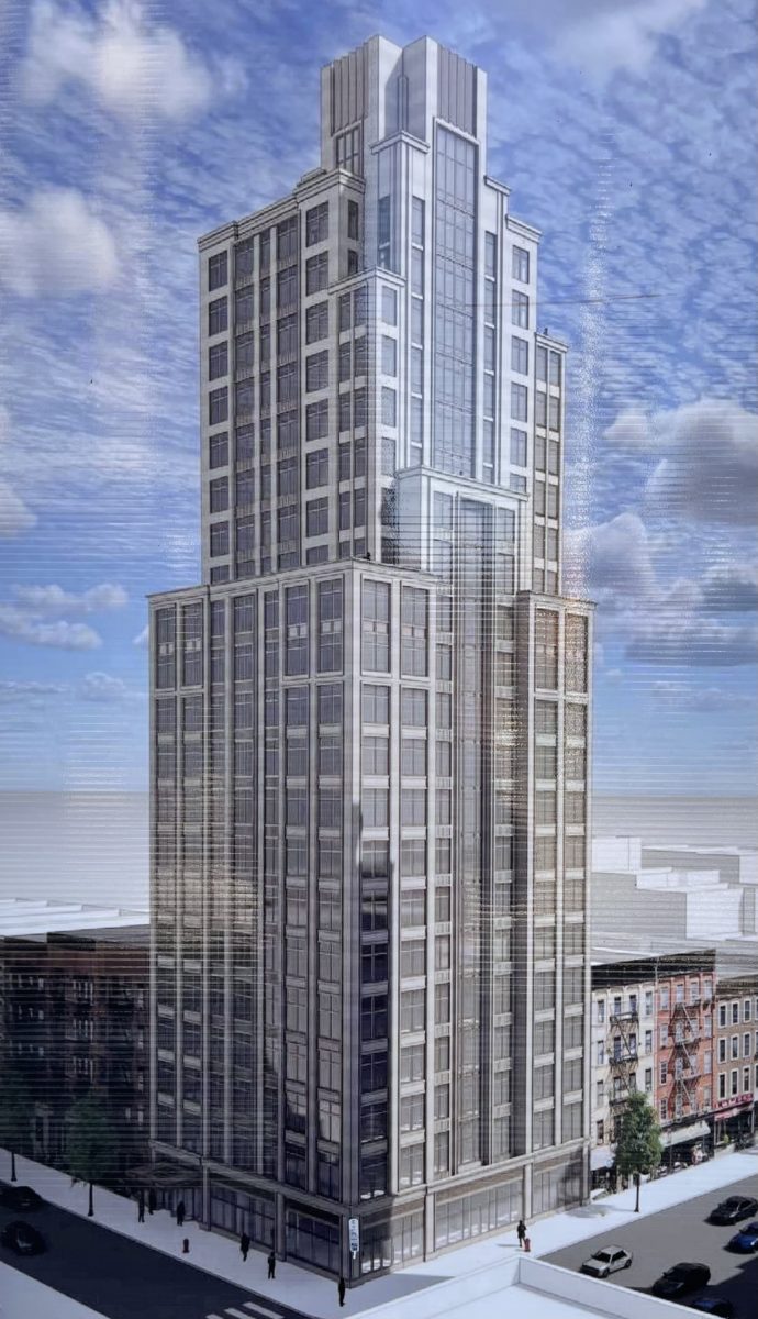
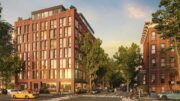
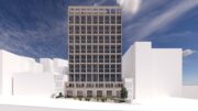
The main rendering shows the façade composed of light-colored stone paneling surrounding a tight grid of floor-to-ceiling windows with gray spandrels. The building massing incorporates several setbacks lined with cornices around the midpoint and upper levels of the superstructure. The tower culminates in a stepped multifaceted crown that appears to be clad in pleated paneling. The residential entrance will be located along East 83rd Street and the retail frontage will line Third Avenue.
The property is located directly across from the southern entrance to the 86th Street subway station, serviced by the Q train. Also nearby are the 4, 5, and 6 trains at the 86th Street station to the west.
300 East 83rd Street is anticipated to be finished late next year.
Subscribe to YIMBY’s daily e-mail
![]()
Follow YIMBYgram for real-time photo updates
Like YIMBY on Facebook
Follow YIMBY’s Twitter for the latest in YIMBYnews

Another generic UES building.
Mehh. The quality of the materials will make or break this one.
yeah generic but could be worse. My biggest problem with these new boxes is the street retail presence. Shops should have awnings or something textual, it all seems just too many hard surfaces and right angles.
The base is also way too scrunched in many cases instead of a taller or even two-story commercial space that looked more like pre-war buildings. Though I know that those decisions are often made for economic reasons.
I agree, the base has that Chase Manhattan Bank branch vibe, unless that is the future tenant?! 🤔
If they use some nice materials this design will be less bland.
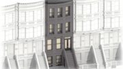
Go to street view. It’s a sin what they tore down for this latest greed box.
Yeah the trio on the corner were exceptionally nice and well preserved. In a vacuum of course we’d want them saved but eveybody should have known that the coming of the SAS would nearly guarantee prime corner within a couple blocks of a station giving way to tall towers. And this lot is literally on top of the station. Look at it this way, had there been no Depression, no WWII, no postwar auto/suburban age – the city would have gotten the SAS built and these would have been demolished 80 years ago and replaced with exactly the density we’re seeing here.
more of nyc history and it’s century old buildings demolished for another high rise .
Another NYC neighborhood destroyed and longtime tenants lose their homes, along with the small businesses and jobs that existed
SO SAD
A dreary tower. A drearier base, with no style, scale or “texture” as someone stated above.
Maybe that’s what happens the further east you travel from Central Park…..less expectation, less delivery. Alas. Maybe as dreary as W96th and Broadway, SW corner.
Love the comments… One day it’s, “oh no another glass box”. Then along comes a classy looking tower with a stone colored curtain wall and plenty of set backs and it’s, “oh how drab”.
So much NIMBY hypocracy on this site.
Looks like a very nice tower that isn’t boxy, isn’t all glass and will help provide more housing in the UES. Big win and I’m excited to see this rise
Bad faith argument.
NIMBYs don’t want development or have completely unmoored ideas about the right of someone to develop something that is allowed by local laws or zoning.
YIMBYs like 99% of development as long as it’s not in awful taste or unworthy of the real or perceived greatness of their locale. The kind of YIMBYs hanging oit on a site like this have strong opinions about what is good, better and best, and because of the high aesthetic standards that most of them hold, will call out and criticize a design that disappoints. YIMBYs serve an important function in elevating the standards of development. Most NIMBYs wouldn’t have a clue what is good or bad design, or at least would be easily duped that one is the other.
I just saw this process I feel that the construction work has begun to develop, composed of many parts that are joined together. Light-colored stone paneling made the building look spacious. So looking straight at this is heavier, and thicker than a tight grid of floor-to-ceiling windows. Beautiful shape on clad in pleated paneling: Thanks to Michael Young.
The facade of the previous structure might have been impressive, but it was still a 5-story walk-up tenement. These tend to be obsolete.