Work is nearing completion on the renovation of the Tiffany & Co. flagship store, a ten-story commercial building at 727 Fifth Avenue in Midtown, Manhattan. Designed by OMA partners Shohei Shigematsu and Jake Forster with interiors by Peter Marino Architects, the project involved the construction of a new three-story volume above the parapet of the 83-year-old structure, as well as 8,400 square feet of interior renovations. CallisonRTKL is the architect of record, WSP is the structural and MEP engineer, Mace is the owners rep, and Structure Tone is the general contractor for the project, which is located at the corner of Fifth Avenue and 57th Street along Billionaires’ Row.
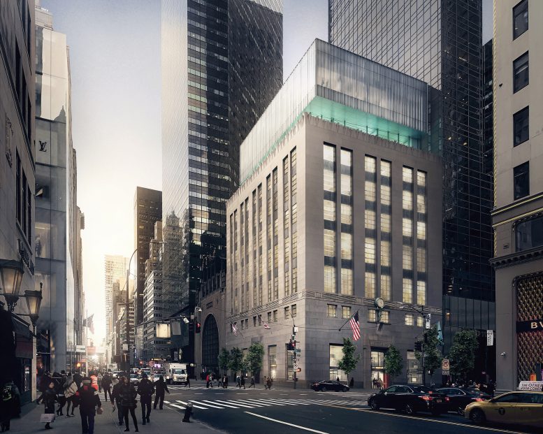
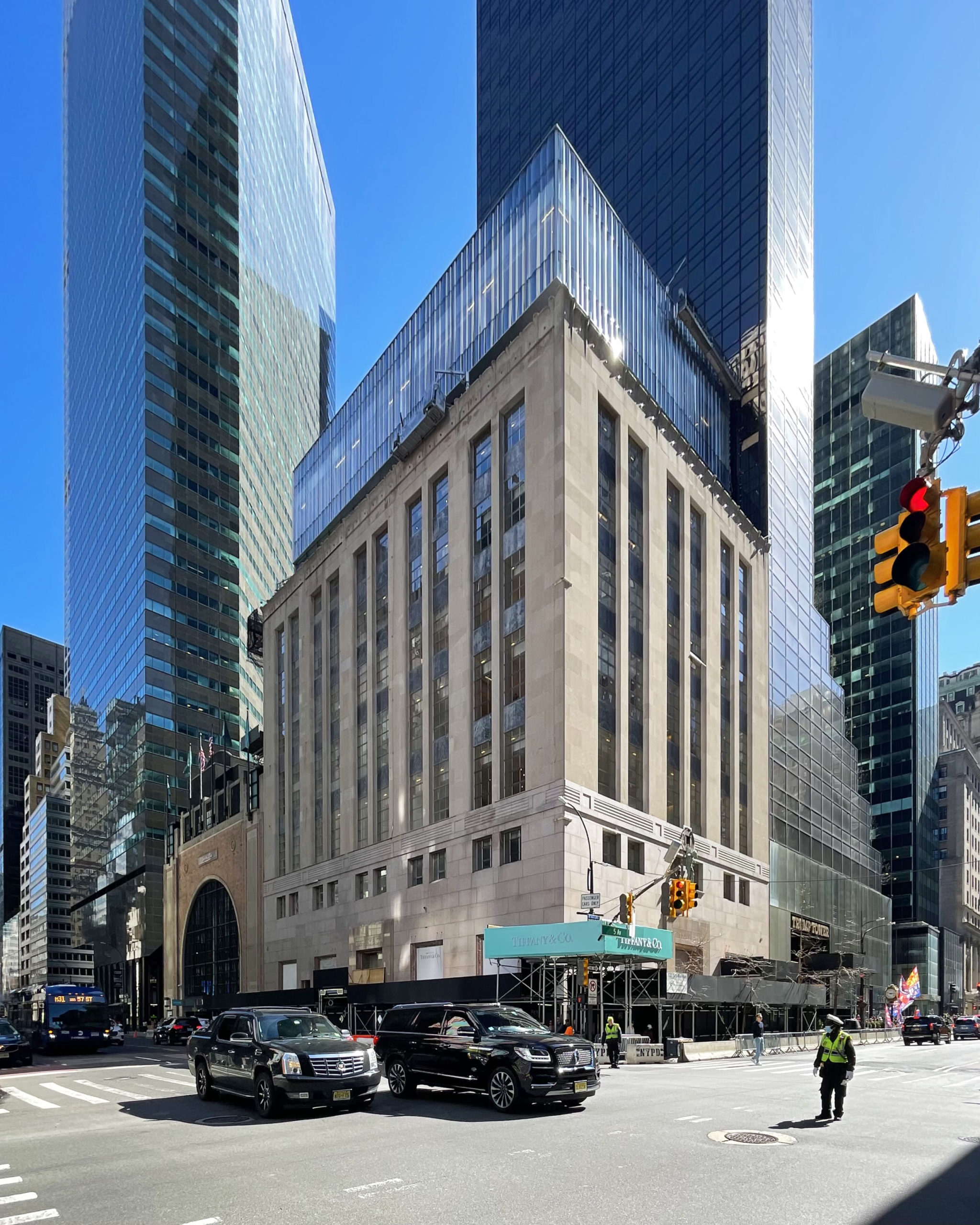
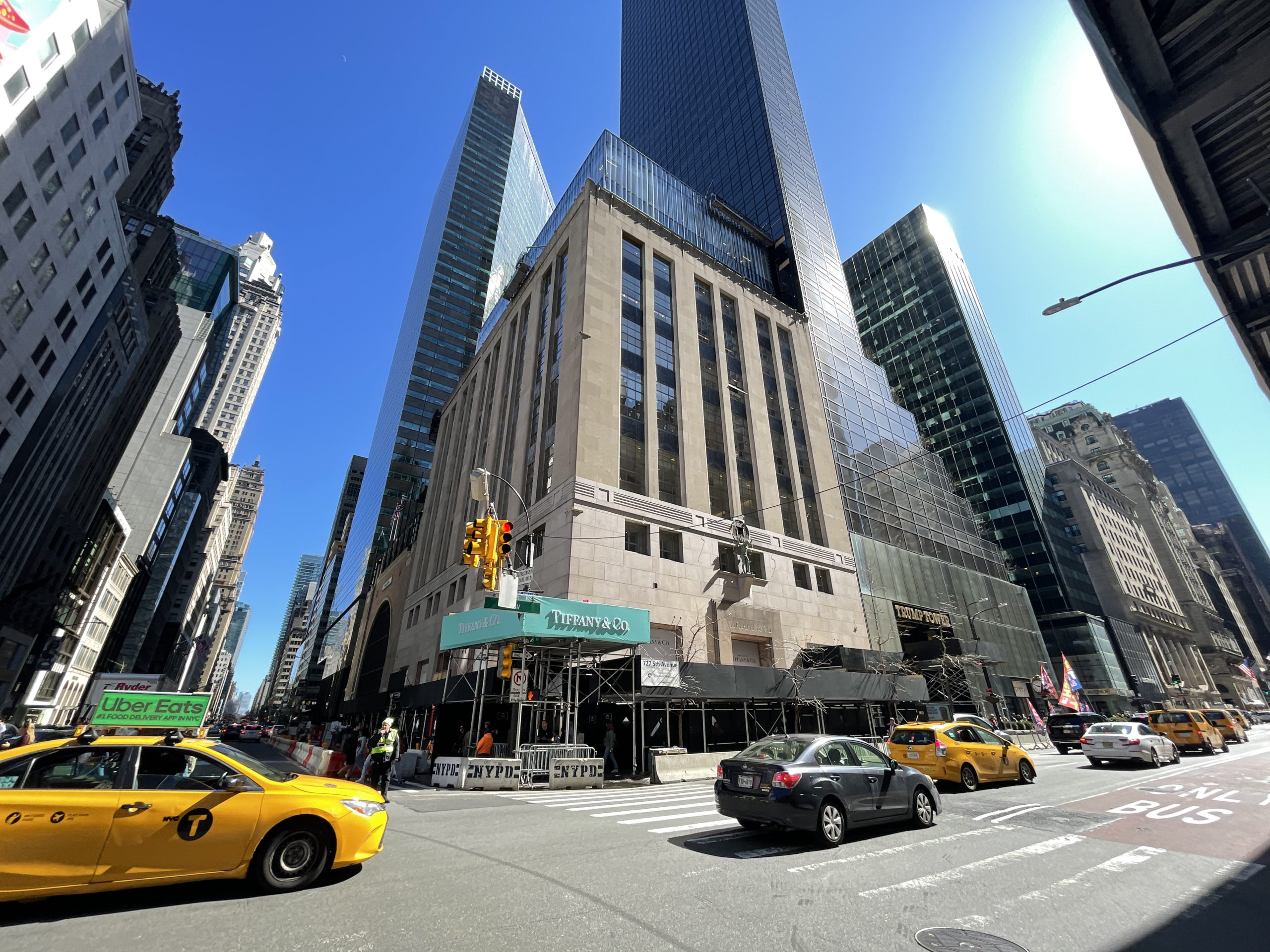
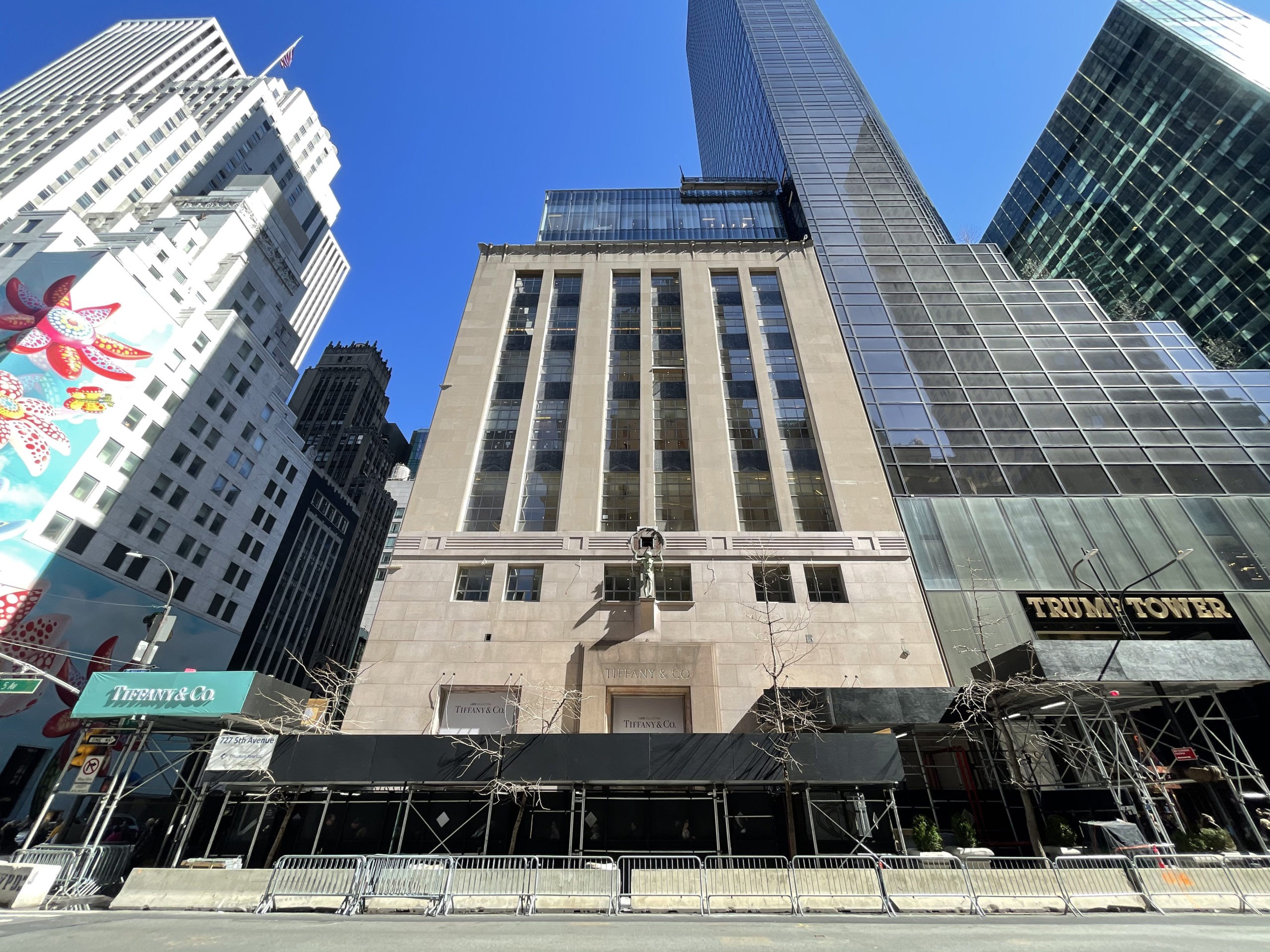
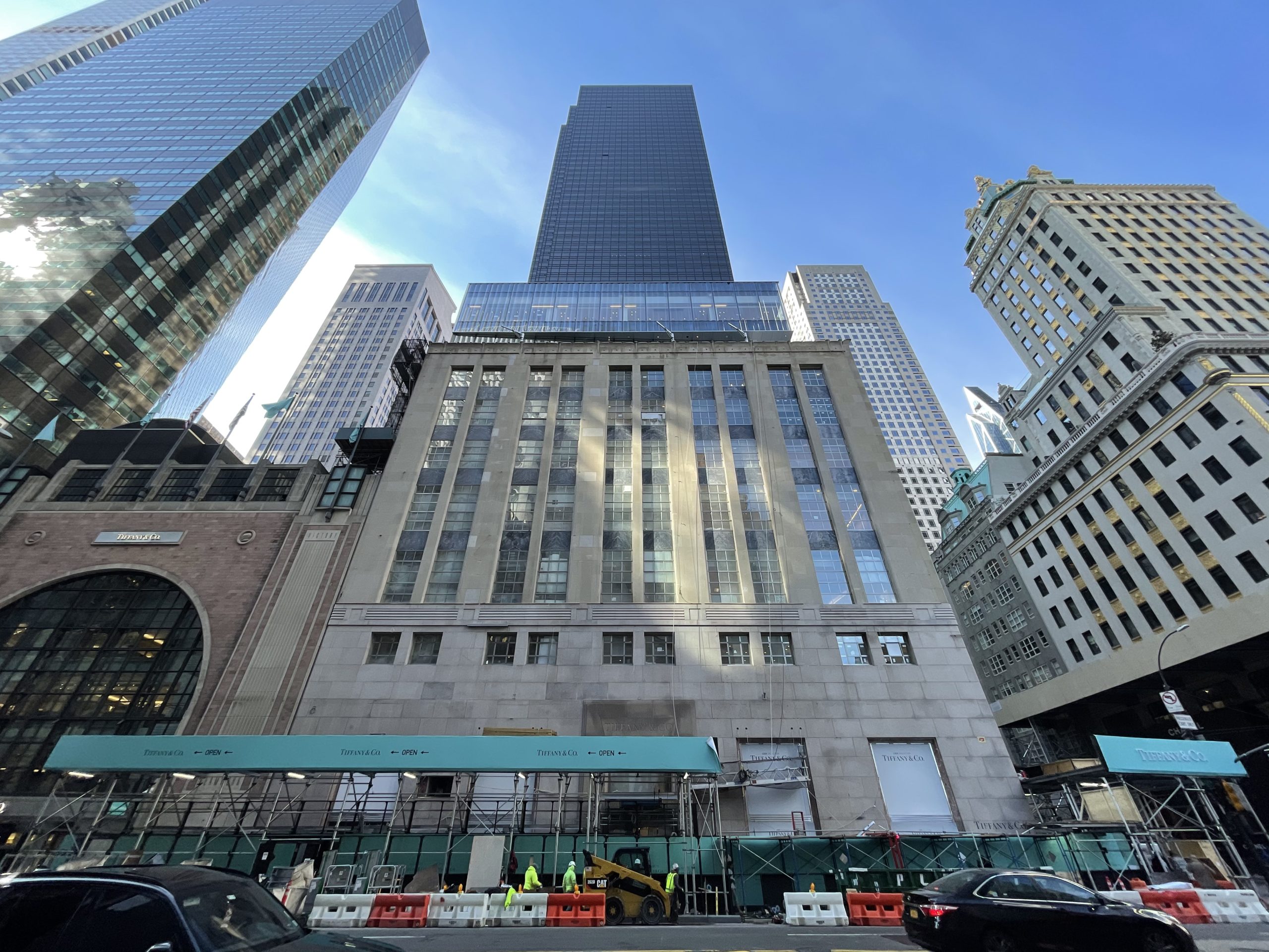
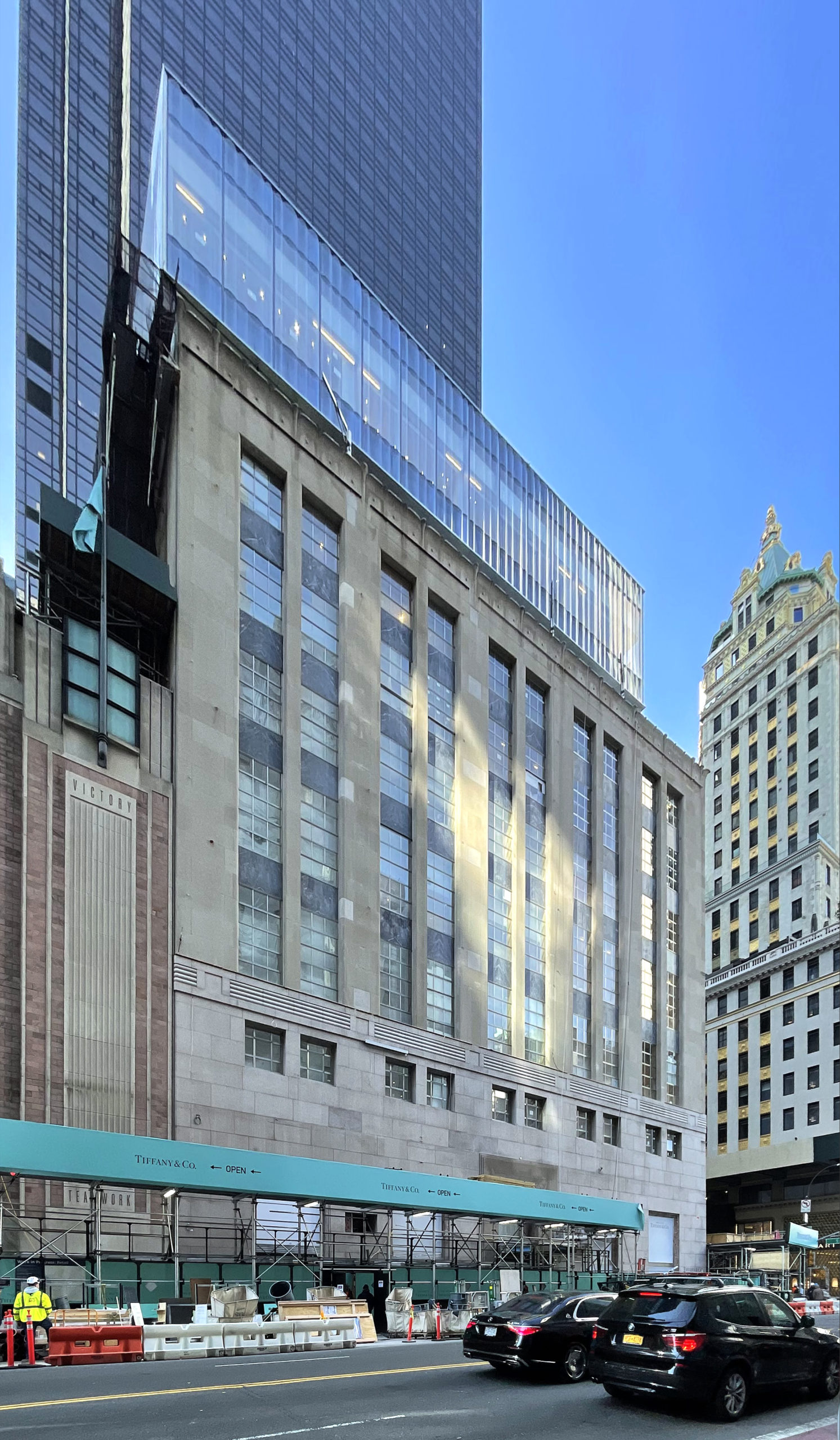
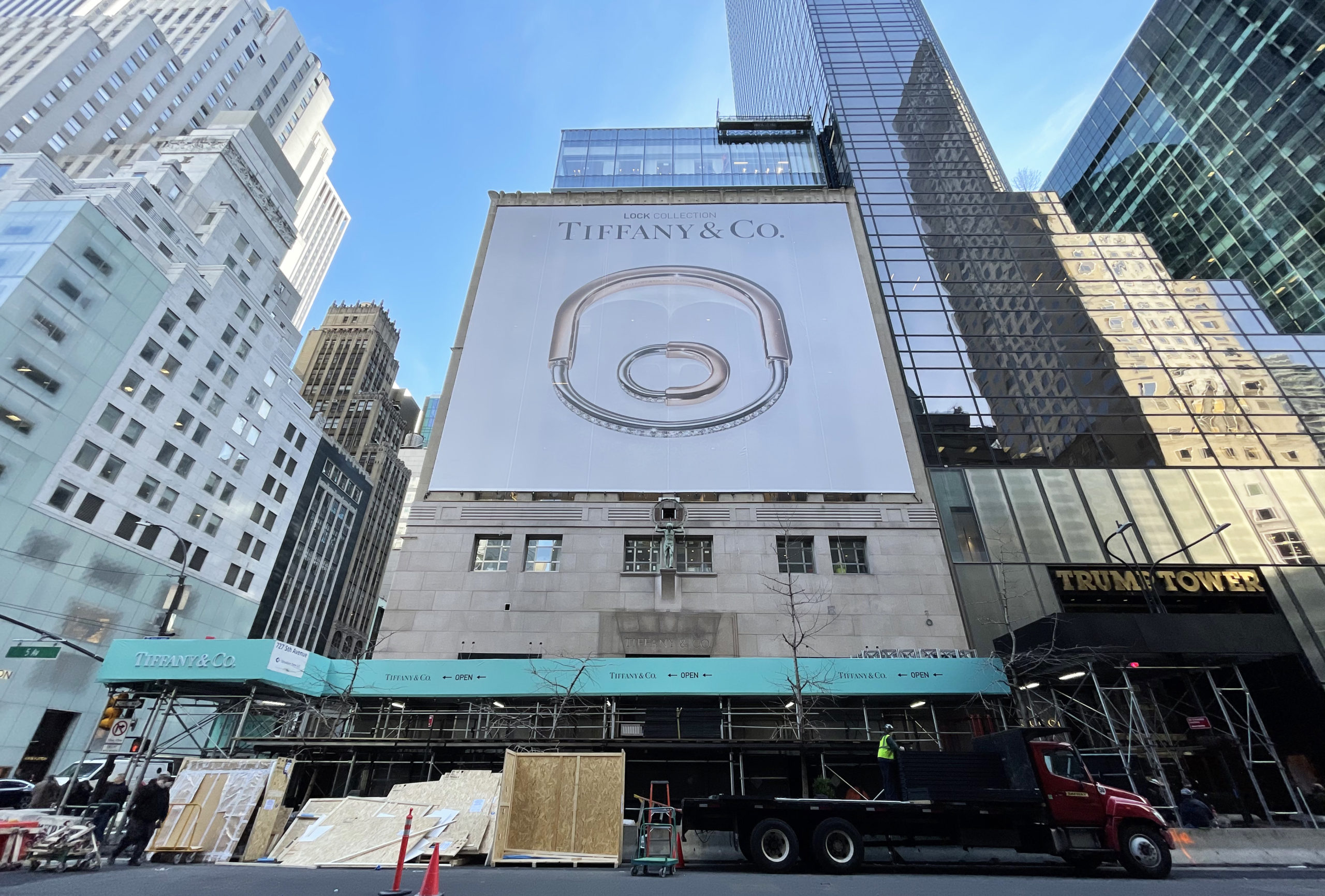
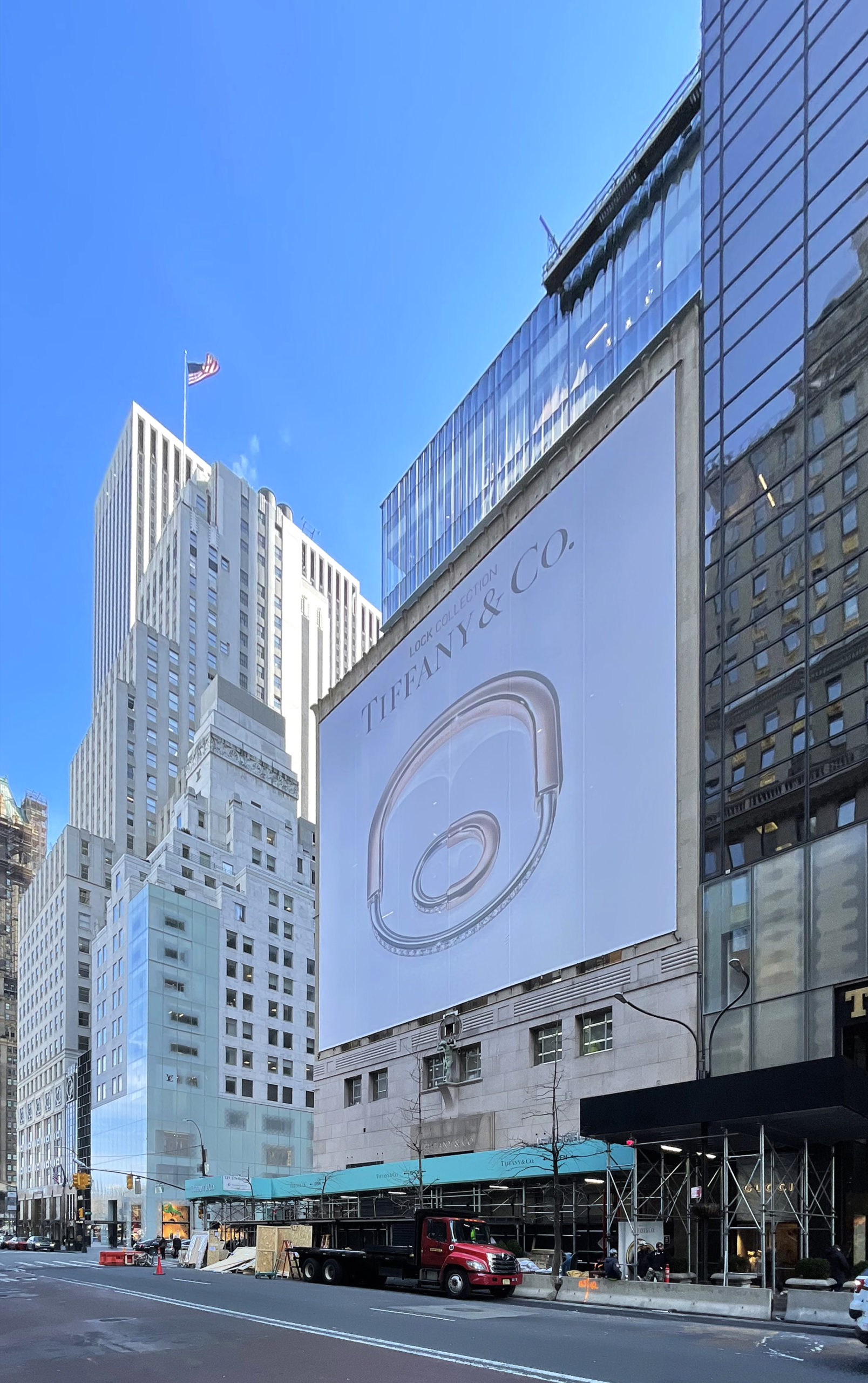
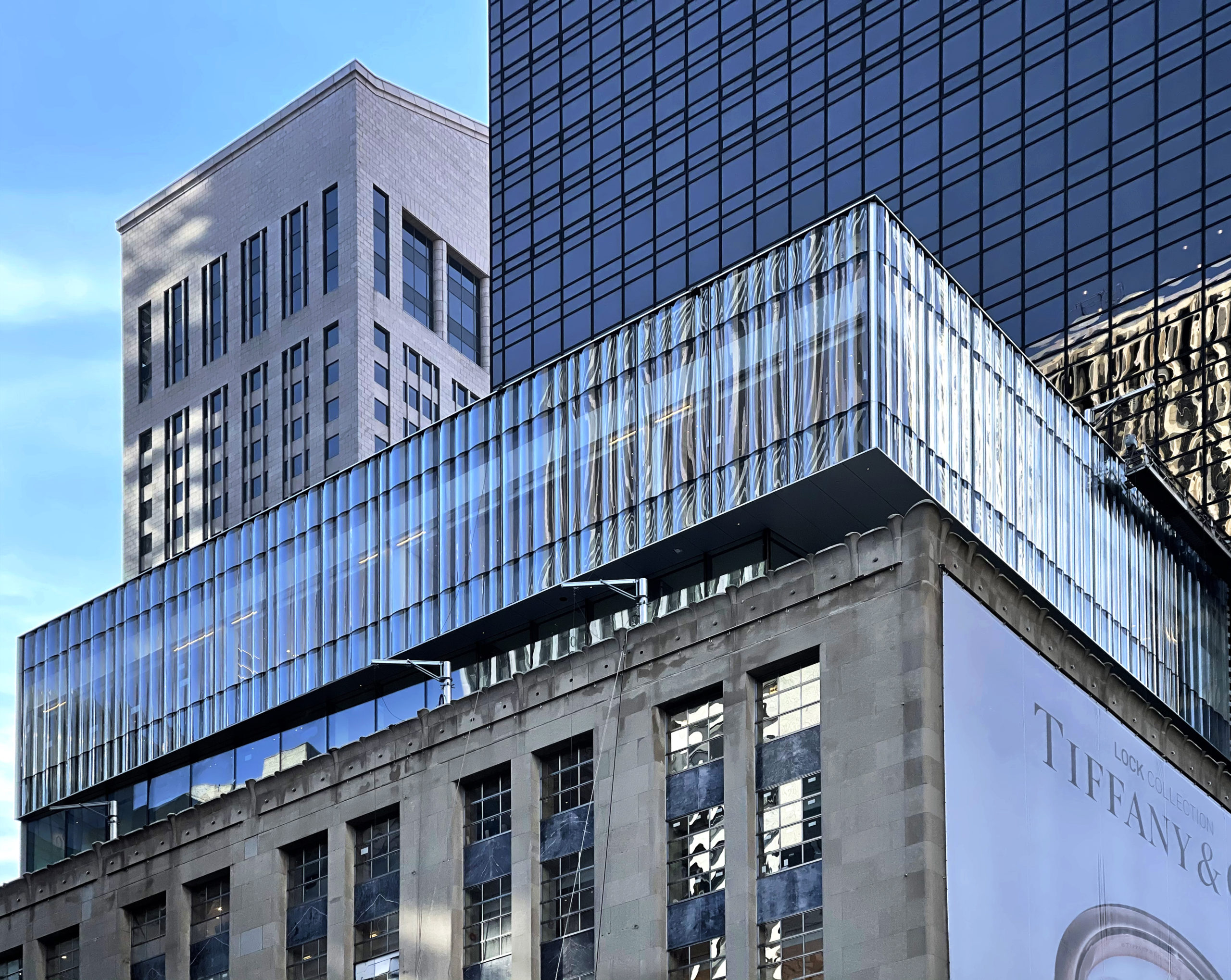
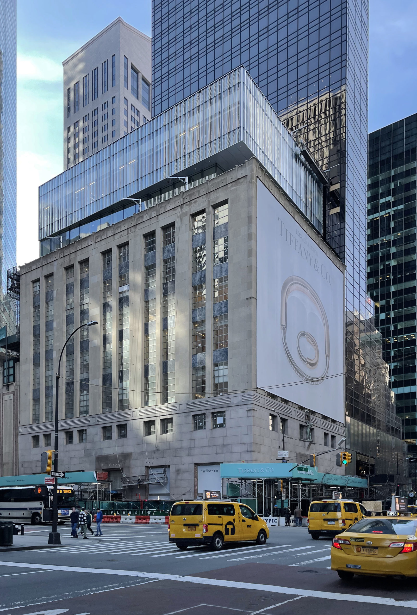
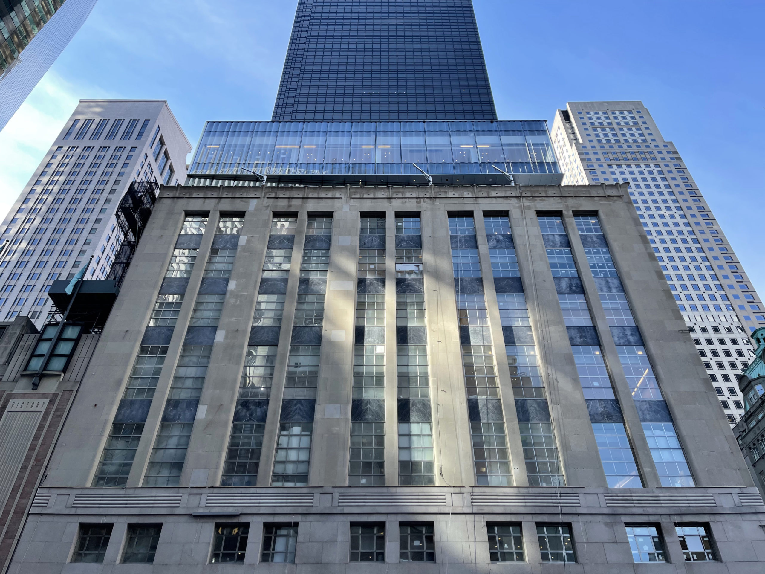
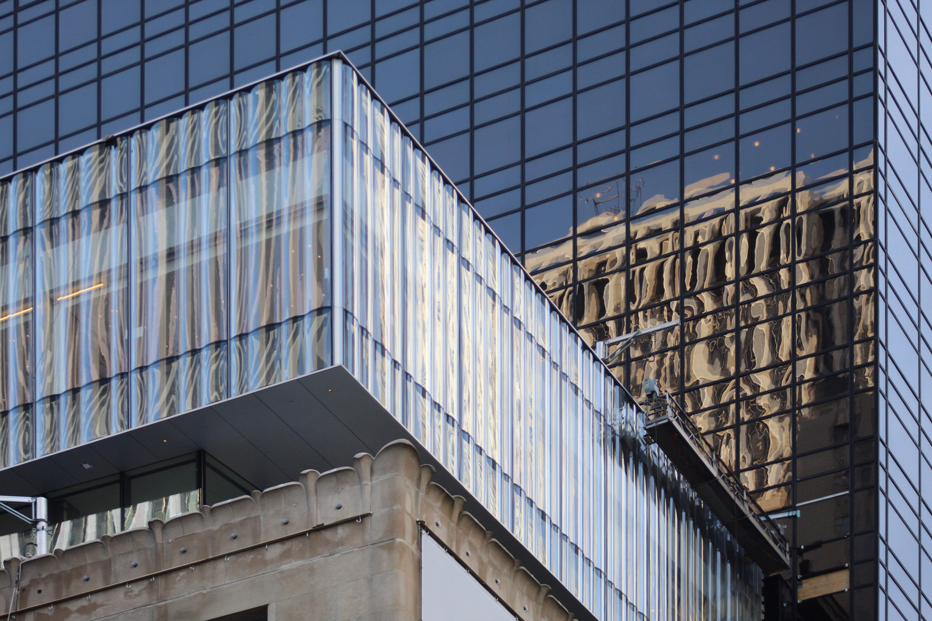
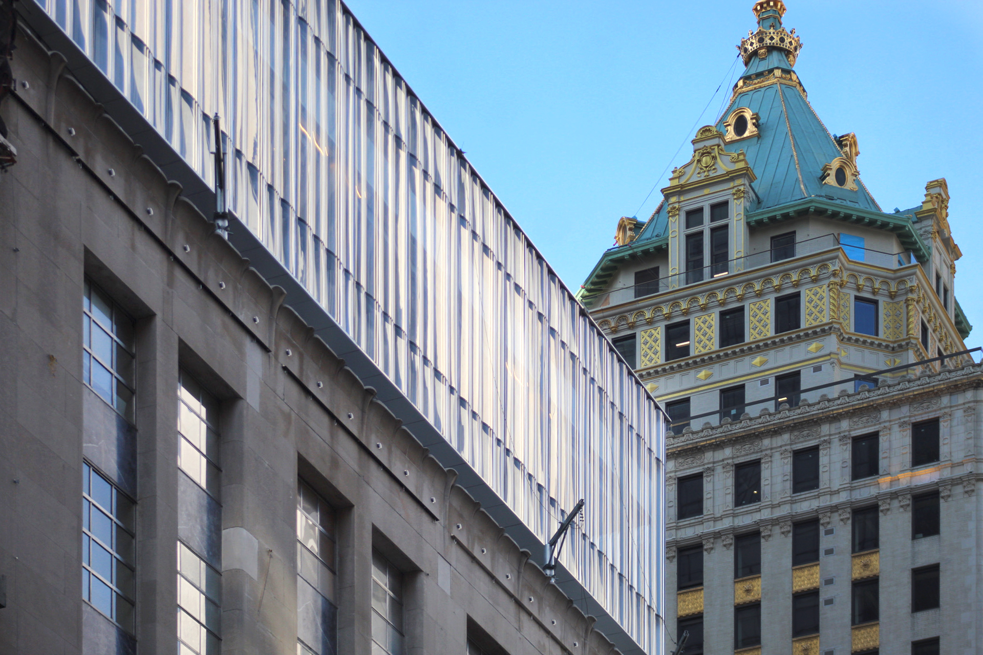
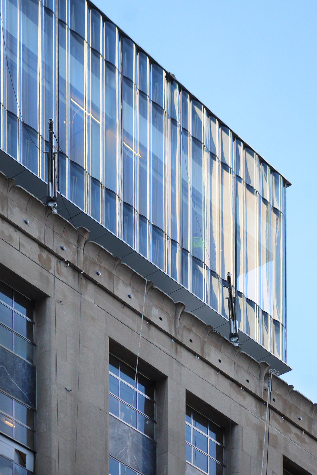
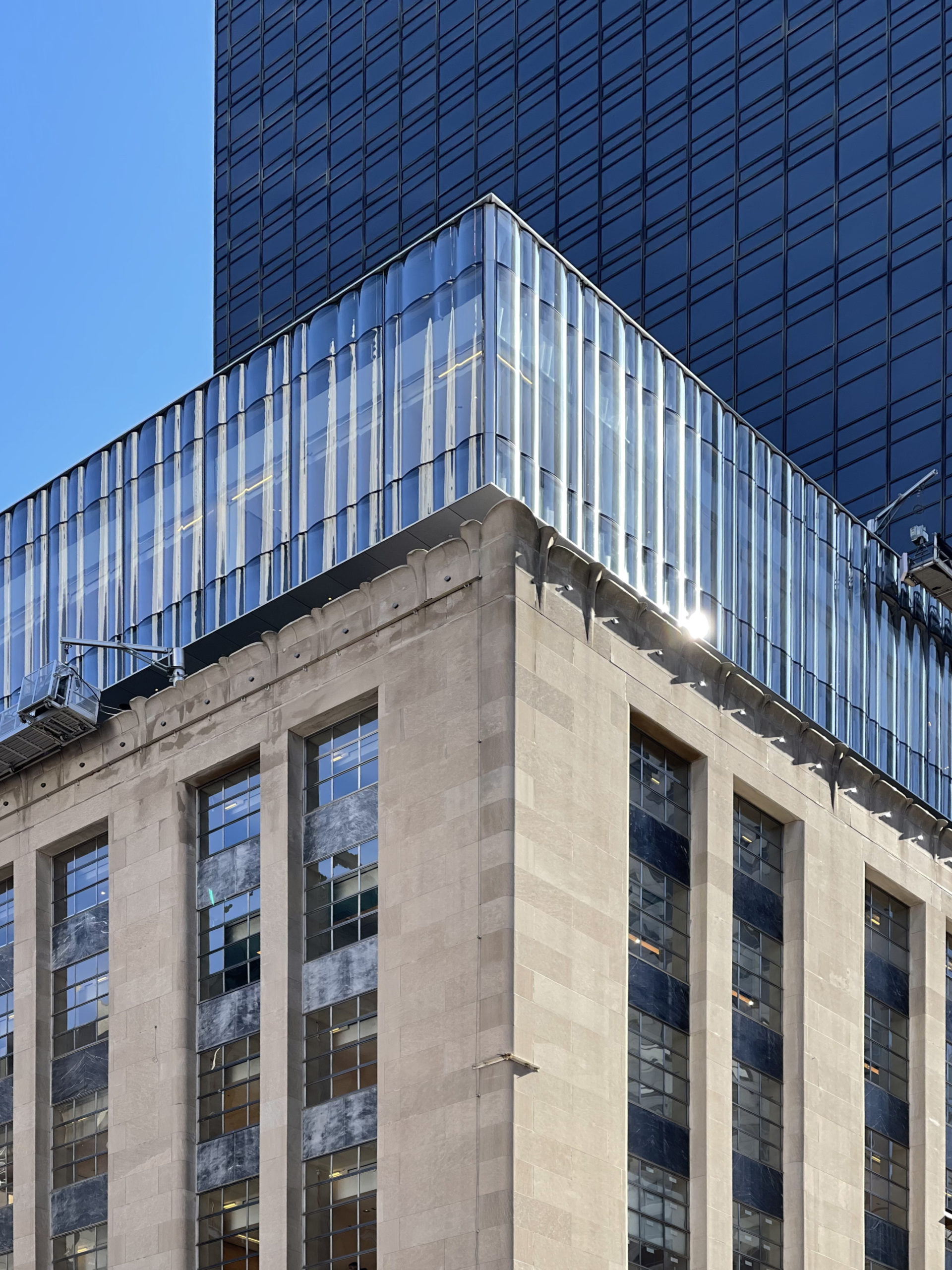
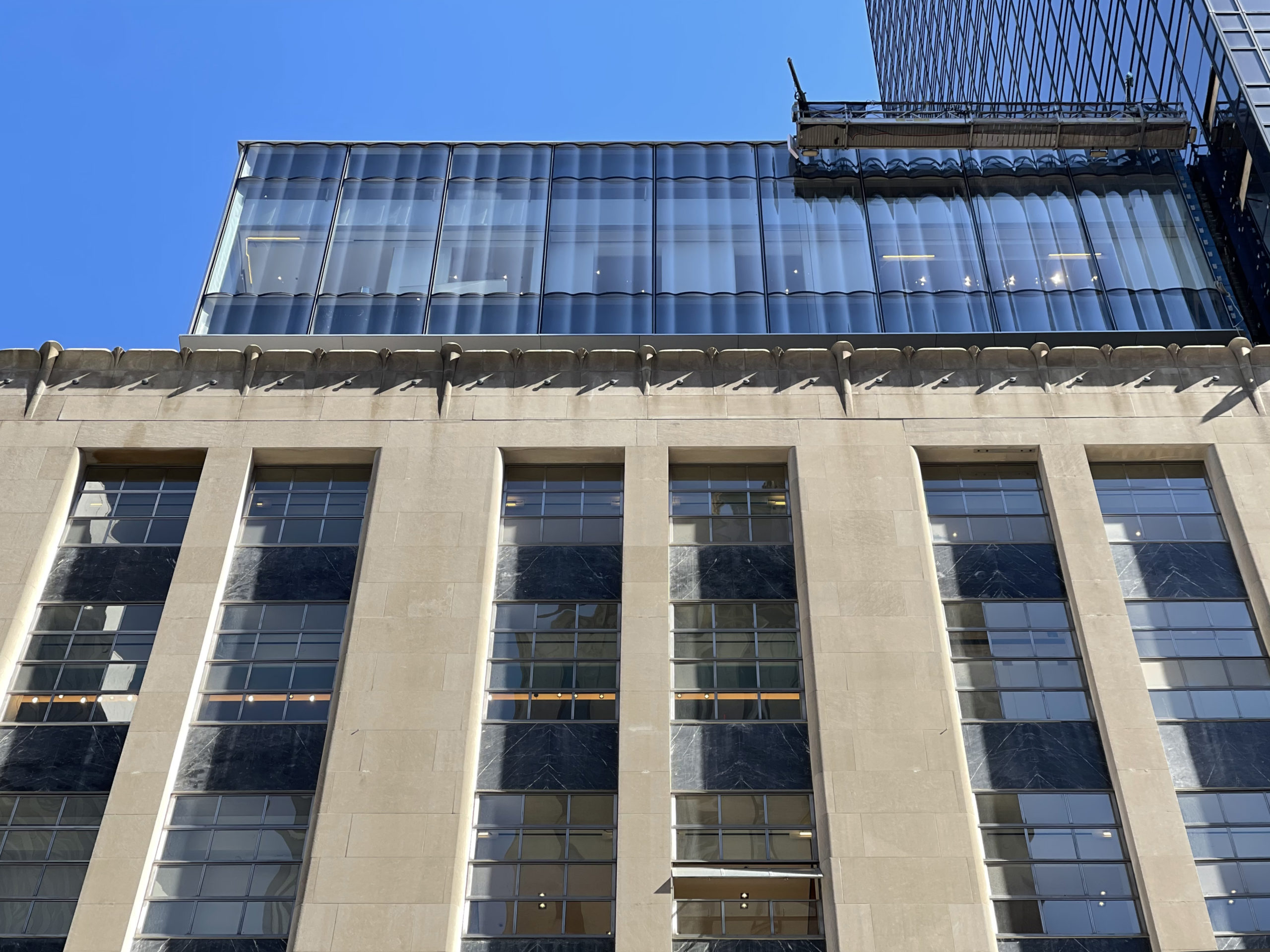
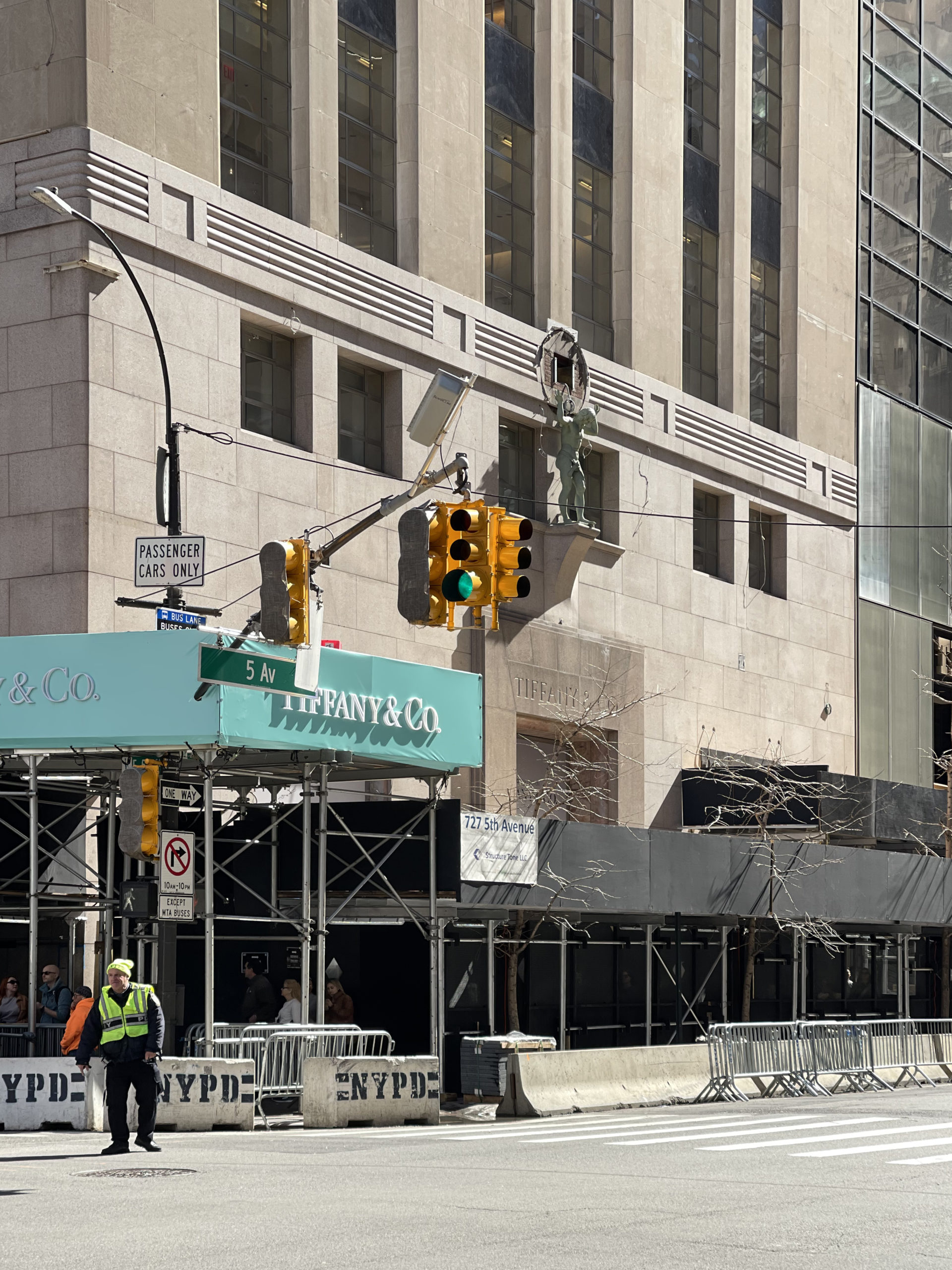
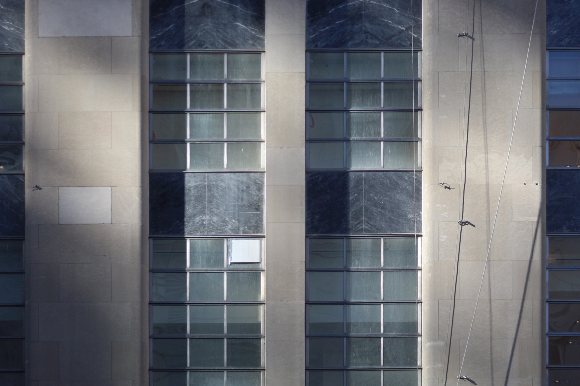
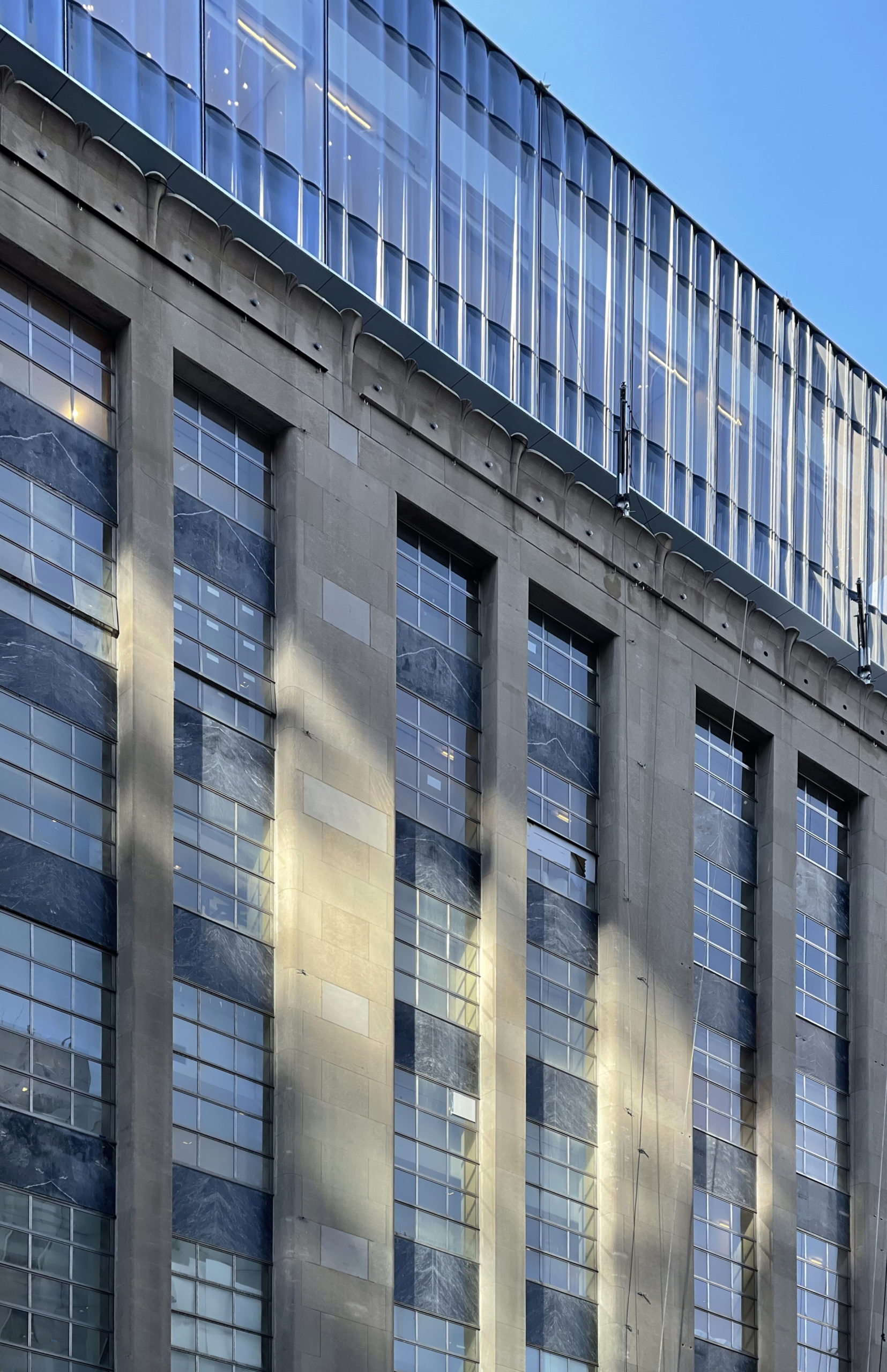
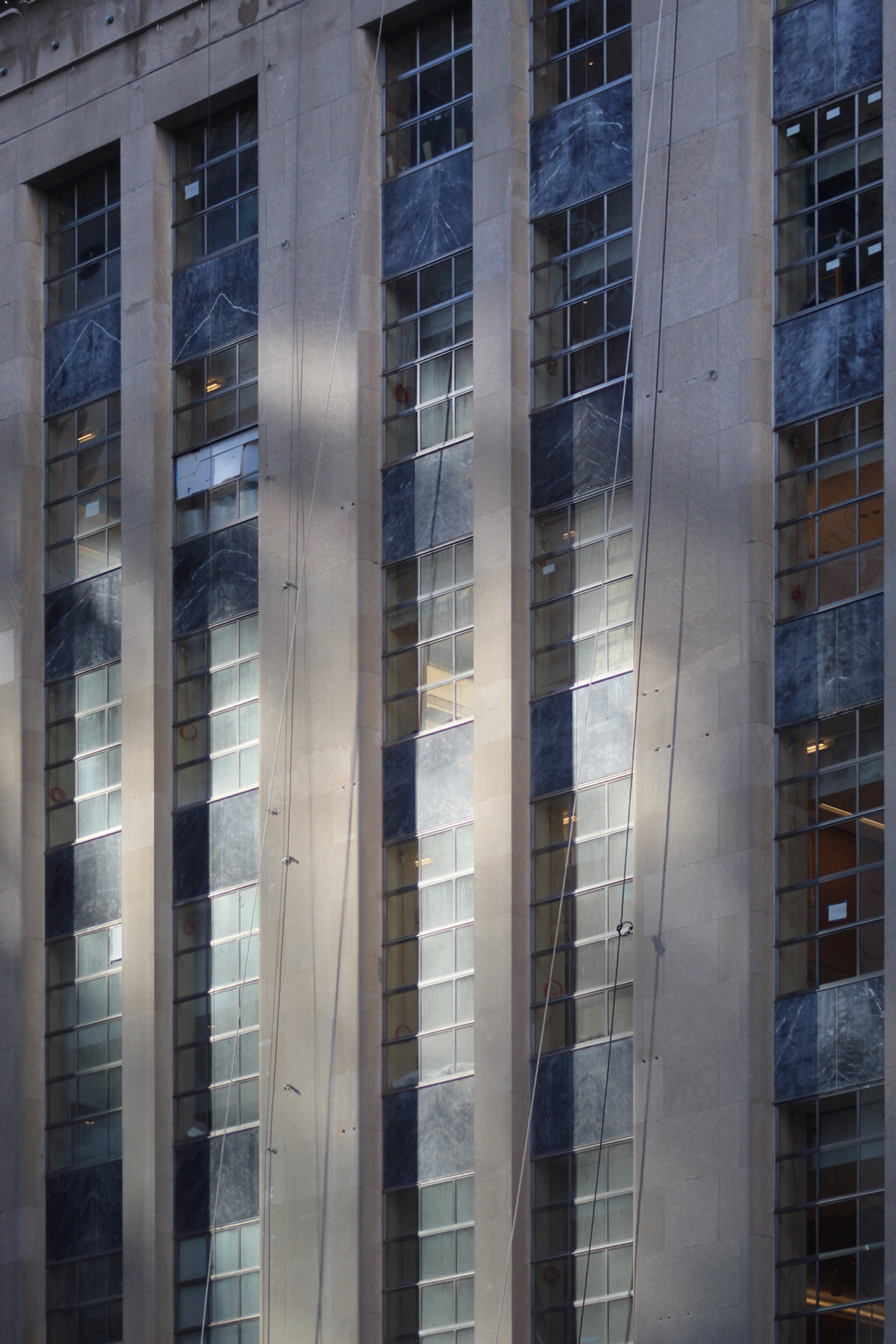
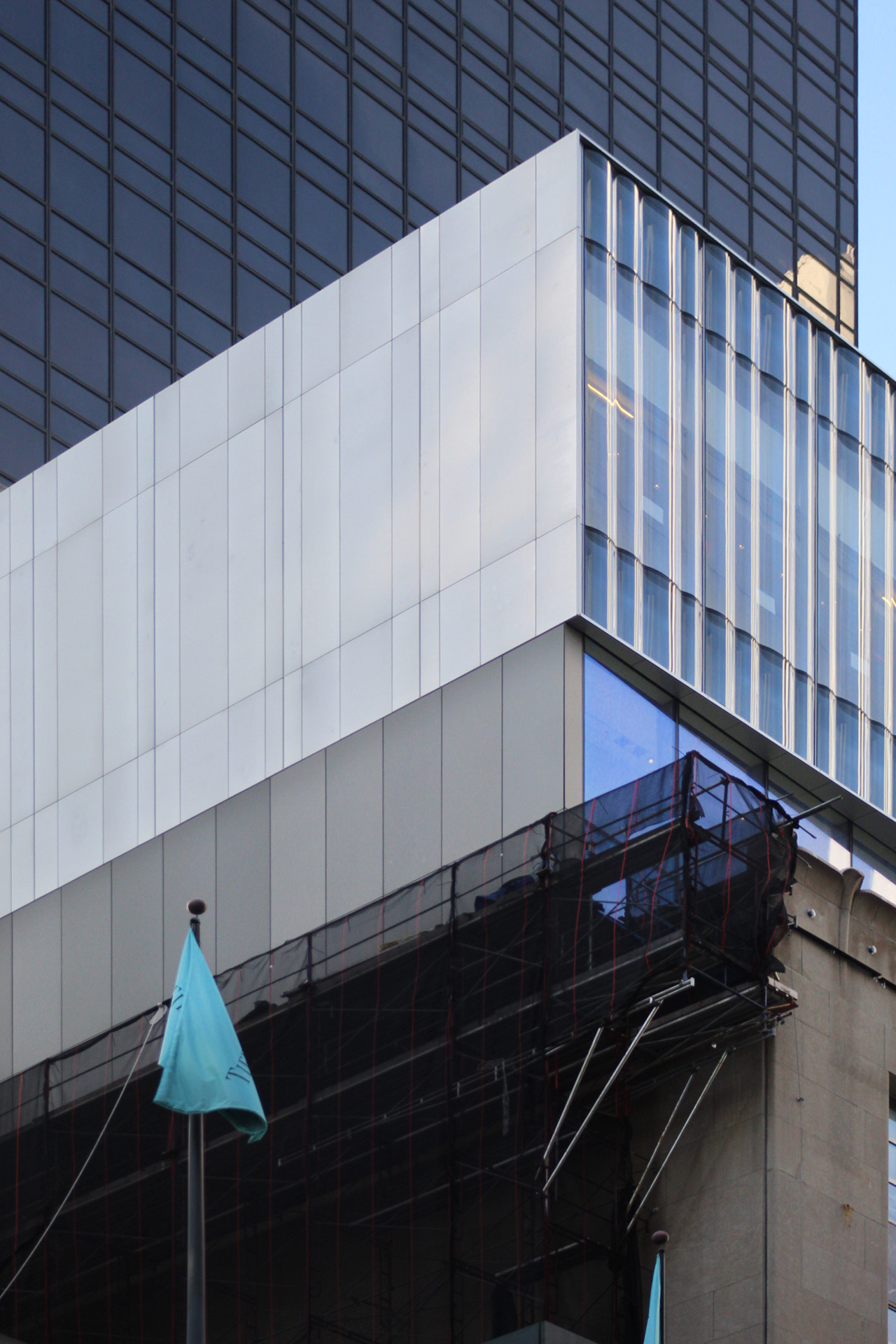
Recent photos show the finished appearance of the glass-clad extension. Since our last update in June, the strip in the northern elevation where the construction elevator had been attached has been filled in, the banner has been removed from the northern face of the main structure, and the sidewalk scaffolding has begun to be dismantled.
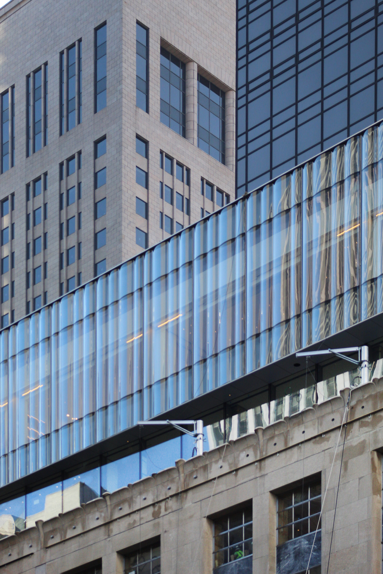
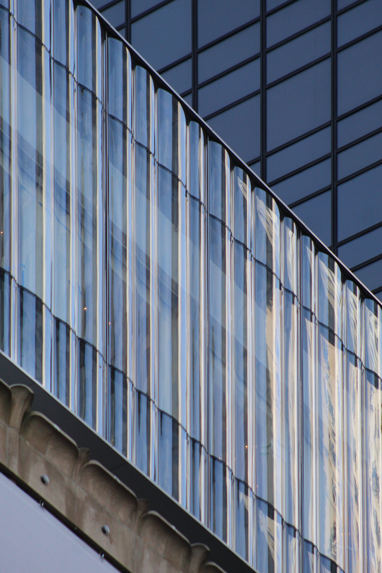
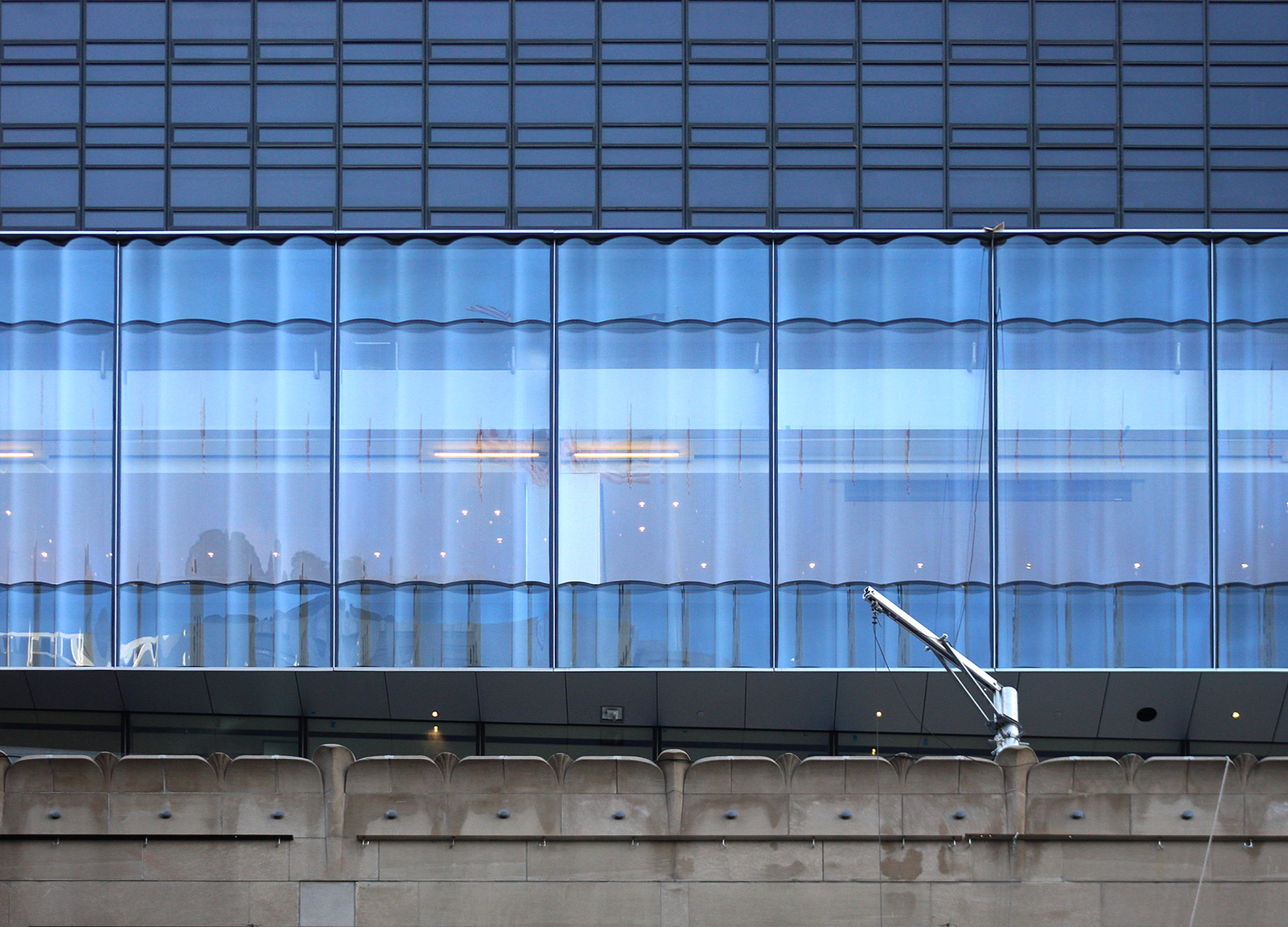
The glass is composed of flat low-e glass on floors eight and nine, and the tenth floor is lined with a subtly undulating glass envelope.
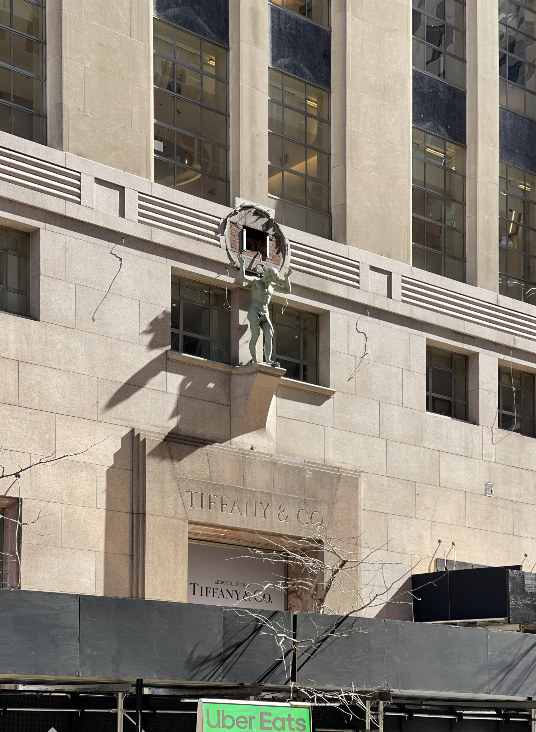
The granite and limestone exterior walls of the old building are almost fully restored.
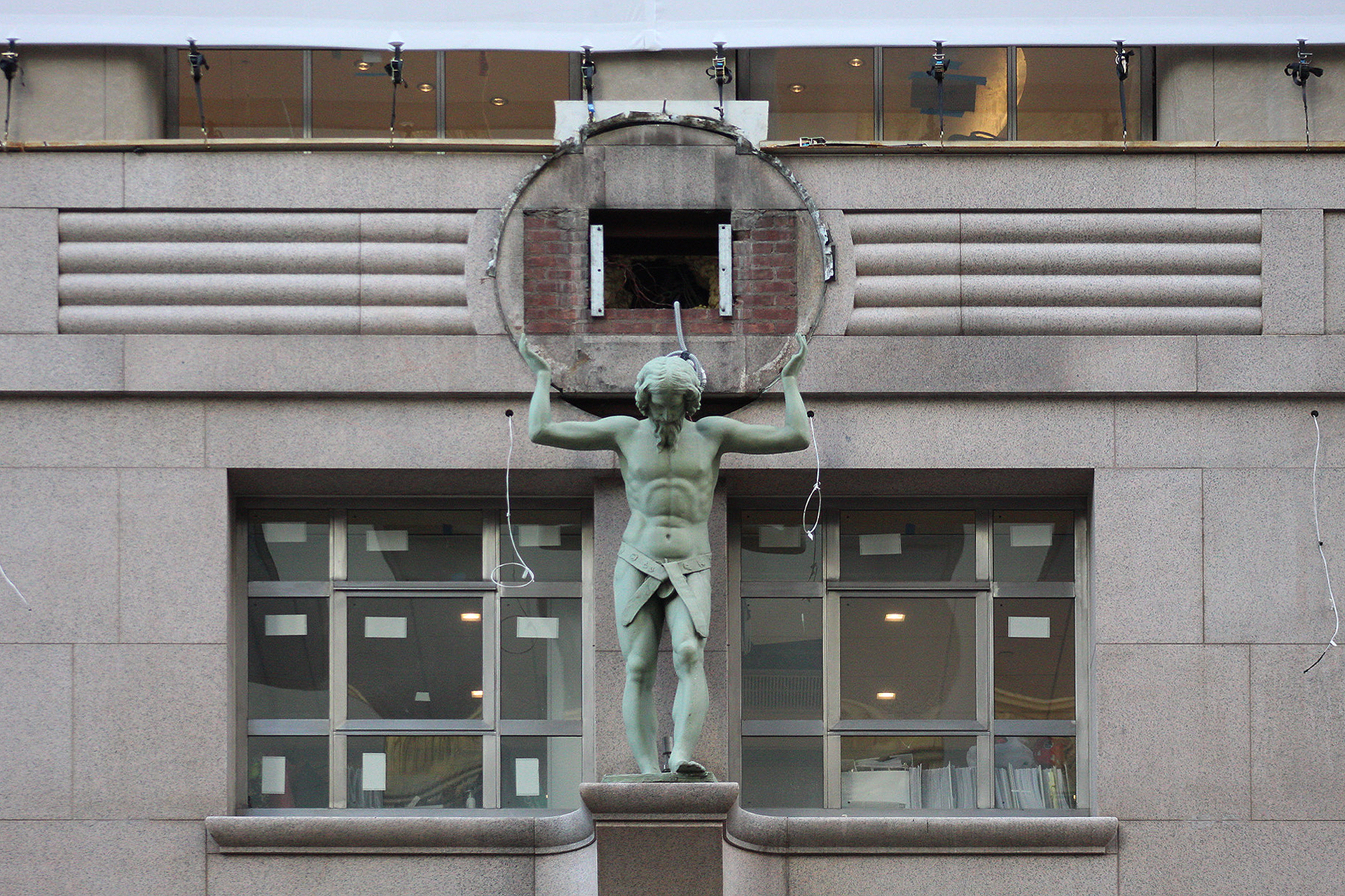
The clock on the western side facing Fifth Avenue has yet to be put back in place above the ground-floor entrance.
The rear eastern side has opaque paneling in a white and light-gray scheme.
Renderings show the new addition standing taller than the first setback of the Aman New York hotel and residential complex across Fifth Avenue. The second rendering highlights the new outdoor terrace space.
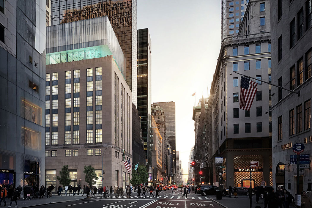
Rendering of Tiffany’s Fifth Avenue Flagship Expansion at 727 Fifth Avenue. Courtesy of OMA New York
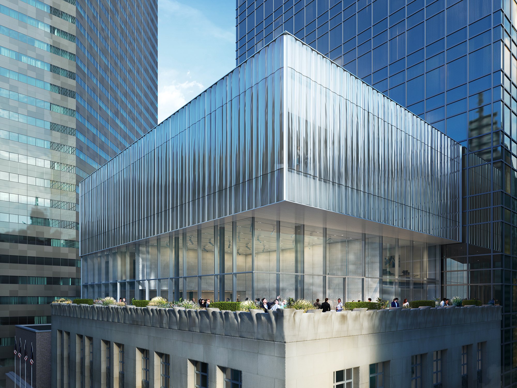
Rendering of Tiffany’s Fifth Avenue Flagship Expansion at 727 Fifth Avenue. Courtesy of OMA New York
727 Fifth Avenue is located near a number of landmarks such as Central Park, the Plaza Hotel, The St. Regis, The Peninsula, Rockefeller Center, St. Patrick’s Cathedral, and a large number of other retail flagships and upscale shops lining Fifth Avenue. The nearest subways are the N, R, and W trains at the 5th Avenue-59th Street station to the north, the F train at the the 57th Street station to the west along Sixth Avenue, the 4, 5, and 6 trains at the Lexington Avenue-59th Street station, and the E and M trains at the 5th Avenue-53rd Street station.
Tiffany & Co.’s interior and exterior overhaul was originally scheduled for completion last spring, but should likely wrap up this spring. The company currently has its largest retail location operating next door at 6 East 57th Street.
Subscribe to YIMBY’s daily e-mail
Follow YIMBYgram for real-time photo updates
Like YIMBY on Facebook
Follow YIMBY’s Twitter for the latest in YIMBYnews



Why don’t they clean the outside of the building?
I really like this. The restored main structure looks great and I love the glass cladding on the addition. The contrast works for me.
This looks beautiful and really shows in the sunlight! Nice photos as always and hope that clock gets reinstalled soon!
If I may offer a minor correction to this most interesting story, I believe that the Tiffany Building was completed in 1940, not 1950.
I don’t like the new addition at all. Why the setback? It looks disjointed. And they are allowed to block the view from 3 floors of the attached neighboring building? In this building’s case, I would have kept the 3 new levels consistent in design to the 10 previous ones for a more clean and complete look.
Probably mechanical floors those three floors built up against so it wouldn’t matter at all
Very elegant indeed. Great work!
They spent a zillion dollars on an addition, but they main building is old, dirty, with eight-year-old single pane windows. They desperately need to clean the building and replace the windows.
eighty
Quite stunning! Peter Marino is such a visionary.
Peter Marino only did the interior of the store.
This actually works! I wasn’t sure but it came out much better than I thought.
I’m pretty sure that’s a clean exterior! Maybe some damp spots in the stone are what you’re calling dirty?
Perhaps The Hallowed House of Diamonds, dear old Tiffany & Co , should have colored its new structural additional a gaudy, bright, in-your-face, blood red — although not for the same reasons that the classical Greeks did so in portions of their architecture and sculpture.
The glass is beautiful corner that operating by itself and skylines behind, to support density of shape from shorter to taller. Remarkable on progress location with expansion I could see, I can figure it out from your photos uncovered some parts as light-gray paneling I like: Thanks to Michael Young.
The story of this renovation isn’t the outside, it is the inside of which we have yet to see photos.
I truly hope that they didn’t not ruin the classic, understated beauty of the Tiffany sales floors.
Where is breakfast served?