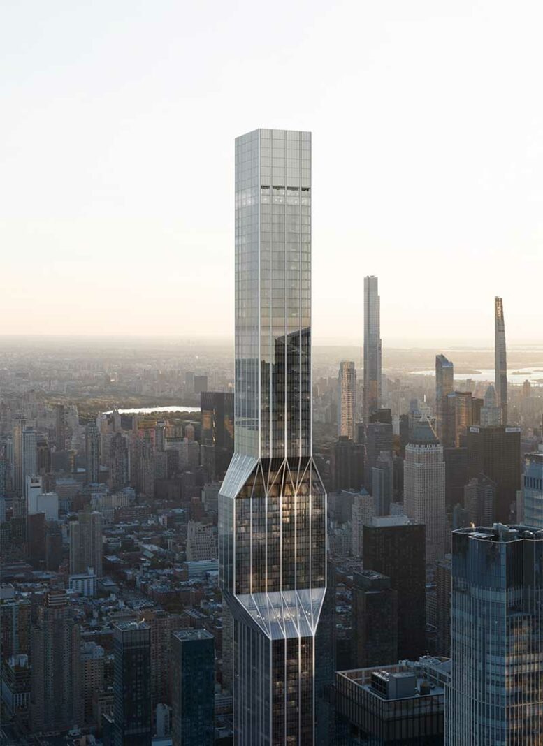
Renderings have been revealed for a redesign of Affirmation Tower, a proposed mixed-use supertall skyscraper at 418 Eleventh Avenue in Hudson Yards. The development team of The Peebles Corporation, McKissack & McKissack, Exact Capital Group, and the Witkoff Group has brought on OMA to redesign the 1.4-million-square-foot structure, which is planned to yield mixed-income apartments, a convention center, retail space, community facilities, a public observation deck, and The National Civil Rights Museum as part of a collaboration with the NAACP. The project will rise from a 1.2-acre plot dubbed “Site K” bound by Eleventh Avenue, Hudson Boulevard West, and West 35th and 36th Streets.
The main rendering is oriented looking northeast with Billionaires’ Row and Central Park in the background. The new design features a striking “pinched” flourish around its midpoint composed of an octagonal section that angles inward on the northern and southern faces and outward on the eastern and western sides. This feature will serve to convert the geometry of the skyscraper from rectangular on the lower half to square on the upper levels. The façade also incorporates vertical metal columns that split into diagrid patterns on the slopes of the midpoint concave.
A revised height and floor count have not been disclosed, and it remains unclear whether the original 1,663-foot plan has been modified. Based on the context of the rendering, the skyscraper will easily surpass the pinnacle of Kohn Pedersen Fox‘s 1,296-foot-tall 30 Hudson Yards, the current tallest structure in the Hudson Yards district.
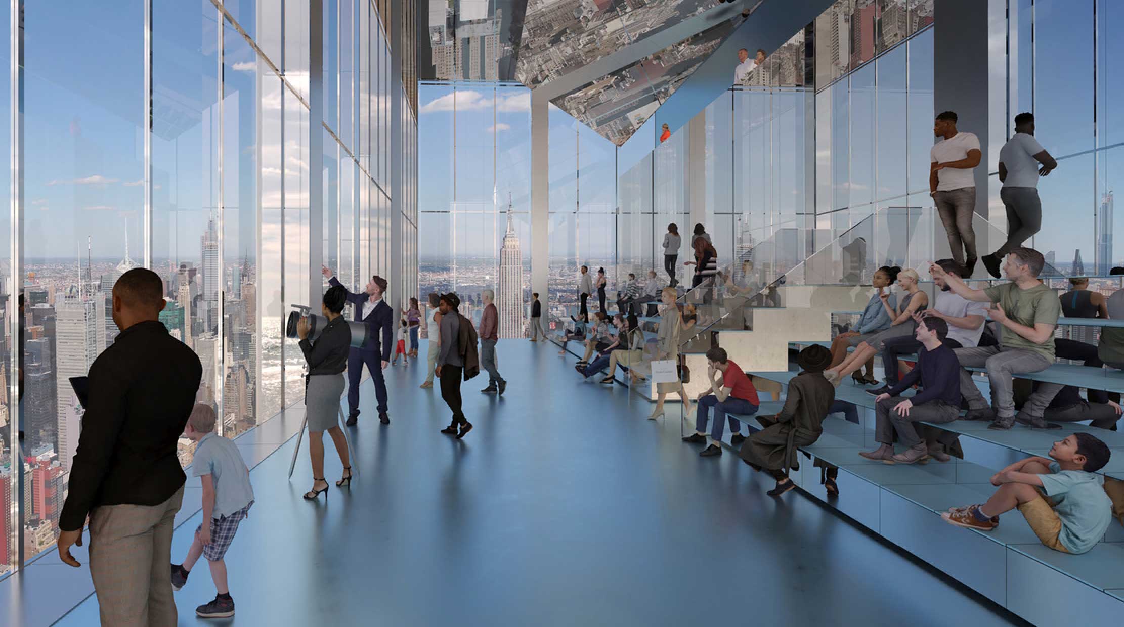
The public observatory, shown below, looks to be positioned around 1,000 feet high based on the comparison with the Empire State Building in the background. The space will make extensive use of mirrored surfaces much like One Vanderbilt’s Summit observatory, and will feature stadium seating for visitors to linger and take in the panoramic views. The exterior rendering also shows vents in the façade that will allow fresh air to flow into the space.
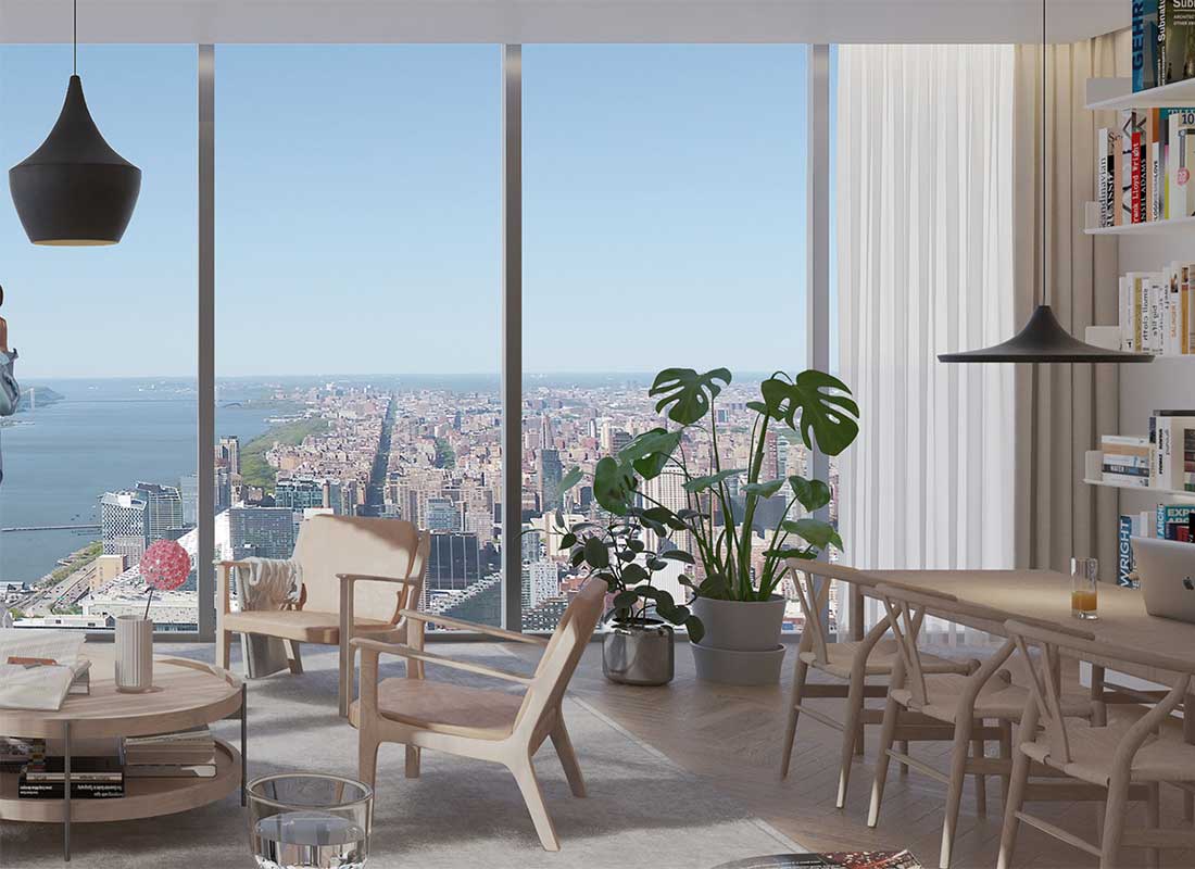
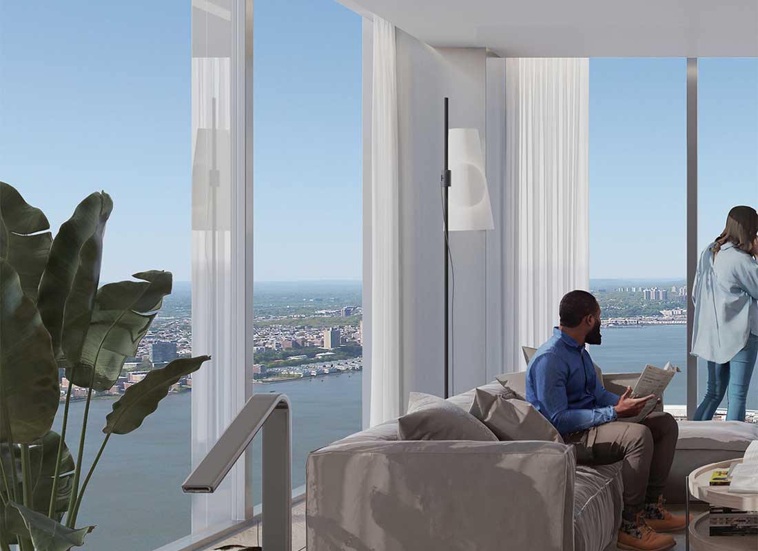
The following two renderings preview a typical residential living room framed by floor-to-ceiling windows with striking views high above Midtown, Manhattan and clear vistas up and down the Hudson River.
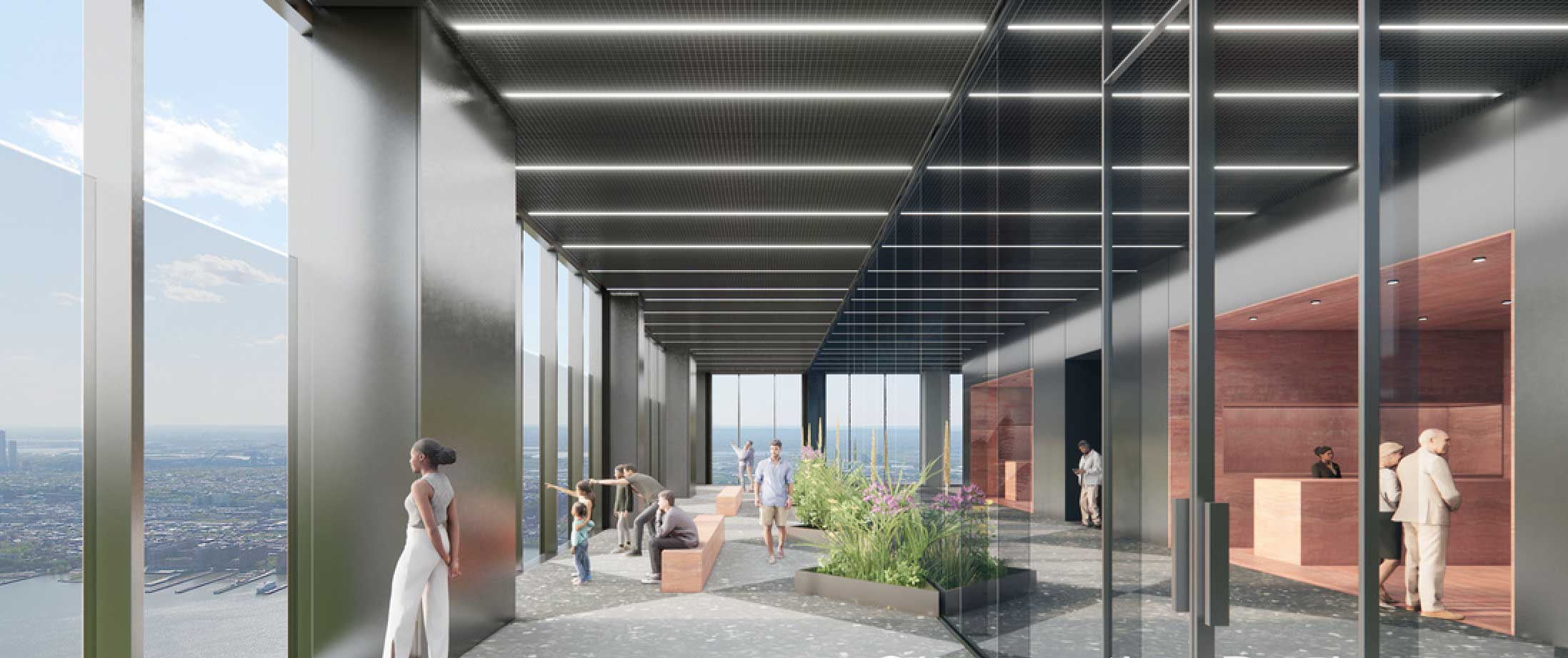
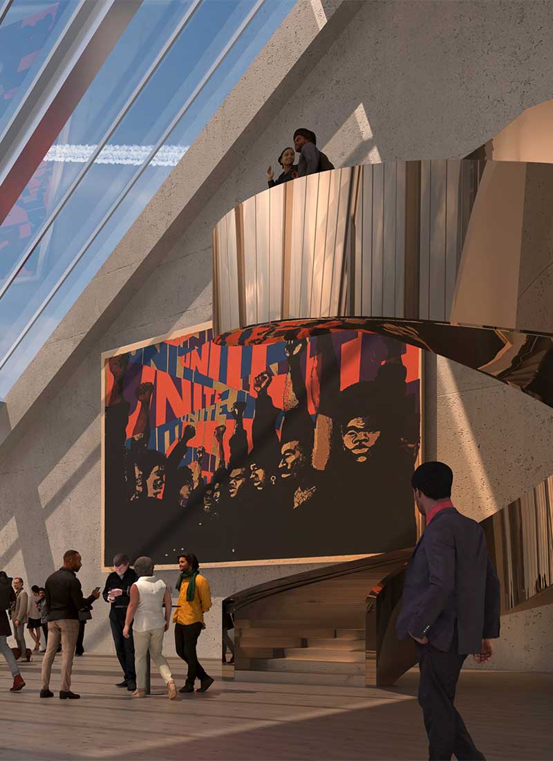
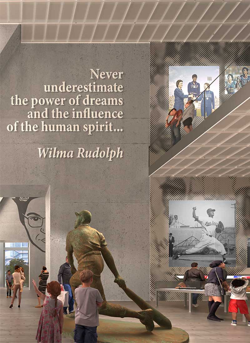
The next two renderings offer a glimpse at the National Civil Rights Museum, with large-scale artwork, sculptures, and abundant natural light exposure. The presence of the Vessel sculpture in the background of the second image indicates this facility will be located in the tower’s base.
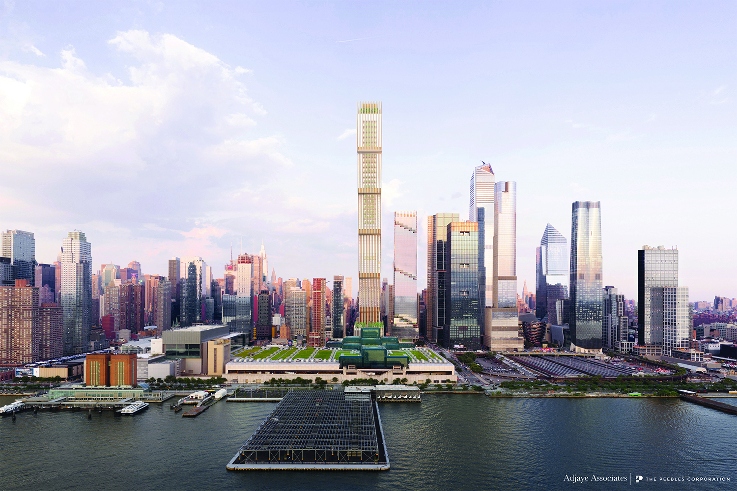
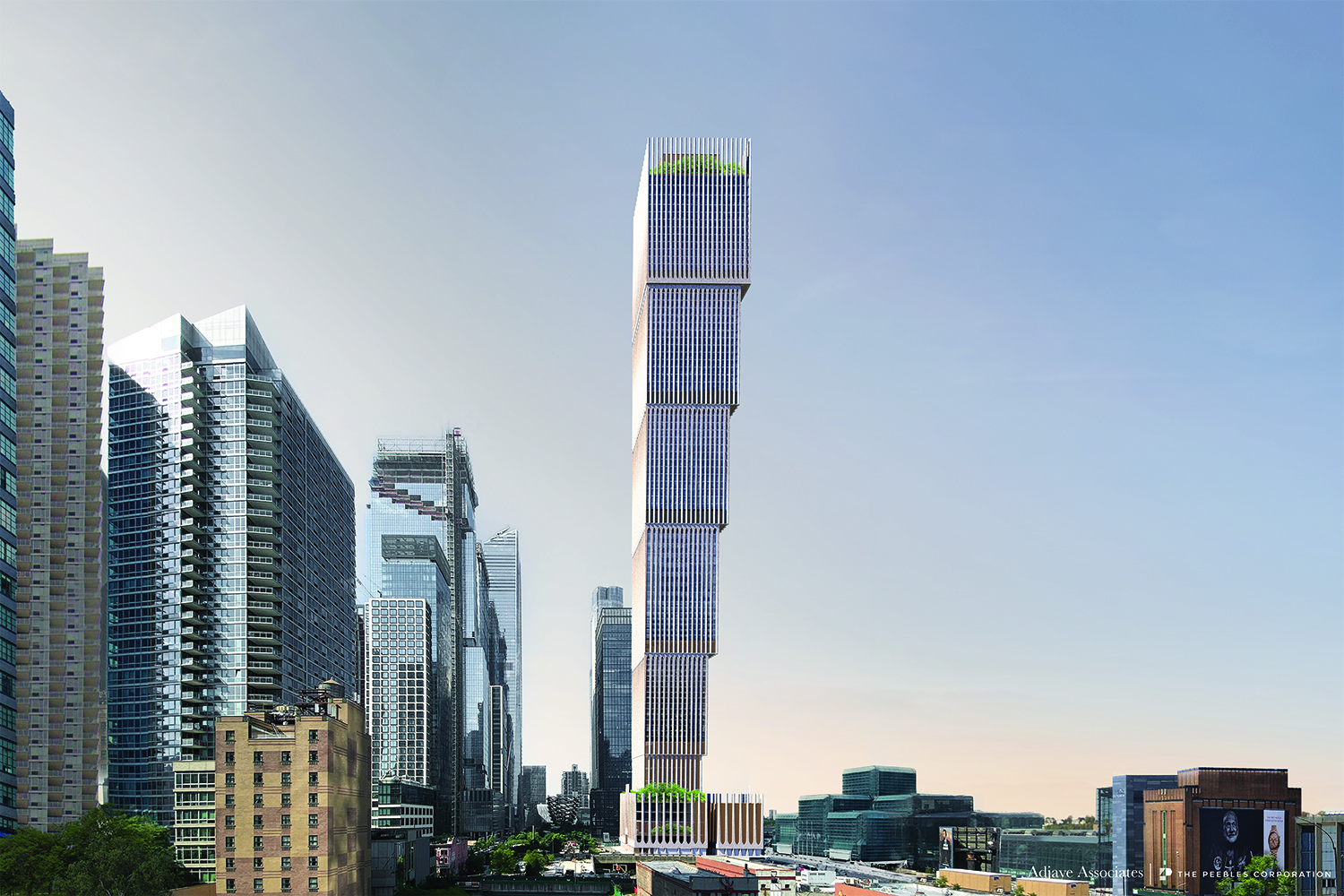
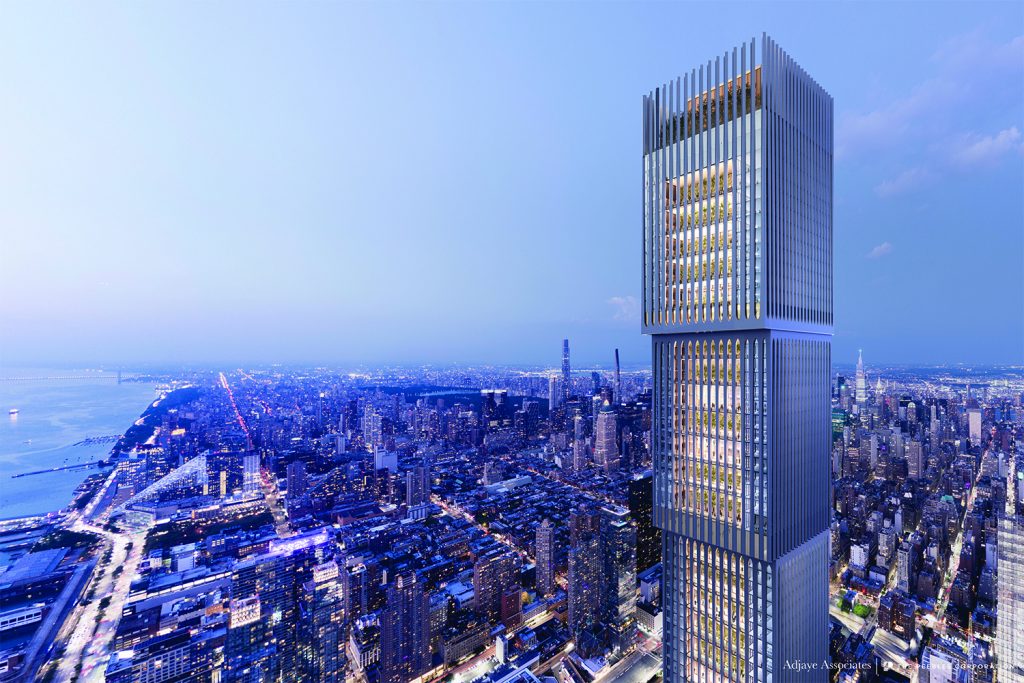
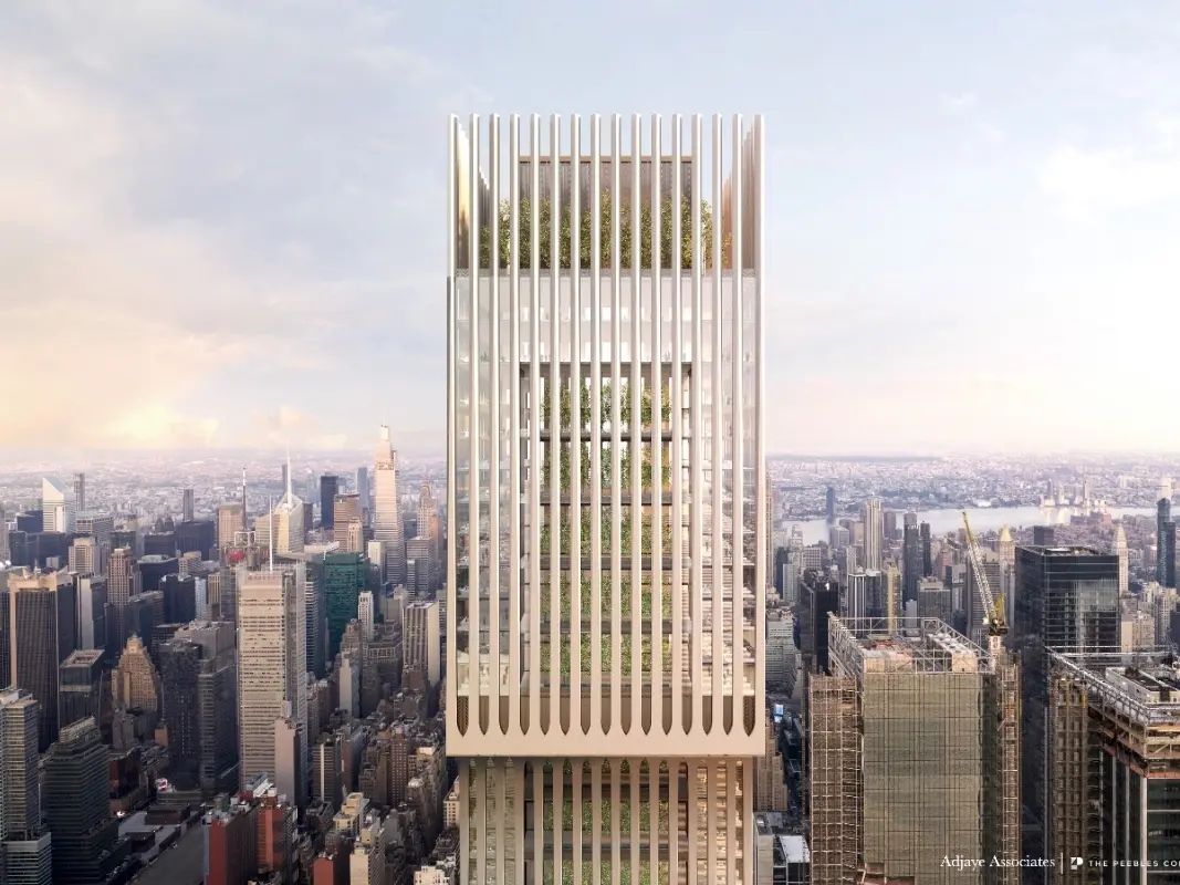
The last four renderings show the previous design of Affirmation Tower by Sir David Adjaye of Adjaye Associates. Proposed to stand 1,663 feet tall, the building would have become the tallest building in the Western Hemisphere by roof height.
If constructed, Affirmation Tower will become the world’s tallest building owned by majority Black-owned companies and the tallest building ever built by a woman-led contractor. The developers have pledged to allocate more than 30 percent of all construction contracts to minority and female contractors.
A spokesman for Empire State Development relayed that Site K is part of an open RFP process and submissions are still being reviewed.
Subscribe to YIMBY’s daily e-mail
Follow YIMBYgram for real-time photo updates
Like YIMBY on Facebook
Follow YIMBY’s Twitter for the latest in YIMBYnews

Reminds me of a watch and wristbands
Midriff bulge.
Shame about Adjaye but the original design was terrible. This is better, probably a little easier to build. Main problem is Peebles has never done anything at this scale and has tried unsuccessfully for years. I’m rooting for him as this will be mostly housing and I do like the guy.
Sad state of the diversity of architects though.
This is just right for Hudson Yards. Makes a statement without overdoing it.
NYC=NEW BABYLON
What does that even mean??
Everything, city is just about bankrupt as Stockton California or Detroit of 1970s… Rich middle class leaving NYC, real estate honchos and investors leaving NY market, that’s Exodus, City is Bankrupt almost…
Lols. NYC had a huge tax surplus this year.
I guess it’s better than Adjaye’s building but looks tired. The giant building on small site formula seems dated. And is it economically viable?
The National Civil Rights Museum here is a great idea, and should happen, but the new overall design of this building is still awkward.
Shame about Adjaye really should have been his project but that design was really weak for him, was never going to happen. Business is business I suppose.
He’s also been accused of sexual harassment, sexual assault and a host of other pretty reprehensible offenses. I think that’s why he’s off the project.
Oh wow really?? I had not heard that…thats awful
An 88-inch flat screen television shouldn’t be in there, because there is a view that is worth to looking at: Thanks to Michael Young.
Is this still going to be the tallest building in the western hemisphere? This design is a thousand times better than the original.
Looks very, “Foster+Partners” to me. Too bad they couldn’t just flip Adjaye’s proposal right side up. All in all, this will be a much nicer addition to the NYC skyline. Hope they build it!
This is definitely better than the disturbing original design, but it still feels like they want a design gimmick rather than an architectural landmark. It’s sad yet another observation deck will ruin the top of a building like with One Vanderbilt. Super clear glass and mirrored columns (and a LED ceiling?) are a cheap way to aesthetically destroy a tower’s design.
Very nice. I love Hudson Yards and this would be a striking yet harmonious addition to it. I do hope it happens.
I question just how much structural stress the columns can handle due to the massive chunk of the tower near the top! 🤔🥺
Does it look to anyone else like the tower was punched in the gut?
Glad to see the anxiety inducing previous design get tossed, but this is only marginally better. It looks like a pastiche of things going up elsewhere in Manhattan.
Looks like someone pinched a rectangular straw. I hope they find a clever way to deal with ice sheets forming on the slope and sliding down to the street below.
Absolutely hideous. Oversized and hideous.
This is New York. No such thing as oversized.
Agreed! Nor such thing as “too tall”!
A vast improvement over the original lopsided, stress-inducing design.
Lord Norman called, he’d like his diagrids back.
One of the biggest attractions for photographers is the ability to photograph surroundings without a big piece of glass in the way. This proposed observation area looks through windows thus giving rise to reflections and smudges. Hopefully planners will tsake this into account and provide an area similar to the ESB, Top of the Rock, and a small part of the Edge provide.
The design of the building is improved from the previous version but many details still need explanation such as how tall is it?.
If they are going that big, can’t they come up with something better? It looks ridiculous
Cant they propose an iconic/beautiful tower? We are falling behind in the area of exceptional design compared to top tier cities around the world.
Horrible design. I hope they included as part of their design team a building maintenance engineer consultant, with all these setbacks there is going to be a lot of mid-air transfer for window washing equipment.
So in other words Adadje isn’t involved anymore? I liked his proposed design A LOT more. The visual effect of it is something the new design doesn’t really do that.
Rooftop Planning:
Sky Garden and Green Spaces
Observation Deck with Panoramic Views
Seating and Lounge Areas
Rooftop Café
Solar Panels and Renewable Energy
Sustainable Features:
Photovoltaic Panels
Green Roofs
Energy-Efficient HVAC
Rainwater Harvesting
Recycled and Sustainable Materials
RGB Lighting Planning:
Horizontal RGB LED Strips
Vertical RGB LED Lines
Interactive and Dynamic Lighting
Holiday and Event Themes
Digital Display Planning:
Ground Level Interactive Displays
High-Level Digital Billboards
Wayfinding Screens
Public Announcements and Art Exhibits
And hopefully maintaining 1600 feet or 1700 feet height etc.