New renderings have been revealed for 75 Essex Street, an upcoming 17-story mixed-use building on Manhattan’s Lower East Side. Designed by Studio C Architects and developed by Soft Stone Development Group, the project involves the restoration of an existing four-story structure and the construction of a 13-story addition above, and is planned to stand 162 feet tall and yield 27,355 square feet. The programming will include nine condominium units with an average scope of 1,592 square feet, 13,023 square feet of commercial space, and a cellar level. The property is located at the corner of Broome and Essex Streets.
The main rendering shows 75 Essex Street in its entirety, rising directly against the eastern lot line of 242 Broome Street and featuring a series of gradually stepped setbacks topped with terraces on the slender glass-clad southern profile. The façade on the wider western elevation is composed of rust colored paneling framing an irregular grid of narrow floor-to-ceiling windows, and incorporates several balconies lined with metal railings. The building culminates in a bulkhead and an outdoor rooftop space on the northern side of the final level.
The parapet of the original structure will be transformed into an expansive terrace populated with trees and outdoor seating.
The main entrance is situated on the southwestern corner next to the base of 242 Broome Street, featuring a series of arches to match the fenestration of the repurposed building at the base of the tower, and a circular metal gate at the sidewalk. High above the entryway is an undulating piece of the façade that curves inward toward the main lobby.
The below street-level rendering looks north on Essex Street at the base of the building.
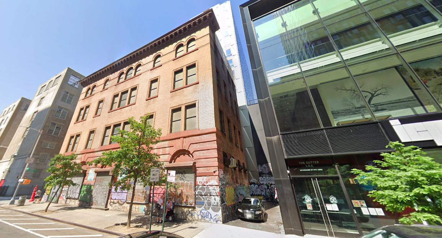
Below is a Google Street View image of the current site conditions. The exterior restoration will involve cleaning the brick and stone façade and replacing all the windows and doorways.
The nearest subways from the property are the F, J, M, and Z trains at the Delancey Street-Essex Street station to the north.
A start and completion date for 75 Essex Street has yet to be finalized.
Subscribe to YIMBY’s daily e-mail
Follow YIMBYgram for real-time photo updates
Like YIMBY on Facebook
Follow YIMBY’s Twitter for the latest in YIMBYnews



I love this project. If they are able to compliment the brick building’s color as in the rendering, it will be great. Love the fact that each section of the building has design merit and while they couldn’t possibly match, the contrast is very unique and interesting.
Fantastic project
REALLY?
High marks..
Amazing – I remember the old clothing store that was there. Am so glad they are preserving the building.
This is a beautifully imagined project. Let’s see if they can execute it as well in reality. It could be absolutely smashing and a wonderful addition to a vibrantly evolving neighborhood.
This is how you do it. Keep New York and grow it.
I am pleased they were able to incorporate the original structure. What New York has that newer cities can never have is the context of numerous historic buildings in contrast to the modern structures.
Ha Ha Ha. Co,e on, April Foold dau has passed guys
Are you having a stroke writing?
That upper glass facade and paneling looks so beautiful and
blend with 242 Broome Street so well! 😍
This building shows how ridiculous most modern buildings are compared to the original “classics”. Every one of the classics must be preserved.
I like what they did to the old building except for the single glass panel in each window. It gives a sort of empty look.
The old is still there, and the new is here. There are also adjustments to make it beautiful, it’s hard to find: Thanks to Michael Young.
Tremendous. Fits in with and yet stands out from the surrounding Essex Crossing buildings. More of this please!
Wow, this is a bold and risky design, I am so glad that it works so well. If buildings can stand next to each other on a city block, why not one atop the other? This structure shows that it can be done successfully. Two beautiful buildings from two very different eras, yet complimenting each other.
I am sick of “towers” in my neighborhood that none of us can afford. I can’t stand the overpopulation of what was once a real neighborhood. The transience that comes with people who can afford these kind of residences. At least you kept the original building which by the way has a long history including a yarn store, but how about preserving the past and keeping thing’s contemporary by just renovating the old building. We don’t need to lose more light and space and add more people to what is now an already overcrowded place to live.