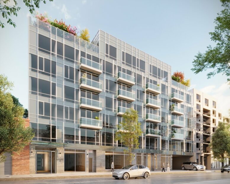
Construction is complete on Lucent33, a seven-story mixed-use building at 37-34 33rd Street in Long Island City, Queens. Designed by Andres Escobar and developed by George Xu under the 33rd Street Ventures LLC, the 75-foot-tall structure spans 64,984 square feet and yields 64 rental units in studio- to two-bedroom layouts with an average scope of 744 square feet, as well as 10,601 square feet of commercial space, a cellar level, a 30-foot-long rear yard, and 32 enclosed parking spaces. The property is located between 37th and 38th Avenues.
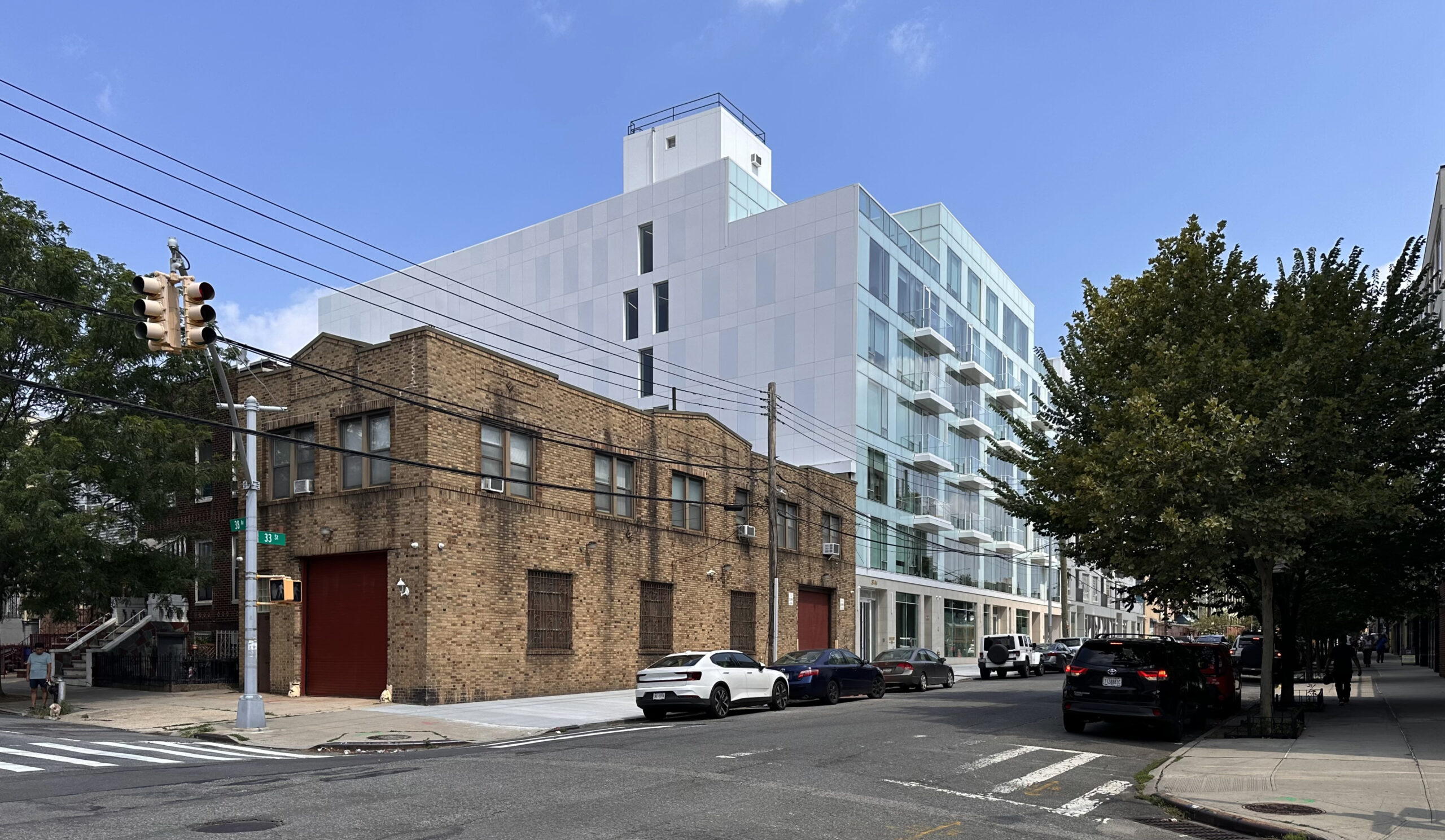
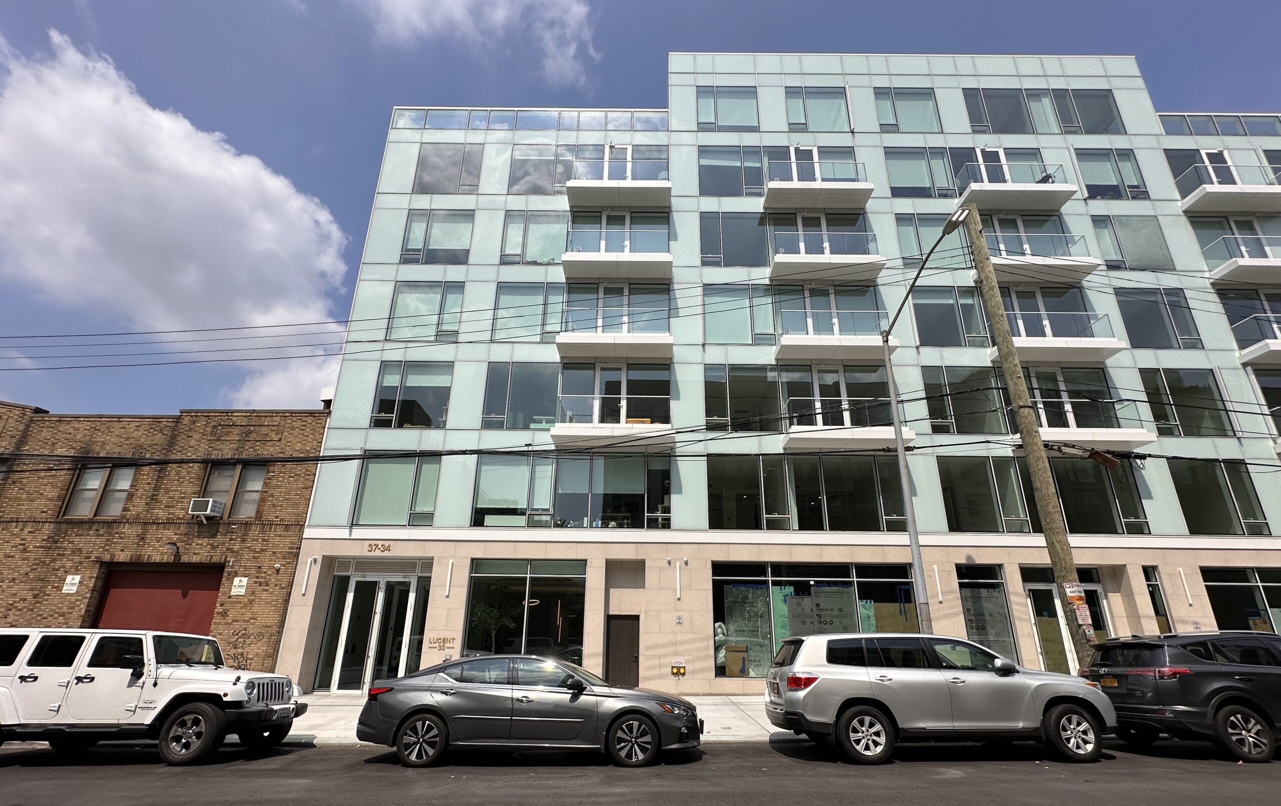
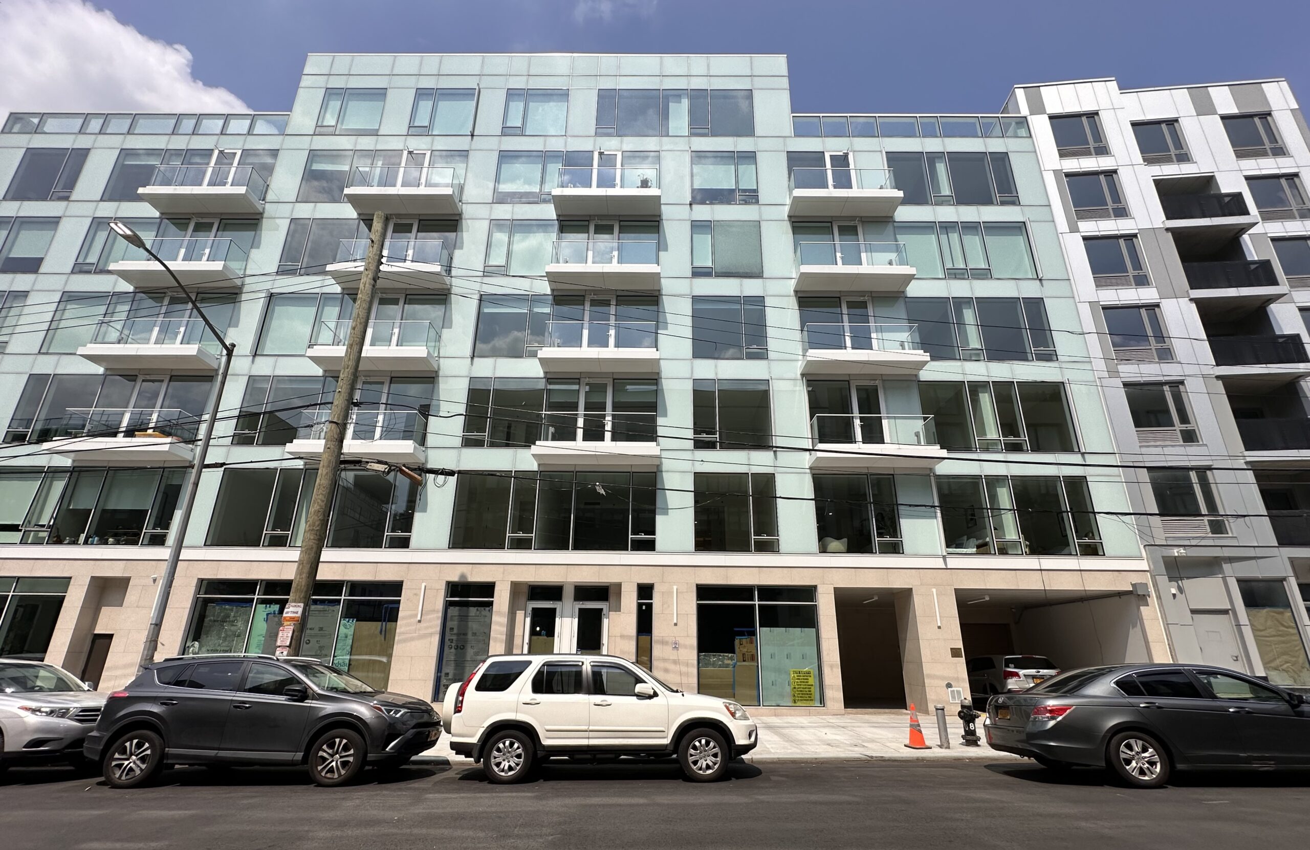
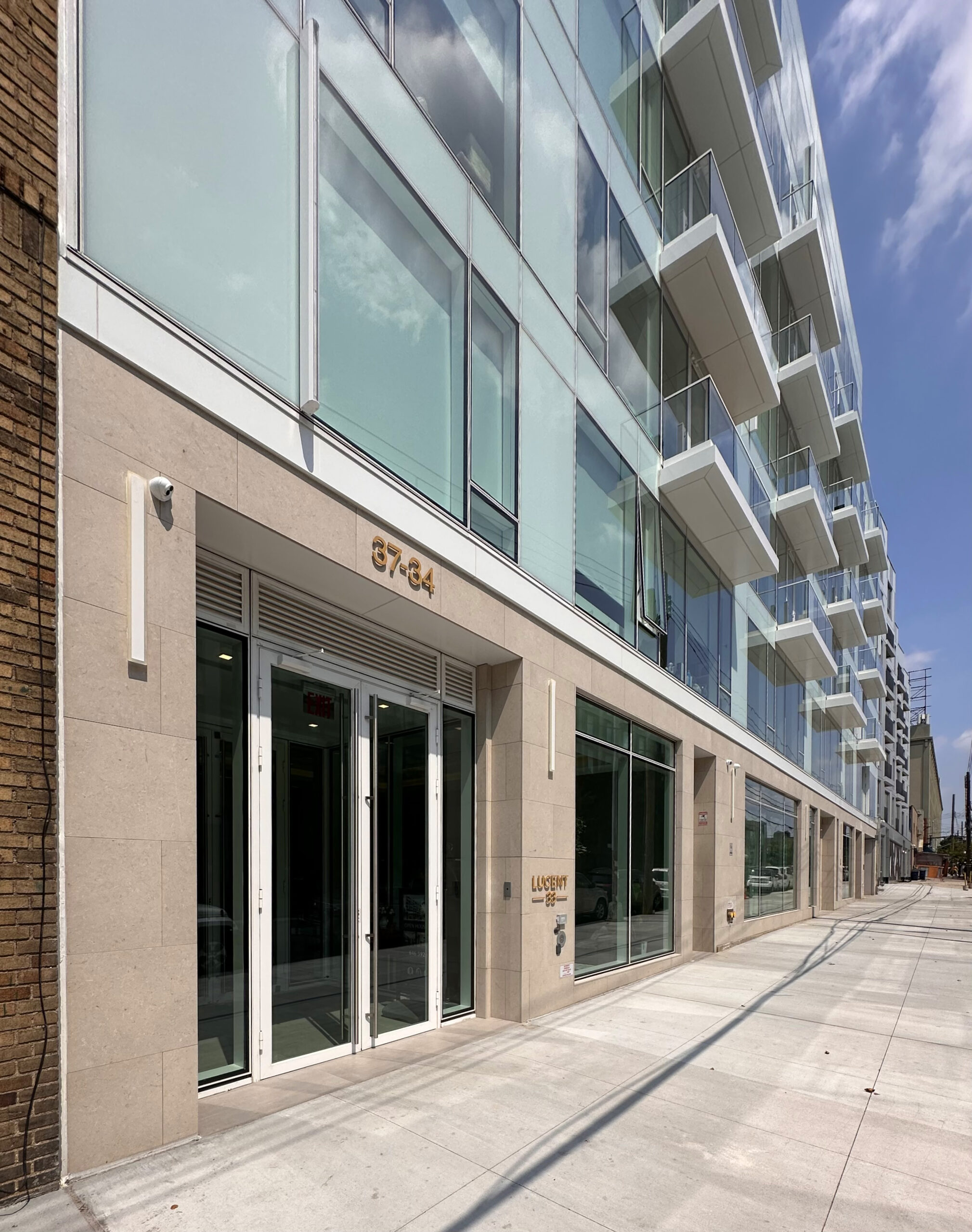
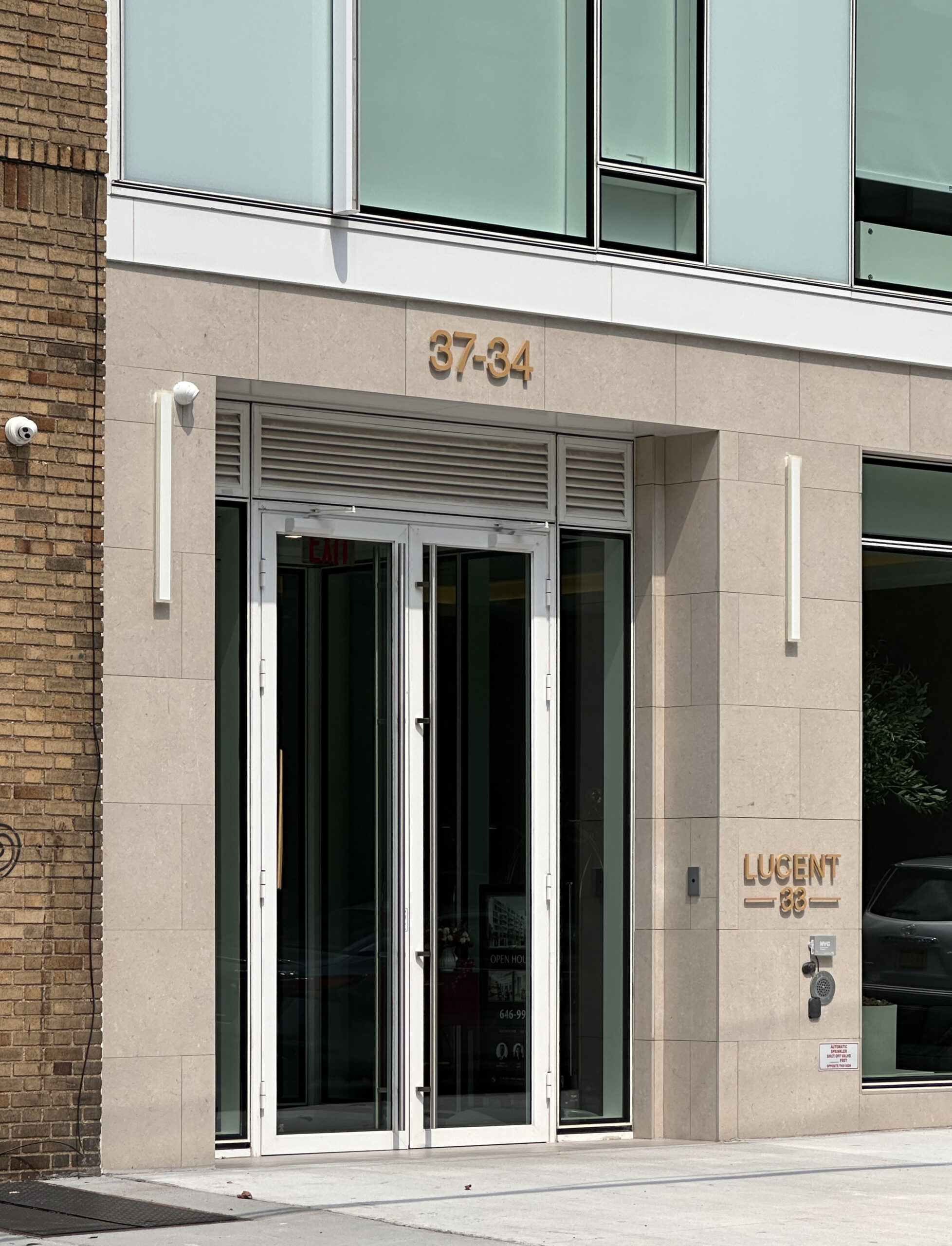
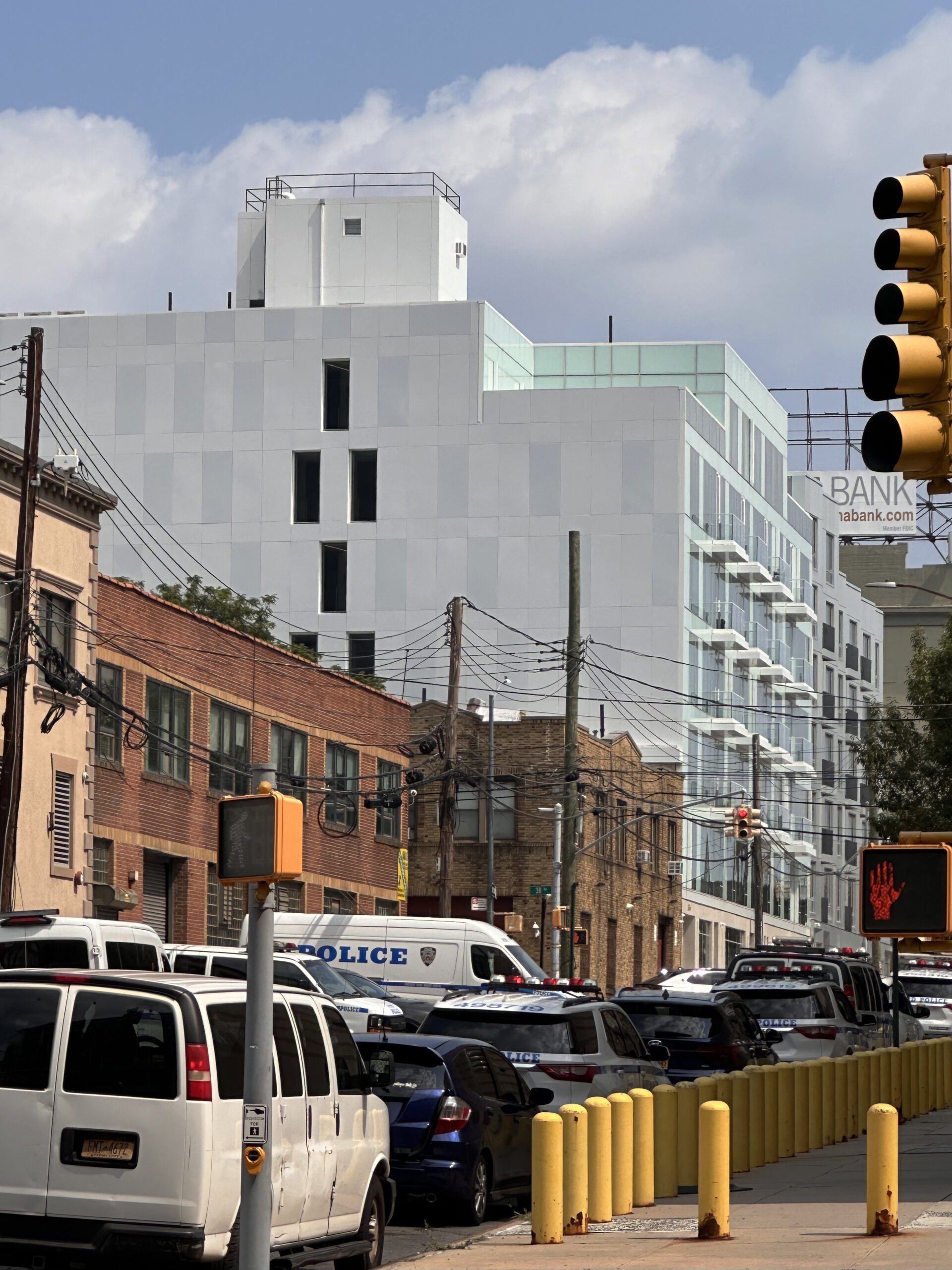
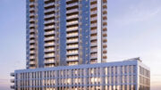
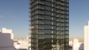
Recent photographs show the finished look of the building, which features a distinctive façade with blue-tinted glass extending beyond the grid of floor-to-ceiling windows and covering the entire main eastern elevation above the ground floor. The first story features contrasting beige stone surrounding the retail frontage, and the mostly blank southern party wall is enclosed in white paneling with a subtle checkerboard pattern of pale blue-gray panels that complement the hue of the glass-clad main face. Four columns of balconies protrude from the front of the building, and a pair of setbacks at the north- and southeastern corners of the seventh floor will be topped with private terraces. The structure culminates in a tall bulkhead.
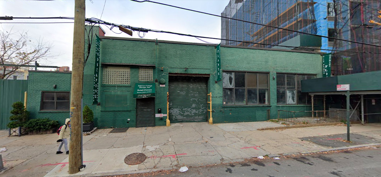
The property was formerly occupied by a derelict one-story commercial structure, as seen in the below Google Street View image from before its demolition.
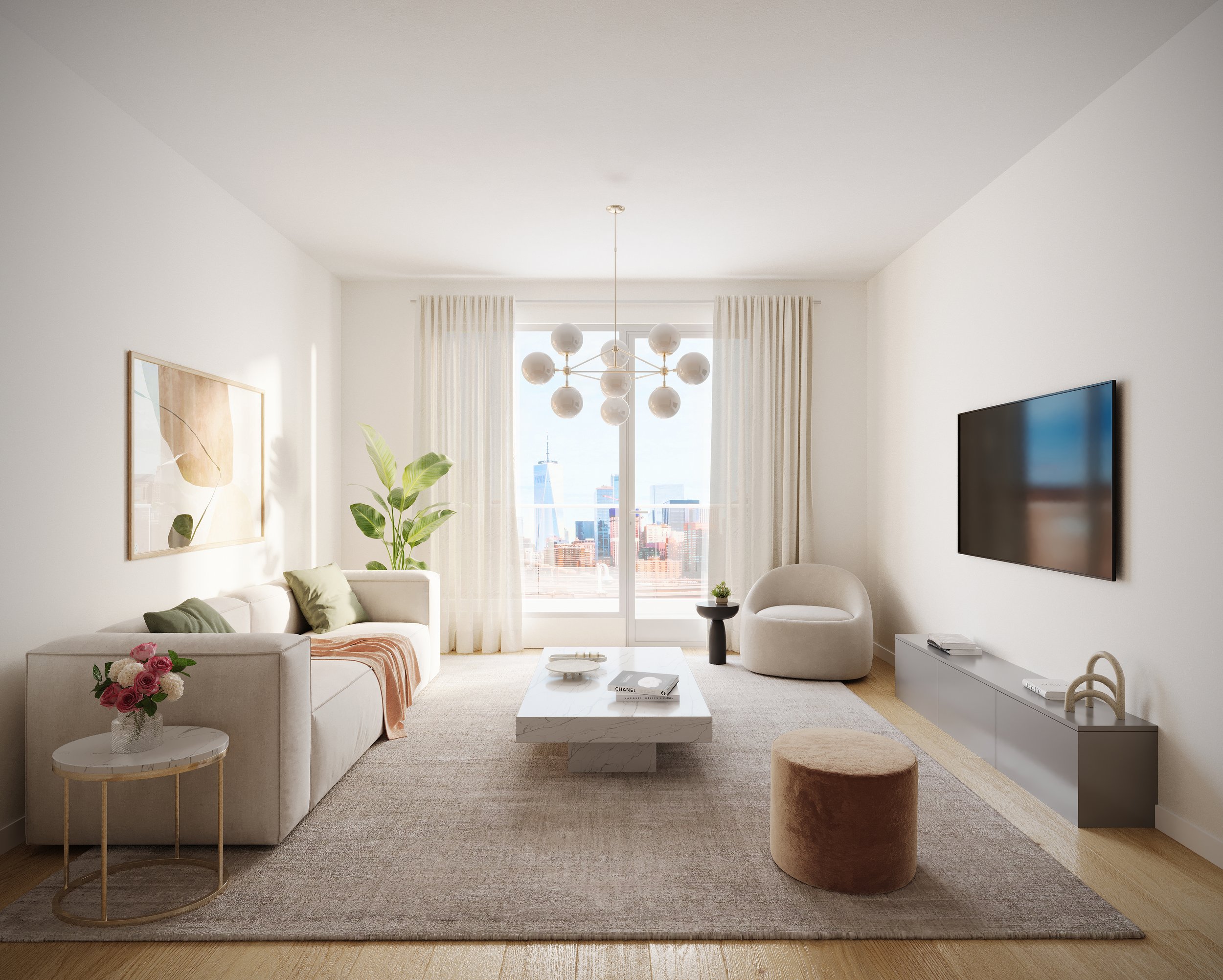
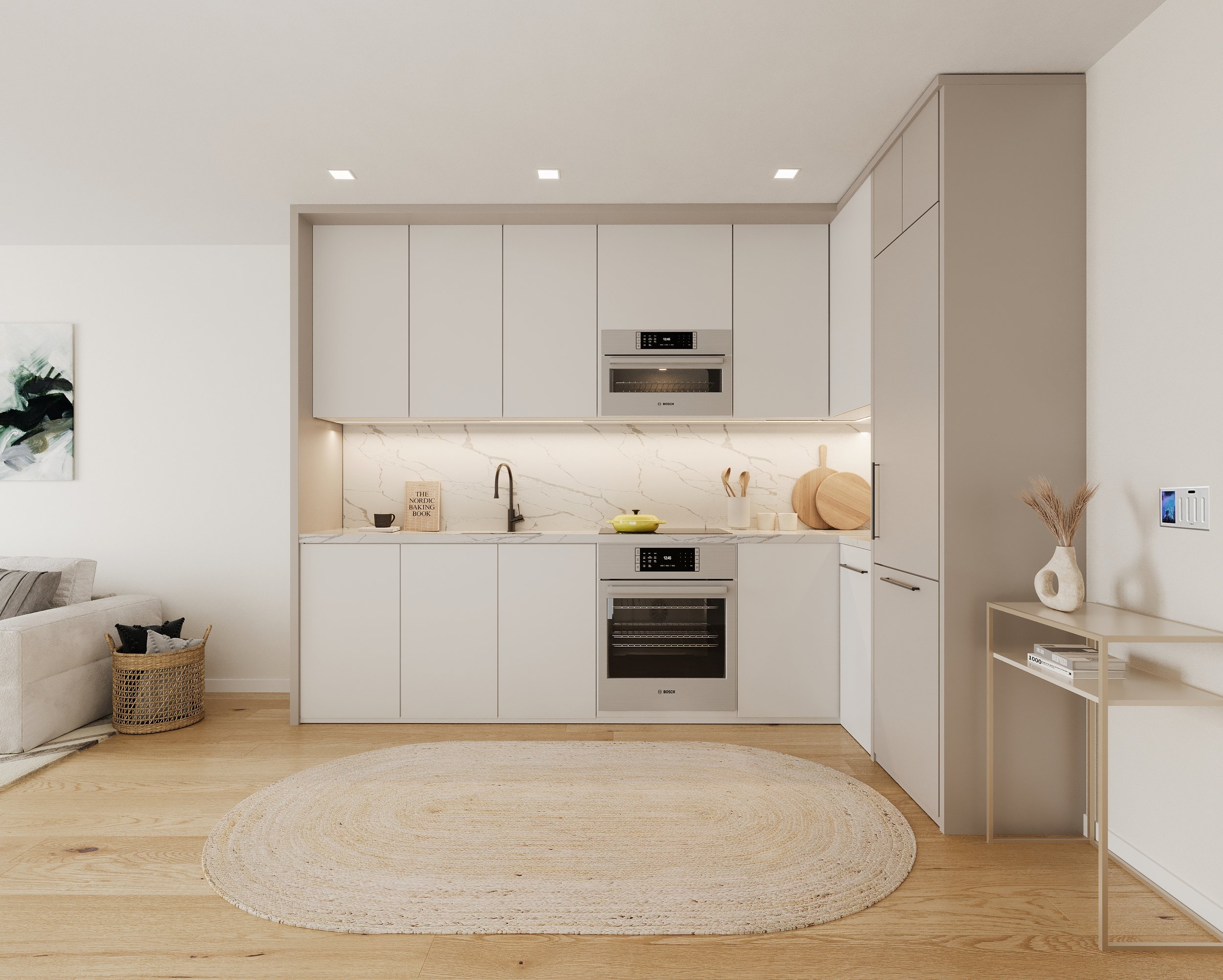
The following renderings showcase a typical open kitchen layout and living room space.
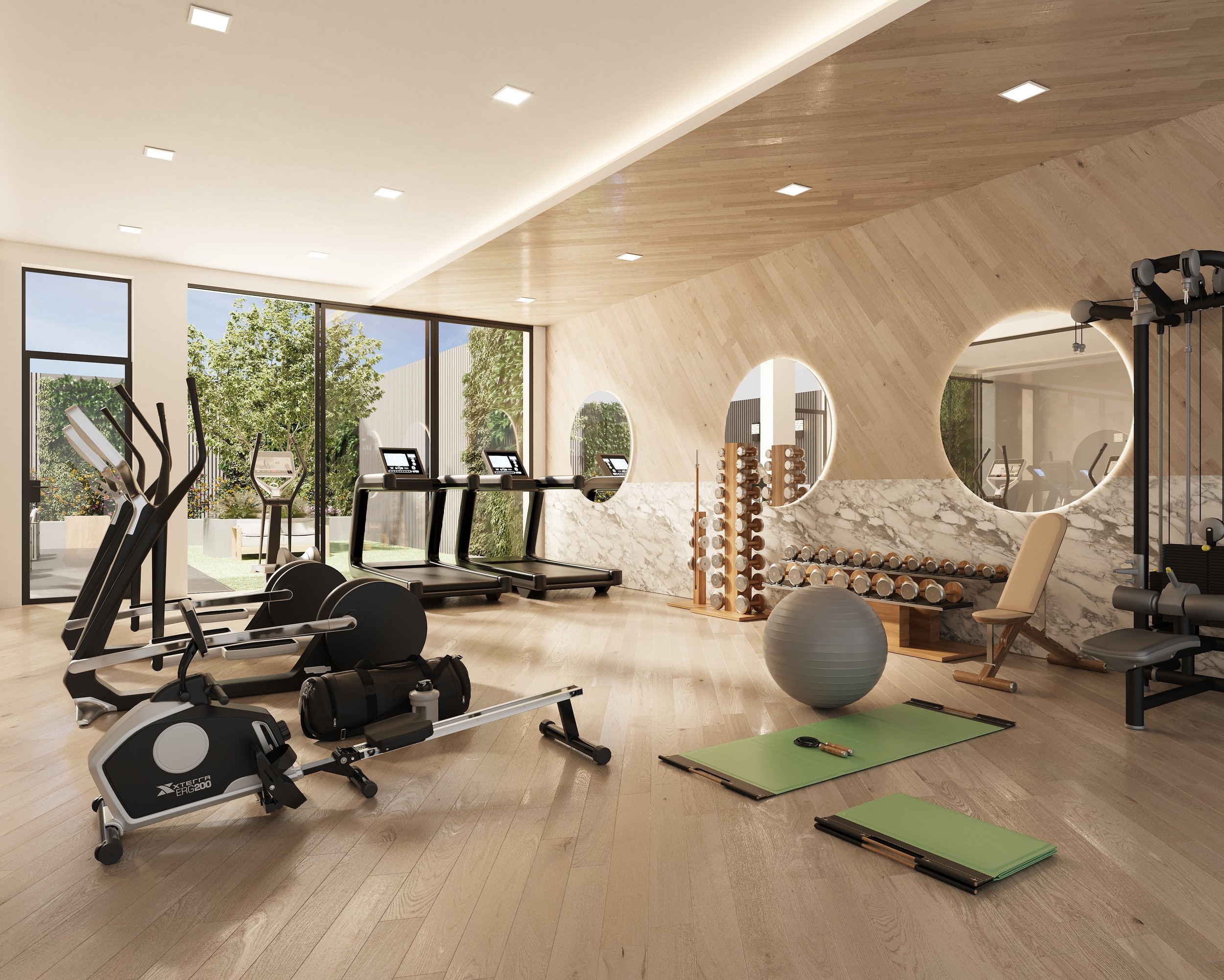
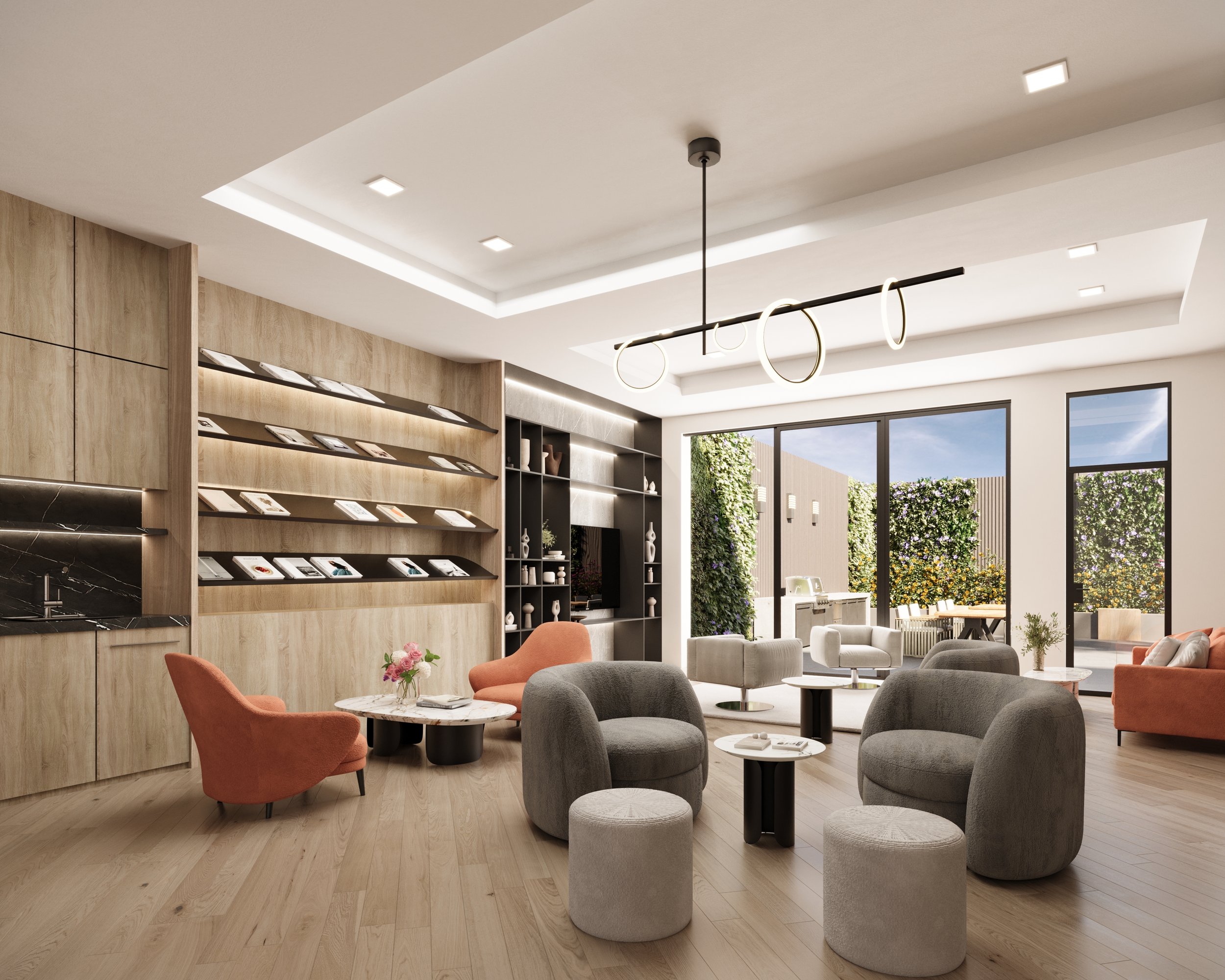
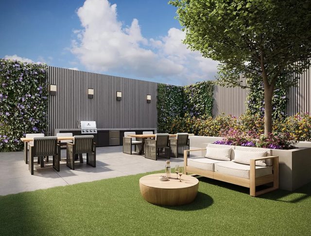
Residential amenities are located on the first floor of Lucent33 and include a doorman, a communal outdoor backyard with a barbecue grill, a fitness center, a lounge, indoor parking, Amazon Hub lockers, bicycle storage, and a package room.
The nearest subways from Lucent33 are the N and W trains at the elevated 39th Avenue station to the southwest.
Bethoney Shen of Nest Seekers International is handling leasing for the project.
Subscribe to YIMBY’s daily e-mail
![]()
Follow YIMBYgram for real-time photo updates
Like YIMBY on Facebook
Follow YIMBY’s Twitter for the latest in YIMBYnews

Nice building but when considering architectural stability, can there be too much? Could this structure have gone a step closer to the edge or is the abyss too deep?
So now we’re naming apartment buildings after defunct telephone companies?
Not bad.
Surprisingly nice adaptation of the mid 20th Century Park Average skyscraper style. I hope other LIC developers are taking note. And look at the dreck it replaced! Now, that’s an upgrade!
“Lucent” can mean radiant or luminous. The building is a light color.
starring out at those power lines and poles would ruin it for me.
The pale blue-gray panels match the color of the main glass-clad façade, I agree with this statement that it looks wide open: Thanks.