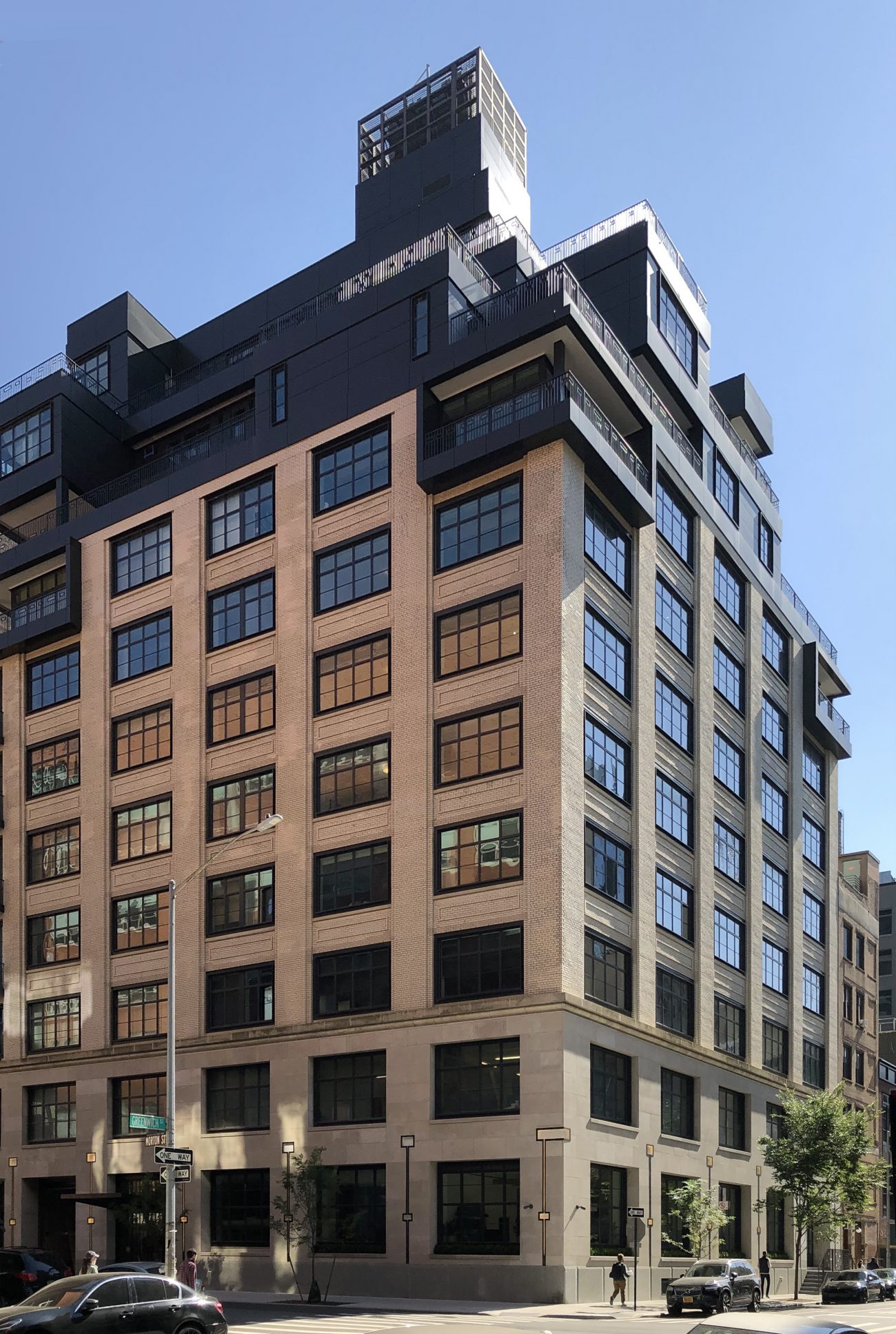
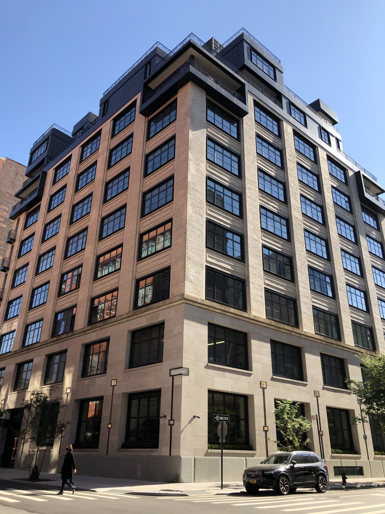
Construction has reached full completion at 90 Morton Street, a 12-story condominium building in the West Village. Designed by Asaf Gottesman of Gottesman-Szmelcman Architecture and developed by Brack Capital Real Estate, the 150-foot-tall project involved a rooftop addition on an eight-story industrial building that once housed a printing warehouse. The structure yields 122,000 square feet with interior design by Marc Turkel of Leroy Street Studio. Reuveni Real Estate is leading sales and marketing of the 35 units, which hit the market in April 2018 with prices starting at $5.3 million.
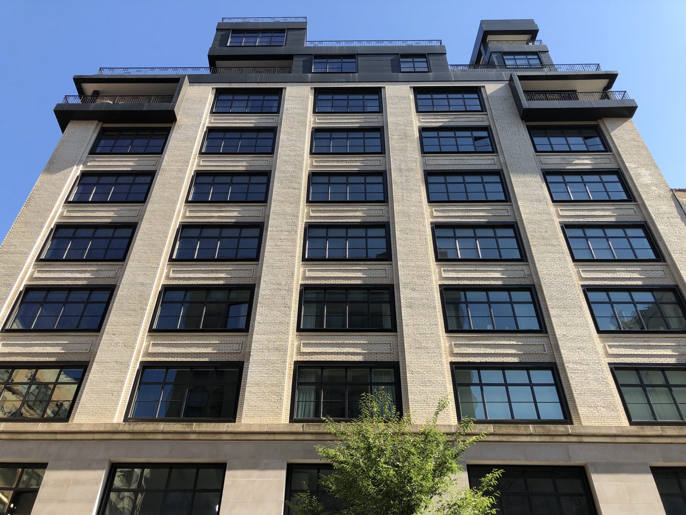
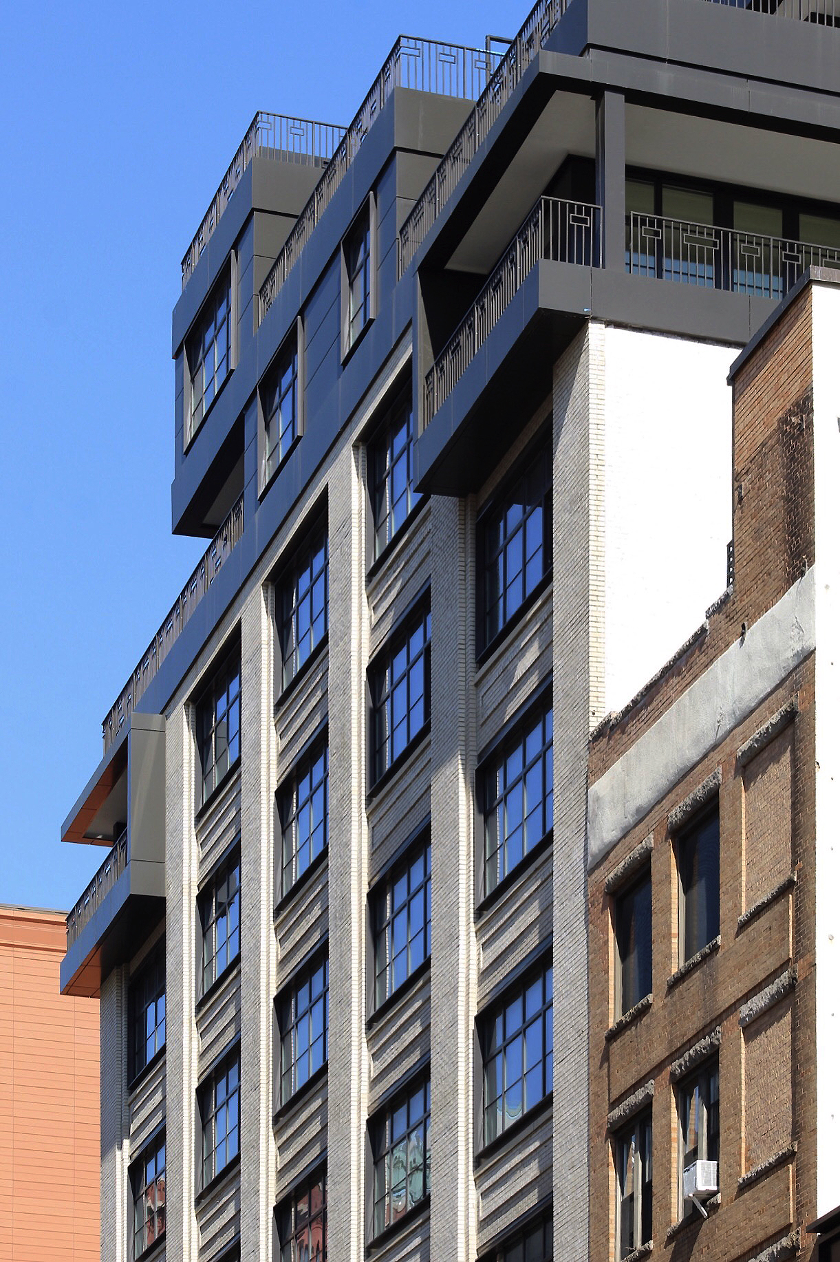
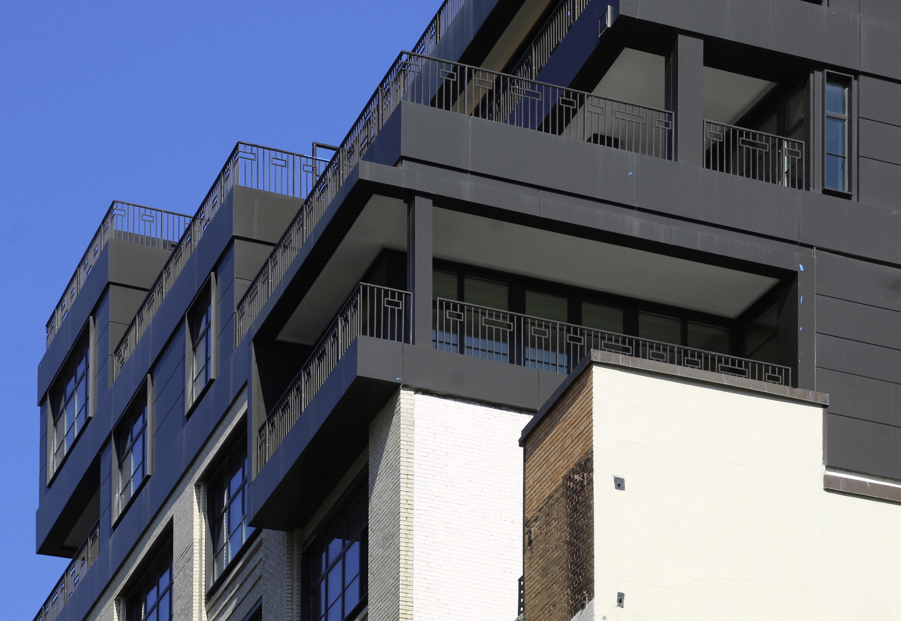
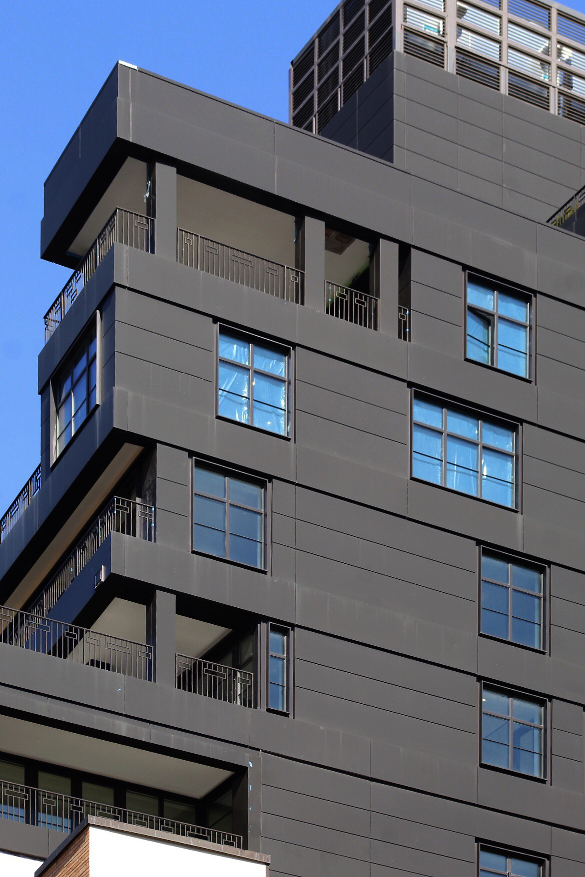
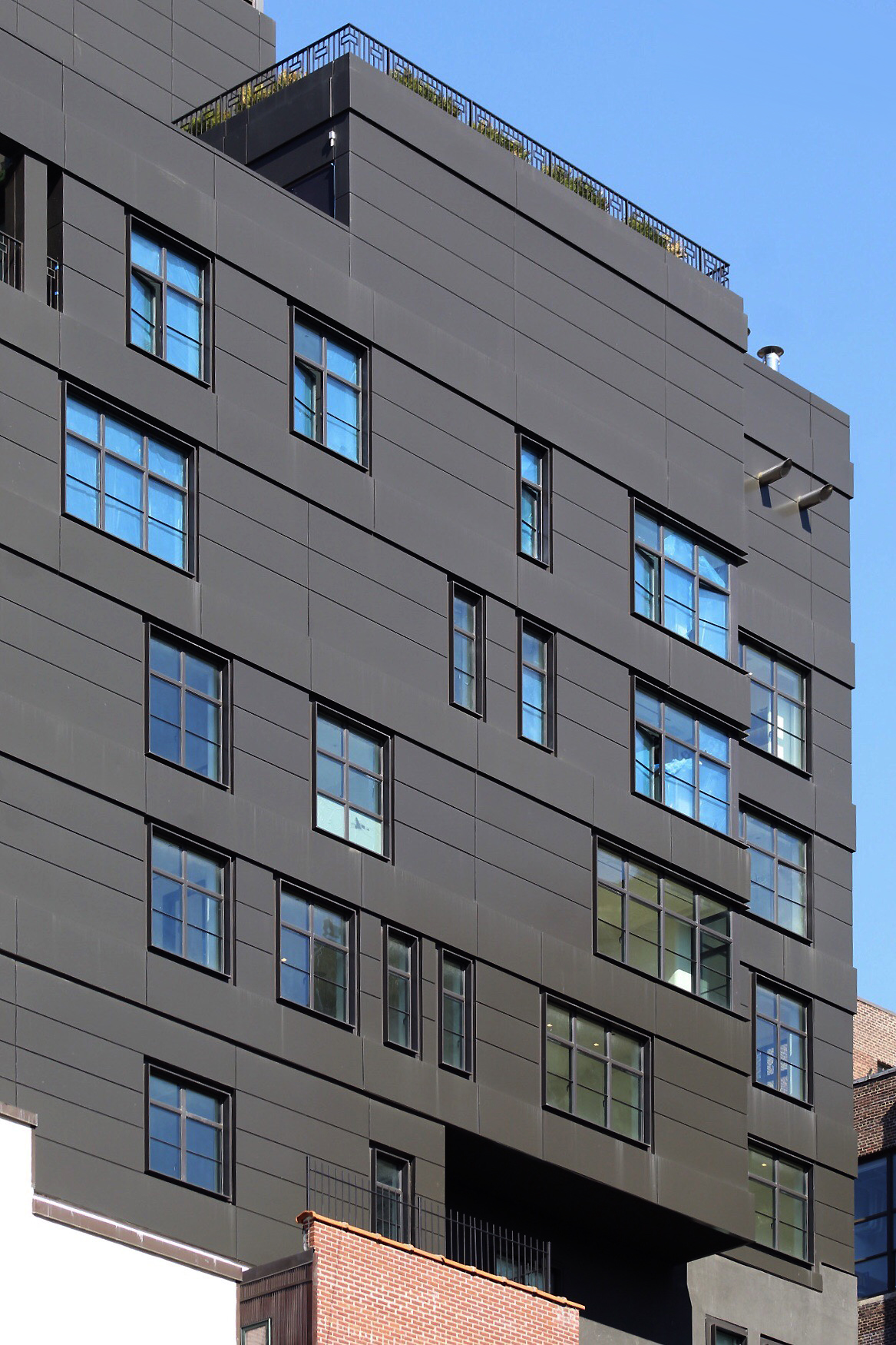
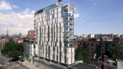
Photographs show the detailed brick masonry walls, restored industrial windows, and the dark-clad upper floors featuring ornate railings and numerous setbacks. The structure fuses traditional and contemporary styles in a cohesive way that distinctly suits its context.
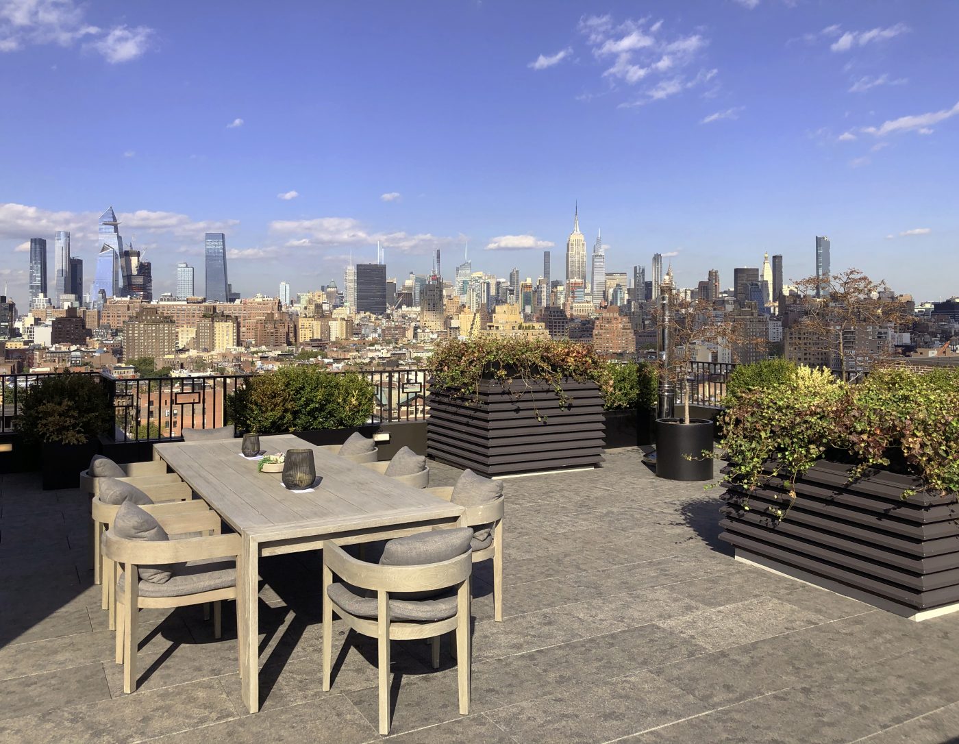
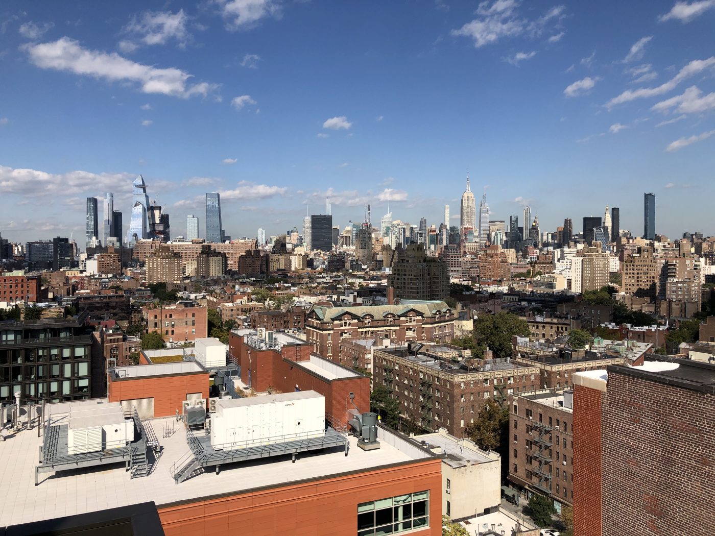
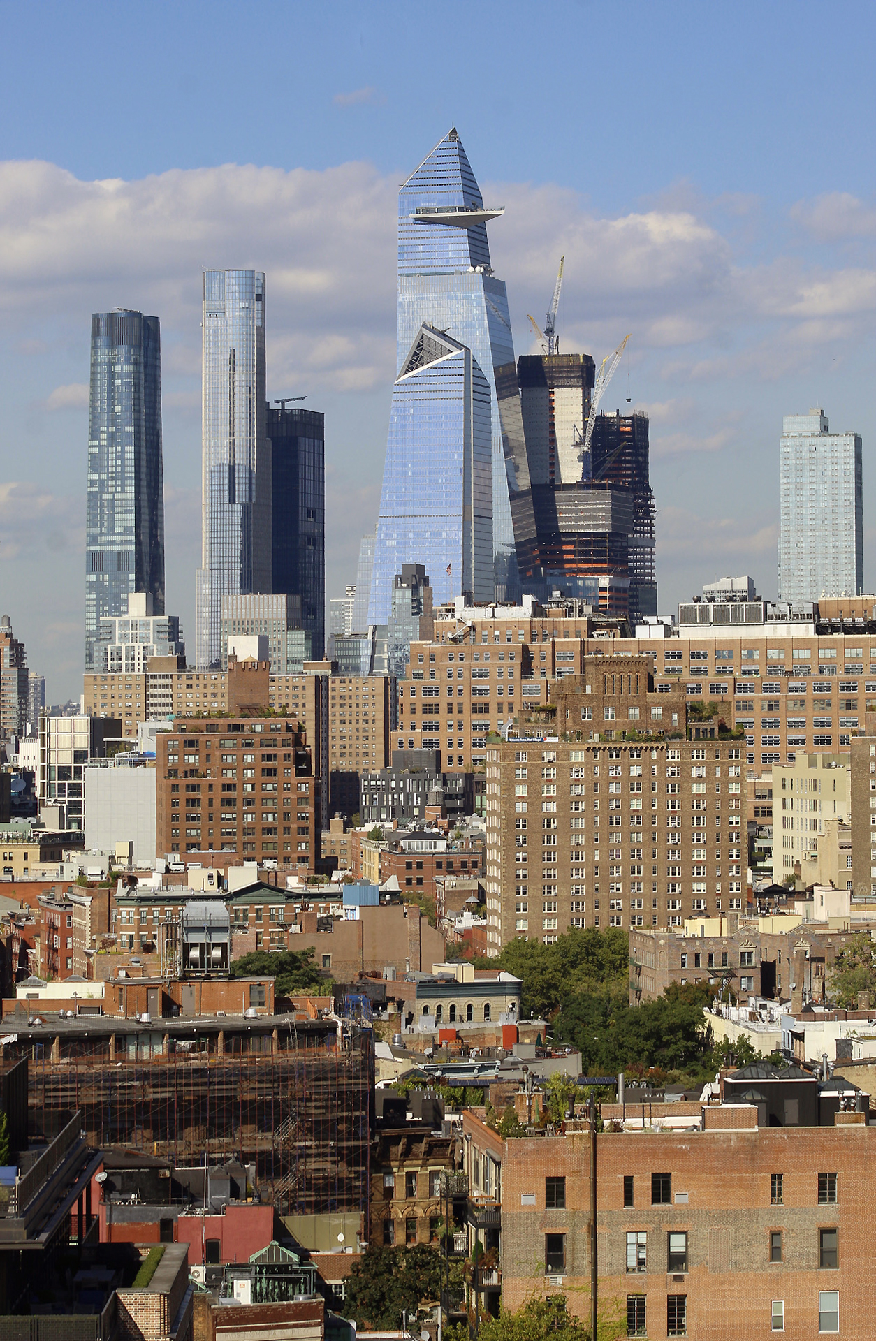
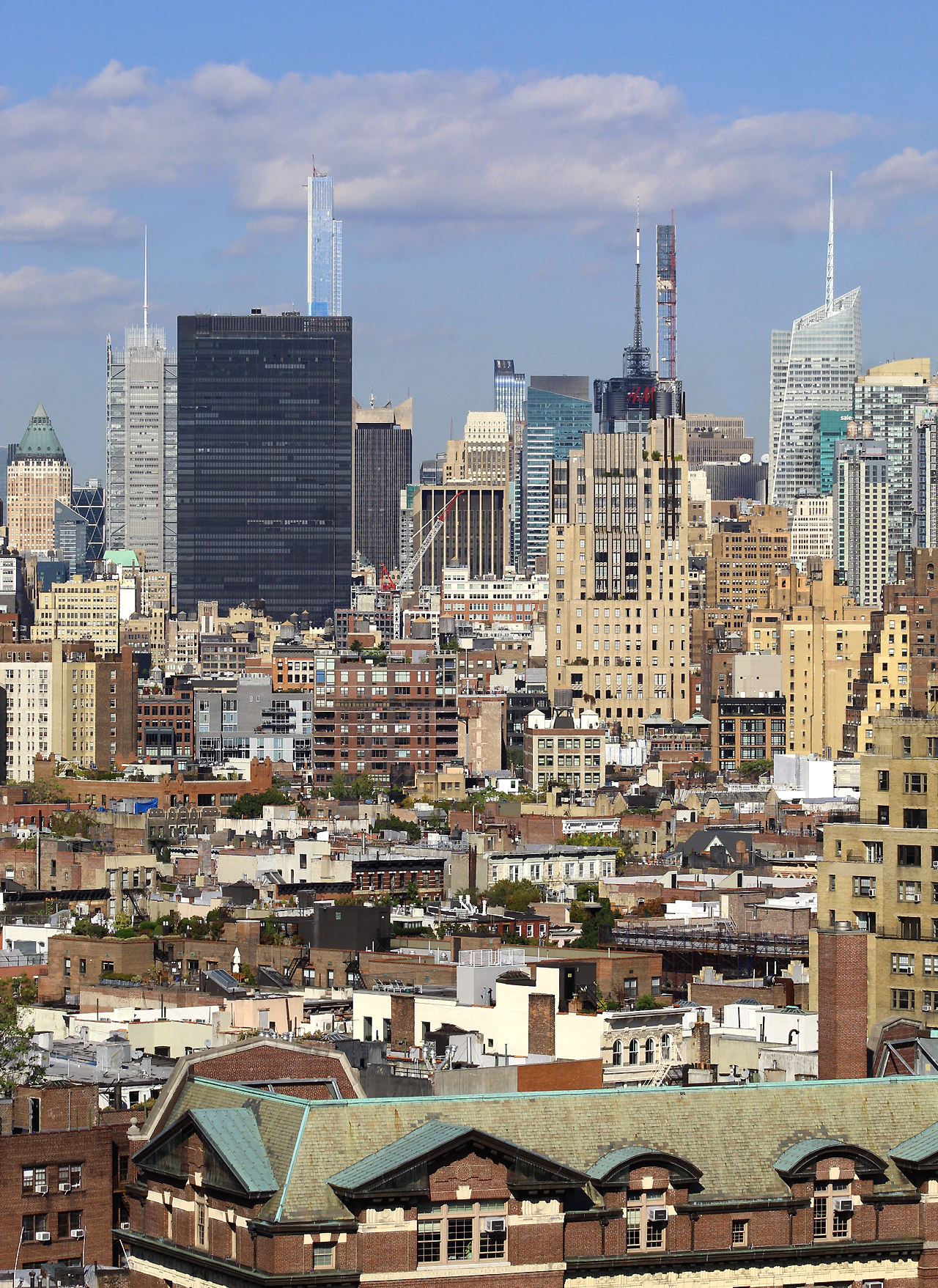
Units range from 1,813-square-foot, two-bedroom homes to 5,820-square-foot, five-bedroom homes. Six of the 35 residences are penthouses with their own private outdoor terraces. Perhaps the biggest selling point of the entire building is the incredible views of the West Village and Midtown skyline from the landscaped rooftop terrace. This space provides vistas of the skyscrapers from Hudson Yards to Billionaires’ Row as well as icons like the Empire State Building and the Chrysler Building. The Hudson River, One World Trade Center, and the Jersey City skyline and Hoboken waterfront are also clearly visible in the opposite direction. A kitchen and outdoor seating and lounge areas are scattered across this amenity space.
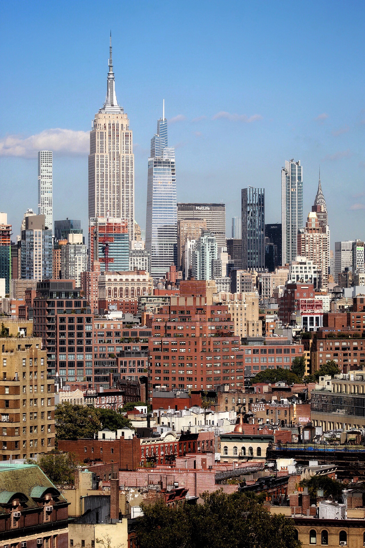
The Empire State Building, One Vanderbilt, 432 Park Avenue, and other skyscrapers seen rising above Midtown. Photo by Michael Young
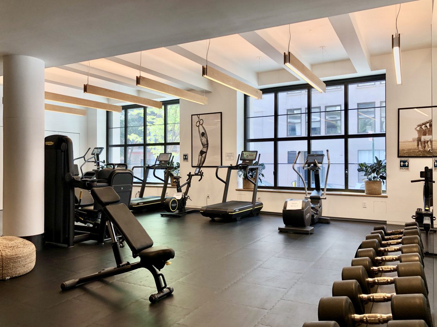
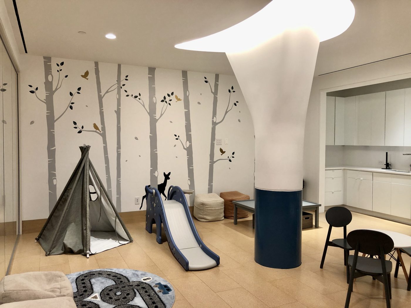
90 Morton Street is already inhabited by a number of residents, and only a minor amount of interior work on the amenity spaces in the lower levels of the property remain to be completed. Amenities include a 24-hour attended lobby, virtual concierge services by LIV Unlimited, a resident’s library, a cold storage room, and a 64-foot indoor pool with direct elevator in the cellar with clerestory windows that obtain lighting from the sidewalk. There are also saunas and changing rooms with showers and individual lockers, a fully equipped fitness center and yoga area located next to the main lobby, and a children’s playroom.
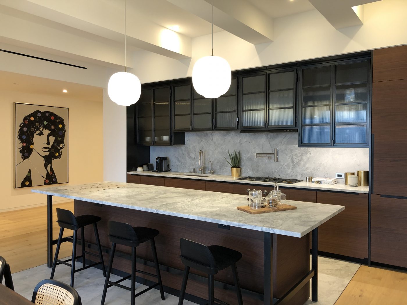
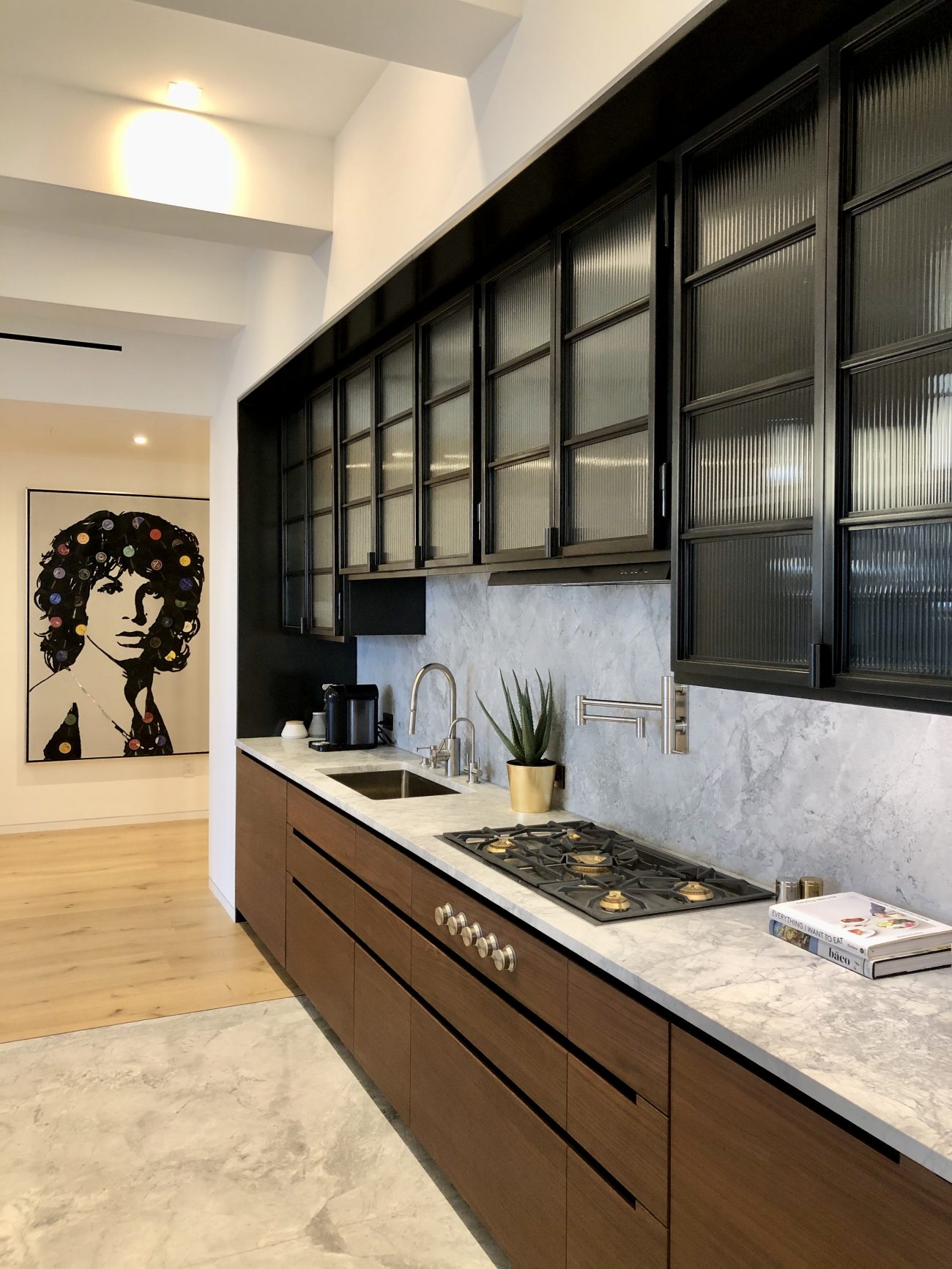
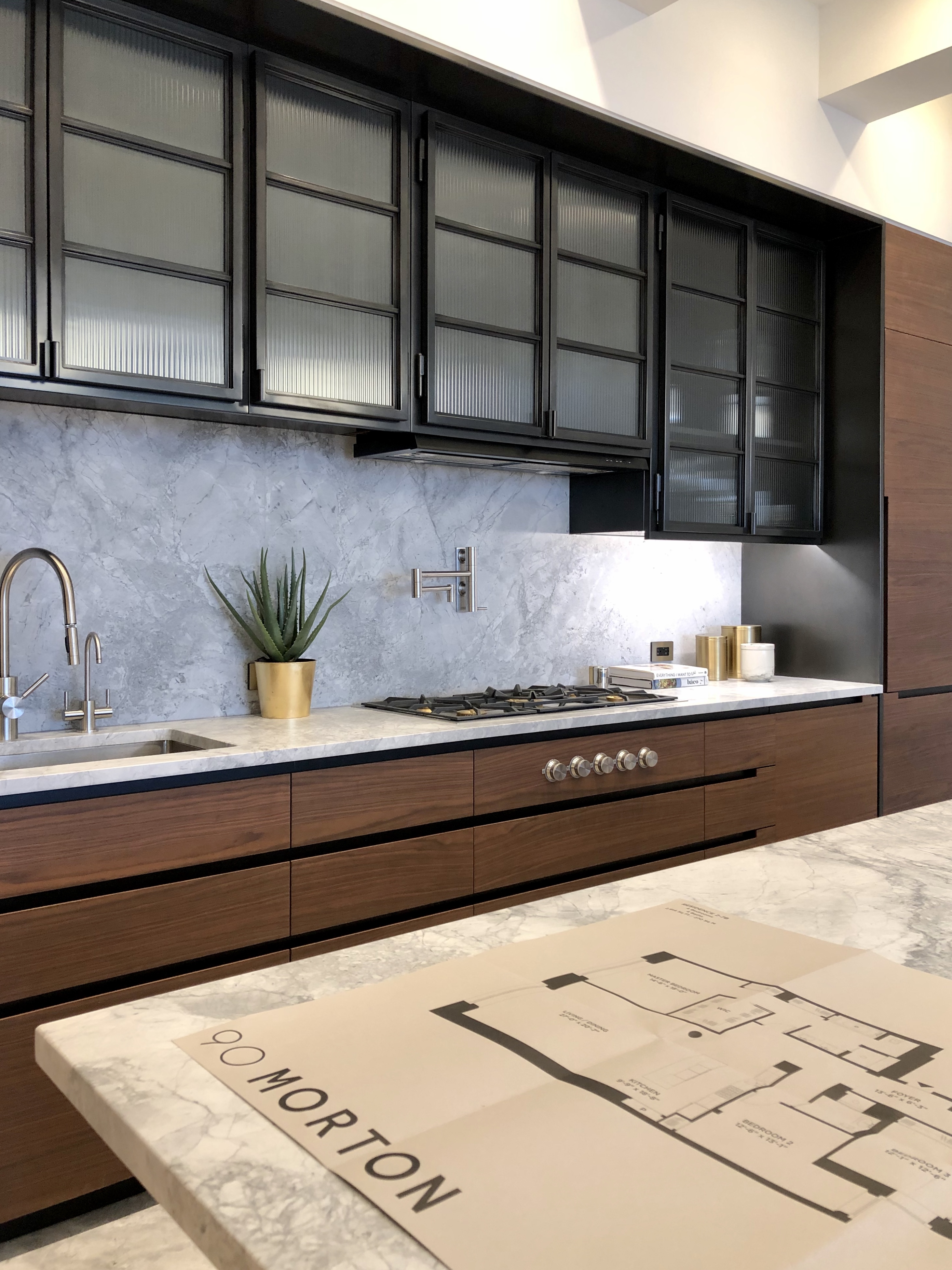
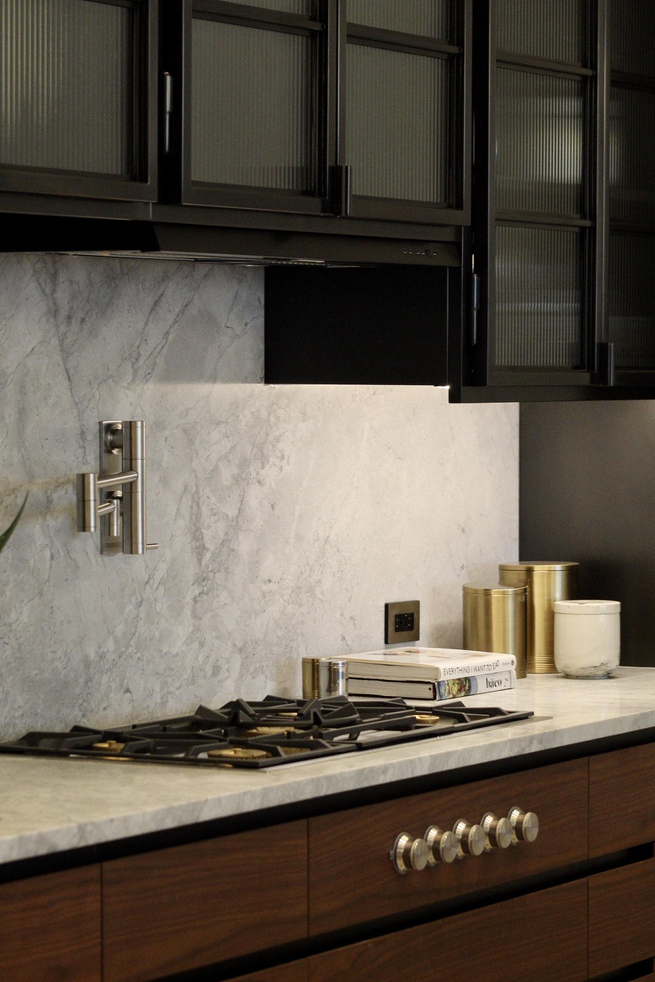
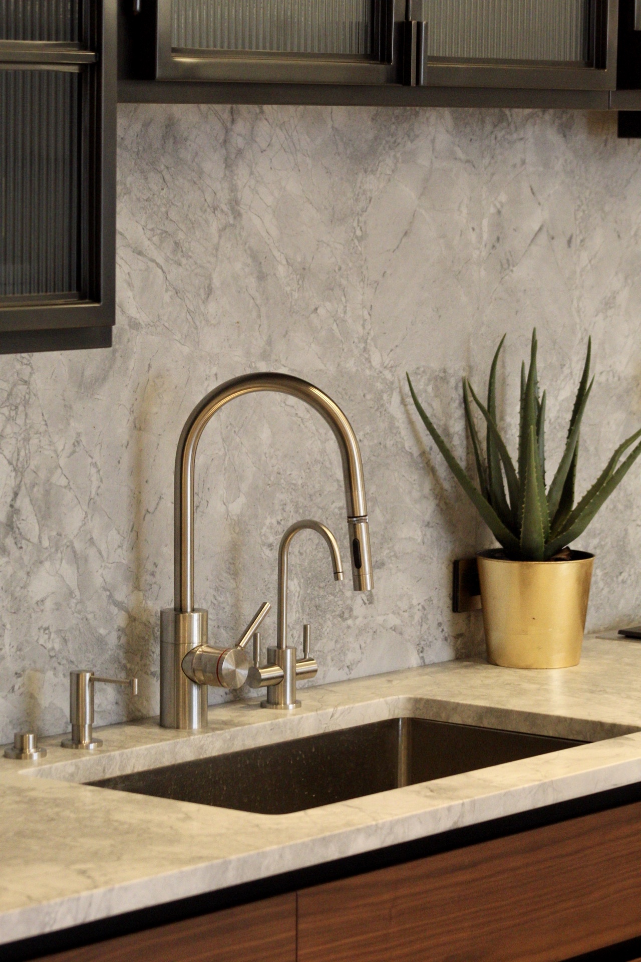
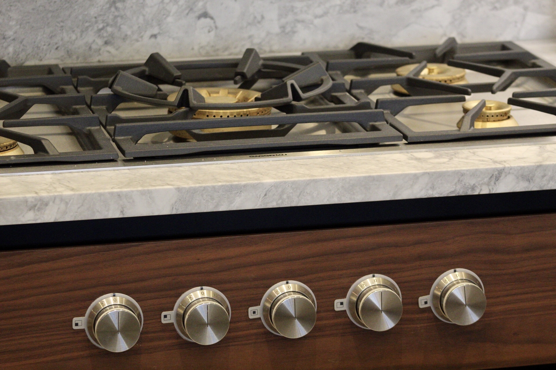
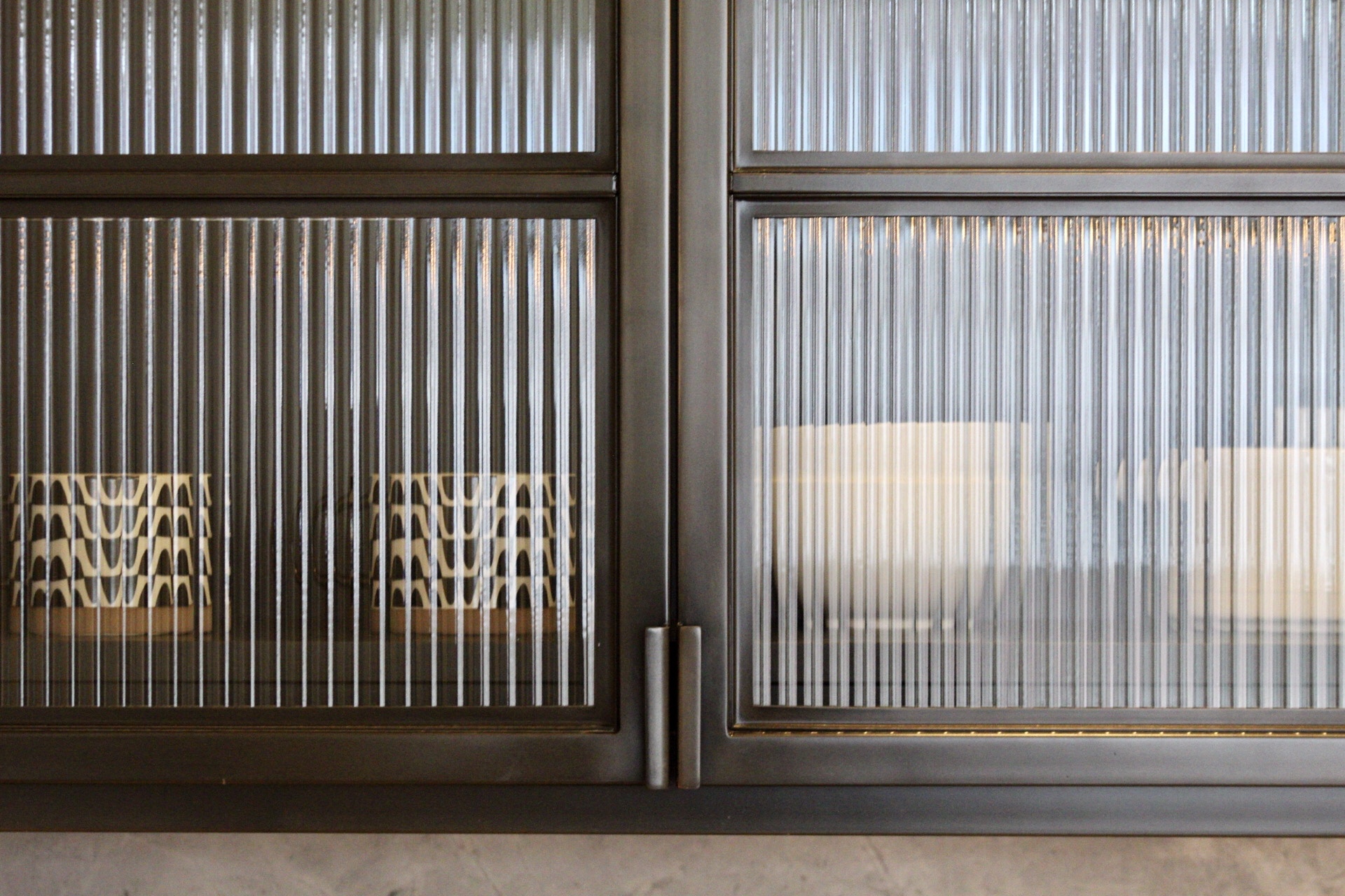
Standard finishes are high ceilings up to 12 feet 4 inches with original concrete beams and columns newly painted, 10-inch-wide-plank floors, and industrial-modern kitchens with custom walnut Poliform cabinets, and custom blackened-steel-and-glass upper cabinets and white quartzite counters and backsplashes. Homes come furnished with Gaggenau refrigerators and dishwashers, a stainless-steel Gaggenau convection oven, a speed oven, a warming drawer and cooktop, two under-counter refrigerator drawers, a Sub-Zero wine refrigerator, a Blanco sink with a stainless-steel Waterstone faucet, and a water filter. Master bathrooms have honed Royal Danby marble and have Kaldewei deep-soaking tubs, while powder rooms are lined with Ceppo di Gre stone tiles.
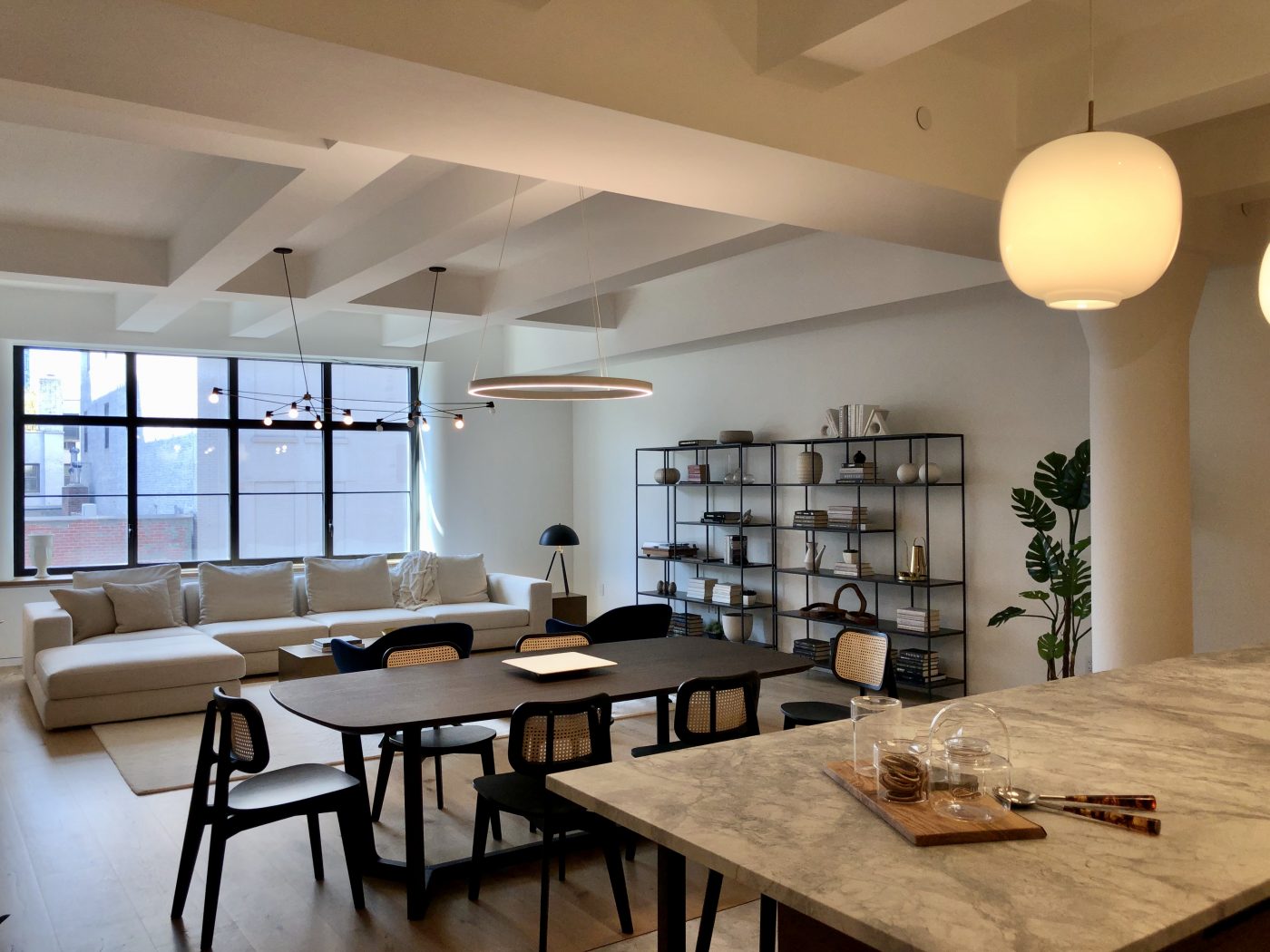
Below are photographs taken of the main lobby, the fitness center, the children’s playroom, and one of the model units.
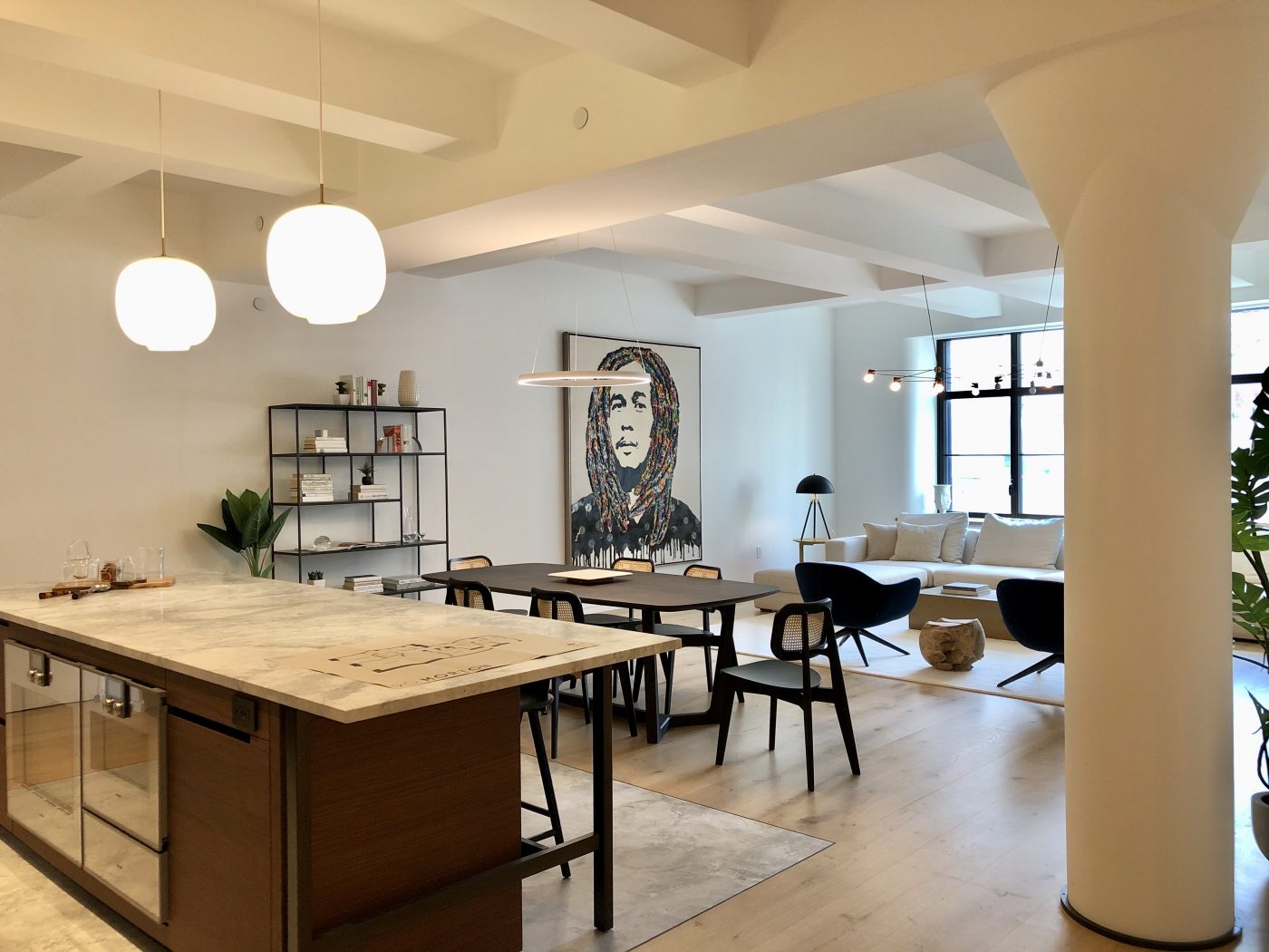
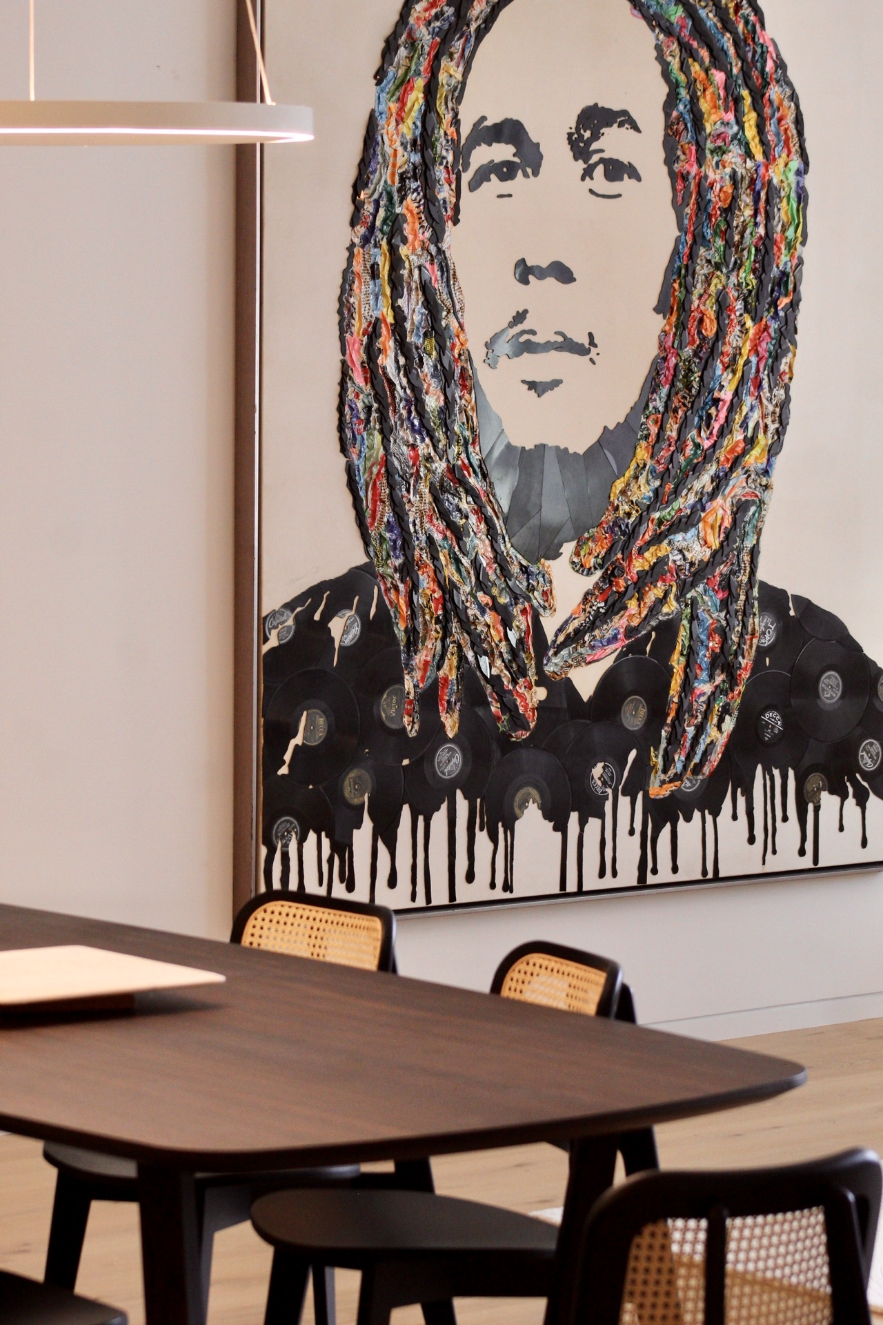
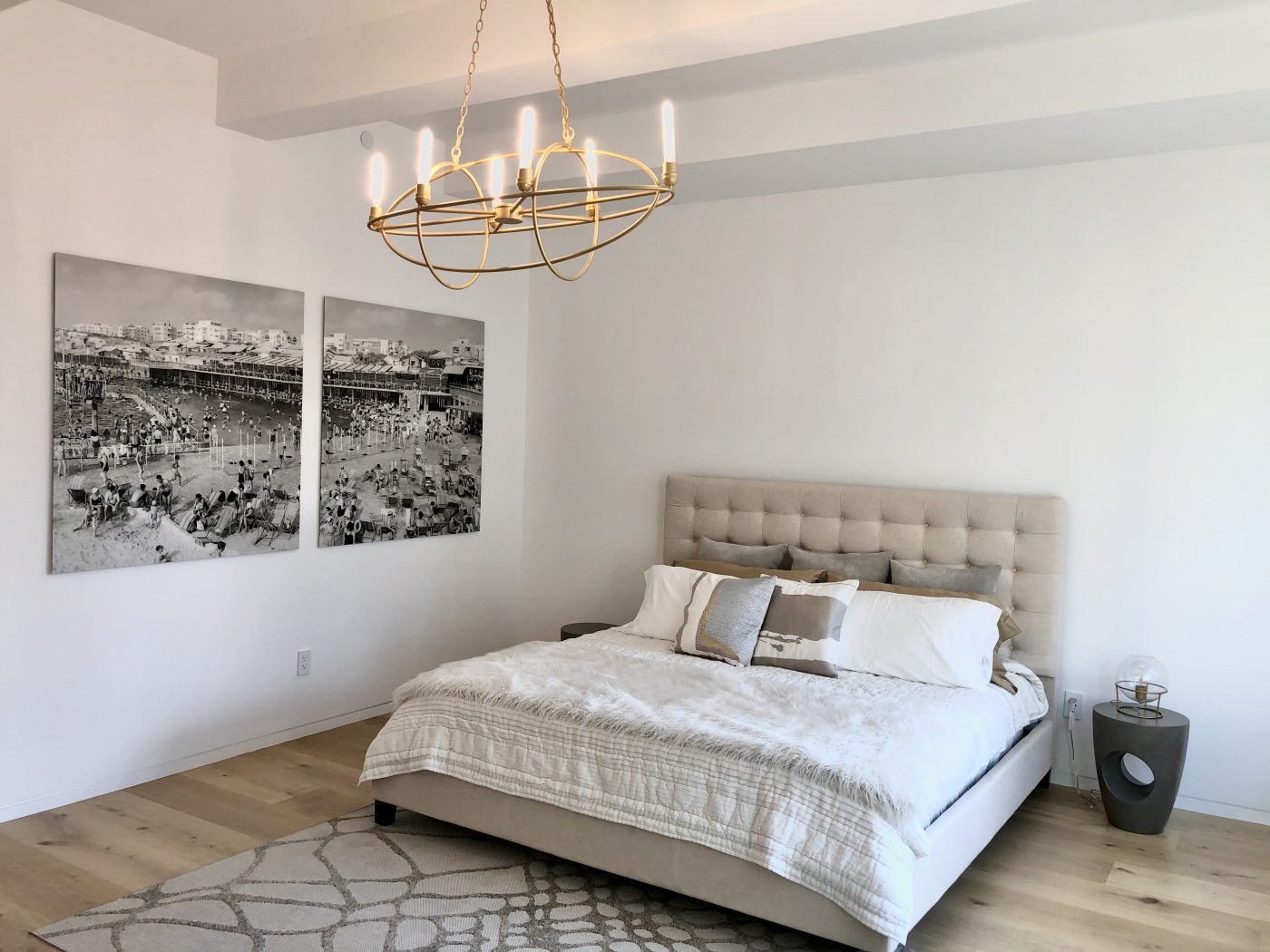
Inside the model unit looking towards the kitchen and adjacent living space. Photo by Michael Young.
Subscribe to YIMBY’s daily e-mail
Follow YIMBYgram for real-time photo updates
Like YIMBY on Facebook
Follow YIMBY’s Twitter for the latest in YIMBYnews






I envy how Michael Young could get such a in depth look of 90 Morton Street. Kudos to him! But the exterior is not good. The original industrial building looks beautiful and very charming. But the new addition looks very weird and almost out of place to be quite honest. I’m very disappointed by this.
..and prices ‘starting’ at 5.3 Million ? Good luck with that!
They bought the building 5 years ago , so I’m not sure why it takes 5 years to finish it, but good luck selling those pats as everyone is moving out of Manhattan
Very nice looking building but clearly overpriced for the area.
5.3 in this market ? The hush secret is probably 2.5 .
If the virus vibes back again. It will be a museum .
This is old news. It was finished 2 years ago at least.
This is nearly criminal. A great piece of industrial architecture dog-humped by a developer’s revenue box.
This architect should be ashamed of himself.
The top addition is disgusting.