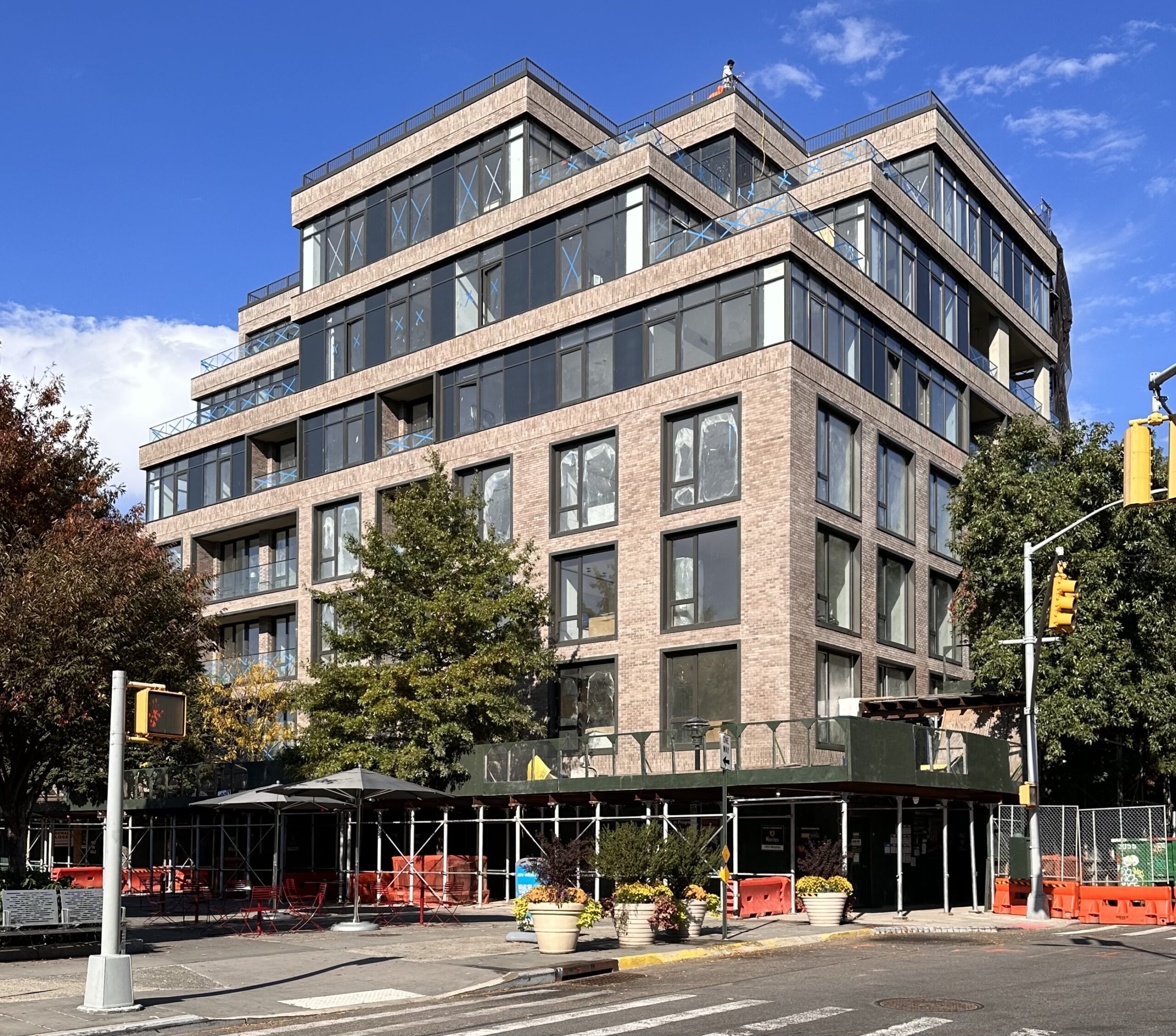
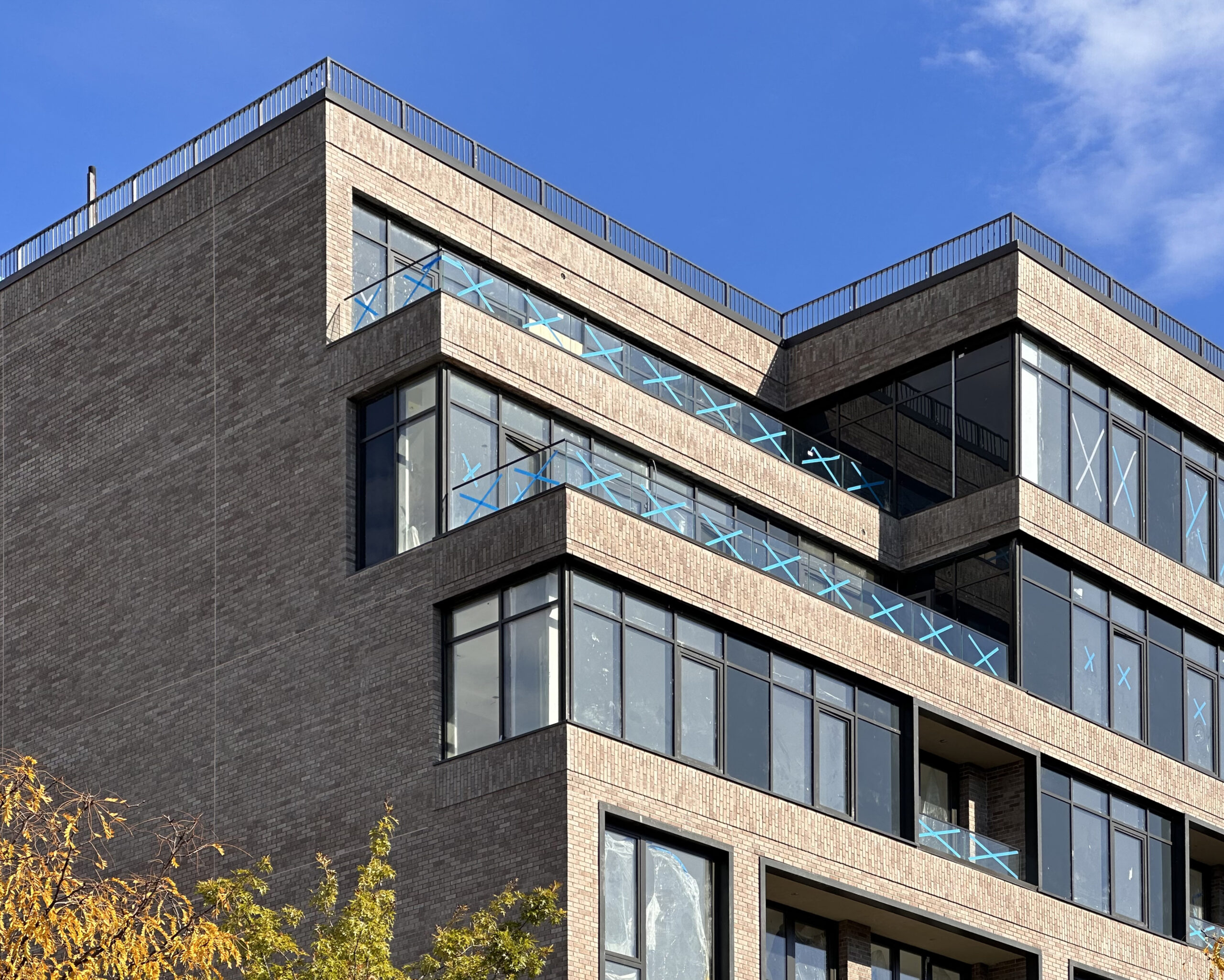
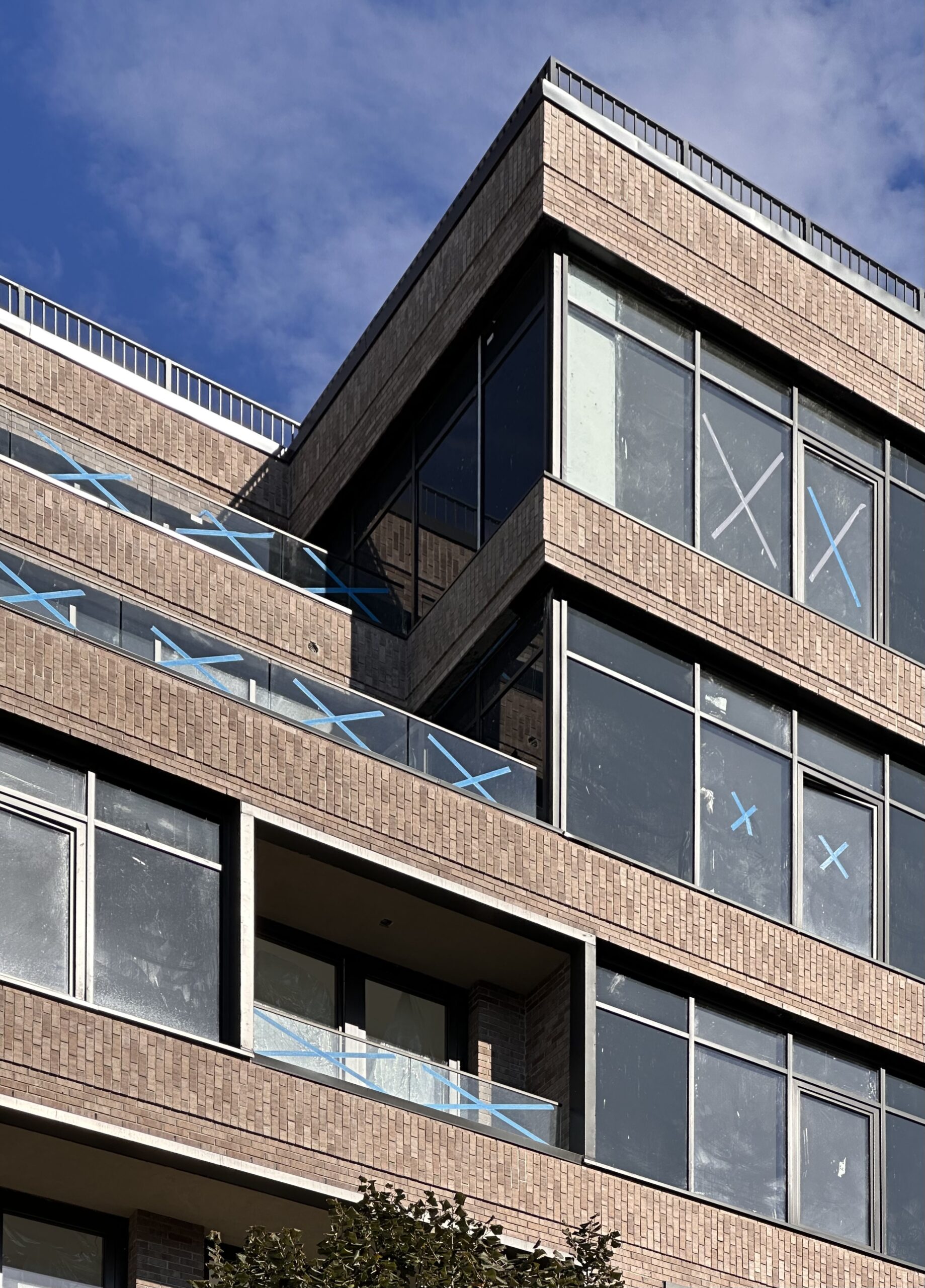
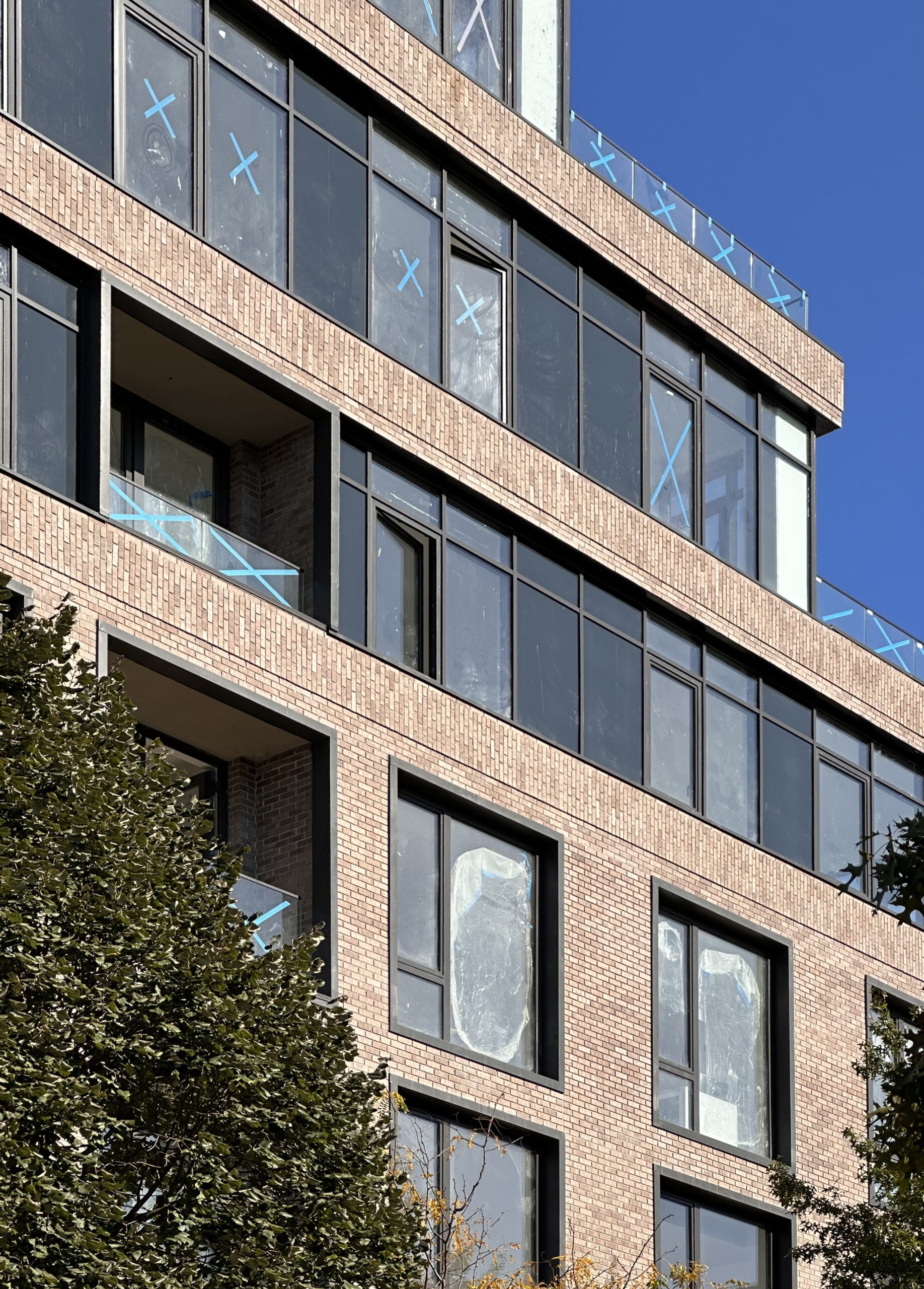
Exterior work is nearing completion on 450 Grand, a seven-story residential building at 450 Grand Avenue in Clinton Hill, Brooklyn. Designed by Issac & Stern Architects and developed and built by Citi Builders NY under the 450 Grand Ave Owner LLC, the 80-foot-tall structure will yield 42 condominium units spread across 35,296 square feet with interiors by Durukan Design, and 6,089 square feet of commercial space. The Scott | Robles Team at Douglas Elliman Development Marketing Group is leading sales an marketing for the property, which is located by the intersection of Grand Avenue and Fulton Street, just north of Putnam Triangle.
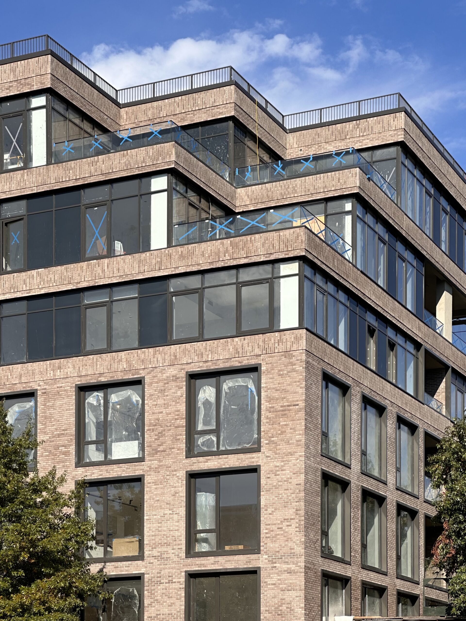
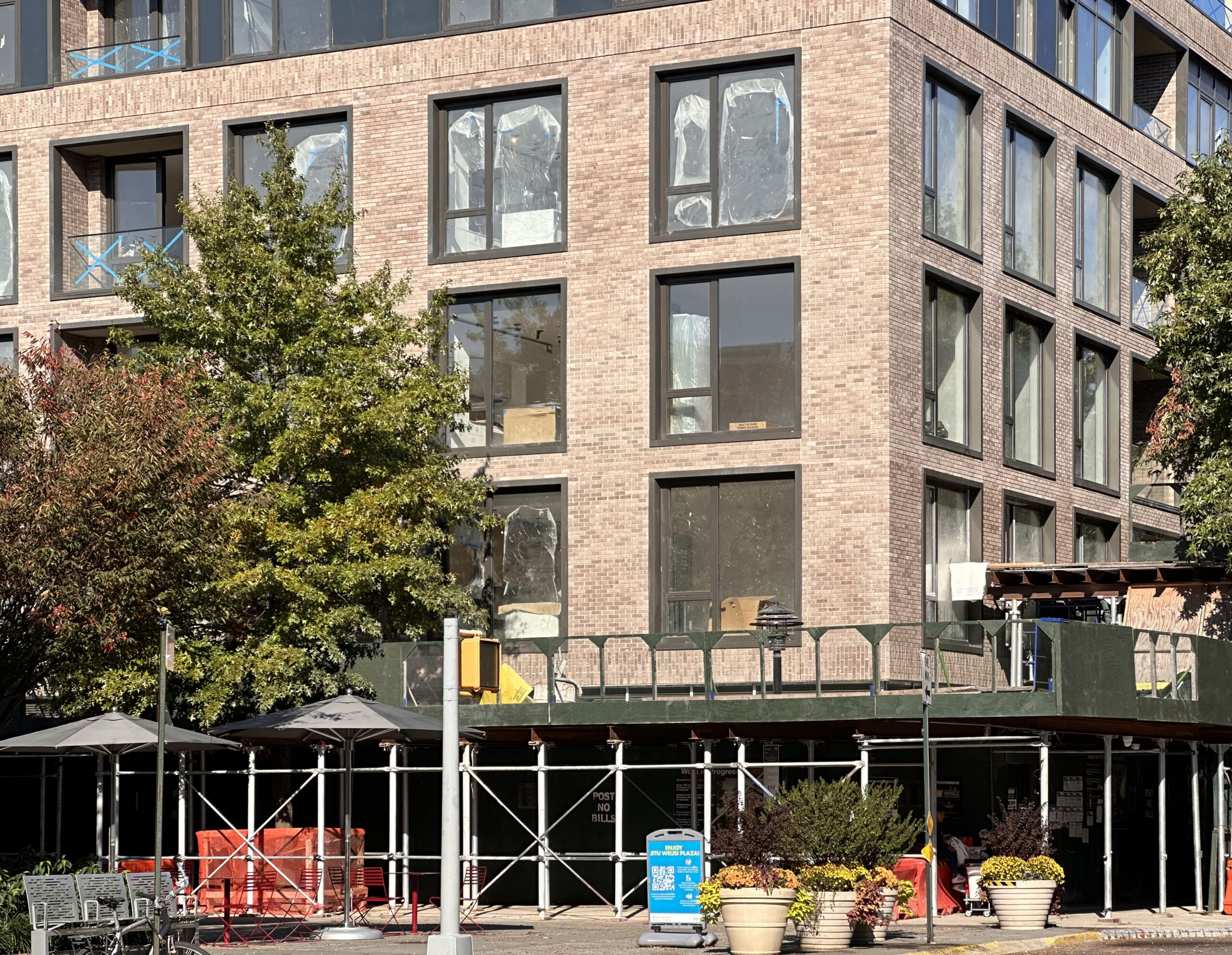
The reinforced concrete superstructure had just topped out at the time of our last update in November 2022, with formwork aiding in the settling of the upper floors behind scaffolding and black netting. Since then, the entire envelope of earth-toned brick and floor-to-ceiling windows with black mullions has been put in place. Glass railings line the edges of the multiple setbacks, which will be topped with terraces. The ground floor is still obscured behind sidewalk fencing, but work should be wrapping up soon.
Each of 450 Grand’s homes will feature kitchens with matte white cabinetry, Caesarstone counters, and Wolf and Sub-Zero appliances. Bathrooms come with natural stone and Dornbracht fixtures.
Residential amenities include a fitness center, a children’s playroom, a coworking space, a pet spa, a sixth-floor karaoke and media club lounge, a lobby appointed with fluted wood millwork and cement-based micro topping walls, a club lounge leading out to an adjacent private landscaped garden, and a rooftop terrace with barbecue grilling stations, al fresco dining, and 360-degree views over Clinton Hill and the Manhattan skyline to the north.
The nearest subway from the property is the C train at the Clinton-Washington Avenues station at the corner of Fulton and Clinton Streets.
Subscribe to YIMBY’s daily e-mail
Follow YIMBYgram for real-time photo updates
Like YIMBY on Facebook
Follow YIMBY’s Twitter for the latest in YIMBYnews


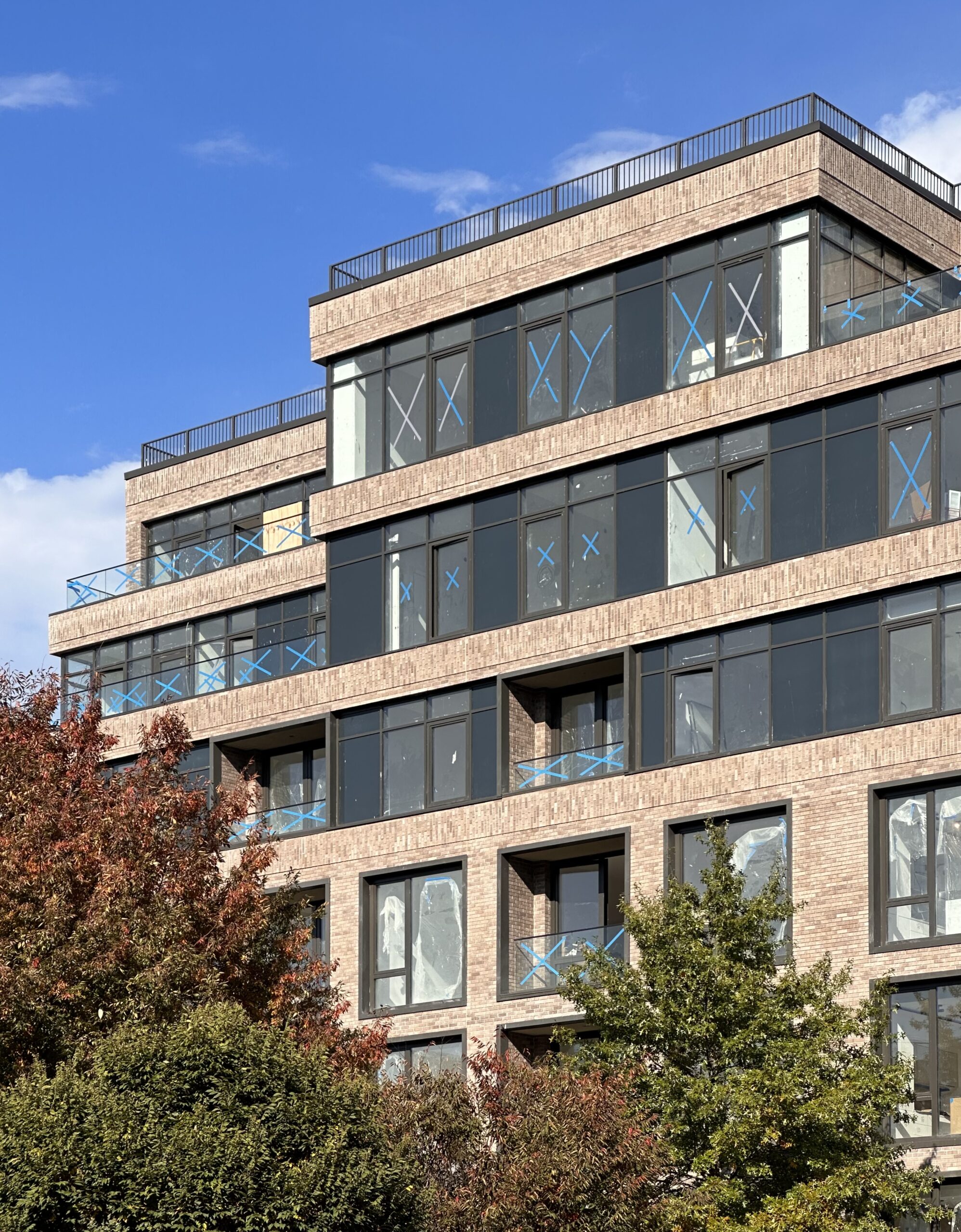
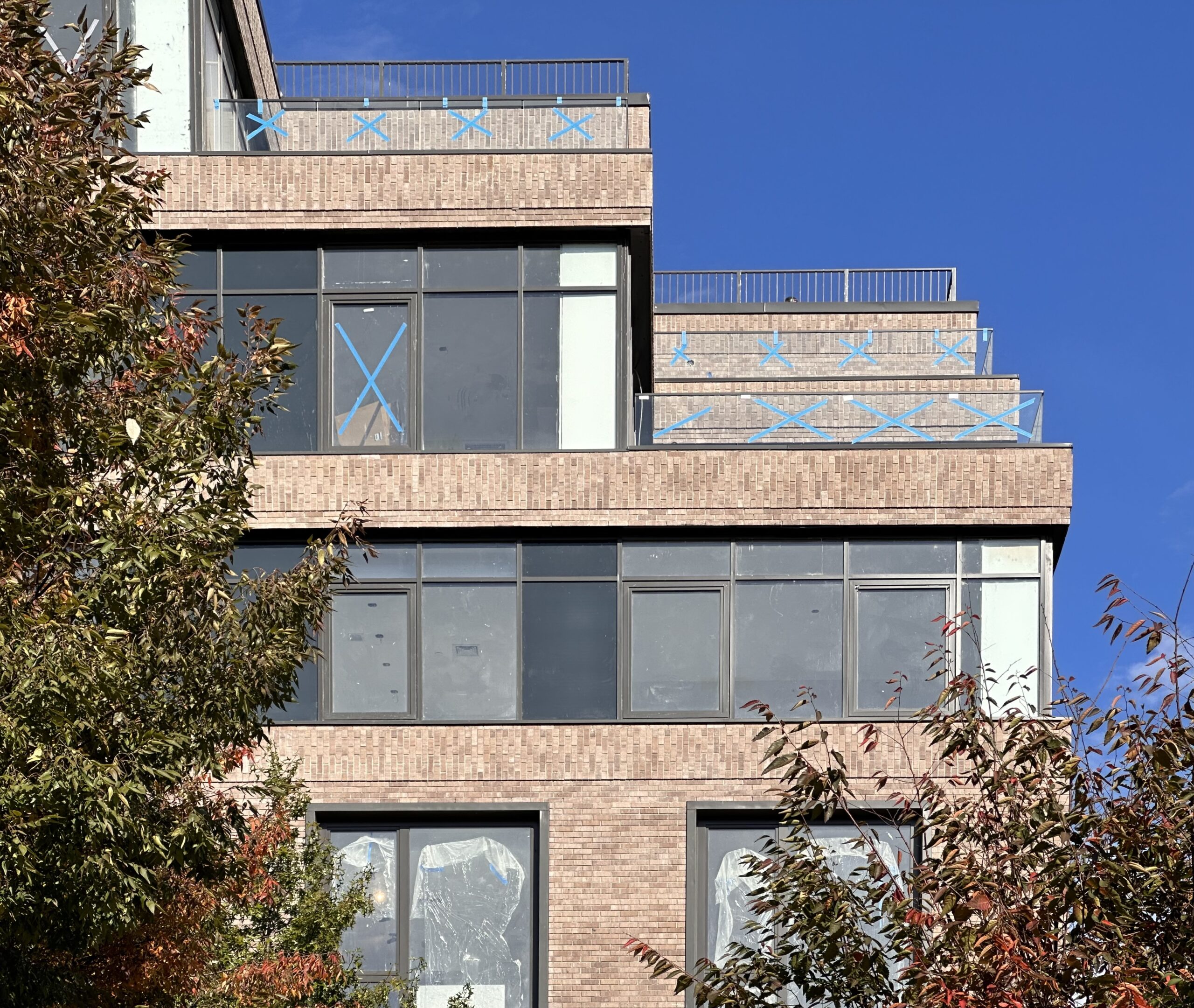
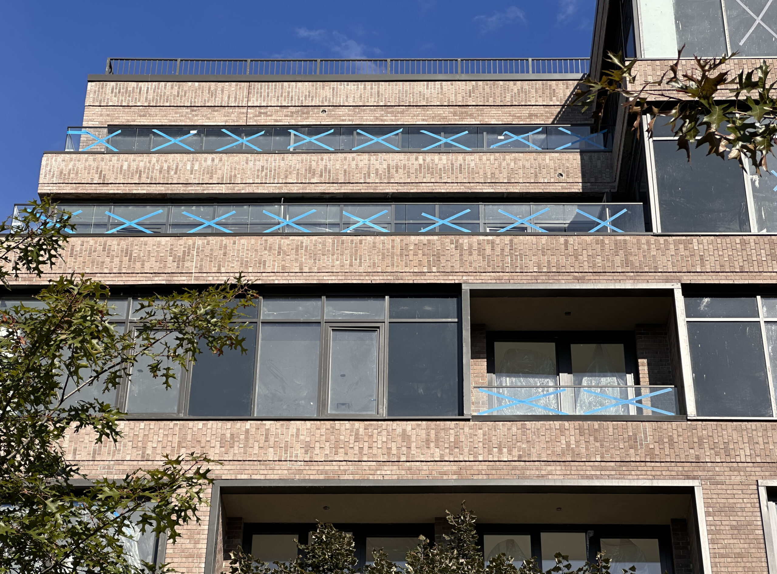
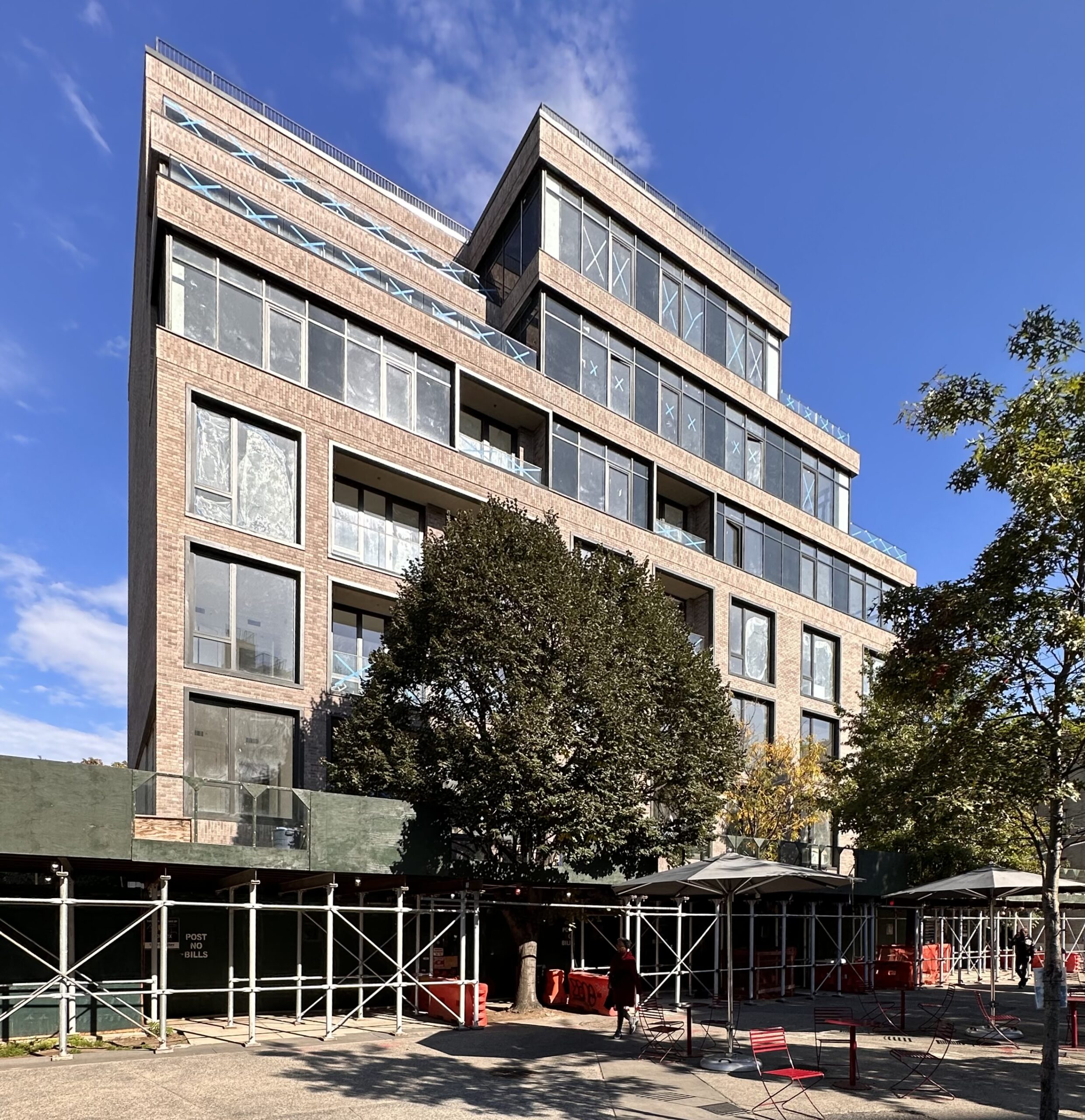
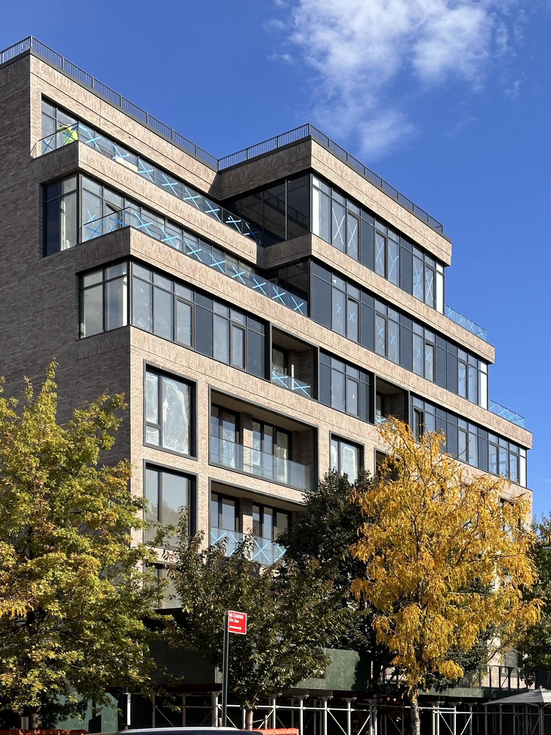



The obvious spandrel glass looks like a mistake.
Just an FYI, but thanks to bird friendly requirements, spandrel glazing can only have a #4 surface of a few select colors, all dark. Hard to blend vision glazing with that aspect. Not sure if its the case here, but expect more of it to come.
They should have painted the sides of the columns facing the corner windows black.
Great architectural intent, windows are nice. However , lower levels give a feel of a medical facility. With all these amenities and spectacular views then I would think one would’ve added a little more elegance to the exterior though it still fits in with the areas other new buildings.