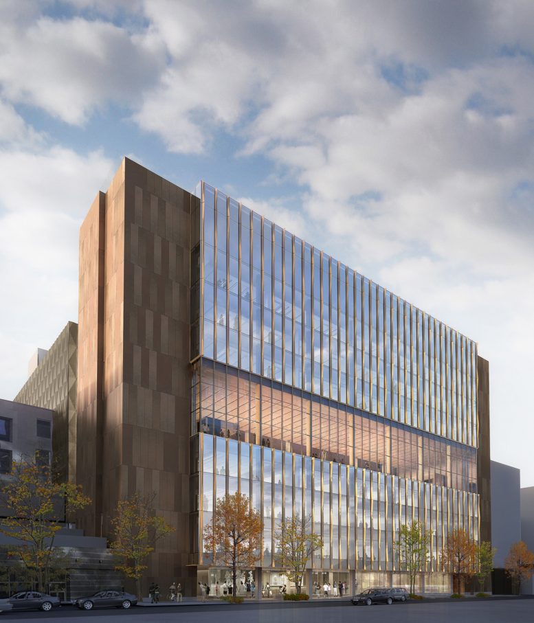
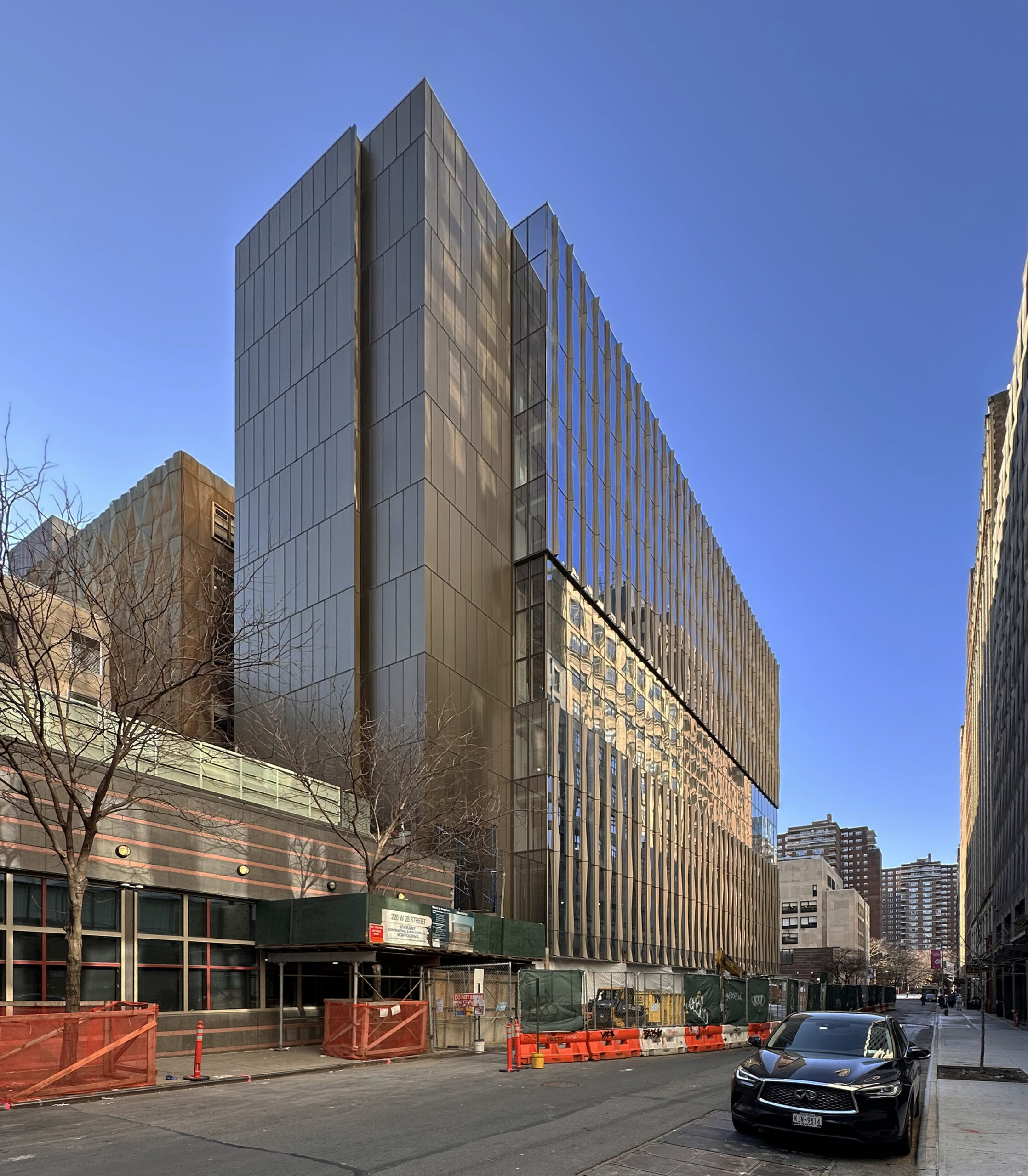
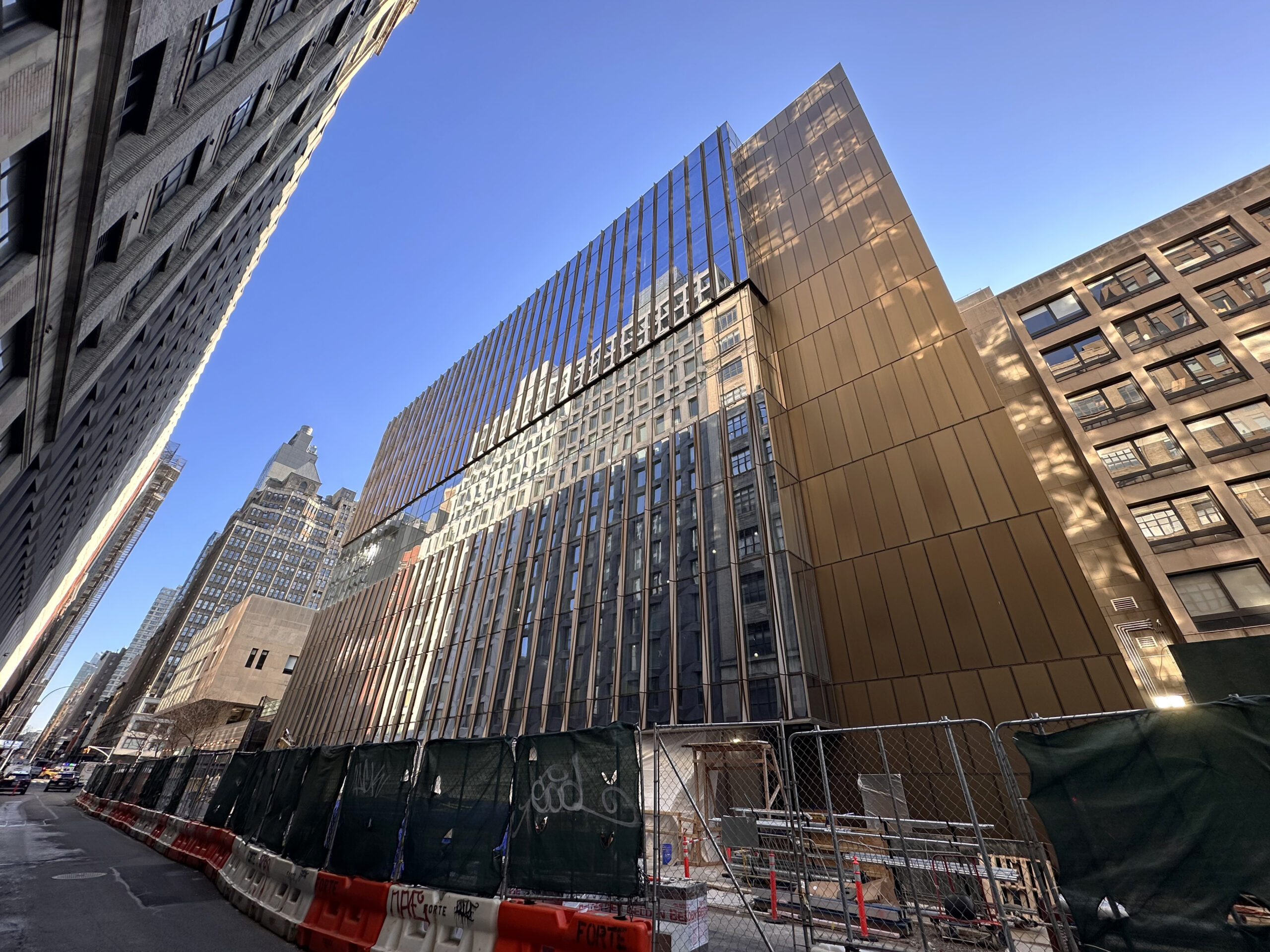
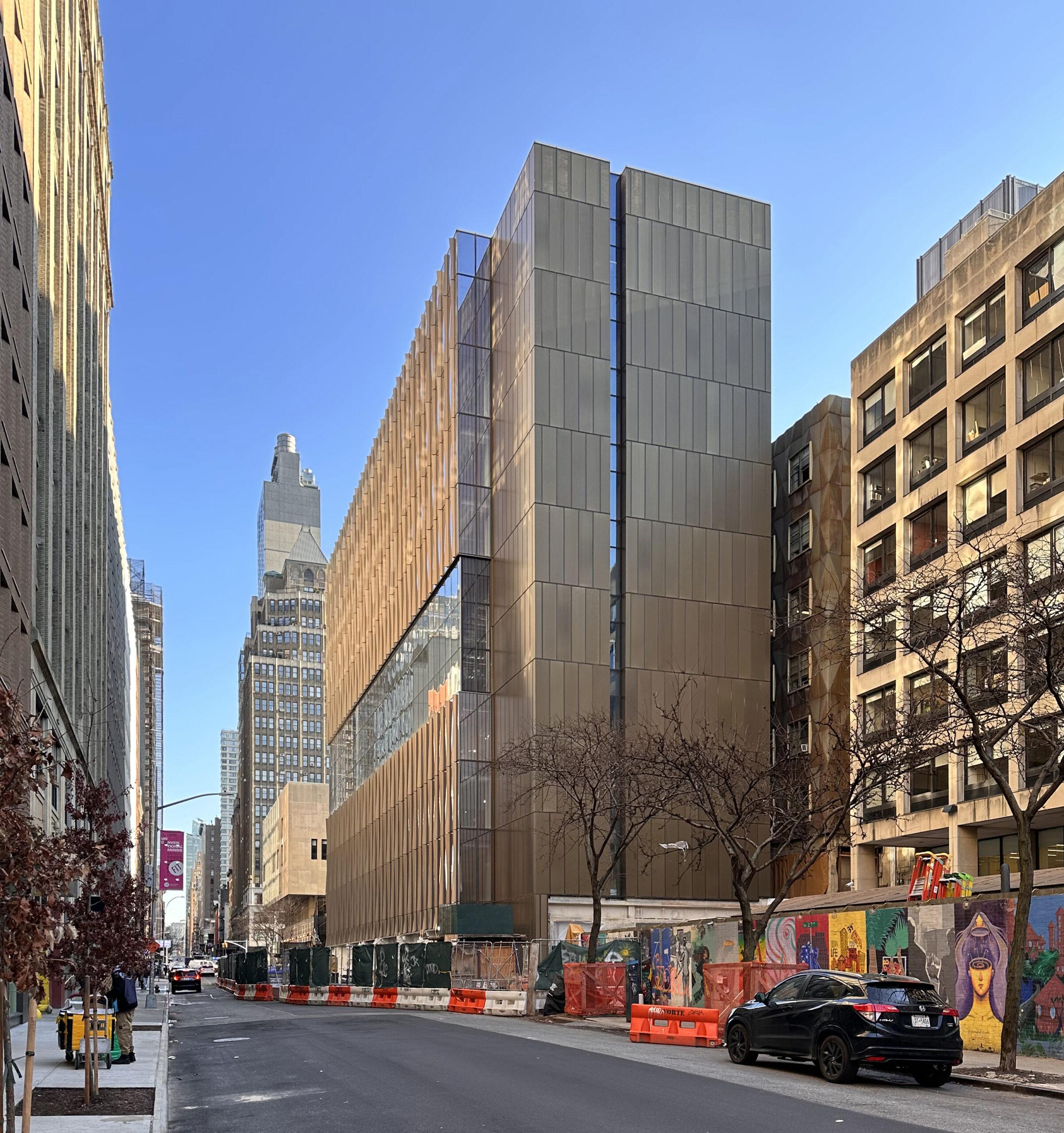
Work is nearing completion on Fashion Institute of Technology‘s ten-story New Academic Building at 220 West 28th Street in Chelsea, Manhattan. Designed by SHoP Architects, the 110,000-square-foot structure is engineered to LEED Gold standards and will yield new classrooms, administrative offices, review and exhibition spaces, and a student quad illuminated by skylights. Forte Construction Corp. is the general contractor for the property, which stands on a shallow plot between Seventh and Eighth Avenues on the northernmost edge of the FIT campus.
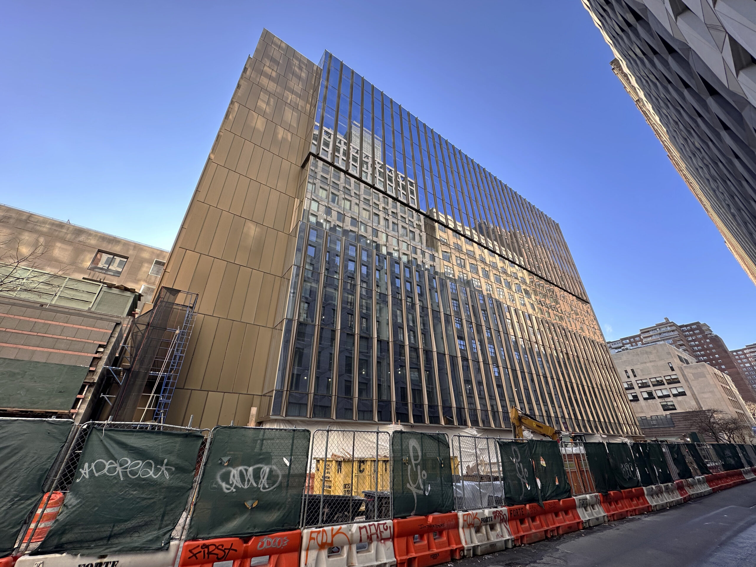
The remainder of the upper façade has been installed since our last update in late May, when the construction hoist was still attached to the northern elevation. The ensuing gap from its dismantlement has been filled in, and all that remains to completed is the ground floor, which is covered in white plastic sheets behind barriers.
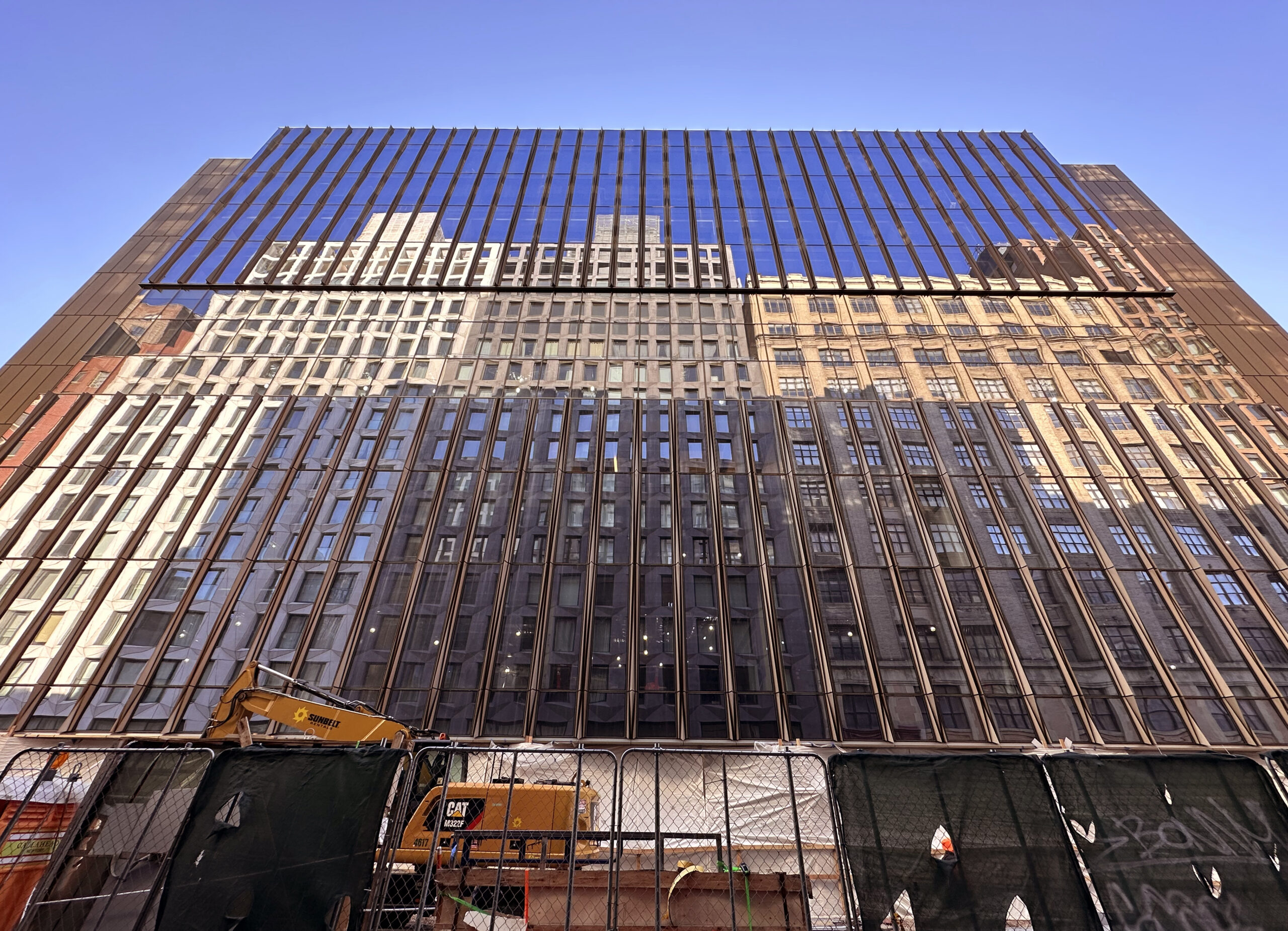
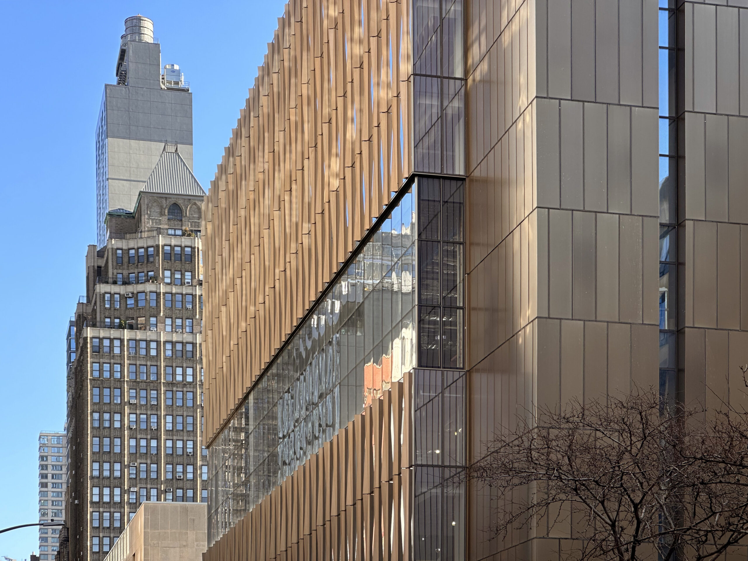
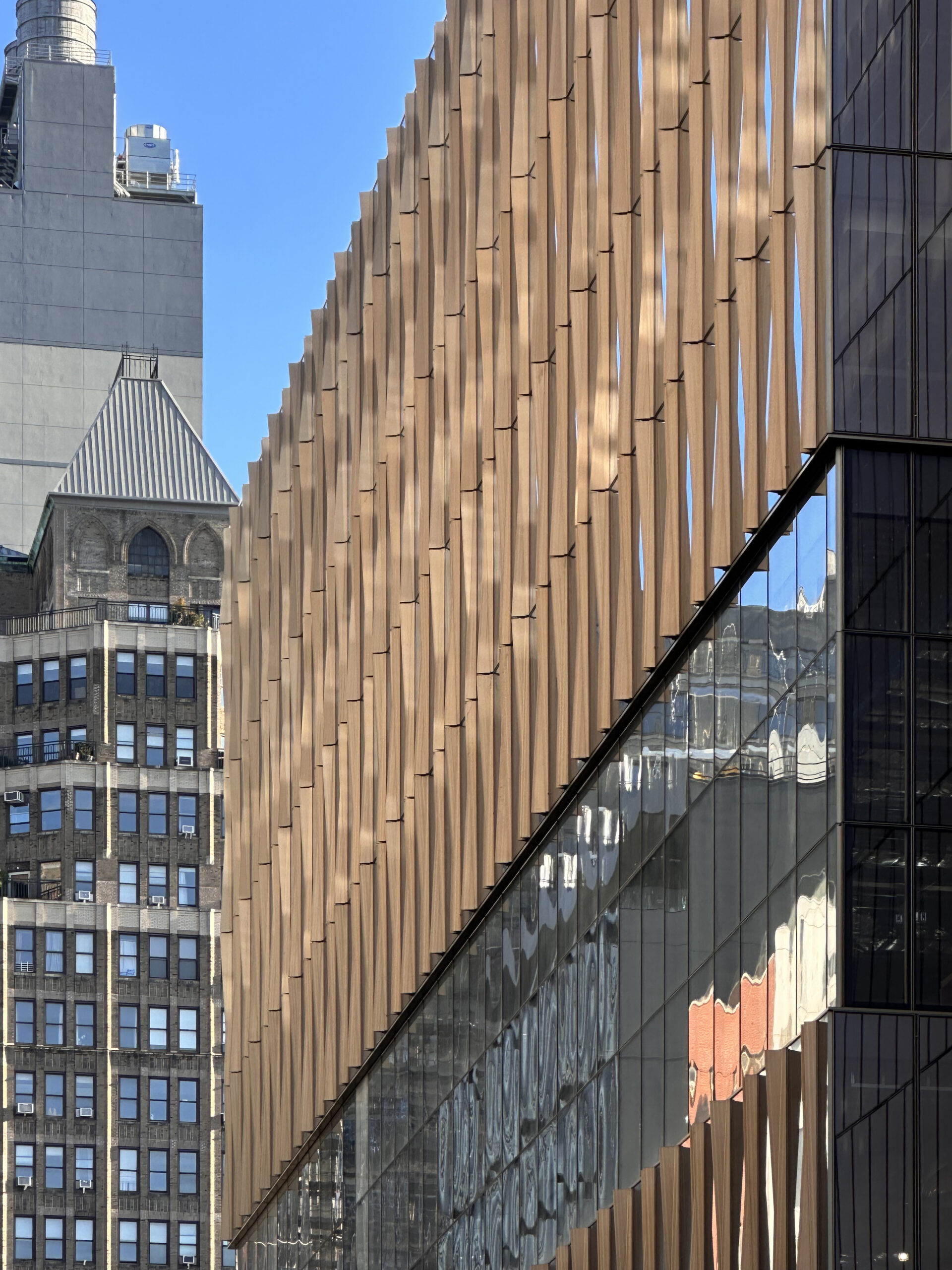
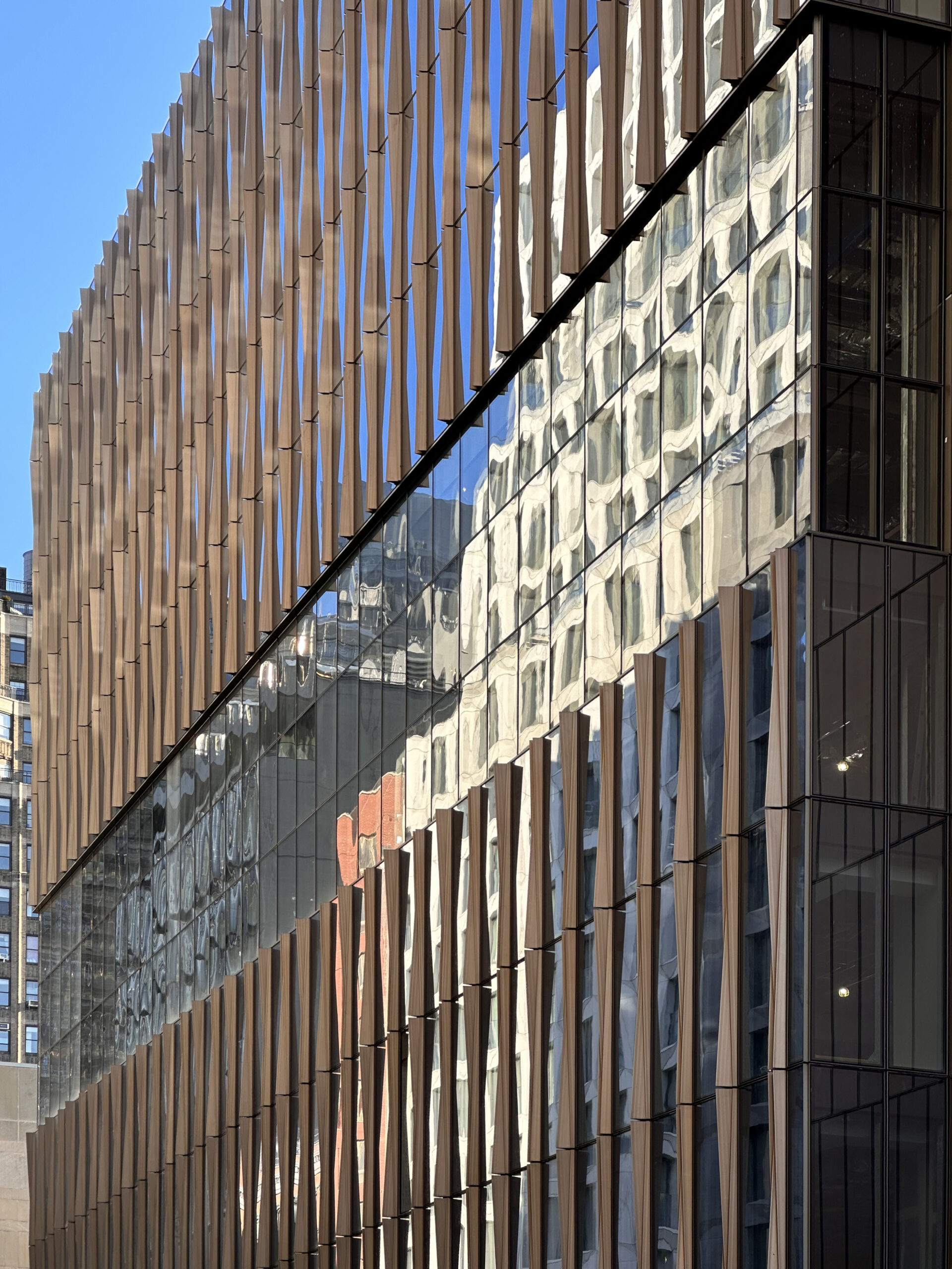
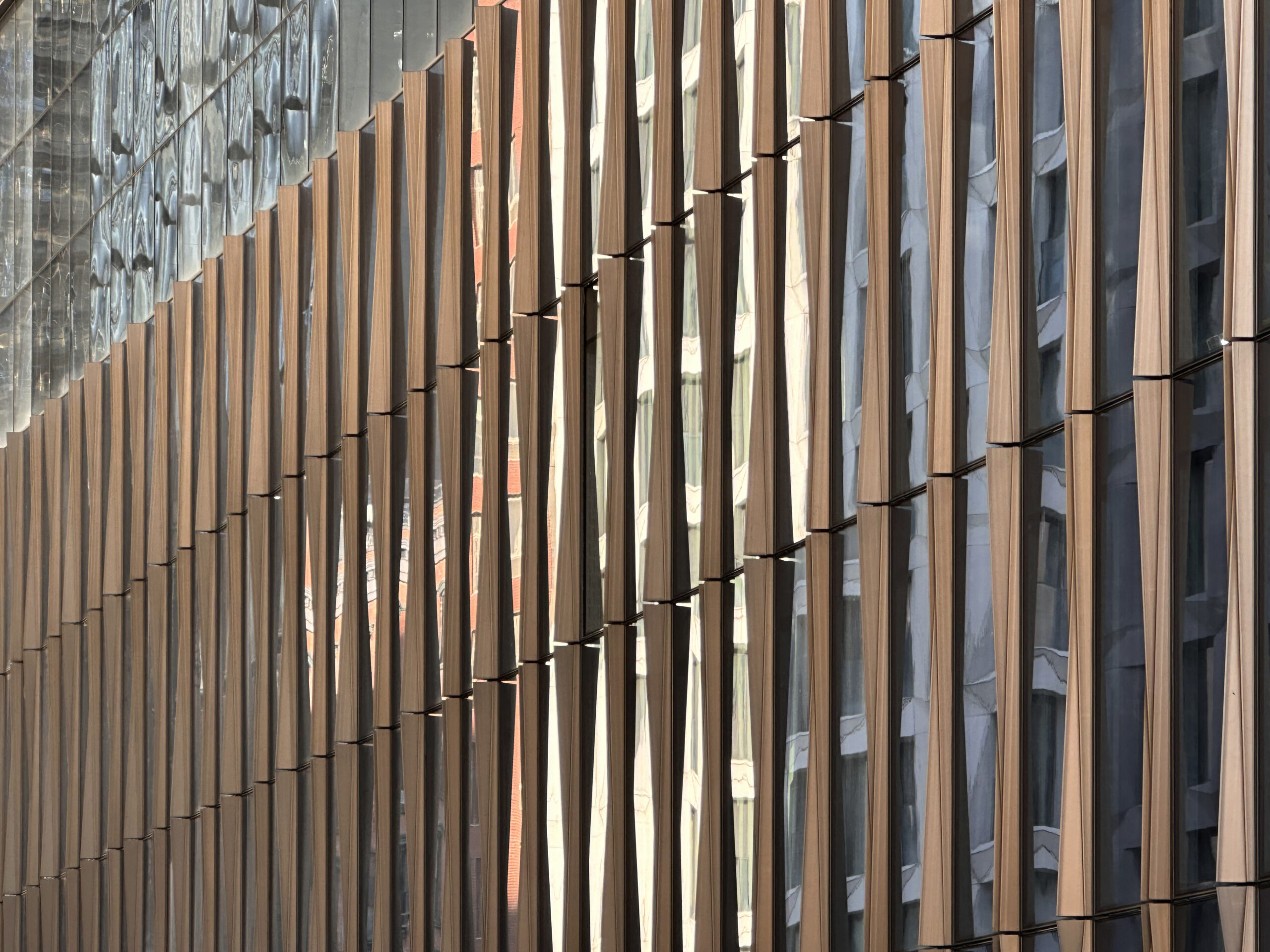
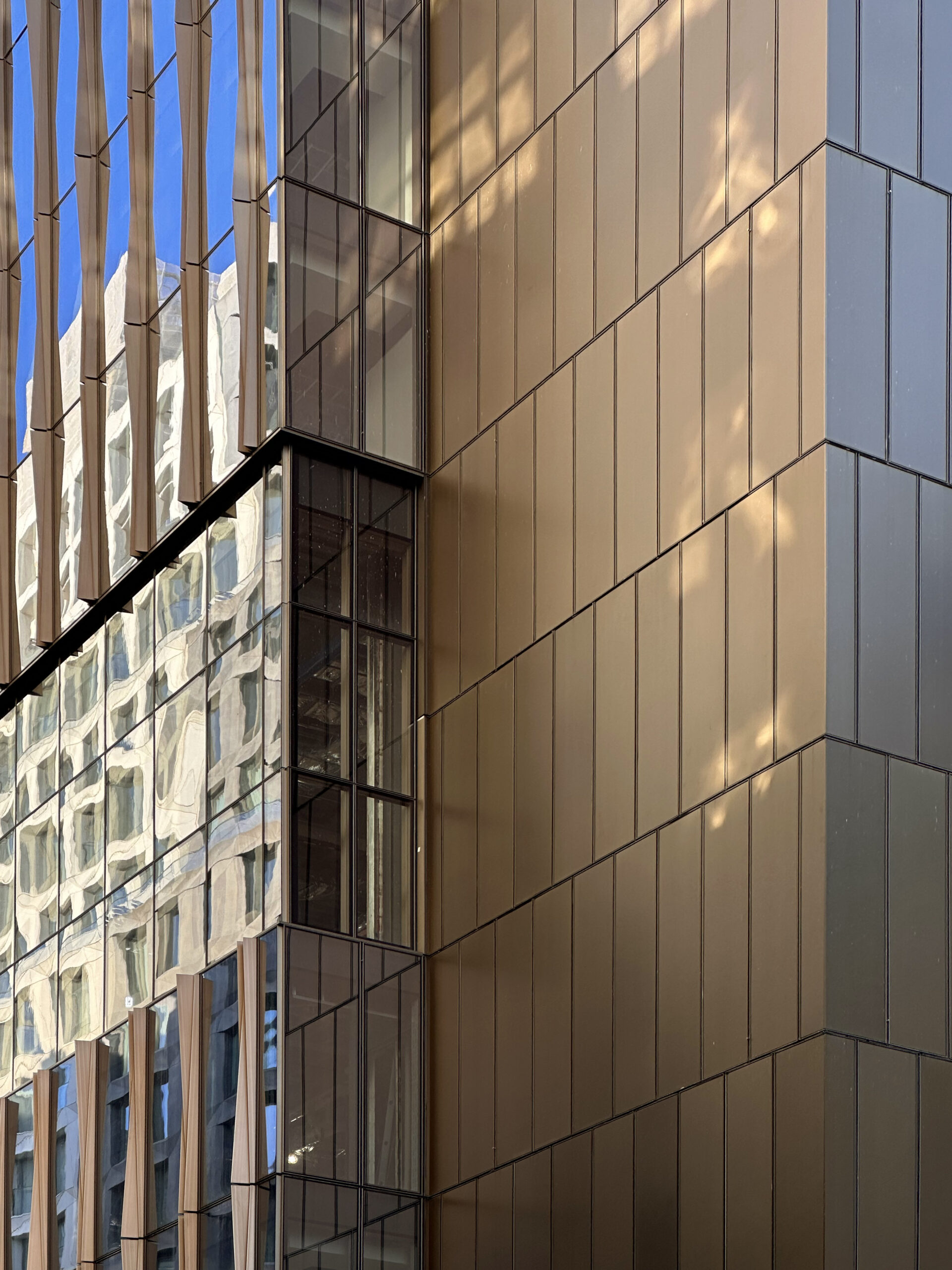
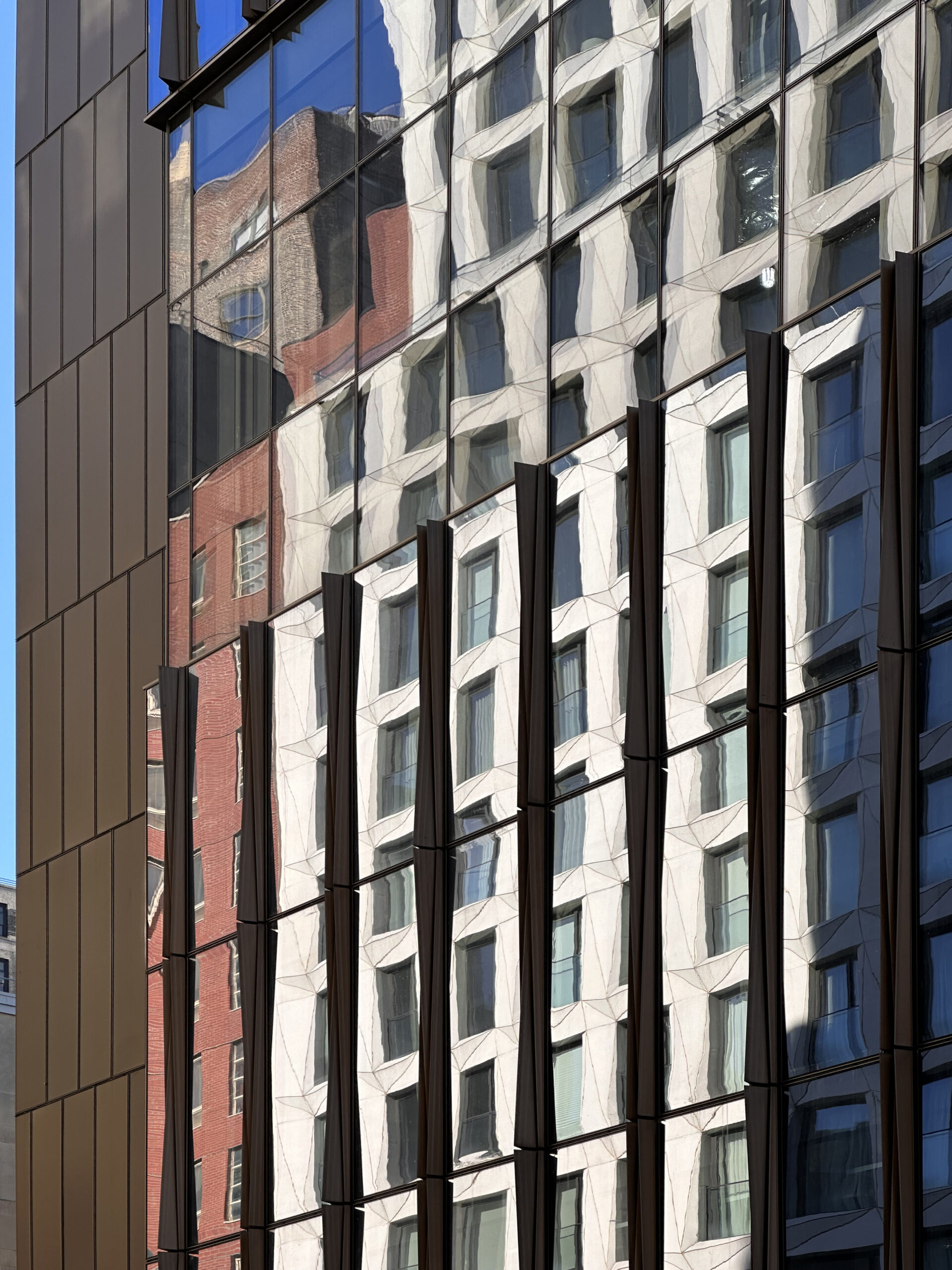
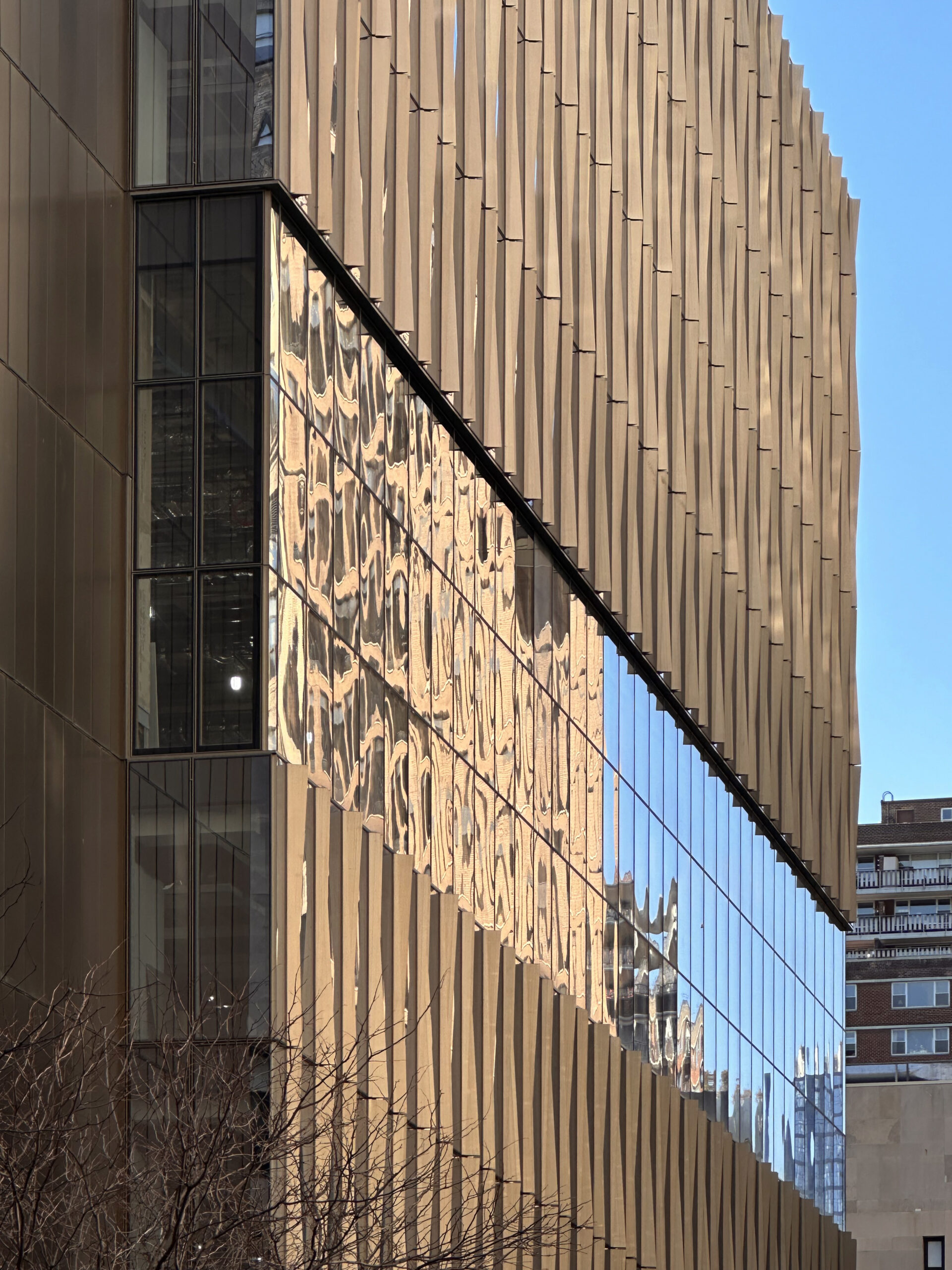
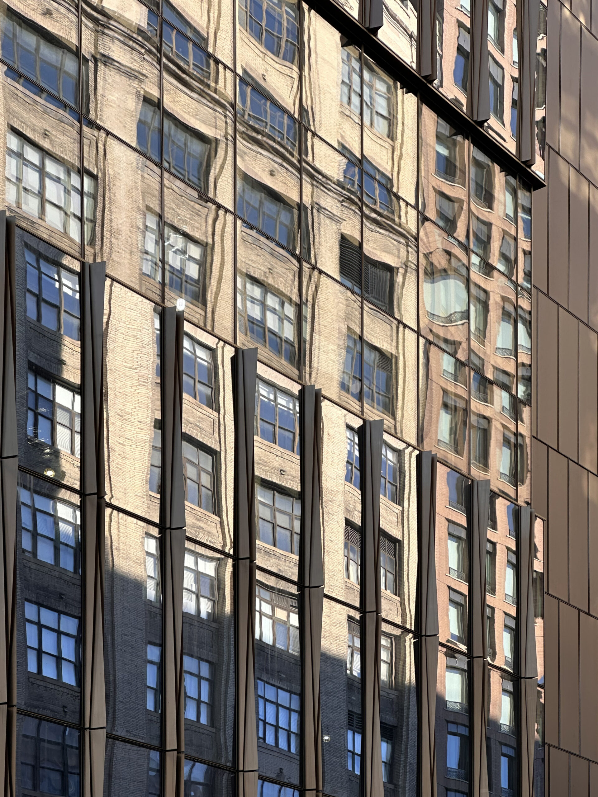
The following photos showcase the look of the earth-toned side paneling, the expansive glass wall facing West 28th Street, and the bronze-hued fins that divide the flat reflective surface, which mirrors the sunlight from the opposing buildings.
The New Academic Building is situated within close walking distance to the A, C, and E trains and NJ Transit, Long Island Rail Road, and Amtrak trains beneath Penn Station, Madison Square Garden, and Moynihan Train Hall. The local 1 train is located half a block to the east at the 28th Street station on Seventh Avenue.
YIMBY anticipates the New Academic Building to be fully completed within the second half of 2024, possibly in time for the beginning of the fall semester.
Subscribe to YIMBY’s daily e-mail
Follow YIMBYgram for real-time photo updates
Like YIMBY on Facebook
Follow YIMBY’s Twitter for the latest in YIMBYnews





The building continued to perfect design, and resulted its beautiful facade. Requirements for this look: Thanks to Michael Young.
The entire block from 7th to 8th has been redone with multiple new apartment buildings and a new office building on the corner. Now this great addition to FIT. Most of the buildings are really well-designed and interesting. It has been a positive transformation over the past several years!
New York City should encourage its colleges and universities to build new facilities to attract the best and brightest.
Love the close-up photos!
Acceptable overall building design but lacking any human scale details at sidewalk level. Building design totally erases any reference as to what might have previously occupied the site. Vertical curtain wall mullions try to give some interest to what is otherwise a very boring glass wall. Overall not an especially attractive looking building which unfortunately adds little or nothing to the surrounding neighborhood.
An unused open space with a loading dock and brick wall is what was “erased,” while the ground floor entrance and sidewalk frontage for the building hasn’t even been finished yet.
Just be patient
That’s because the sidewalk level isn’t even done yet 🧐
A simple, galant-modern design that adds a little color to the streetscape but allows what happens inside the building to shine. Designers, please take note of how the rendering actually represents the actual outcome.
At least, It’s NOT another blue glass tower. North America’s biggest cities skylines are just overrun with those.
you are so right on that. Hopefully they will allow for student design display on the ground to continue to shine and showcase student talent. I WISH THEY HAD A MORE interesting logo that was showcased on the building. deffo much better than the loading g dock that had been there forever
Signature Elements of SHoP’s Design:
Modern with a Twist: While firmly rooted in modernism, SHoP’s approach often incorporates unique elements that push boundaries and challenge conventions.
Focus on Functionality: Their designs prioritize functionality for the intended use, evident in their educational and commercial buildings.
Sustainability as a Core Value: Energy efficiency, use of recycled materials, and innovative building systems are hallmarks of SHoP’s architecture.
Embrace of Technology: They readily integrate advanced technologies into their designs to achieve energy savings and enhance user experience.
Contextual Sensitivity: While innovative, SHoP considers the surrounding architectural context when designing a building.
Geometric Forms: Simple geometric shapes like rectangles, squares, and triangles are prevalent in their projects.
Emphasis on Light and Transparency: Large expanses of glass, open floor plans, and strategic use of light are common features.
Materiality: SHoP utilizes a variety of materials, including glass, metal panels, prefabricated elements, and sometimes even wood.
Influences on SHoP’s Style:
Modern Architecture: The core principles of clean lines, functionality, and a focus on space define SHoP’s foundation.
High-Tech Architecture: The incorporation of advanced technologies and a potential for exposed structural elements reflects this sub-style’s influence.
Sustainability: The growing importance of environmentally friendly design significantly influences their approach.