New renderings have been revealed for One Grand, a 28-story mixed-use building at 76 Varick Street in Hudson Square, Manhattan. Designed by SHoP Architects and developed by Taconic Investment Partners and Nuveen Real Estate, the 430,763-square-foot structure will yield offices, a public grade school, and retail space. Trinity Real Estate is the owner of the vacant lot, which is alternately addressed as Two Hudson Square and bound by Grand Street to the north, Canal Street to the south, Varick Street to the west, and Sullivan Street, Duarte Square, and Sixth Avenue to the east.
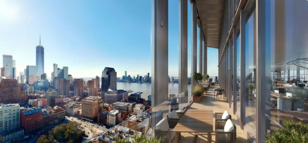
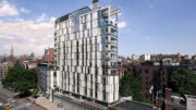
The images from VMI Studio show a glass-clad tower rising from a contrasting podium with dark paneling. The southern elevation features a series of balconies enclosed in a metal framework and topped with landscaping, and the structure culminates in a diagonal bulkhead surrounded by a roof terrace.
South-facing terraces will provide panoramic views of the Lower Manhattan skyline and the Hudson River.
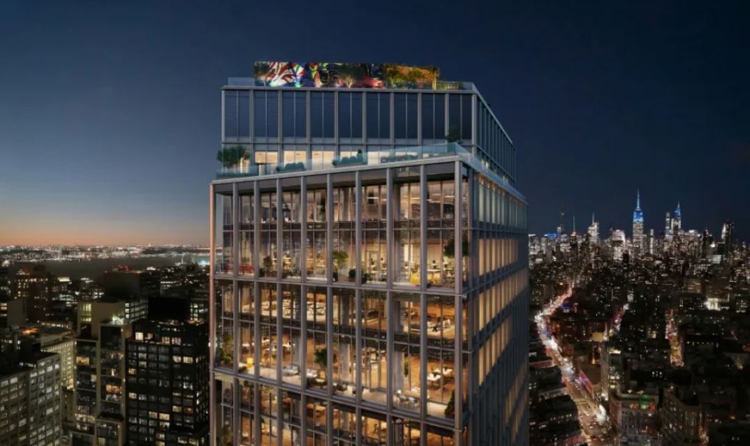
The following nighttime rendering of the top floors depicts the two rooftop spaces. The upper terrace will sit beside a colorful mural stretching across the parapet and provide views of the Midtown Manhattan skyline.
Below is an earlier rendering for the building.
One Grand will feature 13,000 square feet of amenities, 20,000 square feet of outdoor tenant space, and offer 14-foot-tall ceiling spans.
Entrances to the Canal Street station are located on the parcel, providing access to the local 1 train. The A, C, and E trains are also nearby at a separate Canal Street station.
Trinity Real Estate partnered with Taconic Investment Partners and Nuveen Real Estate to develop the property in 2019, but work has yet to unfold so far. Taconic Partners announced that it won’t start construction on One Grand until it finds an anchor tenant, which JLL will be responsible for finding.
Subscribe to YIMBY’s daily e-mail
Follow YIMBYgram for real-time photo updates
Like YIMBY on Facebook
Follow YIMBY’s Twitter for the latest in YIMBYnews




Trinity Real Estate is a church. In this time of housing crisis why is a church with a 6 billion portfolio building class A offices?
I find it interesting that it is reported that NYC has lost population, yet apartment vacancies are at a 56-year low. This might have to do with children leaving their parents’ places leading to an aging of the city’s population.
I have no sympathy for those who whine that they cannot afford a place in Manhattan with a Central Park view. Living outside of Manhattan is not the kiss of death.
This building is inoffensive and not remarkable. The top is a bit jarring, but will likely not be visible from the street.
Actually it’s just the opposite. Reports show that people moving into NYC are younger and earn more than those moving out. I just read that in the past two years, 545,000 moved out, 300,000 moved in. So a net loss, but the delta isn’t a big as you might think.
And I agree, there are plenty of great options for housing in the outer boroughs and North Jersey. Of course those too are quite expense compared to the south or midwest.
It’s not the aesthetics of the building. It’s the use. Why do we tax favor churches if they’re going to use their endowments to build offices?
It’s not 1998 anymore, the “just leave Manhattan bro” thing is not helpful. Rents in Queens, Brooklyn, even The Bronx are skyrocketing.
I’m loving the critical comments. We can be YIMBY in spirit, but it doesn’t mean we can’t have opinions nor concerns. Personally, seeing how so many of the newer buildings have turned out compared with their renderings, I’m assessing this as really just two different toned 60s office towers stacked on top of each other with a what, an 80s flourish at the top? Underwhelming, steeped in criticism with a hint of scandal. What’s not to love and isn’t this absolutely 100% NYC?
The revised design is definitely better, but finding an anchor tenant will be a challenge. Greed drives the want for office tenants who keep moving out as their leases expire. Work from home is apparently here to stay. Changing this building to residential is an obvious solution, and one would hope Trinity would include affordable units for families. That would be the Christian thing to do…
Just what the city needs—more office space! As I’ve said over and over, this isn’t Singapore, so these beautiful renderings with lush greenery will never look like this in reality. Developers should not be allowed to mislead by creating stunning renderings that likely will not look as presented. I know every offering comes with a disclaimer and it’s that loophole that allows developers to over promise and under deliver.
All the watercolor renderings from the 50s and 60s where all the cars looked like spaceships weren’t realistic either. But yes, the hanging gardens of Babylon trend in real estate development marketing is absurd. People forget all that stuff will need to be maintained.
This is just dumb without a known company committed to it as an anchor for their offices. A new school building is great, but this will probably never see the light of day in rendered form, let’s face it.
Based on your track record can we set a future date for you to eat your words. Perhaps March 17, 2027.
Besides the loggias and some carving up of the mass of the base, this is the same building as previously pitched.
Read until the last line so completely twisted, I thought this project was preparing for construction: Thanks.
That roof top mural is “for the birds”, literally.
Pigeon poo
school…? is there any yard or playground for the kids?
Probably not that kind of school. Think trigonometry not recess.