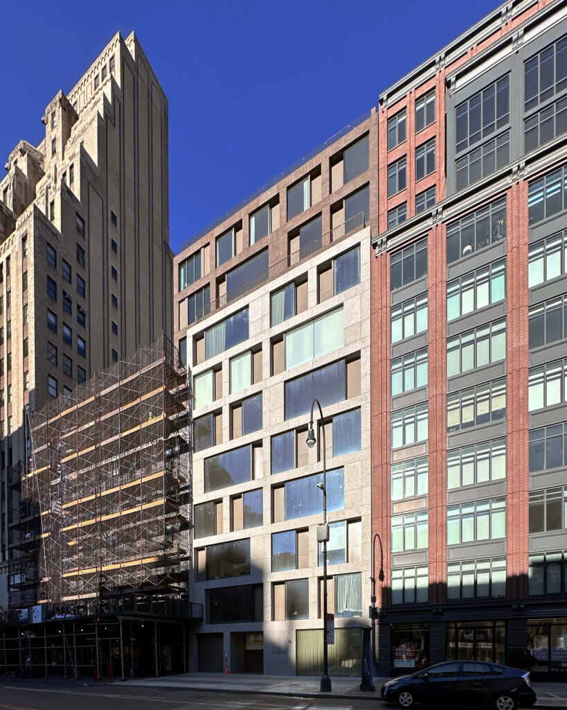
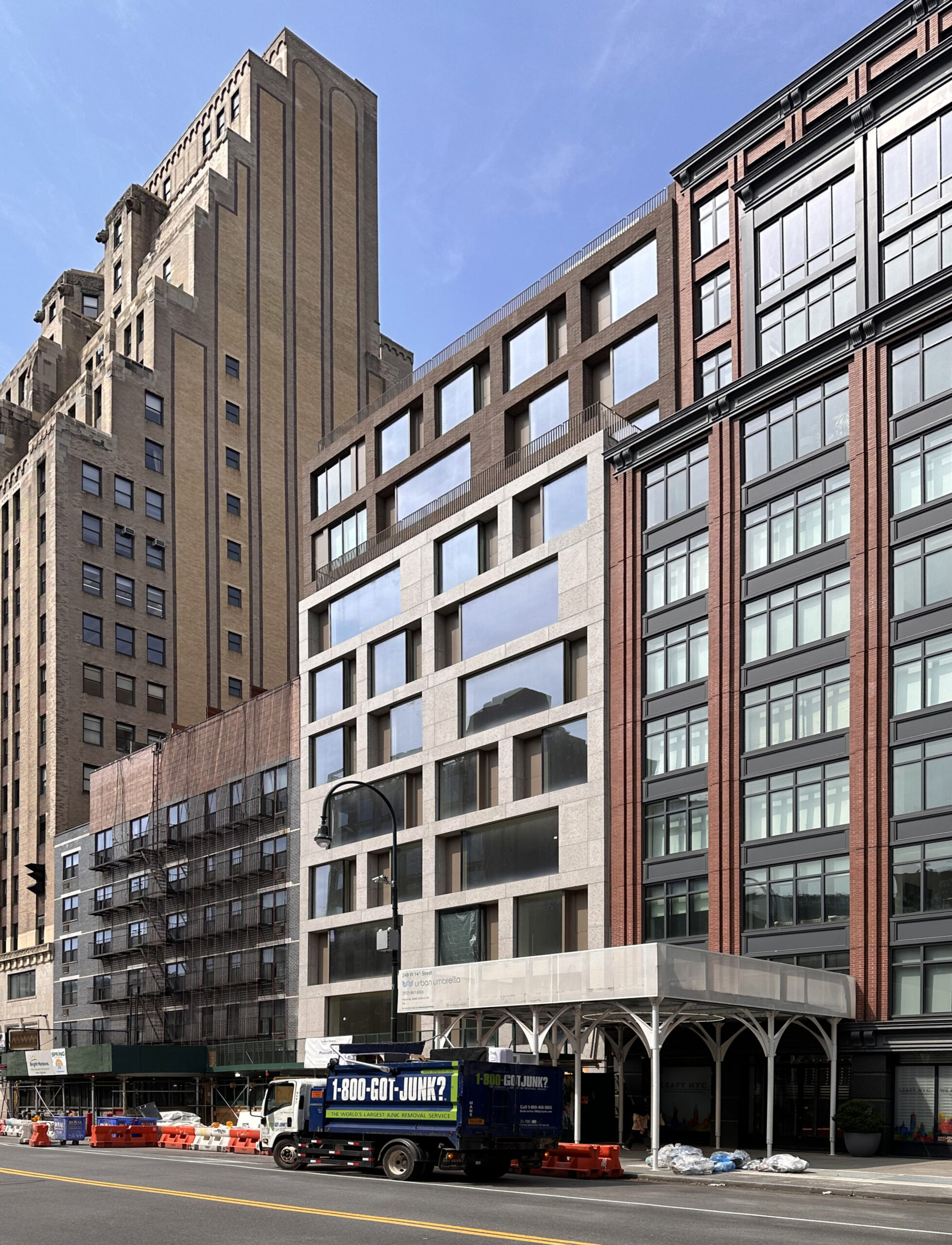
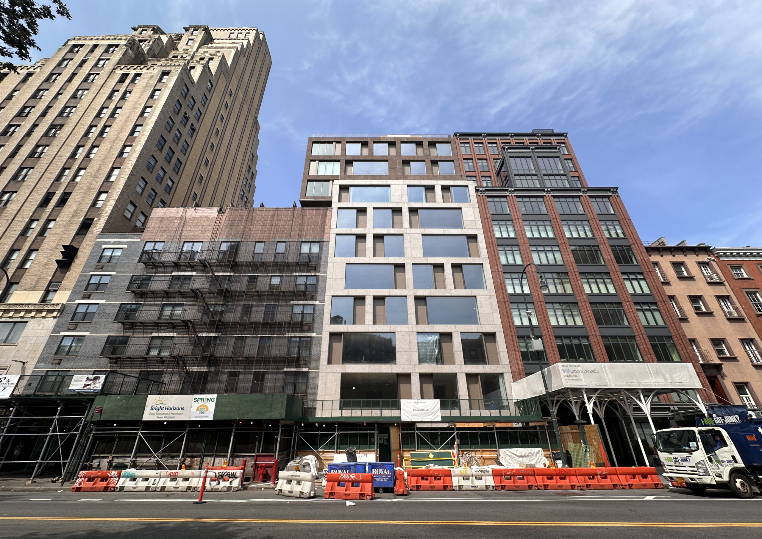
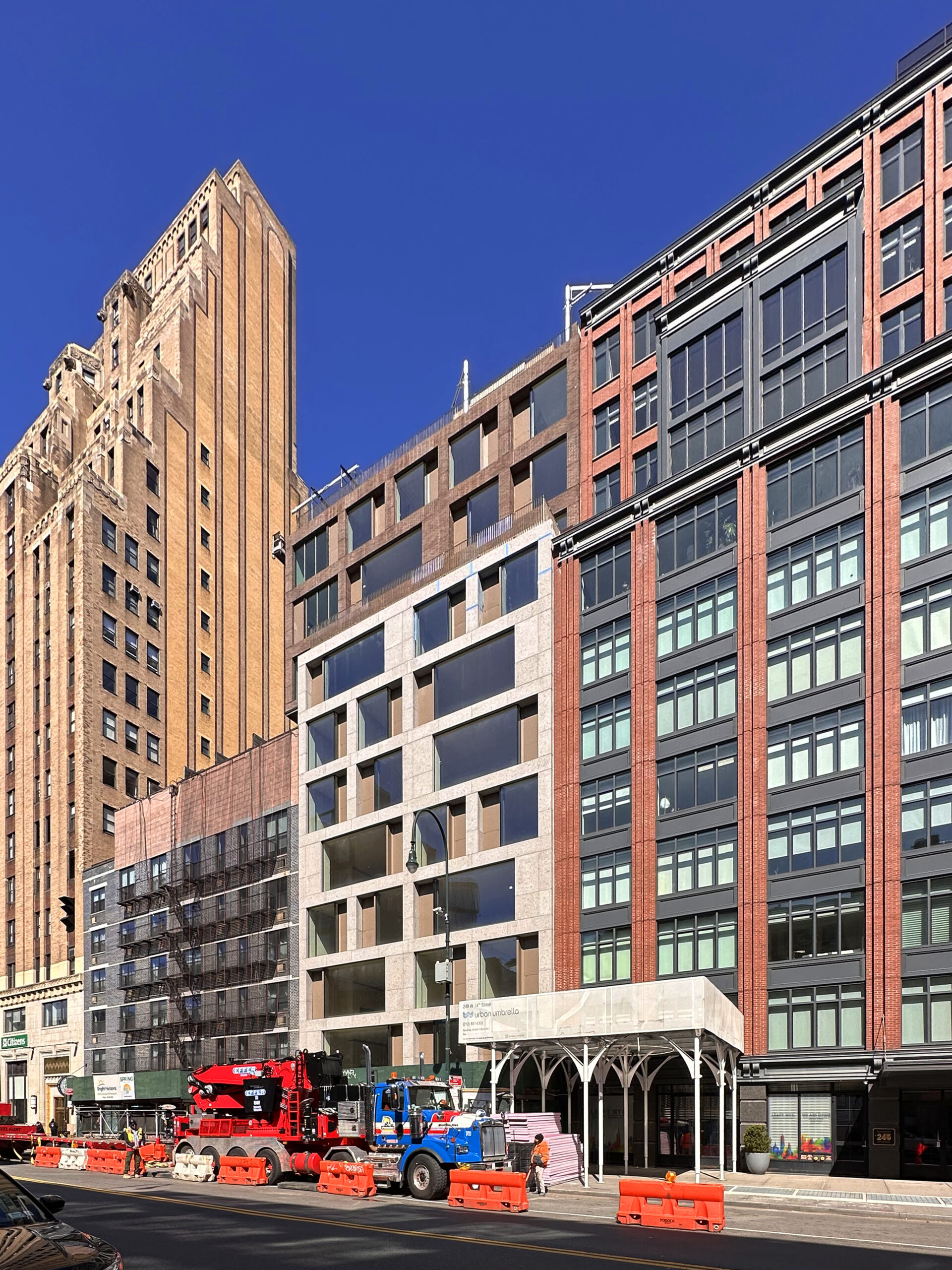
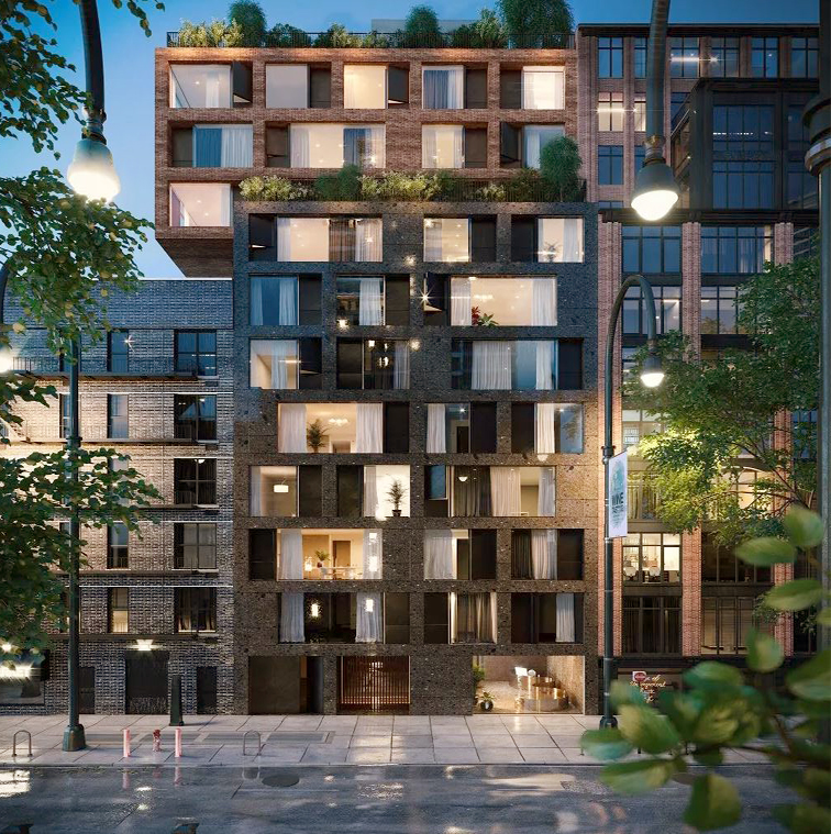
Work is wrapping up on The Elisa, an 11-story residential building at 251 West 14th Street in Chelsea, Manhattan. Designed by Isay Weinfeld Architects, the 33,550-square-foot structure will yield 25 condominium units in one- to three-bedroom layouts. The property is located on an interior lot between Seventh and Eighth Avenues near the border of the West Village and the Meatpacking District.
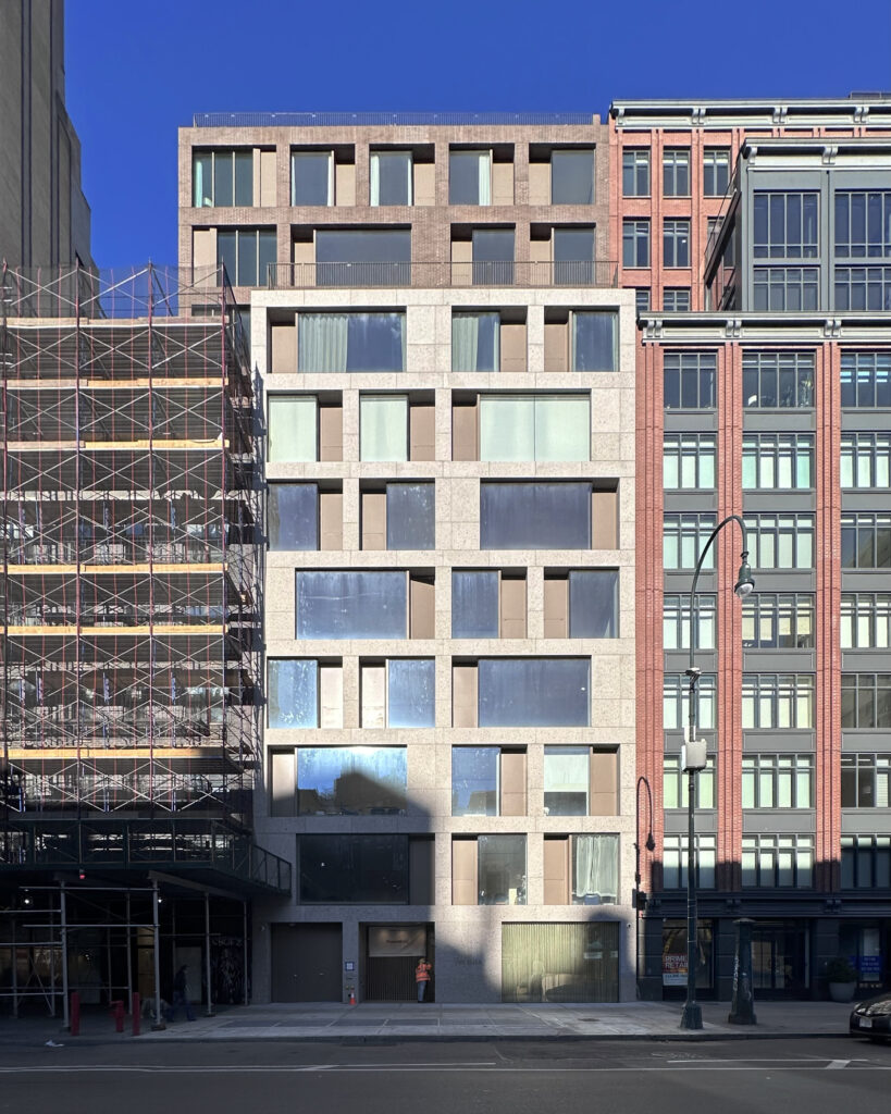
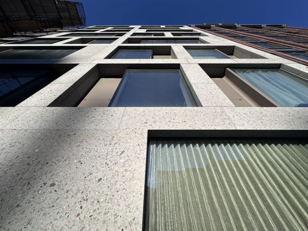
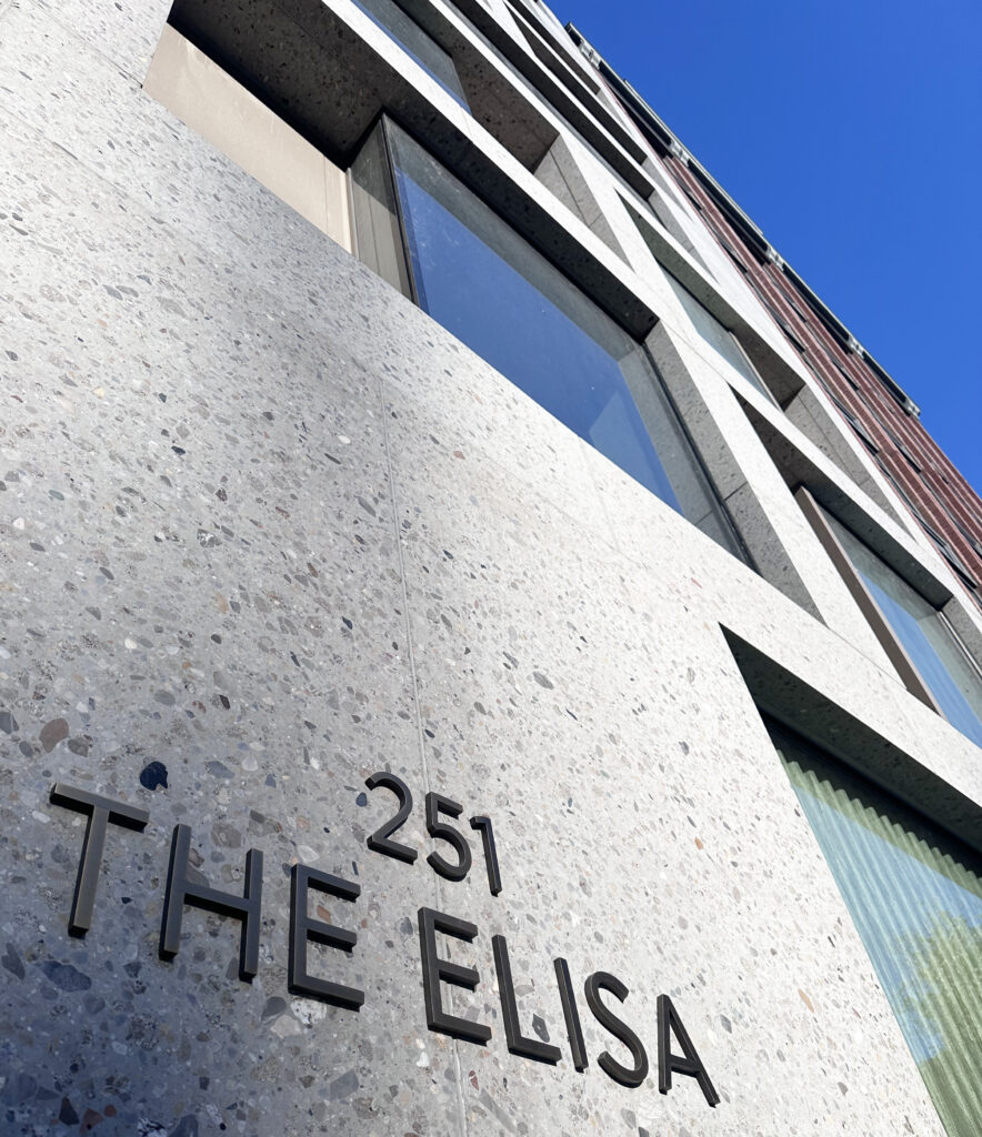
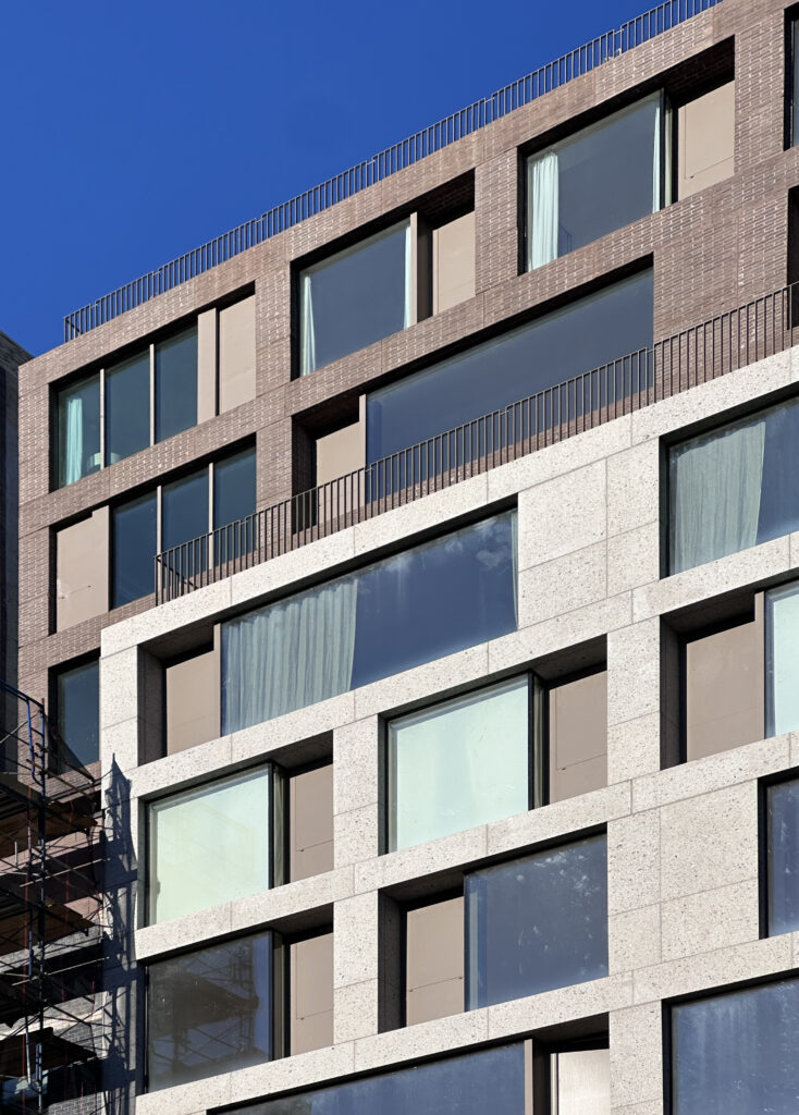
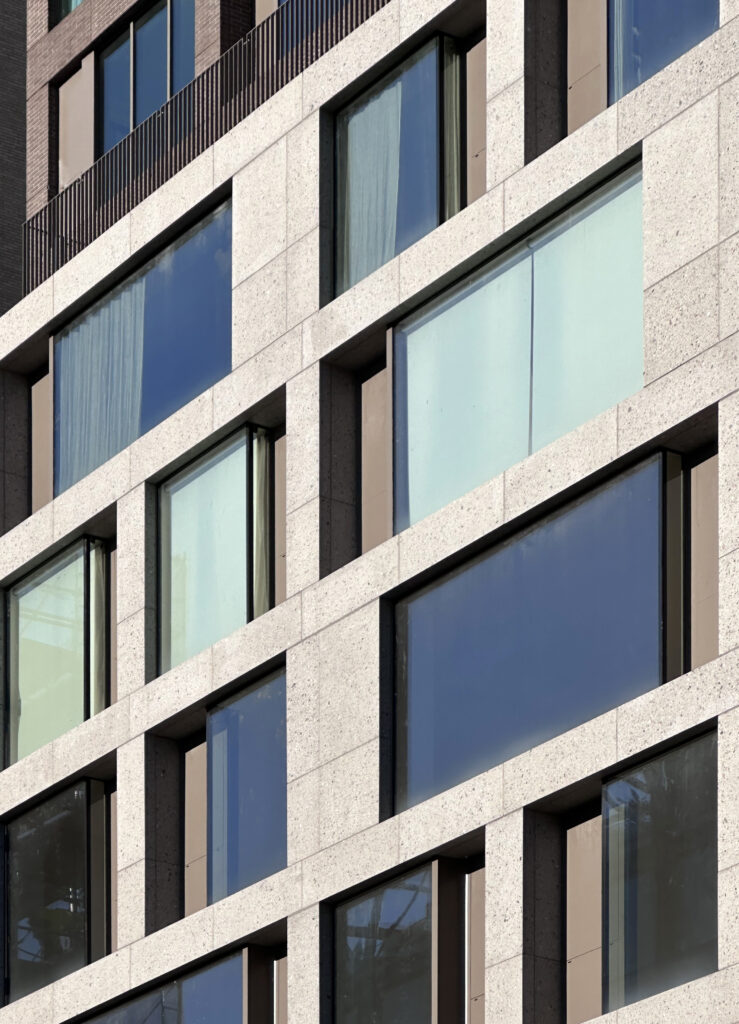
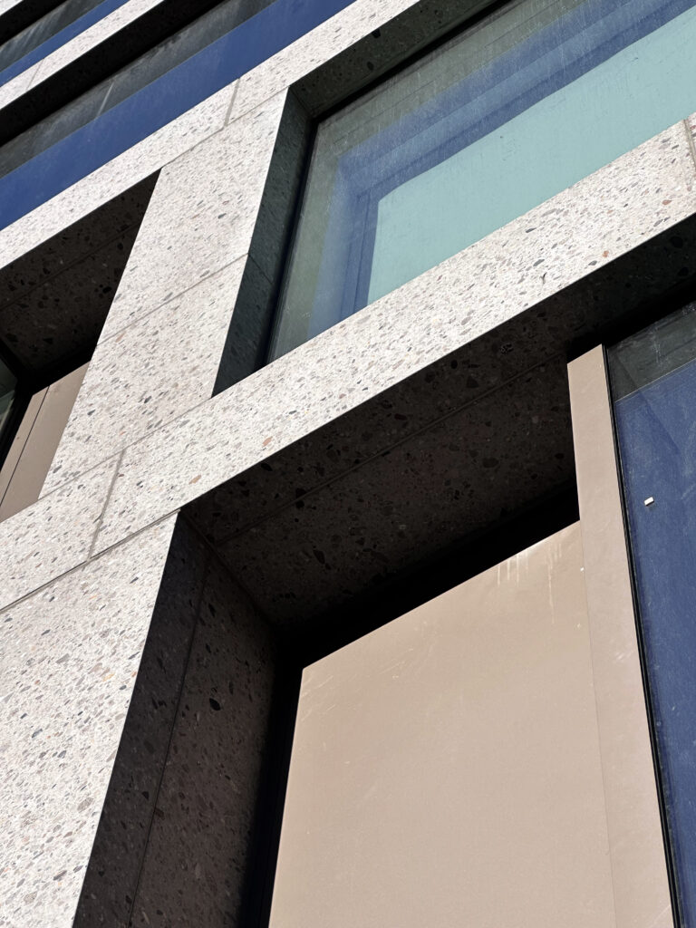
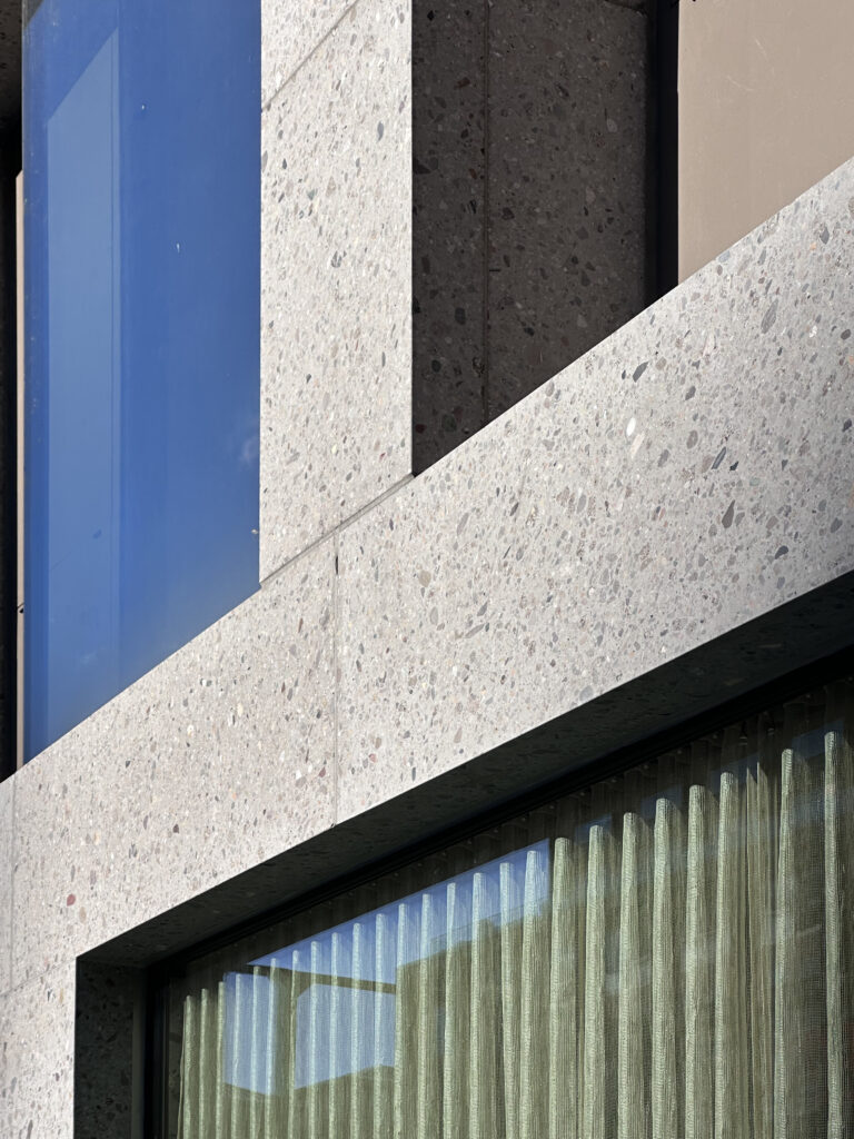
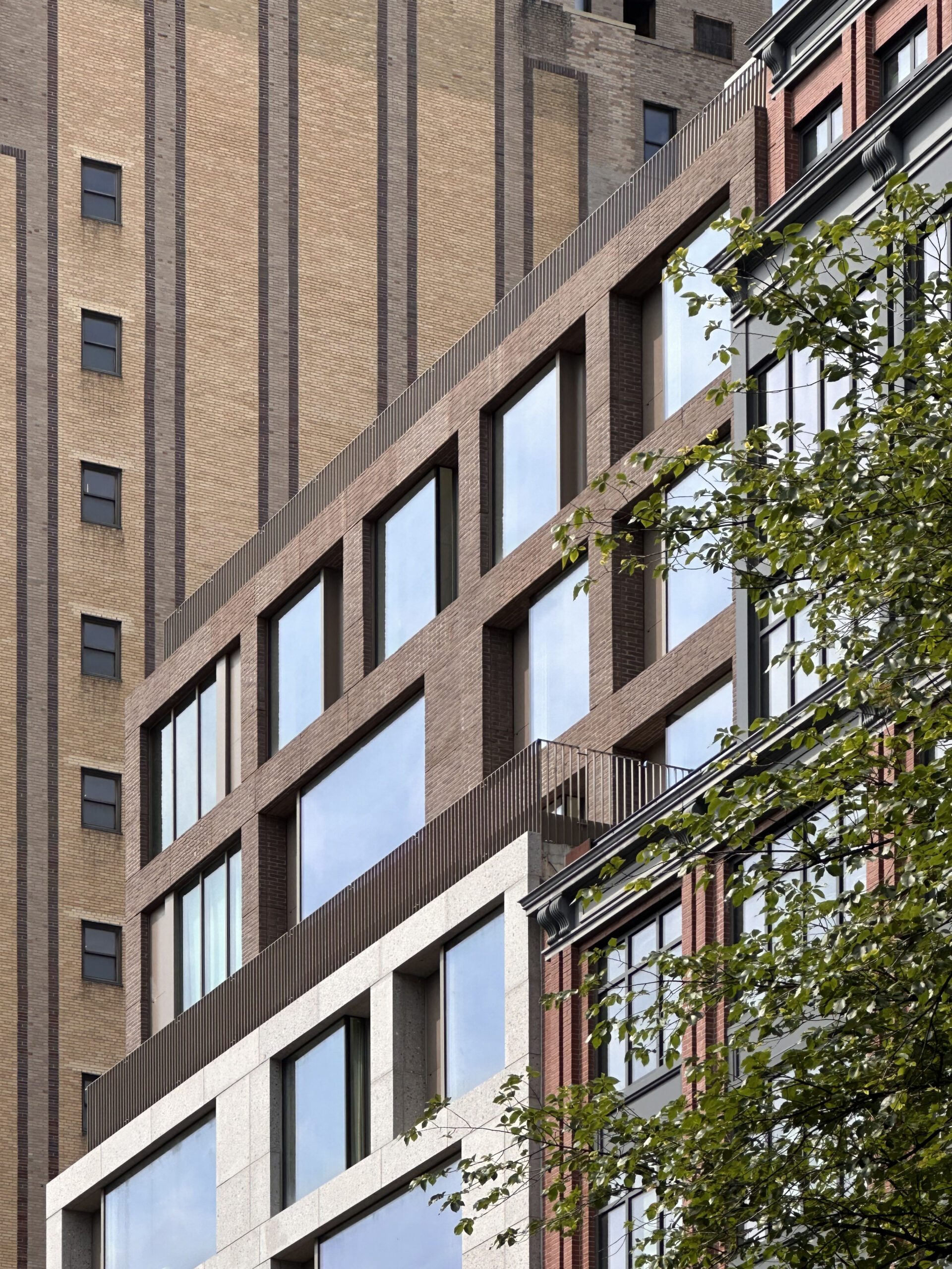
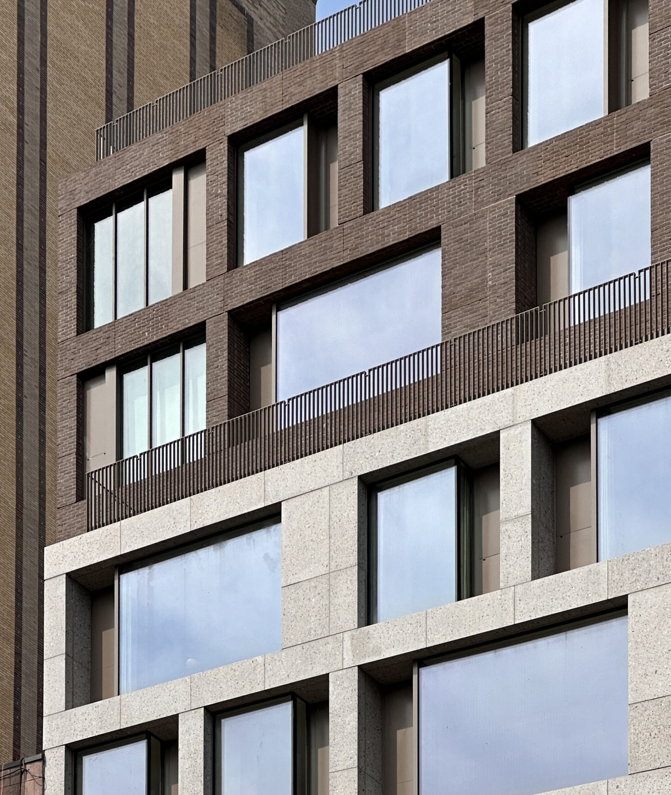
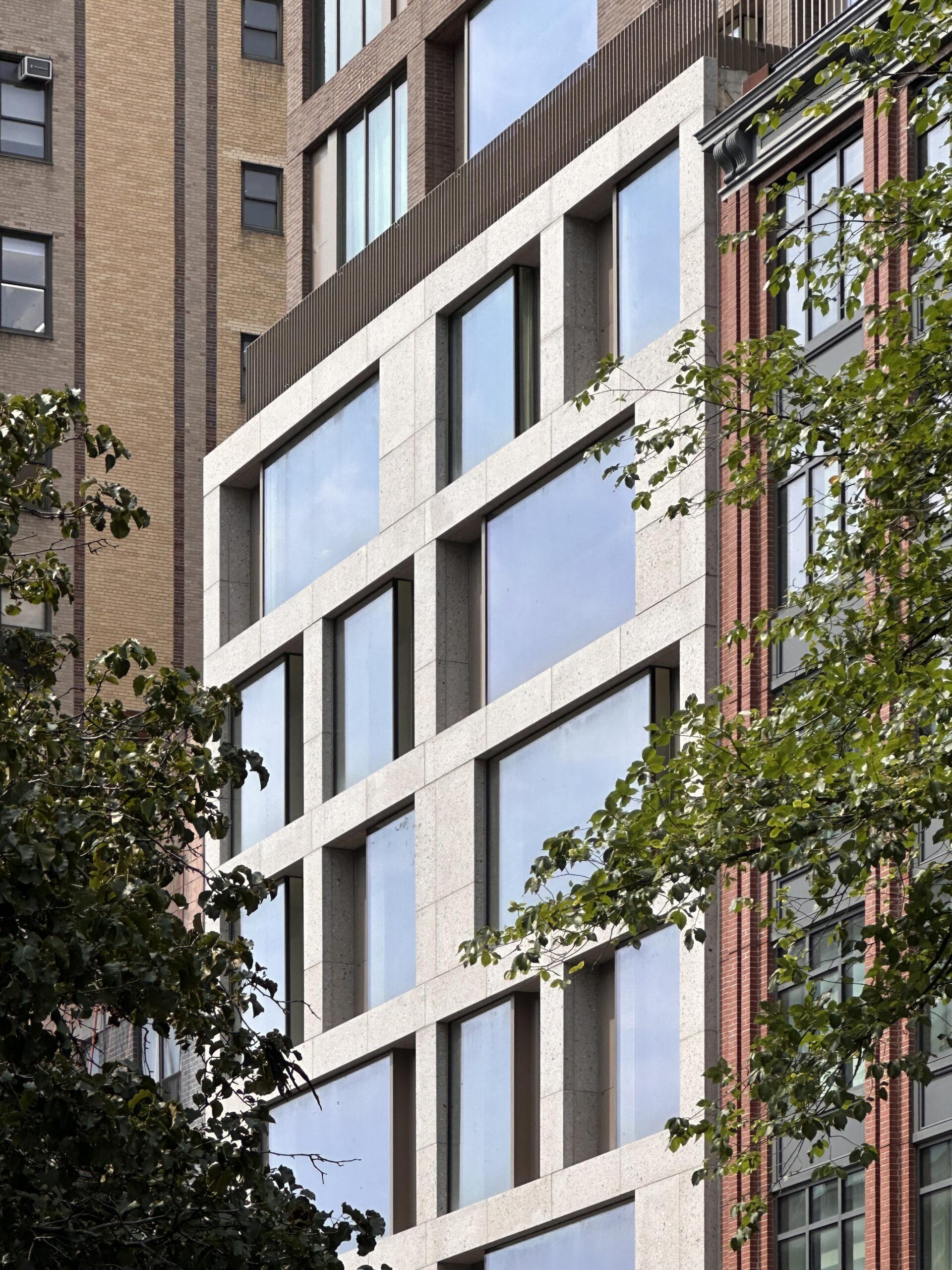
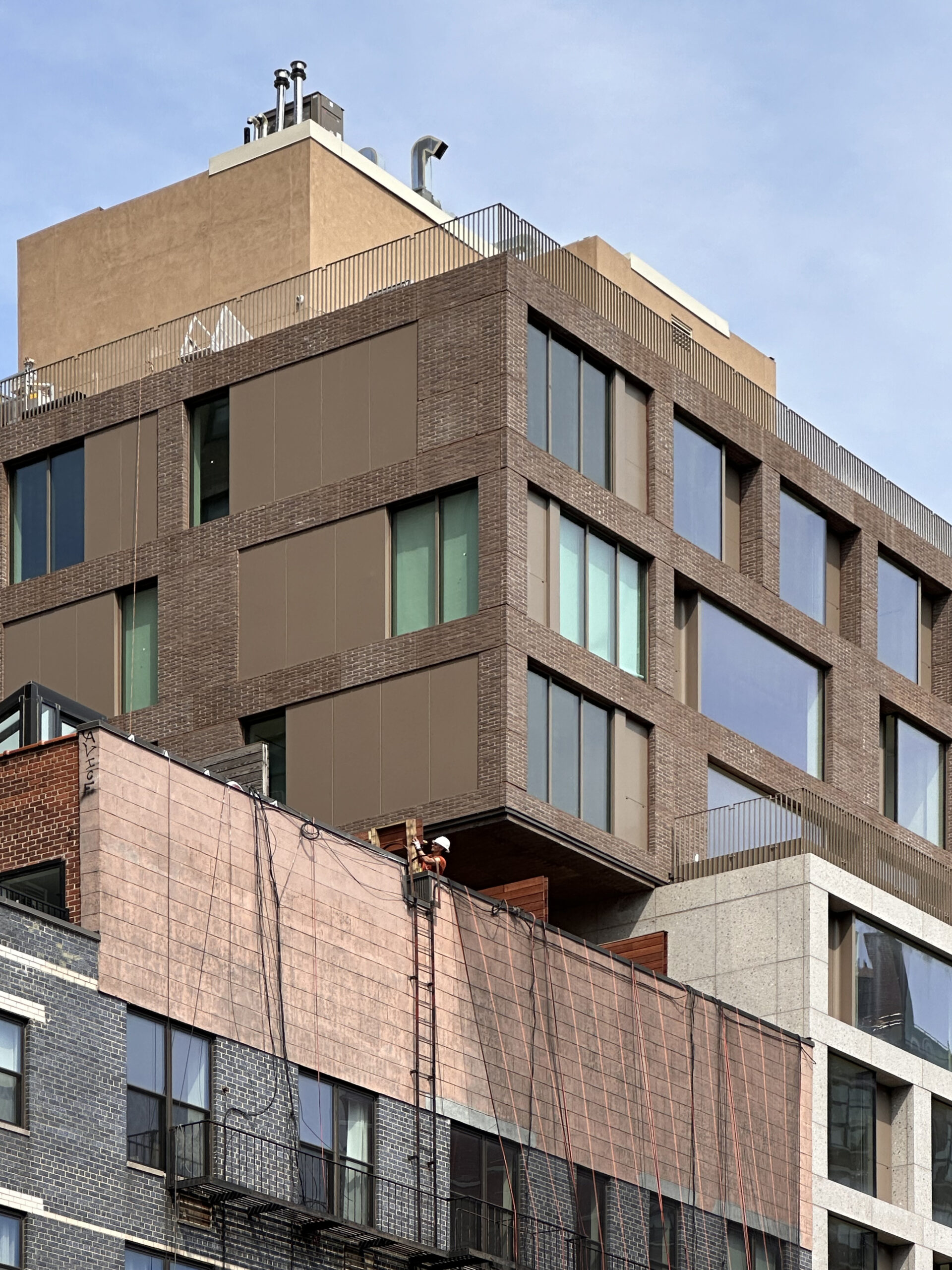
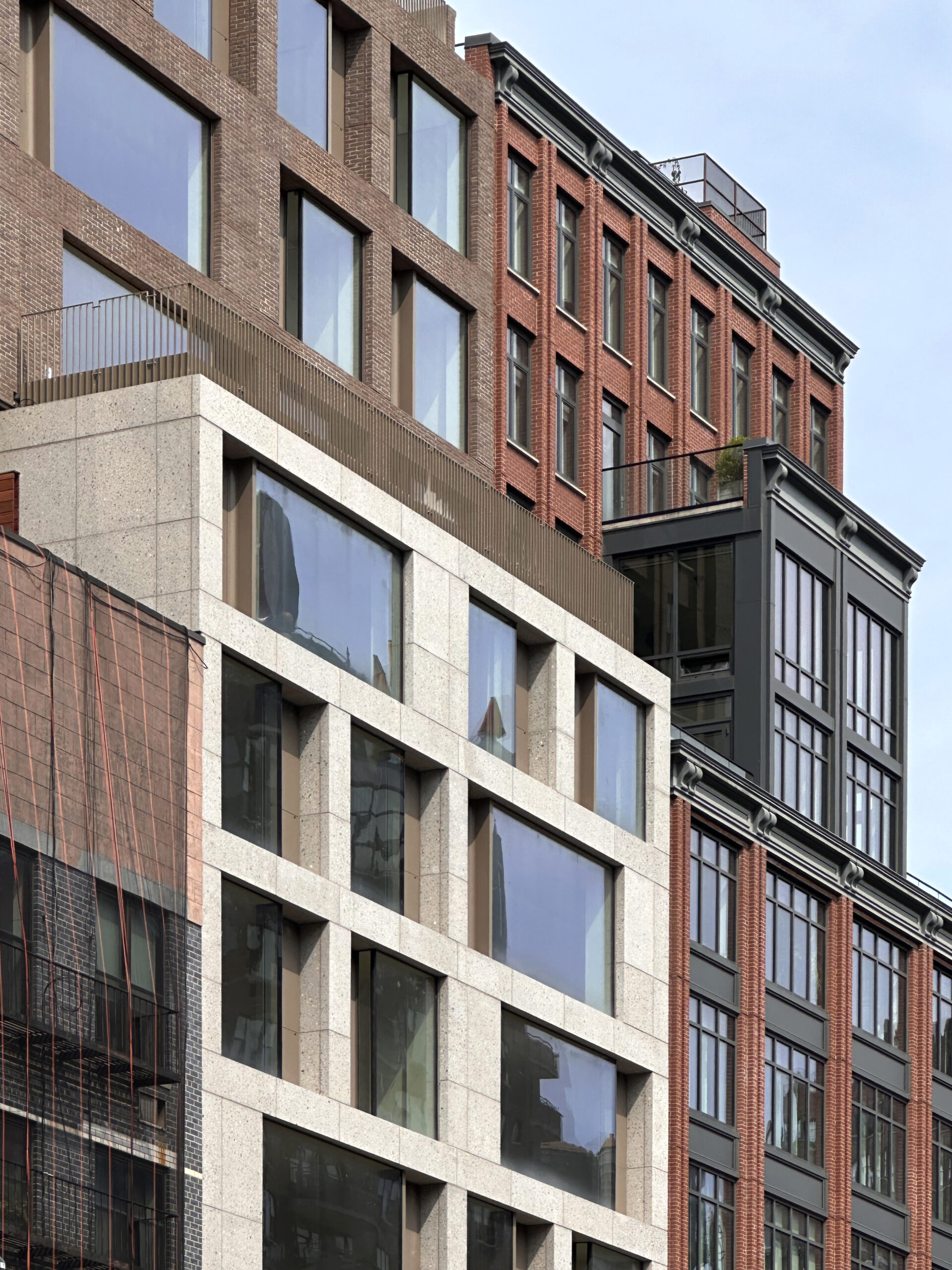
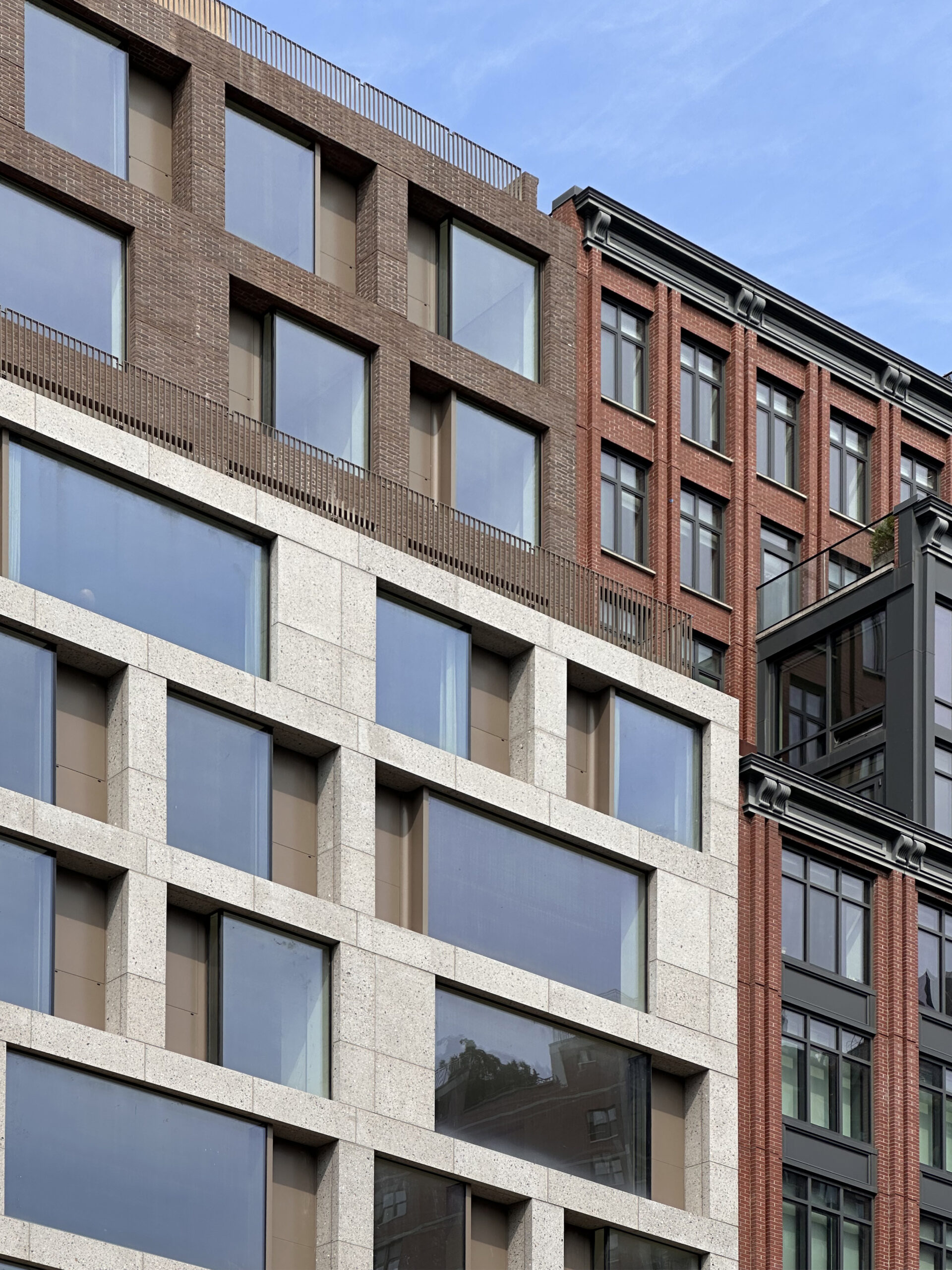
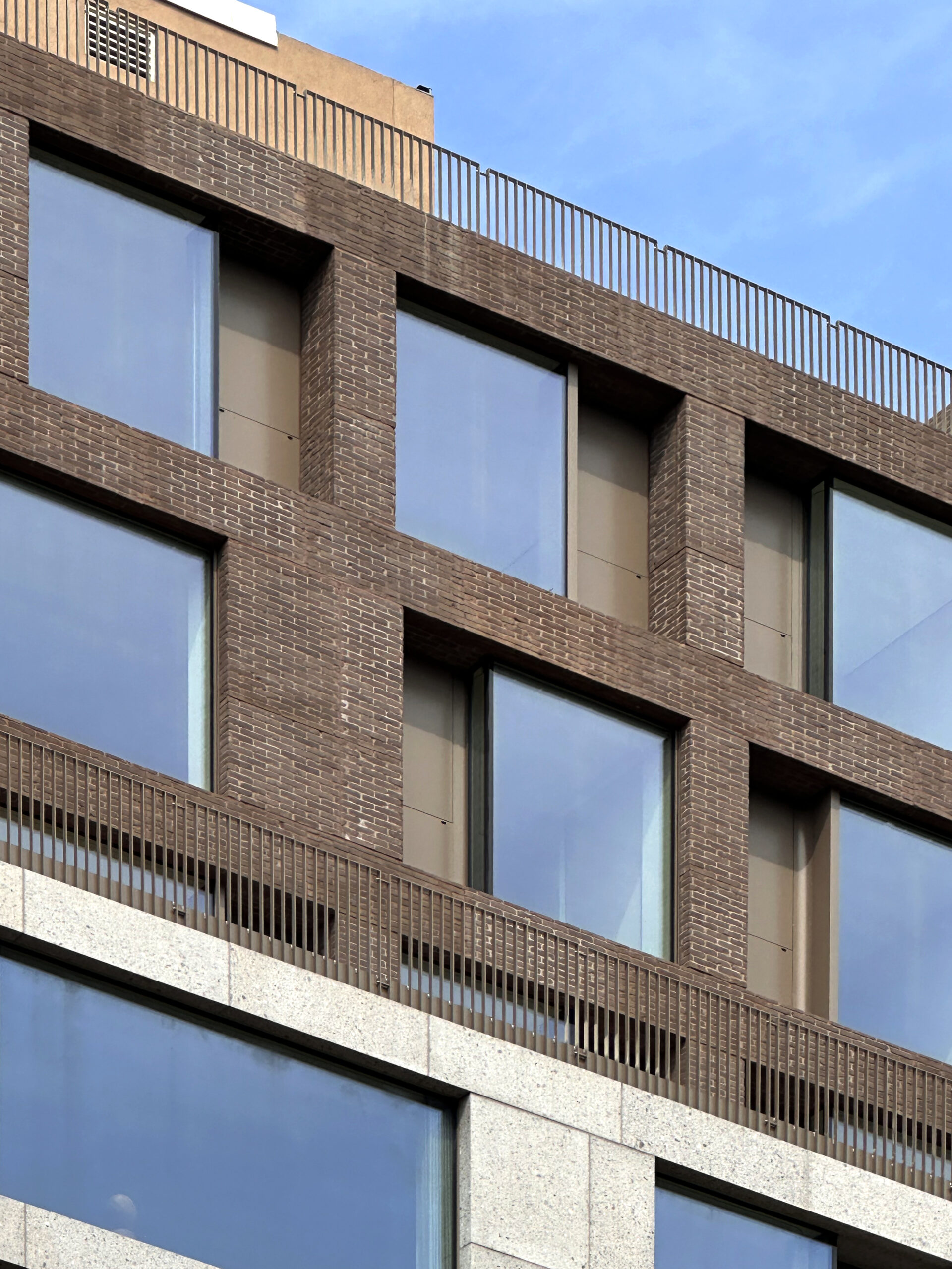
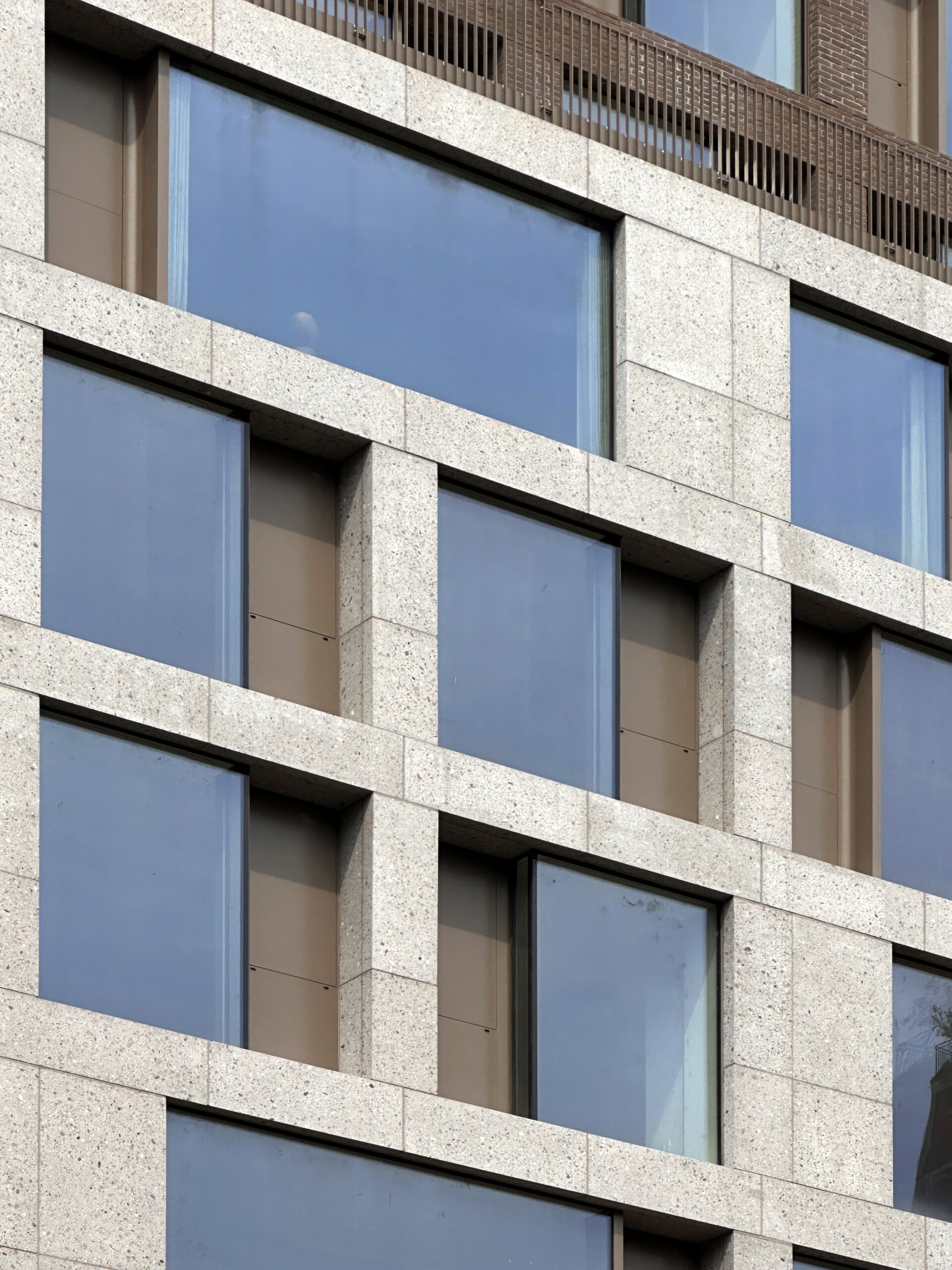
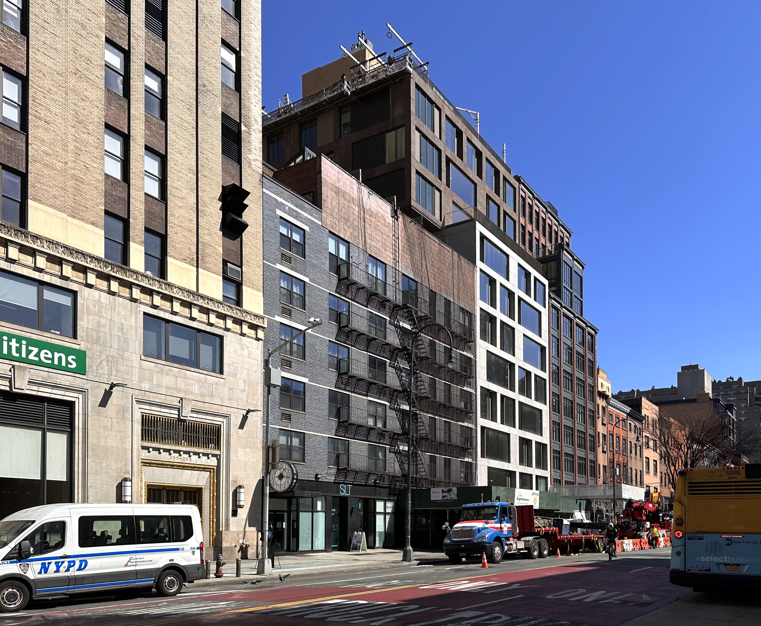
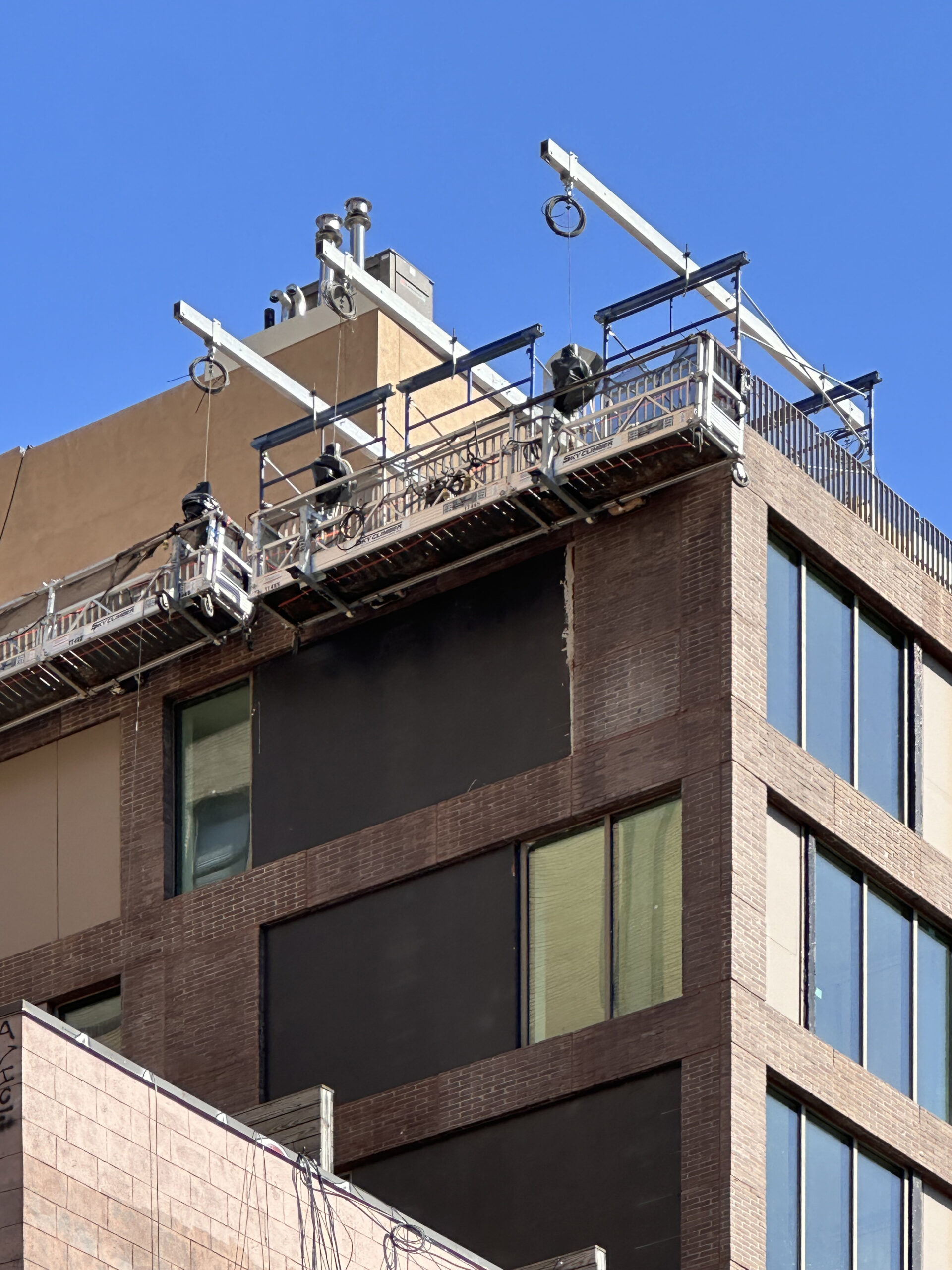
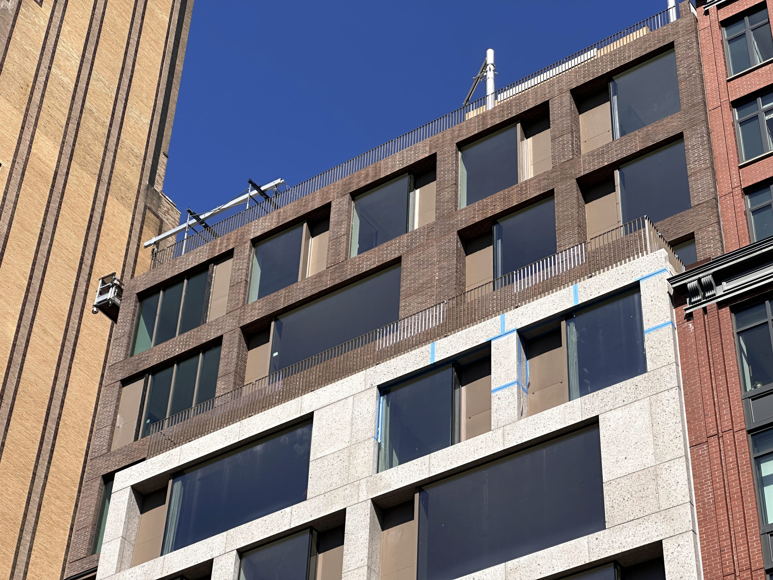
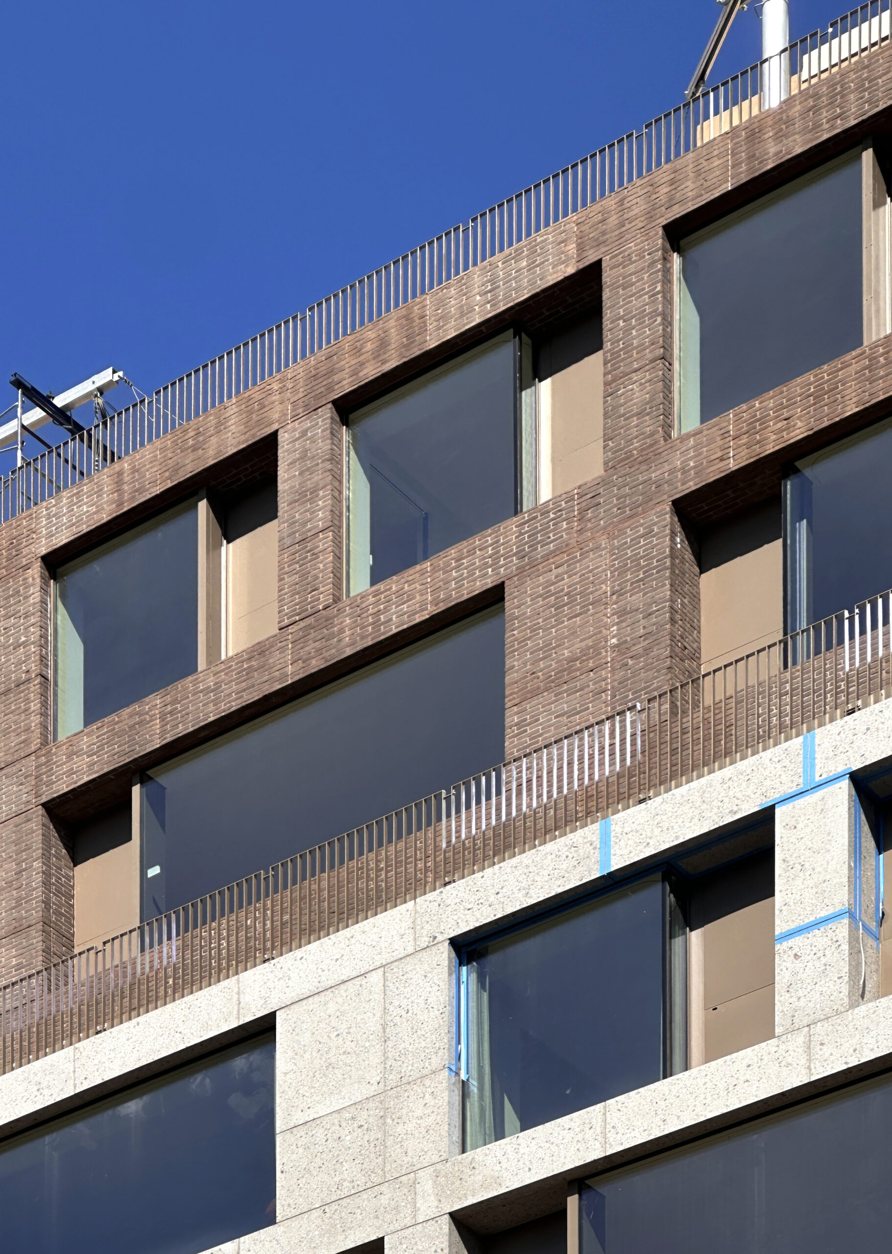
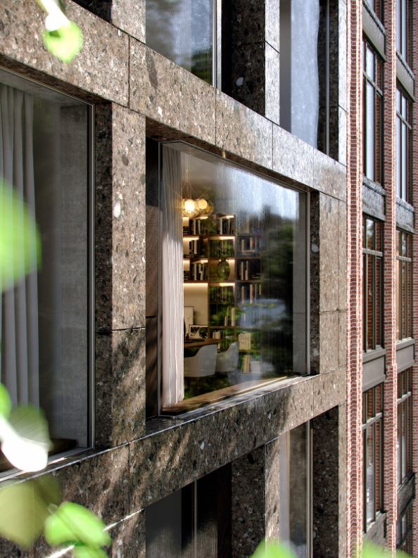
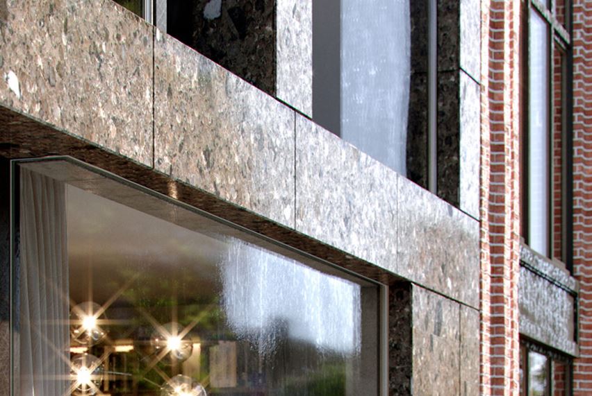
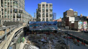
Exterior work has largely finished since our last update in January, when crews were working on the upper levels from hanging scaffolding platforms. Recent photos show the completed look of the gray stone and brown brick façade and the irregular grid of mullion-free floor-to-ceiling windows surrounded by bronze-hued metal paneling. The name of the property is now displayed on the outer wall of the ground floor, which is finally free of scaffolding and fencing. Interiors are finishing up.
The below images from this past summer and late spring, capturing crews in the process of installing the final sections of paneling on the western elevation above the cantilever.
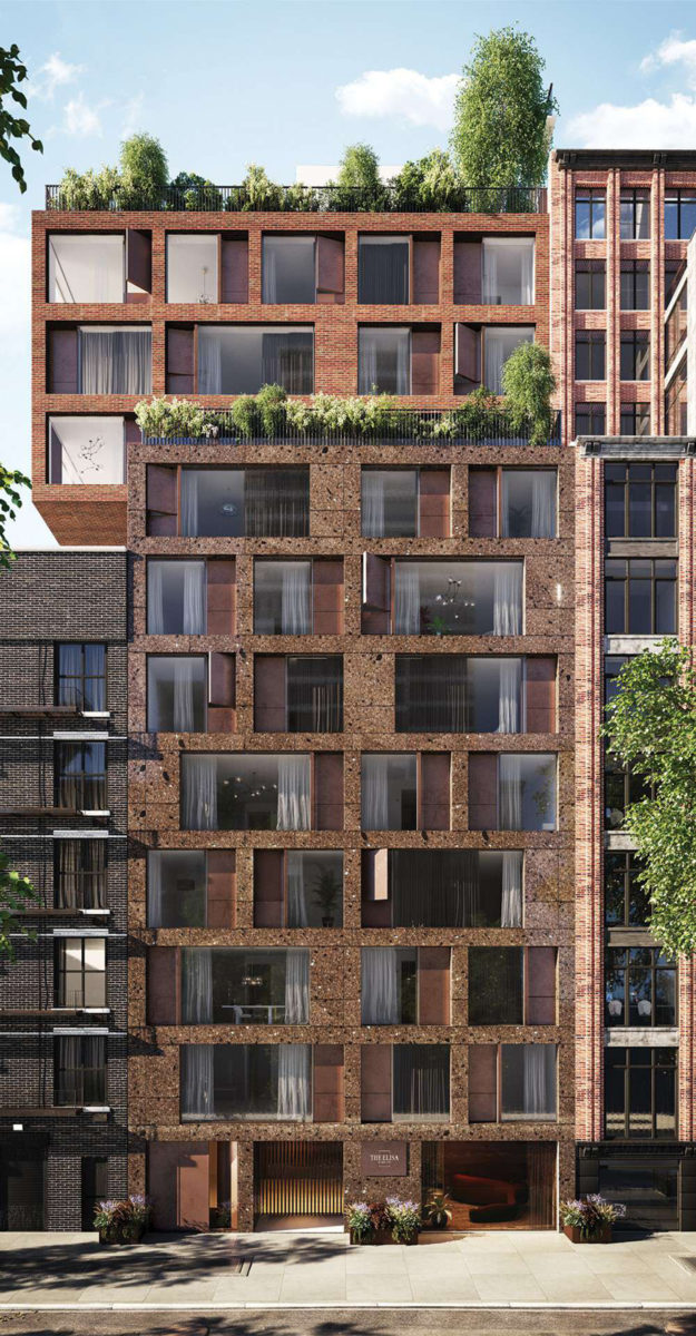
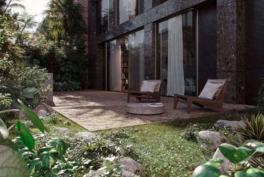
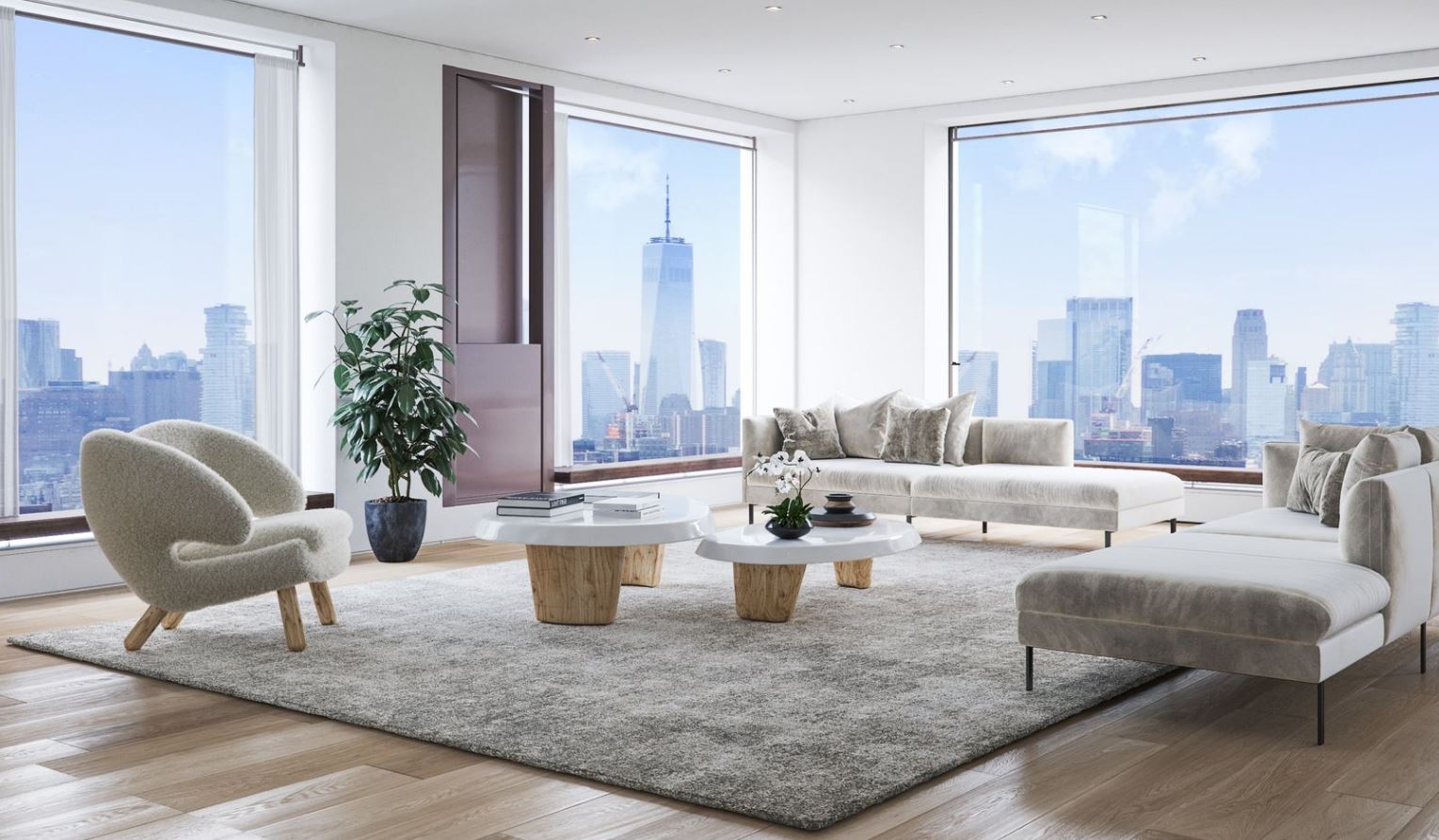
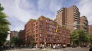
The finished product is a slight departure from the renderings in the main photo and below, which featured a brown terrazzo façade on the lower levels. The rest of the design appears mostly unchanged.
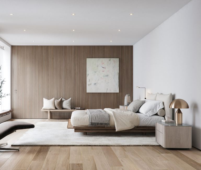
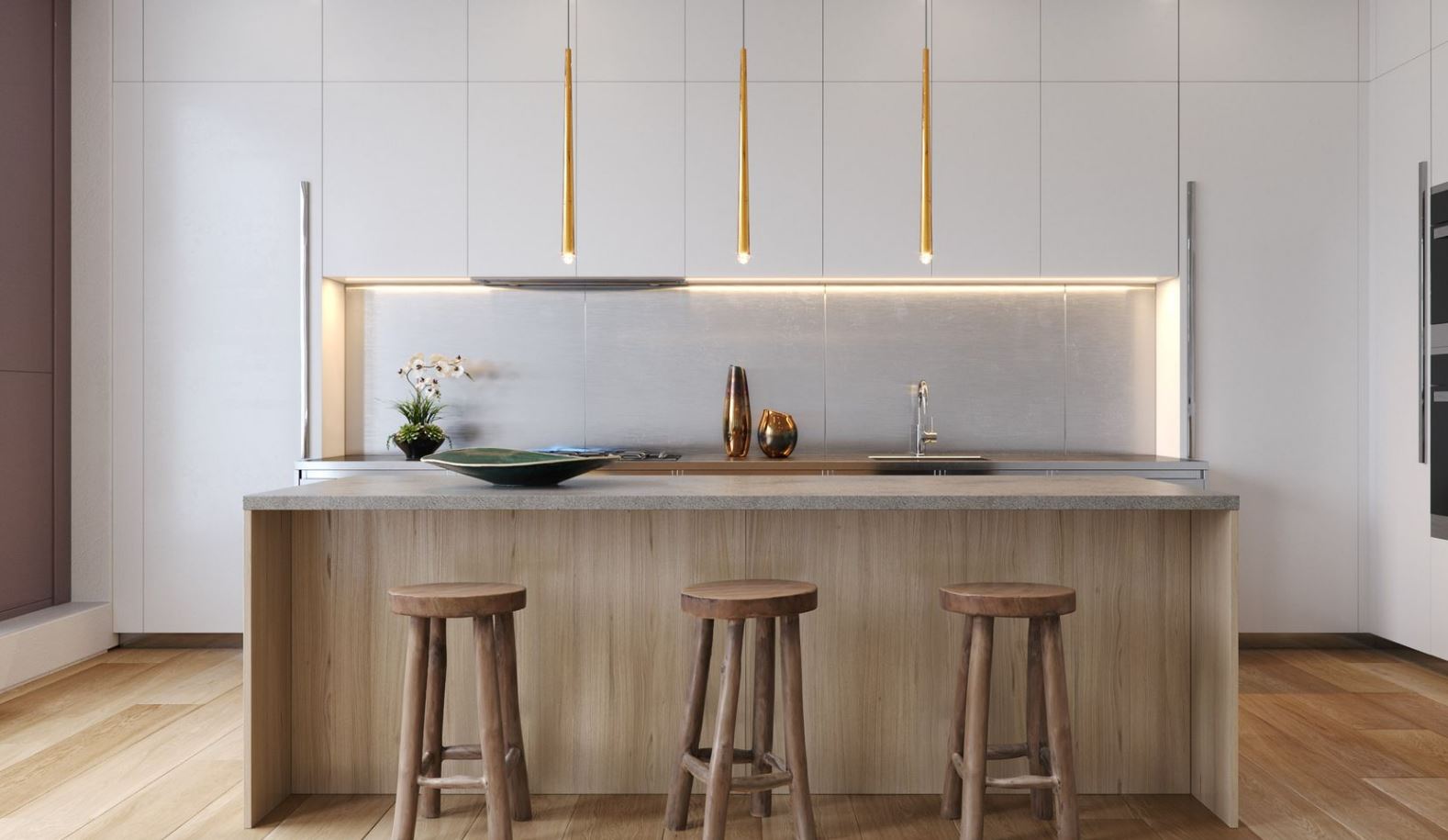
Homes at The Elisa will feature ceilings spans of over 9.5 feet and come with oak flooring, open-concept living spaces, and Boffi-designed kitchens with Miele appliances, eat-in Pietra Serena stone islands/peninsulas, stainless steel countertops and backsplashes, custom oak cabinets and cupboards with opaque varnished doors, and Sub-Zero wine coolers. Bathrooms will feature bespoke Vanilla Ice marble walls and floors, brushed stainless steel fixtures, and thermostatic rain showers by Fantini. Other finishes will include custom Boffi-designed closets and in-unit Whirlpool washer and dryers. Select condominiums have private terraces.
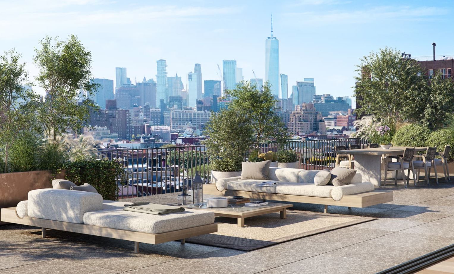
Residential amenities include full-time door attendants, a fitness club with an outdoor landscaped patio, a bike room, a shared laundry room, storage for purchase, and a rooftop garden with an outdoor kitchen and views over the neighborhood and the Hudson River.
Sales and marketing are being led by Donna Strugatz of SERHANT., and Bianca D’Alessio, Mia Calabrese, and Tata Wetzel of Nest Seekers with prices ranging from $1.45 million to $11.9 million for the four-bedroom penthouse.
The closest subways from the property are the A, C, and E trains at the 14th Street station at the corner of Eighth Avenue and West 14th Street.
Subscribe to YIMBY’s daily e-mail
Follow YIMBYgram for real-time photo updates
Like YIMBY on Facebook
Follow YIMBY’s Twitter for the latest in YIMBYnews


I’m sure it will look more like the rendering on a nice rainy day. It’s okay, nothing much to write about, minimalist in a slightly different way. It provides context for the buildings on both sides, a blend of the bland building on the left and a little style for the building on the right.
Going with a lighter colored facade rather than the original darker material was an unfortunate choice. From a distance, it makes the it look life half the windows are boarded up with plywood.
Agreed.
From close-up photos it can be seen, that the glass panels are very large. When the light shines in it will be more beautiful than before: Thanks to Michael Young.
Sadly the Rendering is far better than the disappointing final product. This looks like a hodge podge of panels and will appear in a perpetual state of construction. More than a slight departure and quite an ugly building.
Anyone know what’s going on with the absolute dog of a building next door?
Let’s hope they are spending the money they got for selling their air rights into improving their facade.
Perhaps they haven’t added the clear sealant to the concrete panels. That would improve the look and durability. The design is okay, more curious than good.
Quite a difference between the rendering and the final product. The stone panels just don’t have the richness of color of the rendering. Disappointing.
Rendering so much nicer than the real building.