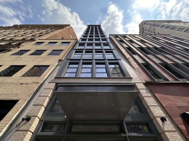
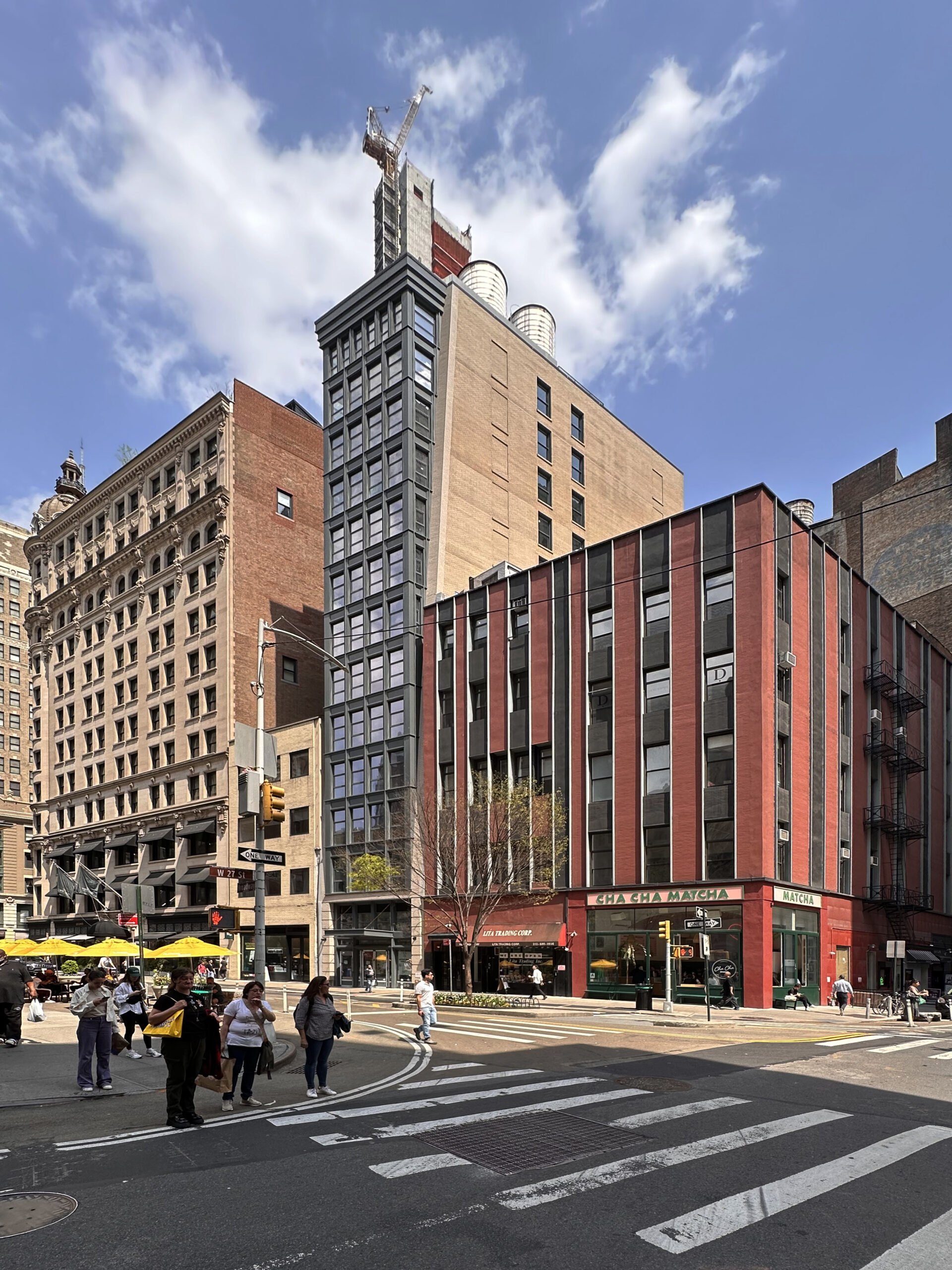
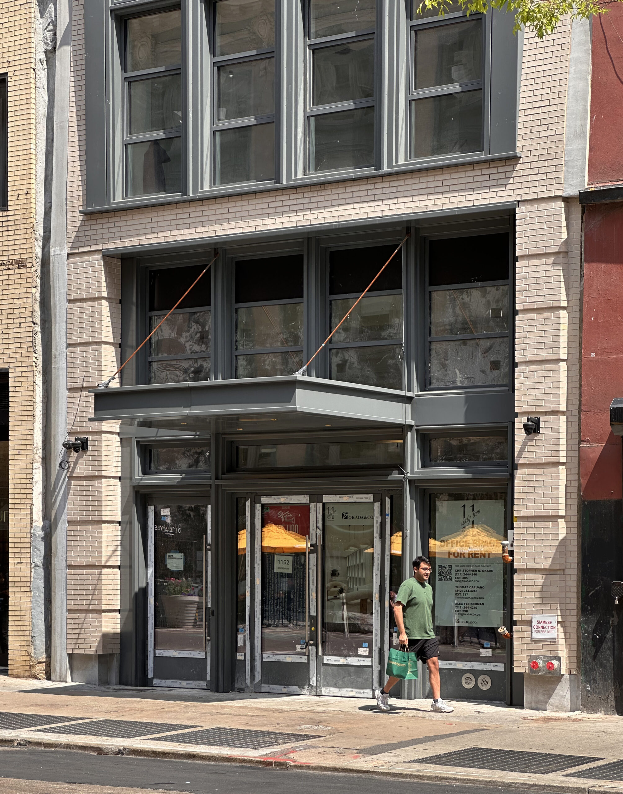
Construction is complete on 1162 Broadway, a 14-story commercial building in the Madison Square North Historic District of NoMad, Manhattan. Designed by Morris Adjmi Architects and developed by Okada & Co. under the 1162 Broadway LLC, the 185-foot-tall structure yields 30,000 square feet of Class A office space and 1,800 square feet for a restaurant on the ground floor and cellar level. The property is located between West 27th and 28th Streets on a narrow interior lot.
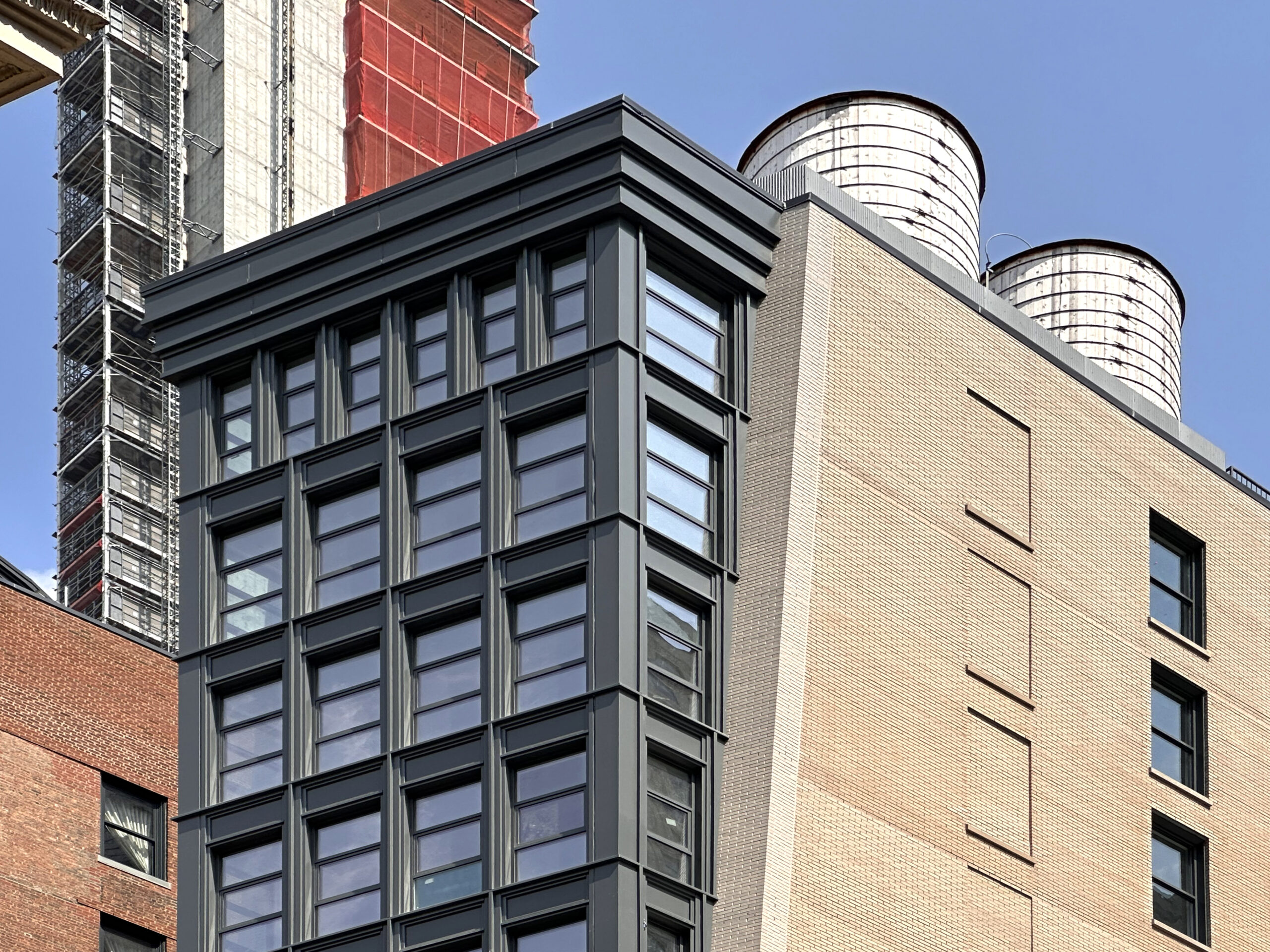
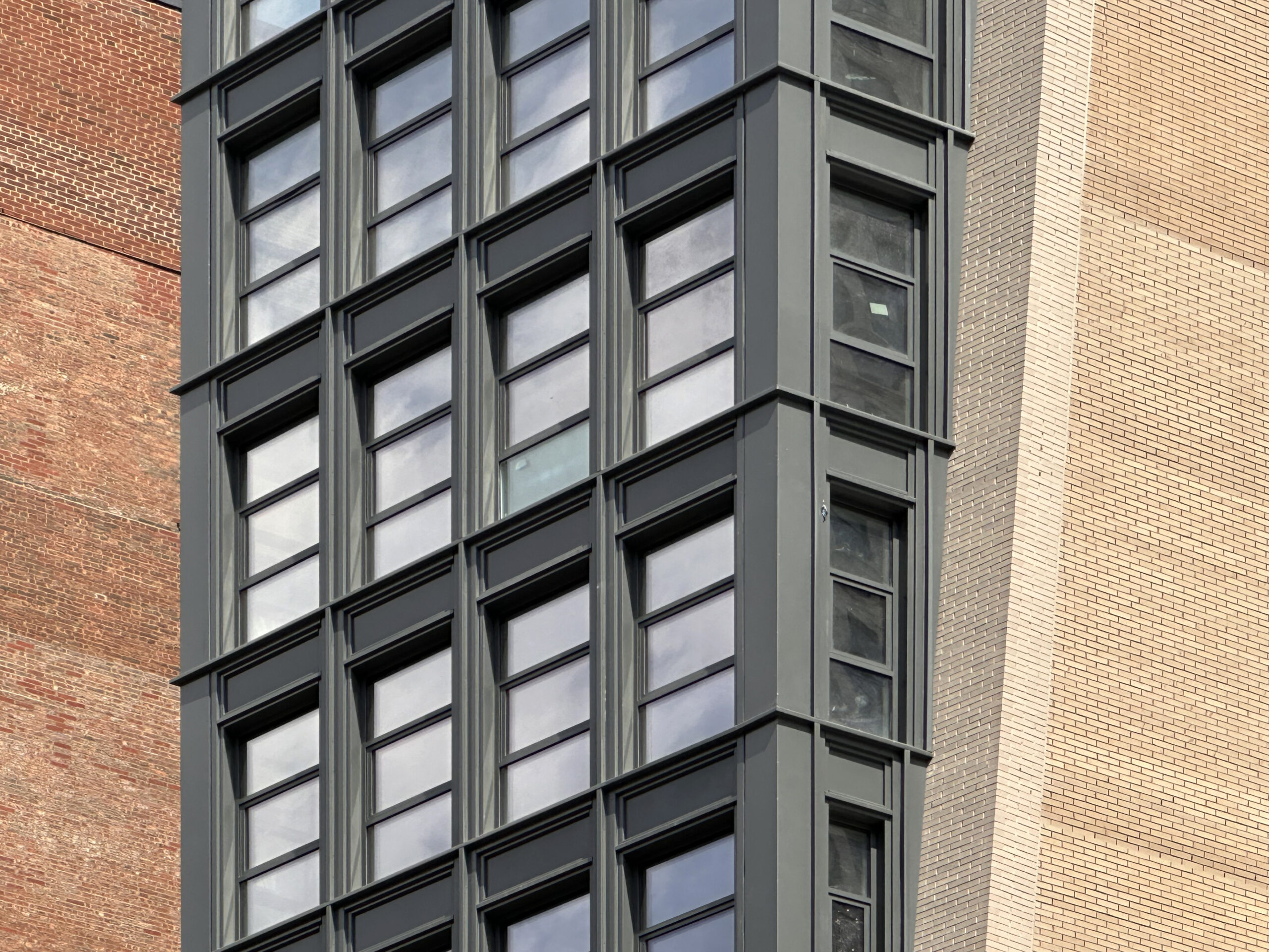
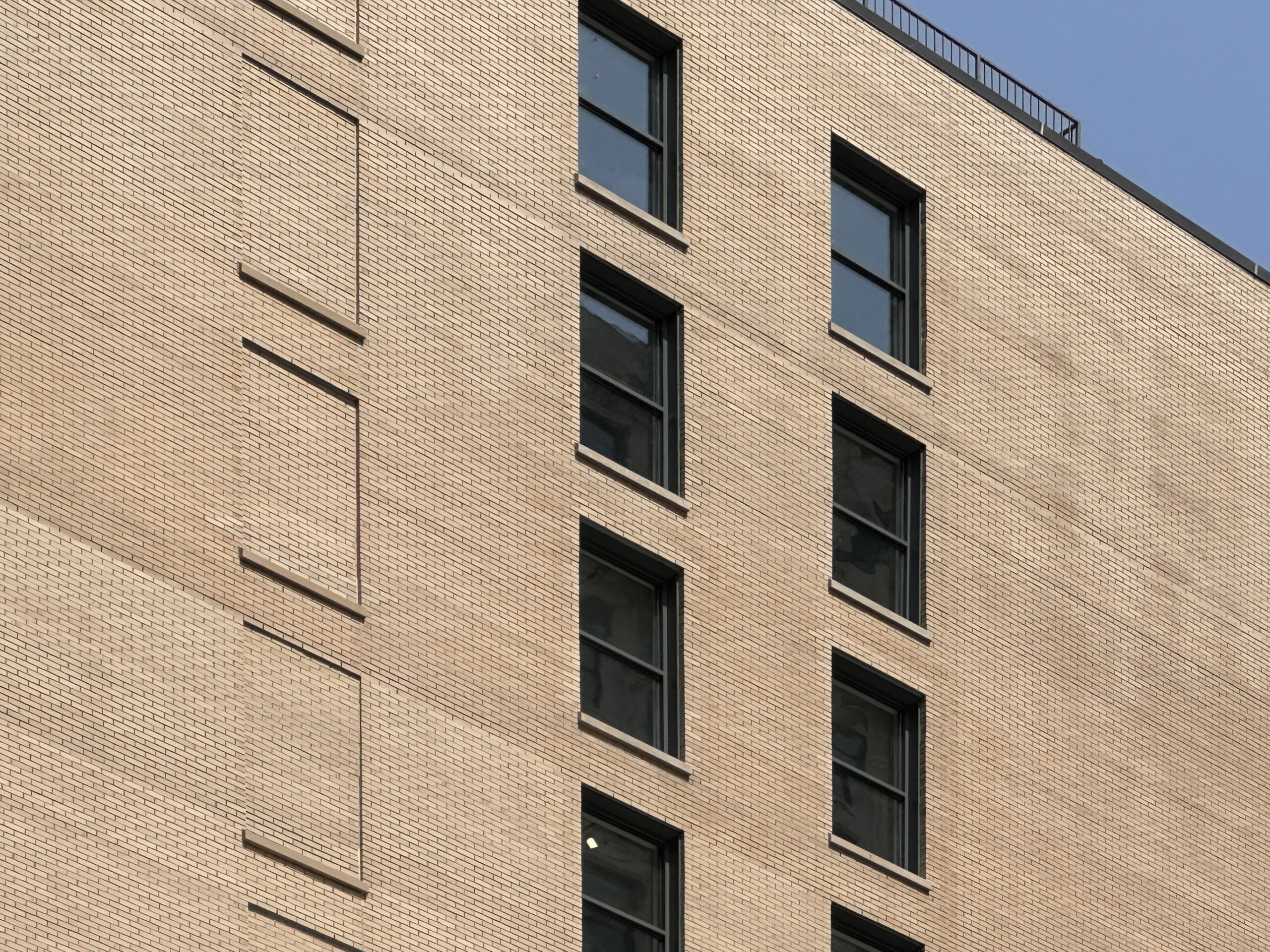
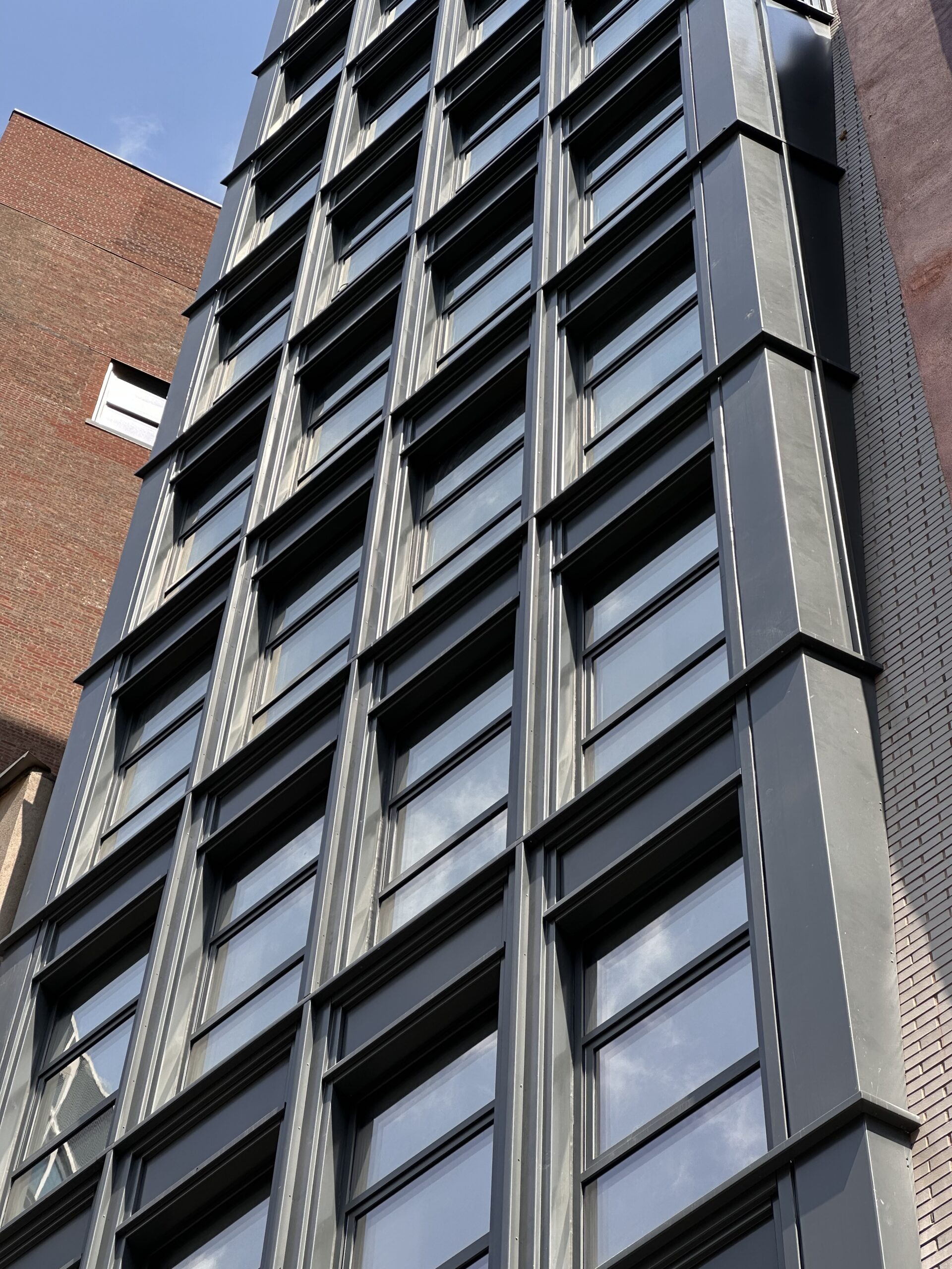
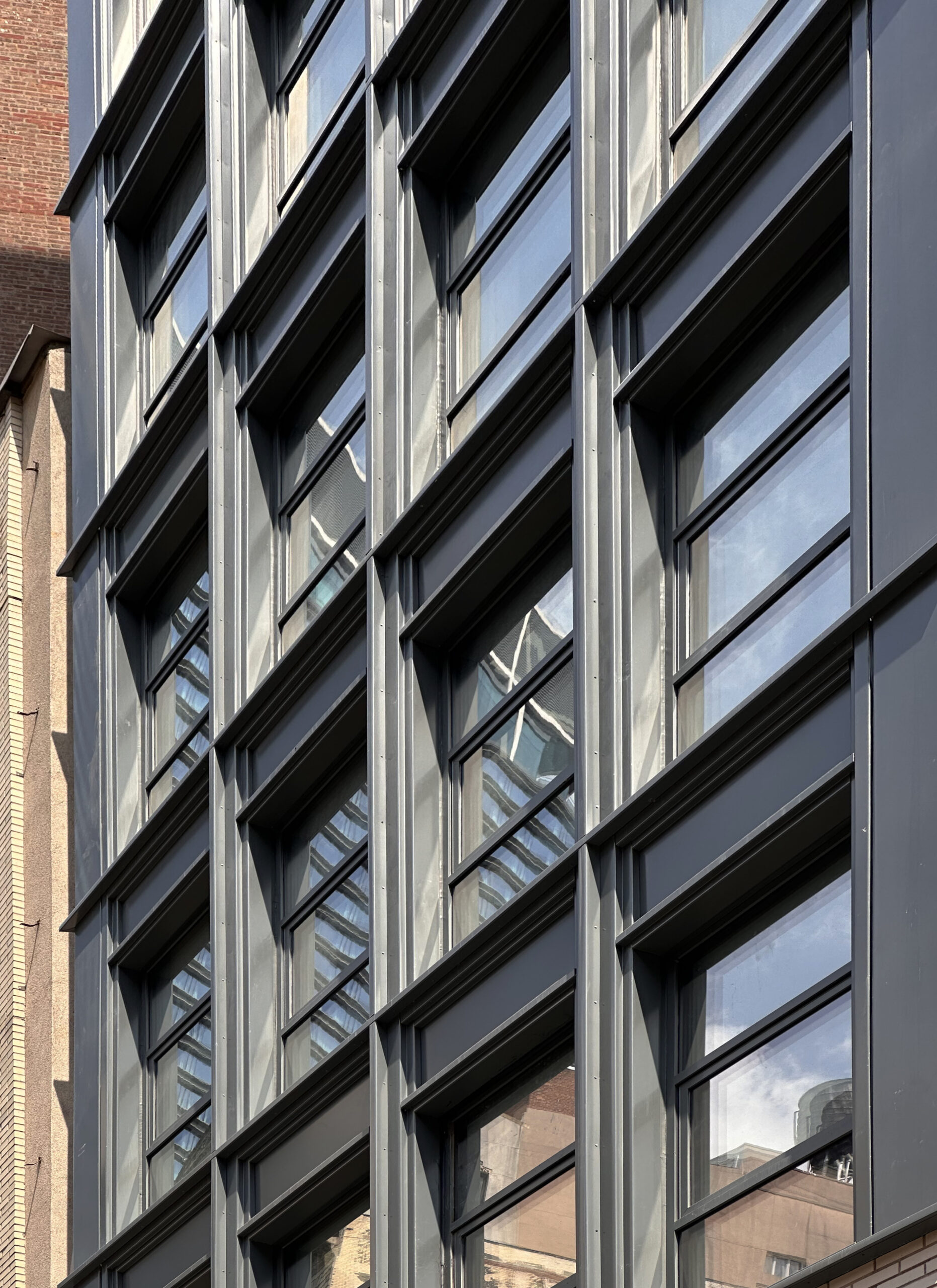
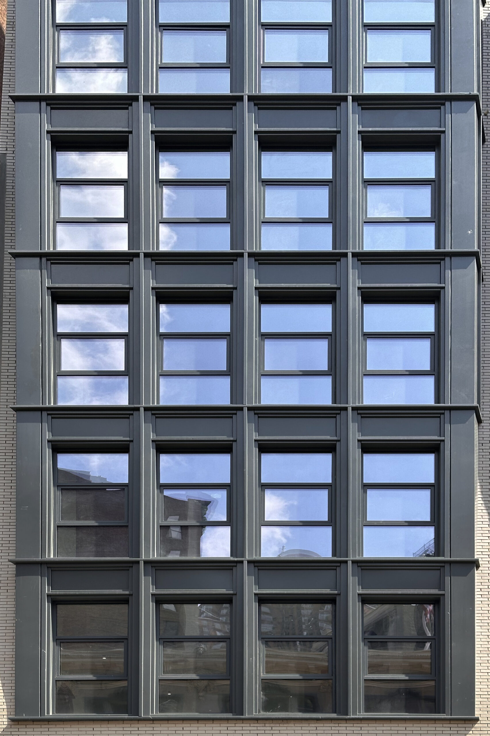
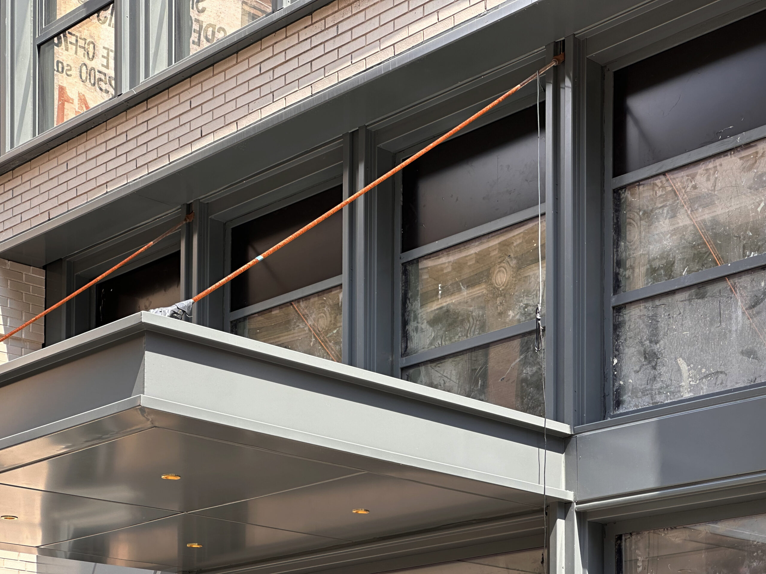
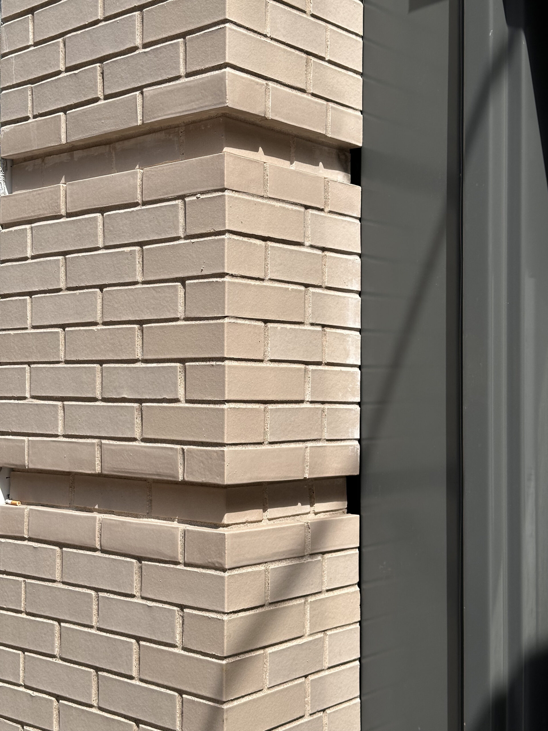
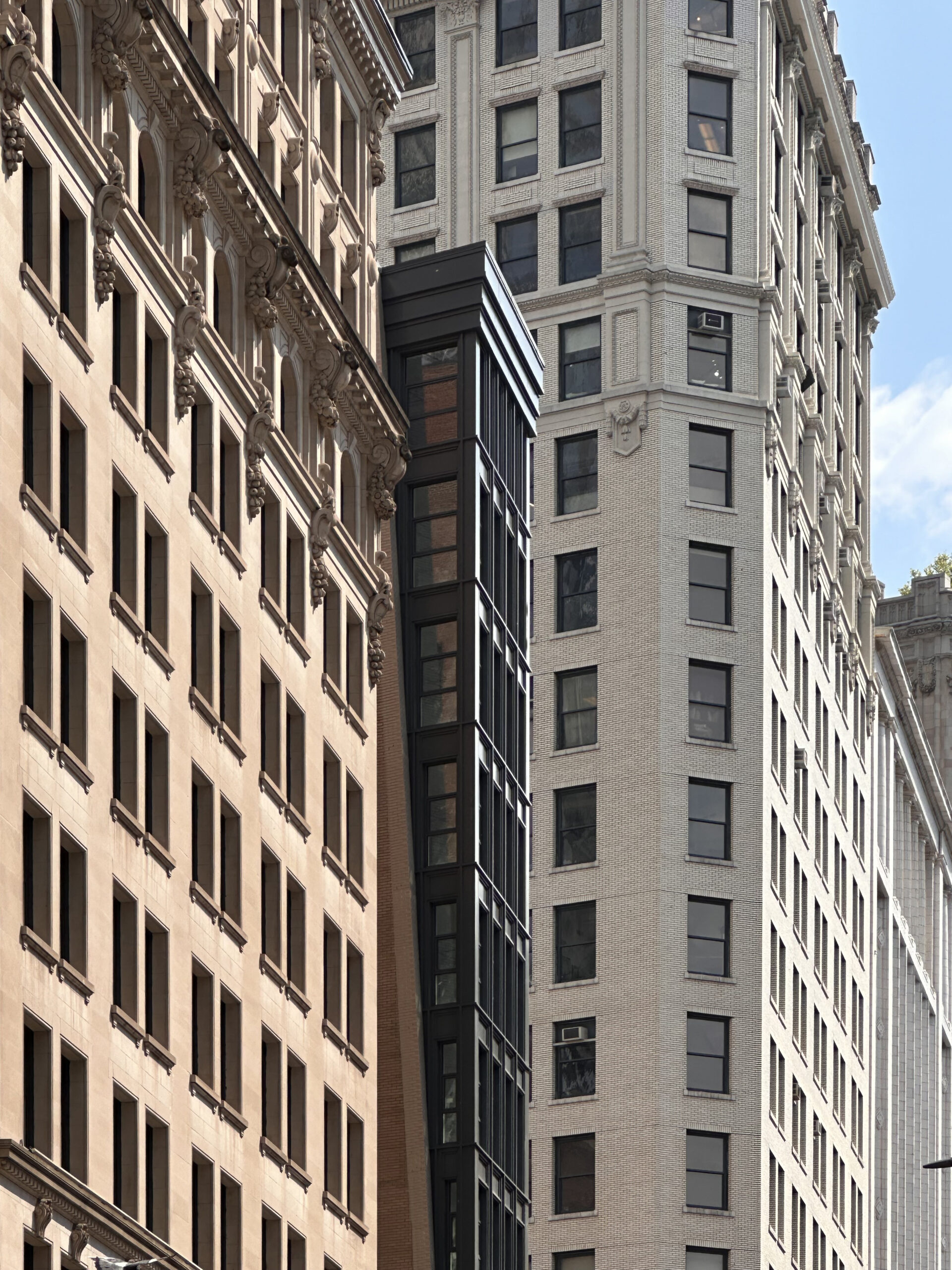
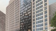
The exterior has completely wrapped up since our last update in early April 2023, when the upper levels of the façade were just beginning to emerge from behind a dense veil of scaffolding and black netting. Recent photographs show the full appearance of the narrow western profile and its symmetrical fenestration of floor-to-ceiling windows and gray metal paneling. The longer southern lot line wall is composed of beige brick and meets the metal elements along a diagonal line running up the corners of the building’s western elevation. Two wooden water towers are visible atop the roof parapet.
Office leases have been signed by a diverse mix of companies, including businesses in technology, furniture, and interior design. The office floors average 2,220 square feet and come with unfinished ceilings with 10-foot spans. Arabica Coffee has agreed to lease the retail space and is expected to move in imminently.
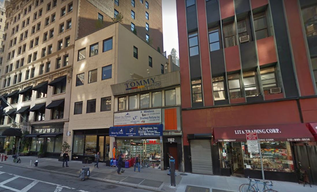
The below Google Street View image shows the two-story commercial building that formerly occupied the plot.
The nearest subways from the property are the R and W trains at the 28th Street station to the north. Madison Square Park is a short walk away to the south and Herald Square is located further north along Broadway.
Subscribe to YIMBY’s daily e-mail
Follow YIMBYgram for real-time photo updates
Like YIMBY on Facebook
Follow YIMBY’s Twitter for the latest in YIMBYnews


The metal window detailing and spandrels are nice. It is unfortunate that the cornice lacks similar refinement.
Thought the same. I don’t like this ziggurat cornice trend in architecture.
What a fascinating building. I love how the design blends modern simplicity with hints of classical architecture found in nearby buildings. Lovely and gallant.
Quick question… what are those “metal” pieces called that fill the gap between old and new buildings?
🤔
Please clarify what you’re asking.
Expansion Joints
This project will look even better when sandwiched between two new structures on the flanking lots. Seems inevitable considering both are trash. The design of this building smartly anticipates this while providing for light to enter each floor from three sides instead of one.
Fits in beautifully with the historic commercial buildings in this district. Hopefully the historic district guidelines will dictate some thoughtful design when these ugly ducklings on either side are replaced. The cornice doesn’t bother me at all, it harmonizes quite well with the design of the window frames all down the front.
Pretty cool—a fresh idea.
This is a new building that has made sure that it is belongs on this block! Well done. Very well done.