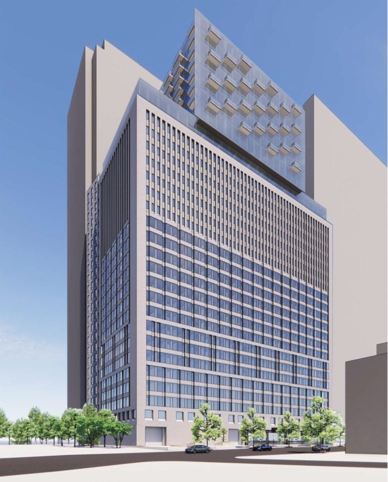
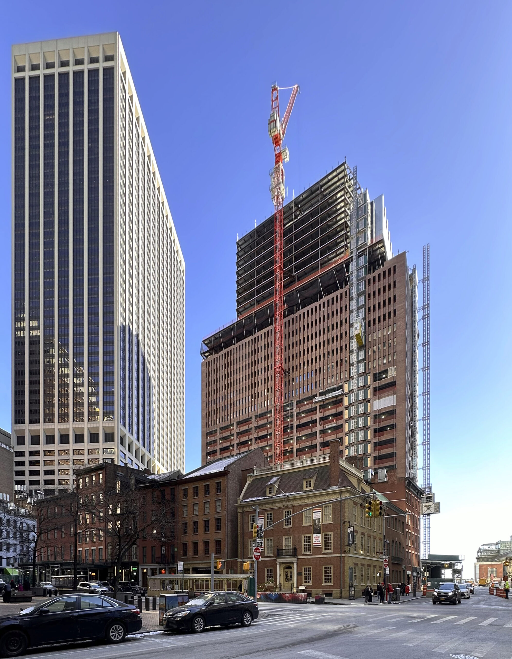
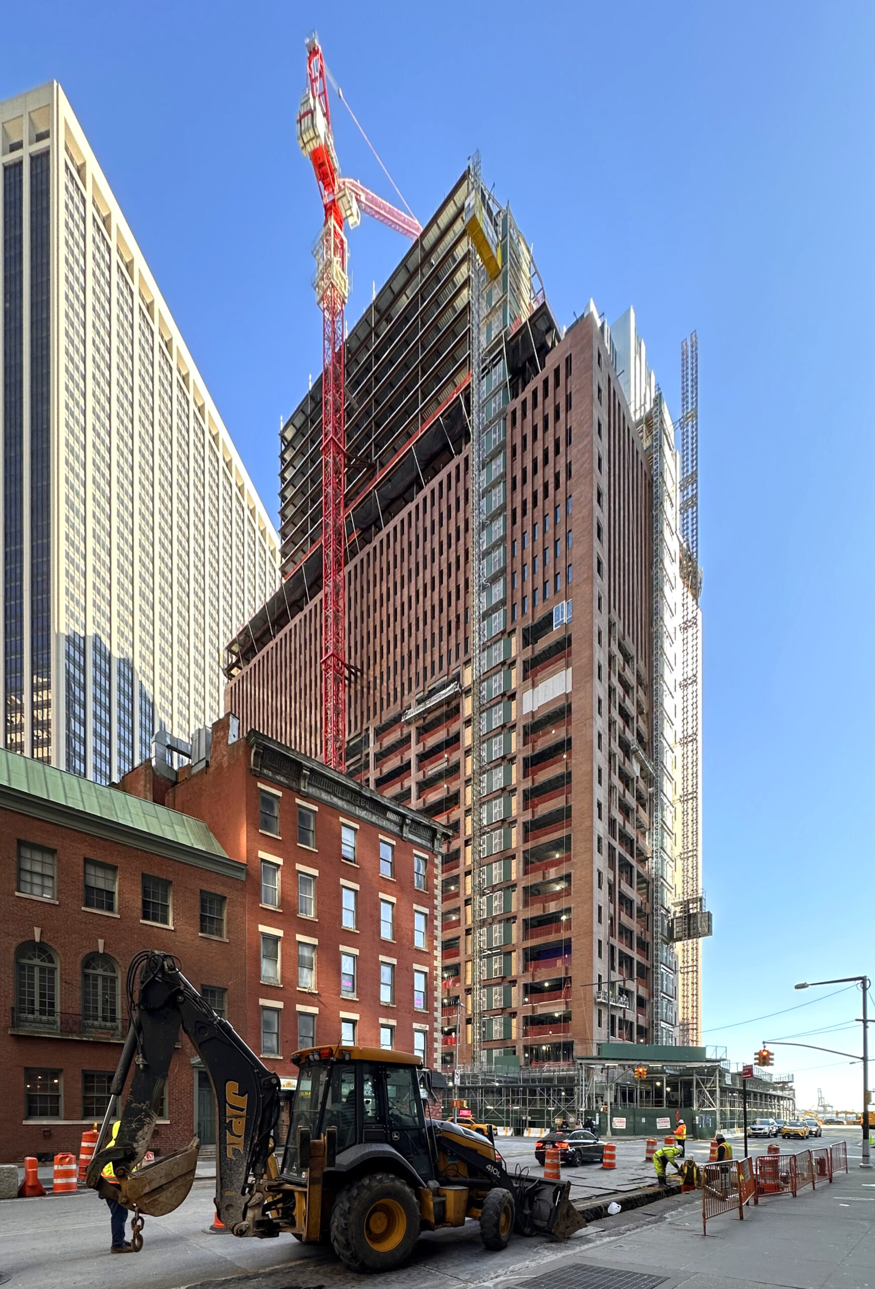
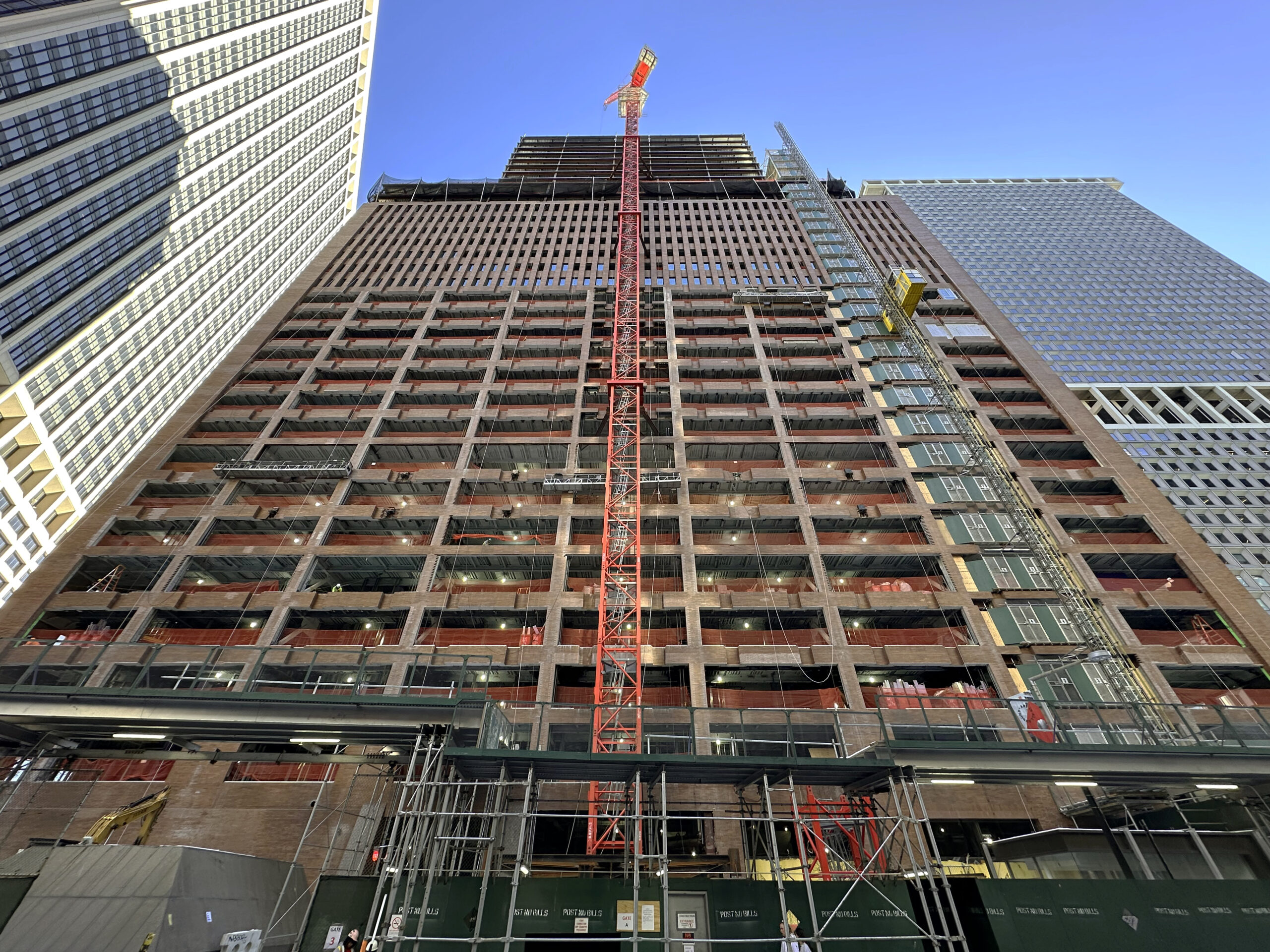
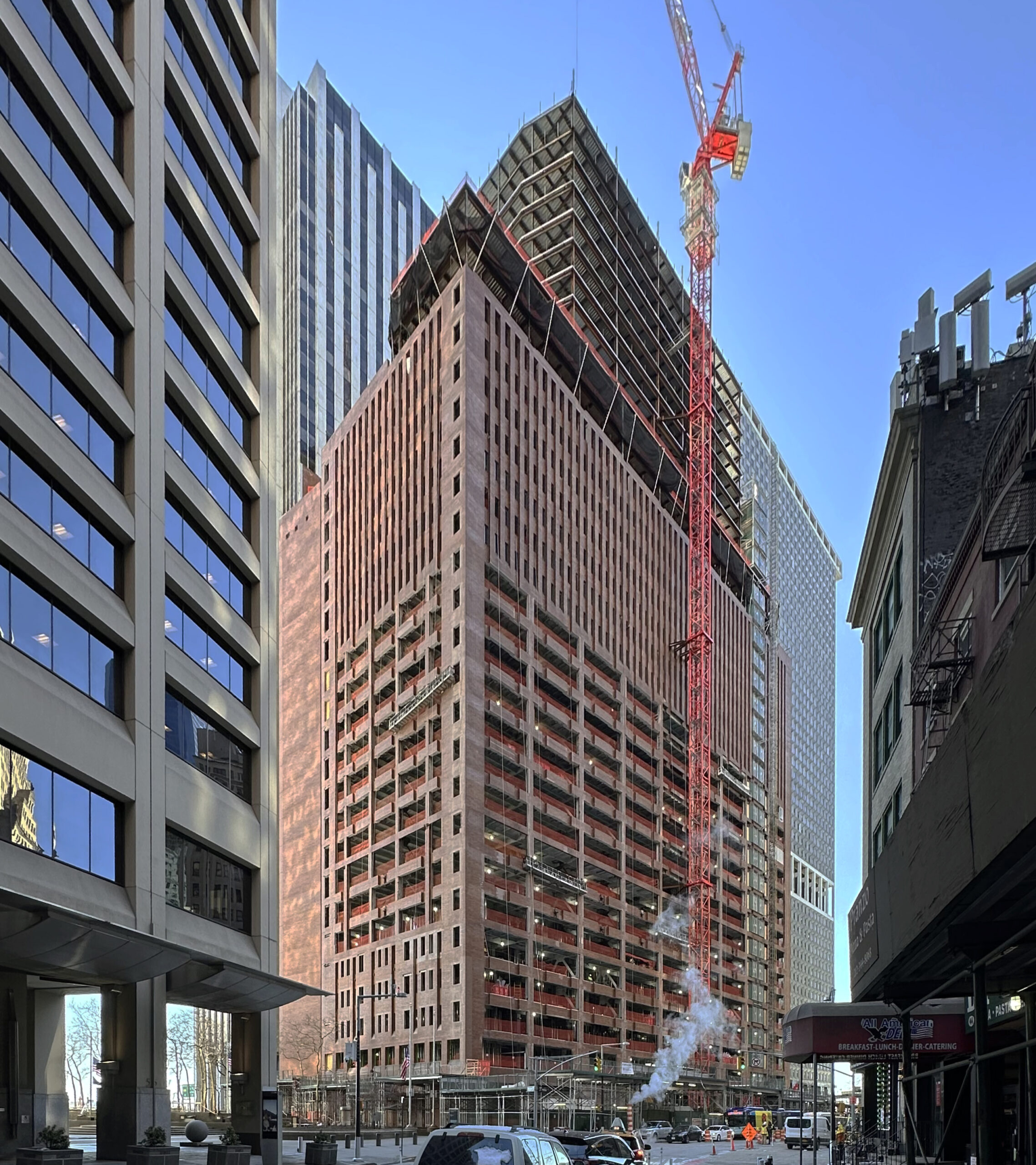
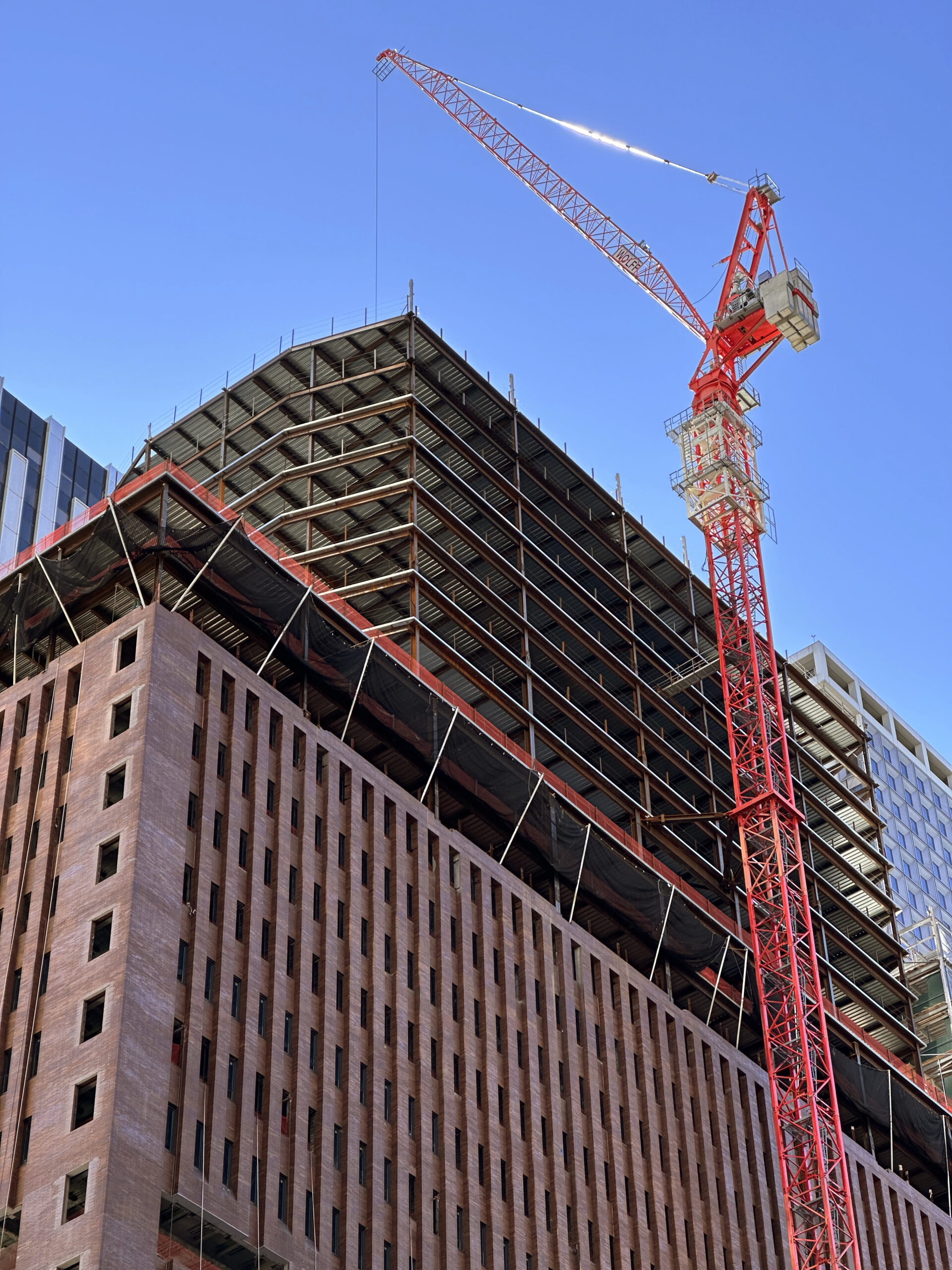
Construction has topped out on 25 Water Street, a 32-story office-to-residential conversion and expansion in Manhattan’s Financial District. Designed by CetraRuddy and developed by GFP Real Estate, Metro Loft Management, and Rockwood Capital, the project involves the construction of ten stories above the parapet of the former 22-story office building, the replacement of much of its old façade with a modern fenestration featuring more expansive glass, and the gut renovation of its 1.1 million square feet of interiors into 1,300 rental units.
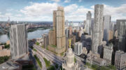
The conversion will be the largest of its type by unit count in US history, surpassing the recent 566-unit redevelopment of One Wall Street. Pavarini McGovern is the general contractor for the property, which is bound by Water Street to the north, 2 New York Plaza to the south, the New York Vietnam Veterans Memorial to the east, and Broad Street to the west.
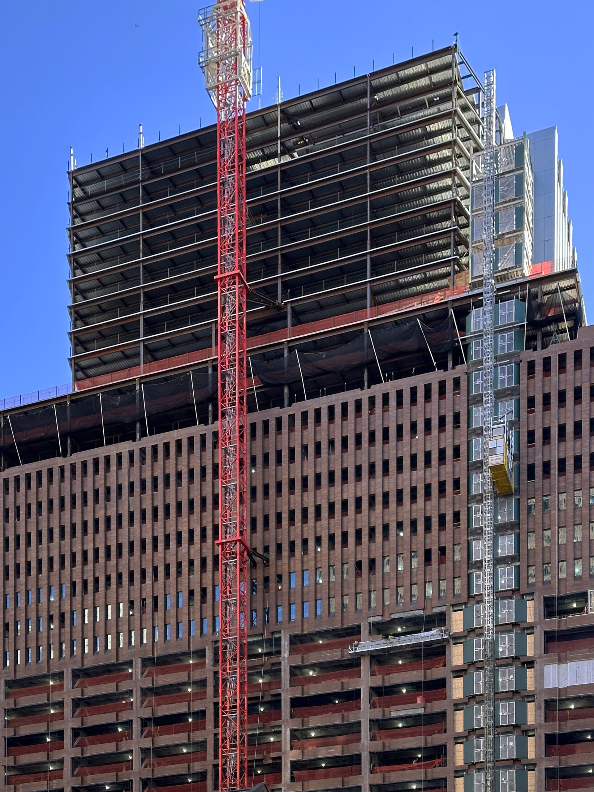
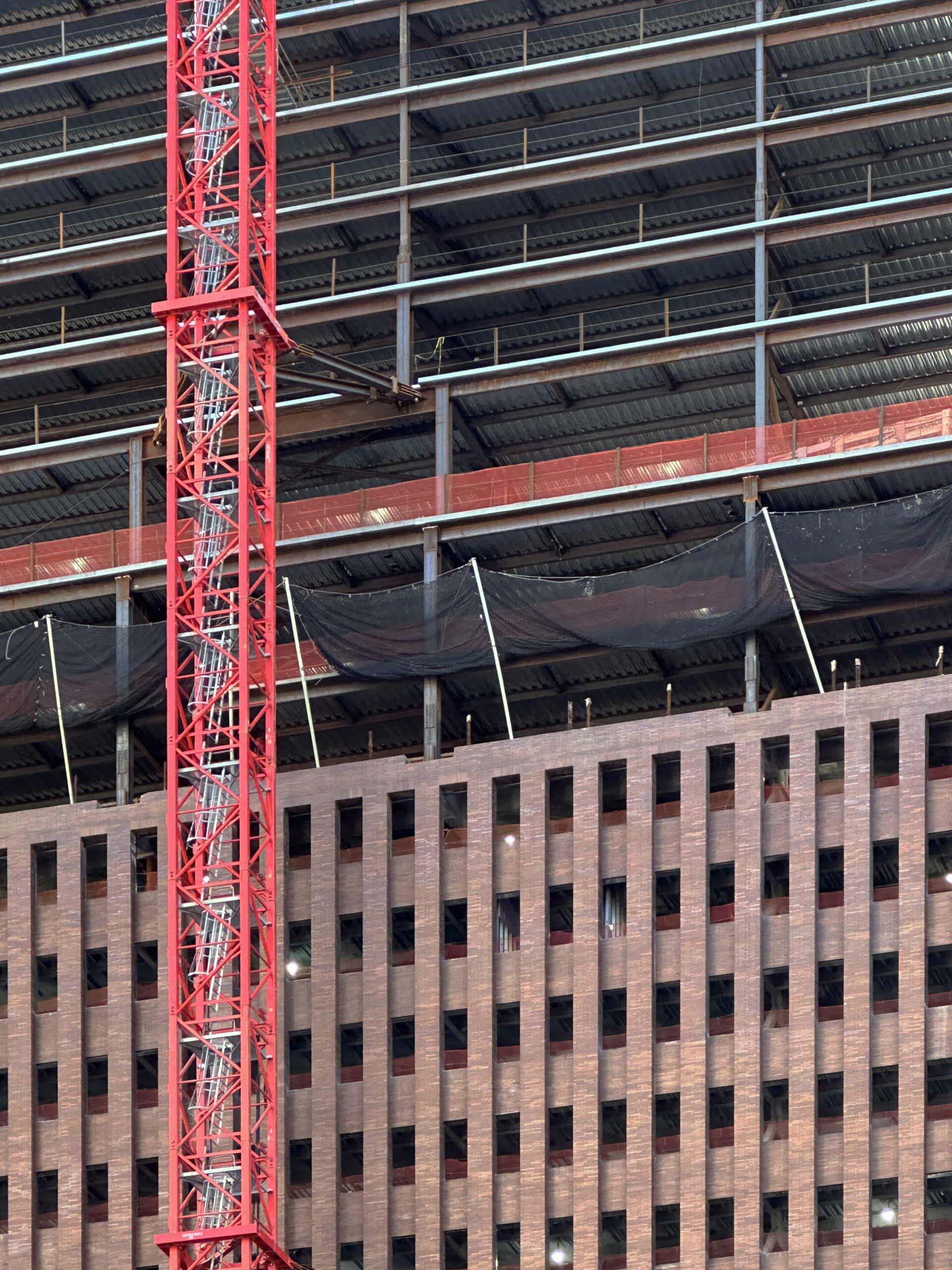
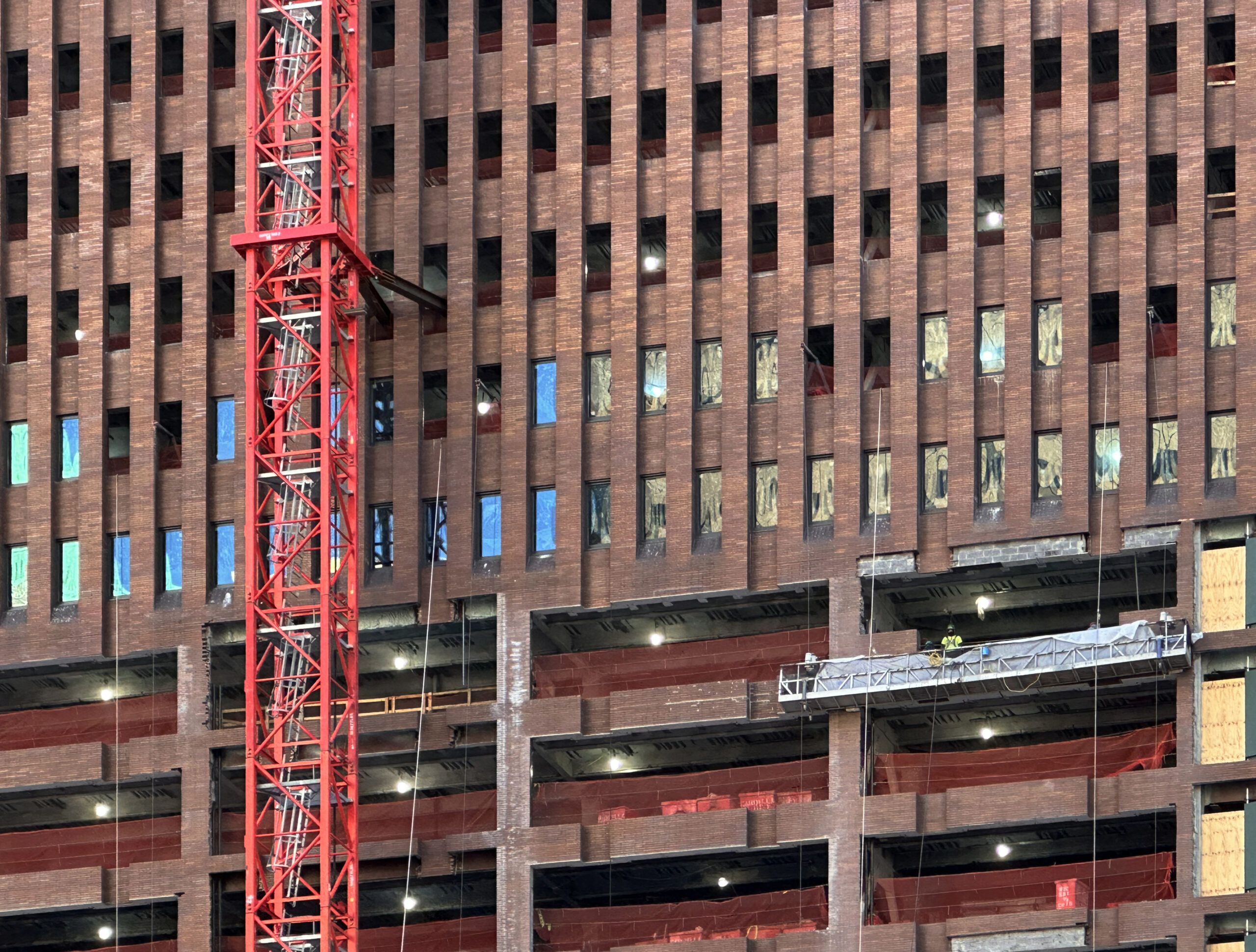
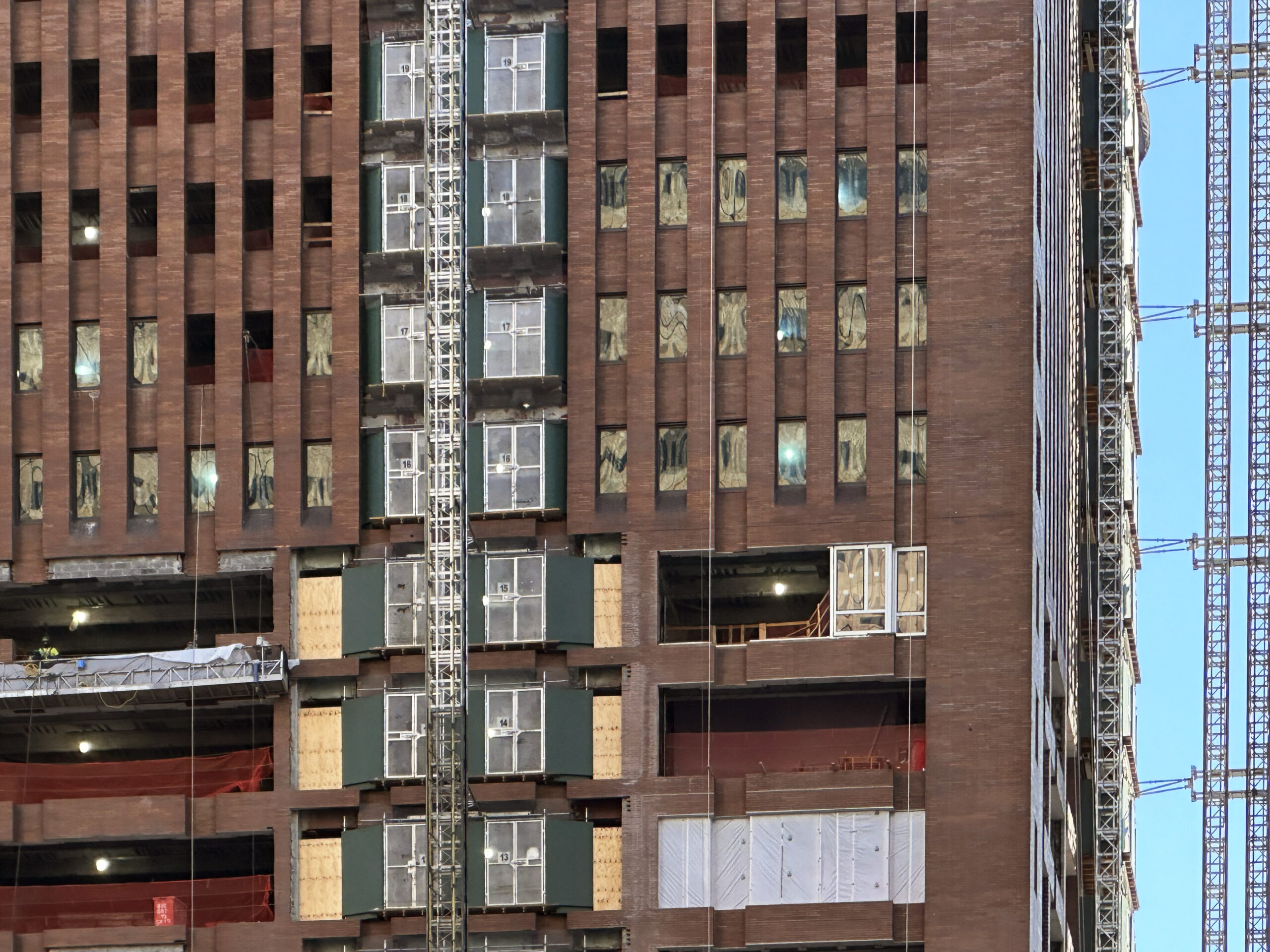
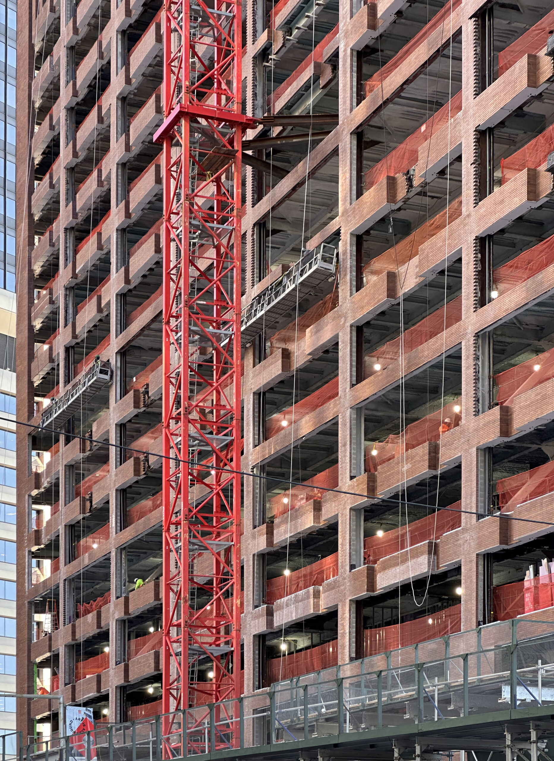
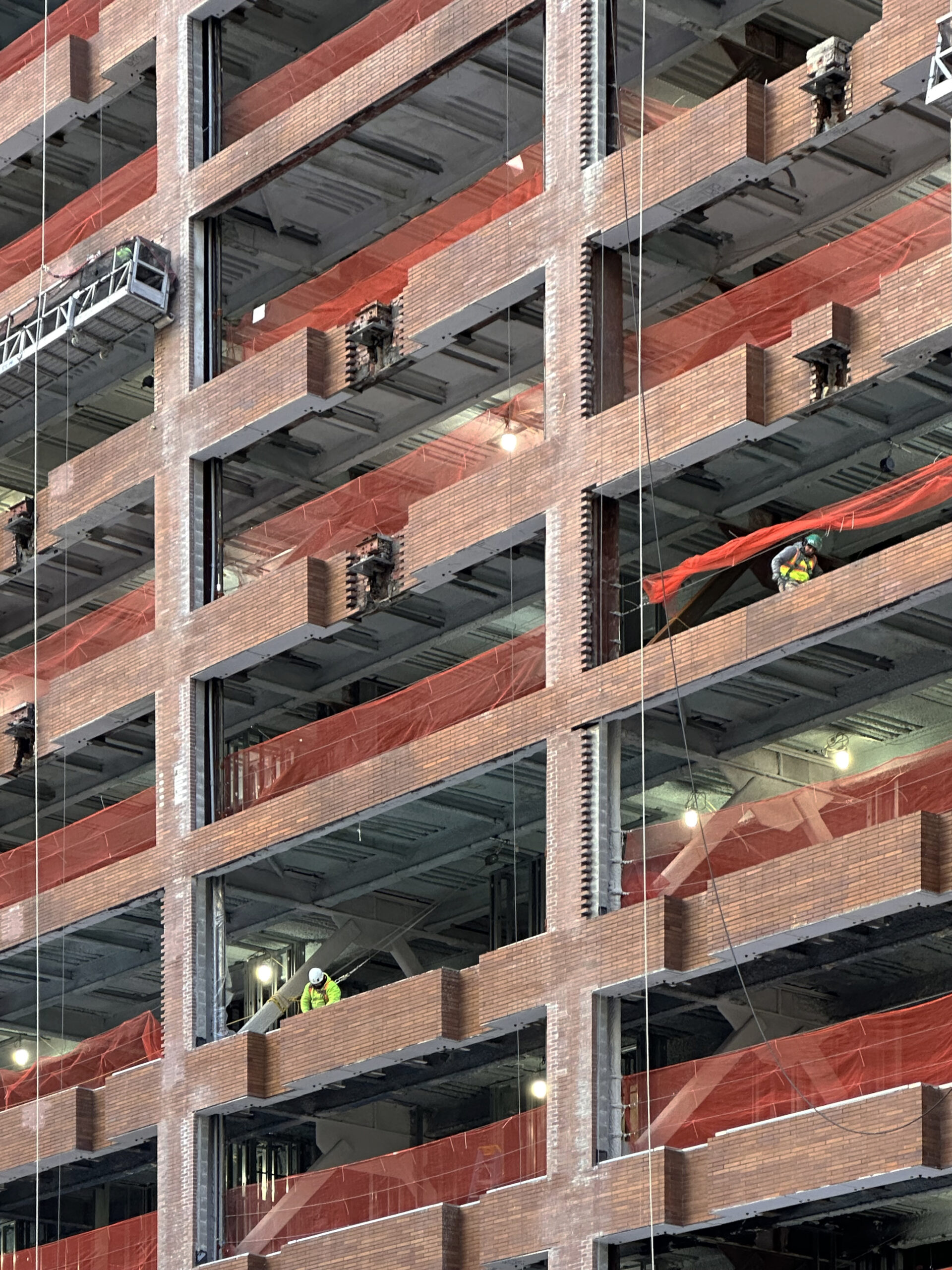
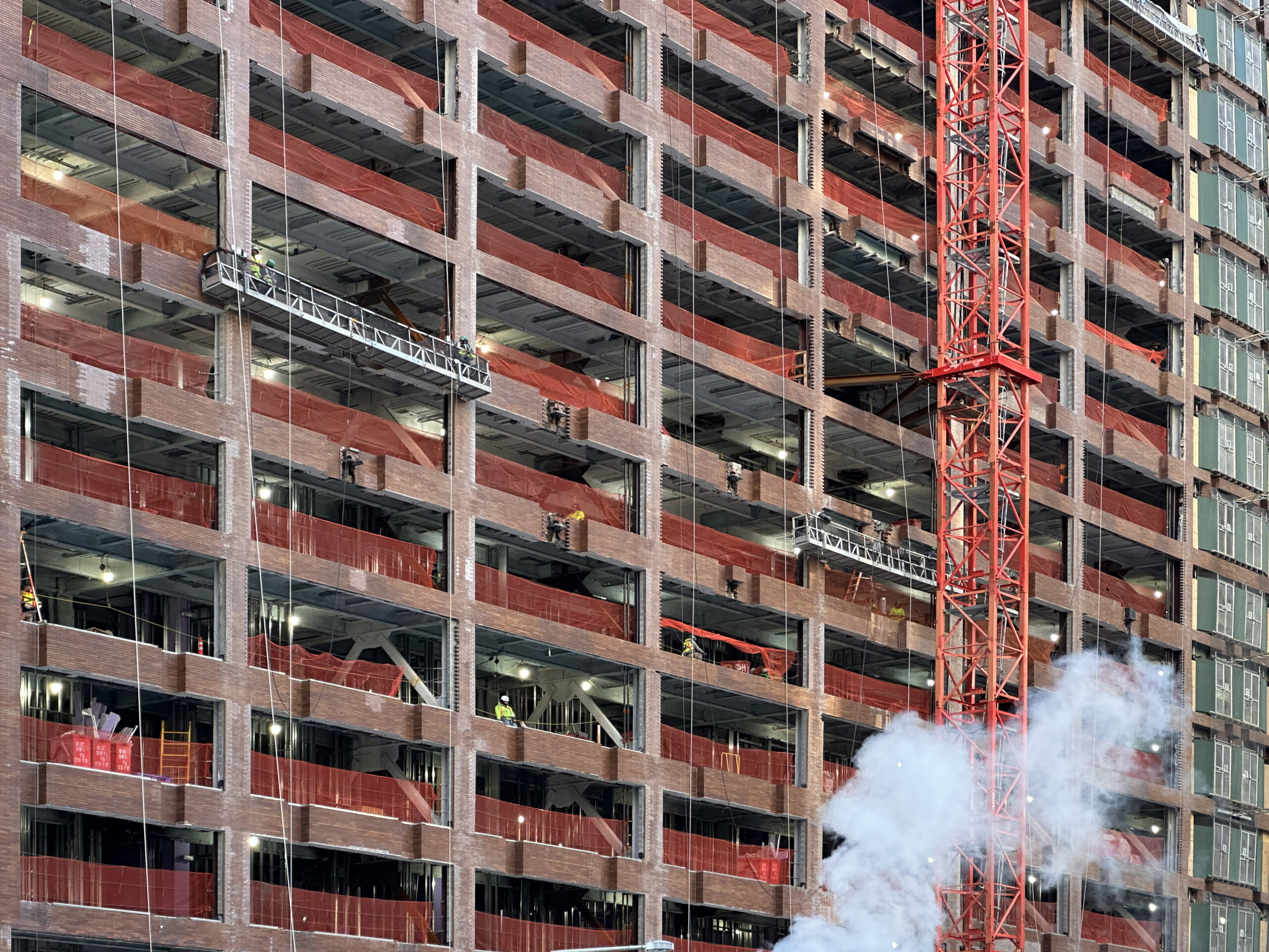
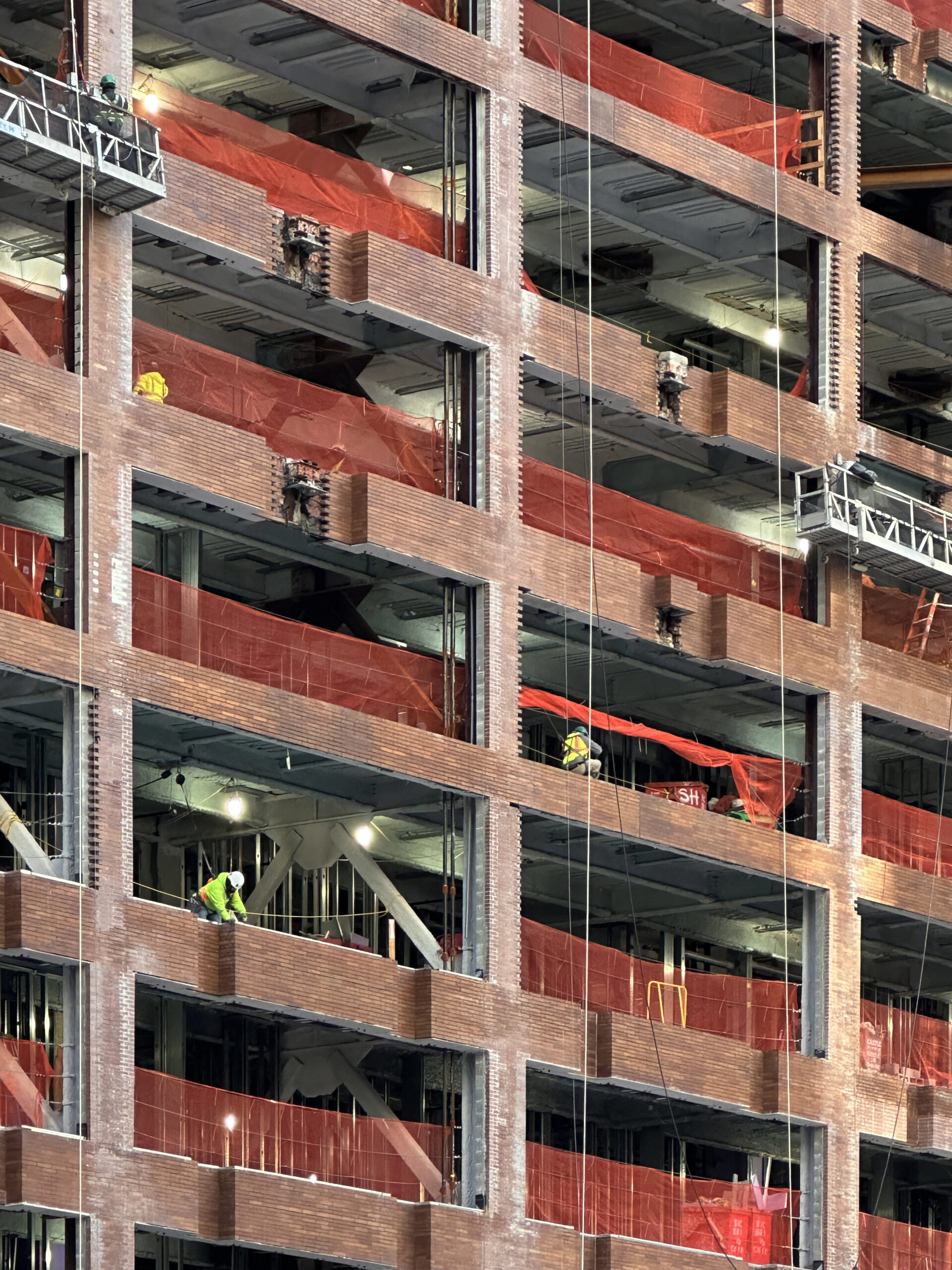
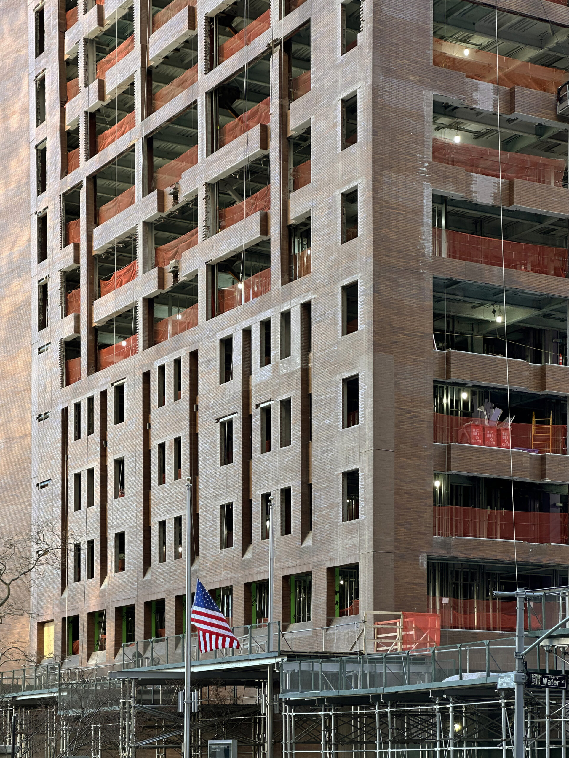
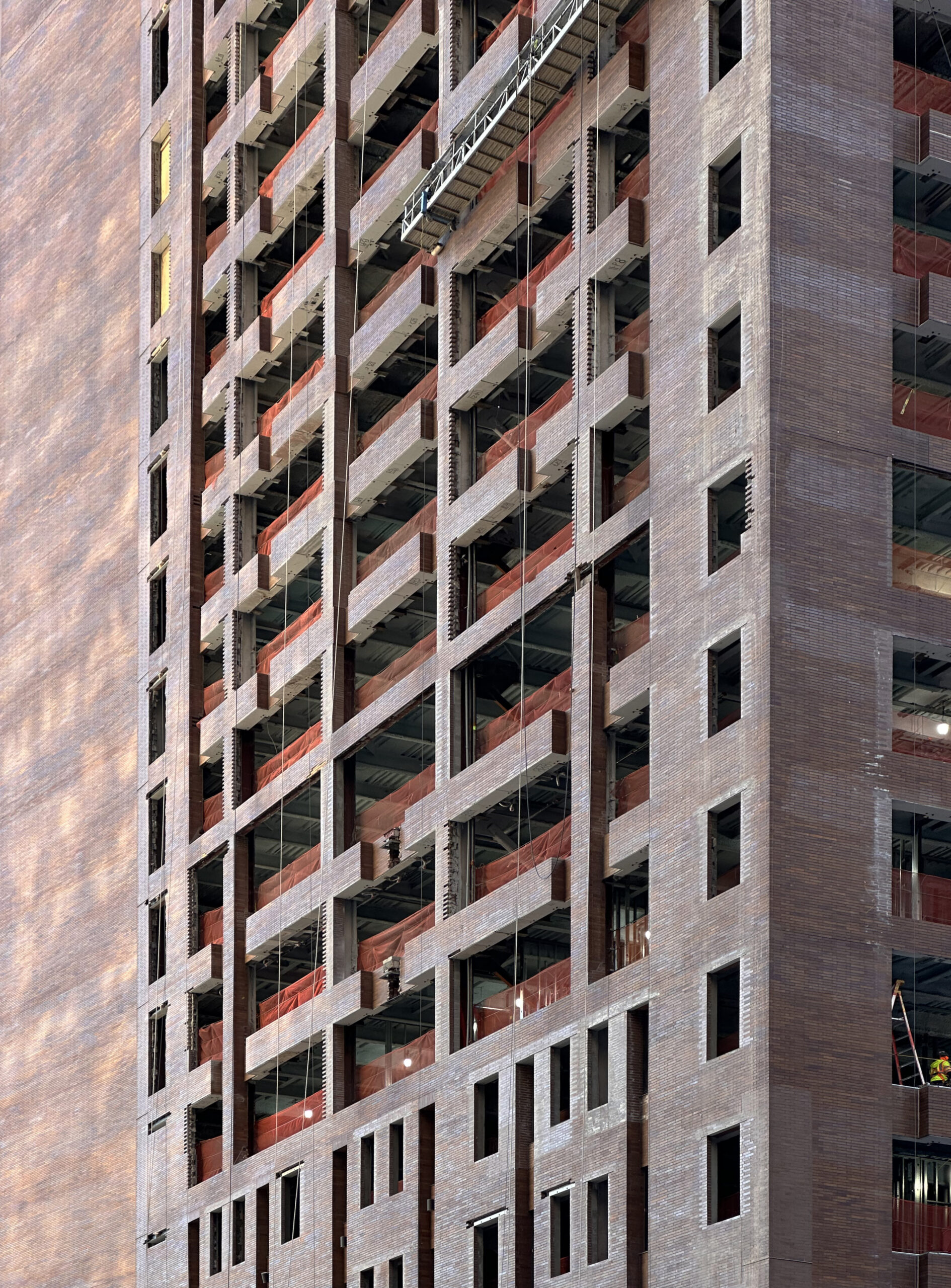
The entire steel-framed addition was erected since our last update in July, when work was just ramping up at the site. Recent photographs show the new superstructure built to its pinnacle and awaiting the installation of its glass curtain wall and staggered balconies. Meanwhile, crews have formed the new window grid on the lower two-thirds of the original building by removing extensive portions of the brick wall, which was formerly only punctuated by sparse slit-like vertical voids. Installation of the new windows has yet to begin, but could likely get underway sometime this spring.
Apartments at 25 Water Street will come in studio to four-bedroom layouts and feature ceiling spans up to 12 feet. The converted floors will house around 50 units per level. Residential amenities will include a basketball court, a steam room and sauna, indoor and outdoor swimming pools, sports simulators, an outdoor rooftop lounge connecting to a landscaped terrace, coworking spaces, and entertainment spaces.
25 Water Street’s anticipated completion date is slated for November 2025, as noted on site.
Subscribe to YIMBY’s daily e-mail
Follow YIMBYgram for real-time photo updates
Like YIMBY on Facebook
Follow YIMBY’s Twitter for the latest in YIMBYnews

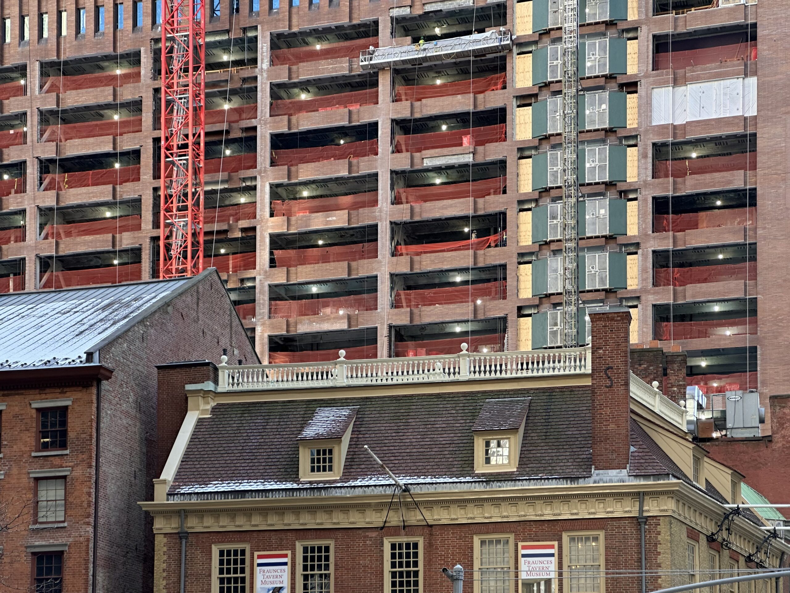

Very nice. And right next to Faunce’s Tavern.
Undoubtedly positive. I’m curious how those notches will fit into the final design.
Now to activate more street level space in those buildings.
The sheer number of new units coming online from this conversion is fantastic. I wish I loved the redesign more though. Would have appreciated if they had removed the slits on the second half of the original structure, too, and gone with a simpler look. Alas, still a great project.
It’s strange it’s rendered in that weird light color that isn’t going to look anything like that… unless they paint it and I hope that’s not the case. Also the vertical brickwork and some of the fenestration doesn’t match the rendering either. We shall see. I’m hoping it ends up better looking than the rendering because besides being generally pleased the conversion will bring so many units the actual design is a bit of a trainwreck IMO.
Just a bit of history… The building was original constructed in 1969 and housed Manufacturers Hanover and Oppenheimer Funds then JPMorgan took all the space in the 1990s.
It’s a hodgepodge of 5 different buildings staked on top of each other. Not very attractive at all.
Conversions are the way to go, if it can be done. Part of the floor was removed near the core all the way up so that more floors could be added above. But yes, the new design is a bit of an unfortunate Frankenstein.
It may seem an odd combo of styles, but More Housing is a strong positive result. I see no mention of affordability, but more units on the market can only help. Wish there were some givebacks to the neighborhood – open space, MTA improvements, etc. We shall see.
Loving the residentialization of FiDi
I muttered to myself on the construction zone is in the Financial District, so there is no need to blame the density of both itself and the surroundings: Thanks to Michael Young.
Sorry, this building is a mess.