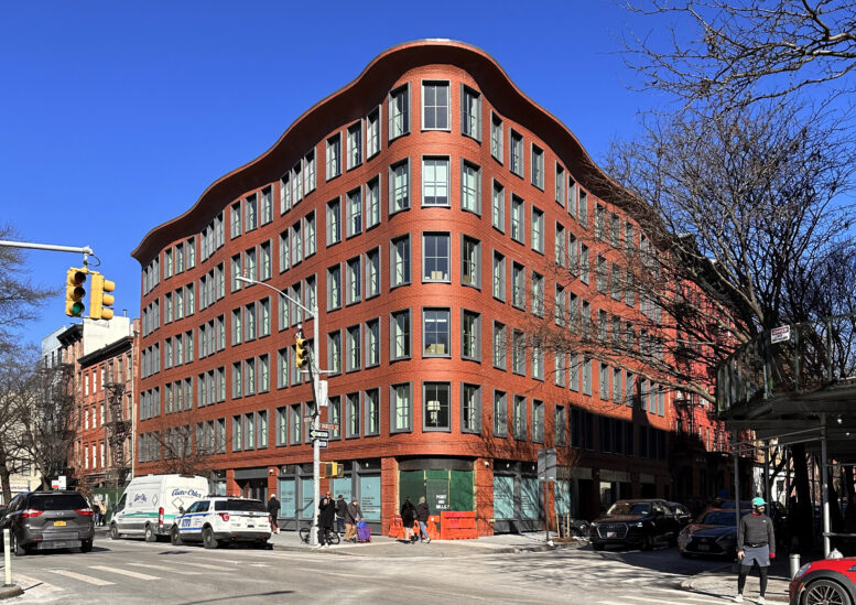
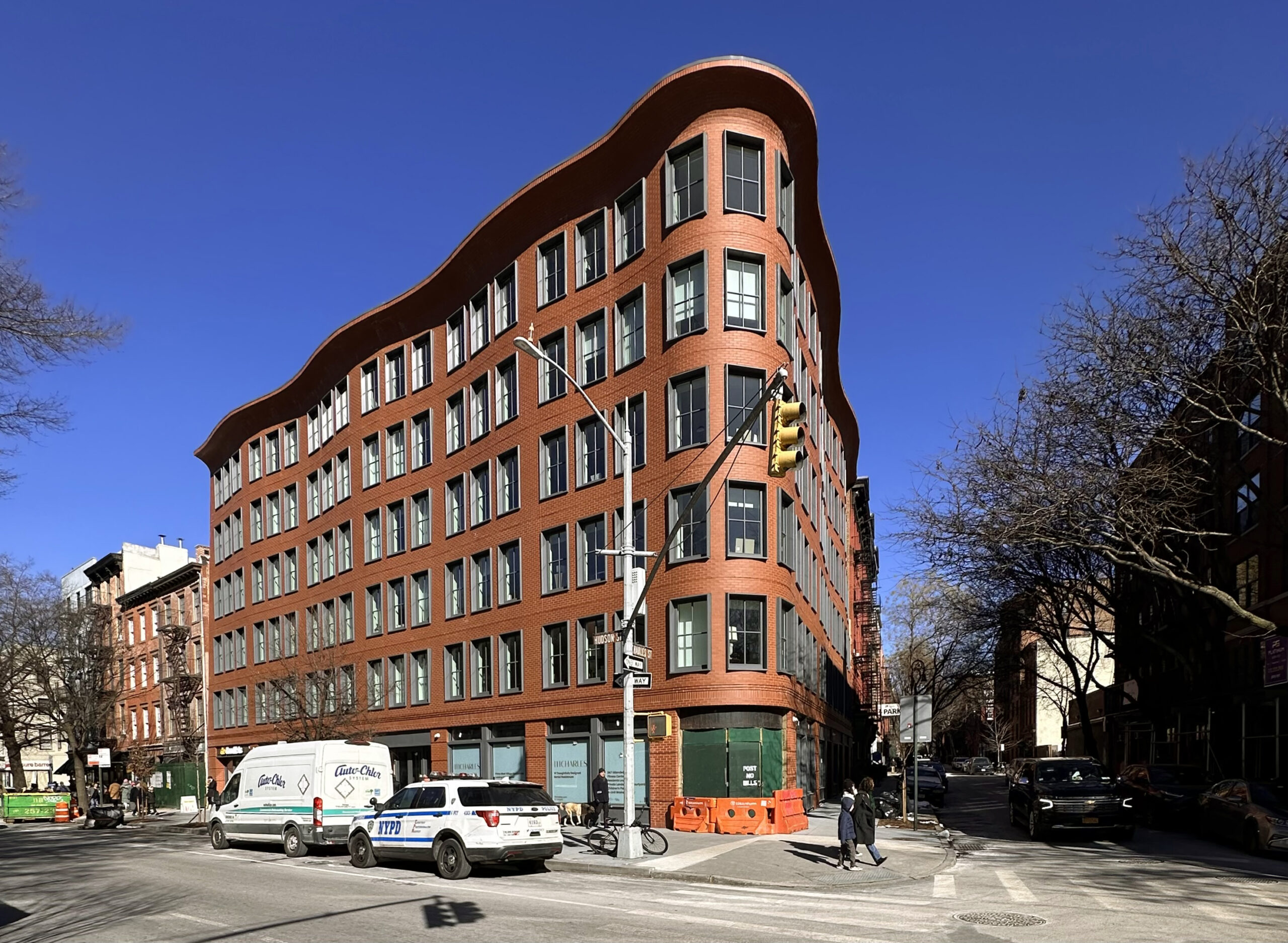
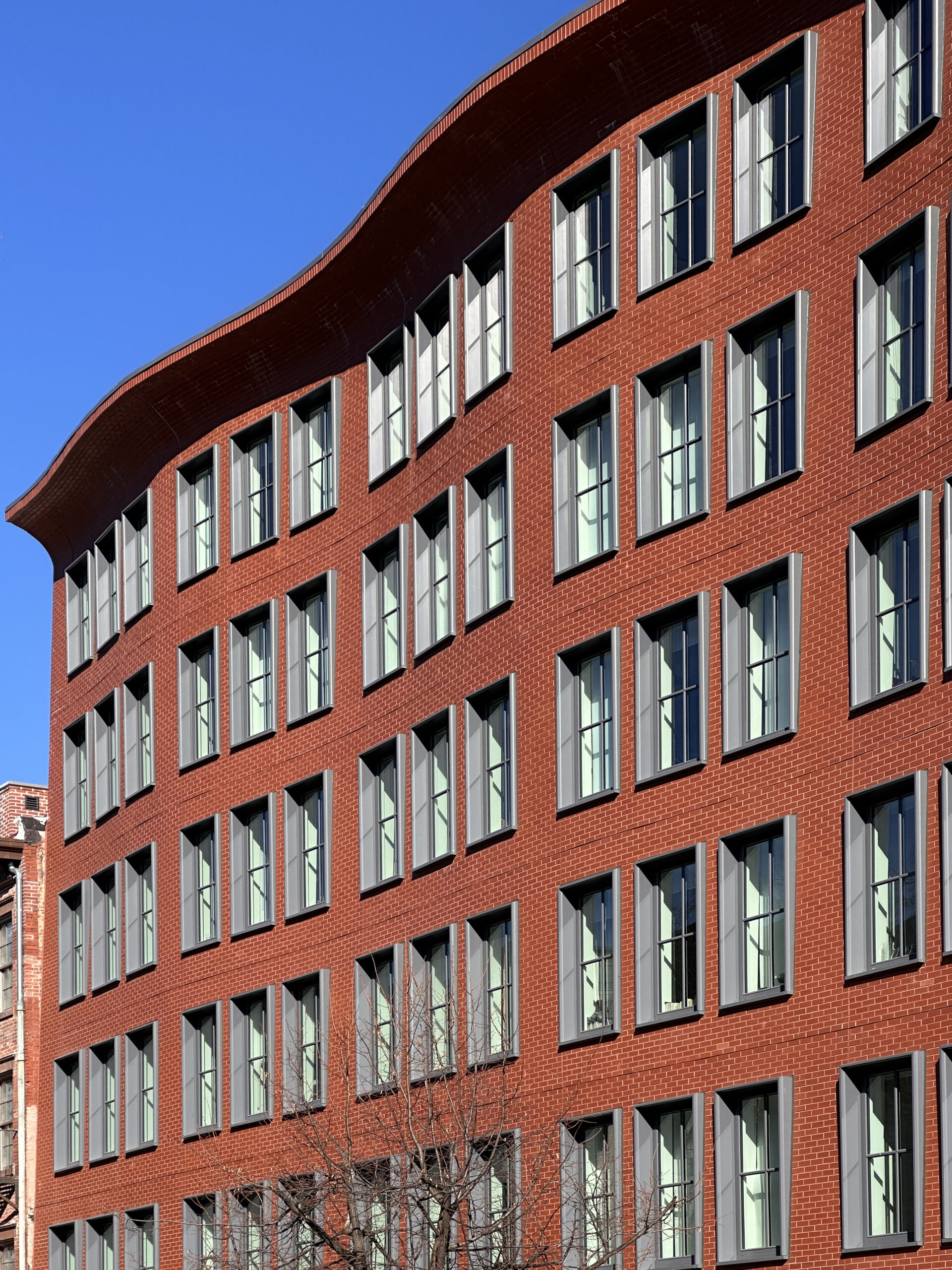
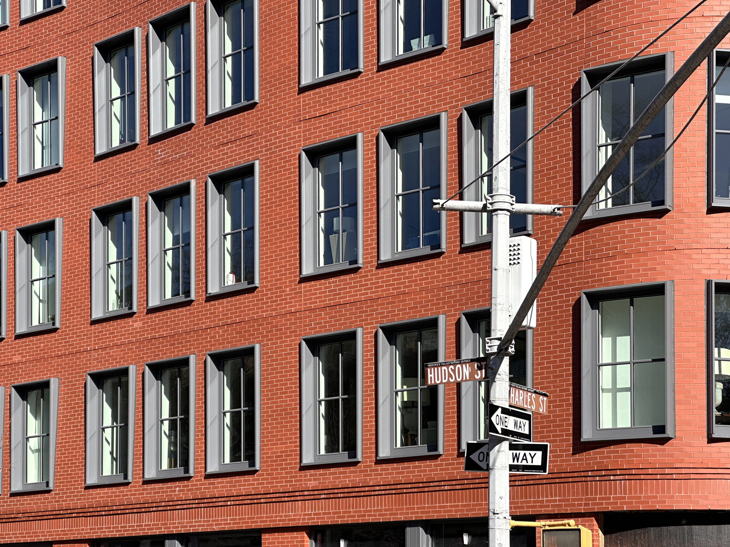
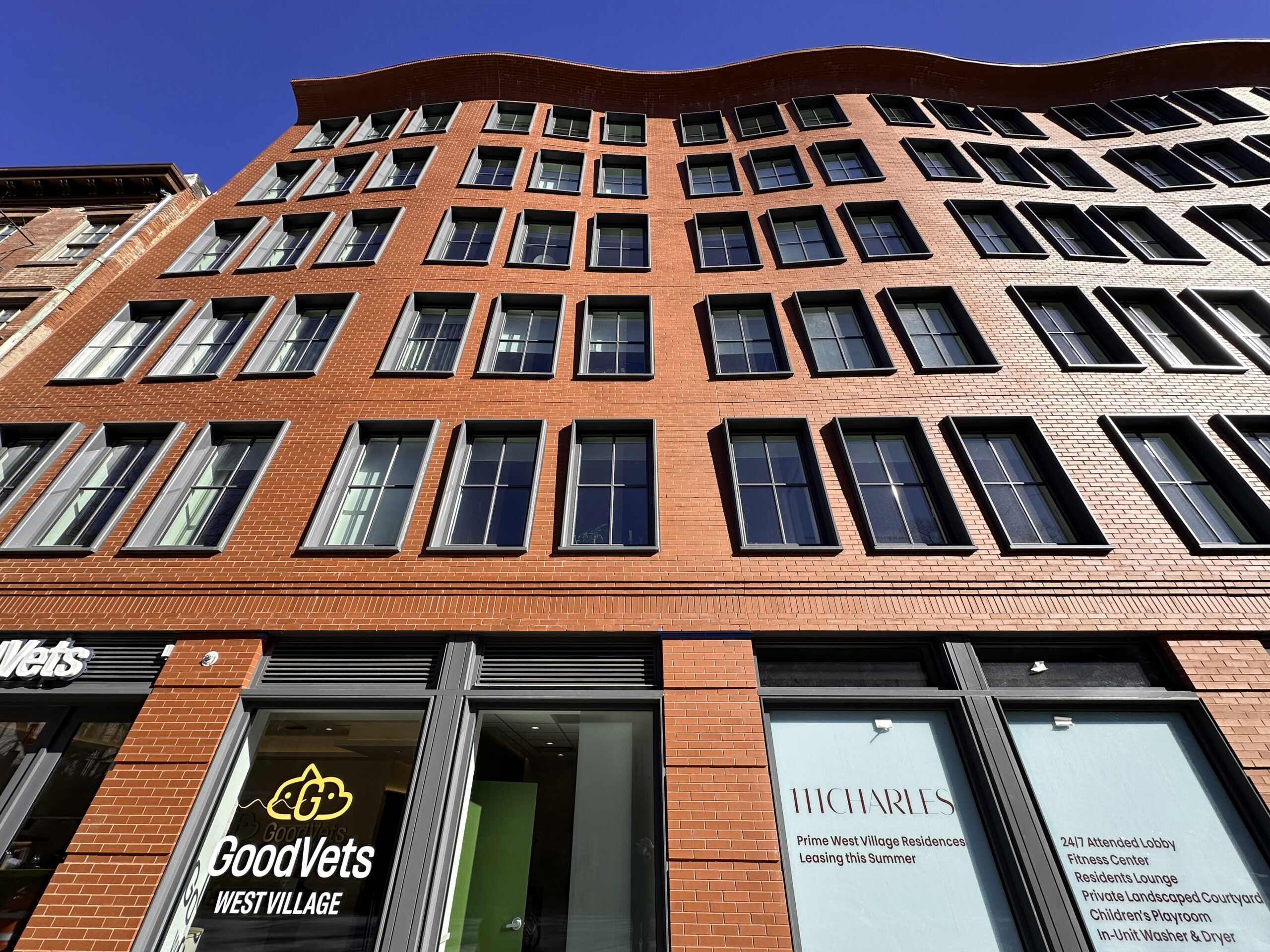
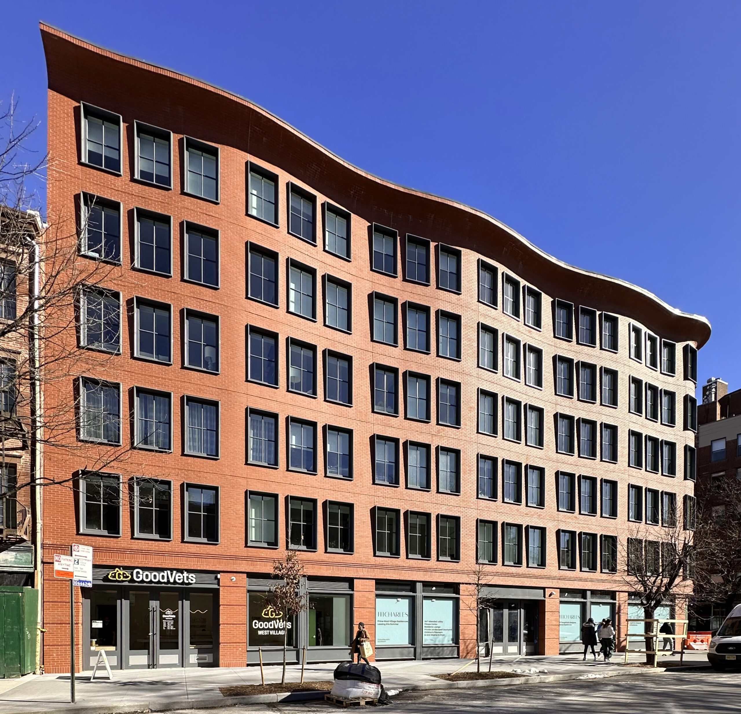
Construction is finishing up on 111 Charles Street, a seven-story residential building in Manhattan’s West Village. Designed by Morris Adjmi Architects who received LPC approval for the facade design and built by BKSK Architects who also did the interiors, the 63-foot-tall structure spans 48,535 square feet and yields 19 rental units, as well as 6,000 square feet of retail space on the ground floor and cellar levels. Titanium Construction Services was the general contractor, and Belden Tri-State Building Materials was the brick supplier for the project, which is alternately addressed as 540 Hudson Street and located at the corner of Hudson and Charles Streets.
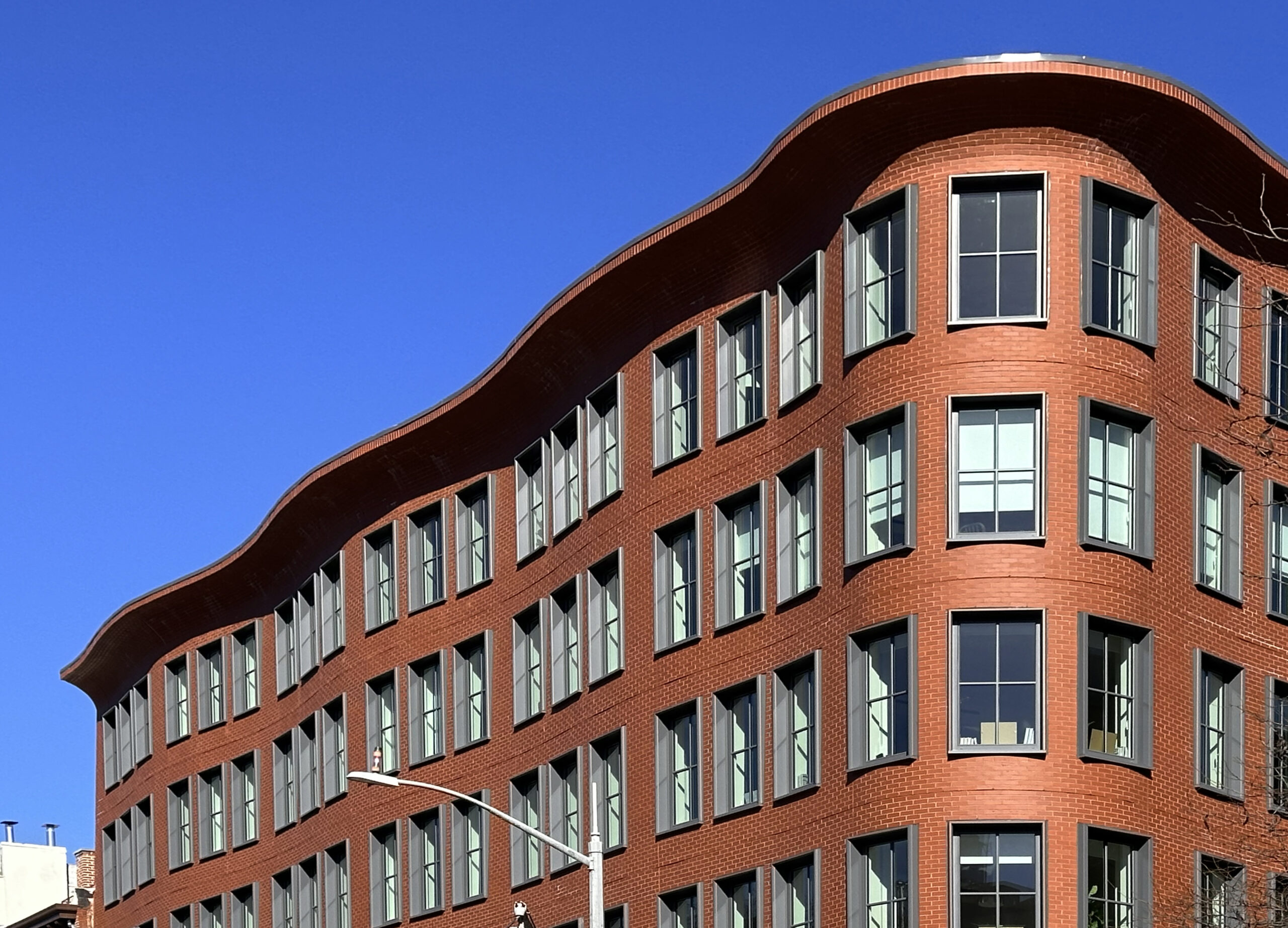
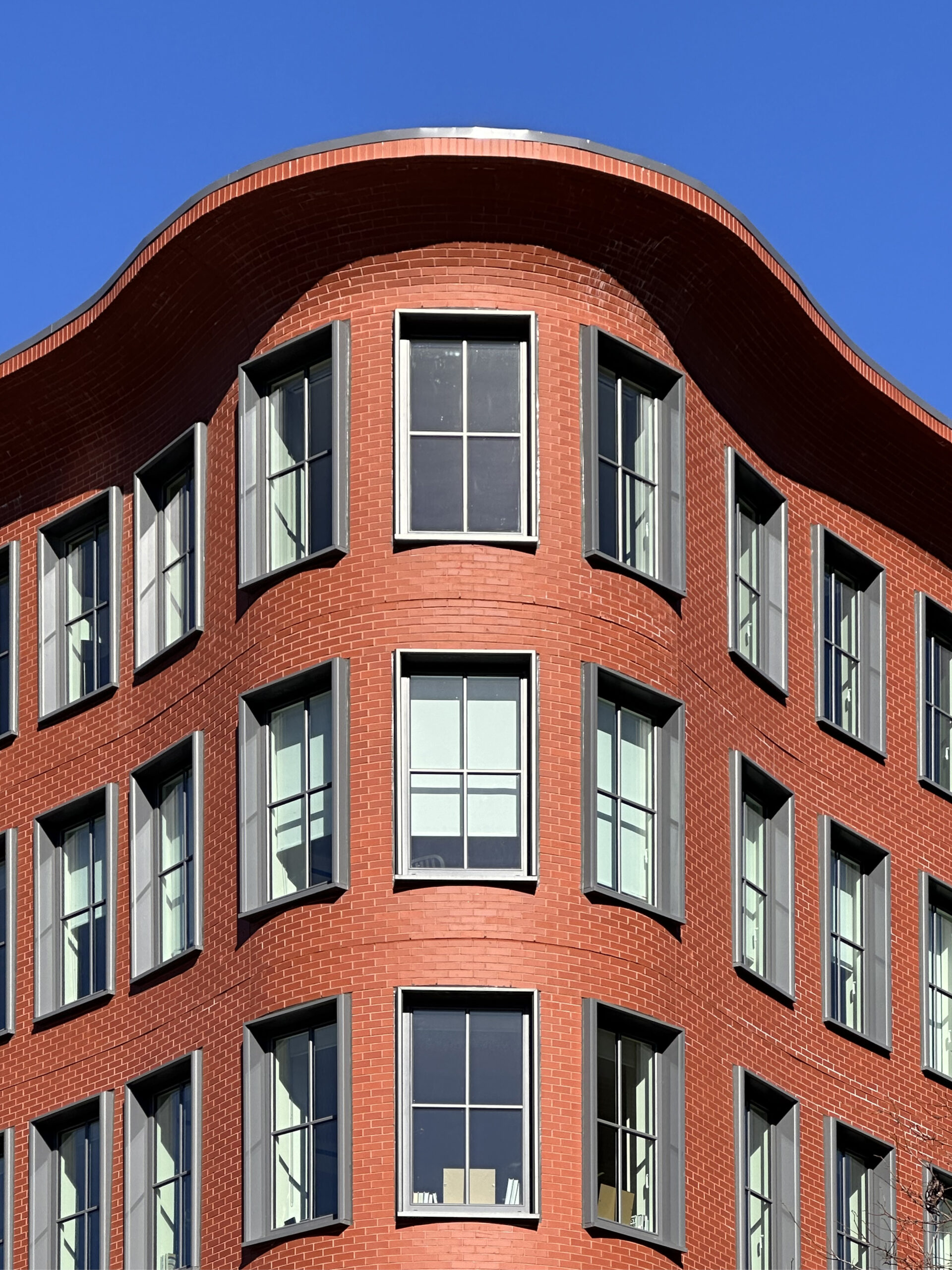
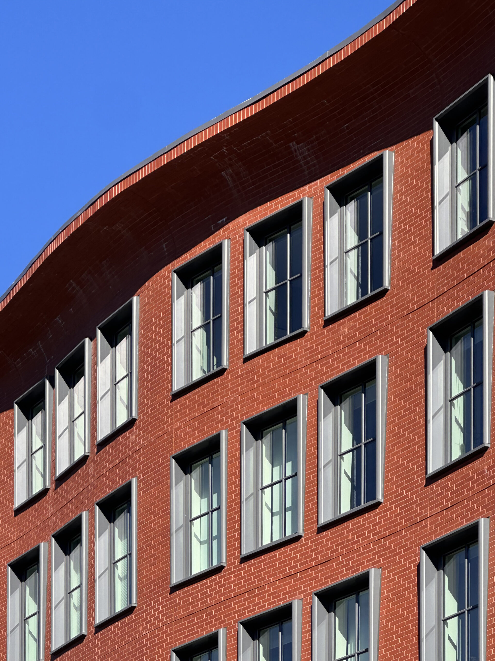
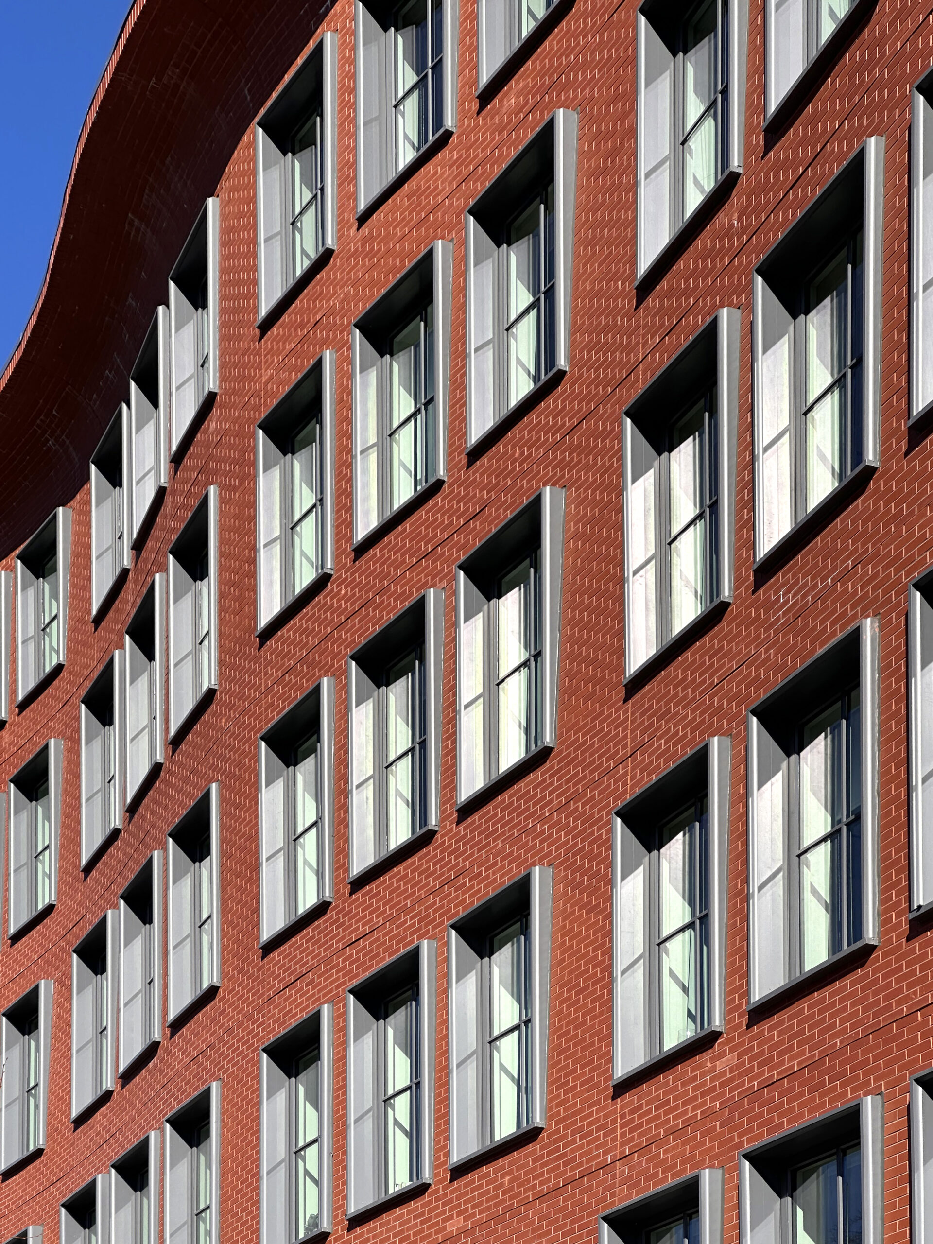
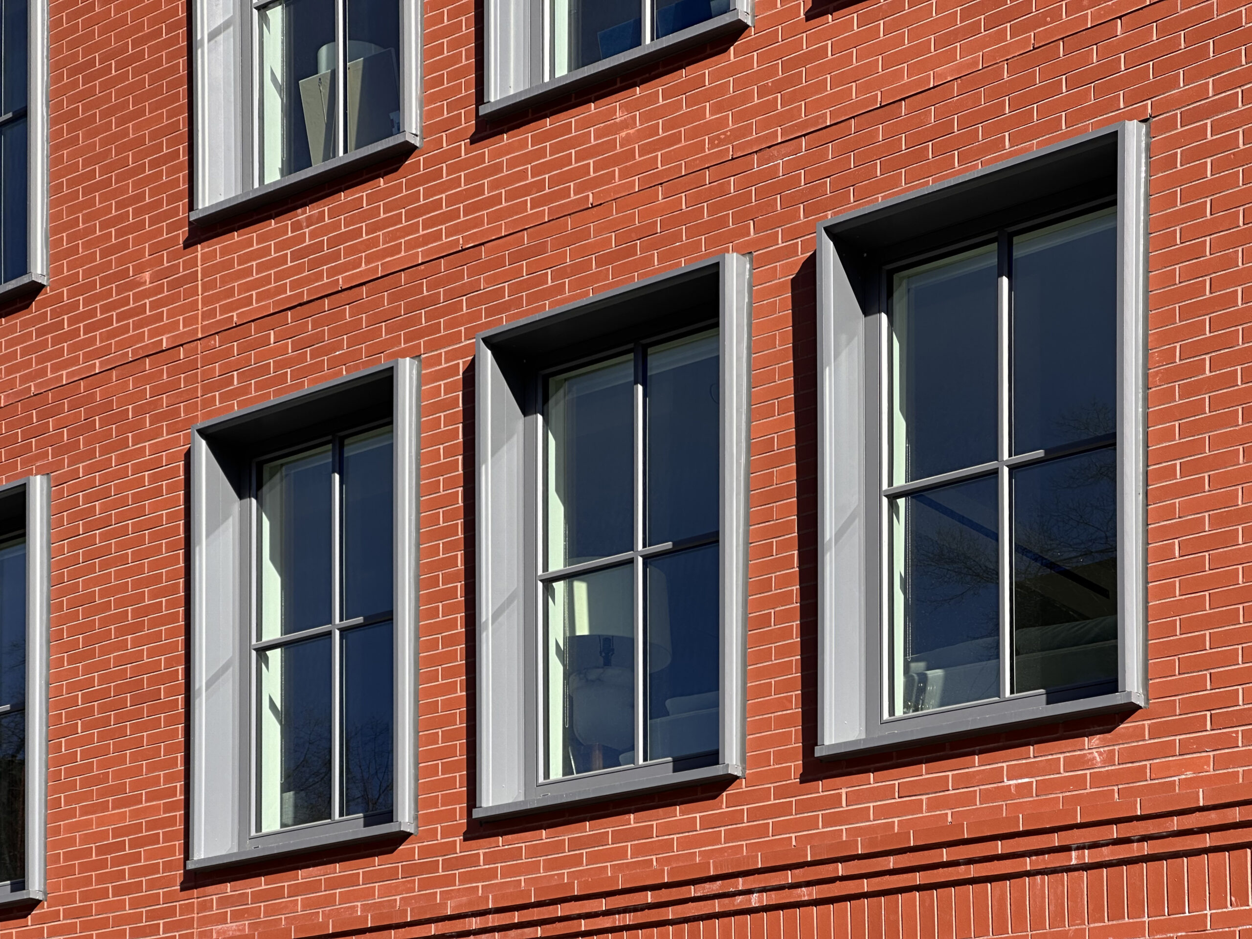
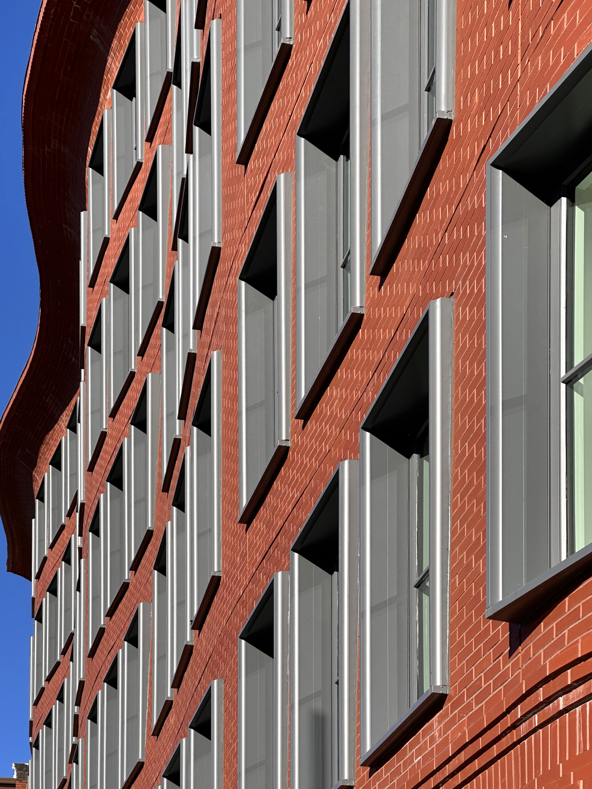
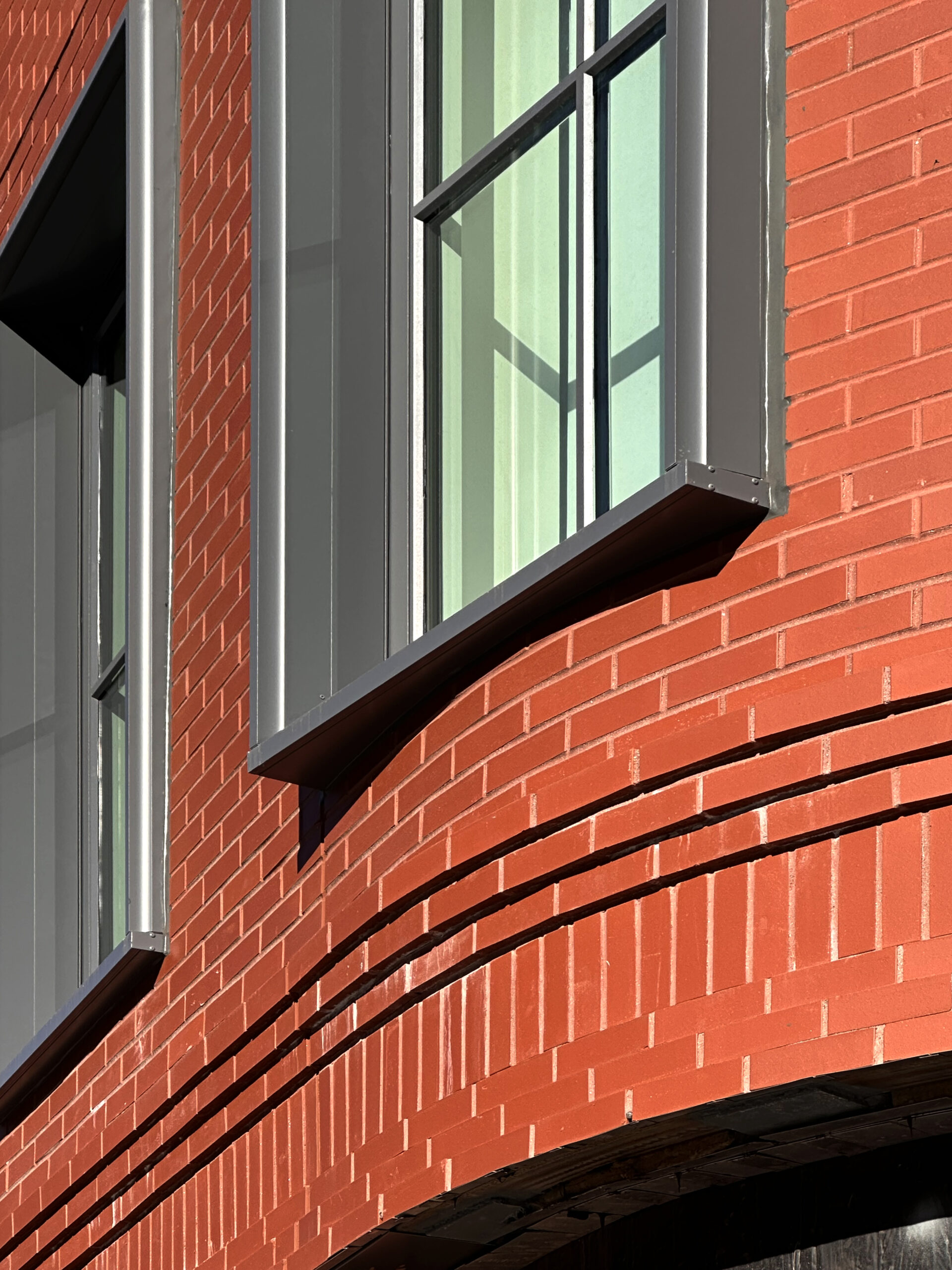
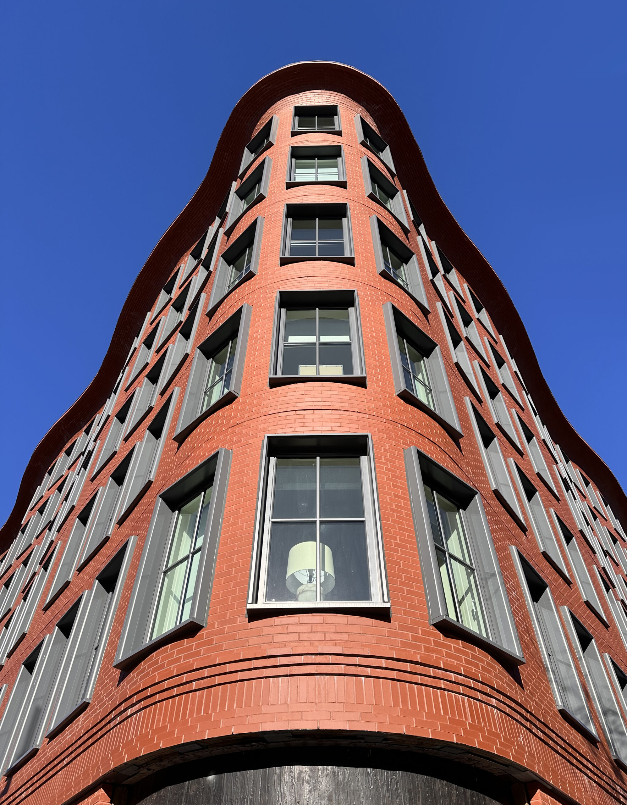
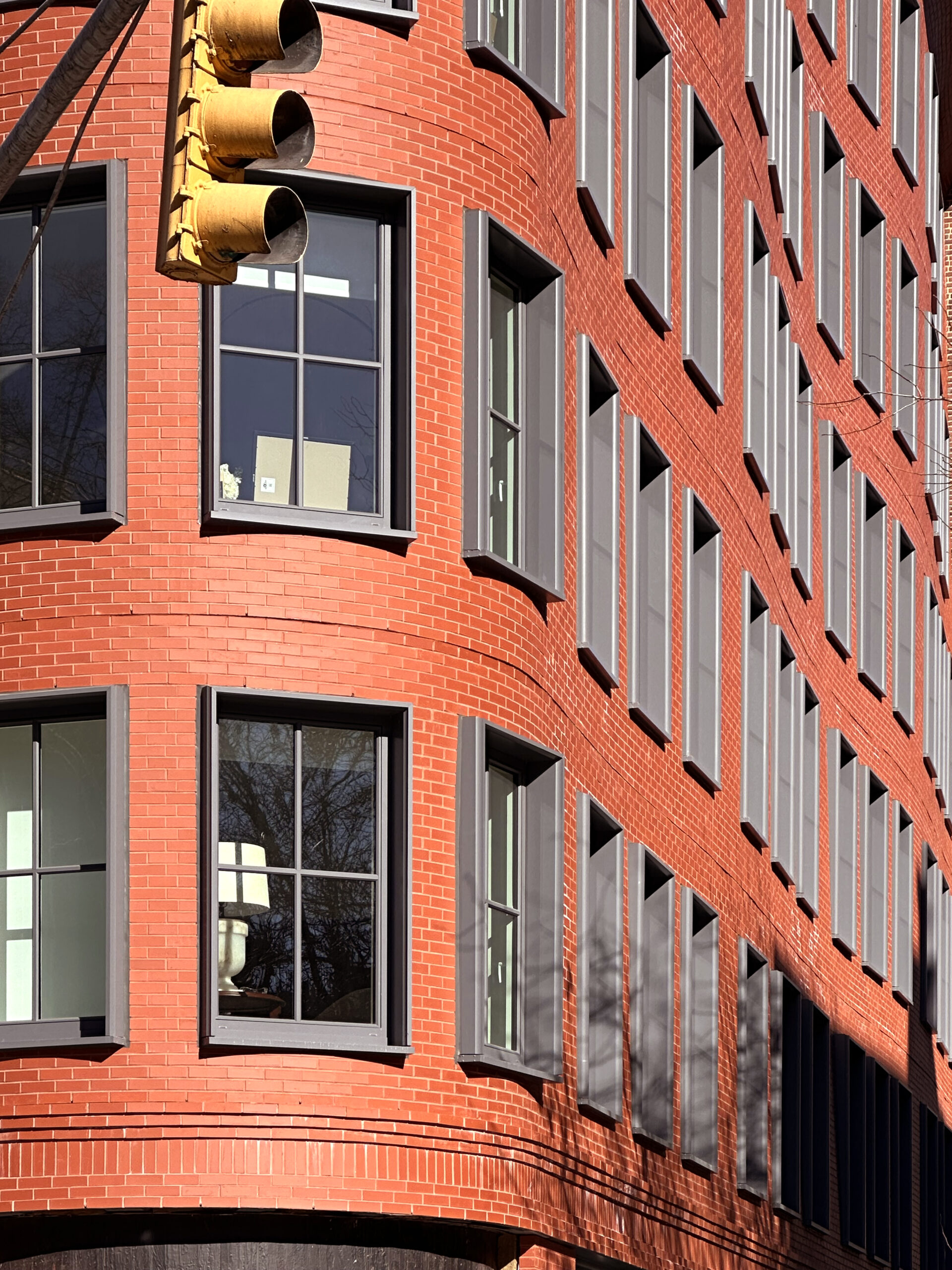
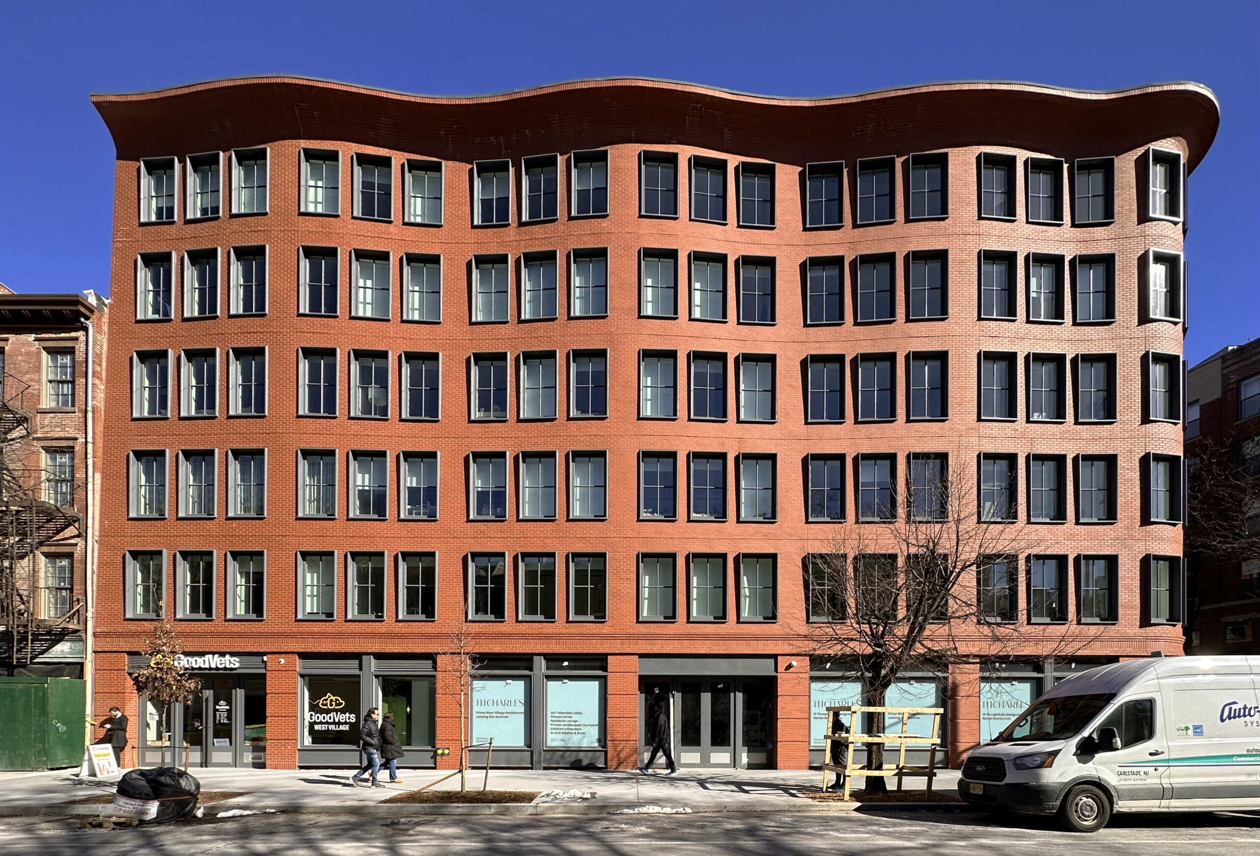
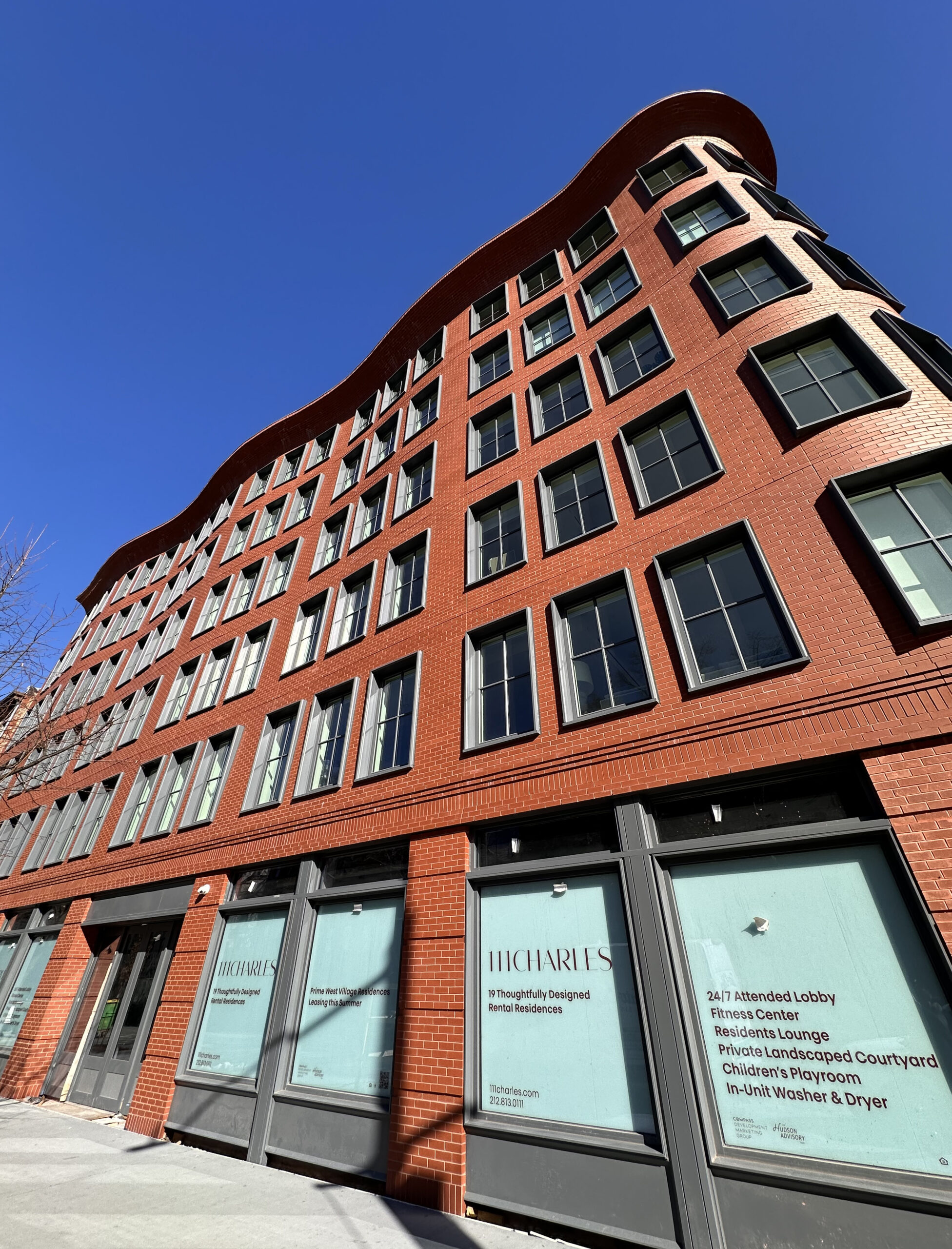
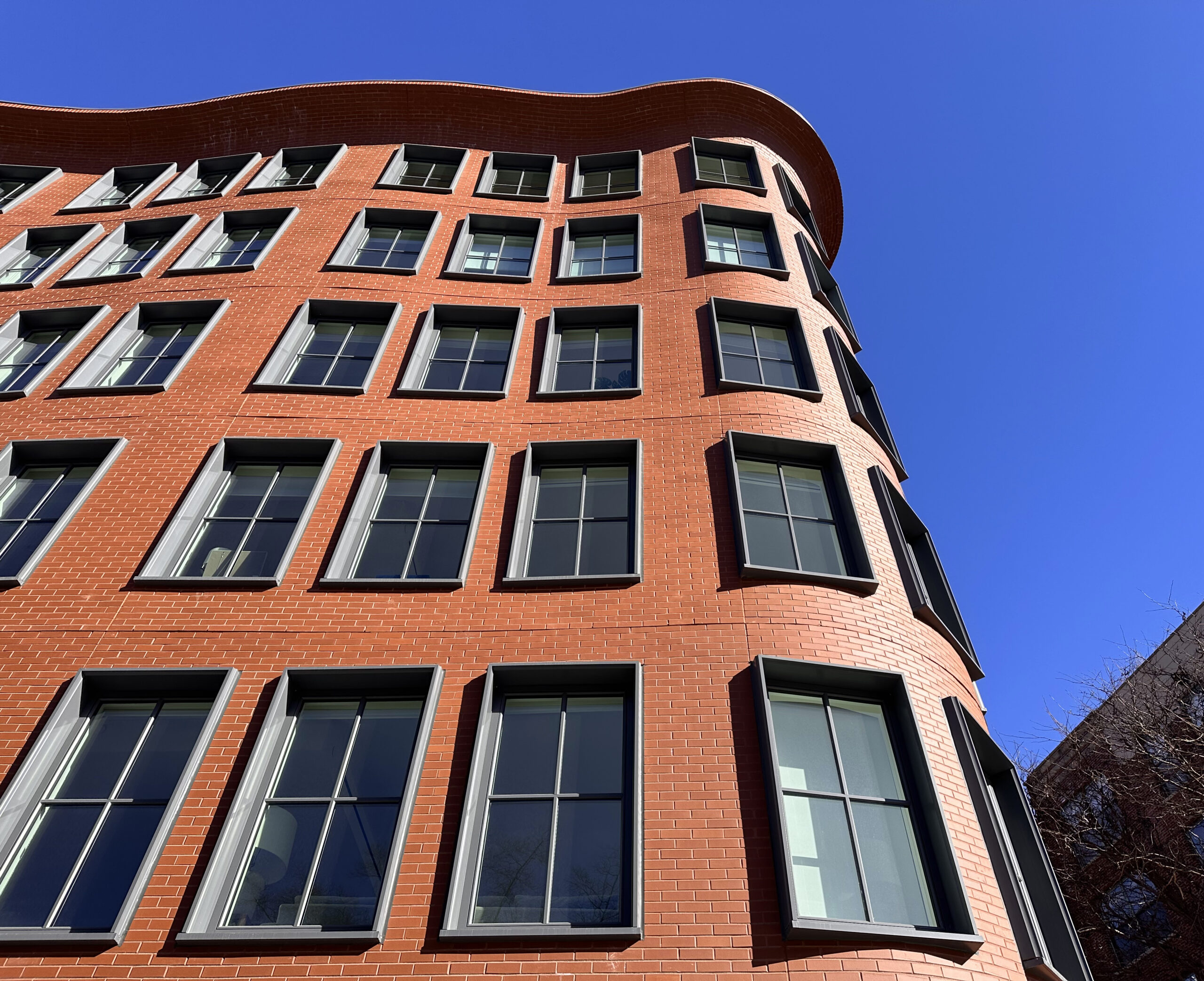
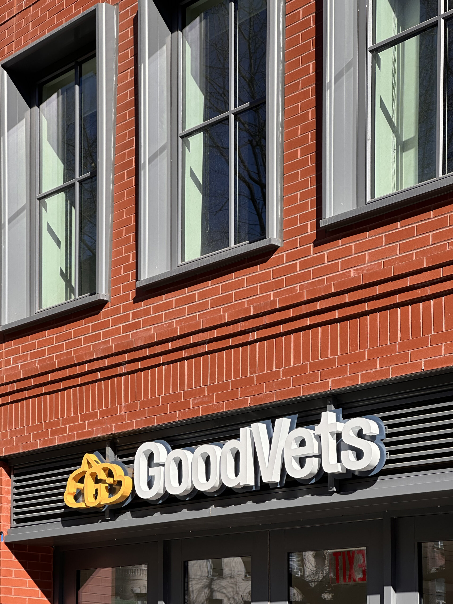
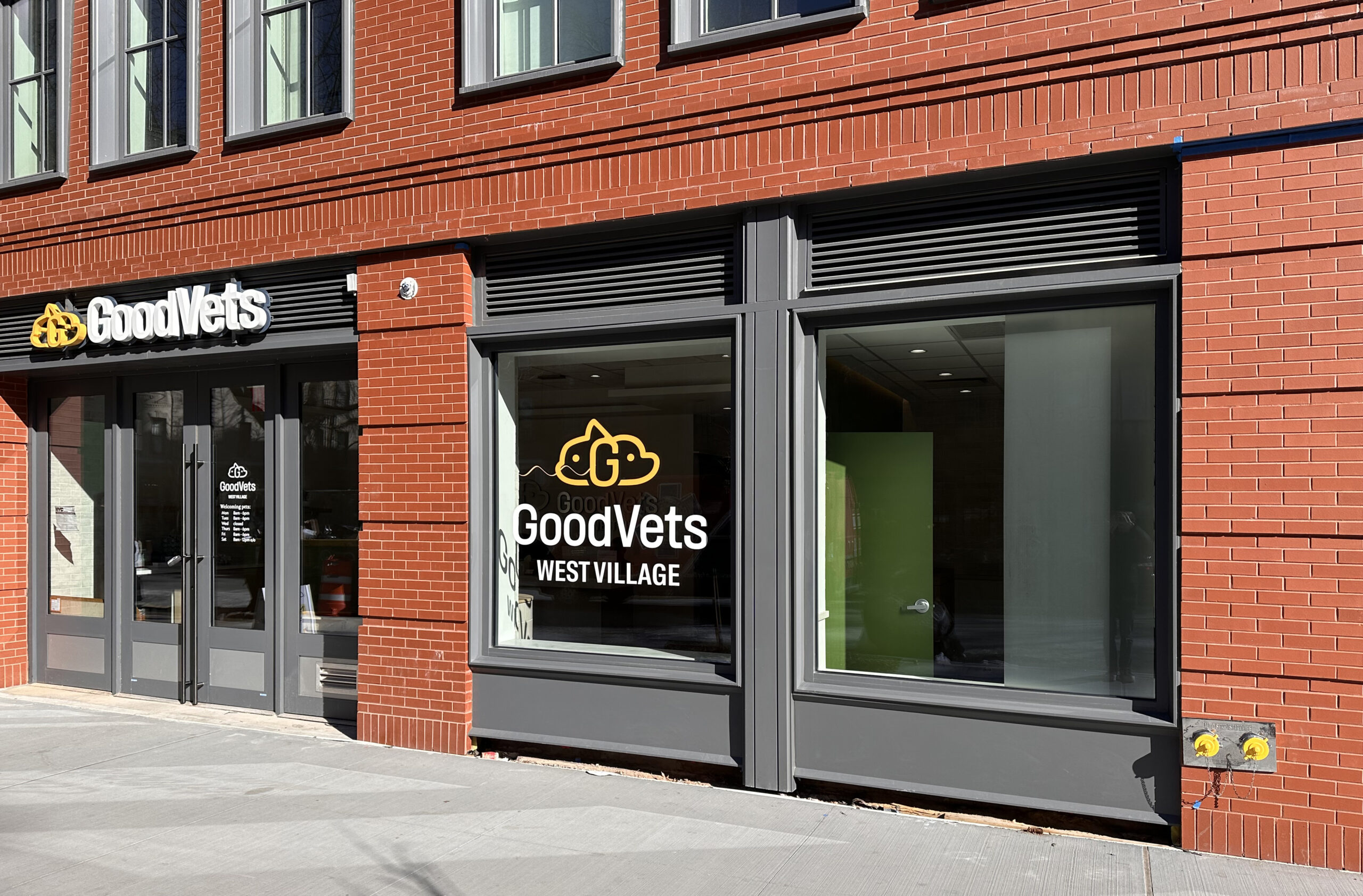
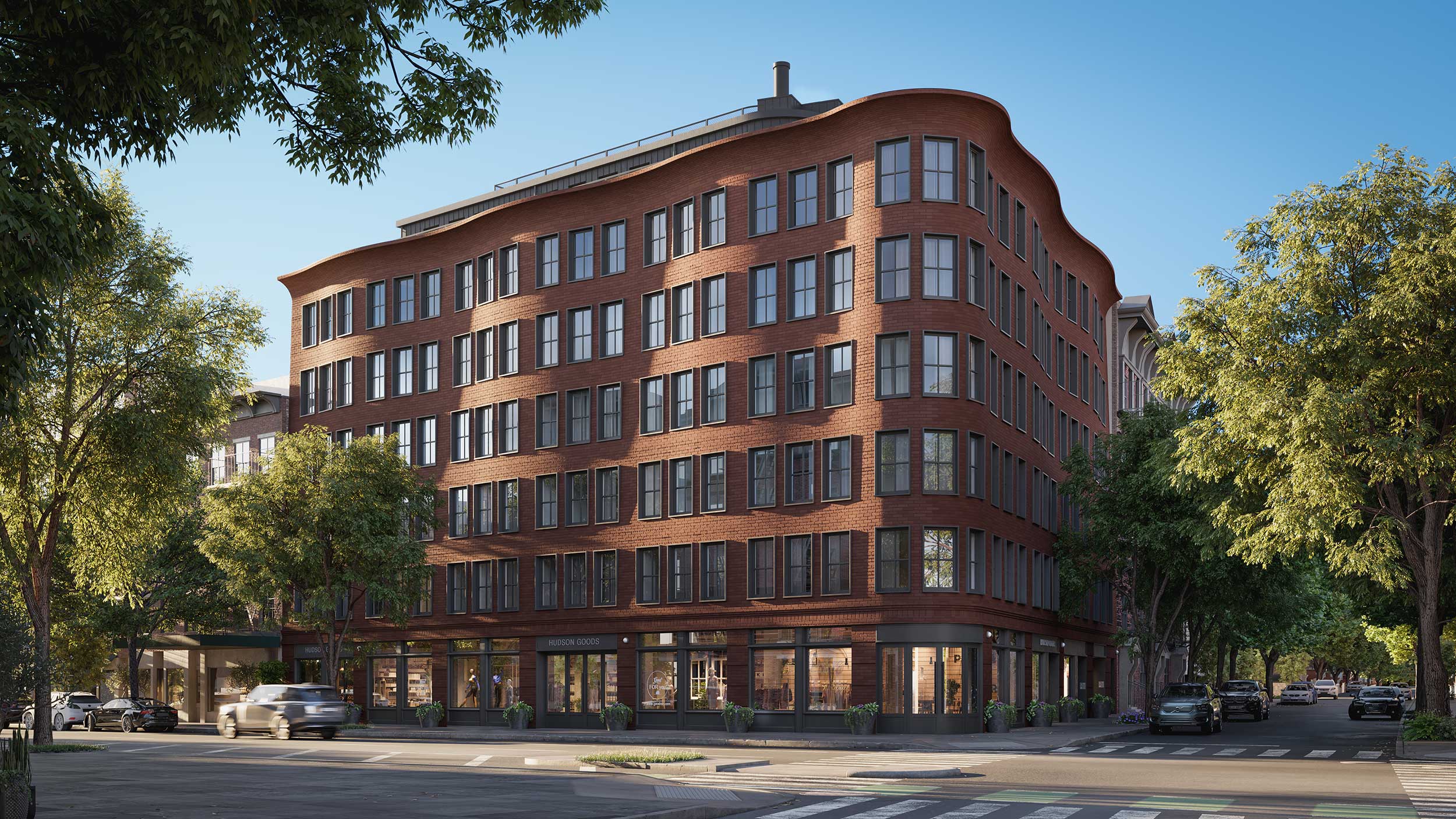
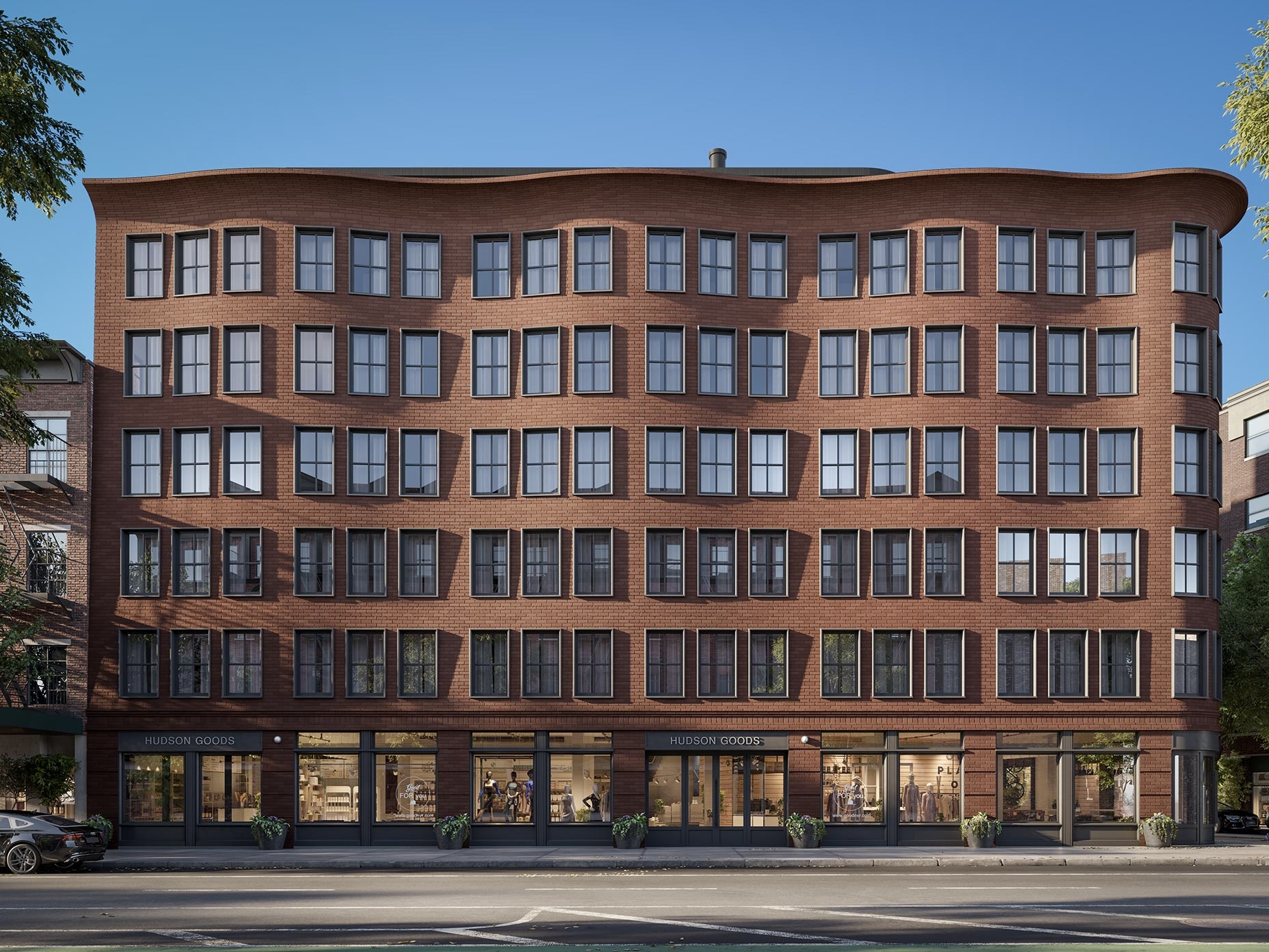
Recent photographs show the scaffolding and sidewalk shed removed from the building since our last update in April, revealing the completed look of the wavy brick façade and grid of rectangular windows with protruding gray frames. Some of the residential units appear occupied, as is the retail space along Hudson Street, with signage present for veterinary care center GoodVets. Only the entrance at the rounded southeastern corner of the building remains to be completed.
Below are additional exterior renderings of 111 Charles Street showing gray metal-paneled roof extension above the distinctive curving cornice.
Compass Development Marketing Group is handling leasing for the homes, which include 670-square-foot one-bedroom apartments, 1,200-square-foot two-bedrooms, and a 4,000-square-foot four-bedroom, 3.5-bathroom duplex penthouse with a powder room, den, and a 1,200-square-foot private rooftop terrace.
111 Charles Street’s residential amenities are housed on the second floor and include a lounge with a landscaped courtyard terrace with barbecue and kitchen area, children’s playroom, a fitness center, and bicycle storage. Other amenities include a package room, including cold-storage with additional private storage available for rent.
The closest subway to the property is the 1 train at the Christopher Street station along Seventh Avenue.
Subscribe to YIMBY’s daily e-mail
![]()
Follow YIMBYgram for real-time photo updates
Like YIMBY on Facebook
Follow YIMBY’s Twitter for the latest in YIMBYnews




Love it! Congrats to BKSK Architects
A true architect master piece. Congratulations!
It’s a great design but it’s really unfortunate how much the poorly executed expansion joints detract from it.
The flashing on the cornice also looks like it’s slapped on a backyard garage. The building could have and should have done better.
builder
It looks like there was some value engineering here – I’d bet the details looked better in the original design. The probably wanted curved windows on the corner and a stronger cornice.
The expansion joints are indeed ugly in these photos, but I have a feeling they will recede into the background in softer lighting and as the eye begins to accept them. Michael Young often photographs in the harshest midday sunlight he can get in order to bring out every detail of the structure. In the normal run of things you would not often be looking at this building at 10 am or 2 pm under a perfectly cloudless sky. I don’t know, is it reasonable to expect these seams to be executed with absolute perfection?
Unless you live in New York City or in the West Village to begin with, then you wouldn’t be seeing this on your everyday walk. Still nice photos though
Majordomo2 maybe because the Hudson Street side of the building doesn’t get sun in the morning? Wouldn’t be nice to shoot with so much shadows
Why did the brick need to be separated on each floor instead of being contiguous?
Expansion joints.
Yeah! Right, beautiful wavy, I’m imagining a house in a cartoon movie. It’s so cute façade: Thanks to Michael Young.
I love the building. It’s a sort of Harry Potterification of a traditional architectural design. The curves and slightly oversized windows create a storybook feeling. I feel like living in the neighborhood will bring a spring to many people’s step. Now I need to return to reality, but I can revisit whenever I want to enter a realm of wonder. (Where’s David from heaven when you need him?)
Reminds me a bit of Michael Graves…
A New Village landmark to live in and enjoy the spirit of the West Village.
At first glance I imagine such a sober looking quasi-traditional apt. house would be welcome in older inner-ring suburbs…SO RESISTANT to multiple units…even when sensibly earmarked for transit stops. Red brick is an especially good choice, it ages better than say, concrete prefab panels. The gentle wave form is particularly easy on the eye of the casual pedestrian.
Its whimsical and kooky but the execution is poor and I dont really like the final product. It is different and i’ll give it props for that
This building has affordable apartments available or studios? Hopefully to heard from Realtor soon
No. Average apartment size over 2000 sq feet and few of them so cannot imagine. Reckon these will rent in the 12-18.000 a month a range.. :s
Under 15k/month rent in a new development in the West village will be a bargain. I dont understand why the OP expects affordable housing in the most expensive neighborhood in Manhattan
This is so lovely!
This is great..the waves remind me of Flatiron, how they break up a straight wall. As the bricks age, it should get even better.
I love the wavy brick effect!!! Nice photos showing the undulating surface
I love this. New York Tenement meets Barcelona Gaudi. Very clever.
I just find it hilarious that so many folks on this website has fetishes for any brick bldgs and hate for any glass bldgs
I mean have you seen downtown Long Island City? They all look cheap and the same
Yes I did. I personally love granite or marble bldgs but not brick bldgs and I would take modern glass bldgs over this brick bldg.
Interestingly, its design wasn’t directly inspired by Gaudi, but rather drew inspiration from the magnificent Atlántida Church by Eladio Dieste. It was crafted with the graceful curvature of a cosine curve in mind, with meticulous attention paid to the amplitude, wavelength, and number of bays.