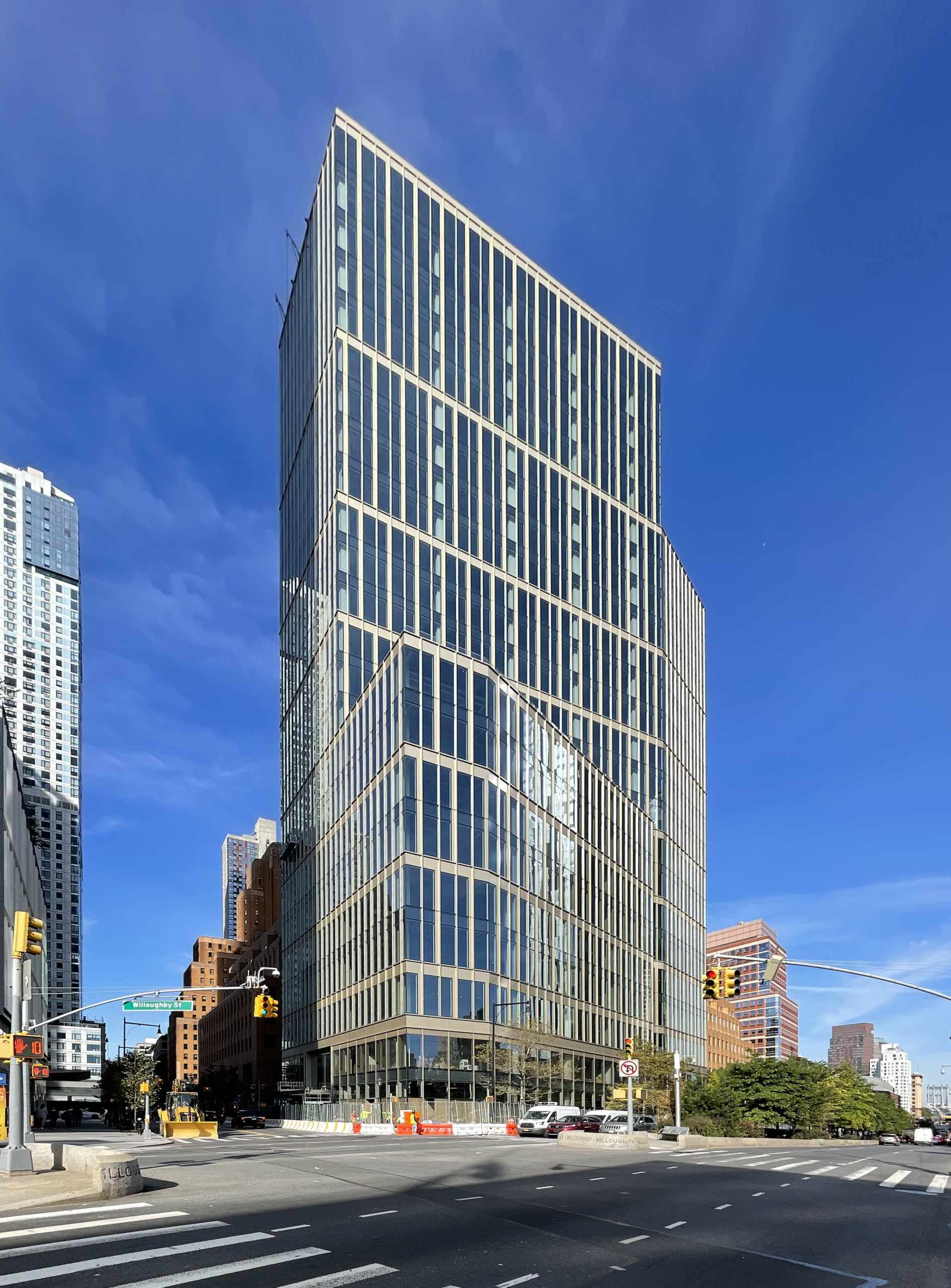
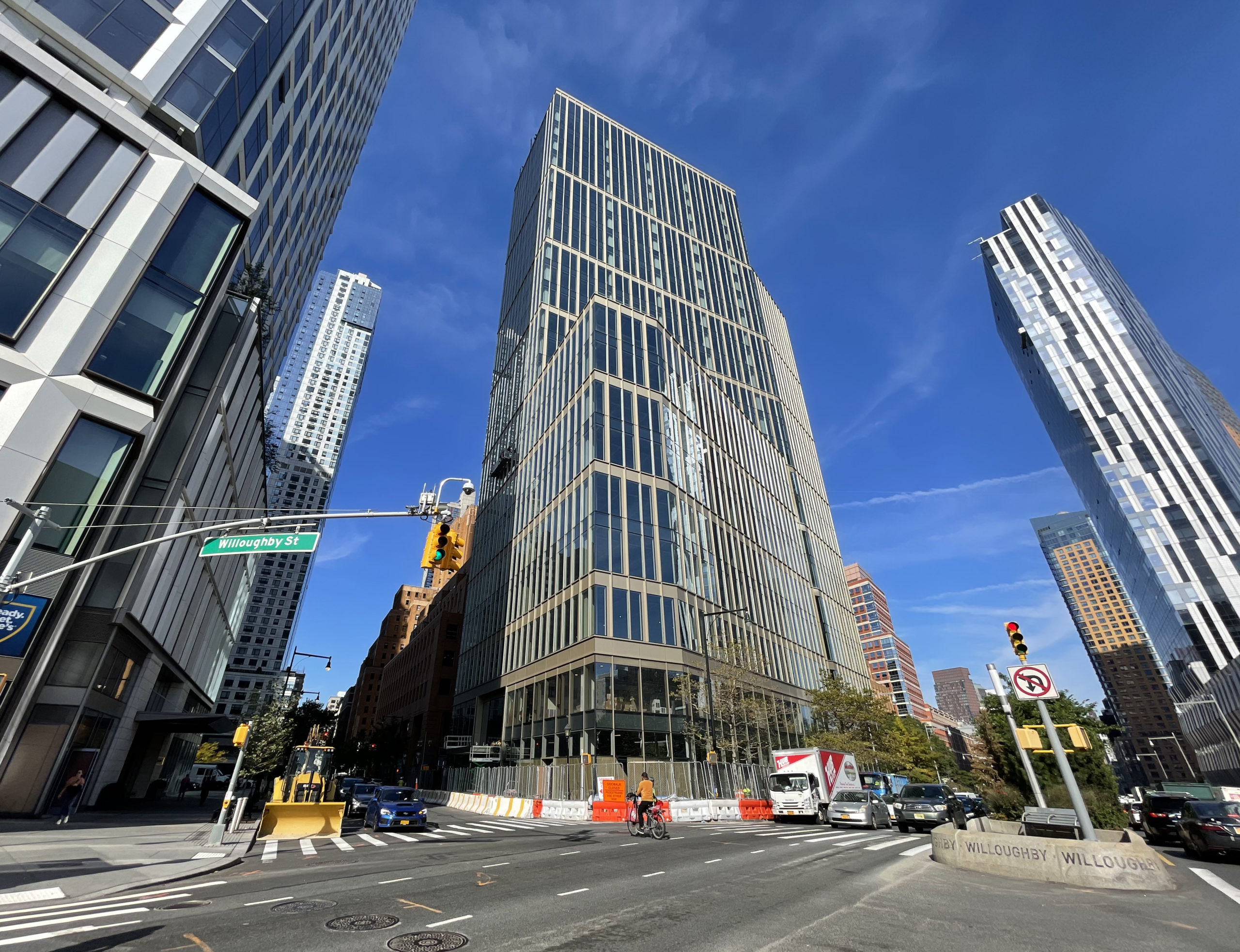
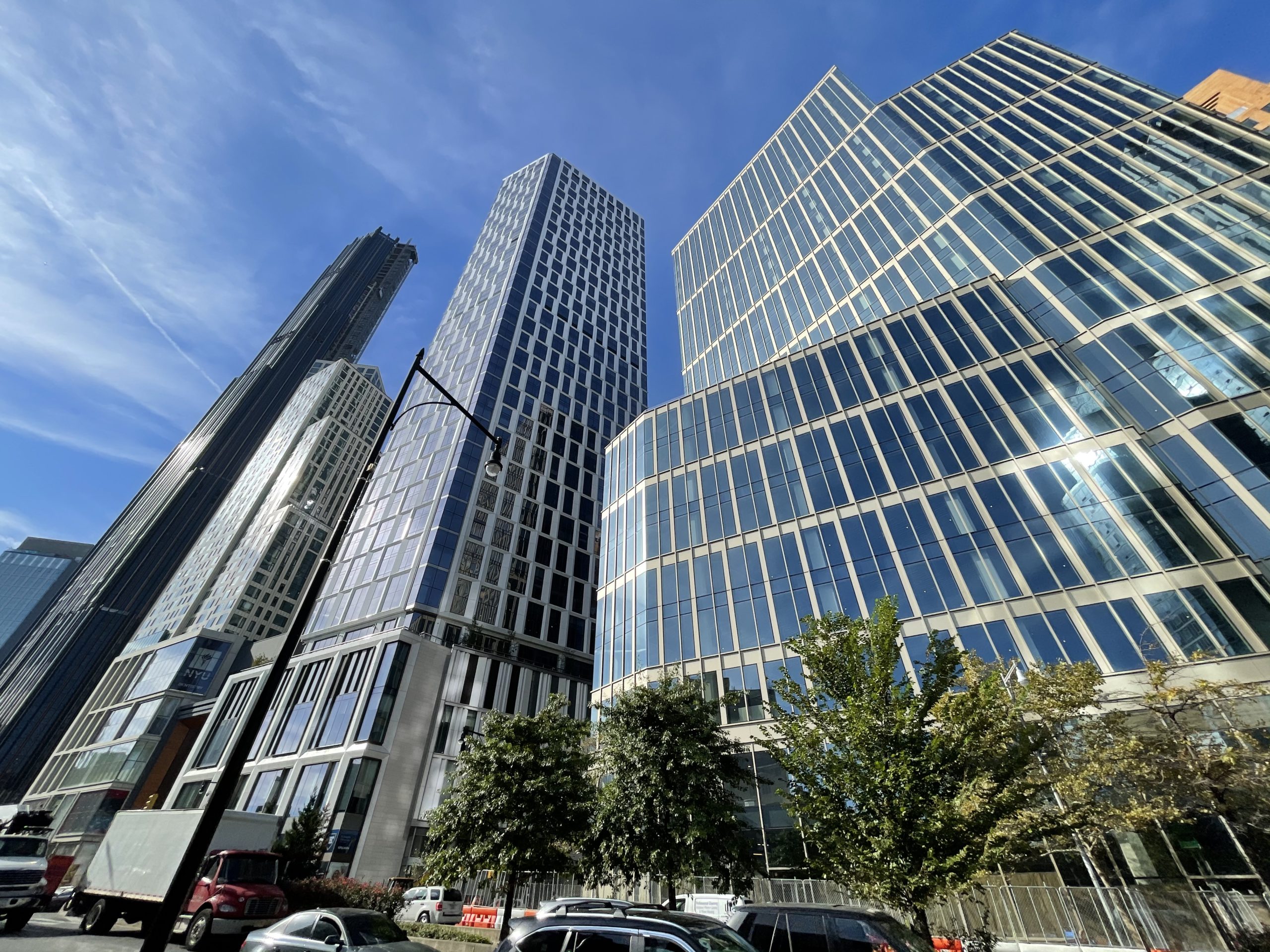
Construction is nearing completion on 141 Willoughby Street, a 24-story commercial building in Downtown Brooklyn. Designed by Fogarty Finger with SLCE as the executive architect and developed by Savanna Real Estate, the structure will yield 400,000 square feet of Class A offices and lower-level retail space. Gilbane Building Company and Savcon are the general contractors, Thornton Tomasetti is the structural engineer, and AKF Group is the MEP engineer for the property, which stands on a trapezoidal plot bound by Willoughby Street to the south, Flatbush Avenue Extension to the east, and Gold Street to the west.
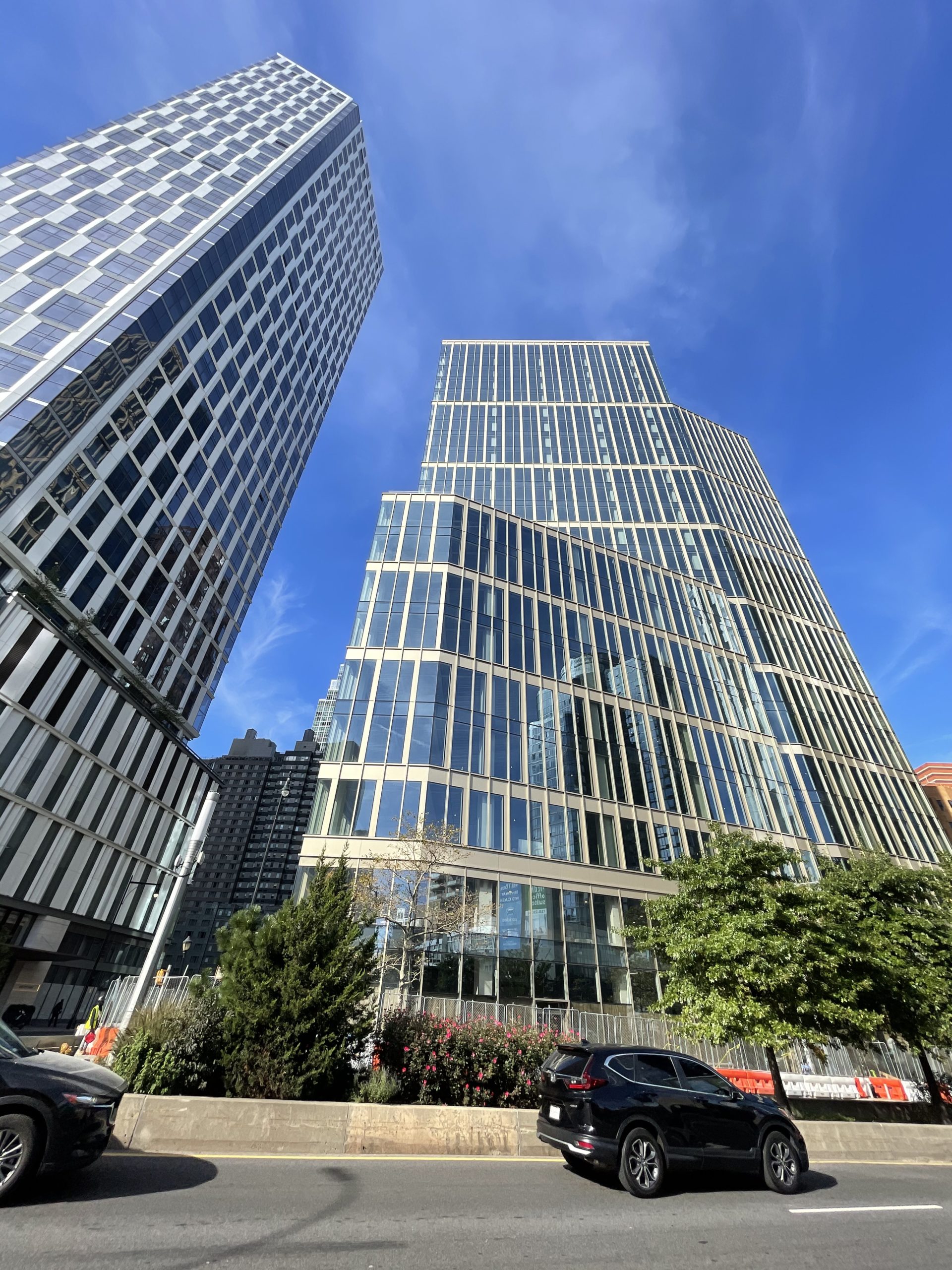
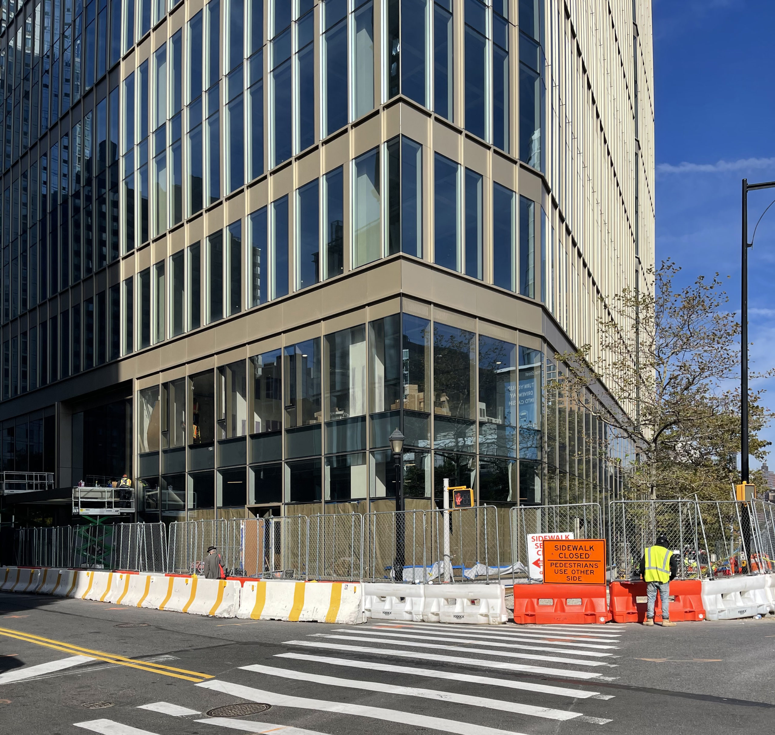
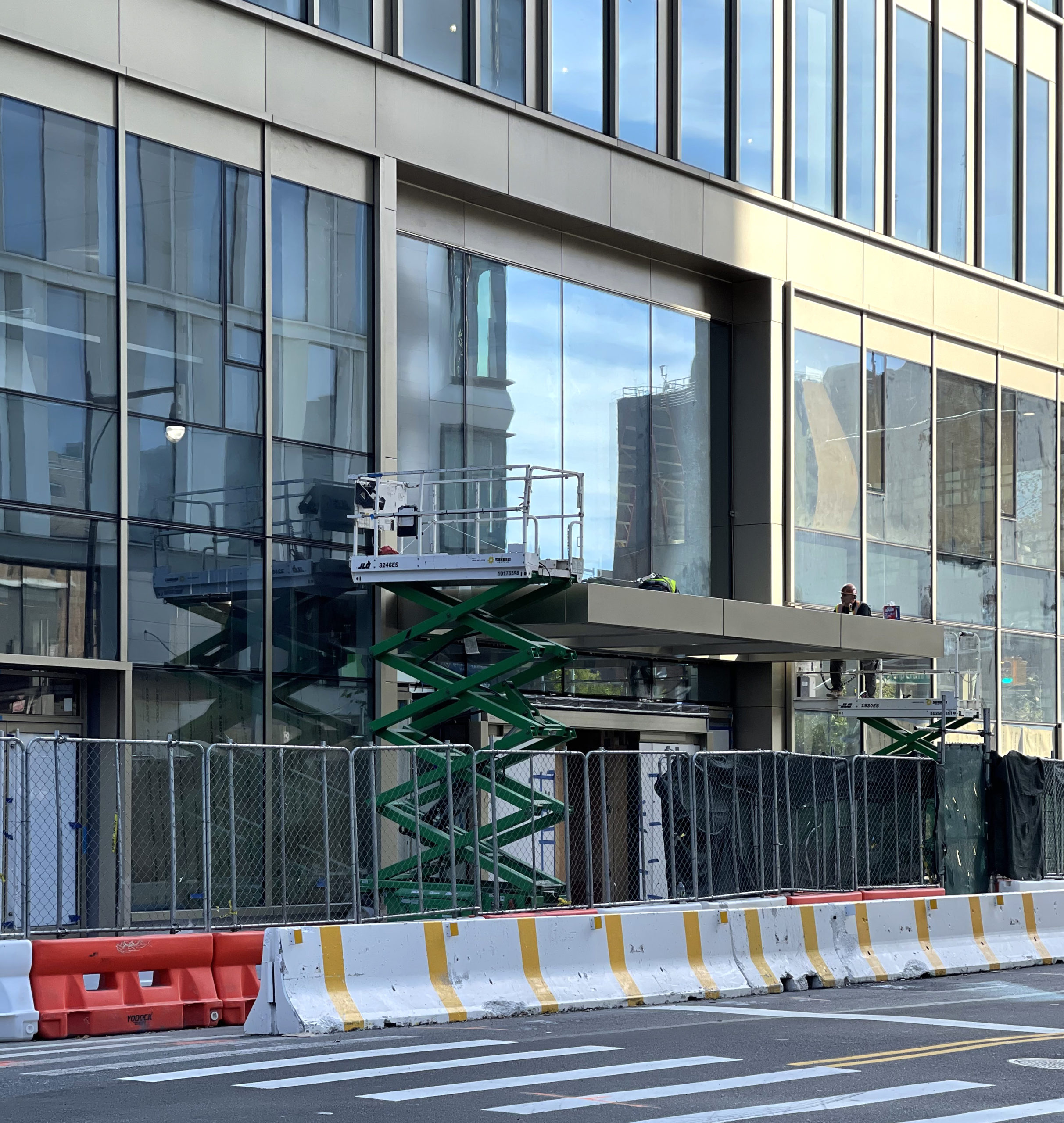
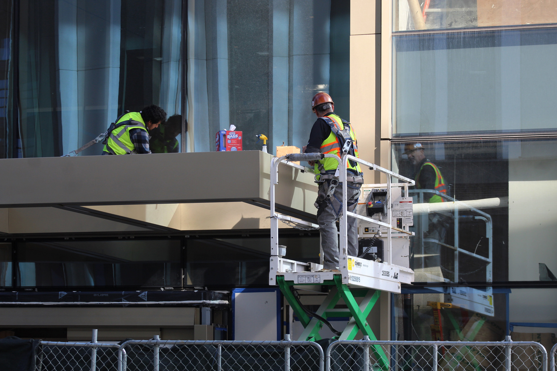
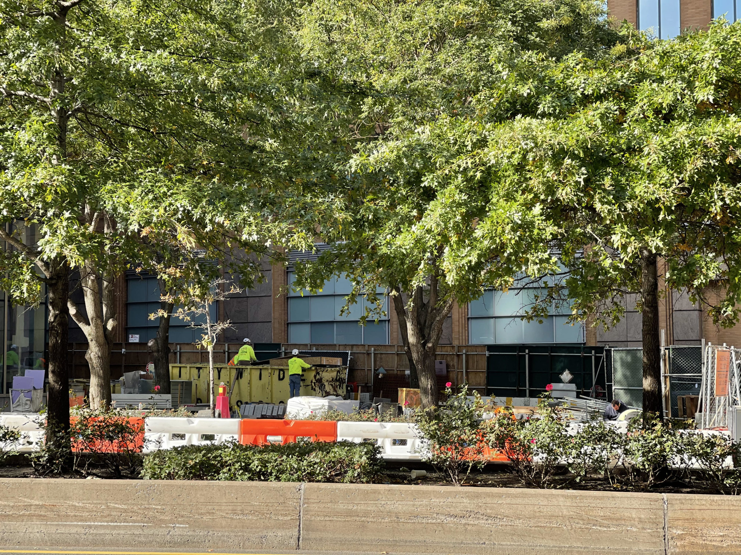
Finishing touches have progressed since our last update in late June, including the dismantling of the construction elevator and removal of the scaffolding. A perimeter of temporary fencing remains in place as crews finish up the sidewalks, the canopy over the ground-floor entrance along Willoughby Street, and the outdoor landscaped plaza on the northern end of the plot.
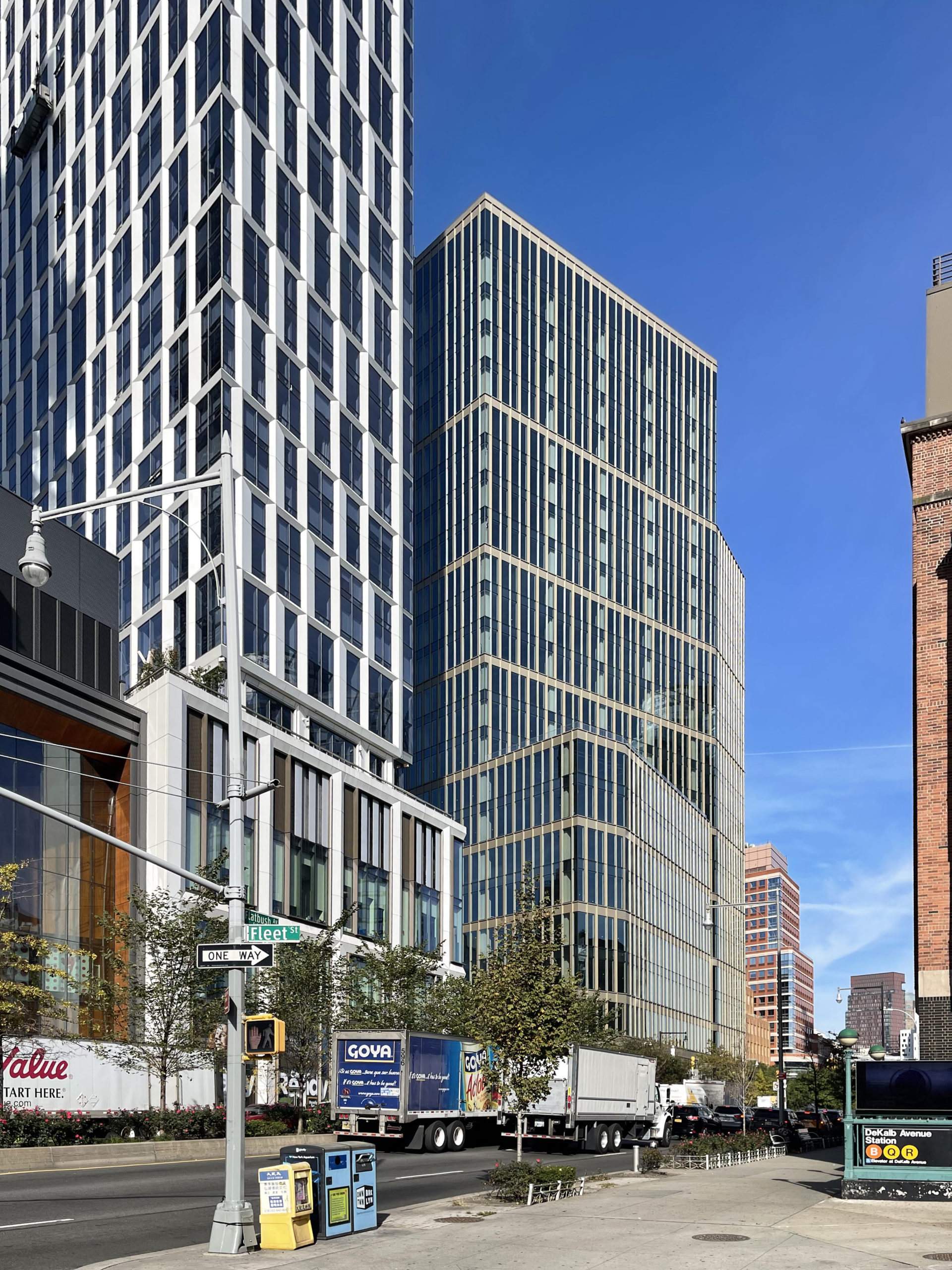
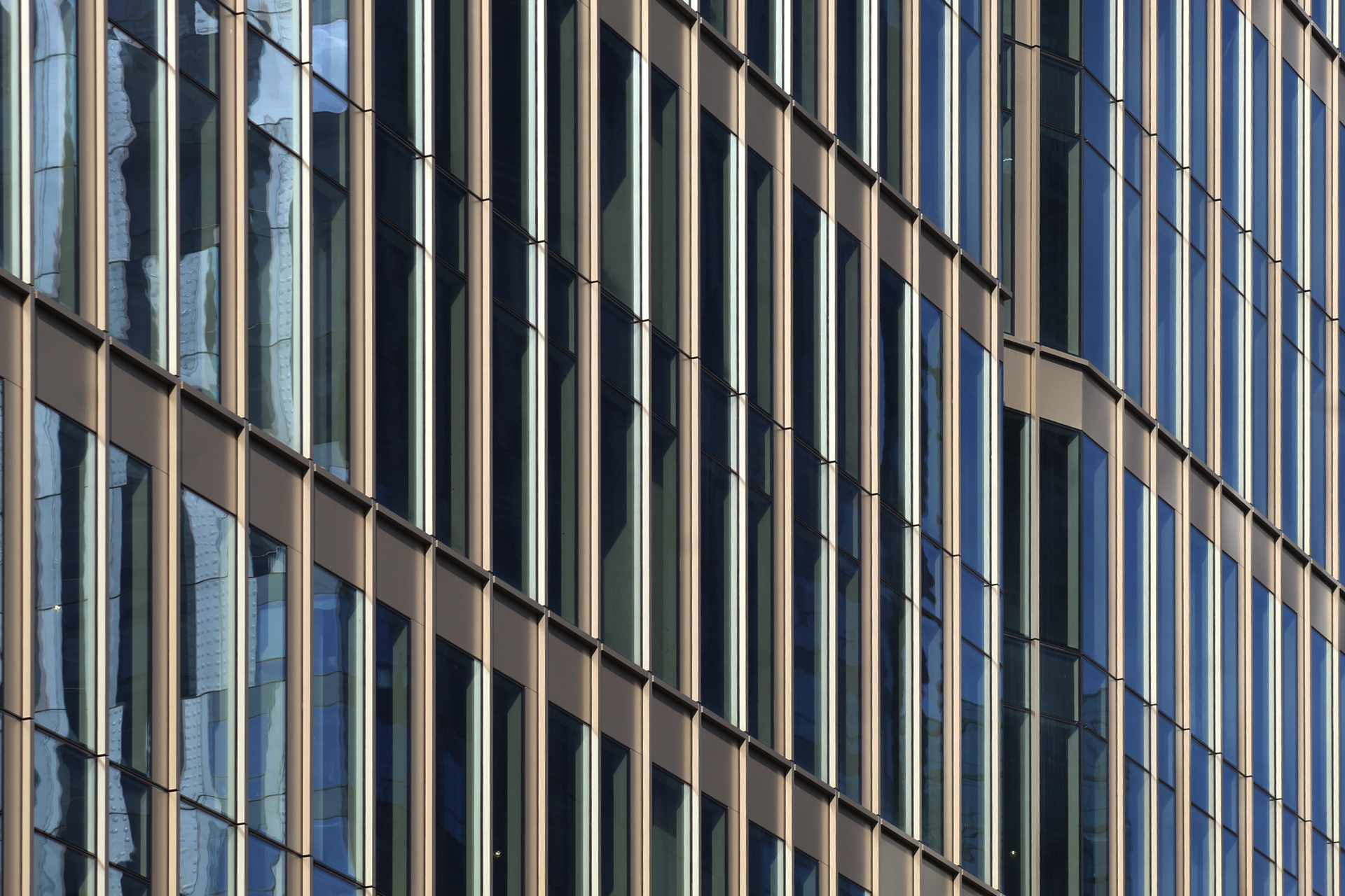
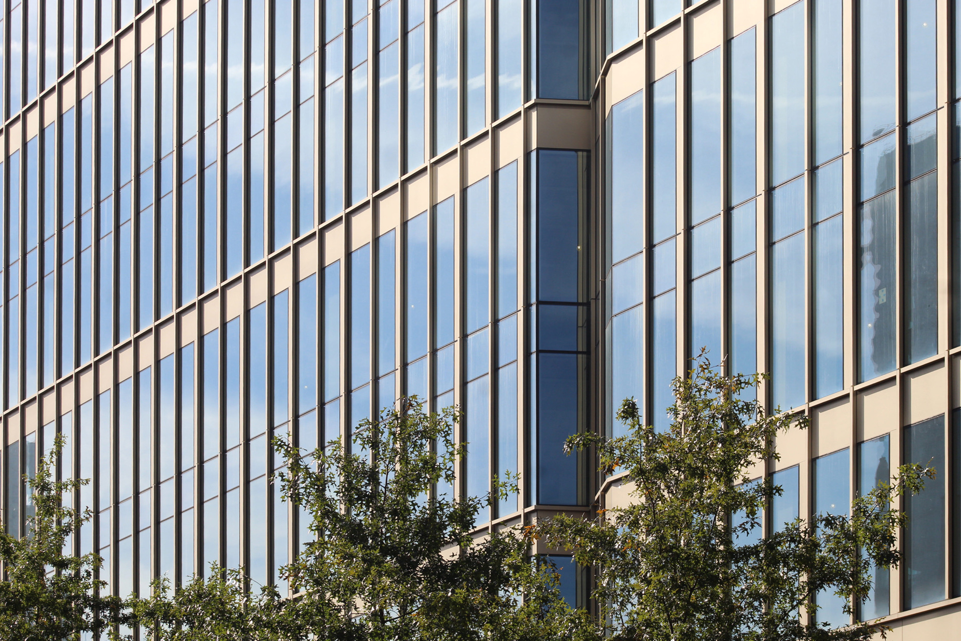
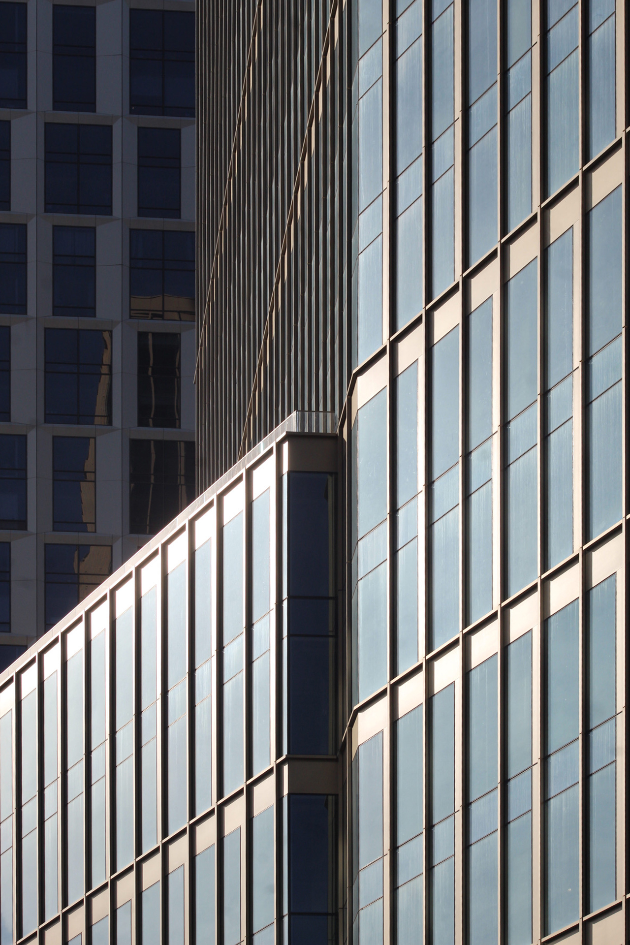
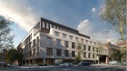
Close-up shots of the façade show the finished look of the floor-to-ceiling glass and bronze-hued paneling. Though modest in height, the building still contributes nicely to the growing density of the corridor along Flatbush Avenue.
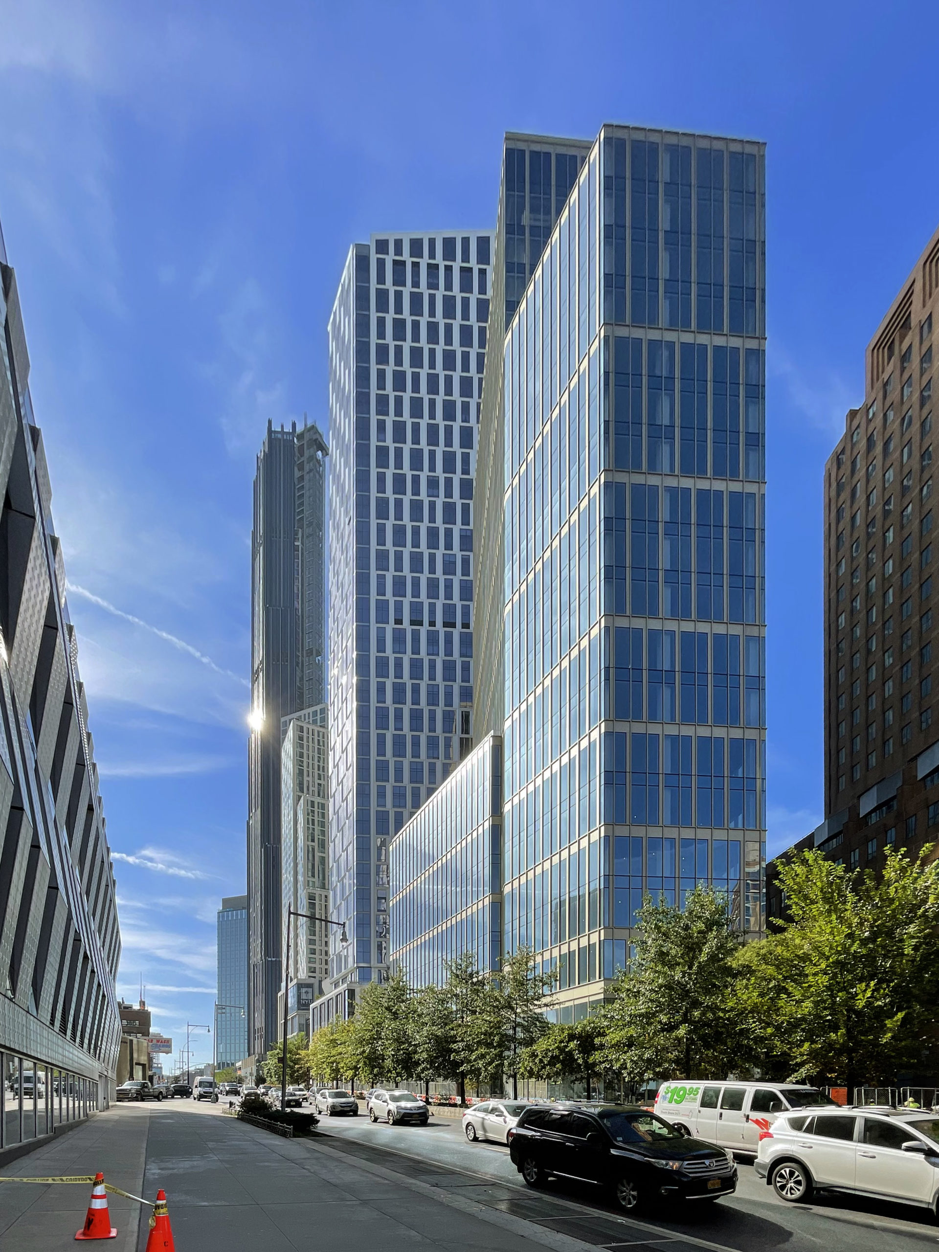
The below photo shows 141 Willoughby Street’s context alongside Kohn Pedersen Fox‘s 720-foot-tall Brooklyn Point and SHoP Architects‘ 1,096-foot-tall 9 DeKalb Avenue.
141 Willoughby Street is expected to finish construction in the first quarter of 2023.
Subscribe to YIMBY’s daily e-mail
Follow YIMBYgram for real-time photo updates
Like YIMBY on Facebook
Follow YIMBY’s Twitter for the latest in YIMBYnews




Very nice location on viewed would be showed the beautiful building, with facade along the street and neighbors around. So standing tall putting progress prominent in actually, turning angle on the structure is the best seen: Thanks to Michael Young.
That building went up extremely quickly. Hats off to a great team.
Looks good.
Wow… What a cityscape here. All new and very cohesive.
It looks so nice together.
The massing is excellent. For some reason, triangular sites make better buildings. The light colored columns behind the glazing could be made to look better by painting the outside face a dark color.
That first photo looks exactly like the rendering funnily enough. As for the building itself, I think it has turned out perfectly. It’s a very attractive design all around.
Amazing job…these photos wonderfully capture the shape and design of the building so well and how 141 blends with the surrounding towers!!!