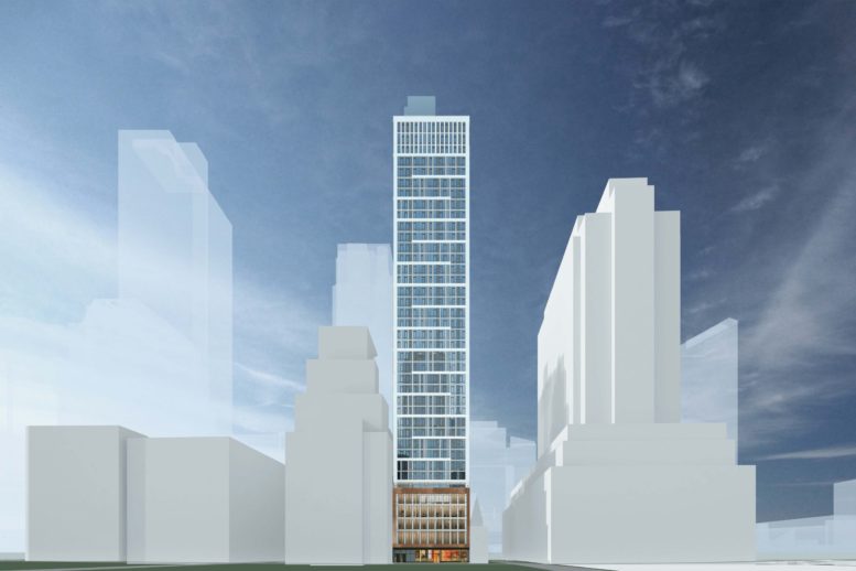
Exterior work is progressing on 111 Willoughby Street, a 40-story mixed-use tower in Downtown Brooklyn. Designed by GF55 Architects and developed by The Michaels Organization, Triangle Equities, and Geolo Capital, the 437-foot-tall structure will span 205,000 square feet and yield 227 rental units, a 20,000-square-foot ministry center for the St. Boniface parish, and 1,814 square feet of commercial space. The property is located by the intersection of Willoughby Street to the south and Duffield Street to the east.
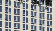
A substantial amount of work has occurred since our last update in December, when the reinforced concrete superstructure had recently surpassed the top of the multi-story podium. The building topped out in early May and recent photos show the curtain wall enclosing almost the entire building, with the primary exception of the gap on the eastern end of the rear northern elevation where the construction hoist is anchored. The narrower side walls are left blank and are in the process of being painted white by crews on hanging scaffolding rigs.
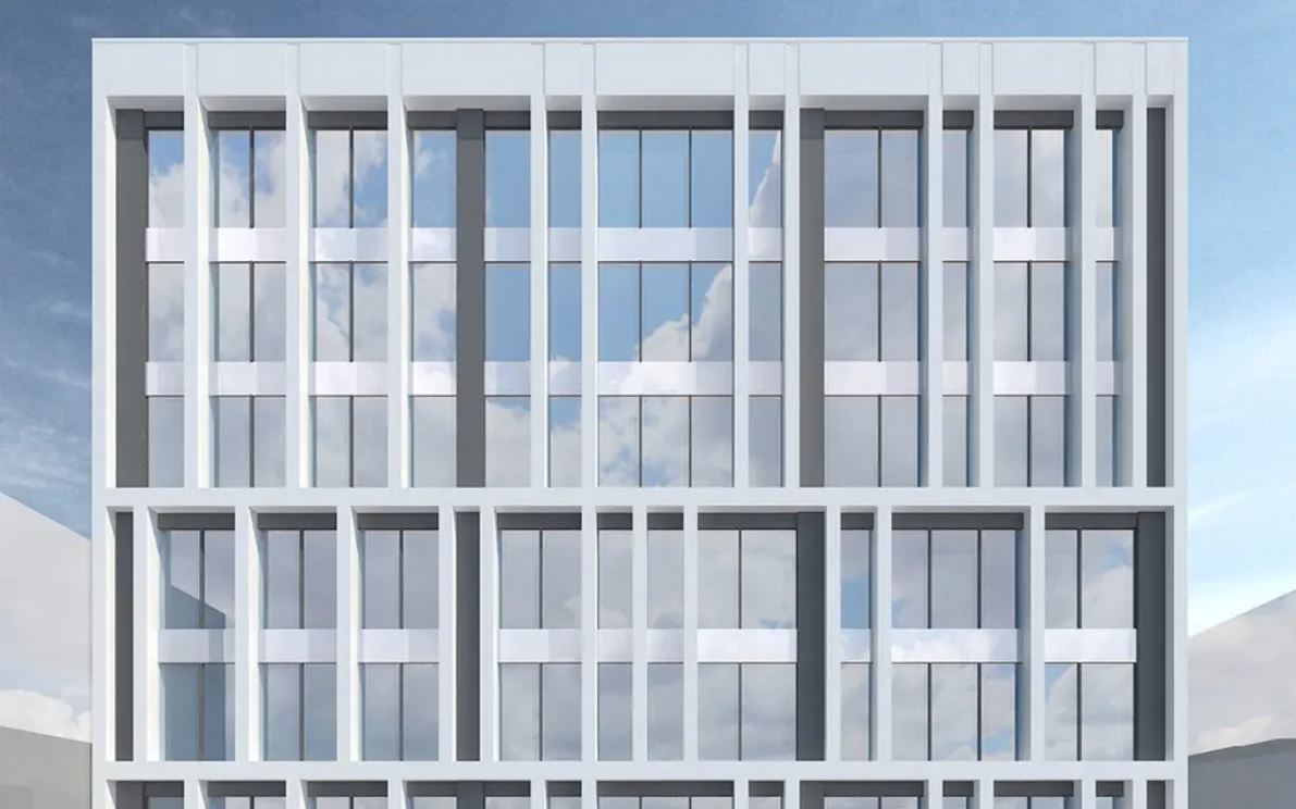
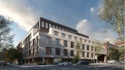
The rendering in the main photo highlights 111 Willoughby Street’s façade and its signature pattern of thick white horizontal bars that form a meandering pattern at two-story intervals. The podium levels are shown framed with a contrasting bronze-hued paneling, and the crown is depicted below with a dense grid of white vertical beams. The flat parapet caps the structure.
Homes at 111 Willoughby Street will occupy floors six through 40, with 69 units designated for affordable housing. Residential amenities will include a 24-hour concierge, a rooftop lounge, and a fitness center.
The property is located in close proximity to multiple subways, including the A, C, F, and R trains at the Jay Street-MetroTech station to the west; the 2 and 3 trains at the Hoyt Street station to the south; and the B, Q, and R trains at the DeKalb Avenue station to the east.
111 Willoughby Street is slated for completion in the spring of 2025, as noted on site.
Subscribe to YIMBY’s daily e-mail
Follow YIMBYgram for real-time photo updates
Like YIMBY on Facebook
Follow YIMBY’s Twitter for the latest in YIMBYnews



I saw this a couple weeks ago and it’s a very decent infill design. It is surprising the adjacent deco building didn’t fill in their blocked windows first. The two wood frame house are total gems that must be preserved.
Maybe they didn’t fill them in so that can still get some “fresh air”, and allow for unchecked tagging of their neighbor?
I know I would enjoy that! 🤗🖍🖌
The NYTCo Building is landmarked. I can’t say 100% but I would imagine that would affect the blocking up of windows.
It’s just too bad the zoning forced yet another goofball massing that slices lot line windows in half on a landmarked building on one side and leaves a 400 foot tall blank wall over a tiny corner building unlikely to ever be replaced on the other.
Crews came down to repair a window, that was beginning to deteriorate below: Thanks to Michael Young.
Amazing they weren’t required to build a foot back to keep exposure for those windows. Also a shame the metal cladding warps at the joins.
That park space has made such a difference to that area though. Really impressed with that project.
There’s a lot of amazings when you see the outcomes of the NYC zoning code. The entirely too uncompromising setback building code has led to a litany of aesthetically horrifying outcomes in this city. See the Garment District econobox hotels, a while considerably better, see this. And do you think anyone will make the effort to remove the ghost outline and painted brick from the previous structure on the side of the landmarked brick building? Highly unlikely.
Not sure why if the developers were confident the corner structure would likely remain in perpetuity, or at least zoning made a much taller building impossible to be built in the future on the corner, why they wouldn’t have put in windows on that lot line and instead bestowed the neighborhood with that 400 foot tall blank wall.
Perhaps people in the future will find some ingenious use for that corner lot. Challenges generate the best solutions. Maybe it could become a multistory trellis for an urban farm, or given over to an overwhelmingly tall work of art that just happens to hide telecommunication devices. Considering how unpredictable everything has become, who knows how people will think 20 years from now.
Or if they’ll think at all.
S
S
S
S
S
So, a little YIMBY inside baseball…. You originally posted—
SSSSS
and I replied—
55555
but now those are both gone—what gives? 🤷♂️
Somebody deleted it. You get the gold star for the day if you know what I’m referencing.
Since 69 units are deemed affordable, the other 158 units are therefore unaffordable, yet 100% of the building receives subsidies.